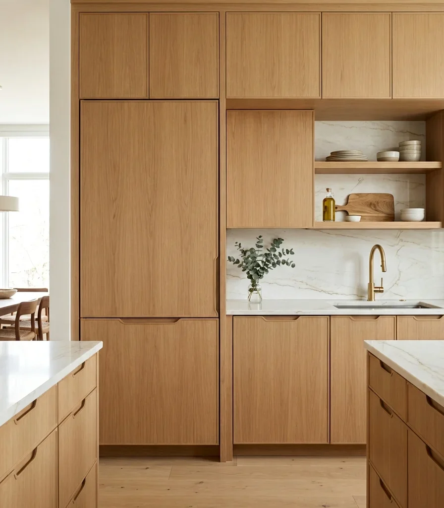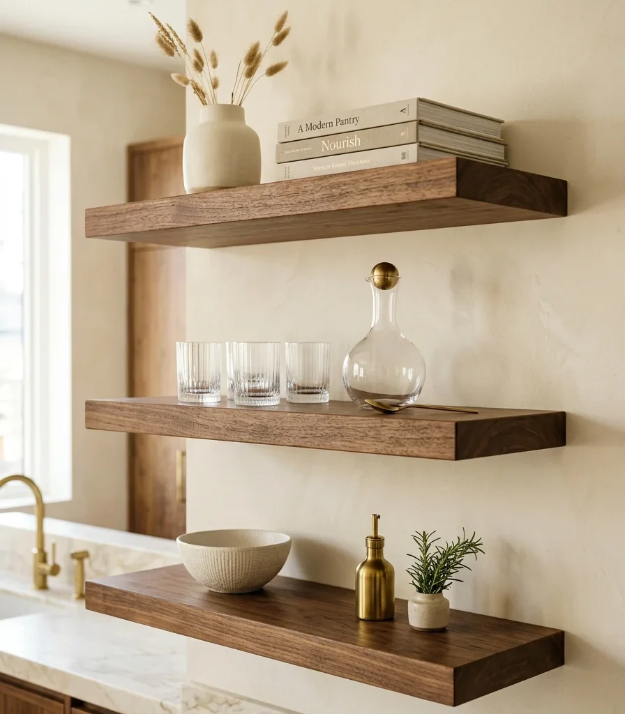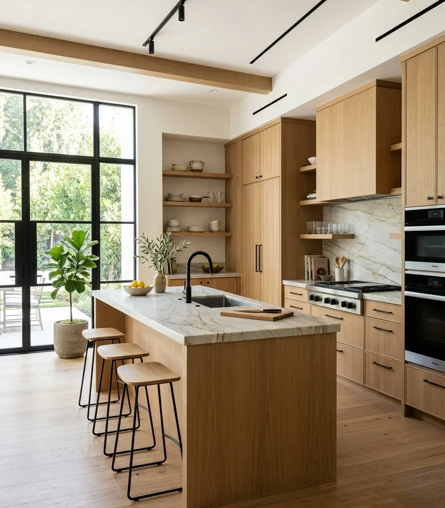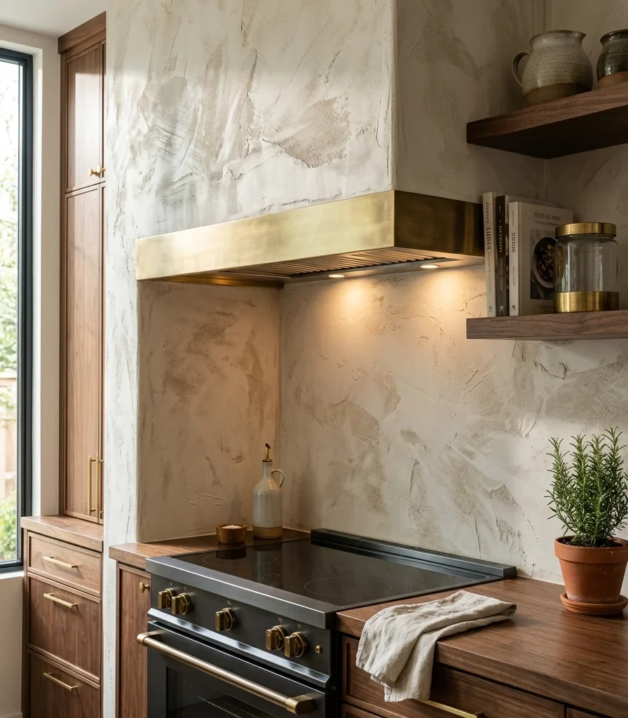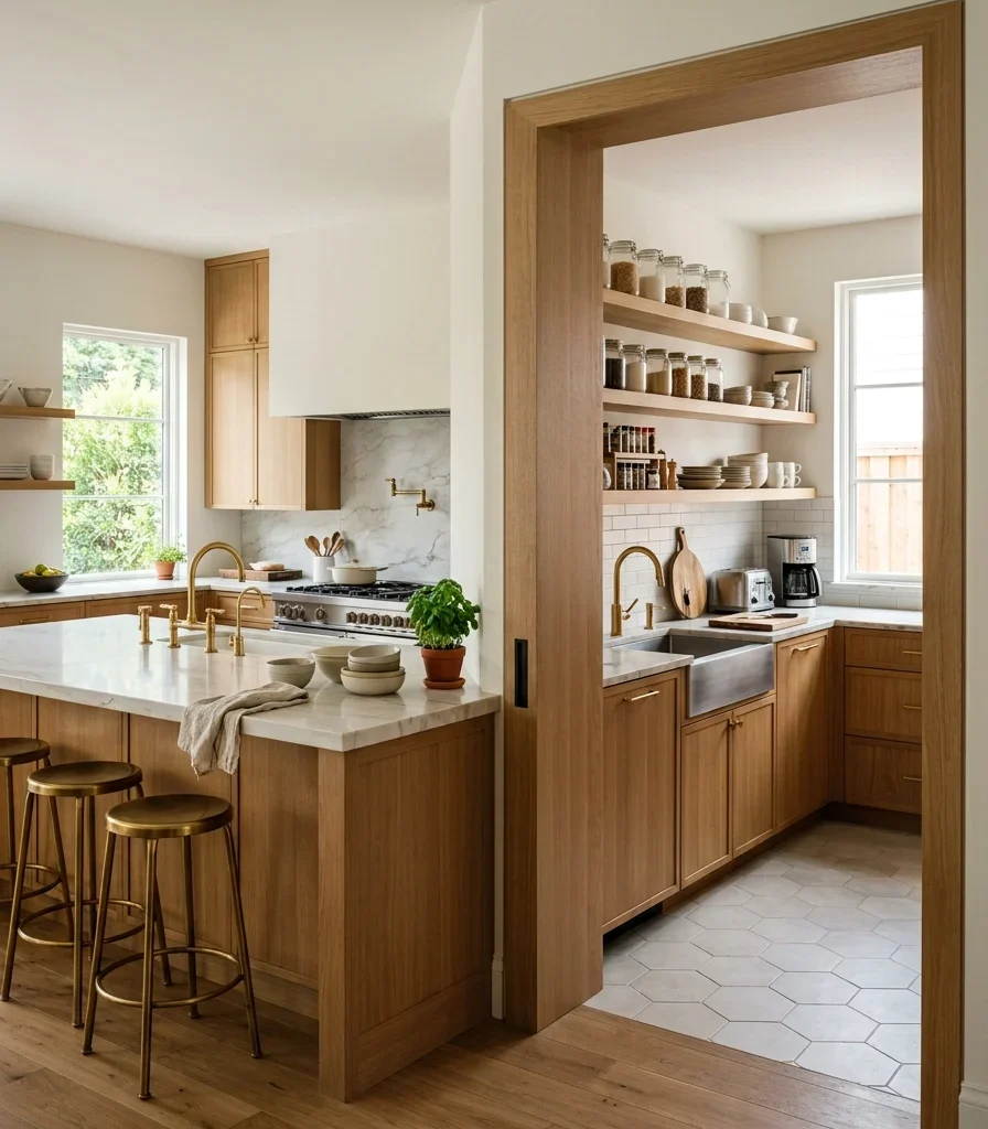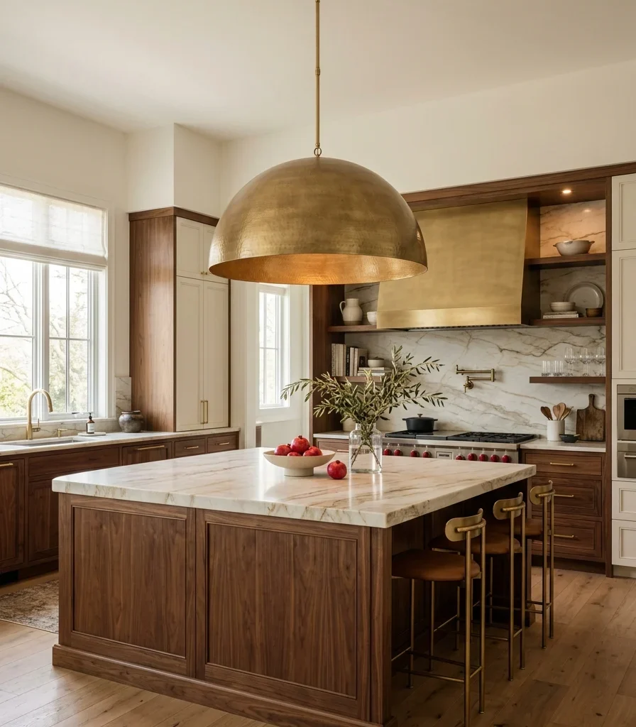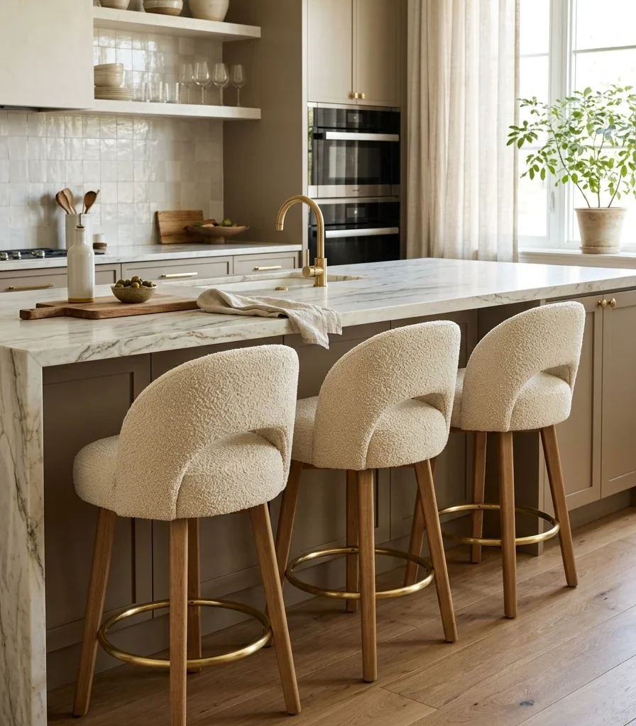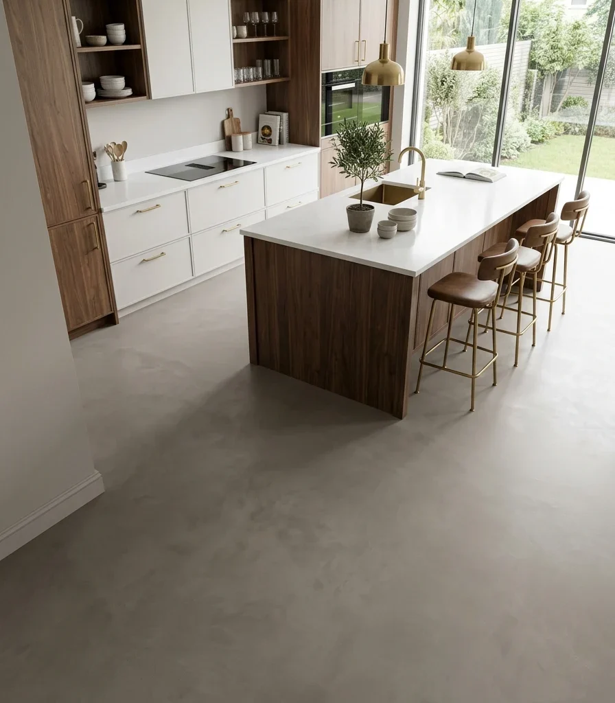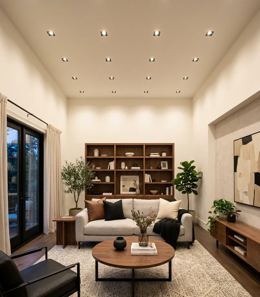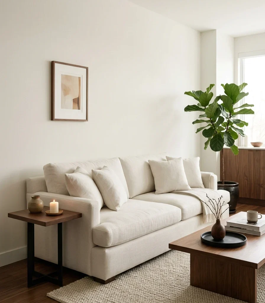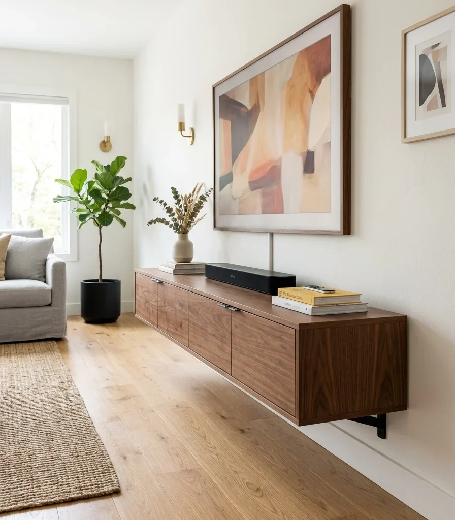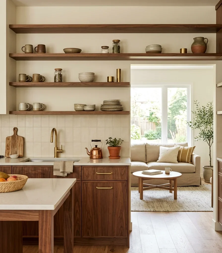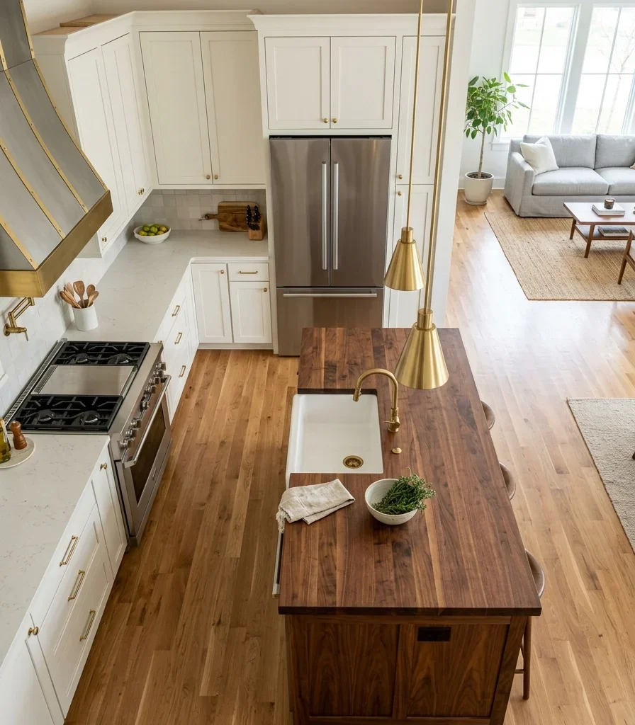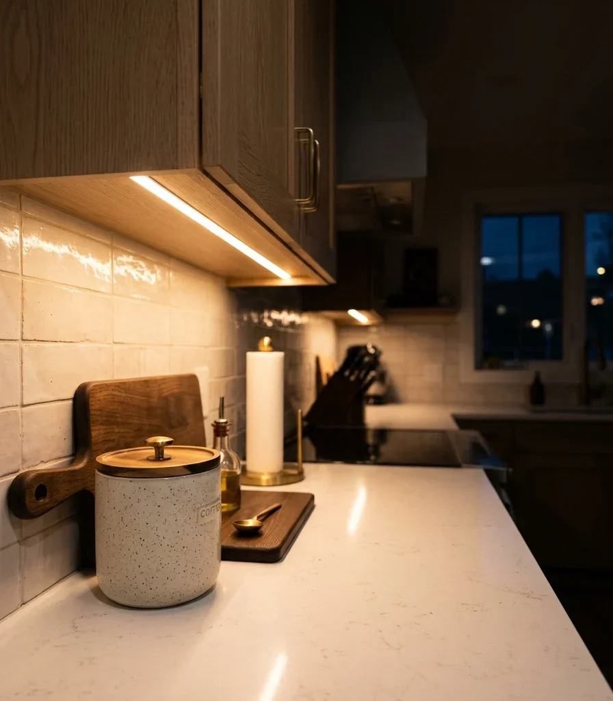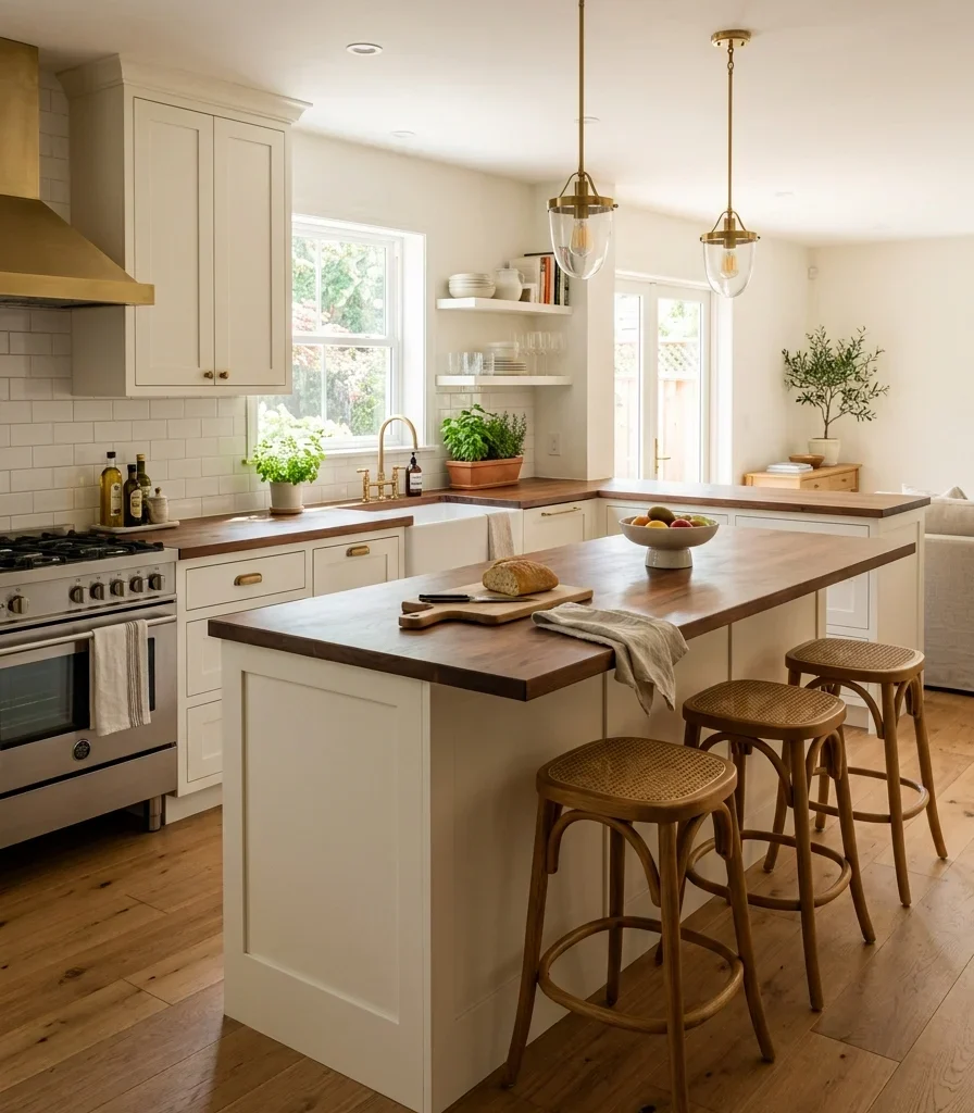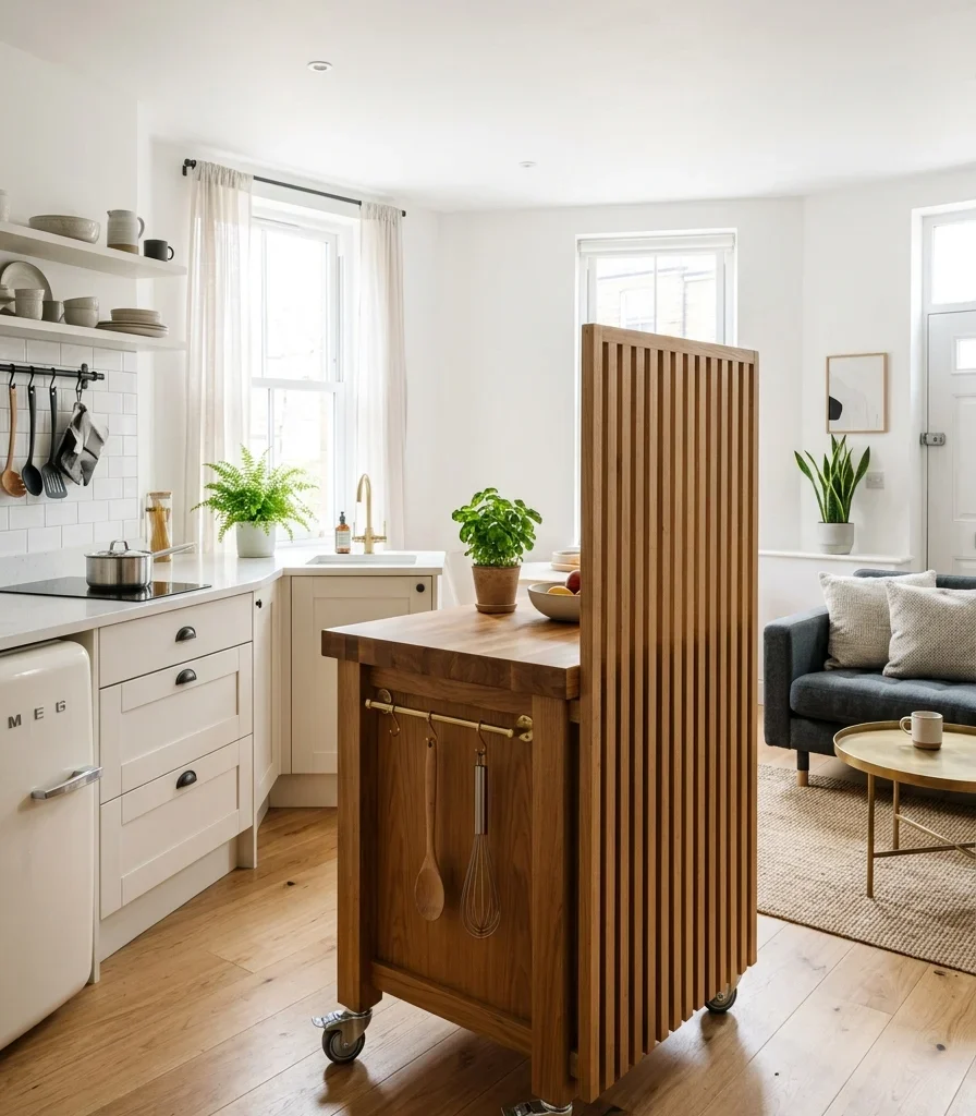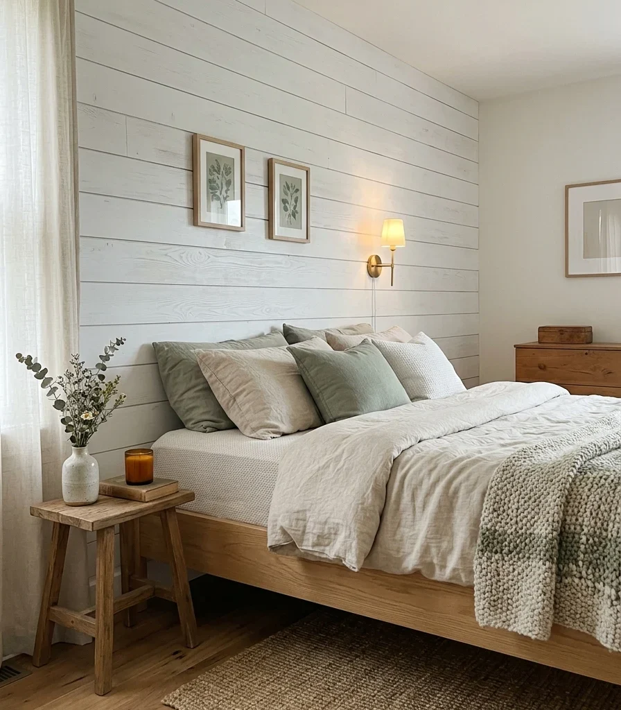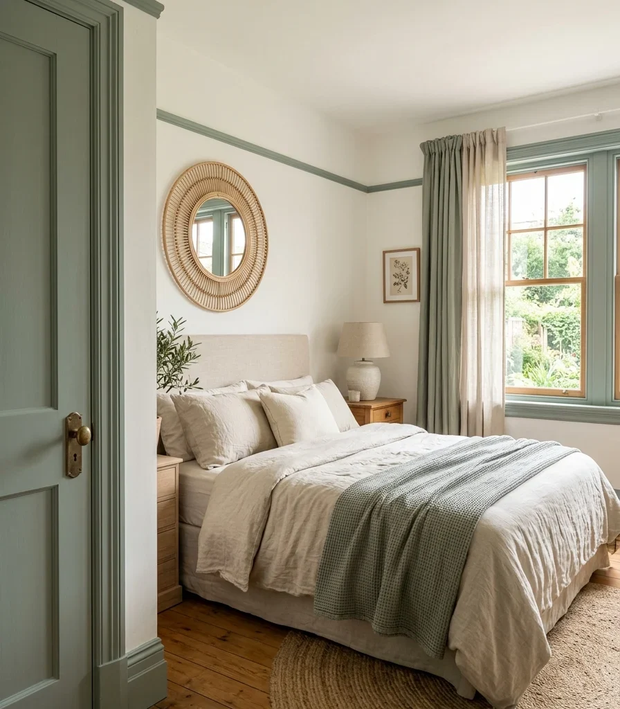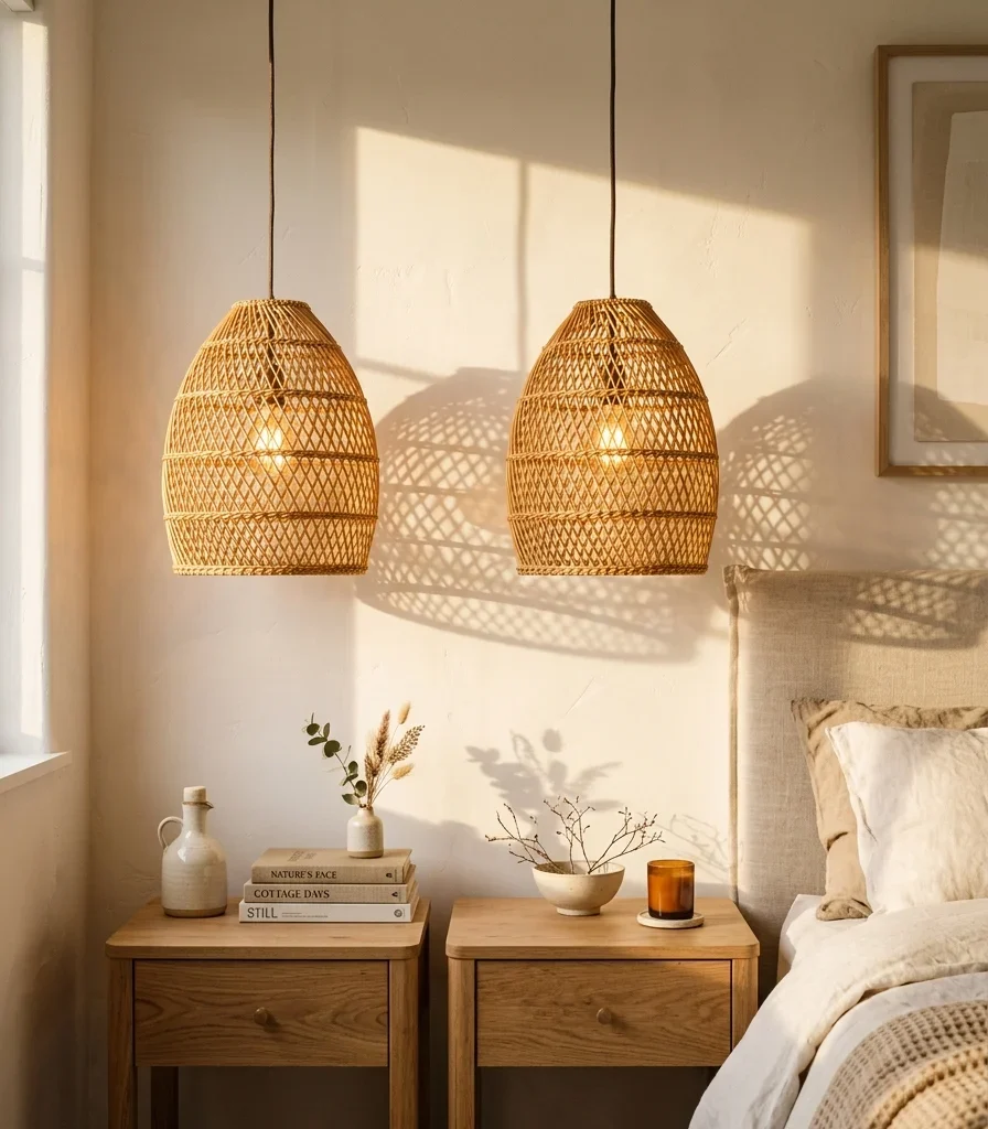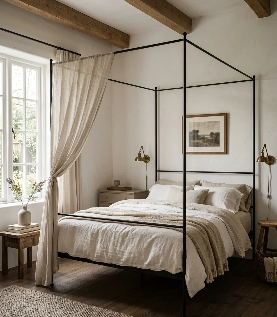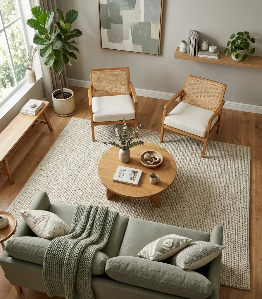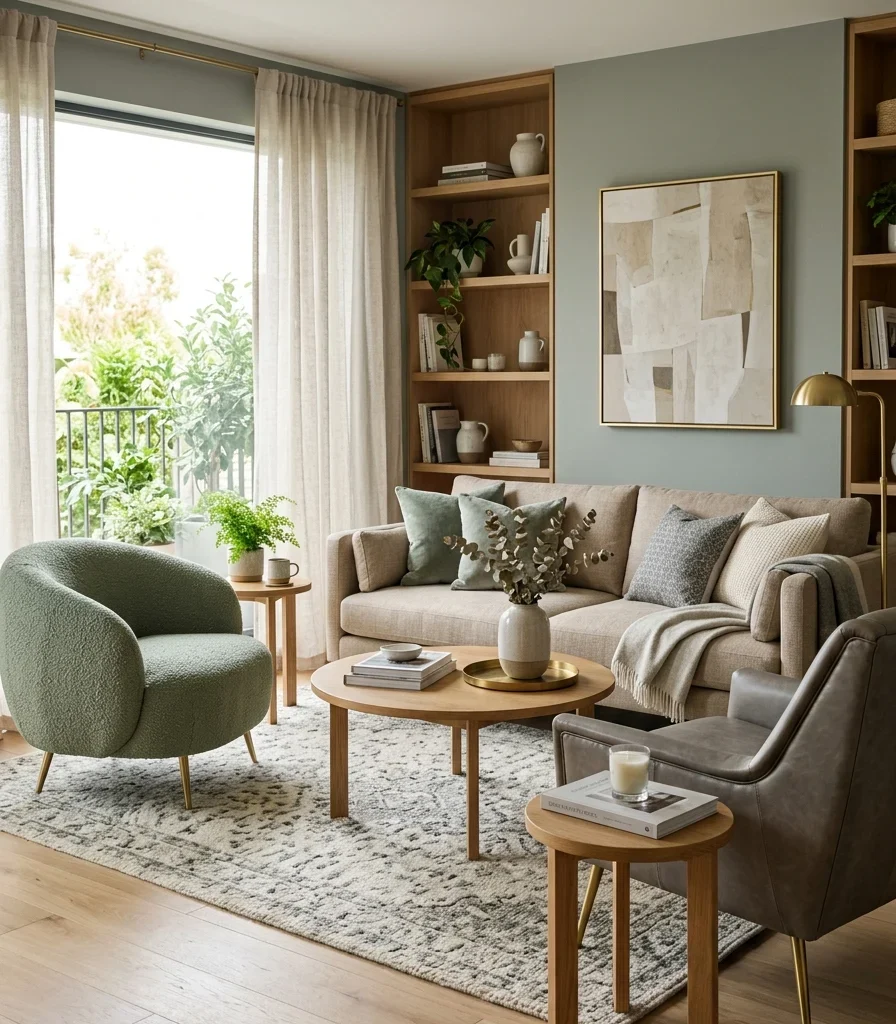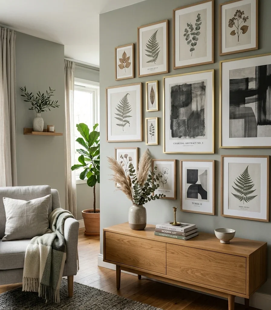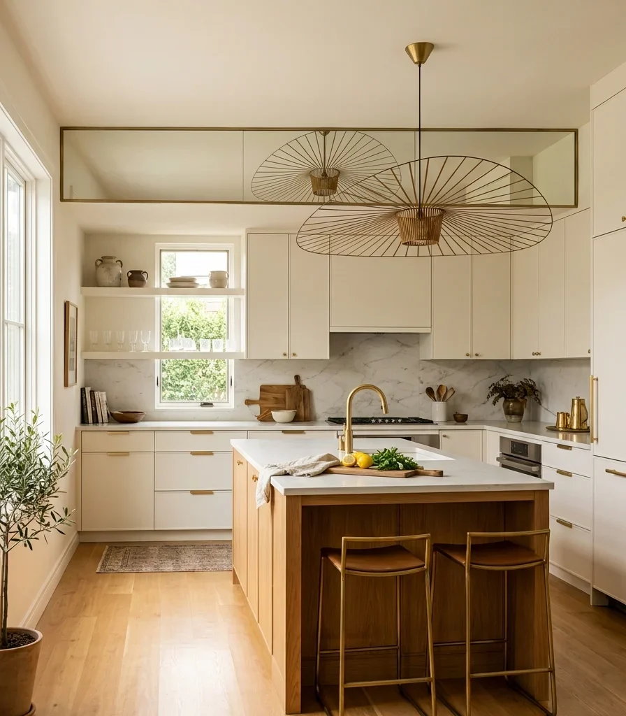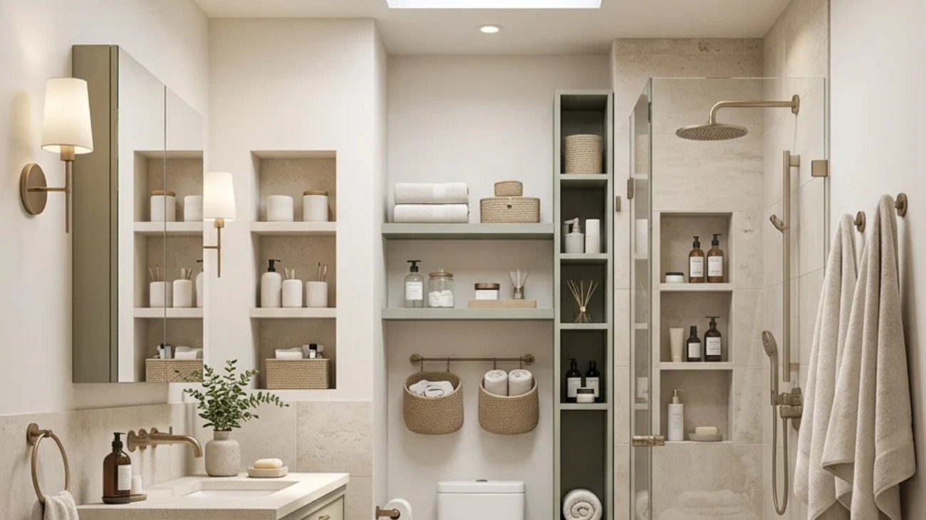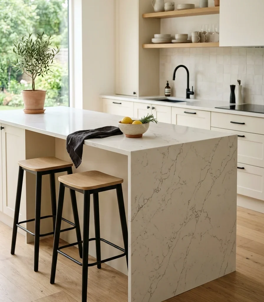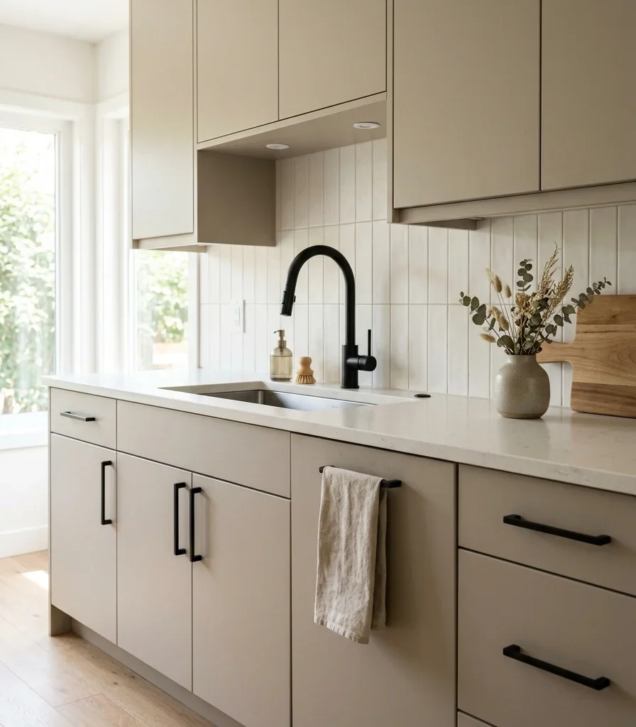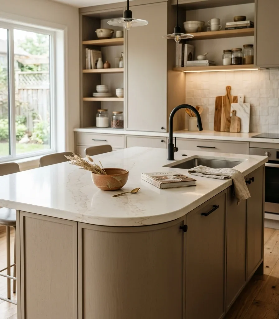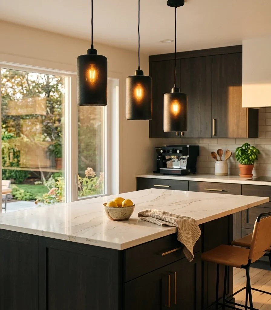
15 Open Concept Kitchen and Living Room Design Ideas

15 Open Concept Kitchen and Living Room Design Ideas

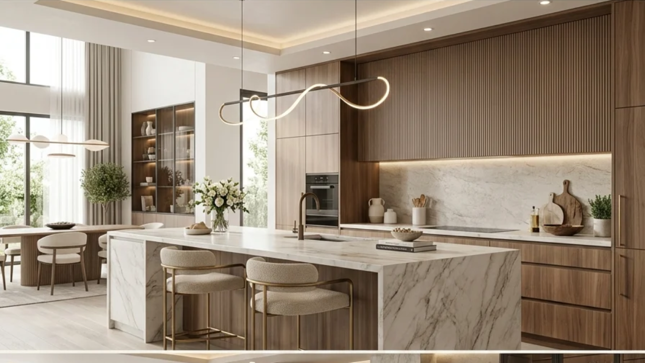
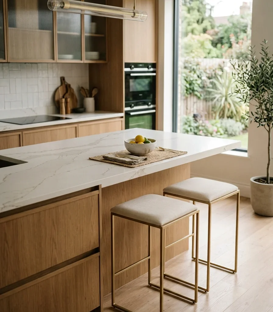
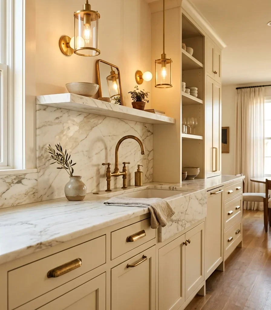
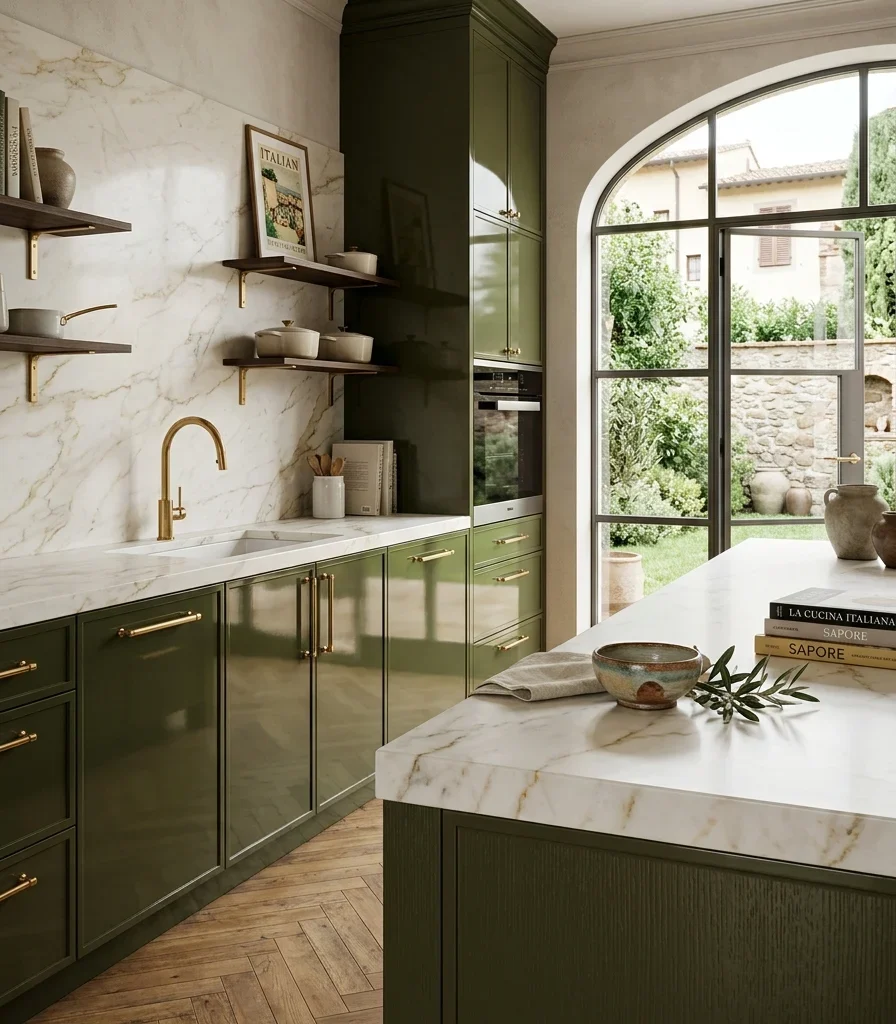
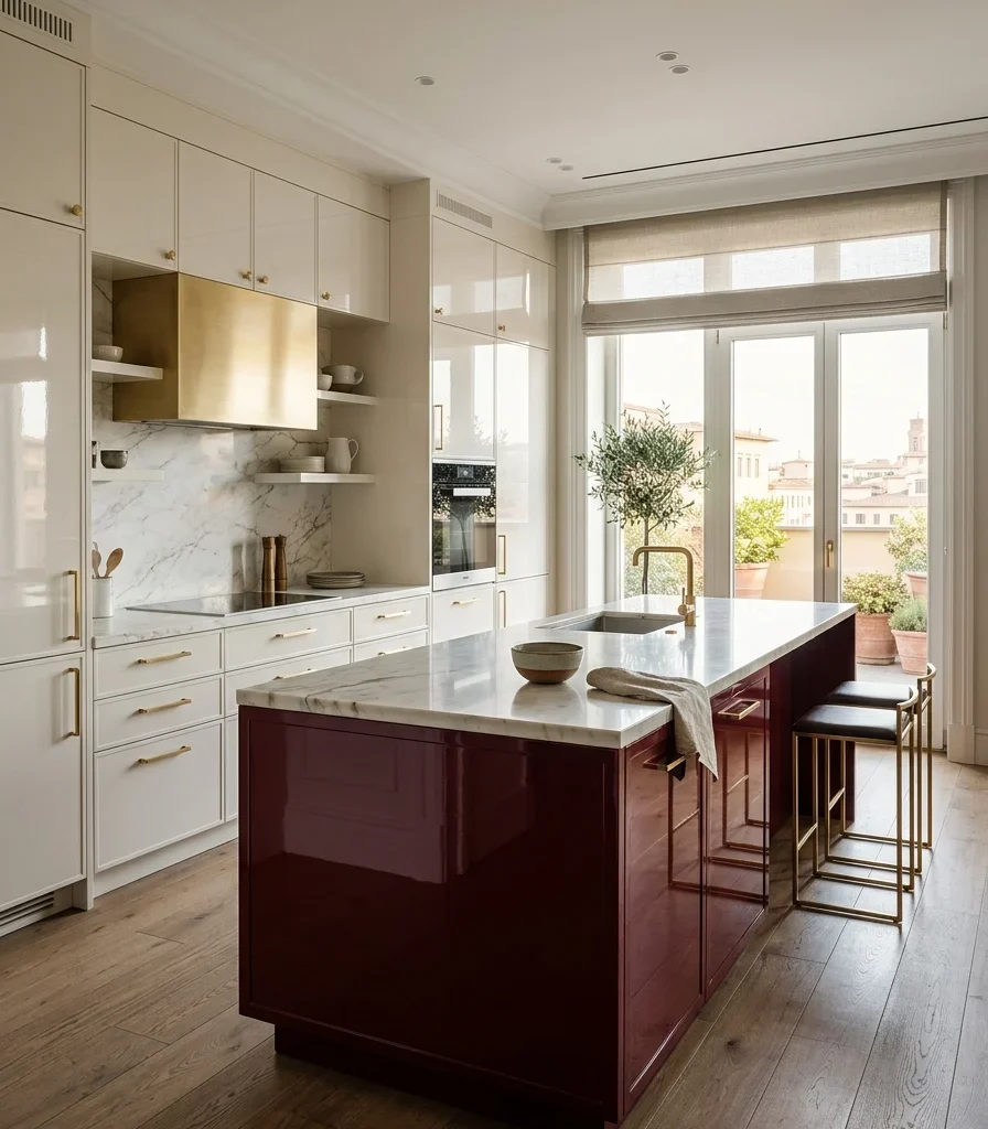
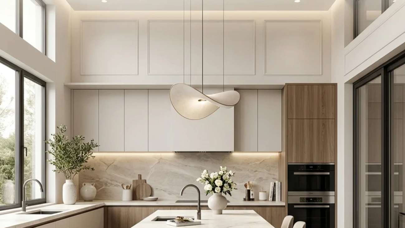
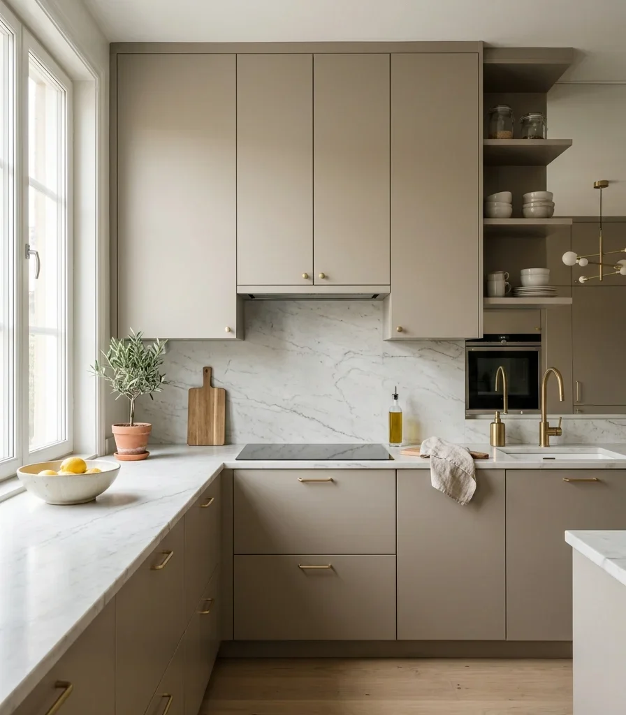
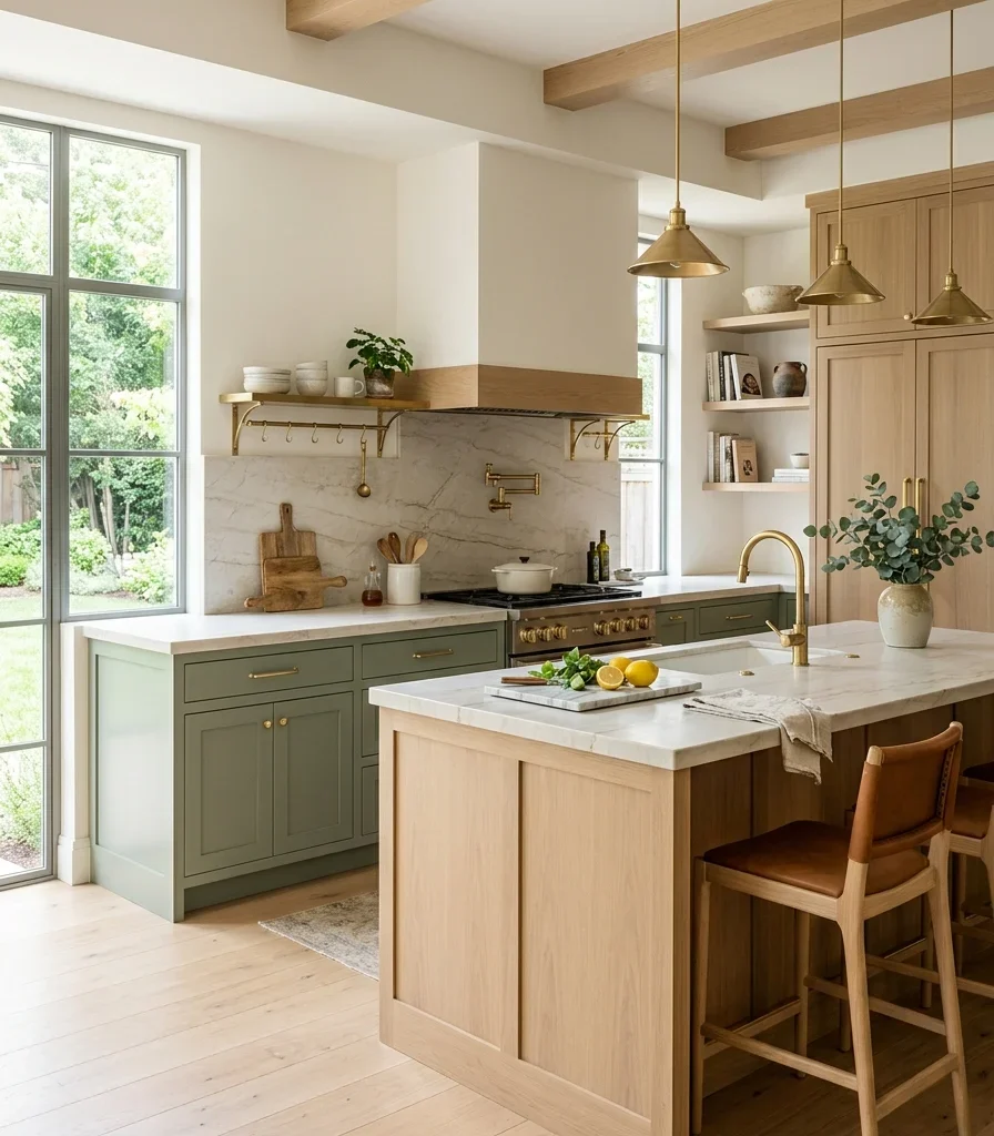
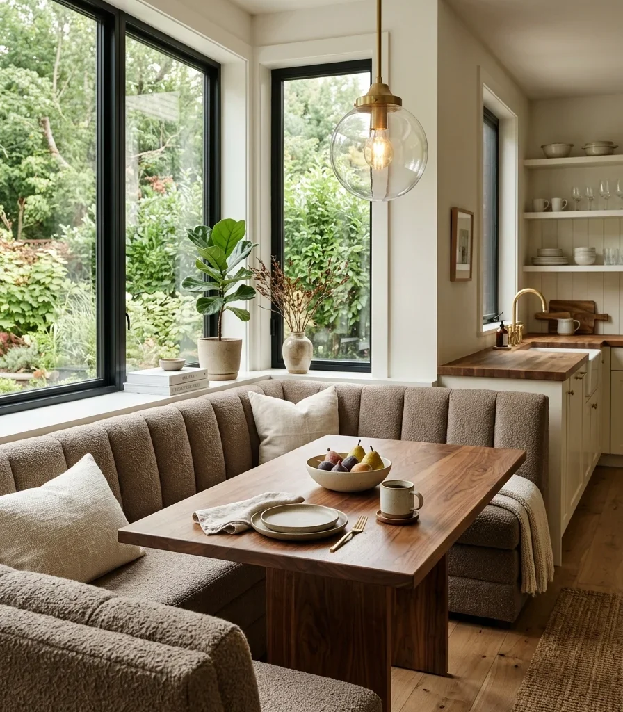
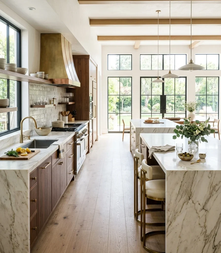
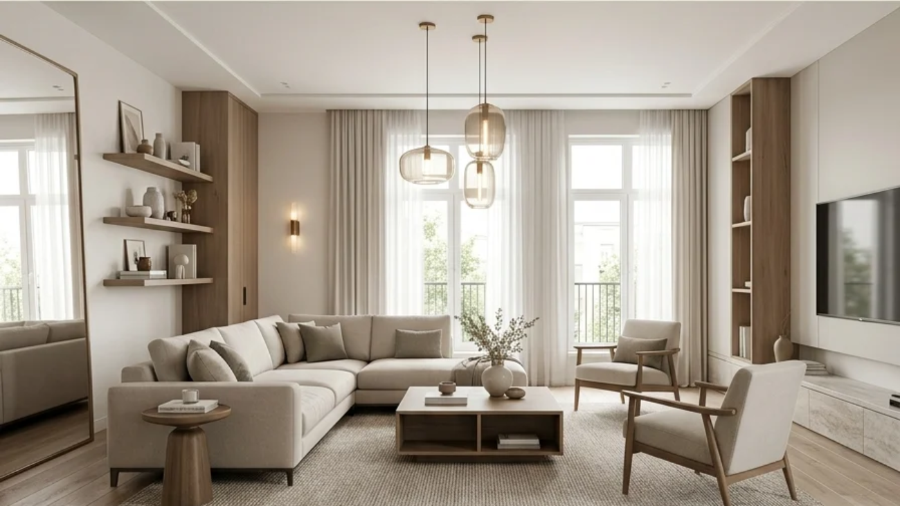
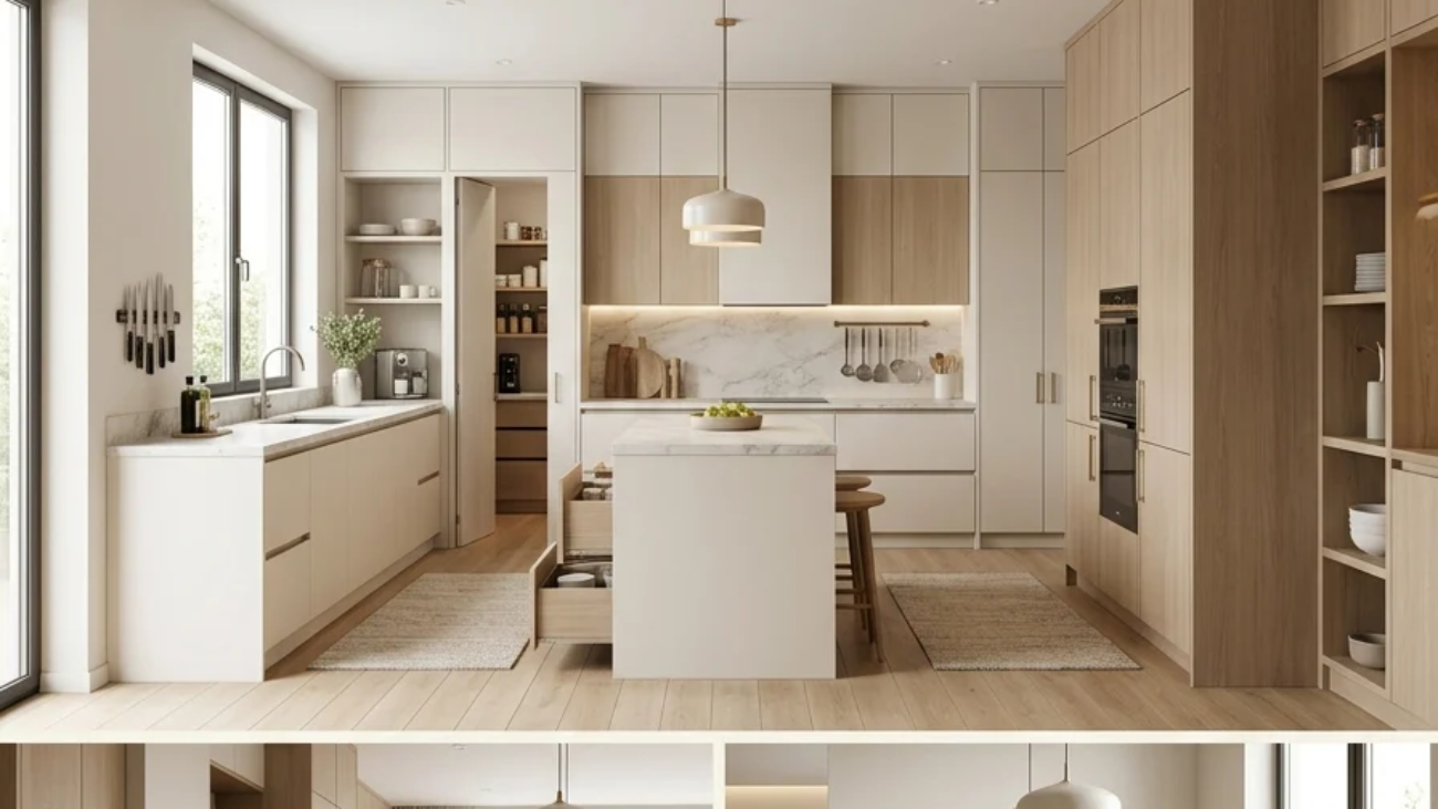
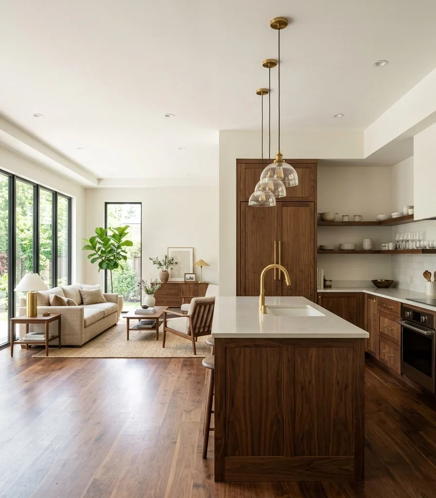
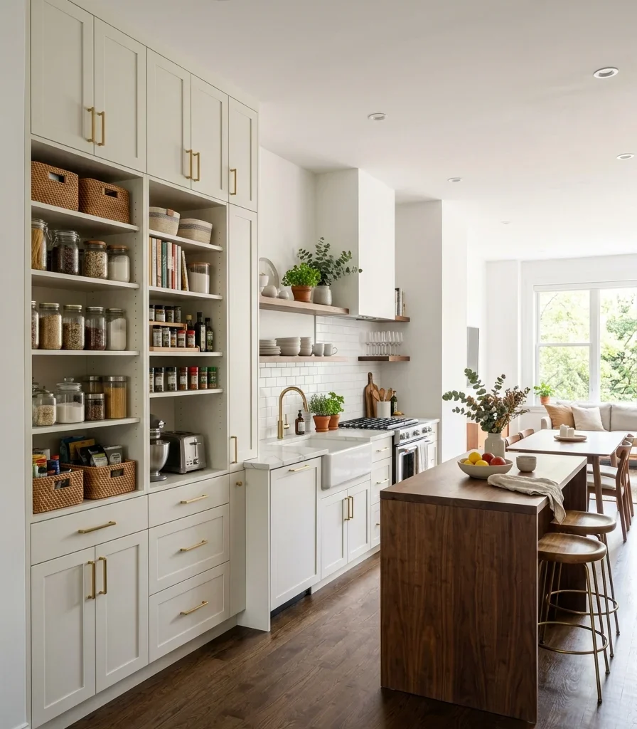
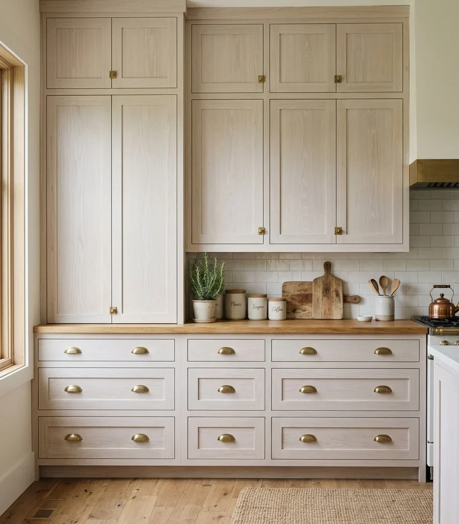
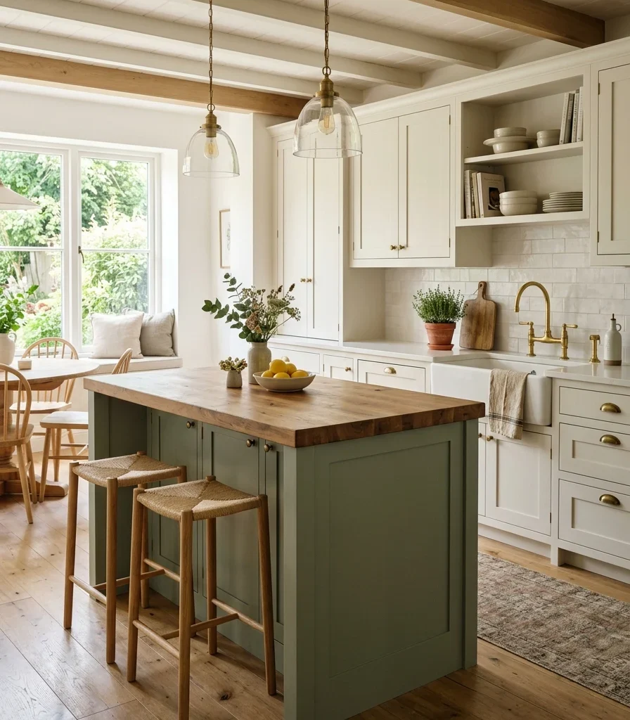
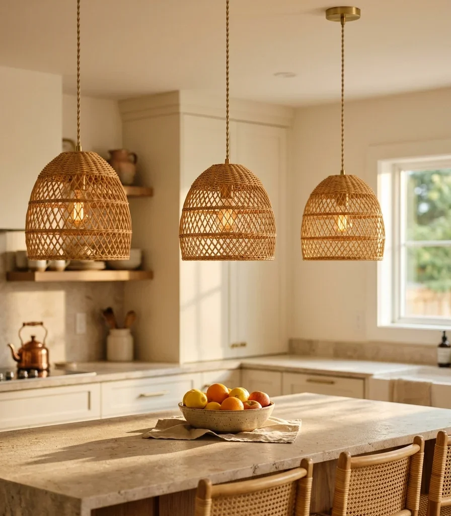
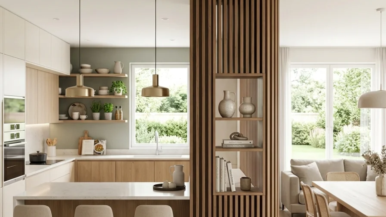
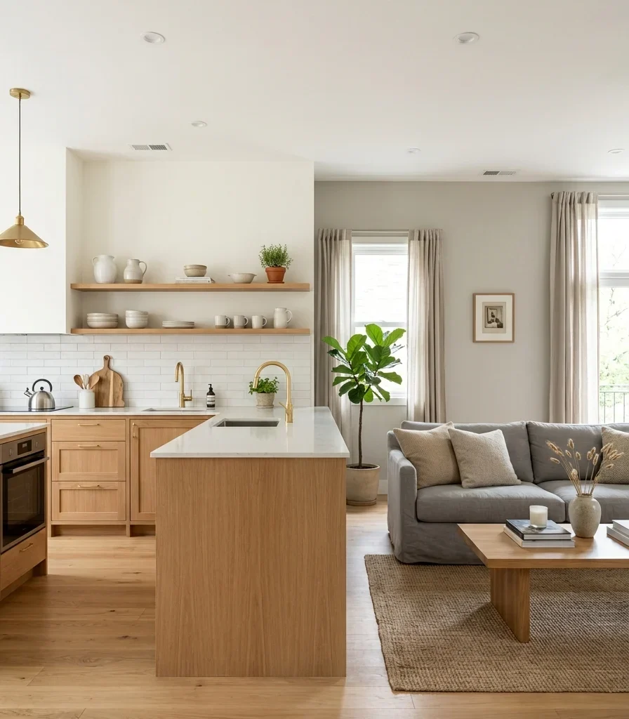
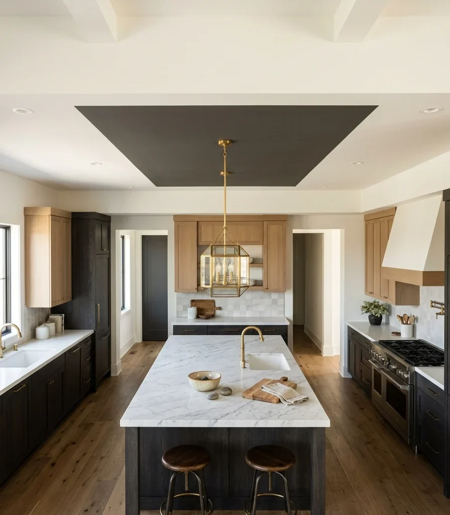
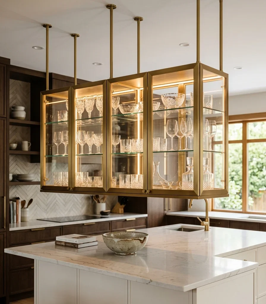
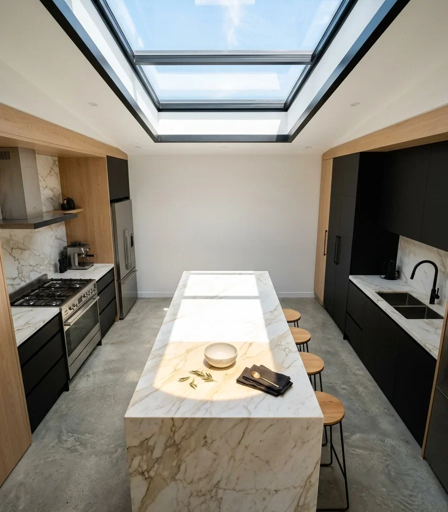
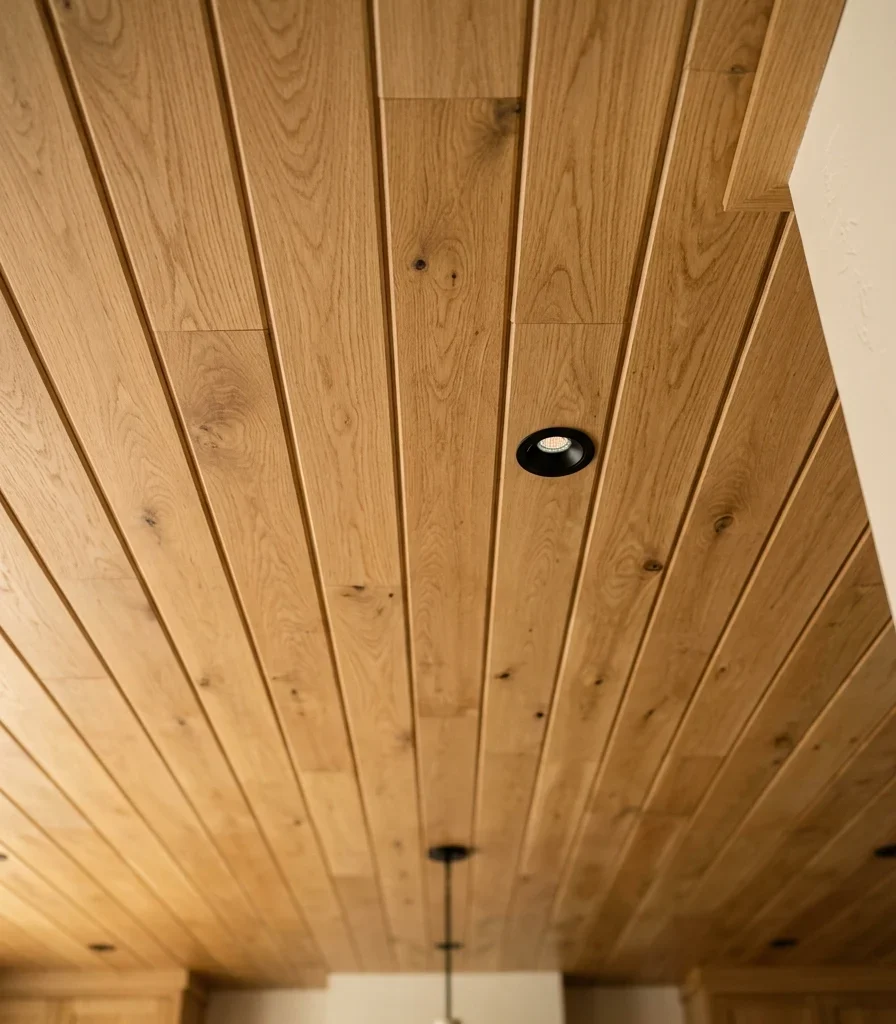
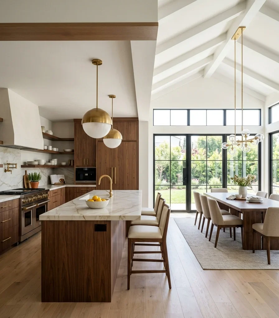
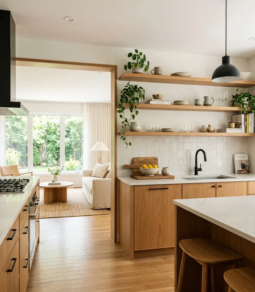
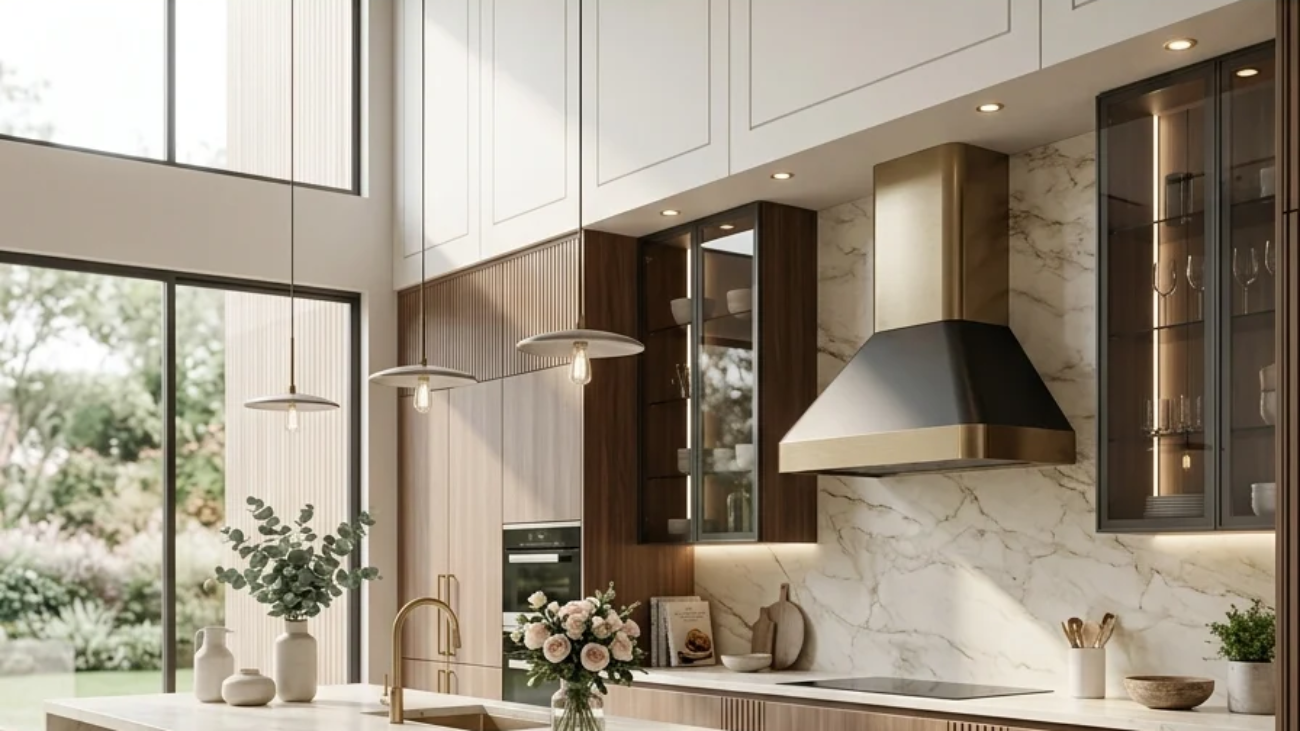
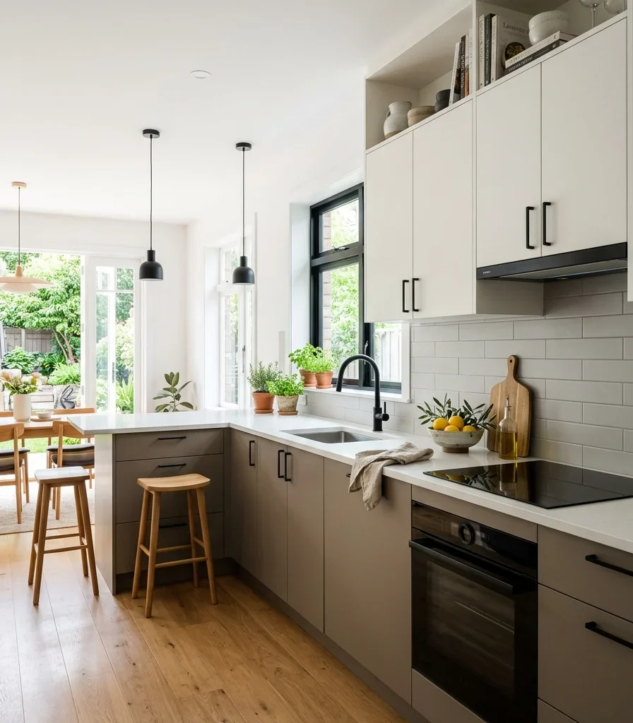
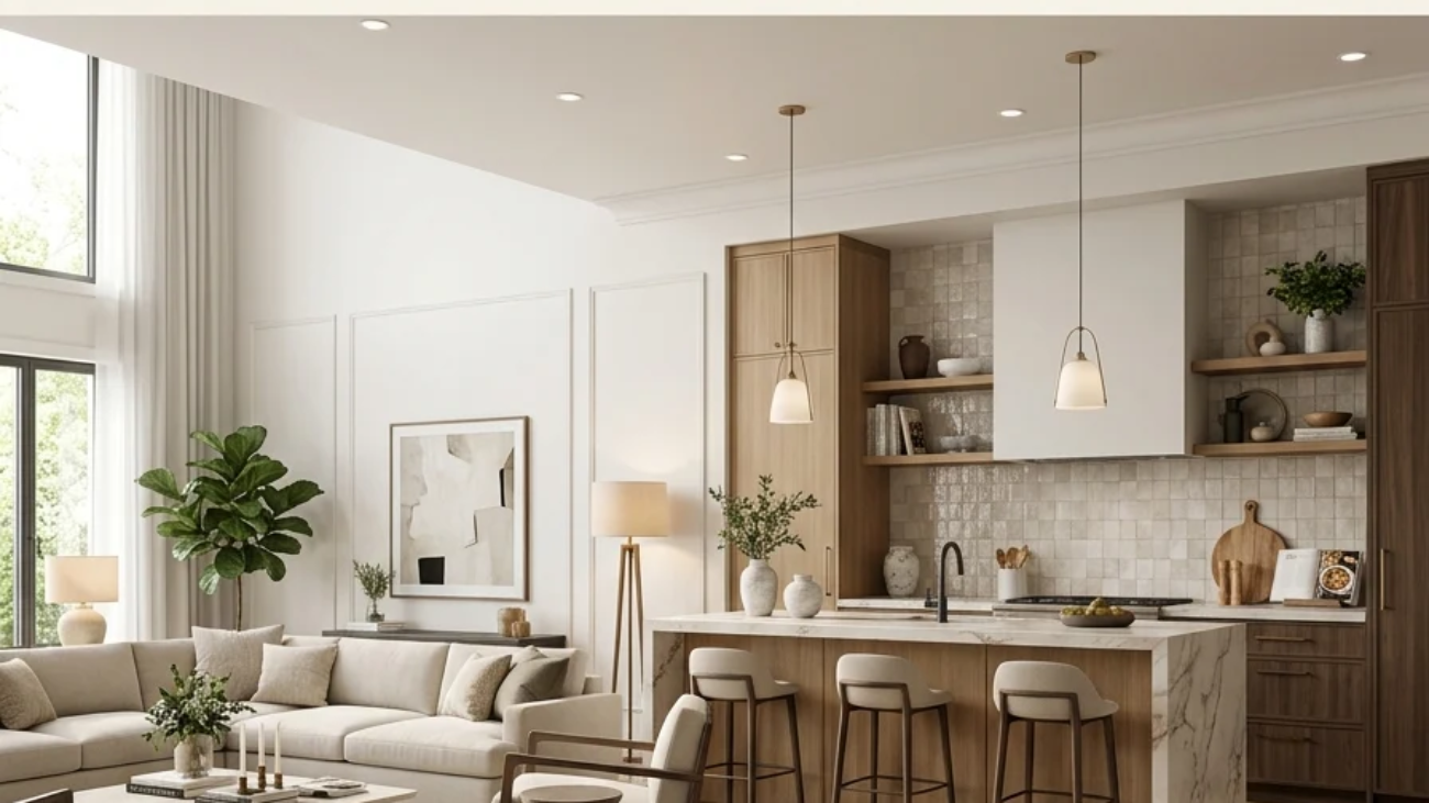
An open concept kitchen and living room design removes the wall between cooking and lounging spaces so both rooms function as one continuous space, unified by matching materials, flooring, and sightlines. This article gives you 15 open concept kitchen and living room ideas that work for full-wall removals, kitchen islands as room dividers, and homes still deciding how open is open enough.

Picture a Saturday morning where the person cooking breakfast never once has their back turned to the conversation happening on the sofa, where the smell of coffee drifts freely into a living room lit by the same warm pendant glow as the island above the stove. Open concept living has a specific kind of energy: the sound of one room reaches the other, light travels uninterrupted from window to window, and nobody standing at the stove misses what’s happening on the television or at the coffee table. It asks for confidence: one continuous floor, one coherent palette, furniture chosen to hold its own against a kitchen instead of hiding from it. Here are 15 ideas worth saving and stealing.

Why Open Concept Kitchen and Living Room Design Works So Well

Open concept design traces back to the mid-century American ranch home, when post-war architects began removing the formal parlor walls that had separated cooking from entertaining, treating the kitchen as a space worth being seen rather than hidden. The concept evolved through the 1990s and 2000s as the kitchen island became a genuine social hub rather than just a work surface, and today the style is defined less by literal wall removal and more by continuous sightlines and a shared material language between zones; a home can be functionally open even with a partial wall or a half-height divider still standing.

The material and color vocabulary centers on continuity. Wide-plank engineered white oak flooring, waterfall-edge quartz islands, matte black or unlacquered brass hardware, and natural stone or stone-look backsplashes repeat across both zones. Color stays warm and restrained: warm white, soft greige, sage green cabinetry, warm charcoal accents, rather than the high-contrast palettes that work in fully separated rooms.

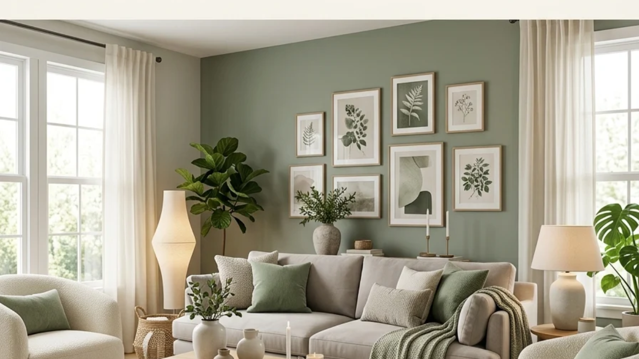
Style at a Glance

ElementTrait 1Trait 2
PhilosophyContinuous sightlines over segmented roomsShared material language ties zones together
MaterialsWaterfall quartz, wide-plank white oak, brass hardwareBoucle and linen upholstery, natural stone backsplash
Color PaletteWarm white, soft greige, sage green cabinetryWarm charcoal, brass accents, terracotta highlights

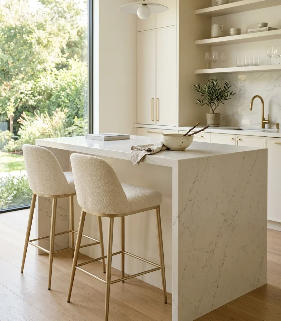
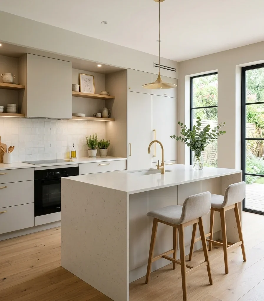
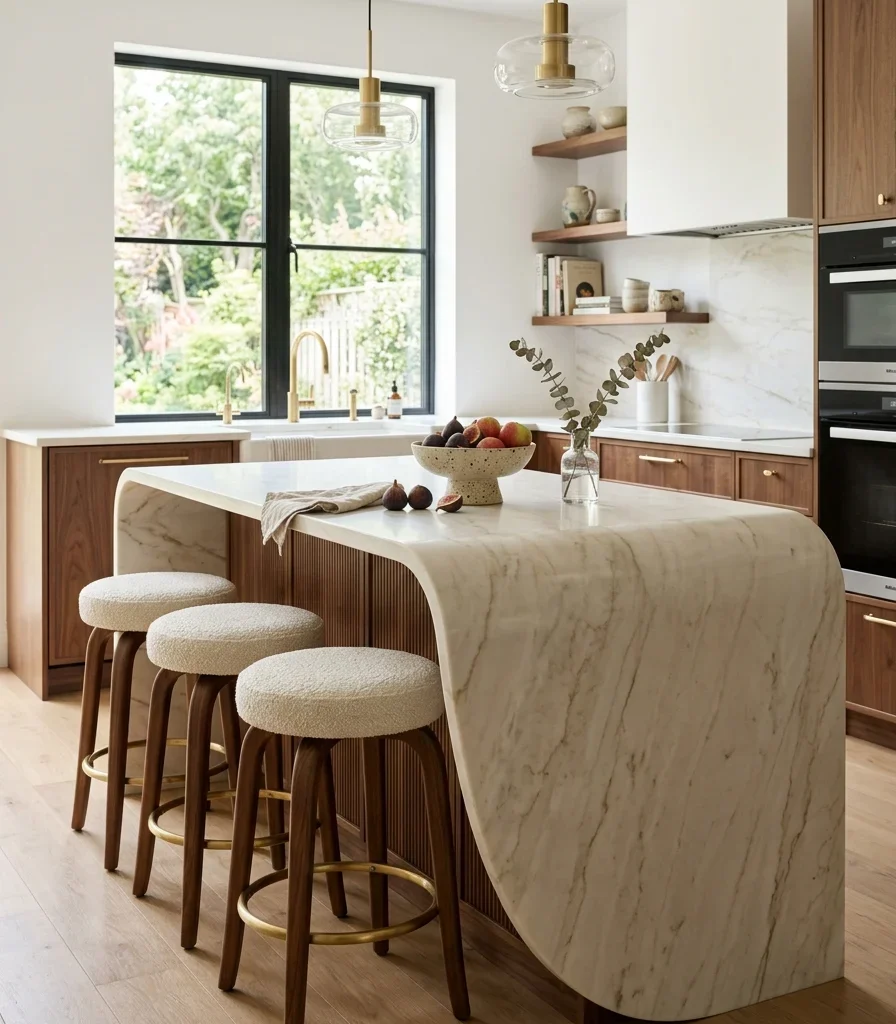
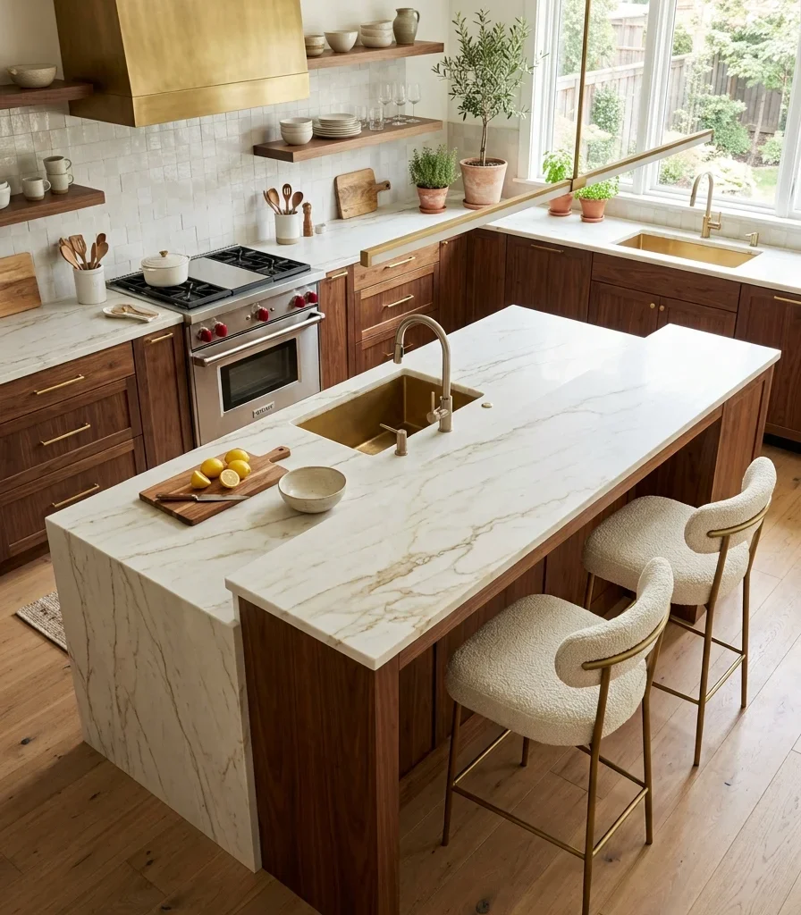
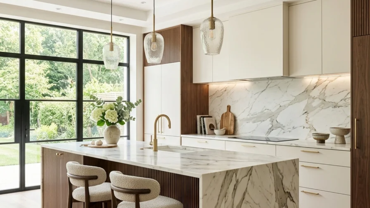
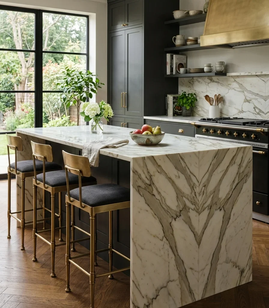
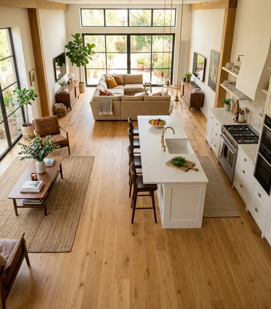
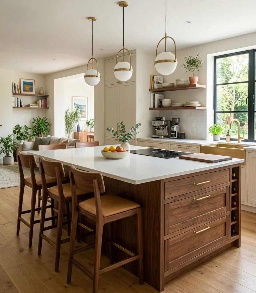
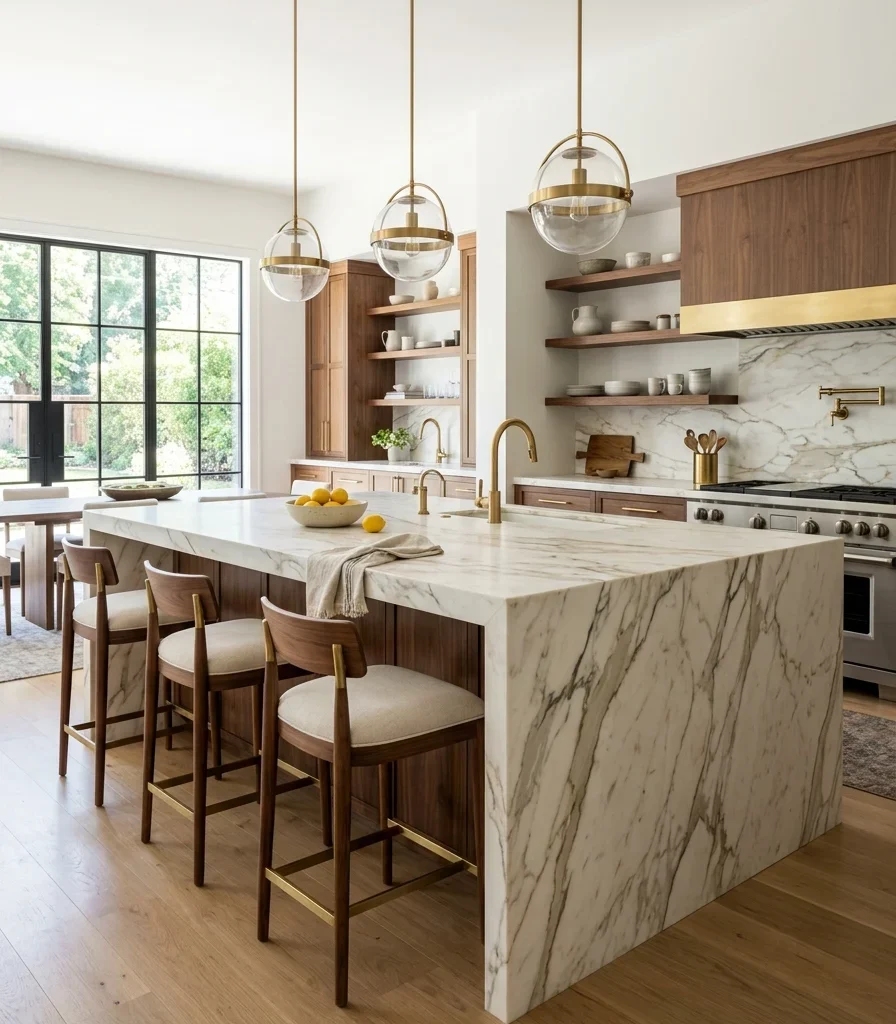
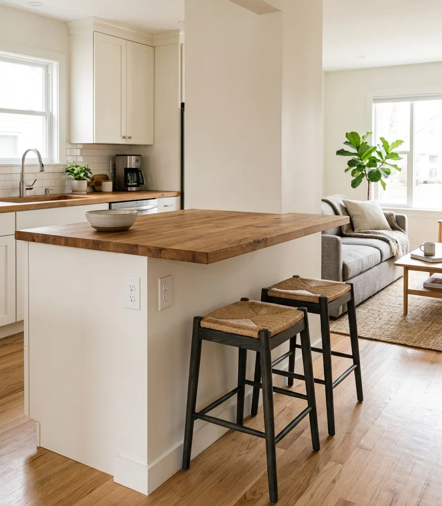
1. The Island as the Room’s Literal and Visual Anchor
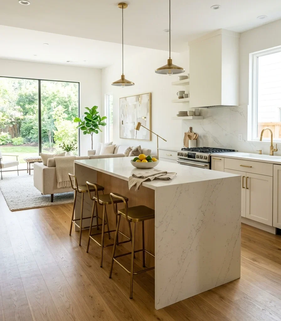
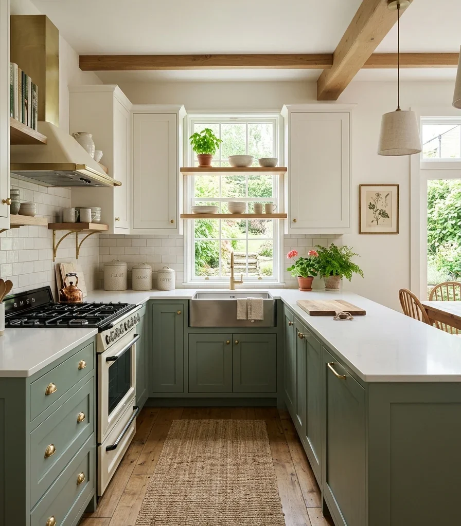
1. The Island as the Room's Literal and Visual Anchor

Vibe: Airy, a floor plan that lets one continuous room breathe instead of two competing ones.

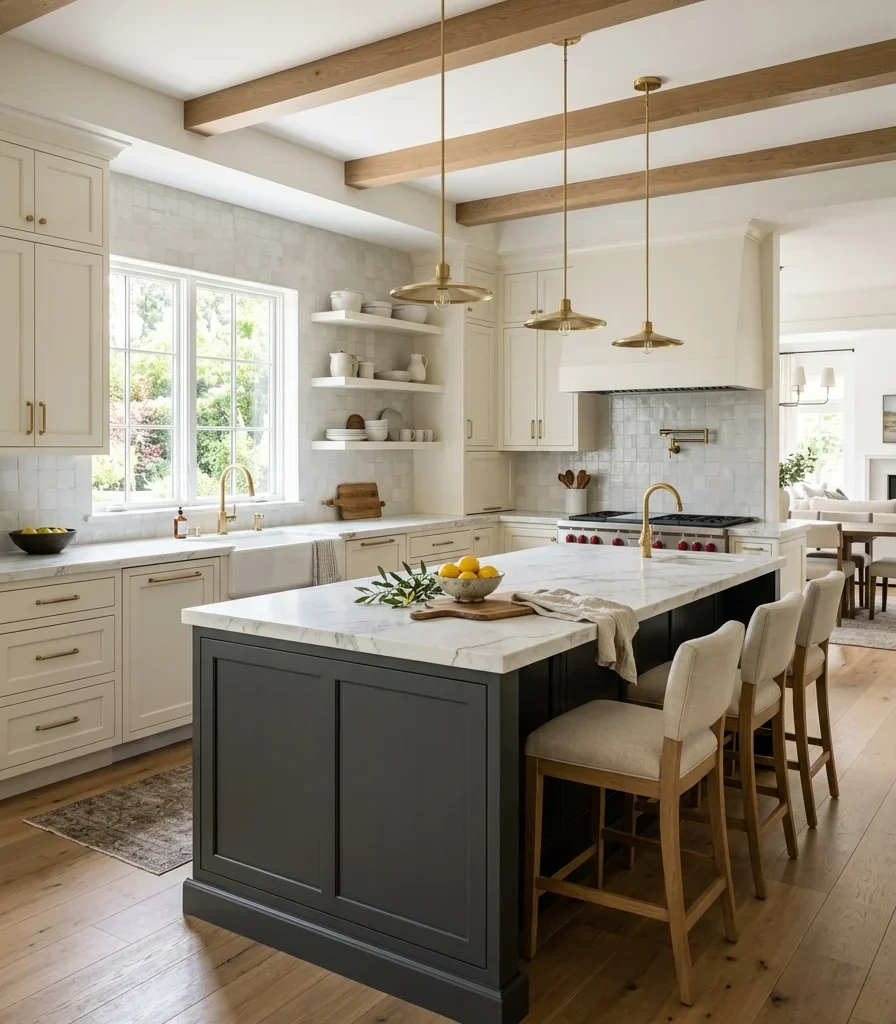
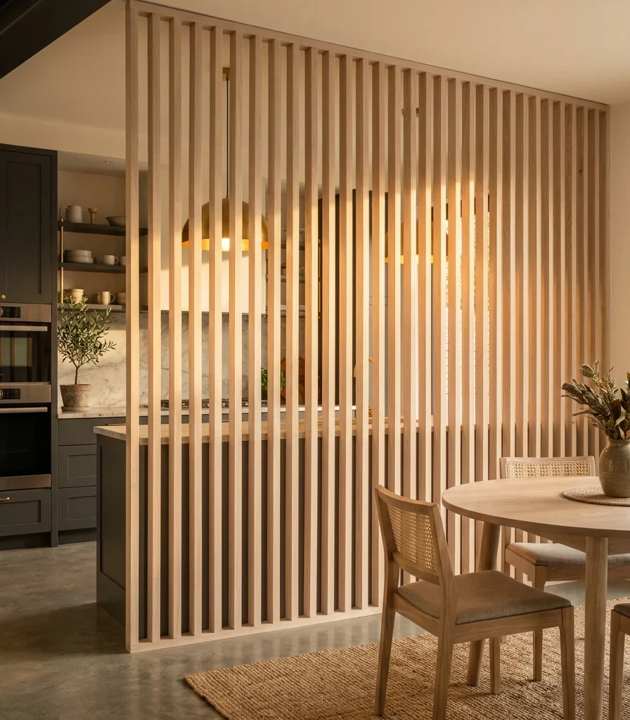
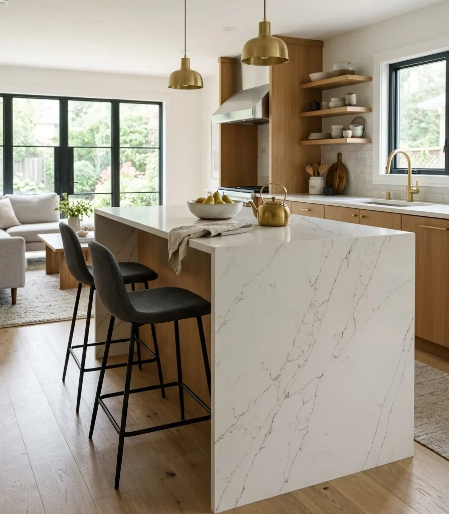
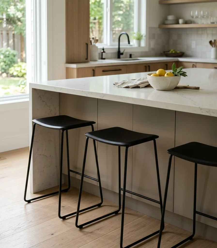
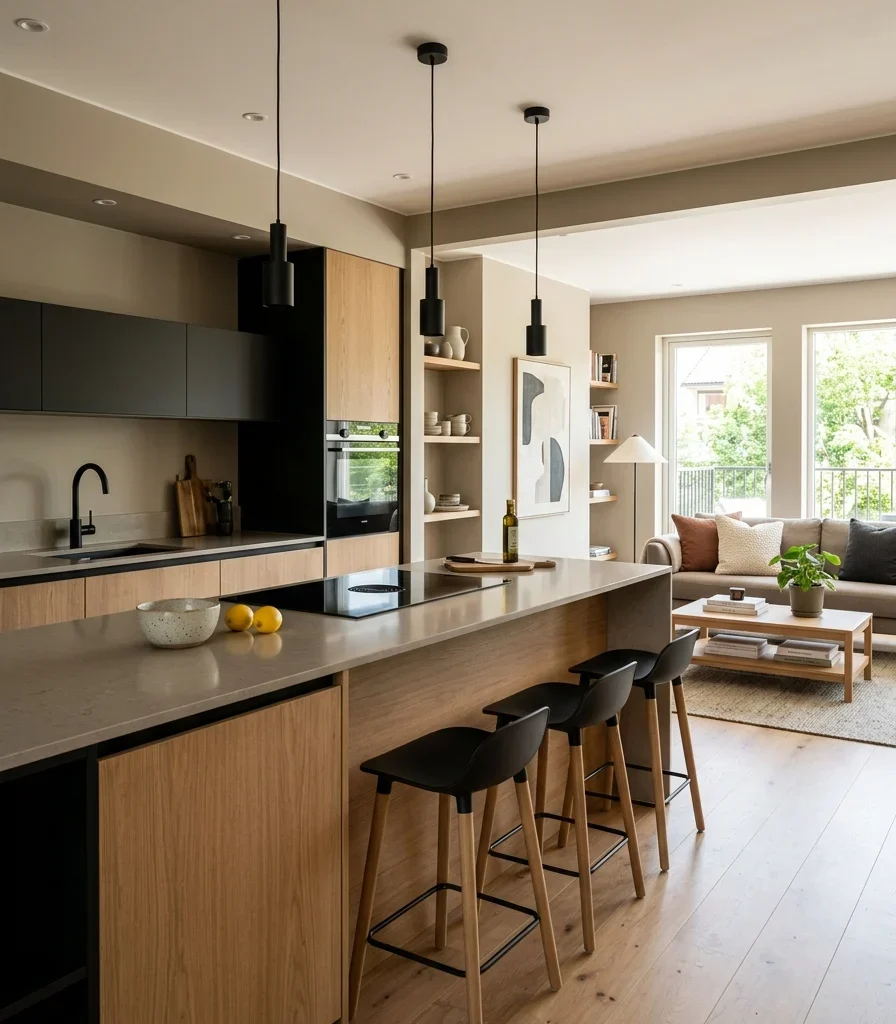
Why it works: Positioning the island as the literal midpoint between the cooking wall and the seating area gives the open floor plan a visual anchor without adding a physical wall one definition through furniture placement rather than architecture. The island’s mass reads as a boundary marker even though sightlines stay completely open above and around it.

How to get it: Center the island roughly eight to ten feet from both the range wall and the sofa’s front edge, leaving a minimum 42-inch walkway on both sides so the space reads as one navigable room rather than two furniture arrangements competing for floor space.

💡 Quick Win: If a full island isn’t possible, a narrow console table or bar cart positioned at the same midpoint creates a lighter-weight version of the same zone marker.

Shop the Look

Product
Waterfall-edge quartz island countertop overlay
Brass counter-height bar stool set of two
Wide-plank warm white oak flooring sample
Woven ceramic fruit bowl
Linen napkin set folded

2. One Continuous Wide-Plank Floor Underfoot
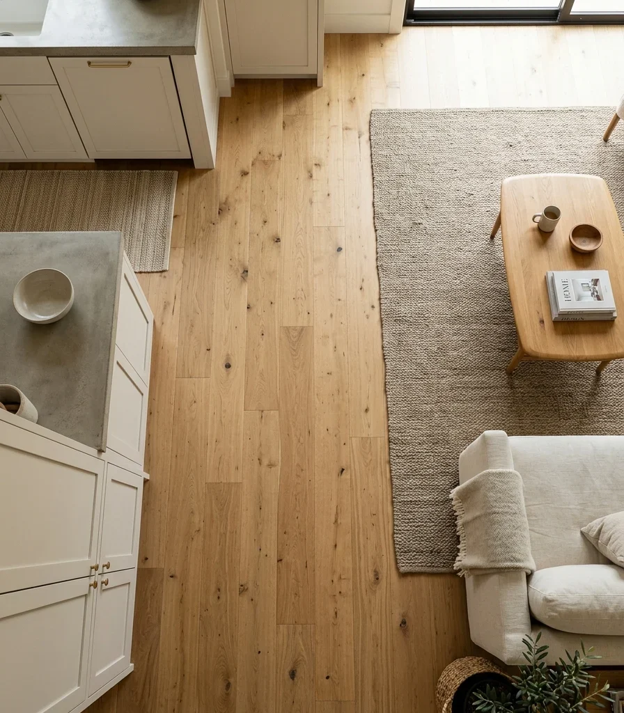
2. One Continuous Wide-Plank Floor Underfoot

Vibe: Grounded floor that makes two rooms behave like one.

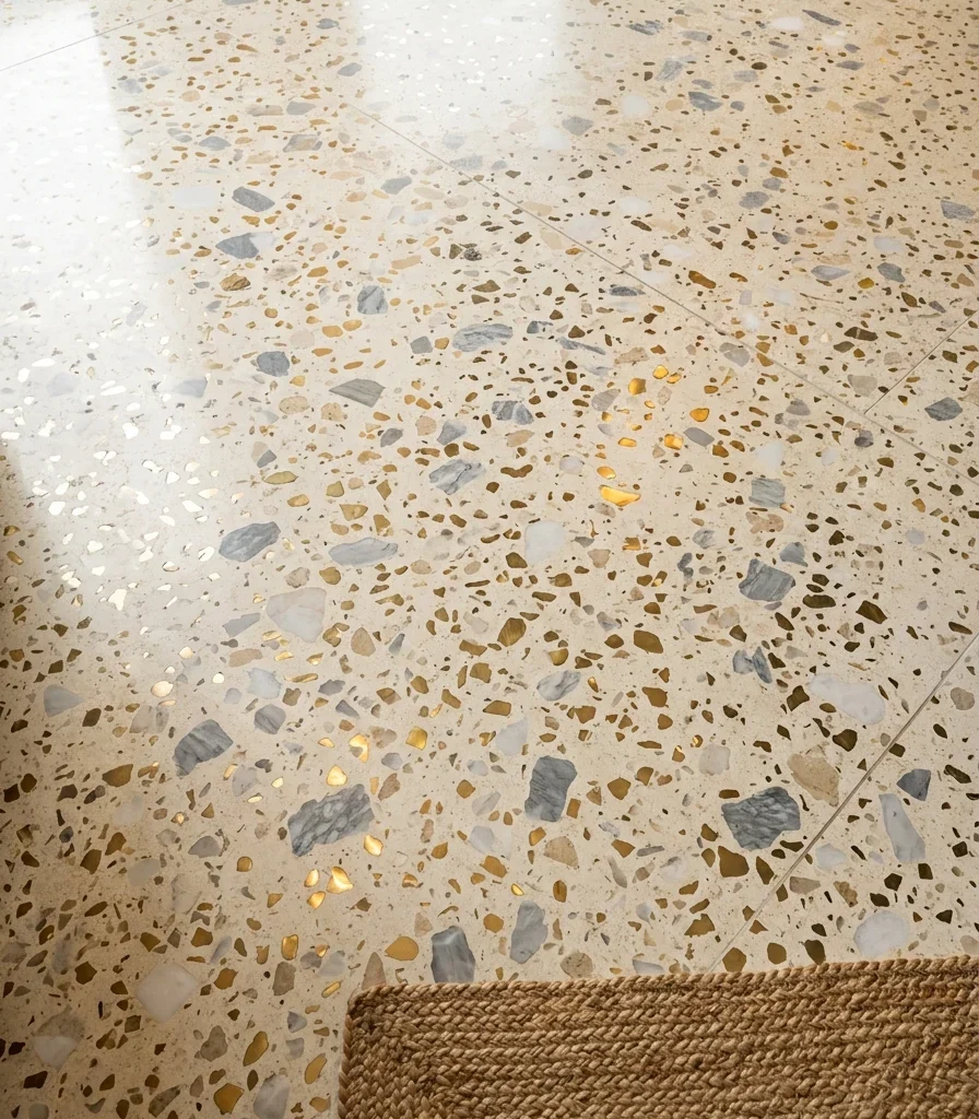
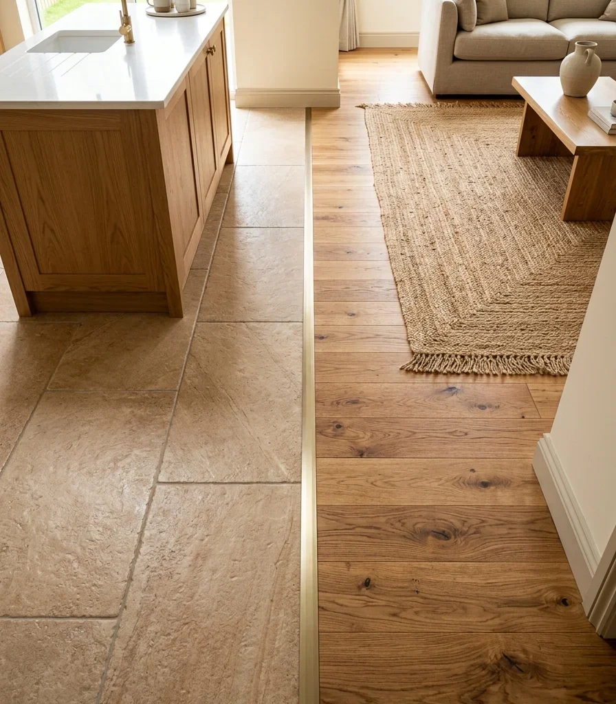
Why it works: A single flooring material run in one continuous plank direction from the kitchen through the living room eliminates the transition strip that visually chops an open floor plan into two separate rooms. Material continuity does more to unify an open concept space than paint color or furniture arrangement combined. Water-resistant engineered oak handles the kitchen’s spill exposure while matching the living room’s warmth exactly.

How to get it: Specify engineered white oak in a wide plank (7-9 inches) laid in the same direction throughout both zones, using a waterproof engineered core rather than solid wood directly around the kitchen work zone so one material choice satisfies both rooms’ different durability needs.

Shop the Look

Product
Engineered white oak wide-plank flooring sample
Waterproof flooring underlayment roll
Jute area rug large neutral
Transition-free threshold strip matching finish
Natural wood floor cleaner safe finish

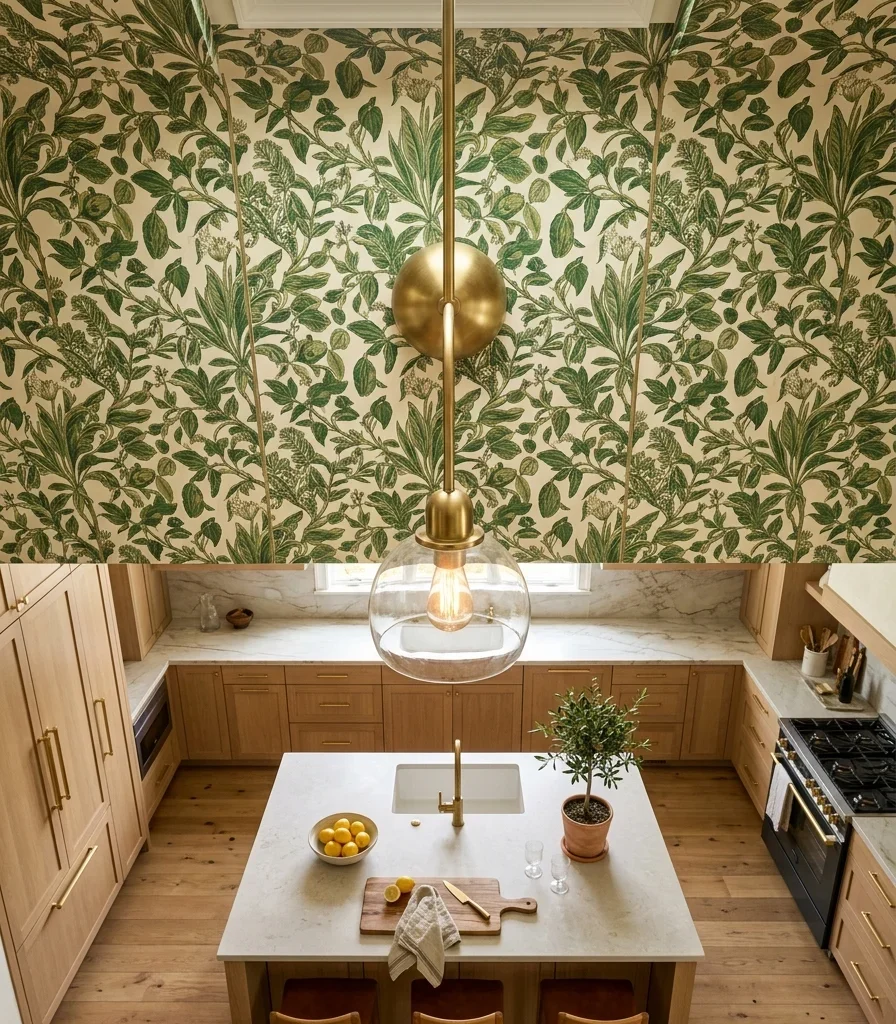
3. A Single Wall Color Carried Through Both Zones
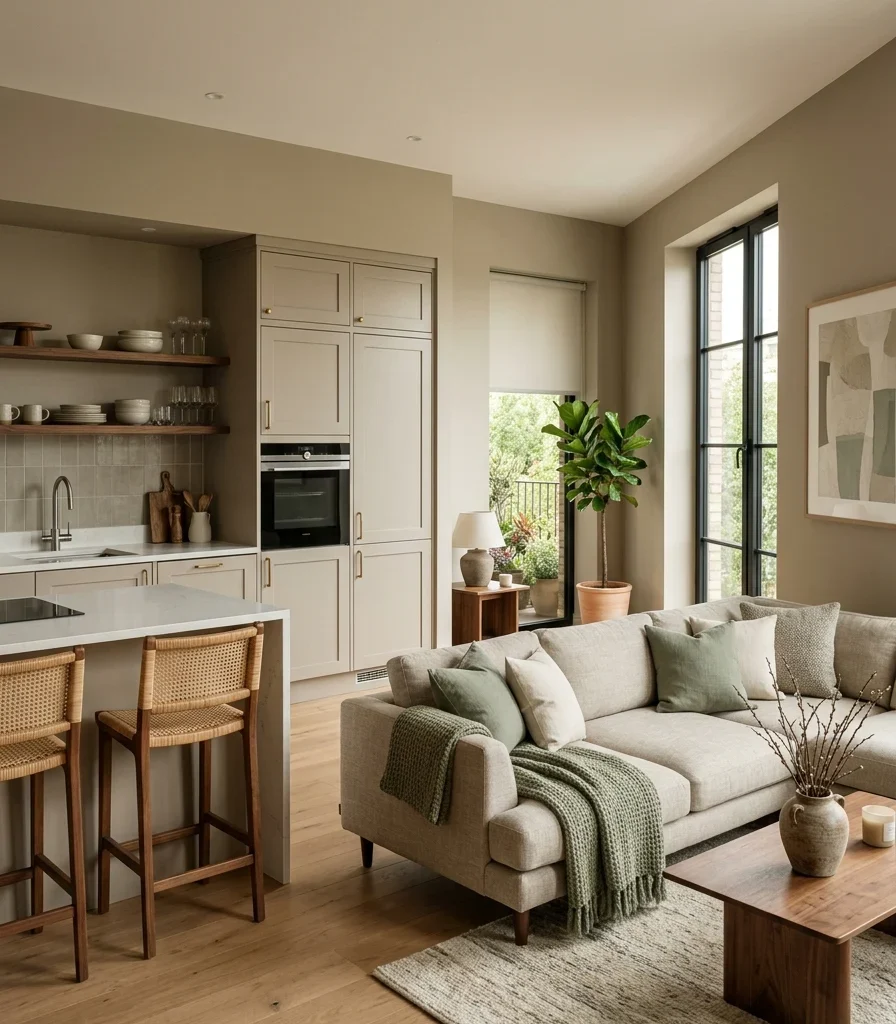
3. A Single Wall Color Carried Through Both Zones

Vibe: Serene, a palette so consistent the eye never registers where one room ends.

Why it works: Painting the kitchen cabinetry and the living room walls in the same or a closely related undertone removes the visual seam where “kitchen” ends and “living room” begins; color continuity is the fastest way to make two functionally different rooms register as one. A shared warm undertone also keeps brass and wood tones from clashing across the open sightline.

How to get it: Choose one warm greige or warm white paint color and use it on every wall visible from the main sightline in both rooms, then let cabinetry, furniture, and accessories introduce the only color variation, keeping the architecture quiet so the eye reads one space.

💡 Quick Win: Test the same paint swatch in both rooms at different times of day before committing; kitchen light and living room light often differ enough to shift how identical paint reads.

Shop the Look

Product
Warm greige interior wall paint sample set
Matte finish paint roller kit
Ceramic table vase warm white
Woven cotton throw blanket neutral
Walnut wood picture frame set

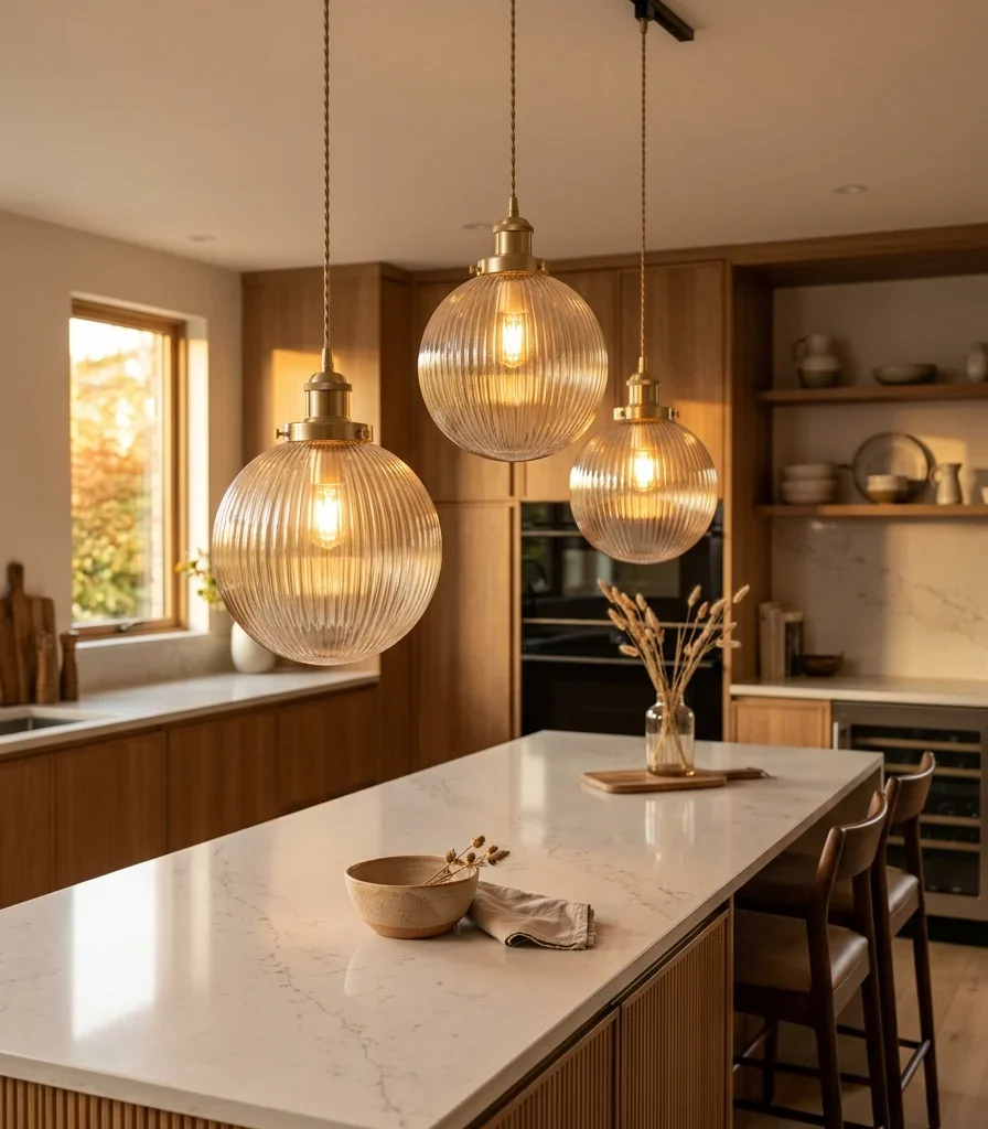
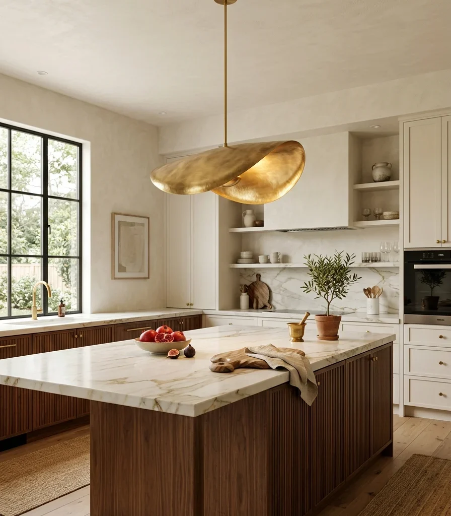
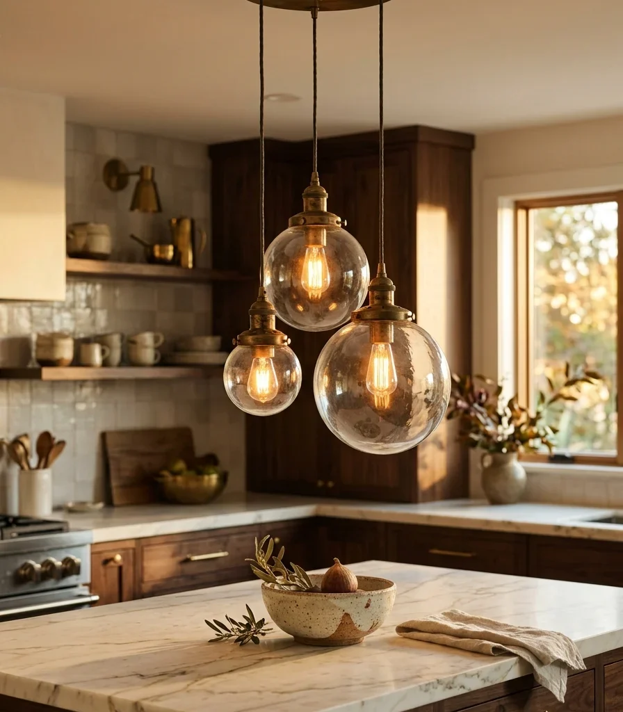
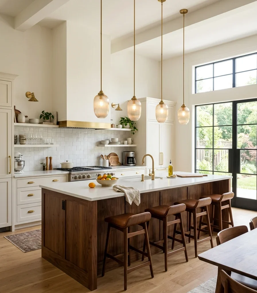
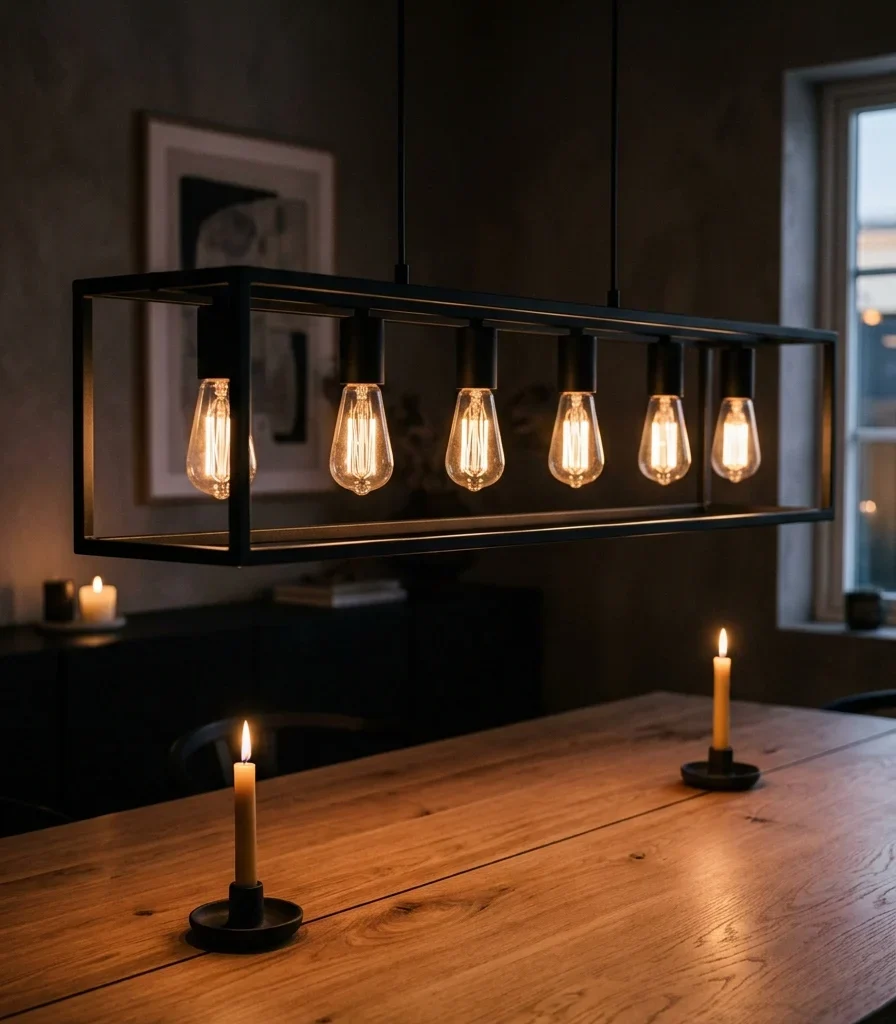
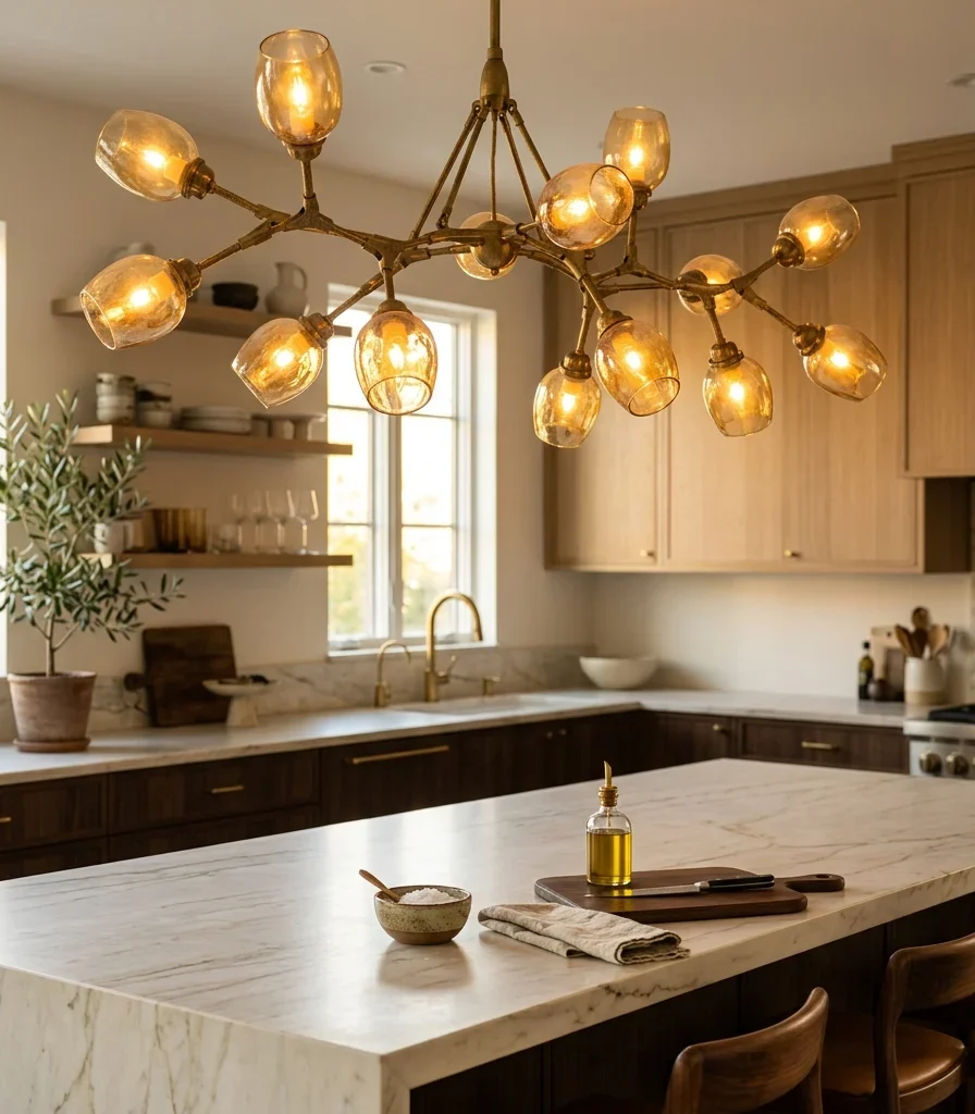
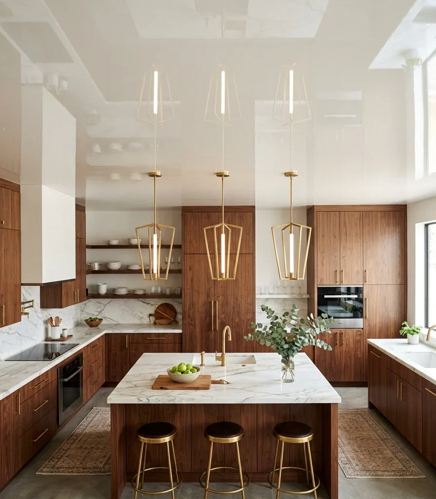
4. A Pendant Cluster That Marks the Kitchen’s Edge
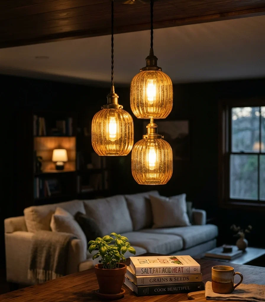
4. A Pendant Cluster That Marks the Kitchen's Edge

Vibe: Warm a pool of light that quietly announces where cooking happens.

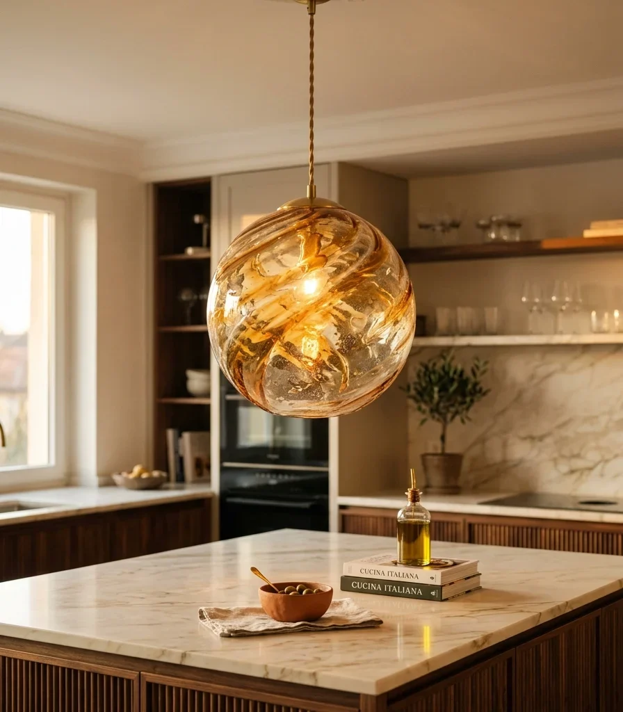
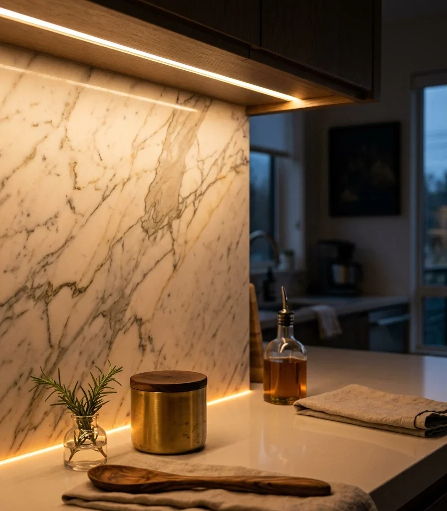
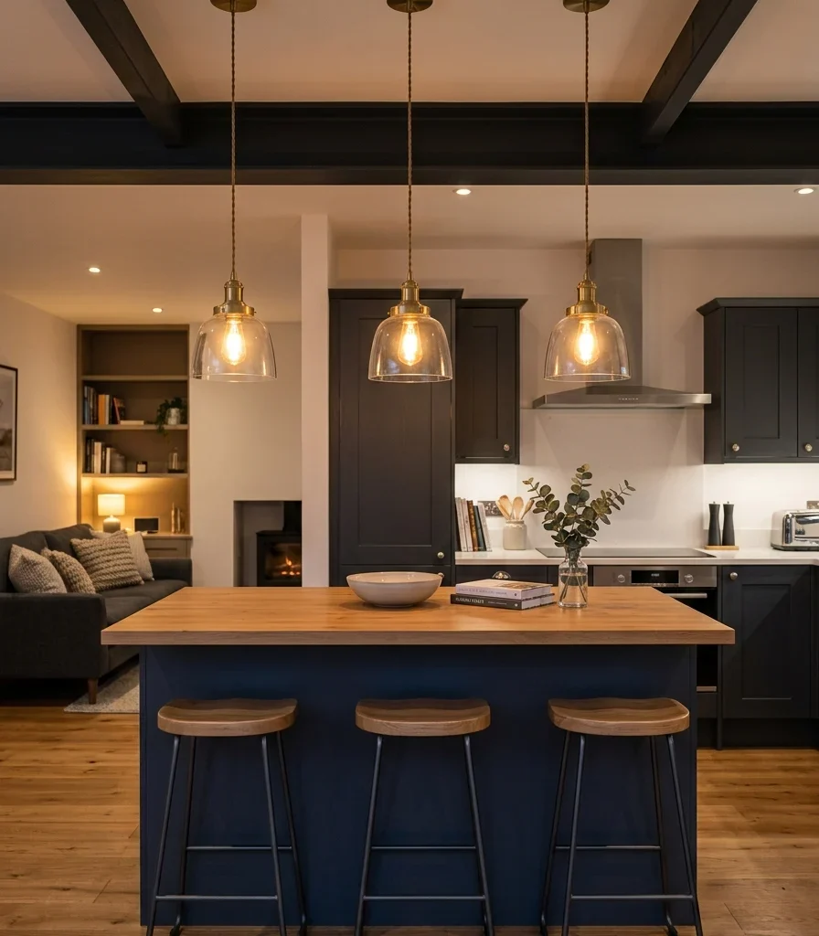
Why it works: A cluster of pendant lights hung lower than the surrounding ceiling fixtures creates a light behavior boundary; the pool of warm light beneath the pendants signals “kitchen zone” even without a wall, while softer ambient lighting in the living room signals the shift to a different function. This layered approach lets one open room contain two distinct moods.

How to get it: Hang three pendants in a row above the island, spaced 24-30 inches apart and 30-36 inches above the counter surface, in a warm amber or smoked glass that reads warmer than the flush-mount or recessed lighting used in the living room ceiling.

Shop the Look

Product
Amber glass pendant light set of three
Brass ceiling canopy kit
Small potted herb ceramic planter
Stacked cookbook set for styling
Dimmer switch kit for pendant lighting

5. A Sofa Back Doing the Work of a Wall
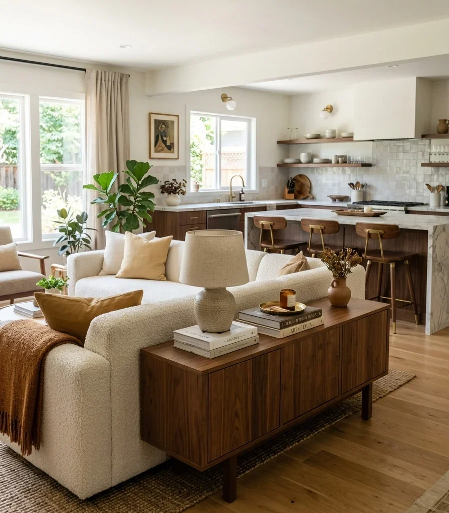
5. A Sofa Back Doing the Work of a Wall

Vibe: Layered furniture that carries architectural weight without becoming architecture.

Why it works: Positioning a sofa with its back toward the kitchen, rather than against a wall, uses the piece itself as a soft spatial divider; furniture-as-boundary achieves the room-separating function of a wall without blocking sightlines or light. A console table placed behind the sofa, facing the kitchen, gives that boundary a second functional layer as a landing spot for keys or drinks.

How to get it: Choose a sofa with a back height no taller than 32 inches so it defines the zone without blocking sightlines to the television or the island, and place a slim console table (12-14 inches deep) directly behind it facing the kitchen.

💡 Quick Win: A bench-style ottoman behind the sofa works as a lighter-weight substitute for a full console table in especially tight layouts.

Shop the Look

Product
Cream boucle low-back sofa
Walnut wood console table slim
Ceramic table lamp warm white shade
Woven storage basket for console
Low bench ottoman alternative

6. A Stone Surface That Travels From Backsplash to Fireplace
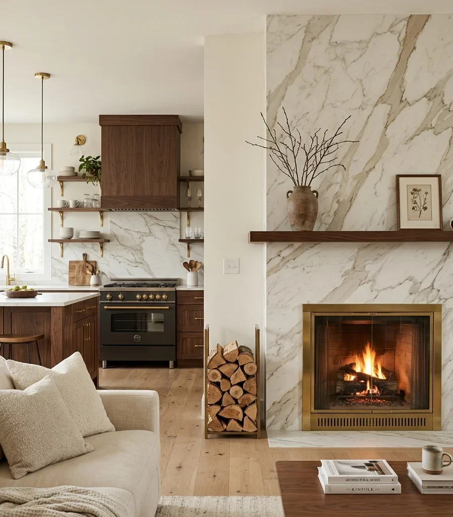
6. A Stone Surface That Travels From Backsplash to Fireplace

Vibe: Grounded, one material telling two ends of the room they belong together.

Why it works: Repeating one stone or stone-look material across two functionally different surfaces a kitchen backsplash and a living room fireplace surround creates a material echo that ties the two ends of an open room together even when they’re twenty feet apart. The eye recognizes the same veining pattern and registers it as intentional, connecting the spaces without needing a direct sightline association.

How to get it: Select one large-format marble-look porcelain slab tile and specify it for both the kitchen backsplash and the fireplace surround at the time of ordering, since dye lots vary between orders and matching them later is difficult once installation is complete.

Shop the Look

Product
Large-format marble-look porcelain slab tile
Brass fireplace surround trim kit
Firewood log rack iron
Ceramic mantel vase warm white
Stone sealer for porcelain maintenance

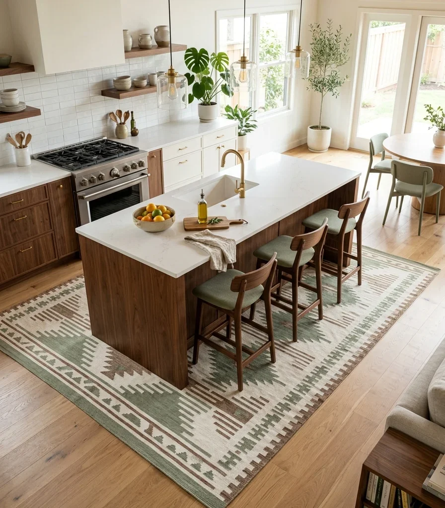
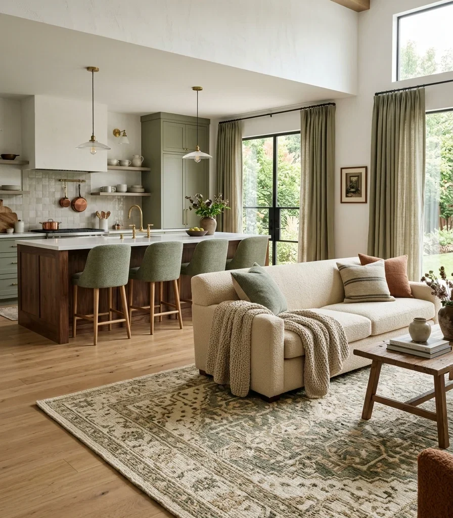
7. Two-Tone Cabinetry Echoed in a Living Room Accent Chair
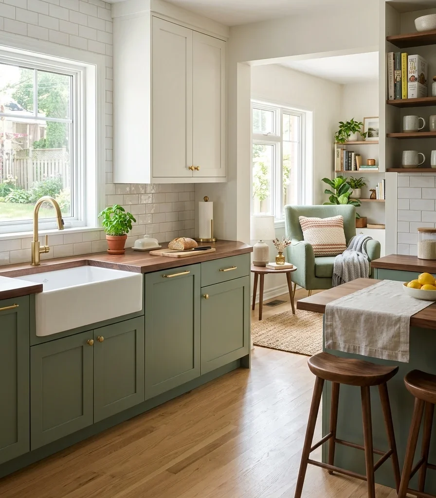
7. Two-Tone Cabinetry Echoed in a Living Room Accent Chair

Vibe: Fresh, a single repeated color doing more work than a whole palette could.

Why it works: Repeating the kitchen’s lower cabinet color as a single upholstered piece in the living room, rather than scattering that color evenly across both rooms, creates color echo without color overload a restrained way to connect two zones through one deliberate repetition instead of matching everything. The sage tone reads as intentional connective tissue rather than a coincidental choice.

How to get it: Choose one accent piece in the living room an armchair, a pair of pillows, or a slim bench in the same paint-matched fabric tone as the kitchen’s lower cabinetry, and keep every other living room color neutral so that the single echo stays legible.

💡 Quick Win: Can’t reupholster? A single sage green throw pillow on an otherwise neutral sofa creates the same color-echo effect for under $40.

Shop the Look

Product
Sage green accent armchair upholstered
Sage green throw pillow cover pair
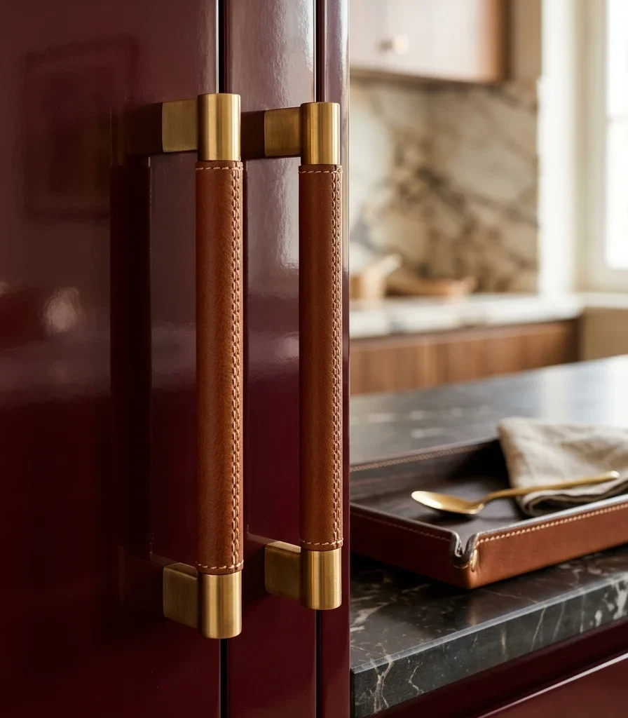
Brass cabinet pull hardware set
Small potted plant ceramic pot
Woven cream throw blanket

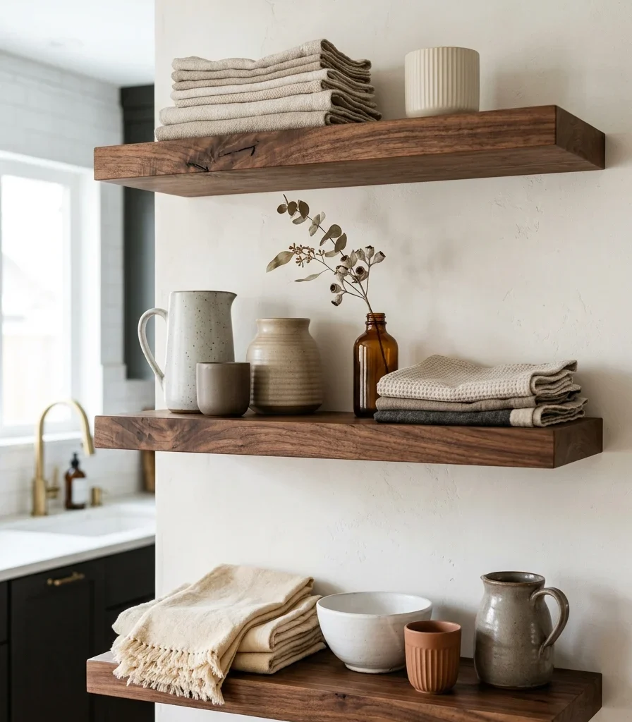
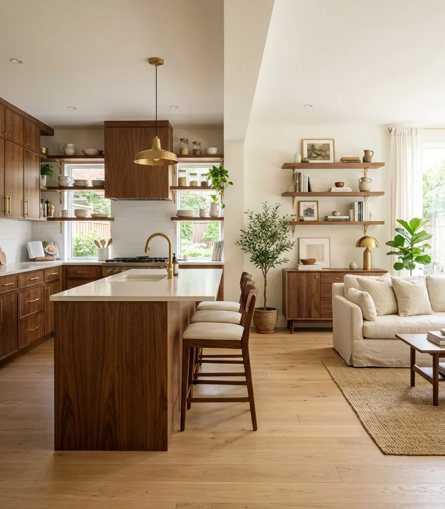
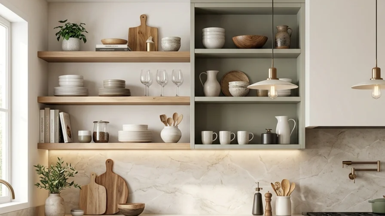
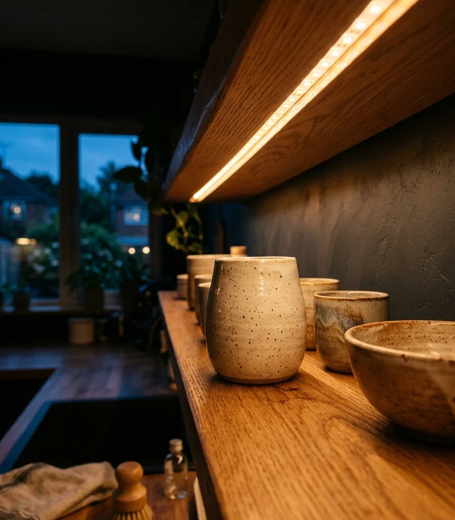
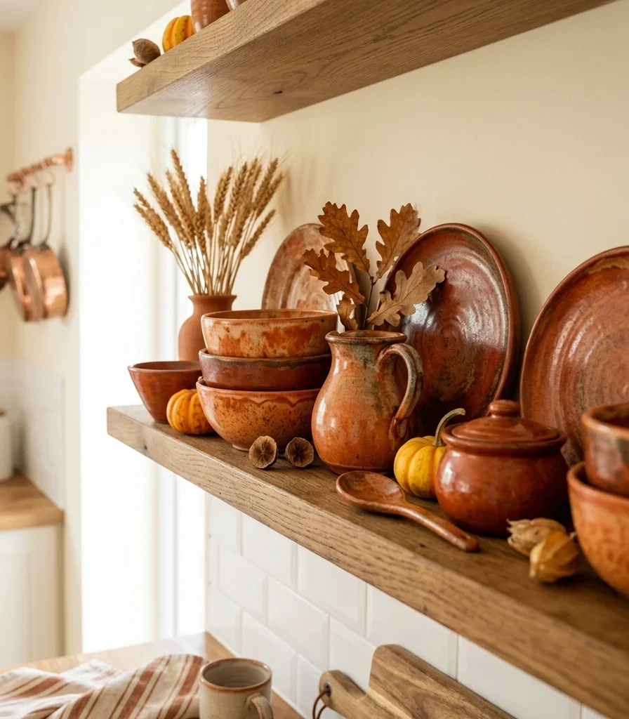
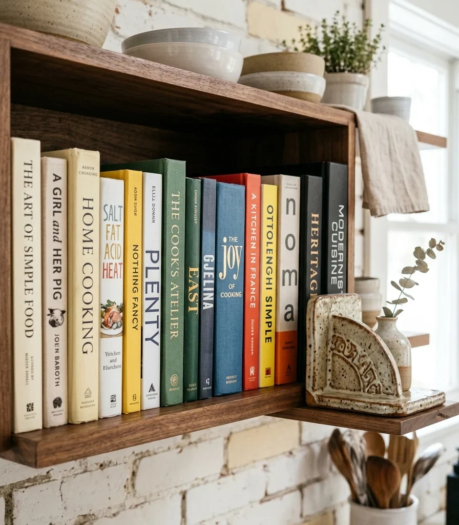
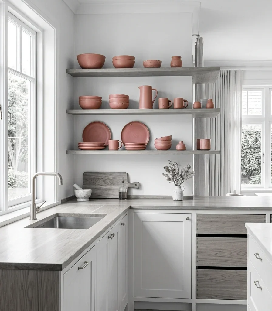
8. Open Shelving That Displays Both Kitchenware and Living Room Objects
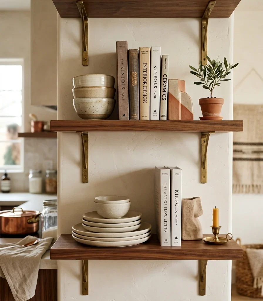
8. Open Shelving That Displays Both Kitchenware and Living Room Objects

Vibe: Layered shelf that belongs to both rooms at once.

Why it works: Open shelving placed at the literal seam between kitchen and living room, styled with a deliberate mix of kitchen ceramics and living room objects, uses object juxtaposition to visually announce that this is shared territory rather than exclusively kitchen or living room space; a subtle way to make the room’s dual function feel intentional rather than accidental.

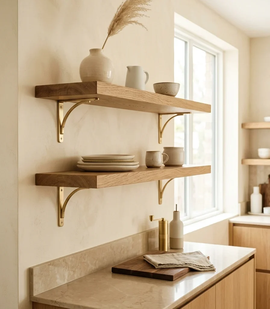
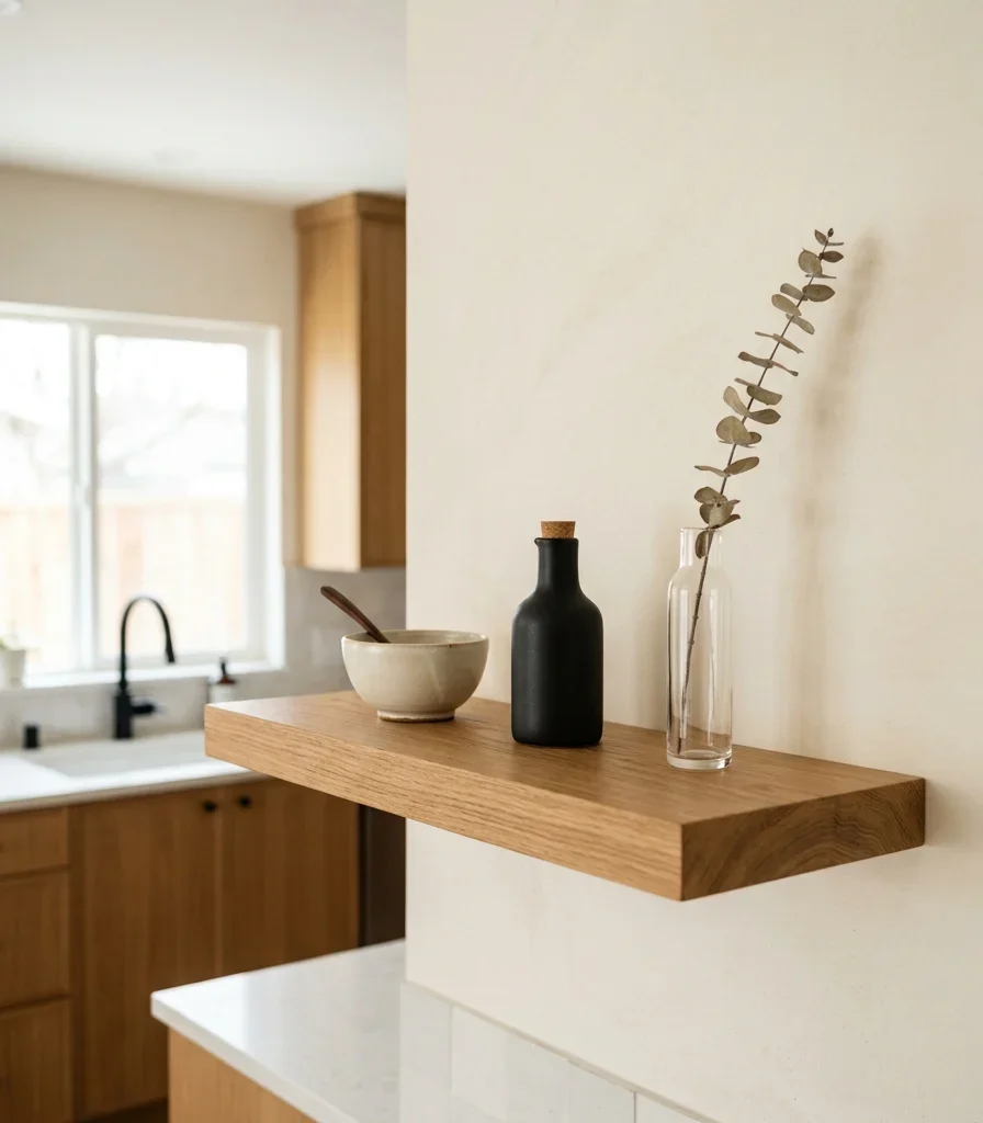
How to get it: Mount two or three walnut shelves on brass brackets at the transition point between zones, and style each shelf with roughly 60% kitchen-adjacent objects (bowls, a cutting board, glassware) and 40% living-room objects (books, a small sculpture, a framed photo) so the mix reads balanced rather than random.

Shop the Look

Product
Walnut open wall shelf set of three
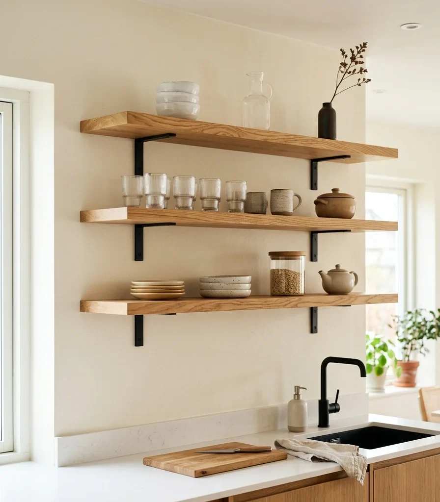
Brass shelf bracket hardware
Stacked ceramic bowl set neutral
Small ceramic sculpture object
Coffee table book stack neutral covers

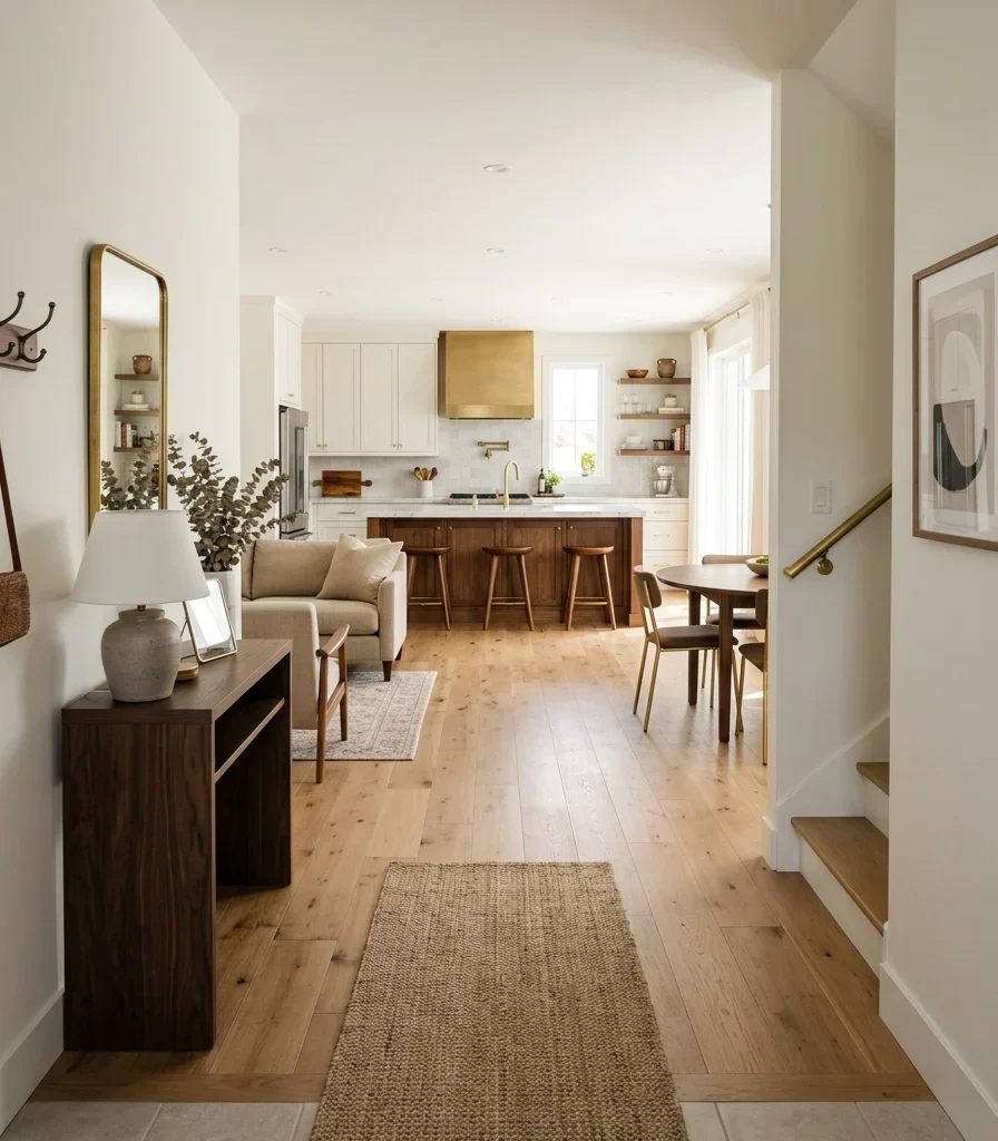
9. A Kitchen Walkway Wide Enough to Double as a Living Room Path
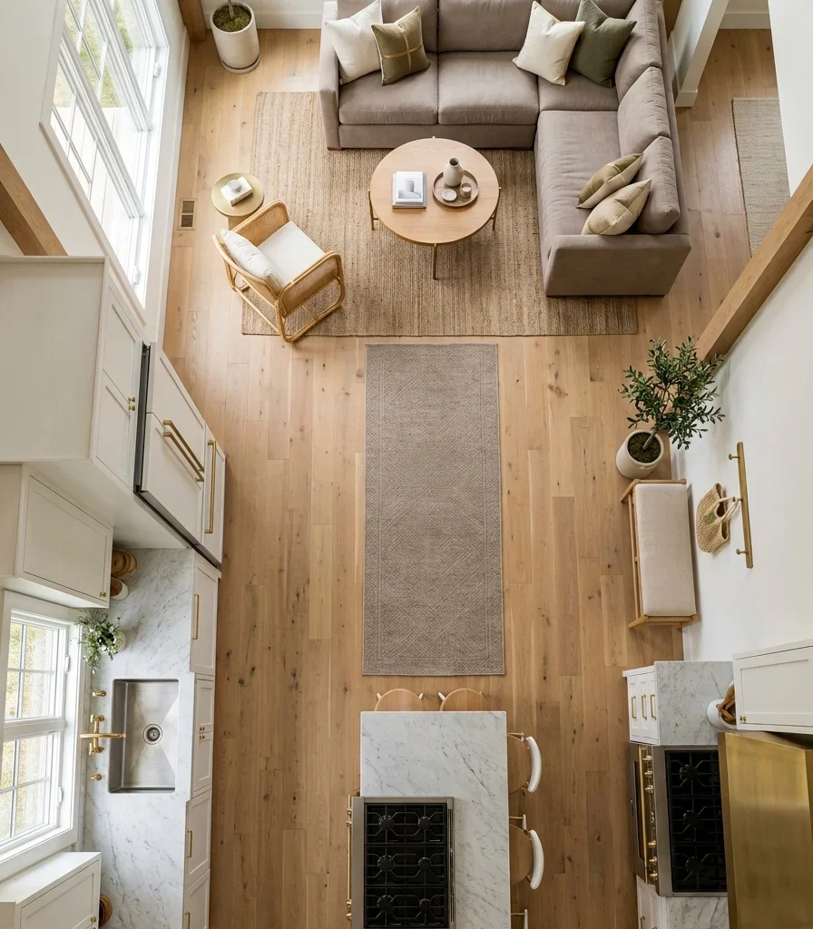
9. A Kitchen Walkway Wide Enough to Double as a Living Room Path

Vibe: Airy room that moves as easily as it looks.

Why it works: Traffic flow is the layout consideration most open concept plans get wrong first: when the path between the kitchen’s work triangle and the living room’s seating area narrows below 36 inches, the room stops feeling open regardless of how few walls exist. Keeping a clear, consistent walkway width is what makes an open floor plan actually function as one connected space rather than an obstacle course.

How to get it: Map the direct path between the refrigerator, the sink, and the sofa before placing any furniture, and keep that path a minimum of 42 inches wide at every point, pulling coffee tables and console tables at least that distance back from the natural walking line.

💡 Quick Win: Use painter’s tape on the floor to mark out the 42-inch path before buying furniture; it’s the fastest way to catch a layout mistake before it becomes an expensive one.

Shop the Look

Product
Runner rug narrow hallway style
Small entry bench slim profile
Furniture floor protectors for rearranging
Low-profile coffee table space-saving
Floor tape measure kit for planning

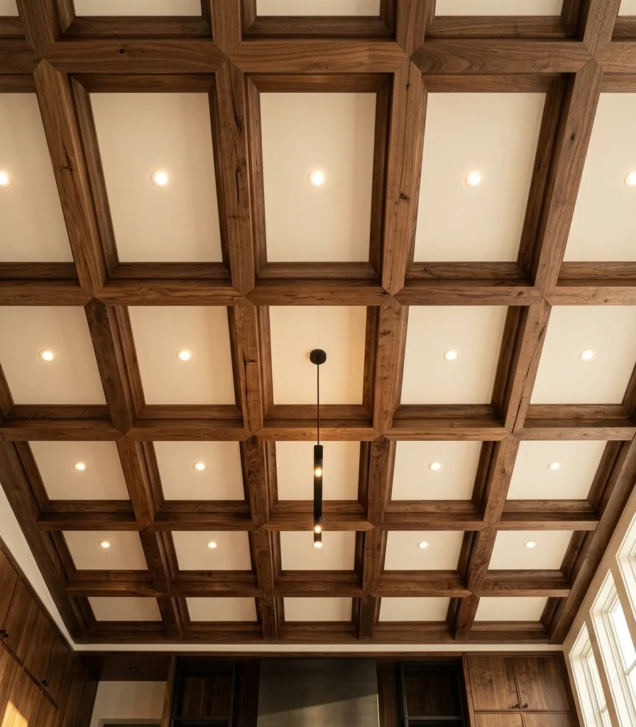
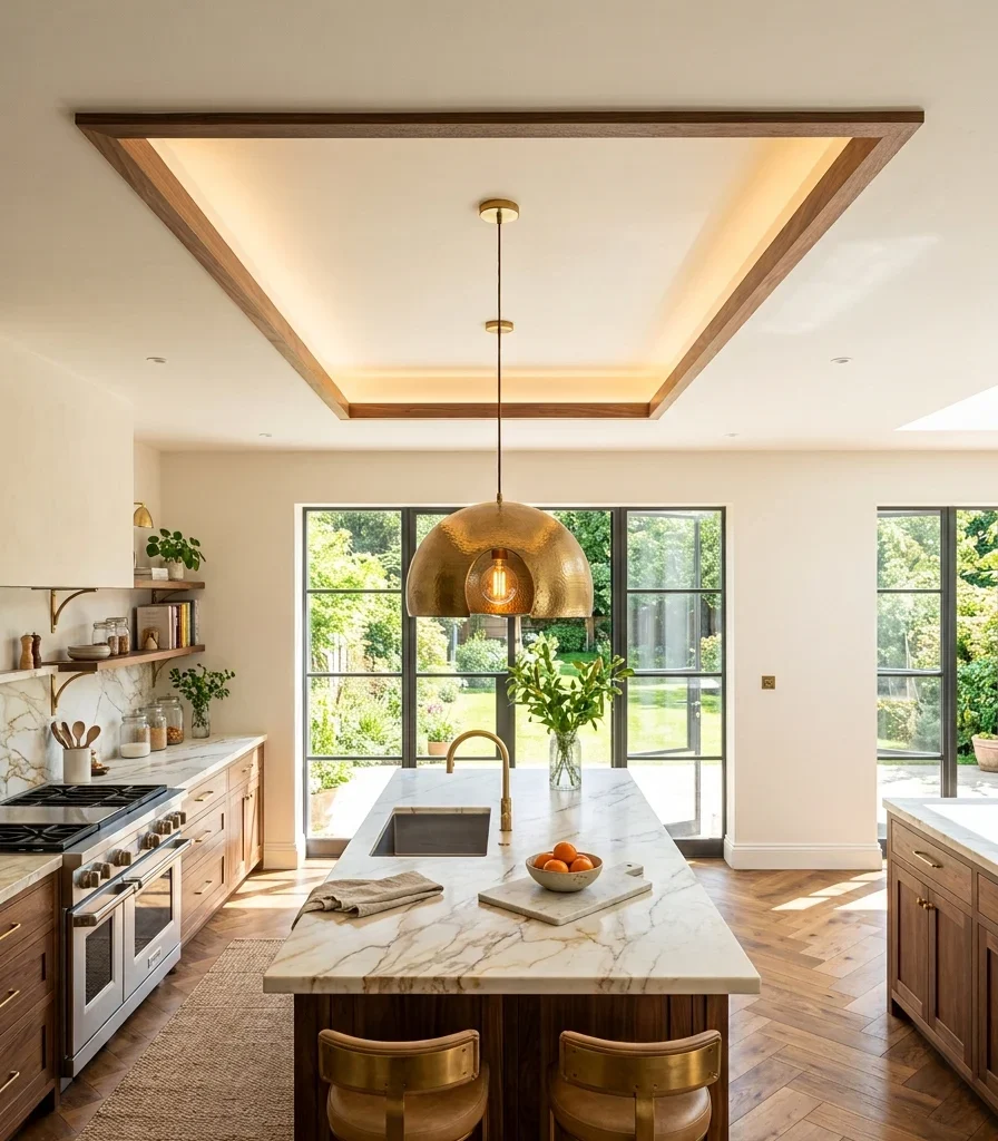
10. Exposed Wood Beams That Run Overhead Through Both Rooms
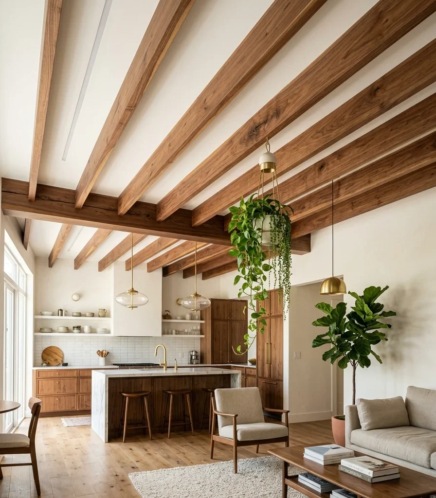
10. Exposed Wood Beams That Run Overhead Through Both Rooms

Vibe: Grounded and an overhead line that stitches the room together from above.

Why it works: Exposed structural or decorative beams running continuously from the kitchen ceiling into the living room ceiling create an overhead sightline that visually stitches the two zones together from above, working the same unifying trick as continuous flooring at eye level’s opposite extreme. The material warmth of walnut against a white ceiling also breaks up an otherwise flat expanse in a large open room.

How to get it: Install hollow decorative walnut beam sleeves spaced evenly across the ceiling’s full span, running perpendicular to the kitchen island’s direction for the strongest visual line, and keep the ceiling paint between them a crisp warm white to maximize the beam’s contrast.

Shop the Look

Product
Decorative walnut beam sleeve set
Ceiling mounting hardware kit for beams
Warm white ceiling paint sample
Integrated pendant light track for beams
Hanging trailing plant in ceramic pot

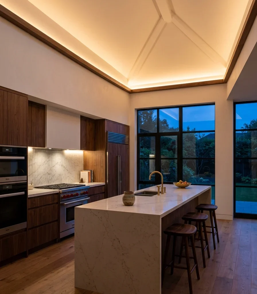
11. Three Layers of Light That Shift the Room’s Mood by Time of Day
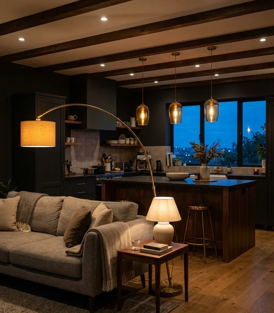
11. Three Layers of Light That Shift the Room's Mood by Time of Day

Via moodydy, a room that knows how to feel like two, depending on the hour.

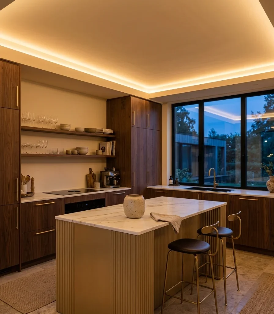
Why it works: An open concept room without distinct lighting layers reads flat at night, since one bank of overhead lights illuminates the whole space evenly and erases the sense of separate zones that walls used to provide. Layering task lighting over the island, ambient recessed lighting throughout, and a floor or table lamp in the living room recreates that zone distinction through light intensity and color temperature rather than architecture.

How to get it: Put the kitchen’s recessed lighting and pendant lighting on separate dimmer circuits from the living room’s fixtures, and set the living room’s floor lamp to a warmer color temperature (2700K) than the kitchen’s task lighting (3000K) so the two zones feel distinct even at full brightness.

Shop the Look

Product
Dimmer switch kit dual circuit
Brass floor lamp living room
Warm 2700K LED bulb set
Ceramic table lamp neutral shade
Recessed lighting trim kit brass finish

12. An Area Rug That Draws the Living Room’s Boundary on the Floor
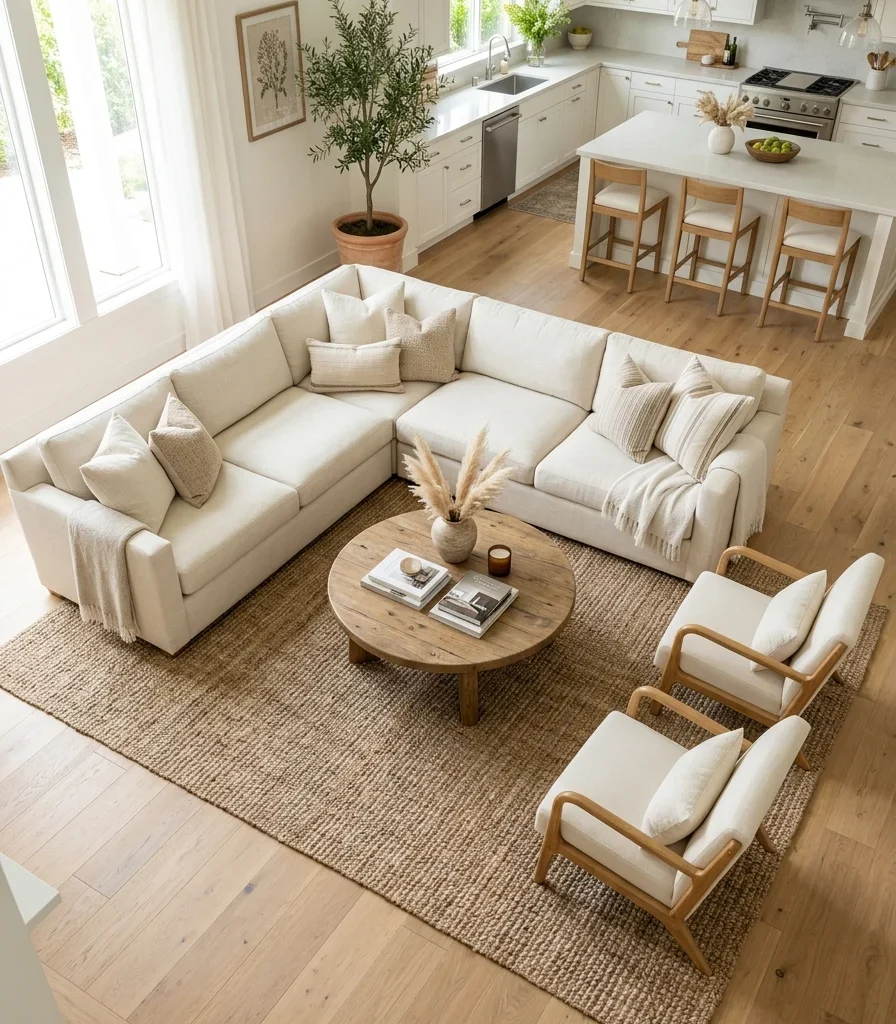
12. An Area Rug That Draws the Living Room's Boundary on the Floor

Vibe: Airy, a boundary drawn on the floor instead of built in the air.

Why it works: A large area rug functions as a floor-level boundary marker in an open plan, using the material change underfoot and flooring transitioning to a woven rug to define where the living room zone begins without a wall or a step change in elevation. The rug must be large enough that all the seating furniture’s front legs rest on it, or the boundary reads as too small for the furniture it’s meant to anchor.

How to get it: Size the rug so at minimum the front two legs of every seating piece sit on it, typically requiring an 8×10 or 9×12 rug for a standard living room grouping, and choose a natural fiber like jute or wool that reads as intentional against the kitchen’s hard flooring.

Shop the Look

Product
Taupe jute area rug 9×12
Cream boucle armchair pair
Low walnut coffee table centered
Neutral throw pillow cover set
Rug pad non-slip for hard floors

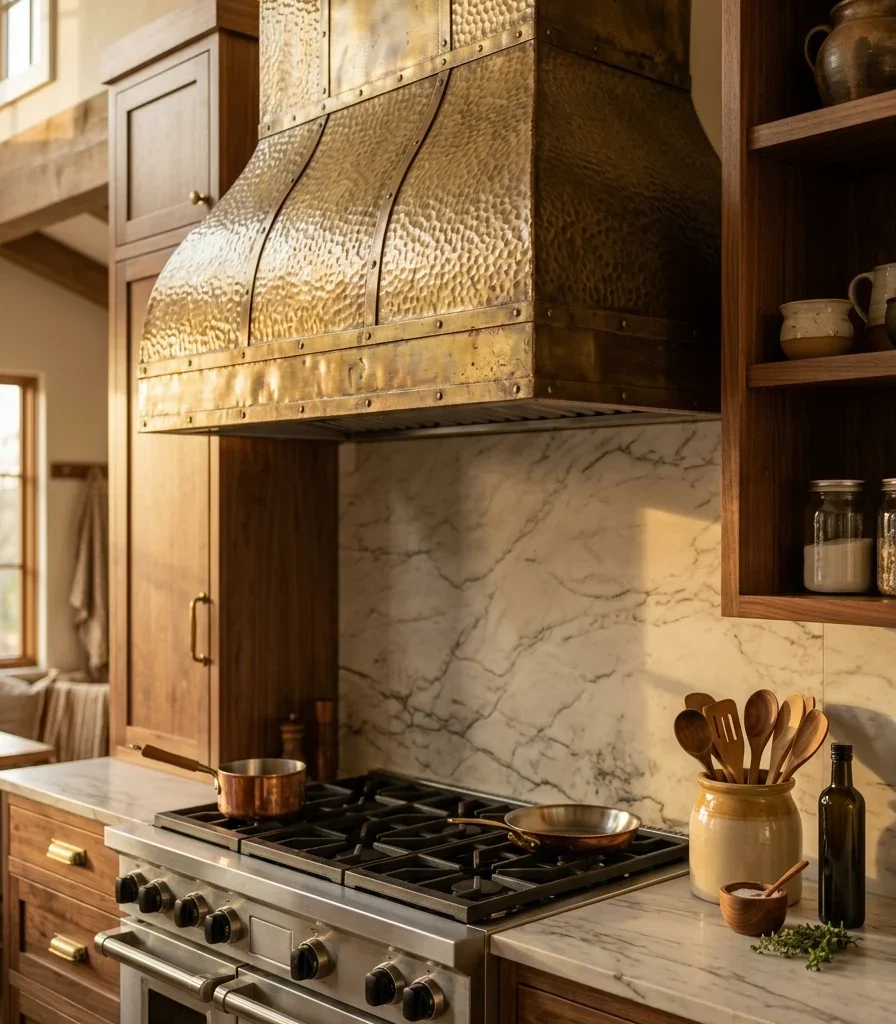
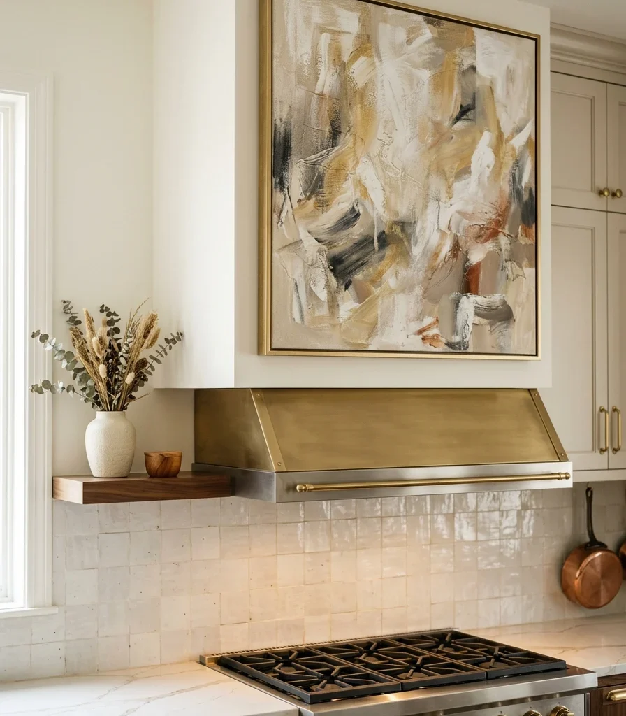
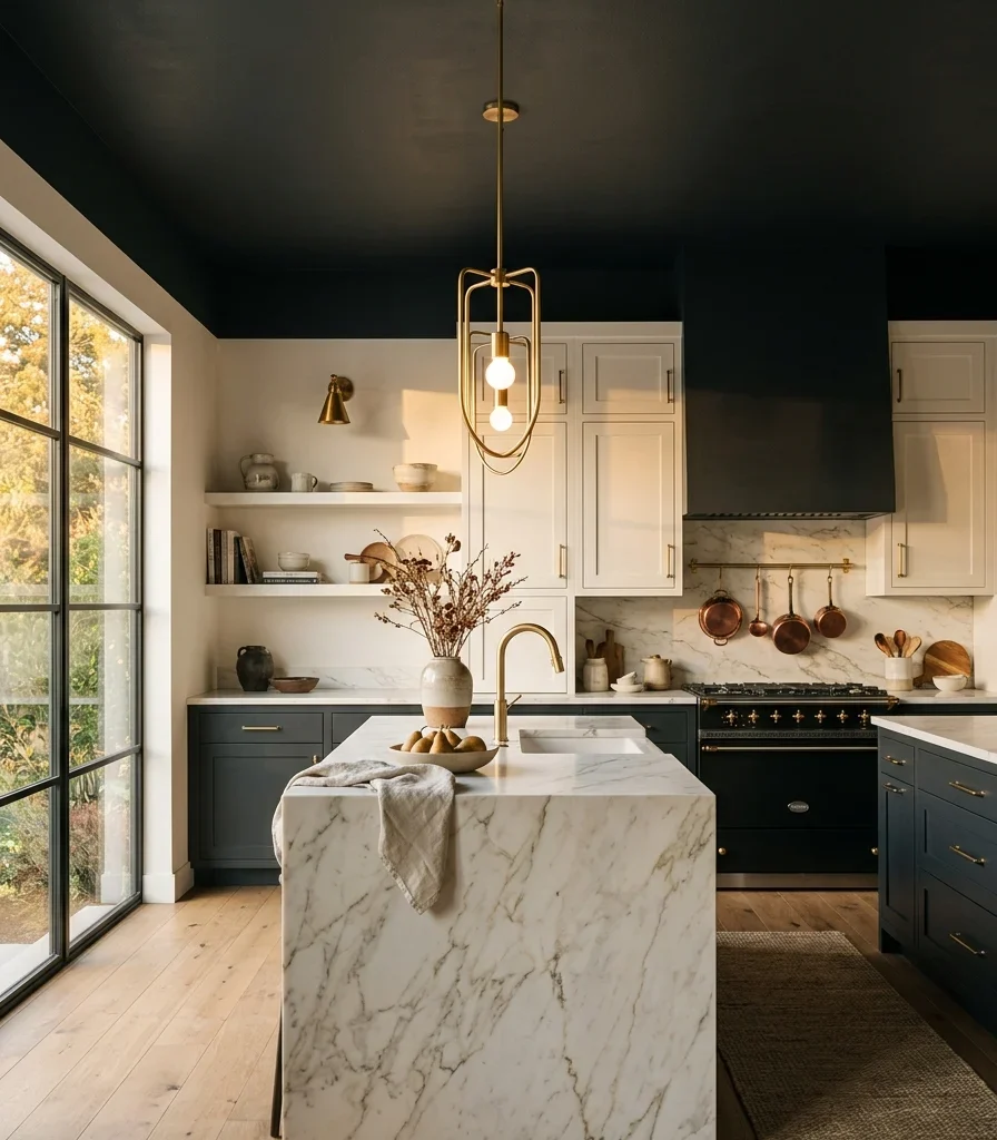
13. A Statement Range Hood That Becomes the Room’s Color Anchor
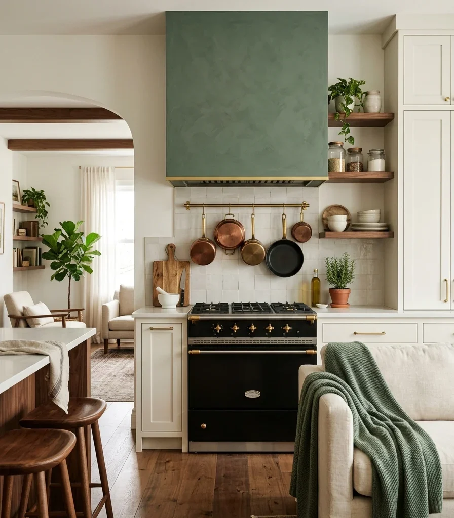
13. A Statement Range Hood That Becomes the Room's Color Anchor

Vibe: Grounded one confident color statement instead of a dozen timid ones.

Why it works: A single saturated color concentrated on one architectural element he range hood rather than spread across the whole kitchen gives an open concept room one confident color statement, a principle of controlled color concentration. Because the hood is visible from nearly every point in the living room in an open layout, that one color choice does the work of anchoring the entire room’s palette.

How to get it: Finish the range hood in a plaster or painted deep sage green while keeping surrounding cabinetry in warm white, then repeat that exact sage tone in exactly one living room textile, a row blanket or a single pillow – the color reads as a deliberate anchor.

💡 Quick Win: A range hood color change is one of the highest-impact, lowest-square-footage paint projects in the whole open concept space in a single weekend and under a gallon of paint.

Shop the Look

Product
Plaster-finish paint for range hood
Brass range hood trim strip
Sage green throw blanket matching
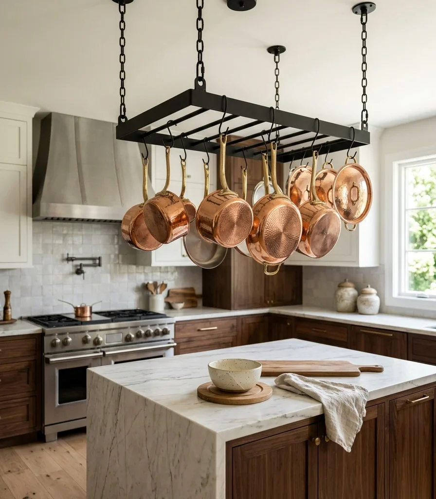
Hanging brass cookware rail
Painter’s tape for hood edge lines

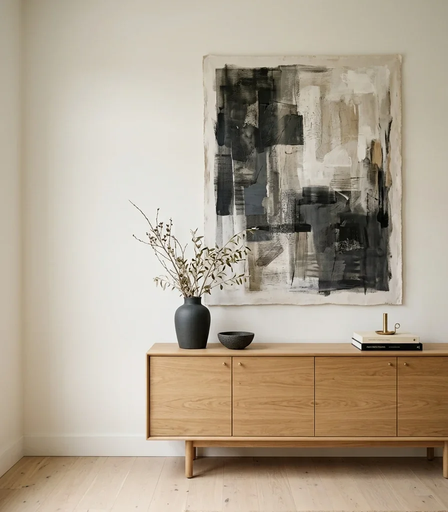
14. One Long Art Piece That Spans the Sightline Between Rooms
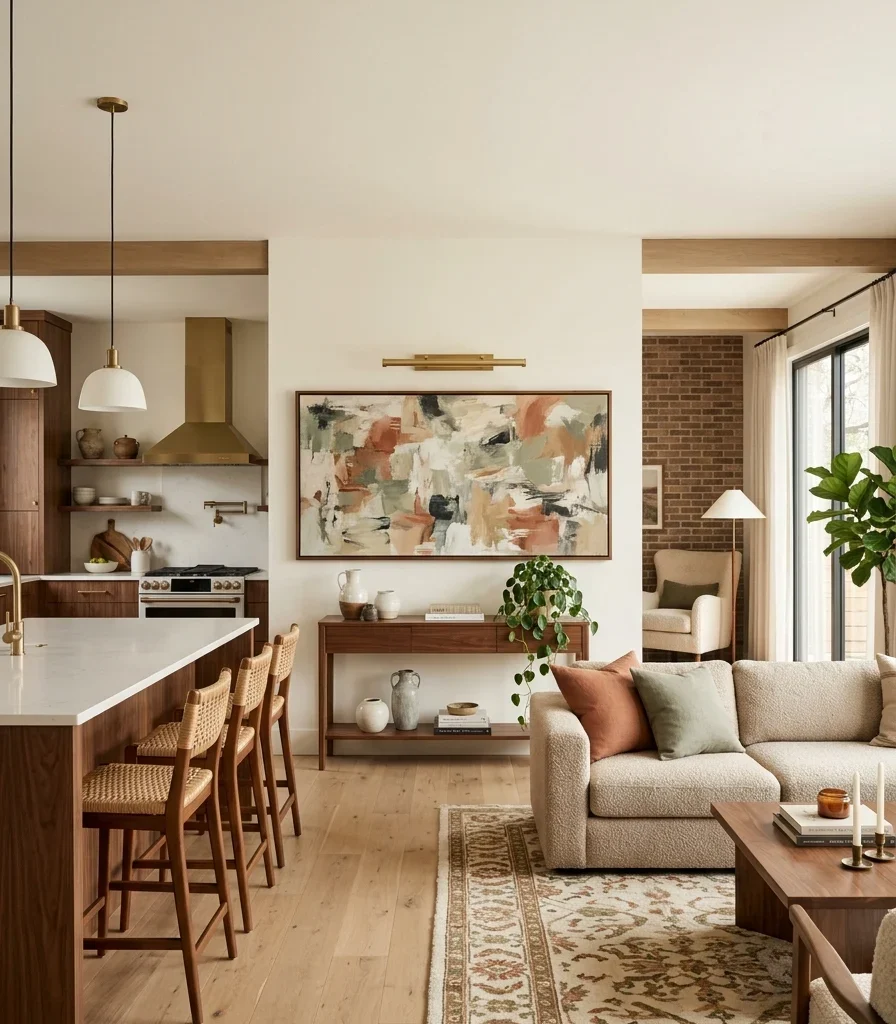
14. One Long Art Piece That Spans the Sightline Between Rooms

Vibe: Layered, single focal point both rooms are allowed to share.

Why it works: One large piece of art hung where it’s visible from both the kitchen and the living room gives the eye a single shared focal point that both zones reference, rather than each room needing its own separate wall decor, reducing visual competition and reinforcing that the space functions as one room with two purposes. A horizontal format works better here than vertical, echoing the room’s own wide, low sightline.

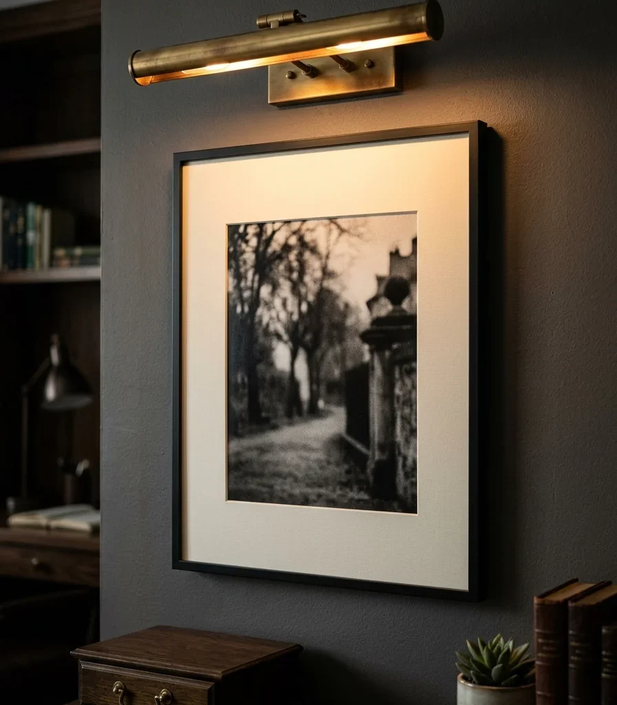
How to get it: Choose a horizontal art piece at least 48 inches wide, hang it on the wall most visible from the kitchen’s main work zone at 57 inches to the piece’s center, and add a slim picture light above it so it stays a clear focal point even as the room’s ambient lighting shifts to evening mode.

Shop the Look

Product
Large horizontal abstract canvas art
Walnut wood picture frame wide format
Brass picture light fixture
Slim console table beneath art
Small ceramic object for console styling

15. Small-Space Tricks for a Compact Open Kitchen and Living Room
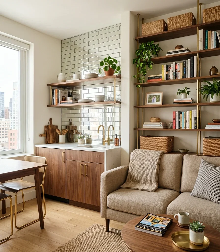
15. Small-Space Tricks for a Compact Open Kitchen and Living Room

Vibe: Airy, a small footprint that borrows every inch of light it can find.

Why it works: In a genuinely small open concept space, the priority shifts from zone definition to light maximization; a mirrored or glossy tile backsplash reflects both the kitchen window’s natural light and the living room’s lamp light into the room, effectively doubling the perceived light source count without adding a single fixture. Furniture scaled down to apartment proportions keeps sightlines open in a footprint too tight for the full-scale versions of ideas earlier in this list.

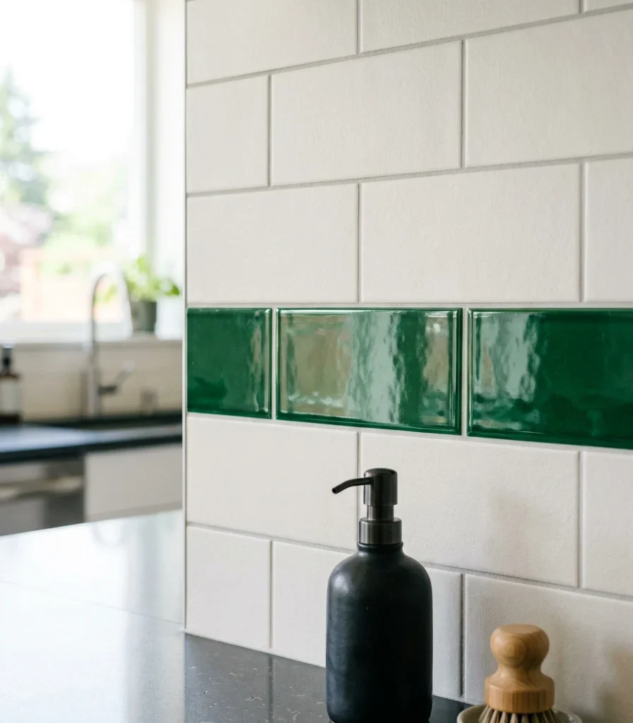
How to get it: Install a glossy or mirrored subway tile backsplash on the kitchen’s most light-exposed wall, choose a loveseat or apartment-scale sofa no deeper than 34 inches, and use vertical wall shelving rather than floor-standing furniture wherever storage is needed, since vertical storage claims almost no floor footprint.

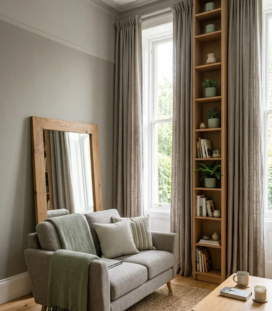
💡 Quick Win: A single large leaning mirror placed at the seam between the kitchen and living room does almost the same light-bouncing job as a full mirrored backsplash, for a fraction of the installation effort.

Shop the Look

Product
Mirrored glossy subway tile backsplash
Apartment-scale loveseat compact
Tall vertical wall shelving unit
Large leaning floor mirror
Woven storage basket set stackable

How to Start Your Open Concept Kitchen and Living Room Transformation

Start with the flooring. Before choosing paint or buying furniture, decide on one continuous flooring material for both zones, because every other decision- placement, furniture legs, sightlines depends on that floor reading as one surface rather than two. Wide-plank engineered white oak in a warm honey tone is the single most versatile starting choice, pairing equally well with sage green, warm white, and walnut wood tones used across the ideas in this list.

The most common mistake is treating the kitchen and living room as two separately decorated rooms that simply happen to share airspace; mismatched wood tones, a gray-washed kitchen floor against a warm walnut coffee table, for instance, is the specific error that breaks an open concept room’s cohesion fastest. Fix this by choosing one dominant wood undertone, warm or cool, and auditing every wood surface in both zones against it before finalizing any furniture purchase.

Three items under $50 that create immediate impact: a sage green throw pillow cover ($15-$25) that echoes cabinet color into the living room; a roll of painter’s tape and a warm greige paint sample pot ($10-$15) to test wall color continuity between zones before committing to gallons; and a brass cabinet knob or drawer pull set ($20-$40) that upgrades kitchen hardware to match living room lamp and frame finishes.

A cosmetic open concept refresh new paint, one accent piece, updated hardware, a properly sized rug is a genuine two-to-three weekend project costing $500-$1,500. A mid-level transformation involving new flooring, a range hood update, and lighting layers typically runs $5,000-$15,000 and takes three to six weeks with contractors. A full structural renovation involving wall removal starts around $15,000 and climbs quickly depending on whether the wall is load-bearing, often taking two to four months including permitting and structural engineering.

Frequently Asked Questions About Open Concept Kitchen and Living Room Ideas

What’s the difference between an open concept and a “great room” layout?

Both terms describe combined living spaces, but a great room historically refers to a single large room built as one space from the start, often including a fireplace as its focal point, while open concept typically describes a kitchen and living room that were once separated by a wall that has since been removed or was never fully enclosed. In practice, the terms have merged in modern real estate listings, but the distinction matters for renovation planning: a true open concept project usually involves demolition and structural assessment, while a great room is a design and furnishing challenge only, since the architecture is already unified.

What color palette works best for an open kitchen and living room?

A palette built around one warm neutral, such as warm white or greige, used consistently on walls and cabinetry in both zones, with two or three accent colors repeated in small doses, performs best in open concept spaces because it gives the eye one consistent base to travel across without visual interruption. Sage green, warm charcoal, and terracotta are the accent colors currently trending most in open concept kitchens according to recent Pinterest and paint-brand search data. Avoid using more than three distinct wall or cabinet colors across the combined space, since each additional color adds a visual seam the open layout doesn’t have architecture to support.

How much does it cost to open up a kitchen to the living room?

Removing a non-load-bearing wall between a kitchen and living room typically costs $1,000-$3,000 including demolition, patching, and finishing, while removing a load-bearing wall requiring a structural beam and engineering approval runs $4,000-$10,000 or more depending on the span and local permitting costs. Beyond the wall removal itself, most homeowners budget an additional $5,000-$20,000 for the cosmetic work that makes the newly combined space feel intentional, matching flooring, updated lighting, and new paint. Getting a structural engineer’s assessment before budgeting is the only way to know which cost range applies to a specific home.

Does open concept work in an older or traditional-style home?

Open concept layouts can work in older or traditional homes, but the transformation requires more deliberate material bridging than in a home built open from the start, since traditional trim, moldings, and door casings can look abruptly cut off where a wall used to be. The fix is to run matching millwork, such as a picture rail or a consistent baseboard height, uninterrupted through the newly opened sightline, and to choose furniture and lighting finishes, aged brass and walnut wood, that echo the home’s existing traditional character rather than importing a fully modern material palette that clashes with original architectural details.

How big should a kitchen island be for an open concept layout?

A kitchen island intended to also anchor sightlines into an open living room generally needs a minimum of 6 feet in length to read as a substantial architectural element rather than a small prep cart, with 8-10 feet being the more common size in open floor plans of 300 square feet or larger. The island also needs a minimum of 42 inches of clearance on any side used for regular walking, and 36 inches on any side without regular foot traffic, so the size should always be planned against the room’s total footprint rather than chosen for counter space alone.

Ready to Create Your Dream Open Concept Kitchen and Living Room?

These 15 open concept kitchen and living room ideas move across color echoes, material continuity, layered lighting, and layout tricks that make one combined room function like a considered whole rather than two rooms sharing a floor. Nobody needs to remove a wall and renovate every surface in the same month; starting with one continuity move, a shared paint color or a single repeated accent, is a legitimate and genuinely effective place to begin. Today, stand in the spot where your kitchen and living room currently meet and photograph exactly what breaks the sightline first, whether that’s a mismatched floor transition or two unrelated wall colors. Once that seam is resolved, the open concept payoff isn’t just visual; it’s the specific ease of never missing a conversation from the stove, of one room holding an entire evening instead of two rooms taking turns. Save the ideas that solve your own room’s seam first, and let the island, the floor, or that one long horizontal art piece be where your open concept story actually begins.

You Might Also Like

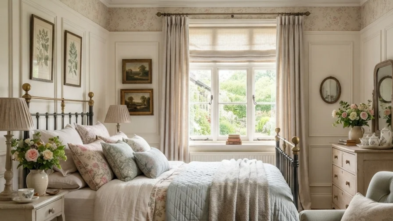
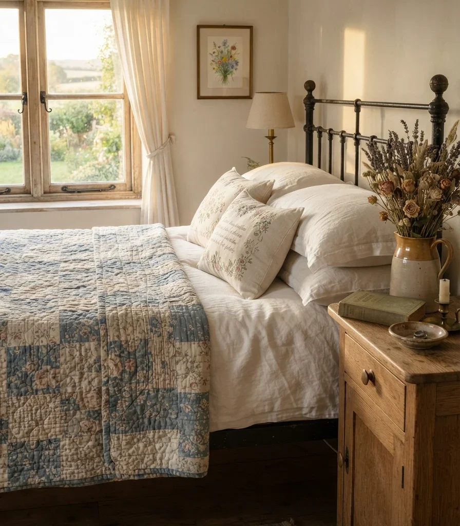
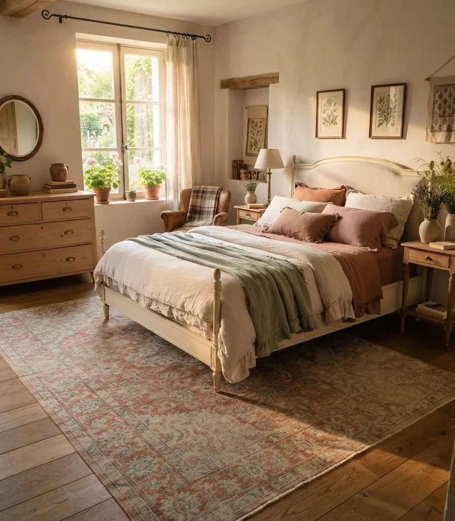
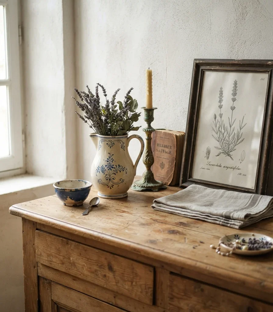
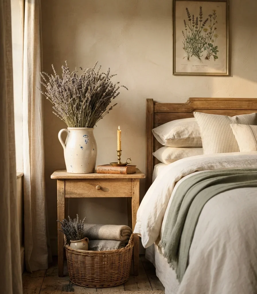
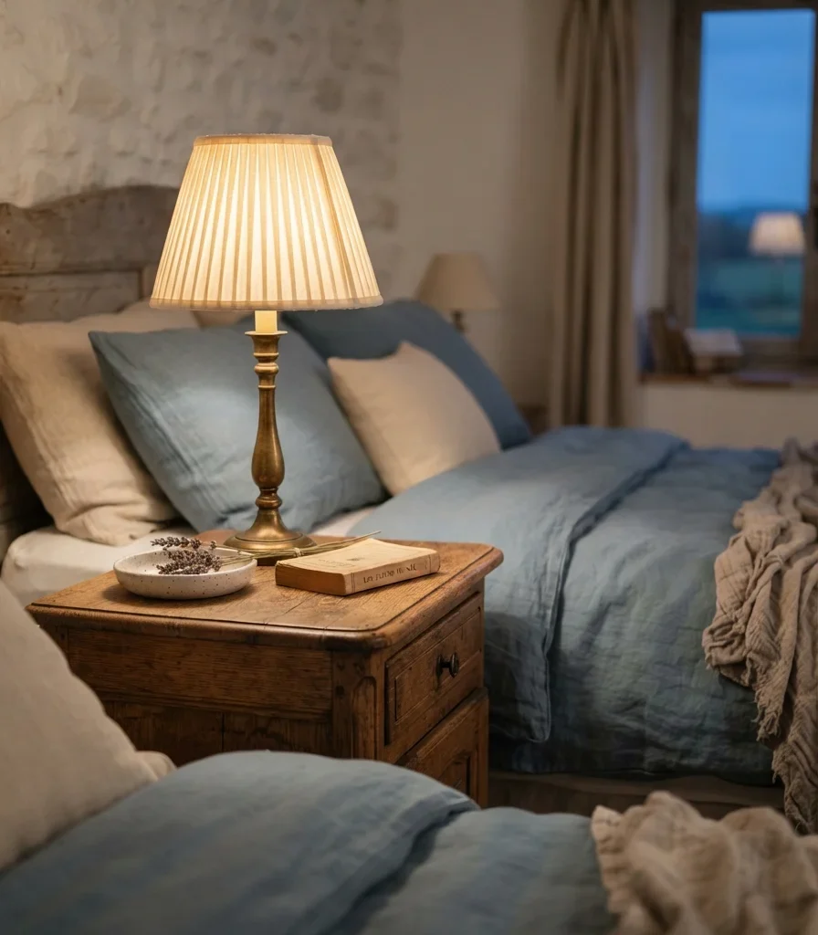
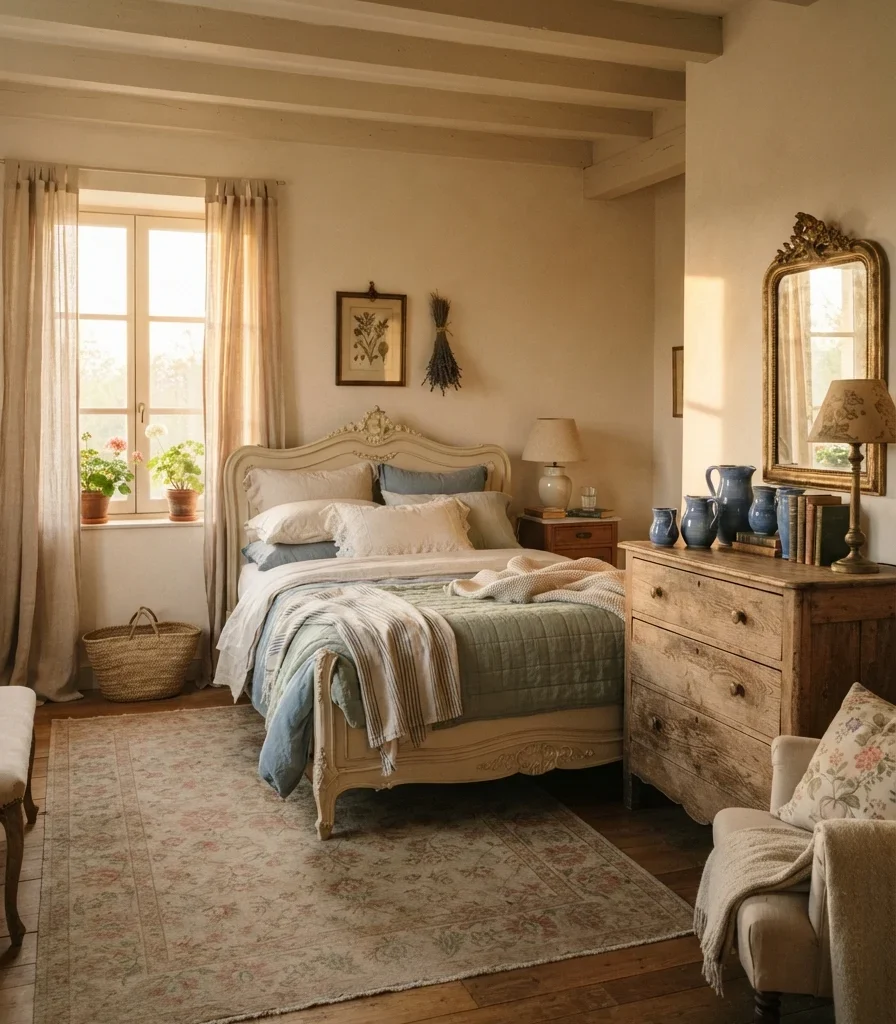
13 English Countryside Bedroom Ideas for a Room That Feels Like a Warm Embrace

13 English Countryside Bedroom Ideas for a Room

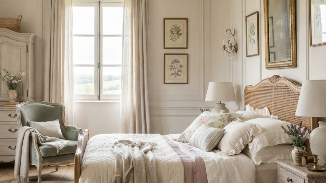
English countryside bedroom design is a relaxed British country-house aesthetic built around aged timber, natural linen, muted botanical colors, traditional furniture, and the quiet comfort of rooms that look lived in rather than staged. These 13 English Countryside Bedroom Ideas for a Room That Feels Like a Warm Embrace show how to use color, texture, lighting, furniture, pattern, and thoughtful layouts to create a bedroom that feels deeply settled.

The atmosphere is soft without being bland, layered without feeling cluttered, and old-fashioned without becoming theatrical. Morning light falls gently across linen bedding, worn wood develops a warmer glow beside the bed, and small imperfections make the room feel personal. There is a sense of stillness here, the feeling of closing a bedroom door at the end of a long day and leaving the outside world behind. English countryside style works because comfort is treated as part of the architecture, not something added at the end. Here are 13 ideas worth saving and stealing.

Why 13 English Countryside Bedroom Ideas for a Room That Feels Like a Warm Embrace Work So Well

English countryside interiors grew from the domestic traditions of rural cottages, rectories, manor houses, and country estates across England rather than from one single decorating movement. The aesthetic overlaps with Georgian, Victorian, Arts and Crafts, and traditional cottage interiors, but its defining quality is the relaxed way these influences are layered. Unlike modern farmhouse, which often simplifies country references into cleaner silhouettes, English country rooms embrace antiques, botanical patterns, painted furniture, irregular surfaces, and furniture that looks as though it has stayed in the family.

The material palette is tactile and naturally subdued: honey oak, dark walnut, painted pine, rush, wool, cotton, washed linen, aged brass, ceramic, and occasional wrought iron. Useful colors include warm ivory, mushroom, oatmeal, muted sage, olive, faded cornflower blue, dusty rose, and soft brown. Rather than using several unrelated accent colors, repeat two or three tones throughout the bedding, curtains, artwork, and accessories so the room feels collected rather than coordinated.

The renewed interest in English countryside interiors also fits a wider decorating shift toward slower, more personal homes. Secondhand furniture, natural fibers, repairable pieces, vintage finds, and rooms designed for comfort all sit comfortably within the sustainability-minded approach many homeowners now prefer. Pinterest-friendly spaces are moving away from disposable matching sets toward rooms with visible character, and English country style naturally rewards that approach because patina is an asset rather than a problem.

Small bedrooms can achieve the look surprisingly well, but restraint becomes more important. Prioritize one substantial hero piece, usually the bed, then use full-height curtains, compact bedside tables, vertical storage, and layered textiles rather than filling every corner. A 10-by-12-foot bedroom does not need an antique wardrobe, bench, desk, and chest simultaneously; one well-scaled vintage piece and strong textiles can communicate the style more effectively.

Style at a Glance

ElementEnglish Countryside Bedroom
PhilosophyComfortable, collected, practical, and gently timeworn
Key MaterialsOak, pine, linen, wool, rush, aged brass, ceramic
Color PaletteWarm ivory, sage, olive, faded blue, dusty rose, mushroom

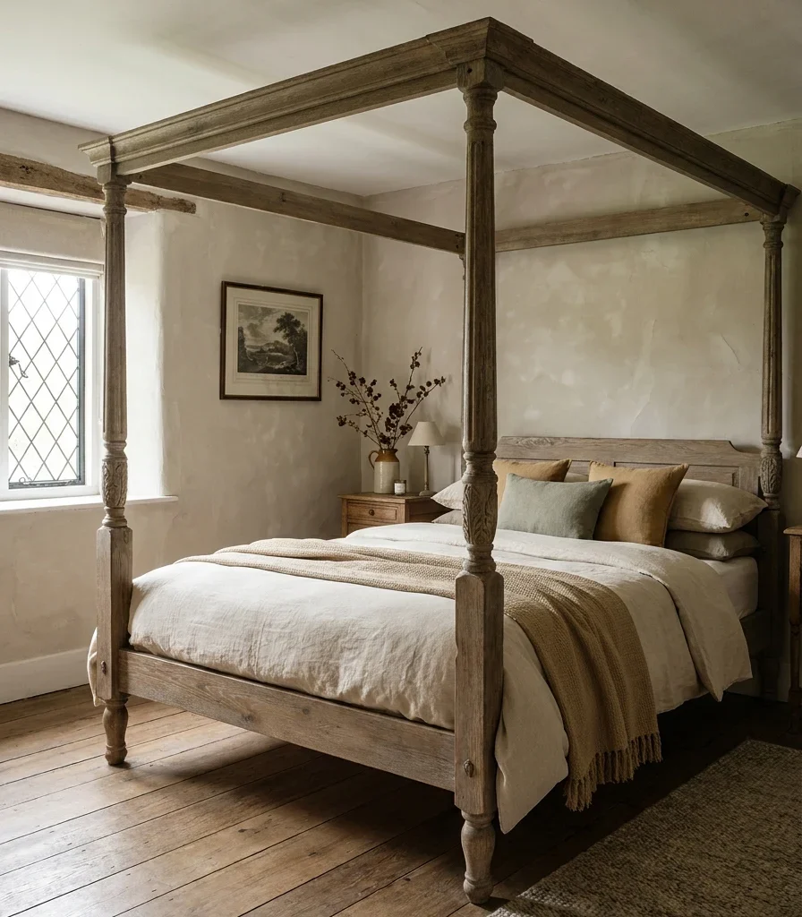
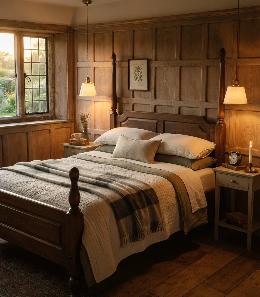
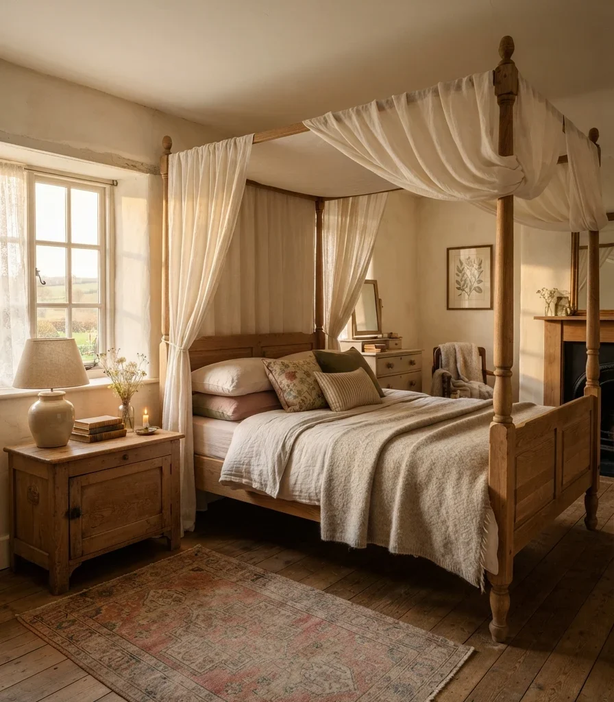
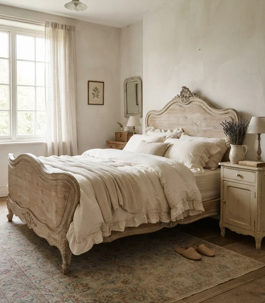
1. English Countryside Bedroom Ideas Start With a Weathered Oak Bed

1. English Countryside Bedroom Ideas Start With a Weathered Oak Bed

Vibe: Grounded. The bed gives the bedroom the reassuring weight of furniture made to stay.

Why it works: A substantial oak bed creates visual hierarchy and establishes the material language immediately. The contrast between solid timber and loosely rumpled linen prevents the room from becoming too formal, while visible grain introduces the irregularity that makes English country furniture feel authentic.

How to get it: Choose medium-to-dark oak with a matte waxed finish rather than high-gloss varnish. Keep the headboard visually substantial, but allow at least 75 cm of clear circulation at the sides if the room permits.

💡 Quick Win: If replacing the bed is outside the budget, add a 100% linen headboard cushion in oatmeal to a simple wooden frame for an immediate country-house shift.

Shop The Look

Product
Weathered solid oak four-poster bed
Oatmeal European linen duvet cover
Antique oak three-drawer bedside table
Handwoven wool throw blanket
Ceramic bedside water pitcher

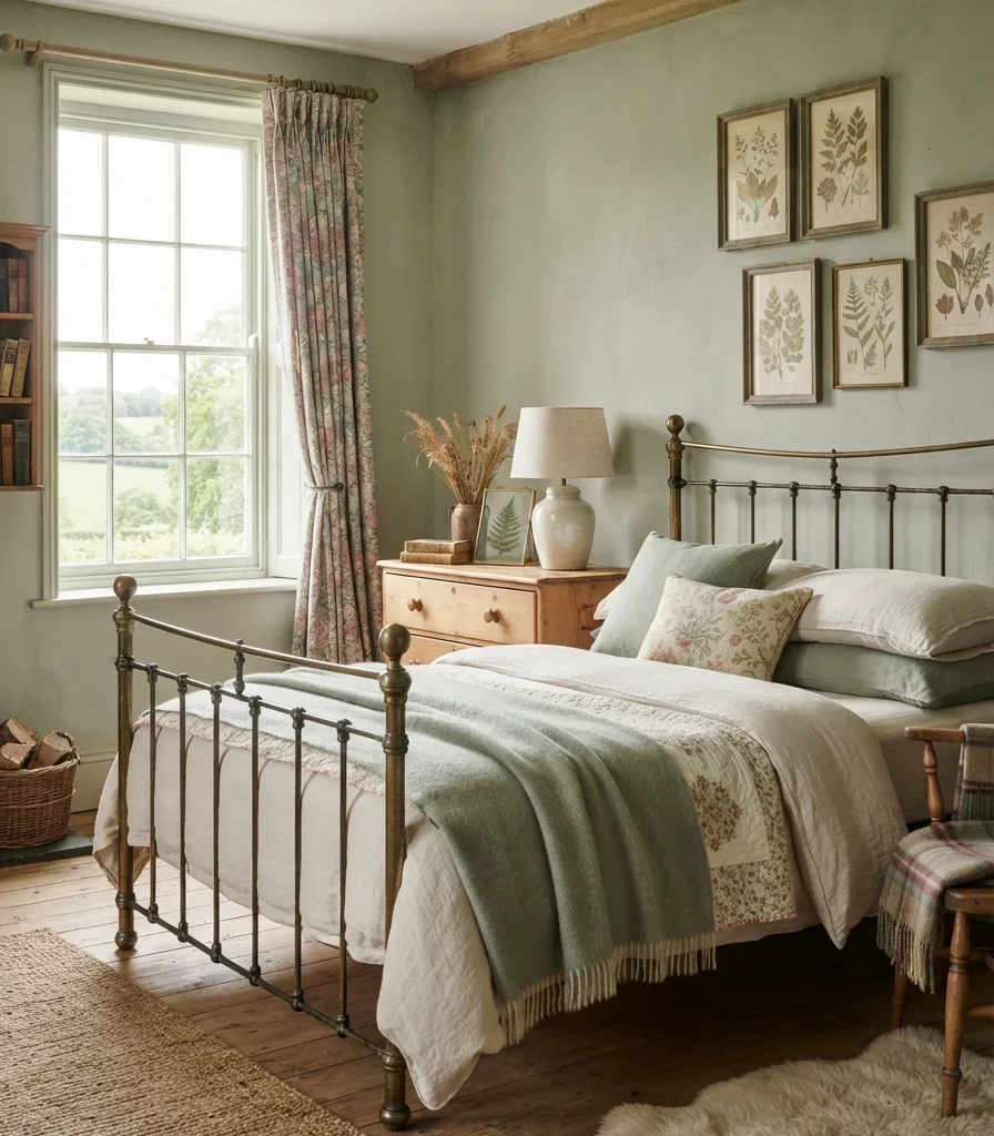
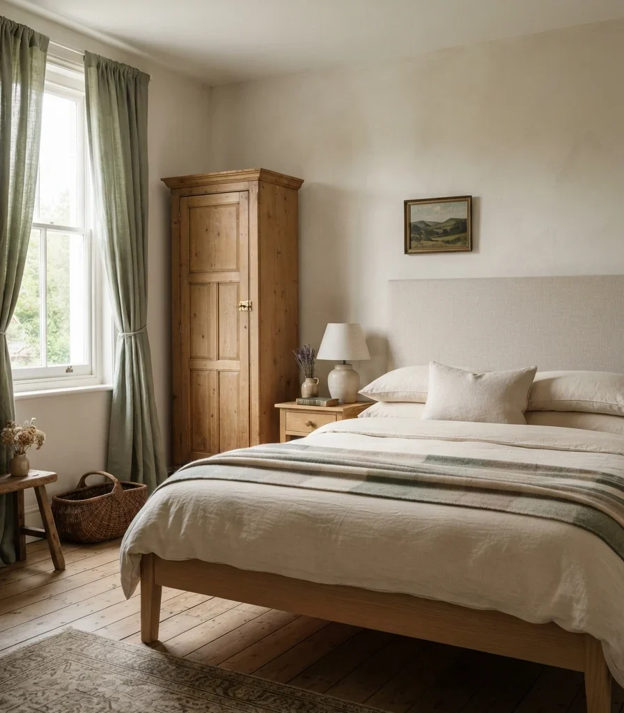
2. Use Sage Green With Warm Ivory for a Soft English Palette

2. Use Sage Green With Warm Ivory for a Soft English Palette

Vibe: Sun-warmed; the muted green feels connected to hedgerows and garden foliage outside the window.

Why it works: Sage and warm ivory create low-contrast color continuity, which makes a bedroom feel calmer than a palette built around sharp black-and-white contrast. The warmer white also prevents sage from becoming cold, especially in north-facing rooms.

How to get it: Use a chalky sage around the walls and trim only if the room receives enough daylight; otherwise choose a warmer greige-sage. Repeat the green in one curtain or cushion rather than introducing it through every accessory.

Shop The Look

Product
Muted sage green interior wall paint
Warm ivory linen duvet cover
Faded sage floral curtain panels
Antique pine bedside chest
Sage ceramic table lamp

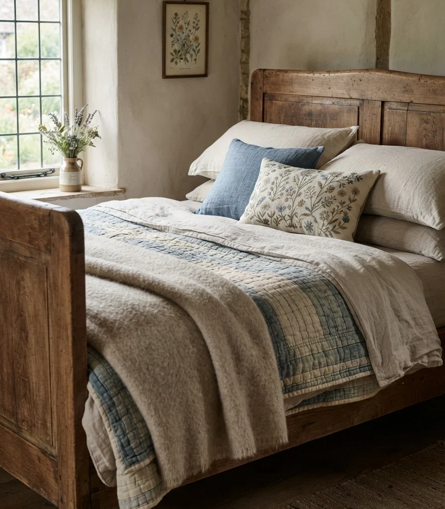
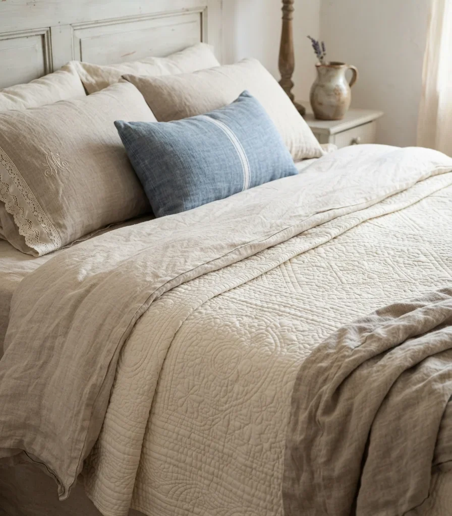
3. Layer Washed Linen, Wool, and Cotton on the Bed

3. Layer Washed Linen, Wool, and Cotton on the Bed

Vibe: Layered every textile invites touch and makes the bed feel assembled over years.

Why it works: Texture layering creates depth without relying on strong pattern. Linen has a slightly irregular surface, cotton provides a smoother middle layer, and wool introduces loft and visual weight, allowing a restrained color palette to remain interesting.

How to get it: Build the bed in three tactile levels: crisp or washed linen sheets, a lightweight cotton quilt, then one wool blanket folded across the lower third. Avoid piling more than three major patterns into the arrangement.

Shop The Look

Product
Stonewashed oatmeal linen sheet set
Quilted cotton bedcover ivory
Chunky natural wool blanket
Faded blue linen pillowcase pair
Embroidered floral lumbar cushion

4. Hang a Traditional Brass Pendant Beside the Bed

4. Hang a Traditional Brass Pendant Beside the Bed

Vibe: A luminous arm bedside light makes timber and linen appear softer after sunset.

Why it works: Pendant lighting frees the bedside surface while creating vertical rhythm around the bed. Aged brass reflects warm light gently, unlike polished chrome, which tends to introduce a sharper contemporary note.

How to get it: Hang each pendant approximately 45–60 cm above the bedside surface and use 2200–2700K dimmable bulbs. Keep the pendants visually small enough that they frame the bed rather than compete with the headboard.

💡 Quick Win: Swap existing cool-white bedside bulbs for warm 2700K bulbs before buying new fixtures; the color temperature alone can noticeably change the room’s atmosphere.

Shop The Look

Product
Aged brass bedside pendant light
Cream fabric shade pendant
2700K dimmable vintage LED bulb
Brass ceiling hook canopy
Antique brass cord adjuster

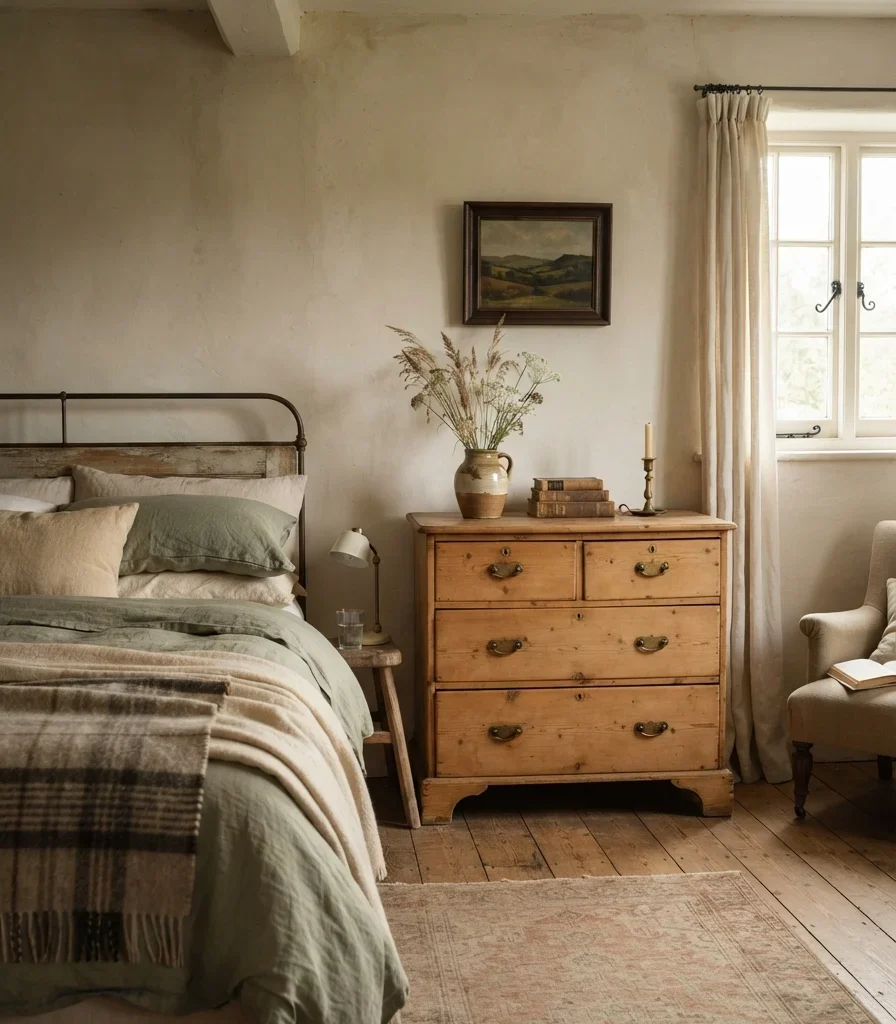
5. Bring in an Antique Pine Chest for Honest Country Character

5. Bring in an Antique Pine Chest for Honest Country Character

Vibe: Ancestral worn pine makes the room feel connected to another generation.

Why it works: Pine has a lighter visual weight than dark oak and brings an informal cottage quality into the bedroom. Its knots, dents, and uneven color also provide authentic surface variation that manufactured distressed furniture often struggles to reproduce.

How to get it: Search for secondhand pine chests with simple drawer fronts and original brass or iron pulls. Avoid pieces with artificially exaggerated distressing; genuine small scratches and uneven color are enough.

Shop The Look

Product
Vintage pine six-drawer chest
Antique brass cup drawer pulls
Small framed English landscape print
Stoneware bud vase
Traditional brass candlestick

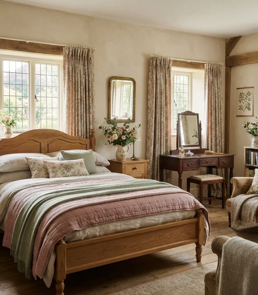
6. Frame the Bed With Full-Length Floral Curtains

6. Frame the Bed With Full-Length Floral Curtains

Vibe: Airy. The curtains soften the bed’s silhouette and make the wall feel taller.

Why it works: Full-length fabric adds vertical emphasis, while a small floral pattern reinforces the botanical vocabulary of English country interiors. Framing the bed with fabric also creates a subtle architectural effect in rooms without a traditional alcove.

How to get it: Mount the curtain rod close to the ceiling and extend it 15–20 cm beyond each side of the bed. Choose a small botanical print with a warm ivory background so the pattern remains secondary to the bed.

Shop The Look

Product
Small-scale English floral curtain panels
Aged brass curtain rod
Brass curtain rings with clips
Floral linen tieback set
Natural cotton curtain liner

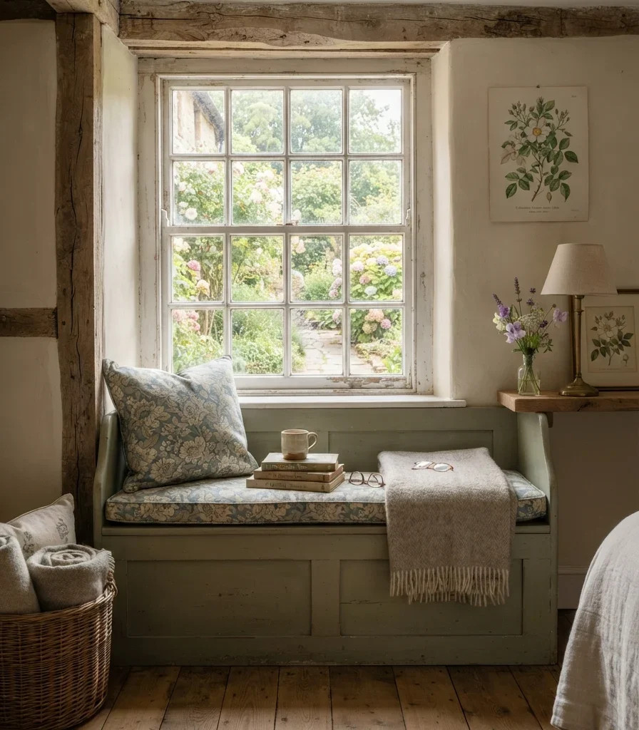
7. Add a Window Seat for a True Country-House Retreat

7. Add a Window Seat for a True Country-House Retreat

Vibe: Still, the window seat creates a sheltered pause within the bedroom.

Why it works: A window seat turns otherwise unused wall depth into functional seating and makes natural light part of the room’s experience. Linen upholstery and a wool throw provide softness while the window frames the landscape as living artwork.

How to get it: Aim for a seat height around 45 cm and a depth of approximately 50–60 cm. Add a tailored 7–10 cm cushion rather than an oversized loose cushion that consumes useful seating depth.

💡 Quick Win: A freestanding wooden bench placed beneath a suitable window can create the same visual effect without building cabinetry.

Shop The Look

Product
English floral window seat cushion
Natural wool throw blanket
Wicker storage basket with handles
Traditional ceramic reading mug
Small brass reading lamp

8. Make a Four-Poster Bed Feel Relaxed, Not Formal

8. Make a Four-Poster Bed Feel Relaxed, Not Formal

Vibe: Hushed. Fabric around the bed creates a gentle sense of enclosure.

Why it works: The four-poster supplies strong vertical geometry, so the rest of the room can remain visually quiet. Loose linen softens the architectural frame and prevents the bed from reading like a formal hotel suite.

How to get it: Use lightweight washed linen rather than heavy velvet or gathered drapery. Let the fabric fall naturally from the upper rails instead of creating symmetrical theatrical swags.

Shop The Look

Product
Natural oak four-poster bed
Ivory washed linen canopy panels
Faded floral bolster cushion
Antique wool Persian-style rug
Ceramic bedside table lamp

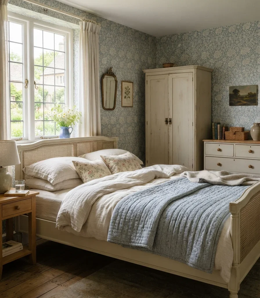
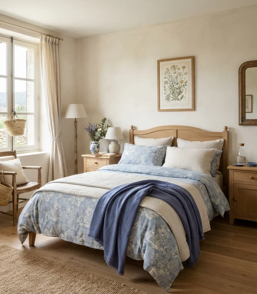
9. Use Faded Blue-and-White Pattern for English Cottage Character

9. Use Faded Blue-and-White Pattern for English Cottage Character

Vibe: Nostalgic. The faded blue pattern recalls old cottage textiles without becoming overly sweet.

Why it works: Blue and warm ivory provide gentle contrast while painted furniture keeps the room visually light. The small floral scale is important because a large high-contrast print would dominate a bedroom that depends on softness.

How to get it: Select wallpaper where the blue is greyed rather than saturated and pair it with plain ivory bedding. Repeat the blue in only two or three accessories so the pattern remains the main statement.

Shop The Look

Product
Faded blue floral wallpaper
Blue-and-white ceramic pitcher
Ivory linen duvet cover
Painted cream bedside table
Blue floral quilted throw

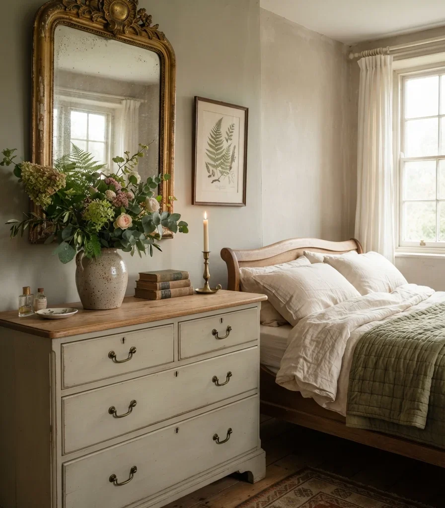
10. Add an Antique Mirror Above a Painted Dresser

10. Add an Antique Mirror Above a Painted Dresser

Vibe: Reflective. The old mirror gives the room the feeling of a piece collected over time.

Why it works: Aged reflective surfaces bounce daylight without creating the hard contemporary effect of a frameless mirror. The contrast between muted painted furniture and an imperfect gilt frame adds a small amount of visual sparkle while retaining country character.

How to get it: Choose a mirror with visible patina and an irregular or softly aged frame. Hang it so its center sits around eye level rather than automatically centering it high above the dresser.

💡 Quick Win: An inexpensive vintage-style mirror can be made more convincing by replacing a bright modern frame with one finished in muted antique gold or aged wood.

Shop The Look

Product
Antique-style aged gilt mirror
Sage green painted dresser
Small brass candlestick pair
Handmade ceramic vase
Vintage-style botanical print

11. Design a Small Bedroom Around Vertical Storage

11. Design a Small Bedroom Around Vertical Storage

Vibe: Cozy; the compact room feels enveloping rather than cramped.

Why it works: Vertical storage uses height instead of valuable floor area, while a narrow furniture footprint keeps circulation open. Full-length curtains further draw the eye upward, creating the perception of a taller room.

How to get it: Choose storage no deeper than approximately 45–55 cm where possible, and take it close to the ceiling. Keep bedside furniture narrow enough that the bed remains the dominant horizontal element.

Shop The Look

Product
Narrow antique-style wardrobe
Slim oak bedside cabinet
Full-length ivory linen curtains
Woven under-bed storage basket
Small framed countryside landscape

12. Style the Bed With a Traditional Quilted Coverlet

12. Style the Bed With a Traditional Quilted Coverlet

Vibe: Cocooned. The quilt gives the bed a tactile sense of protection and warmth.

Why it works: Traditional quilting introduces pattern and texture without requiring wallpaper or upholstered furniture. A faded cotton quilt also contrasts naturally with the smoother surface of linen, creating depth through textile construction rather than excessive color.

How to get it: Fold the quilt across the lower third of the bed rather than covering everything completely. Choose a washed pattern in faded blue, cream, or dusty rose so it looks softened by time.

Shop The Look

Product
Traditional English quilted bedspread
Cream linen sheet set
Embroidered cotton pillowcases
Antique iron bed frame
Faded floral cotton cushion

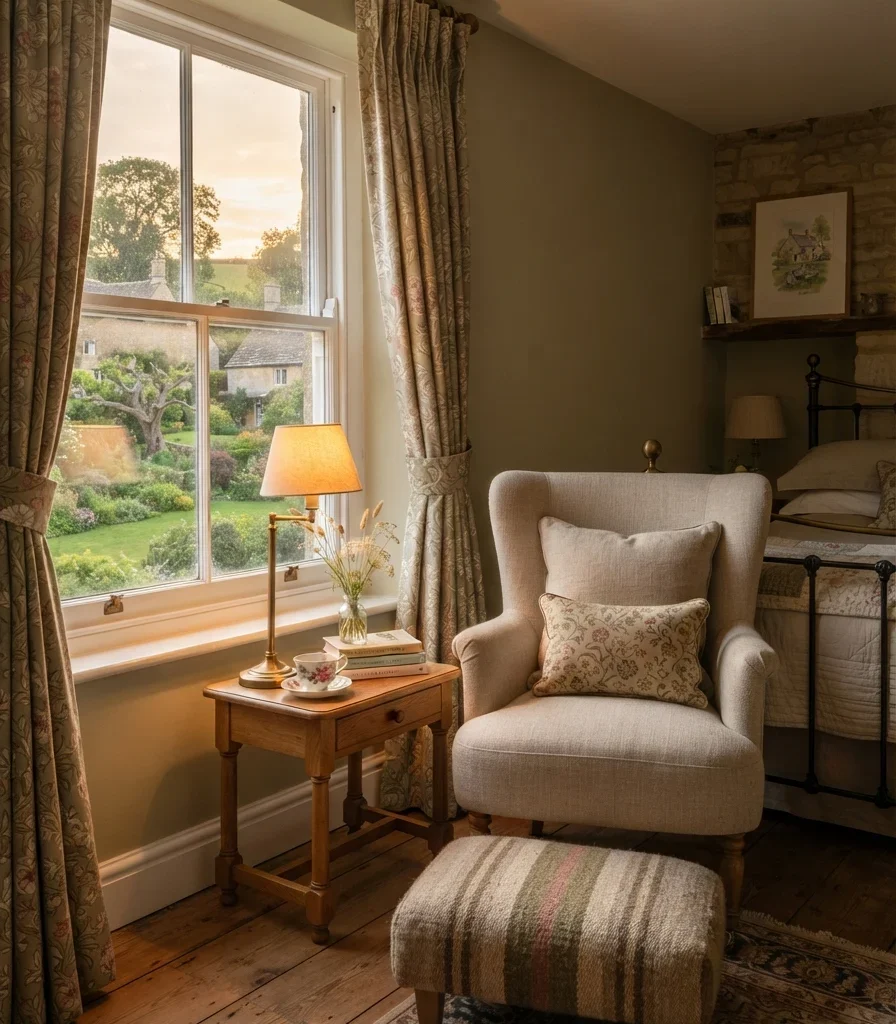
13. Finish With a Quiet English Country Reading Corner

13. Finish With a Quiet English Country Reading Corner

Vibe: Restorative. The corner creates a small ritual space for slowing down before sleep.

Why it works: A bedroom does not have to be organized exclusively around the bed. A compact reading chair introduces a secondary zone and gives unused corner space a purpose, while warm task lighting creates a lower layer of illumination.

How to get it: Choose a chair no wider than approximately 75 cm for a compact bedroom and position it near a window without blocking curtain movement. Add a small round table rather than a bulky rectangular nightstand.

💡 Quick Win: If a full chair is too large, use a compact upholstered slipper chair with a wool throw and a small wooden stool beside it.

Shop The Look

Product
Oatmeal linen wingback reading chair
Antique oak round side table
Aged brass adjustable reading lamp
Wool footstool neutral pattern
Floral lumbar cushion

How to Start Your English Countryside Bedroom Transformation

Start with warm ivory linen bedding. This single change anchors the bedroom because linen immediately introduces the relaxed texture associated with traditional English country interiors, while warm ivory gives you a flexible base for sage, faded blue, dusty rose, oak, pine, and antique brass.

The most common mistake is using too many obviously distressed reproduction pieces. Furniture with exaggerated chipped paint, fake wormholes, and identical “antique” finishes makes the room look themed rather than inherited. Keep one genuinely aged piece, such as an antique pine chest, and let newer furniture remain simple.

Three budget pieces can make an immediate difference for under $50 each: a small blue-and-white ceramic pitcher, a pair of aged-brass candlesticks, and a natural linen cushion cover in oatmeal or flax. Place the pitcher on the bedside table, the candlesticks on a dresser, and the cushion at the front of the bed.

A simple textile refresh can happen over one weekend for roughly $150–$500. A fuller bedroom transformation with quality bedding, curtains, lighting, furniture, rug, and artwork can reach $1,500–$5,000+, while custom wardrobes, flooring, architectural work, and genuine antiques may take several months. The look becomes more convincing gradually as authentic pieces replace generic ones.

Frequently Asked Questions About 13 English Countryside Bedroom Ideas for a Room That Feels Like a Warm Embrace

What is the difference between an English country bedroom and a cottage bedroom?

An English country bedroom is broader and can range from a modest rural cottage to a Georgian country house, so it often combines antiques, traditional upholstery, botanical textiles, and more formal furniture proportions. Cottage bedrooms tend to be smaller, simpler, and more rustic. Both can use linen, painted wood, florals, and natural materials, but English country style usually allows greater variation in furniture age and scale.

Which colors work best in an English countryside bedroom?

Warm ivory, muted sage, olive green, mushroom, faded cornflower blue, dusty rose, and soft brown are especially effective. For darker bedrooms, warm ivory and muted sage usually perform better than icy white or blue-grey. A useful starting combination is warm ivory walls with sage textiles, honey oak furniture, and small touches of faded blue.

How much does an English countryside bedroom cost to create?

A small styling update can cost around $150–$500, particularly if you already own a suitable bed. A mid-range transformation with linen bedding, curtains, lighting, rug, artwork, and secondhand furniture can fall around $1,500–$5,000. Genuine antique furniture, custom cabinetry, architectural changes, and high-quality natural fabrics can push a full renovation considerably higher.

Can English countryside style work in a modern bedroom?

Yes, but balance is important. Keep the modern architecture simple and introduce character through an antique pine chest, washed linen bedding, aged brass lighting, botanical artwork, or a traditional wool rug. Avoid adding every country-house reference at once; two or three authentic-looking pieces can create a stronger contrast than an entire room of reproduction furniture.

What type of bedding is best for an English countryside bedroom?

Washed linen, cotton quilts, wool blankets, and embroidered cotton are excellent choices because they create texture without excessive visual polish. Start with warm ivory or oatmeal linen sheets, then add a faded floral or blue-and-white quilt across the lower third of the bed. A lightweight wool throw folded over the quilt adds warmth and gives the bedding a naturally layered appearance.

Ready to Create Your Dream English Countryside Bedroom?

These 13 English Countryside Bedroom Ideas for a Room That Feels Like a Warm Embrace cover the details that give the style its depth, from sage and faded blue color schemes to weathered oak, washed linen, traditional lighting, antique storage, botanical patterns, and practical small-bedroom layouts. You do not need to transform everything at once; starting with one meaningful textile or genuinely aged piece is often the better way to build a room with character. Today, replace one synthetic bedding layer with a warm ivory linen duvet cover and add a small ceramic pitcher beside the bed. Over time, the room should begin to feel quieter, softer, and more personal- the emotional quality that makes an English countryside bedroom so comforting. Save and pin the ideas that speak to you most, especially the linen bed, painted dresser, floral curtains, and window-seat details, so your future room develops like a country house rather than a showroom.

You Might Also Like

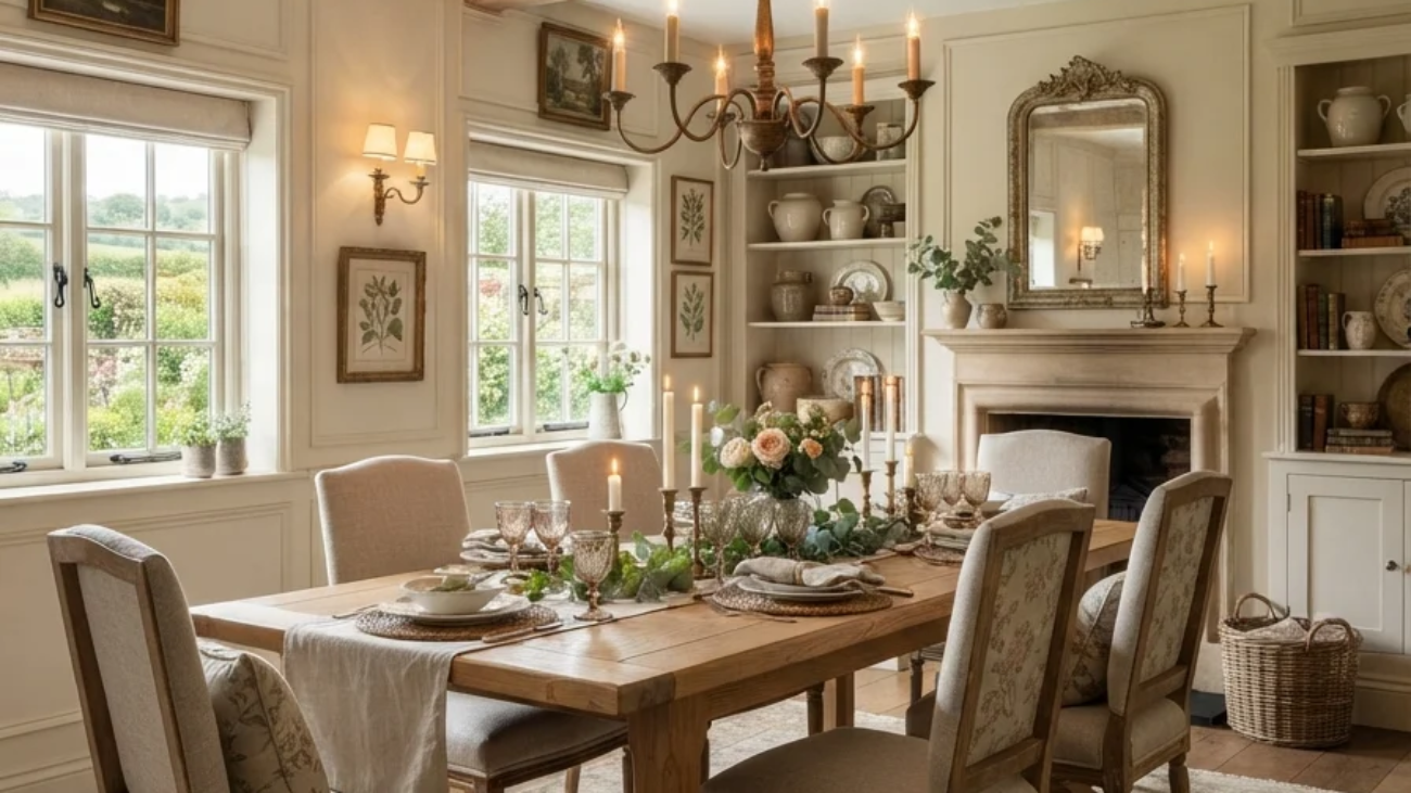
20 The Timeless Elegance of an English Countryside Dining Room

20 The Timeless Elegance of an English Countryside Dining Room

English countryside dining rooms combine traditional architectural character, natural materials, muted botanical colors, and comfortable furniture to create spaces that feel gracious without becoming formal. These 20 timeless English countryside dining room ideas show how to use aged wood, linen, soft lighting, floral patterns, antiques, and thoughtful layouts to recreate that collected country-house feeling.

There is something quietly comforting about an English countryside dining room: afternoon light falling across an old oak table, linen moving gently beside a window, and the faint warmth of candlelight waiting for dinner. The room feels established rather than decorated, with objects gathered over time instead of purchased to match. Its elegance comes from proportion, patina, craftsmanship, and restraint rather than shine or excess. Here are 20 ideas worth saving and stealing.

Why The Timeless Elegance of an English Countryside Dining Room Works So Well

English countryside interiors developed from the practical rooms of rural cottages, manor houses, rectories, and country estates rather than from a single formal design movement. The look overlaps with the Arts and Crafts tradition, English Georgian and Victorian interiors, and the accumulated character of old country houses. Unlike modern farmhouse style, it favors patinated furniture, traditional silhouettes, botanical references, layered textiles, and the visual evidence of age.

Its material palette is equally specific: honey-toned or dark oak, pine, walnut, aged brass, wrought iron, natural linen, wool, rush seating, glazed ceramics, and occasionally limestone or terracotta. Colors tend toward chalky warm white, mushroom taupe, muted sage, olive, dusty blue, faded rose, ochre, and deep forest green. The important distinction is softness; colors should look slightly weathered rather than freshly saturated.

The style feels particularly relevant now because homeowners are moving toward rooms that feel personal, durable, and less dependent on fast-changing trends. The emphasis on secondhand furniture, natural fibers, repairable materials, antiques, and pieces that become better with age also fits the wider preference for sustainable decorating. An English country dining room can therefore feel current without looking designed around a short-lived trend.

Small dining rooms can absolutely achieve the look, although scale matters. Start with one appropriately sized wooden table, use wall-mounted or compact lighting, keep curtains full-length to emphasize height, and choose a narrow sideboard rather than several small storage pieces. The goal is not to reproduce a country estate; it is to capture its material warmth and collected character within the space you actually have.

Style at a Glance

ElementDetail
PhilosophyCollected, comfortable elegance with visible age and craftsmanship
Key MaterialsOak, pine, linen, wool, rush, aged brass, ceramic, wrought iron
Color PaletteWarm ivory, mushroom, sage, olive, faded blue, dusty rose, ochre

20 Timeless Elegance of an English Countryside Dining Room Ideas

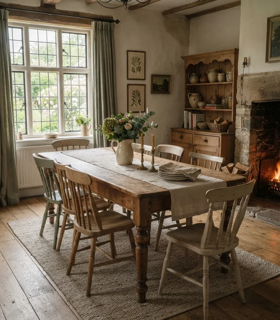
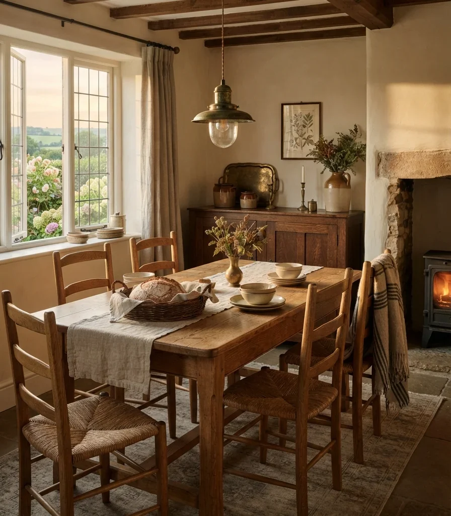
1. Ground the Room With a Weathered Oak Farmhouse Table

1. Ground the Room With a Weathered Oak Farmhouse Table

Vibe: Grounded. The table gives the room the reassuring weight of furniture meant to be used for decades.

Why it works: A substantial oak table establishes visual hierarchy immediately, while its imperfect surface prevents the dining room from feeling overly formal. The combination of weathered timber and upholstered or rush-seat chairs creates material contrast without introducing unnecessary decoration.

How to get it: Choose a solid-oak table with a matte or lightly waxed finish rather than glossy polyurethane. Leave approximately 90 cm of circulation behind occupied chairs so the table feels generous without obstructing movement.

💡 Quick Win: Rub a small amount of clear furniture wax into an unfinished-looking oak tabletop to deepen the grain without creating a shiny surface.

Shop The Look

Product
Weathered solid oak farmhouse dining table
English ladder-back rush seat dining chair
Natural linen table runner oatmeal
Antique-style brass candlestick pair
Stoneware farmhouse serving platter

2. Layer Mushroom and Sage for a Quiet Country Palette

2. Layer Mushroom and Sage for a Quiet Country Palette

Vibe: Hushed. The restrained colors make the room feel settled rather than decorated.

Why it works: Mushroom and sage sit close enough in value to create continuity, while the warm ivory ceiling prevents the darker colors from visually lowering the room. The muted green also connects the dining room to the garden outside, an important characteristic of country-house interiors.

How to get it: Use mushroom taupe on the walls and reserve sage for upholstery, ceramics, or a painted sideboard. Avoid pairing these shades with stark brilliant white, which can make the palette look contemporary rather than timeworn.

Shop The Look

Product
Mushroom taupe washable interior paint
Sage green upholstered dining chair
Antique oak sideboard with drawers
Botanical fern wall art framed
Sage green ceramic table vase

3. Hang a Traditional Brass Chandelier Over the Table

3. Hang a Traditional Brass Chandelier Over the Table

Vibe: Luminous warm light makes the dining room feel intimate as evening arrives.

Why it works: A chandelier creates a strong vertical focal point while visually connecting the ceiling to the dining table. Aged brass is softer than polished chrome and works naturally with oak, linen, ceramics, and traditional architecture.

How to get it: Hang the lowest part of the chandelier roughly 75–90 cm above the tabletop. Choose a dimmable 2700K bulb so the fixture can shift from practical dinner lighting to a softer evening glow.

💡 Quick Win: Replace cool-white bulbs in an existing chandelier with 2700K dimmable bulbs before changing the fixture itself.

Shop The Look

Product
Six-arm aged brass dining chandelier
2700K dimmable warm LED candle bulbs
Brass chandelier chain extension
Antique brass ceiling medallion
Traditional brass dimmer switch

4. Bring in the Texture of Natural Linen

4. Bring in the Texture of Natural Linen

Vibe: Sun-warmed linen softens the hard edges of timber and makes daylight feel gentler.

Why it works: Natural linen introduces irregular texture and relaxed movement, qualities that balance the solidity of oak furniture. Its slightly uneven weave also feels more authentic to an English country house than crisp synthetic curtains.

How to get it: Choose linen curtains in natural flax or warm ivory and hang the rod close to the ceiling. Let the panels just kiss the floor rather than stopping at the windowsill

Shop The Look

Product
Natural flax linen curtain panels
Unbleached linen tablecloth
Stonewashed linen napkin set
Natural linen chair cushion ties
Embroidered linen dining runner

5. Use Faded Blue as a Traditional Accent

5. Use Faded Blue as a Traditional Accent

Vibe: Nostalgic faded blue brings the gentle memory of old painted country furniture into the room.

Why it works: Desaturated blue works especially well against warm timber because its coolness creates controlled contrast. The key is choosing a greyed, chalky blue rather than a bright royal or coastal blue.

How to get it: Use faded blue on one secondary element such as a dresser or lower cabinet, then repeat it in three smaller accessories. This keeps the color intentional rather than scattered.

Shop The Look

Product
Faded blue painted wooden sideboard
Blue-and-white botanical dinnerware
Antique-style blue ceramic pitcher
Powder blue linen napkins
Blue floral framed country print

6. Mix Oak, Wicker, and Aged Brass

6. Mix Oak, Wicker, and Aged Brass

Vibe: Layered, different natural textures make the room feel collected rather than coordinated.

Why it works: Material contrast is more important here than color contrast. Smooth oak, fibrous rush, cool ceramic, and softly reflective brass each catch light differently, creating visual depth without relying on busy patterns.

How to get it: Limit the room to three dominant natural materials- oak, woven fiber, and aged metal- and allow smaller accessories to repeat those materials.

💡 Quick Win: Add one vintage-style woven market basket beside the sideboard; it introduces the right texture without committing to new furniture.

Shop The Look

Product
Honey oak trestle dining table
Woven rush-seat country dining chair
Aged brass linear pendant
Natural seagrass market basket
Antique brass serving tray

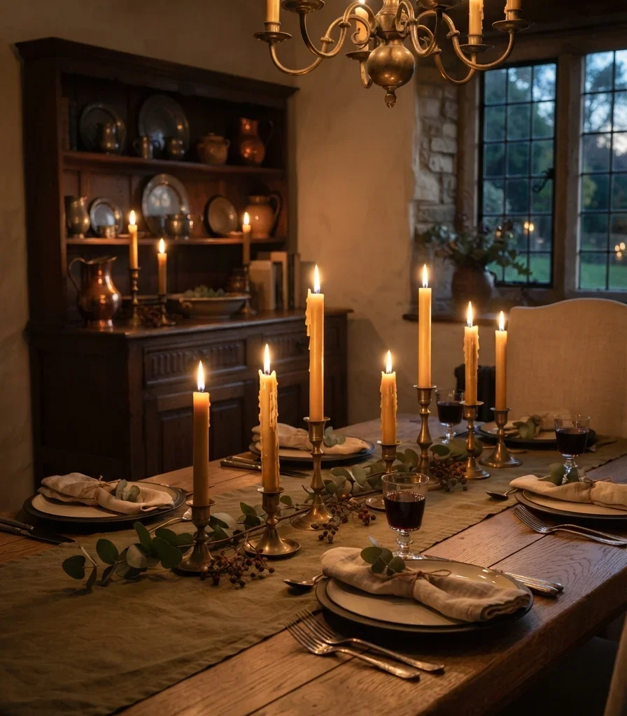
7. Create a Candlelit Dining Atmosphere

7. Create a Candlelit Dining Atmosphere

Vibe: Glowing candlelight gives old timber and aged metal a softness that overhead lighting cannot reproduce.

Why it works: Low-level light creates a more intimate visual field and draws attention toward the dining table, where conversation and food actually happen. Brass candlesticks reinforce the warm reflection without requiring additional color.

How to get it: Place three or five candleholders along the table rather than lining them up symmetrically. Use unscented beeswax tapers so food aromas remain the focus.

Shop The Look

Product
Beeswax taper candle set
Antique brass candlestick trio
Glass hurricane candle holder
Traditional brass taper snuffer
Linen candle table runner

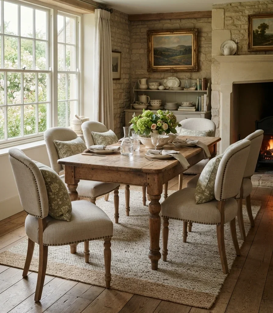
8. Choose Upholstered Chairs With Traditional Profiles

8. Choose Upholstered Chairs With Traditional Profiles

Vibe: Comfortable. The chairs suggest that dinner is meant to last rather than be hurried.

Why it works: Upholstered backs introduce softness against a hard wooden table, while traditional curved profiles reference English dining furniture without requiring elaborate carving. The chairs also make the room more practical for long meals.

How to get it: Look for oatmeal or mushroom linen upholstery and wooden legs in a tone close to the dining table. Avoid ultra-sleek metal legs, which introduce a competing modern visual language.

Shop The Look

Product
Oatmeal linen upholstered dining chair
Turned-leg English dining chair
Mushroom linen seat cushion
Floral lumbar dining cushion
Oak furniture touch-up wax

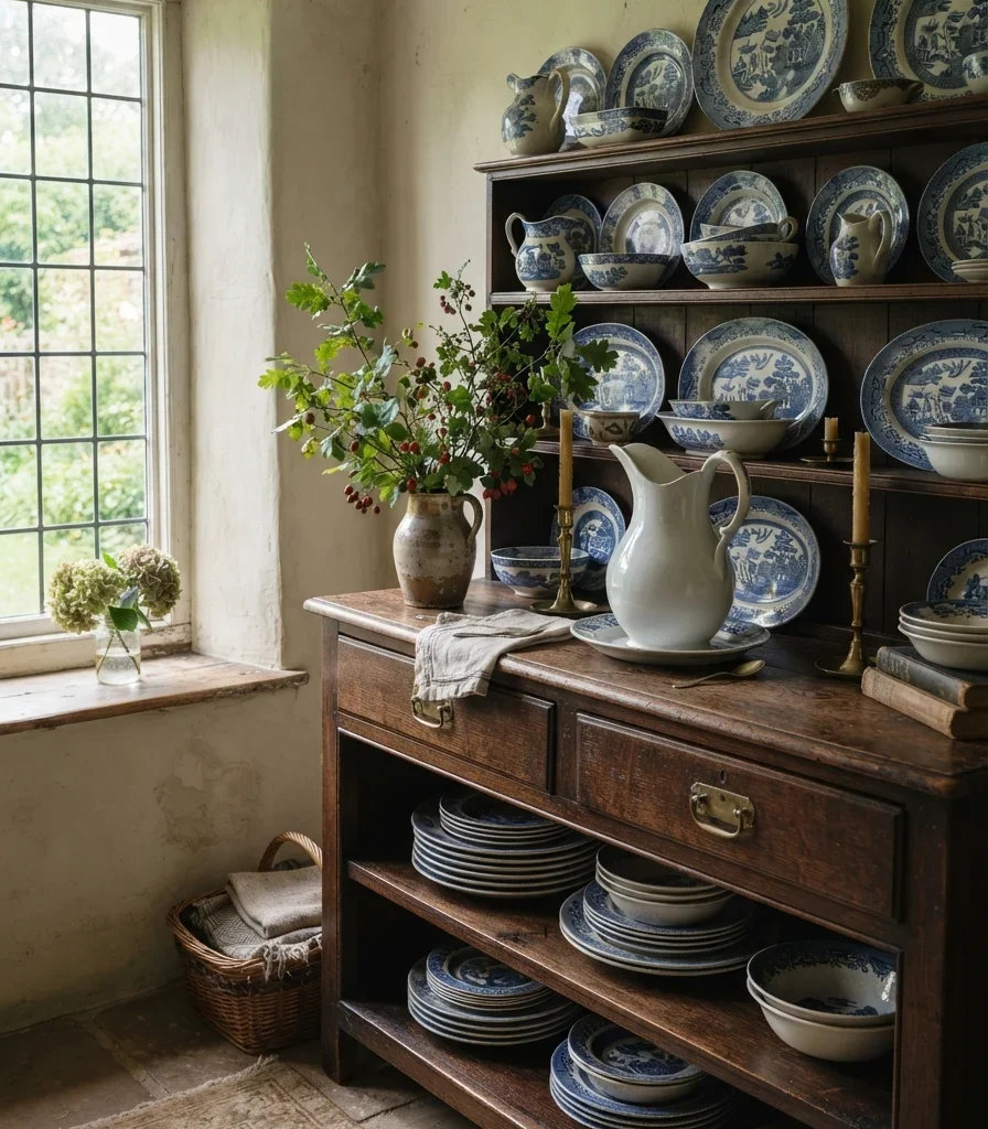
9. Display Blue-and-White Ceramics on a Dresser

9. Display Blue-and-White Ceramics on a Dresser

Vibe: Collected; the display feels accumulated over years rather than bought in a single afternoon.

Why it works: Repeating blue-and-white ceramics creates cohesion while allowing different shapes and patterns to provide variation. A dark wooden dresser gives the collection enough visual weight to prevent delicate ceramics from looking scattered.

How to get it: Group ceramics in odd-numbered clusters and vary height: one tall pitcher, two medium vessels, and several lower plates or bowls create a more natural hierarchy.

💡 Quick Win: Start with three blue-and-white transferware pieces from a thrift shop or vintage market instead of buying an entire matching collection.

Shop The Look

Product
Blue-and-white transferware dinner plate set
Traditional porcelain pitcher
Blue floral ceramic serving bowl
Dark oak display dresser
Brass plate display stand set

10. Use an Antique-Style Sideboard to Balance the Table

10. Use an Antique-Style Sideboard to Balance the Table

Vibe: Anchored. The sideboard gives the room a strong architectural counterweight.

Why it works: A long, low sideboard balances the horizontal dining table while adding essential storage. Darker timber can also create depth when the main table and walls are lighter.

How to get it: Select a sideboard roughly two-thirds the length of the dining table. That proportion creates a visual relationship without making the storage piece compete with the table.

Shop The Look

Product
Dark oak English-style sideboard
Aged brass cabinet pull set
Antique-style ceramic table lamp
Small framed landscape oil print
Woven storage basket with handles

11. Frame the Windows With Full-Length Country Curtains

11. Frame the Windows With Full-Length Country Curtains

Vibe: Airy. The curtains turn ordinary daylight into a softer architectural feature.

Why it works: Full-length fabric emphasizes vertical height and makes windows appear more substantial. A small-scale botanical print adds country character without visually overwhelming the dining table.

How to get it: Mount the curtain rod 10–15 cm above the window frame and extend it beyond both sides so the fabric can stack away from the glass when open.

Shop The Look

Product
Small floral linen curtain panels
Aged brass curtain rod
Brass curtain rings with clips
Floral linen tieback pair
Window privacy sheer linen panel

12. Make a Gallery Wall From Botanical and Landscape Prints

12. Make a Gallery Wall From Botanical and Landscape Prints

Vibe: Thoughtful; the wall feels like a personal collection rather than a decorative backdrop.

Why it works: A varied gallery wall adds vertical visual weight and gives a plain dining wall the layered character associated with older country houses. Keeping the frames within a narrow family of antique wood and muted brass prevents the arrangement from becoming chaotic.

How to get it: Begin with the largest landscape print at eye level, then build outward using smaller botanical studies. Keep approximately 5–8 cm between frames for a cohesive salon arrangement.

Shop The Look

Product
Vintage botanical print set
Antique brass picture frames
Dark oak landscape frame
Picture hanging wire and hooks
Aged paper countryside art prints

13. Introduce Pattern With a Muted Floral Tablecloth

13. Introduce Pattern With a Muted Floral Tablecloth

Vibe: Layered; the floral pattern gives the table the softness of an old country-house textile.

Why it works: A small-scale floral print introduces pattern without dominating the room. The muted background allows the oak table and ceramic pieces to remain visible through the fabric, preserving the sense of material depth.

How to get it: Choose a floral print containing no more than four muted colors and repeat one of those colors in the napkins or ceramics.

Shop The Look

Product
Muted English floral cotton tablecloth
Sage floral linen napkin set
Cream stoneware dinner plate set
Small brass taper candleholders
Vintage-style floral serving tray

14. Let the Floor Become Part of the Design

14. Let the Floor Become Part of the Design

Vibe: Rooted; the floor makes the entire room feel connected to the history of the house.

Why it works: Wide timber boards introduce horizontal continuity and natural variation beneath the furniture. A faded wool rug adds softness and protects the floor while creating a subtle visual zone around the dining table.

How to get it: If replacing flooring is not realistic, use a large distressed-look wool rug with enough visible timber around its edges to preserve the room’s natural foundation.

💡 Quick Win: A secondhand Persian-style runner can create instant patina for considerably less than replacing a perfectly serviceable floor.

Shop The Look

Product
Wide-plank natural oak flooring
Faded Persian-style wool dining rug
Non-slip rug pad natural felt
Vintage-style woven floor basket
Oak floor maintenance wax

15. Center the Room Around the Dining Ritual

15. Center the Room Around the Dining Ritual

Vibe: Welcoming; the room feels organized around people rather than objects.

Why it works: The strongest dining rooms prioritize their actual function: comfortable seating, clear circulation, accessible serving storage, and flattering light. This functional hierarchy prevents the country aesthetic from becoming a collection of decorative props.

How to get it: Center the chandelier and table first, then allow at least 90 cm behind frequently used chairs. Position the sideboard within easy reach of the table without narrowing the primary walking route.

Shop The Look

Product
Extendable solid oak dining table
Upholstered English country dining chair
Large traditional dining chandelier
Solid wood serving trolley
Oak serving board with handle

16. Use a Small Round Table in a Compact Dining Room

16. Use a Small Round Table in a Compact Dining Room

Vibe: Intimate. The compact footprint makes conversation feel naturally close.

Why it works: A round pedestal table eliminates sharp corners and allows chairs to move around the perimeter more freely. It is particularly effective in narrow dining rooms where a rectangular table can create awkward circulation.

How to get it: For four people, look for a round table around 110–120 cm wide and pair it with armless chairs that can tuck completely underneath.

Shop The Look

Product
Round oak pedestal dining table 120cm
Compact spindle-back wooden chairs
Slim antique oak console table
Small woven storage basket
Petite brass wall sconce

17. Add a Painted Welsh-Style Dresser

17. Add a Painted Welsh-Style Dresser

Vibe: Domestic. The dresser makes useful objects part of the room’s decoration.

Why it works: A traditional dresser provides vertical storage while creating a strong focal point that a low sideboard cannot offer. Painted timber also breaks up an all-wood furniture scheme and gives the room an unmistakably country-house character.

How to get it: Paint the dresser in a muted olive or heritage green with a low-sheen finish, then leave some natural wood visible on the countertop if the piece allows.

💡 Quick Win: A freestanding secondhand wooden dresser can be transformed with chalky mineral paint and aged-brass replacement pulls.

Shop The Look

Product
Olive green Welsh-style dresser
Aged brass cup pull hardware
Cream stoneware dinner plate set
Handmade ceramic pitcher collection
Wooden plate display rack

18. Pair Floral Wallpaper With Simple Furniture

18. Pair Floral Wallpaper With Simple Furniture

Vibe: Romantic. The wallpaper gives the walls the quiet pattern of an English garden.

Why it works: Small-scale botanical wallpaper works because its visual complexity is balanced by simple furniture silhouettes. If both wallpaper and furniture are highly ornate, the dining room can quickly feel visually heavy.

How to get it: Choose wallpaper where the background is close to the wall’s existing undertone and keep large furniture pieces relatively plain. Repeat one flower color through the table linen or ceramics.

Shop The Look

Product
Muted English floral peel-and-stick wallpaper
Dark walnut dining table
Cream linen dining chair
Antique brass wall sconce pair
Botanical ceramic centerpiece bowl

19. Create a Flexible Dining Nook With a Built-In Bench

19. Create a Flexible Dining Nook With a Built-In Bench

Vibe: Sun-warmed; the nook feels like a little country-house corner designed for lingering breakfasts.

Why it works: Bench seating uses wall space efficiently and eliminates the chair clearance required along one side of the table. The upholstered cushion also introduces a large area of pattern and softness without taking up additional floor area.

How to get it: Use a 45–50 cm deep bench with a tailored linen cushion and pair it with a round pedestal table. Keep the wall shelf shallow, around 15–20 cm, to preserve headroom and circulation.

Shop The Look

Product
English cottage-style bench cushion
Floral linen bench cushion cover
Round pedestal oak dining table
Slim spindle-back dining chair
Narrow reclaimed wood picture shelf

20. Finish With an English Country Tablescape

20. Finish With an English Country Tablescape

Vibe: Hushed; the table feels ready for a long conversation rather than a staged photograph.

Why it works: An English country tablescape succeeds through relaxed layering rather than formal symmetry. Natural linen, slightly mismatched ceramics, low flowers, aged metal, and candlelight combine different textures while keeping the palette restrained.

How to get it: Keep the centerpiece below approximately 30 cm so diners can see across the table. Mix two or three ceramic patterns within the same muted color family rather than using a completely matching dinner set.

💡 Quick Win: Put three small garden clippings into a single vintage ceramic jug instead of buying a large formal bouquet; the asymmetry feels much more natural to the style.

Shop The Look

Product
Natural linen dinner napkin set
Vintage-style mismatched ceramic plate set
Antique silver-style flatware set
Small ceramic country pitcher
Beeswax taper candle collection

How to Start Your English Countryside Dining Room Transformation

The first move should be the dining table: choose a solid oak or oak-look farmhouse table in a medium honey-brown finish. It establishes the room’s scale, warmth, and material direction, making it much easier to select chairs, lighting, rugs, and accessories without creating a disconnected collection of pieces.

The most common mistake is making everything artificially distressed. Excessively chipped paint, fake wormholes, heavily antiqued furniture, and matching “vintage” accessories can make the room look themed rather than genuinely lived-in. Choose one or two authentically aged pieces and let the rest be simple, well-made furniture.

For an inexpensive entry point, start with a natural linen table runner under $30, a small aged-brass candlestick set under $25, and a blue-and-white ceramic pitcher under $40. Those three additions can immediately shift an ordinary dining table toward English country character without replacing furniture.

A focused weekend refresh can realistically cost $150–$500, depending on what you already own. A more substantial room with a quality oak table, chairs, lighting, rug, curtains, and storage can run $2,000–$6,000+. Architectural changes, antique sourcing, flooring, and custom cabinetry may take several months, but the atmosphere can begin changing in a single weekend.

Frequently Asked Questions About The Timeless Elegance of an English Countryside Dining Room

What is the difference between English countryside and modern farmhouse dining rooms?

English countryside dining rooms emphasize accumulated history, traditional furniture profiles, muted botanical colors, antiques, and natural patina. Modern farmhouse tends to use cleaner silhouettes, brighter whites, shiplap, industrial hardware, and more deliberately coordinated furniture. An English country room can include a farmhouse table, but it should usually be softened with linen, aged brass, traditional ceramics, or vintage pieces.

Which colors work best in an English countryside dining room?

The strongest palette starts with warm ivory, mushroom taupe, muted sage, olive green, faded blue, dusty rose, and honey oak. For a darker dining room, forest green or deep olive can create a more traditional country-house atmosphere. Avoid extremely cool whites and highly saturated accent colors because they tend to fight the aged materials that give the style its character.

How much does it cost to create an English countryside dining room?

A small styling update can cost around $150–$500 if you already have a suitable table and chairs. A complete mid-range transformation with dining furniture, curtains, lighting, rug, storage, and accessories can reasonably reach $2,000–$6,000 or more. Antique furniture can either increase or reduce the budget depending on where you source it, which is why estate sales and secondhand markets are worth exploring.

Can an English countryside dining room work in a modern house?

Yes, and the contrast can actually make the style more interesting. Keep modern architecture such as large windows or clean flooring, then introduce traditional oak furniture, linen curtains, aged brass lighting, botanical artwork, and antique ceramics. The key is allowing the country pieces to be substantial enough to visually balance the cleaner architecture rather than filling the room with small decorative objects.

What is the best lighting for an English countryside dining room?

A dimmable aged-brass chandelier or traditional pendant is usually the strongest central fixture, ideally paired with 2700K warm bulbs. Wall sconces or table lamps can provide lower secondary light, while beeswax candles add the softest evening layer. For a dining table, hanging the chandelier roughly 75–90 cm above the tabletop generally provides an intimate light level while maintaining comfortable sightlines.

Ready to Create Your Dream English Countryside Dining Room?

These 20 English countryside dining room ideas cover the details that make the style convincing, from oak furniture and muted color palettes to linen, candlelight, floral patterns, traditional storage, and practical layouts. The transformation does not need to happen all at once; starting with one honest material and one well-chosen vintage piece is often the most convincing approach. Today, try replacing your existing table centerpiece with a simple ceramic pitcher filled with three or four garden branches and add a pair of aged-brass candlesticks beside it. Over time, the room should begin to feel quieter, warmer, and more rooted- the kind of dining space where dinner naturally stretches into conversation. Save or pin your favorite ideas, especially the oak table, botanical ceramics, linen curtains, and candlelit tablescape, and use them as your English country-house design roadmap.

You Might Also Like

11 Home Bedroom Refresh Ideas That Make Your Space Feel New Again

11 Home Bedroom Refresh Ideas That Make Your Space Feel New Again

A home bedroom refresh is a focused update that improves a bedroom’s color, lighting, textiles, furniture arrangement, and decorative details without requiring a complete renovation. These 11 home bedroom refresh ideas show you how to make a tired bedroom feel more comfortable, cohesive, functional, and visually finished through manageable changes.

A refreshed bedroom should feel easier to enter at the end of the day: softer light across the walls, clean bedding beneath your hands, a calmer bedside surface, and enough visual breathing room to let your mind slow down. You do not need to replace every piece of furniture to create that feeling. Small changes in proportion, texture, color, and lighting can alter how the entire room is experienced. The best bedroom updates also improve everyday routines, from reaching for a book at night to finding clothes in the morning without fighting through clutter. Think of the process as editing rather than rebuilding. Here are 11 ideas worth saving and stealing.

Why Home Bedroom Refresh Works So Well

A bedroom refresh works because it sits between ordinary decorating and a full renovation. Instead of changing the architecture, you improve the visual hierarchy of the existing room: the bed becomes the anchor, lighting establishes atmosphere, textiles add softness, and secondary furniture supports how the space is actually used. Contemporary bedroom design also borrows from hospitality, Scandinavian interiors, quiet luxury, and residential minimalism, where comfort and restraint matter as much as appearance.

The most effective materials are tactile rather than merely decorative. Washed linen, cotton percale, unfinished or medium-toned oak, walnut veneer, wool, jute, ceramic, aged brass, and matte black metal all introduce useful variation. A practical palette might combine warm ivory with mushroom taupe, dusty sage, muted clay, soft charcoal, or walnut brown. These tones are easier to layer than a collection of unrelated accent colors.

Bedroom refreshes remain especially relevant because people increasingly expect their homes to support rest, work, storage, and personal rituals. The bedroom has become more than a place to sleep, which makes lighting, organization, comfortable seating, charging access, and flexible furniture important design considerations. A good refresh therefore improves both the photograph and the lived experience of the room.

Small bedrooms can absolutely benefit from the same approach, but scale becomes critical. Prioritize one strong focal point, furniture with useful storage, wall-mounted lighting, and textiles that create softness without consuming floor area. Avoid filling every empty corner simply because it is available; negative space is one of the cheapest ways to make a compact bedroom feel more generous.

Style at a Glance

ElementHome Bedroom Refresh
PhilosophyEdit, layer, and improve function
Key MaterialsLinen, cotton, oak, walnut, wool, ceramic, brass
Key ColorsWarm ivory, mushroom taupe, dusty sage, muted clay

1. Start With a Layered Neutral Bedding Reset

1. Start With a Layered Neutral Bedding Reset

Vibe: Hushed. The bed immediately becomes softer, calmer, and more inviting.

Why it works: Textile hierarchy gives the eye a clear visual order instead of making the bed look like a pile of unrelated cushions and blankets. Combining washed linen, cotton percale, and a lightweight quilt creates contrast through texture while keeping the colors within one tonal family. The neutral layering also makes existing furniture easier to keep, because the bed becomes the refreshed focal point without demanding a new frame or headboard.

How to get it: Begin with one warm ivory duvet cover, add a mushroom or oatmeal quilt folded across the lower third, and finish with two larger pillows behind your regular sleeping pillows. Keep decorative cushions to one or two so the bed remains practical rather than staged.

💡 Quick Win: Replace only the duvet cover and add one textured throw before buying anything else; this can change the room within an afternoon.

Shop The Look

ProductSearch on Amazon
Linen duvet coverWarm ivory washed linen duvet cover queen
QuiltOatmeal lightweight cotton quilt queen
Euro shamsMushroom taupe euro pillow covers set
ThrowChunky neutral knit throw blanket
Pillow coversTextured boucle lumbar pillow cover

2. Paint the Headboard Wall a Softer Accent Color

2. Paint the Headboard Wall a Softer Accent Color

Vibe: Grounded; the room feels visually anchored without becoming dark.

Why it works: A single accent wall creates contrast and establishes a focal plane behind the bed, which is especially useful when the existing headboard is visually plain. Dusty sage, muted clay, mushroom taupe, and soft blue-gray are safer choices than highly saturated colors because they introduce depth without competing with bedding. A matte finish also reduces glare and gives the wall a more substantial appearance.

How to get it: Choose the wall behind the bed and paint it in a muted, low-saturation shade such as dusty sage. Keep the remaining walls warm white or very pale greige so the accent wall reads as intentional rather than making the whole room feel smaller.

Shop The Look

ProductSearch on Amazon
Wall paintDusty sage green interior matte wall paint
Paint roller9-inch microfiber smooth wall paint roller
Cutting brush2 inch angled paint brush
Drop clothReusable cotton canvas painting drop cloth
Painter’s tapeLow-tack clean-edge painter’s tape

3. Replace Hard-Edged Curtains With Soft Linen Panels

3. Replace Hard-Edged Curtains With Soft Linen Panels

Vibe: Airy daylight becomes softer, and the room feels less visually rigid.

Why it works: Full-height curtains create vertical emphasis, making the window wall feel taller while softening hard architectural edges. Linen is particularly effective because its irregular weave catches daylight without looking glossy or overly formal. The key principle is fullness: skimpy curtain panels expose too much glass and produce a temporary-looking finish, while generous fabric creates controlled folds.

How to get it: Mount the curtain rod or track close to the ceiling and extend it beyond both sides of the window frame. Choose panels with approximately 1.5–2 times the window width in total fabric so they retain fullness even when closed.

💡 Quick Win: If your existing curtains are usable, simply raise the rod closer to the ceiling and add wider panels rather than replacing the entire window treatment.

Shop The Look

ProductSearch on Amazon
CurtainsNatural flax linen curtain panels 96 inch
Curtain rodMatte black or antique brass extra long curtain rod
RingsWooden curtain rings with clips
SheersWarm white sheer linen-look curtain panels
TiebacksNatural cotton rope curtain tiebacks

4. Add Warm Bedside Lighting at the Correct Height

4. Add Warm Bedside Lighting at the Correct Height

Vibe: Luminous; the room shifts from functional brightness to deliberate evening atmosphere.

Why it works: Layered bedroom lighting works because different sources illuminate different visual planes. A bedside sconce supplies task light for reading while eliminating the footprint of a table lamp, which is valuable when nightstands are narrow. Warm 2700K bulbs create a softer evening environment than cool daylight bulbs, while adjustable arms direct light toward the book rather than directly into the sleeper’s eyes.

How to get it: Mount each sconce so its switch is reachable from bed and position the reading head approximately 45–60 cm above the top of the mattress, adjusting for your seated reading position. Choose dimmable fixtures whenever the wiring and switch arrangement allow it.

Shop The Look

ProductSearch on Amazon
Wall sconcesAdjustable arm bedroom wall sconces brushed brass
Bulbs2700K dimmable warm white LED bulbs
Plug-in kitPlug-in wall sconce cord cover kit
Cord coverPaintable adhesive cable raceway
DimmerPlug-in lamp dimmer compatible with LED

5. Introduce One Substantial Wood Piece

5. Introduce One Substantial Wood Piece

Vibe: Anchored. One substantial natural material gives the room visual weight.

Why it works: Bedrooms can look unfinished when every major surface is lightweight, glossy, or visually similar. A solid-looking oak dresser introduces visual weight and natural grain, creating contrast against softer bedding and painted walls. Proportion matters more than quantity: one substantial timber piece usually contributes more character than several small decorative wooden accessories.

How to get it: Select one dresser, chest, or substantial bedside cabinet in oak or walnut and make it the room’s primary furniture investment. Keep its styling deliberately sparse, leaving roughly one-third of the top surface visually empty so the wood remains part of the composition.

💡 Quick Win: If replacing furniture is not practical, add a solid oak tray or wooden bedside stool to introduce natural grain at a much smaller cost.

Shop The Look

ProductSearch on Amazon
DresserNatural oak 6 drawer bedroom dresser
Bedside chestOak wood two drawer nightstand
TraySolid oak rectangular decorative tray
StoolNatural wood bedroom accent stool
Drawer organizersBamboo adjustable drawer organizer set

6. Build a Bedside Surface That Actually Works

6. Build a Bedside Surface That Actually Works

Vibe: Personal. The bedside becomes a small ritual station rather than a dumping ground.

Why it works: A functional bedside arrangement improves visual order because every object has a defined role. The combination of a lamp, tray, book, and one organic element creates asymmetrical balance without filling the entire surface. The shallow tray is particularly useful because it visually groups small objects and prevents chargers, jewelry, and everyday items from spreading across the nightstand.

How to get it: Clear the entire nightstand first, then return only four functional categories: light, reading, personal item, and catchall storage. Use a tray no wider than about two-thirds of the nightstand so there is still deliberate negative space around it.

Shop The Look

ProductSearch on Amazon
Table lampSmall ceramic bedside lamp linen shade
Catchall trayStoneware oval bedside catchall tray
Book standMinimal wooden adjustable book stand
Plant potSmall matte ceramic planter sage green
Charging stationCompact wooden bedside charging station

7. Rework the Furniture Layout Around the Bed

7. Rework the Furniture Layout Around the Bed

Vibe: Balanced; the bedroom feels calmer because movement through it becomes obvious.

Why it works: Furniture arrangement determines how spacious a bedroom feels even when the square footage does not change. Centering the bed where possible establishes symmetry and gives the sleeping zone visual authority, while clear circulation reduces the feeling of congestion. Ideally, maintain roughly 60–75 cm of comfortable walking space beside the bed where the room allows it.

How to get it: Remove small movable furniture and temporarily center the bed on the strongest wall before returning anything else. Walk through the room from the door to the bed and from the bed to the closet; anything that interrupts those primary paths should be moved or removed.

💡 Quick Win: Before buying furniture, use painter’s tape on the floor to mark the footprint of a proposed bed, dresser, or chair and test the circulation for a full day.

Shop The Look

ProductSearch on Amazon
Bed benchUpholstered bedroom bench 48 inch neutral
Area rug8×10 low pile neutral bedroom rug
Floor lampSlim arc floor lamp warm white shade
Furniture slidersHeavy-duty reusable furniture moving sliders
Measuring tape25-foot retractable measuring tape

8. Add a Textured Throw at the Foot of the Bed

8. Add a Textured Throw at the Foot of the Bed

Vibe: Tactile; the room becomes inviting through visible and implied softness.

Why it works: Texture layering adds depth without requiring additional color. A chunky cotton, wool, or boucle throw contrasts with the flatter surface of a duvet and the fine weave of linen, creating a material hierarchy that the eye can read immediately. Placing the throw across the lower third also creates horizontal balance and visually finishes the bed without covering its entire surface.

How to get it: Choose a throw that differs from the duvet in both texture and scale, then place it loosely across the lower quarter to third of the bed rather than folding it into a rigid rectangle. Keep the color within two shades of the bedding for a restrained result.

Shop The Look

ProductSearch on Amazon
Throw blanketOatmeal chunky cotton knit throw
Boucle throwCream boucle textured throw blanket
Bed scarfTaupe woven bed runner
Bench cushionNeutral boucle bench cushion
Wool rugSmall natural wool bedside rug

9. Use a Large Mirror to Multiply Daylight

9. Use a Large Mirror to Multiply Daylight

Vibe: Open reflected daylight gives the room more visual breathing room.

Why it works: A mirror can visually extend a bedroom by reflecting existing light and creating another apparent plane. The placement matters more than the mirror itself: positioning it where it catches a window or bright wall is considerably more effective than placing it against a dark corner. A tall vertical shape also emphasizes ceiling height and can make compact rooms feel less compressed.

How to get it: Position a large mirror perpendicular or diagonally opposite the brightest window rather than directly facing the bed. Choose a frame that echoes an existing material, such as pale oak, walnut, or matte black, so the mirror feels integrated rather than randomly introduced.

💡 Quick Win: Move an existing full-length mirror before purchasing a new one and test three positions during daylight; the brightest reflection is usually the strongest placement.

Shop The Look

ProductSearch on Amazon
Floor mirrorFull length arched wood frame bedroom mirror
Wall mirrorLarge rounded rectangle bedroom wall mirror
Mirror hooksHeavy duty D-ring mirror hanging hardware
Anti-tip kitFurniture and mirror anti-tip wall anchor
Felt padsSelf-adhesive felt furniture floor protectors

10. Create a Calm Gallery Above the Dresser

10. Create a Calm Gallery Above the Dresser

Vibe: Considered; the wall feels intentionally composed rather than merely decorated.

Why it works: A small coordinated gallery gives a bedroom personality while maintaining visual control. Repetition creates cohesion: using the same frame finish or a consistent color family makes three different artworks read as one collection. The arrangement should also relate to the furniture below; a grouping that is too narrow can make a dresser look oversized, while a grouping around two-thirds of the furniture width usually feels more proportionate.

How to get it: Choose three prints that share one visual thread, such as botanical forms or muted landscapes, and arrange them with consistent 5–8 cm spacing. Center the entire grouping over the dresser rather than centering each artwork individually.

Shop The Look

ProductSearch on Amazon
Botanical printsNeutral botanical wall art set of 3
FramesWalnut wood picture frames 8×10 set
Mat boardsOff-white archival picture mat 8×10
Hanging levelMagnetic picture hanging alignment tool
Dresser trayDark walnut decorative dresser tray

11. Turn an Awkward Corner Into a Mini Reading Zone

11. Turn an Awkward Corner Into a Mini Reading Zone

Vibe: Hushed; an unused corner becomes a reason to slow down.

Why it works: Giving an awkward corner a defined purpose makes the whole bedroom feel more intentional. The important principle is scale: a slim chair and small round table provide function without creating a second heavy furniture cluster. A dedicated reading light also prevents the corner from becoming purely decorative; the space earns its footprint through actual use.

How to get it: Choose the smallest chair that still supports your back comfortably, then pair it with a table no wider than about 40–45 cm. Place the lamp slightly behind and to the reading side of the chair so the light falls onto the pages rather than directly into your eyes.

💡 Quick Win: You can create the zone for under $50 initially with a small side table, secondhand chair cushion, warm LED bulb, and one basket for books or blankets.

Shop The Look

ProductSearch on Amazon
Accent chairCompact oatmeal boucle bedroom reading chair
Side tableSmall round natural oak side table
Reading lampAdjustable warm light floor reading lamp
Book basketWoven seagrass floor basket for books
ThrowSage green wool blend reading chair throw

How to Start Your Home Bedroom Refresh

The single best first move is to reset the bed, because it is normally the largest visual object in the room and determines the color and texture direction for everything around it. Start with a warm ivory duvet cover and one muted secondary tone such as mushroom taupe or dusty sage; that foundation makes later decisions about curtains, rugs, art, and accessories much easier.

The most common mistake is changing too many small accessories before fixing scale and visual hierarchy. Ten new decorative objects cannot compensate for a bed that is badly positioned, curtains mounted too low, or lighting that is harsh and overhead-only. Fix the largest visual problems first, then add smaller details.

For an inexpensive entry point, buy three specific pieces: a warm ivory textured pillow cover, a small ceramic bedside lamp, and a woven cotton throw in oatmeal or muted sage, ideally keeping each under $50. Those three changes can introduce softness, warmth, and layered light without committing to new furniture.

A focused weekend can handle bedding, styling, curtains, artwork, and furniture rearrangement, while painting may take one to two days, i ncluding drying time. A starter refresh can realistically fall around $150–$500, while a fuller room update with new lighting, rug, curtains, storage, and one substantial furniture piece may reach $800–$2,500+, depending on room size and product quality.

Frequently Asked Questions About Home Bedroom Refresh

What is a home bedroom refresh and how is it different from redecorating?

A home bedroom refresh is a lighter intervention that improves an existing room without requiring a complete furniture replacement or renovation. It might involve new bedding, lighting, curtains, paint, artwork, and furniture placement while keeping the main bed and storage. Redecorating can be broader and may involve replacing multiple major pieces. A refresh is particularly useful when the room’s structure already works, but its atmosphere feels dated or unfinished.

What colors work best for a bedroom refresh?

Warm ivory, mushroom taupe, dusty sage, muted clay, soft blue-gray, and oatmeal are versatile choices because they create depth without overwhelming a sleeping space. If the room receives limited natural light, avoid using several dark colors simultaneously. A warm ivory base with one accent such as dusty sage is usually easier to balance than introducing three or four competing colors.

How much does a bedroom refresh usually cost?

A small DIY refresh can cost approximately $150–$500 if you concentrate on bedding, lighting, textiles, and artwork. A more comprehensive update with a rug, curtains, new lighting, paint, storage, and one substantial furniture piece can reach $800–$2,500 or more. The largest savings usually come from keeping the existing bed and major storage pieces while changing the surfaces around them.

Can I refresh a small bedroom without making it feel more crowded?

Yes, but every new item should justify its footprint. Use wall-mounted sconces, under-bed storage, tall curtains, a large mirror, and furniture with drawers instead of adding multiple freestanding decorative pieces. Keep at least one visible area of negative space around the bed so the room does not become visually compressed.

What is the most important element to update during a home bedroom refresh?

The bed is usually the strongest starting point because it occupies the most visual area and is the room’s primary functional feature. Start with layered bedding, then evaluate the headboard, bedside lighting, rug, and surrounding furniture. A correctly proportioned bed zone can make the rest of the room look more intentional even before additional accessories are added.

Ready to Create Your Refreshed Bedroom?

These 11 home bedroom refresh ideas cover the pieces that make the biggest difference: bedding, color, natural materials, lighting, layout, mirrors, artwork, and functional corners. A transformation does not need to happen all at once; starting with one high-impact change is often the smartest way to avoid buying pieces that later compete with each other. Today, strip the bed, clear both nightstands, and rebuild the bed with one warm ivory layer and one contrasting textured layer. As the room becomes calmer and more functional, it should feel less like a collection of furniture and more like a place designed specifically for rest and everyday comfort. Save or pin your favorite ideas now, especially the layered bedding, warm lighting, and small reading-corner concepts you can return to when your next bedroom update begins.

You Might Also Like

16 Ways to Master the Art of a French Country Bedroom

16 Ways to Master the Art of a French Country Bedroom

French country bedroom style blends the relaxed character of rural French homes with aged materials, graceful furniture, soft textiles, and an effortless sense of comfort. These 16 Master the Art of French Country Bedroom ideas show you how to create that atmosphere through color, linen, antique-inspired furniture, lighting, pattern, layout, and carefully chosen details.

Morning light should feel softened rather than harsh, filtering through linen curtains onto rumpled bedding and warm plaster-toned walls. At night, aged brass lamps and candlelike illumination replace bright overhead light, making the room feel slower and more intimate. The beauty of French country design comes from things that look collected rather than coordinated on a single shopping trip. Natural linen, weathered timber, faded florals, antique mirrors, and imperfect ceramics give the bedroom a sense of history without making it feel like a museum. Here are 16 ideas worth saving and stealing.

Why Master the Art of French Country Bedroom Works So Well

French country bedroom design comes from the domestic traditions of rural and provincial France, particularly regions such as Provence, Burgundy, Normandy, and the Dordogne. It sits between rustic farmhouse practicality and traditional French elegance, using the architectural vocabulary of old farmhouses, village homes, and country estates without requiring excessive ornament. Unlike contemporary farmhouse rooms, it relies less on manufactured rustic effects and more on genuine-looking patina, natural textiles, curved furniture, and relaxed symmetry.

Its core materials are linen, cotton, oak, walnut, painted timber, wrought iron, aged brass, terracotta, ceramic, and occasionally limestone. The most useful colors include warm ivory, aged plaster, flax, mushroom taupe, faded Provençal blue, dusty sage, lavender gray, muted terracotta, and soft butter yellow. Toile, ticking stripe, faded florals, quilted boutis, and embroidered linen provide pattern while keeping the palette restrained.

French country remains relevant because it answers the desire for homes that feel personal, comfortable, and less disposable. Its emphasis on natural fibers, antique furniture, repaired objects, handmade ceramics, and long-lasting materials also fits naturally with the move away from highly coordinated, short-lived interiors. The result feels collected over time rather than purchased as a matching bedroom set.

Small bedrooms can absolutely achieve the look, but scale matters. Choose one substantial vintage-inspired piece, use pale warm colors to reflect available daylight, hang curtains high, and keep bulky storage concentrated against one wall. A small room cannot comfortably imitate a large French farmhouse bedroom, so prioritize material authenticity and atmosphere rather than quantity.

Style at a Glance

ElementFrench Country Bedroom
PhilosophyRelaxed elegance, useful beauty, authentic patina
MaterialsLinen, oak, walnut, wrought iron, aged brass, ceramics
Color paletteWarm ivory, flax, faded blue, sage, lavender gray, terracotta

1. Anchor the Room With a Carved French-Style Bed

1. Anchor the Room With a Carved French-Style Bed

Vibe: Ancestral. The bed gives the room an immediate sense of history and permanence.

Why it works: The bed is the largest visual object, so its silhouette establishes the entire bedroom’s character. A gently curved headboard and carved timber introduce traditional French proportion without requiring heavy ornament, while distressed cream paint contrasts naturally with relaxed linen. The combination creates visual weight without making the room feel formal.

How to get it: Choose a bed with curved rails, turned details, or restrained carved panels rather than ornate baroque decoration. If the frame is too glossy, use a matte chalk-style finish in warm ivory and lightly expose the timber only at natural wear points.

💡 Quick Win: If replacing the bed is unrealistic, attach a vintage-style carved wood headboard to your existing frame and repaint it in aged ivory.

Shop The Look

ProductSearch on Amazon
French bedCarved French country wooden bed frame cream
Linen beddingNatural ivory washed linen duvet cover
Bedside tableFrench provincial two drawer nightstand
RugFaded floral vintage bedroom area rug
HeadboardAntique white carved wood headboard

2. Build a Warm Ivory and Faded Blue Palette

2. Build a Warm Ivory and Faded Blue Palette

Vibe: Airy muted blue and warm white make the room feel sun-washed rather than stark.

Why it works: French country palettes depend on desaturation, not bright color contrast. Faded blue works particularly well because its gray undertone prevents the room from becoming nautical or overly crisp, while warm ivory prevents the blue from feeling cold. Repeating the blue in only three or four locations creates cohesion without turning the bedroom into a themed space.

How to get it: Use warm ivory for the largest surfaces, faded blue for bedding or one upholstered piece, and natural flax for curtains. Keep decorative blue objects within the same muted value rather than mixing turquoise, navy, and cobalt.

Shop The Look

ProductSearch on Amazon
Blue duvetFaded French blue linen duvet cover
Pillow shamsBlue ticking stripe euro pillow covers
Ceramic vaseBlue and white French faience style vase
CurtainsNatural flax linen curtain panels
ThrowMuted indigo blue cotton woven throw

3. Layer Washed Linen With a Quilted Boutis

3. Layer Washed Linen With a Quilted Boutis

Vibe: Tactile; every layer invites touch and signals relaxed comfort.

Why it works: Texture layering is more authentic to French country bedrooms than piling on decorative cushions. A quilted boutis provides fine stitched texture against the irregular surface of washed linen, creating depth without requiring strong colors. The slight wrinkles are valuable because perfectly pressed textiles can make the room feel more contemporary and staged.

How to get it: Use three textile weights: lightweight linen sheets, medium-weight linen bedding, and a quilted cotton coverlet. Fold the boutis across the lower half of the bed rather than covering everything completely.

💡 Quick Win: Add one ivory quilted coverlet to existing neutral bedding before changing anything else; it delivers the strongest French-country textile cue for relatively little effort.

Shop The Look

ProductSearch on Amazon
Boutis quiltFrench country quilted boutis bedspread ivory
Linen sheetsNatural flax linen sheet set
PillowcaseWhite embroidered linen pillowcase
Lumbar pillowFaded blue floral lumbar pillow
Bed throwOatmeal linen cotton throw blanket

4. Hang a Wrought-Iron Chandelier

4. Hang a Wrought-Iron Chandelier

Vibe: Luminous, layered warm light gives the ceiling and furniture a softer evening character.

Why it works: Wrought iron introduces a dark structural note against pale plaster and textiles, creating contrast without the hardness of glossy black metal. A chandelier also brings decorative lighting to the center of the room, establishing a visual axis above the bed. Warm bulbs around 2200–2700K are preferable to cool white LEDs for an evening bedroom.

How to get it: Choose an open, lightweight iron fixture rather than an oversized ornate chandelier. Center it over the bed and hang it high enough to preserve comfortable head clearance, using a dimmable warm-white bulb.

Shop The Look

ProductSearch on Amazon
ChandelierFrench country wrought iron bedroom chandelier
Bulbs2200K dimmable warm white vintage LED bulbs
Ceiling medallionSmall antique white ceiling medallion
Wall switchVintage brass dimmer wall switch
Chain coverDecorative black chandelier chain sleeve

5. Give an Antique Armoire the Main Storage Role

5. Give an Antique Armoire the Main Storage Role

Vibe: Storied; the storage piece feels inherited rather than newly installed.

Why it works: A tall armoire creates vertical emphasis and gives the bedroom one dominant furniture statement. Traditional French wardrobes historically served as freestanding storage before modern built-in closets became standard, making the form both decorative and functional. Its substantial height also balances a low bed and prevents the room’s furniture from clustering entirely at mattress level.

How to get it: Look for solid oak or walnut, raised panels, curved cornice details, and aged brass or bronze hardware. In a smaller room, choose a narrow armoire around 90–120 cm wide rather than sacrificing circulation for a larger statement.

💡 Quick Win: Replace plain wardrobe knobs with aged bronze drop pulls; changing hardware can give ordinary storage a more provincial character in under an hour.

Shop The Look

ProductSearch on Amazon
ArmoireFrench provincial antique white wardrobe armoire
HardwareAged bronze drop pull cabinet handles
Storage basketNatural seagrass wardrobe storage basket
Drawer boxLinen fabric wardrobe organizer boxes
Door hookAntique brass over-door coat hook

6. Frame the Bed With Toile de Jouy

6. Frame the Bed With Toile de Jouy

Vibe: Pastoral. The room carries the quiet narrative quality of an old French countryside textile.

Why it works: Toile de Jouy provides pattern without requiring multiple colors because its traditional compositions use detailed pastoral imagery against a restrained ground. Its historical association with French textile production makes it more specific to French country design than generic floral fabric. The pattern is strongest when surrounding surfaces remain relatively quiet.

How to get it: Use toile on one dominant element- an upholstered headboard, bench, or pair of cushions- and keep nearby bedding mostly plain. Blue-on-cream is the easiest version to combine with warm ivory, oak, and faded blue accessories.

Shop The Look

ProductSearch on Amazon
Toile fabricBlue toile de Jouy cotton fabric by yard
BenchToile upholstered bedroom bench
Pillow coversBlue cream toile de Jouy pillow covers
Wall artFrench pastoral toile framed print
BolsterToile de Jouy bolster pillow

7. Create a Window-Side Reading Retreat

7. Create a Window-Side Reading Retreat

Vibe: Hushed; the corner creates a private place to pause without adding visual noise.

Why it works: Zoning turns unused bedroom floor area into purposeful space. A curved chair introduces the rounded furniture language associated with traditional French interiors, while a small table and task light prevent the corner from becoming decorative dead weight. Keeping the footprint compact protects the circulation around the bed.

How to get it: Leave at least 75 cm of clear walking space between the reading chair and the main furniture route. Pair a 40–50 cm side table with a slim floor lamp rather than adding a bulky cabinet.

Shop The Look

ProductSearch on Amazon
Accent chairFrench bergere style upholstered bedroom chair
Side tableSmall round walnut pedestal side table
Floor lampAntique brass adjustable reading floor lamp
BasketFrench market style woven storage basket
ThrowCream wool fringe throw blanket

8. Add a Faded Floral Rug Beneath the Bed

8. Add a Faded Floral Rug Beneath the Bed

Vibe: Sun-warmed; the floor gains the faded color variation of something collected over years.

Why it works: A large rug visually joins the bed, nightstands, and surrounding floor into one sleeping zone. Faded floral patterns work particularly well because they introduce color without the sharp contrast of new geometric designs. The worn appearance also reinforces French country’s preference for patina over showroom polish.

How to get it: For a queen bed, begin around 8×10 feet if the room permits, positioning the rug so it extends beyond the sides and lower portion of the bed. Choose low-pile construction for easier furniture placement and door clearance.

💡 Quick Win: If a large rug is outside your budget, use a smaller vintage-style runner on each side of the bed to introduce the same faded floral language.

Shop The Look

ProductSearch on Amazon
Area rug8×10 faded French floral vintage rug
Bedside runnerFaded floral washable bedside runner
Rug padNon-slip low-profile rug pad 8×10
Rug tapeDouble-sided rug corner grip tape
FootstoolVintage floral upholstered bedroom footstool

9. Style a Weathered Dresser With Ceramic Pieces

9. Style a Weathered Dresser With Ceramic Pieces

Vibe: Collected small objects feel inherited and useful rather than decorative filler.

Why it works: Styling a dresser with ceramics creates a layered still life while preserving useful surface space. Repeating ceramic forms in slightly different heights gives the eye a visual rhythm, and aged brass provides a warm metallic counterpoint to cool blue-and-white pottery. The weathered timber becomes part of the display rather than merely supporting it.

How to get it: Use one tall ceramic pitcher, one low bowl, and one small brass object arranged in a loose triangular composition. Leave at least one-third of the dresser top empty to preserve negative space.

Shop The Look

ProductSearch on Amazon
Ceramic pitcherCream French farmhouse ceramic pitcher
BowlBlue and white hand-painted ceramic bowl
CandlestickAntique brass taper candlestick pair
Botanical artVintage French botanical print
Linen runnerNatural flax linen dresser runner

10. Use Lavender and Dried Botanicals as Living Color

10. Use Lavender and Dried Botanicals as Living Color

Vibe: Fragrant; the room feels connected to a garden even when the windows are closed.

Why it works: Botanical accessories connect French country interiors to the agricultural landscape that inspired them. Lavender provides a muted purple-gray accent rather than a saturated floral color, while its vertical stems add height to low furniture. Dried botanicals also last considerably longer than fresh bouquets and do not introduce water near delicate wood surfaces.

How to get it: Place one substantial lavender bundle in a ceramic or stoneware pitcher rather than scattering small artificial flowers throughout the room. Add one olive branch or dried rosemary bundle only if the palette needs another organic shape.

💡 Quick Win: A $10–$20 dried lavender bundle in a secondhand ceramic jug can create an immediate French-country focal point.

Shop The Look

ProductSearch on Amazon
LavenderDried natural lavender bundle
PitcherLarge cream stoneware farmhouse pitcher
Botanical stemsDried olive branch artificial natural style
VaseFrench ceramic floor vase aged cream
BasketSmall woven French market basket

11. Choose an Aged Brass Bedside Lamp

11. Choose an Aged Brass Bedside Lamp

Vibe: Candlelit; the bedside becomes warmer and more intimate after sunset.

Why it works: The combination of aged brass and fabric shade introduces both reflective and absorbent surfaces, which softens the behavior of artificial light. A traditional lamp profile also supports the historical character of French provincial furniture without requiring an expensive antique. The key is patina: bright polished gold usually reads more contemporary than aged brass.

How to get it: Choose a lamp with an aged or unlacquered brass base and an ivory linen or pleated fabric shade. Use a 2700K bulb and a dimmer-compatible lamp if possible.

Shop The Look

ProductSearch on Amazon
LampAged brass French provincial bedside lamp
ShadeIvory pleated linen lamp shade
Bulb2700K warm white dimmable LED bulb
TrayAntique brass oval bedside tray
CandleUnscented beeswax taper candle set

12. Introduce a Soft Sage and Lavender Bedroom Palette

12. Introduce a Soft Sage and Lavender Bedroom Palette

Vibe: Serene. The softened greens and lavender create quiet color without becoming sugary.

Why it works: Analogous muted colors create harmony because they share a similarly low saturation and gentle visual intensity. Dusty sage works as the dominant secondary color while lavender gray contributes a small cooler note, and warm ivory prevents both from making the room feel chilly. Natural oak then supplies the warmer value needed to balance the palette.

How to get it: Keep sage on one major surface such as the walls or upholstered headboard, use lavender only for small textiles, and reserve ivory for most bedding. Avoid pairing these tones with bright white, which can make the palette appear more contemporary.

Shop The Look

ProductSearch on Amazon
PaintDusty sage green matte interior wall paint
Pillow coversLavender gray linen pillow cover set
QuiltWarm ivory cotton quilt
Wall artSage lavender botanical bedroom print
Ceramic lampSage green ceramic bedside lamp

13. Create Symmetry Without Making the Room Formal

13. Create Symmetry Without Making the Room Formal

Vibe: Balanced symmetry creates calm while imperfect materials keep the room relaxed.

Why it works: Symmetry gives the sleeping area visual stability, but French country rooms rarely need perfectly matching furniture. Repeating the position and height of lamps creates order while allowing nightstands, ceramics, or artwork to vary slightly. This is a useful example of controlled asymmetry: the architecture is balanced, while the objects retain individuality.

How to get it: Match the two lighting fixtures first, then allow the bedside objects to differ. Keep the lamp shades approximately equal in height and place the bed on the strongest central axis available.

💡 Quick Win: If your nightstands do not match, use identical lamps and linen shades to visually connect them.

Shop The Look

ProductSearch on Amazon
LampsMatching ceramic bedside lamps with linen shades
NightstandsFrench provincial bedside table pair
Picture framesAntique brass picture frame set
CurtainsWarm ivory linen-look curtain pair
BeddingCream stonewashed linen bedding set

14. Turn a Small Bedroom Into a French Country Retreat

14. Turn a Small Bedroom Into a French Country Retreat

Vibe: Weightless; the room feels larger because the floor remains visually open.

Why it works: Small bedrooms need visual subtraction more than decoration. A narrow iron bed occupies less visual mass than a deep upholstered frame, while wall-mounted lamps eliminate bedside-table clutter. Tall curtains and a vertical mirror draw the eye upward, creating the perception of height rather than width.

How to get it: Keep the largest furniture piece against one wall and choose a bed frame with visible space beneath it. Use one slim floating shelf on each side instead of full nightstands when circulation is tight.

Shop The Look

ProductSearch on Amazon
Iron bedNarrow French farmhouse black iron bed frame
Floating shelfRustic oak floating bedside shelf
SconcesPlug-in aged brass swing arm wall sconces
MirrorSmall antique-style oval wall mirror
StorageUnder bed woven storage baskets

15. Add an Antique-Style Mirror Above the Dresser

15. Add an Antique-Style Mirror Above the Dresser

Vibe: Luminous reflected daylight gives old surfaces a softer, richer appearance.

Why it works: Mirrors are particularly useful in French country bedrooms because antique frames add decorative history while the reflective surface increases available light. Aged gold or distressed wood creates warmth without the sharpness of polished metallic finishes. The composition also adds vertical emphasis above a low dresser, balancing the room’s furniture heights.

How to get it: Select a mirror approximately two-thirds the width of the dresser and hang it so its center aligns comfortably with eye level. Place it where it reflects a window, pale wall, or lamp rather than a cluttered storage area.

Shop The Look

ProductSearch on Amazon
MirrorDistressed French antique gold wall mirror
DresserFrench provincial painted wood dresser
CandlesticksVintage brass taper candlestick set
VaseDistressed ceramic French pitcher vase
ArtFrench countryside landscape print

16. Finish With an Imperfect, Collected Layer

16. Finish With an Imperfect, Collected Layer

Vibe: Lived-in; the bedroom feels accumulated through life rather than completed in one shopping trip.

Why it works: The defining principle here is material variation: polished and weathered, smooth and woven, pale and dark, old and new. French country bedrooms become convincing when every object does not look as though it came from the same collection. One genuine antique beside newer linen bedding is often more effective than filling the room with artificial distressing.

How to get it: Finish the room by removing approximately 10–15% of the decorative objects you initially planned to display. Keep pieces with useful history, natural material, or personal meaning and let the remaining negative space become part of the design.

💡 Quick Win: Replace three mass-produced decorative objects with one secondhand ceramic pitcher, one old wooden frame, and one bunch of dried lavender; the variation will immediately make the room feel more collected.

Shop The Look

ProductSearch on Amazon
Ceramic pitcherVintage French farmhouse ceramic pitcher
Picture frameDistressed antique wood picture frame
Linen throwNatural flax fringed linen throw
Woven basketFrench market woven storage basket
CandleholderAged iron French taper candleholder

How to Start Your French Country Bedroom Transformation

Make the bed textiles your first move. Choose a warm ivory washed-linen duvet cover and layer it with a lightweight quilted coverlet in oatmeal or faded blue, because the bed occupies the largest visual area and immediately establishes the room’s material language. Once those textiles are in place, you can judge whether your existing furniture, curtains, rug, and wall color support the same warm, relaxed direction.

The most common mistake is using too many distressed finishes at once. A chipped dresser, heavily distressed bed, faux-aged mirror, rustic rug, and artificially weathered accessories can make a bedroom look themed rather than genuinely French. Keep one or two pieces visibly aged and let the rest use honest natural materials such as linen, oak, cotton, ceramic, and aged brass.

For an entry point under $50, start with a dried lavender bundle, a small blue-and-white ceramic pitcher, and a faded floral or ticking-stripe pillow cover. These three pieces introduce the style’s botanical, ceramic, and textile vocabulary without requiring furniture replacement.

A simple bedroom refresh can take one weekend and cost $150–$500, while a more complete transformation with paint, curtains, lighting, rug, and furniture can take two to six weeks and cost approximately $800–$3,000. Structural additions such as plaster treatment, built-in storage, or flooring take longer and can push costs substantially higher.

Frequently Asked Questions About Master the Art of French Country Bedroom

What is a French country bedroom and how is it different from a farmhouse bedroom?

A French country bedroom combines rural practicality with traditional French elegance, whereas many farmhouse bedrooms emphasize simpler American or English agricultural forms. French country interiors commonly use linen, carved timber, toile, faded florals, aged brass, wrought iron, and antique-style furniture. The palette is usually softer and more nuanced, with warm ivory, faded blue, sage, lavender gray, and muted terracotta rather than stark black-and-white contrasts.

Which colors work best for a French country bedroom?

Warm ivory is the safest foundation because it resembles aged plaster rather than modern bright white. Pair it with faded Provençal blue, dusty sage, lavender gray, flax, or muted terracotta depending on the amount of natural light. North-facing bedrooms generally benefit from warmer ivory and flax, while bright south-facing rooms can handle cooler faded blues without feeling chilly.

How much does it cost to create a French country bedroom?

A starter transformation can cost around $150–$500 when you focus on bedding, secondhand ceramics, curtains, and lighting. A more complete room with a new rug, painted furniture, linen window treatments, and decorative lighting commonly falls around $800–$3,000. Antique armoires, carved beds, custom upholstery, and structural changes can increase the budget considerably.

Can French country style work with modern bedroom furniture?

Yes, provided the modern pieces have simple silhouettes and are surrounded by authentic-looking natural materials. For example, a contemporary oak bed can work with washed linen bedding, a vintage rug, an antique-style mirror, and aged brass lighting. Avoid combining several ultra-glossy surfaces or highly geometric pieces, because they can overpower the softer provincial character.

What bedding is best for a French country bedroom?

Washed linen is one of the strongest choices because its natural wrinkles and irregular texture reinforce the relaxed character of the style. Build the bed with warm ivory or flax linen sheets, a quilted cotton or bouclé-style coverlet, and one faded floral or ticking-stripe accent. A layered combination of three related textures usually looks more convincing than a large collection of decorative pillows.

Ready to Create Your Dream French Country Bedroom?

These 16 Master the Art of French Country Bedroom ideas cover the full design vocabulary, from faded color and linen layering to antique furniture, wrought iron lighting, botanical accents, spatial planning, and collected accessories. The transformation is intentionally incremental, and beginning with bedding or one authentic secondhand piece is often smarter than replacing an entire bedroom at once. Today, make the bed your starting point by adding one warm ivory linen layer and one quilted coverlet in oatmeal or faded blue. As natural textures, aged finishes, and softened light accumulate, the bedroom should begin to feel calmer, more personal, and quietly connected to the relaxed elegance of rural France. Save or pin the combinations that speak to you most, especially the linen, toile, lavender, antique mirror, and faded-blue details you can build around over time.

You Might Also Like

15 Modern Luxury Dry Kitchen Design Ideas

15 Modern Luxury Dry Kitchen Design Ideas

A dry kitchen is the front-facing, display-oriented kitchen in a dual-kitchen home layout used for light prep, coffee, plating, and entertaining, kept separate from a back “wet kitchen” that handles heavy cooking, frying, and wok work. This article gives you 15 genuinely elevated modern luxury dry kitchen design ideas covering material, color, lighting, and layout decisions for a space built to stay beautiful because it was never meant to take on the mess of daily heavy cooking.

It feels like the calmest room in the house: countertops that never carry the smell of last night’s stir-fry, a marble backsplash with nothing splattered against it, light falling evenly across a surface kept intentionally clear. This is the modern luxury dry kitchen at its best: quiet, considered, built to be looked at as much as used. Every material choice can afford to be a little more precious here, because this room was never asked to survive daily heavy use.

Here are 15 ideas worth saving and stealing.

Why Modern Luxury Dry Kitchen Design Works So Well

The dry kitchen concept originates from Southeast Asian and Chinese residential design, where high-heat wok cooking, deep frying, and strong aromatics made a single open kitchen impractical for entertaining homeowners in Singapore, Malaysia, and mainland China began splitting the kitchen into a “wet kitchen” for actual heavy cooking and a “dry kitchen” for display, coffee, baking, and guest-facing tasks, a division now common across modern open-concept homes throughout the region and increasingly adopted elsewhere. What distinguishes it from a Western butler’s pantry is that the dry kitchen is the primary visible kitchen guests see, while the wet kitchen stays fully enclosed and often ventilated separately.

Core materials favor light-reflecting, low-maintenance luxury finishes since the room absorbs minimal grease or splatter: polished or honed marble, seamless quartz, fluted or reeded glass cabinet fronts, and warm brass or champagne gold hardware. Color runs warm cream, soft greige, and champagne gold, chosen specifically because a room without heavy cooking can sustain lighter, more delicate tones than a working kitchen typically could.

This layout is trending in modern luxury homes because open-concept living has made the kitchen the space guests see first, and separating heavy cooking into an enclosed wet kitchen lets homeowners commit to genuinely luxurious, delicate materials in the dry kitchen without worrying about daily wear from actual cooking.

Yes, but a small home without room for two full kitchens can still borrow the philosophy: prioritize keeping the visible counter clear of daily cooking clutter, routing actual meal prep to a smaller enclosed zone or the same counter used more sparingly for guest-facing tasks only.

Style at a Glance

ElementCore Trait 1Core Trait 2
PhilosophyA display and entertaining kitchen kept separate from daily heavy cookingMaterials chosen for visual luxury over heavy-use durability
MaterialsPolished marble, seamless quartz, fluted glassWarm brass, champagne gold hardware
Color PaletteWarm cream, soft greigeChampagne gold accent

15 Modern Luxury Dry Kitchen Design Ideas

1. Install a Seamless Quartz Waterfall Island

1. Install a Seamless Quartz Waterfall Island

Vibe: Serene, an island surface kept genuinely spotless because it was never asked to handle daily grease.

Why it works: A seamless quartz waterfall is a material-continuity principle that reads as more precious, specifically in a dry kitchen context because engineered quartz resists staining better than natural marble; it can be specified in a bright, light-reflecting warm white without the maintenance anxiety that same tone would carry in a heavy-use wet kitchen.

How to get it: Choose a warm white quartz with subtle grey veining (avoid a stark bright white, which can look clinical), and specify a seamless waterfall fabrication where the fabricator matches the vein pattern across the mitered corner so no visible break interrupts the flow.

💡 Quick Win: A quartz-look large-format porcelain waterfall panel achieves a similar seamless effect at a lower material cost.

Shop the Look

Product
Warm white quartz waterfall slab
Champagne gold counter stool set
Small ceramic countertop bowl
Quartz edge polishing kit
Champagne gold pendant light

2. Pair Warm Cream With Champagne Gold

2. Pair Warm Cream With Champagne Gold

Vibe: Warm, a palette soft enough to photograph beautifully in the natural light most dry kitchens are built to showcase.

Why it works: Warm cream and champagne gold apply a tonal-layering principle that leans deliberately lighter and more delicate than a typical working kitchen palette because the dry kitchen doesn’t absorb daily cooking wear; it can sustain a softer, more reflective color story that would show grease and fingerprints too visibly in a heavy-use wet kitchen.

How to get it: Choose a warm cream with a soft yellow undertone (test against natural daylight, since cream shifts more than a true white under artificial light), and commit to champagne gold exclusively across faucet, cabinet hardware, and lighting rather than mixing in chrome or matte black.

Shop the Look

Product
Warm cream cabinet-grade paint
Champagne gold faucet single hole
Champagne gold cabinet pull set
Small ceramic countertop vessel
Champagne gold pendant fixture

3. Replace Upper Cabinets With Minimal Open Shelving

3. Replace Upper Cabinets With Minimal Open Shelving

Vibe: Layer a wall that displays curated objects instead of hiding everyday dishware behind closed doors.

Why it works: Open shelving is a negative-space principle that works specifically well in a dry kitchen because the room holds fewer daily-use items than a wet kitchen would. With heavy cookware and pantry staples routed to the back kitchen, the dry kitchen’s shelves can display a smaller, more curated set of objects without the clutter a fully stocked working kitchen would introduce.

How to get it: Mount two or three floating oak shelves on champagne gold brackets, styling each with no more than four objects total, and leave meaningful negative space between pieces so the arrangement reads as edited rather than filled.

Shop the Look

Product
Floating oak shelf set
Champagne gold shelf bracket
Matte ceramic vessel set
Slim glass bud vase
Single dried stem bundle

4. Add Recessed Cove Lighting for a Gallery-Like Glow

4. Add Recessed Cove Lighting for a Gallery-Like Glow

Vibe: Warm, a ceiling that glows softly at its edges the way a gallery lights its walls rather than its center.

Why it works: Cove lighting is an architectural light-layering technique that raises the perceived ceiling height and adds a soft, indirect ambient layer appropriate specifically in a dry kitchen where the room’s primary function shifts toward entertaining and display rather than task-heavy cooking, so softer ambient light matters more than the bright, even task lighting a wet kitchen would prioritize.

How to get it: Recess a warm 2700K LED strip into a routed cove channel set back at least 4 inches from the ceiling edge, angled to wash upward and outward, and run it on a separate dimmer so the room can shift from bright daytime coffee-station light to a softer evening entertaining glow.

Shop the Look

Product
Recessed cove LED channel kit
Warm 2700K LED strip
Ceiling cove dimmer switch
Small ceramic decorative vessel
Champagne gold switch plate

5. Use Fluted Glass Cabinet Fronts for the Display Pantry

5. Use Fluted Glass Cabinet Fronts for the Display Pantry

Vibe: Hushed cabinetry that hints at what’s inside without fully exposing it, softened by texture rather than hidden behind a solid door.

Why it works: Fluted glass applies a texture-layering and light-diffusion principle to storage; its ridged surface scatters light and blurs the contents behind it just enough to keep a display pantry looking curated rather than cluttered, which matters in a dry kitchen where the cabinetry itself is part of what guests see and evaluate.

How to get it: Specify fluted or reeded glass with vertical ridging (rather than horizontal, which can read more industrial) framed in champagne gold rather than the more common matte black, and keep only your most visually cohesive dishware behind these fronts specifically, routing mismatched everyday items to closed storage elsewhere.

Shop the Look

Product
Fluted ribbed glass cabinet panel
Champagne gold cabinet frame trim
Coordinated ceramic dishware set
Champagne gold cabinet pull
Small folded linen napkin set

6. Style a Curated Coffee and Tea Station

6. Style a Curated Coffee and Tea Station

Vibe: Layered, a corner dedicated entirely to one small ritual, styled with the same care as the rest of the room.

Why it works: A dedicated coffee and tea station is a functional accessory-layering choice specific to the dry kitchen’s role as an entertaining space, rather than routing coffee-making to the wet kitchen with the rest of daily cooking. Keeping it in the dry kitchen on a styled tray gives guests a natural gathering point that stays visually consistent with the rest of the room.

How to get it: Contain the entire station on a single champagne gold or marble tray no larger than 16×12 inches, using matching matte ceramic canisters for coffee and tea rather than original packaging, and keep the electric kettle or espresso machine in a finish that coordinates with the room’s hardware.

Shop the Look

Product
Champagne gold serving tray
Matte ceramic canister set
Small ceramic teacup set
Linen napkin stack
Champagne gold electric kettle

7. Paint Walls in Soft Greige to Maximize Brightness

7. Paint Walls in Soft Greige to Maximize Brightness

Vibe: Fresh, a room bright enough to photograph well at any hour, which matters for a space built partly for display.

Why it works: Soft greige is a contrast and reflectivity principle that maximizes brightness without the starkness of pure white because the dry kitchen’s role includes being seen by guests and often photographed for the home overall. A warm greige with a subtle undertone reflects natural light effectively while reading as more considered than a flat white.

How to get it: Choose a greige with a visible warm (not cool blue) undertone, testing it in both morning and evening light before committing, since greige shifts more dramatically across the day than most true neutrals.

Shop the Look

Product
Soft greige matte wall paint
Small framed abstract print
Champagne gold picture frame
Warm white LED ceiling bulb
Painter’s tape precision edge

8. Build an Integrated Breakfast Bar With No Bulky Stools

8. Build an Integrated Breakfast Bar With No Bulky Stools

Vibe: Still a casual seating extension that stays visually light rather than bulking up the island’s silhouette.

Why it works: Slim backless stools apply a proportion principle specific to a display-forward room: bulky upholstered stools with visible backs and armrests add visual weight that competes with the island’s clean lines, while a slim, backless profile in the same metal tone as the rest of the room keeps the whole composition reading as one cohesive, uncluttered piece.

How to get it: Choose backless counter stools no wider than 16 inches, with slim champagne-gold legs that tuck fully under the counter overhang when not in use, so the island’s silhouette stays clean between meals.

Shop the Look

Product
Backless champagne gold counter stool
Slim quartz bar overhang extension
Small ceramic countertop bowl
Stool footrest ring detail
Marble coaster set

9. Hang a Statement Pendant Cluster Over the Island

9. Hang a Statement Pendant Cluster Over the Island

Vibe: Warm light fixtures with enough individual character to double as the room’s jewelry.

Why it works: A clustered pendant arrangement at staggered heights is a light-layering and visual-weight principle that gives the dry kitchen a genuine focal point above the island, which matters more here than in a strictly functional wet kitchen, since the dry kitchen’s lighting doubles as a decorative statement guests see immediately upon entering.

How to get it: Hang three glass globe pendants in graduated heights (typically 28, 32, and 36 inches above the counter) in a champagne gold finish, spaced evenly along the island’s length rather than clustered tightly together.

💡 Quick Win: A single oversized pendant centered over the island delivers similar visual impact for a lower cost than a full three-piece cluster.

Shop the Look

Product
Champagne gold glass globe pendant set
Adjustable pendant cord kit
Champagne gold ceiling canopy
Warm 2700K globe bulb set
Small ceramic countertop bowl

10. Specify a Book-Matched Marble Backsplash as the Room’s Art

Vibe: Layered backsplash dramatic enough to function as the room’s primary artwork rather than a purely functional surface.

Why it works: A full-height book-matched marble backsplash makes sense specifically in a dry kitchen because it never faces the grease splatter a wet kitchen’s cooktop would generate; it lets the room commit to a dramatic, symmetrical veining pattern purely for visual impact, treating the wall as art rather than a surface that needs to withstand daily heavy cooking.

How to get it: Extend the book-matched slab pair from counter to ceiling behind the primary display wall, and frame the edges in champagne gold trim to coordinate with the rest of the room’s hardware without competing with the marble’s own pattern.

Shop the Look

Product
Book-matched marble slab pair
Champagne gold backsplash trim
Small ceramic decorative vessel
Marble sealant polish
Champagne gold outlet cover

11. Layer Warm Brass Accents Against a Neutral Base

Vibe: Warm metal warm enough to soften an otherwise very light, neutral room.

Why it works: Layering warm brass consistently across all hardware and lighting elements is a finish-coordination principle that keeps a predominantly light, neutral palette from reading flat or cold. Since the dry kitchen’s material palette leans so heavily toward warm cream and white marble, the brass accent becomes the primary source of visual warmth and depth in the room.

How to get it: Choose warm brass (not the cooler antique brass of a decade ago) across every visible fixture faucet, cabinet hardware, pendant fixtures sourced from a single product line where possible, since brass finishes vary noticeably in warmth between manufacturers.

Shop the Look

Product
Warm brass cabinet pull set
Warm brass single hole faucet
Warm brass pendant light
Small ceramic countertop vessel
Warm brass outlet cover plate

12. Hide Small Appliances in a Concealed Garage

12. Hide Small Appliances in a Concealed Garage

Vibe: Still a counter that stays genuinely bare because even the small appliances that do live in the dry kitchen have a concealed home.

Why it works: An appliance garage applies negative-space and visual-weight principles at the room scale, which matters more in a dry kitchen than a wet kitchen because the entire point of the room is staying visually calm. Hiding even a coffee maker or electric kettle behind a matching tambour door keeps the counter reading as intentionally bare rather than merely tidy.

How to get it: Build the appliance garage with a vertical tambour door finished to match the surrounding cabinetry exactly, sized for one or two small appliances with an integrated outlet inside, positioned at the counter’s end run.

Shop the Look

Product
Vertical tambour appliance garage door
Matching cabinet finish panel
Integrated outlet strip
Small ceramic canister set
Champagne gold cabinet interior light

13. Add a Glass-Front Display Cabinet for Fine China

13. Add a Glass-Front Display Cabinet for Fine China

Vibe: Warm a cabinet that turns fine china into part of the room’s visual story instead of packing it away for special occasions only.

Why it works: A lit glass-front display cabinet applies accessory-layering and furniture-arrangement principles together because the dry kitchen exists specifically for entertaining, showcasing fine china and stemware openly (rather than storing it in the wet kitchen or a separate dining room cabinet) r, which reinforces the room’s hospitality-forward purpose.

How to get it: Install warm 2700K interior LED lighting inside a glass-front cabinet with champagne gold shelf trim and adjustable shelf heights to fit both plates and taller stemware, positioning the cabinet where it’s visible from the main entry to the space.

Shop the Look

Product
Glass front display cabinet
Interior LED cabinet light strip
Champagne gold shelf trim kit
Fine china place setting
Small ceramic serving dish

14. Connect the Dry Kitchen to the Wet Kitchen Through a Hidden Pass-Door

14. Connect the Dry Kitchen to the Wet Kitchen Through a Hidden Pass-Door

Vibe: Still a dry kitchen that stays visually calm because the actual cooking happens entirely out of sight, one door away.

Why it works: A hidden pass-door is the layout principle that makes the entire dry-and-wet kitchen concept function architecturally, routing food and prepared dishes between the two kitchens through a concealed door (rather than an open doorway) keeps cooking smells, steam, and clutter fully contained to the wet kitchen while dishes still move efficiently between the two spaces during actual meal service.

How to get it: Build the pass-door to match the surrounding cabinetry exactly, using a push-latch mechanism with no visible pull so the doorway disappears into the cabinetry run, and size the opening wide enough to pass serving trays and platters through comfortably.

Shop the Look

Product
Push-latch cabinet door mechanism
Matching cabinet panel material
Champagne gold interior door pull
Serving tray set for pass-through
Small ceramic canister set

15. Design a Compact Dry Kitchen Counter for an Open-Concept Condo

15. Design a Compact Dry Kitchen Counter for an Open-Concept Condo

Vibe: Airy proof that the dry kitchen concept scales down to a single counter run without losing its purpose.

Why it works: In a genuinely small condo without room for two full kitchens, a compact dry kitchen counter is the small-space adaptation that preserves the concept’s core function- a slim run dedicated to coffee, light prep, and display, positioned near the living area- while an enclosed kitchenette elsewhere handles actual heavy cooking, achieving the same separation of function in a fraction of the footprint.

How to get it: Limit the dry kitchen counter to 4–6 linear feet with a single small sink or none at all, dedicating the space specifically to a coffee station and display shelving rather than trying to replicate full kitchen function, and route any actual cooking to a separate enclosed kitchenette even if it’s small.

💡 Quick Win: A slim marble-topped bar cart styled as a coffee station approximates the dry kitchen concept in a condo too small for a built-in counter at all.

Shop the Look

Product
Compact marble top counter unit
Champagne gold cabinet hardware
Small ceramic canister set
Slim bar cart marble top
Champagne gold pendant light small

How to Start Your Modern Luxury Dry Kitchen Transformation

Your first move is defining the pass-door or transition point between the dry and wet kitchen before any material or color decision. Since this connection determines how food and dishes physically move between the two spaces, its width, placement, and mechanism shape the layout every other design choice in the dry kitchen has to work around.

The most common mistake is over-equipping the dry kitchen with heavy-duty cooking appliances that belong in the wet kitchen, which undermines the entire concept and invites the mess the separation was meant to prevent. The fix is limiting the dry kitchen’s equipment strictly to coffee, light prep, and display needs, routing anything involving oil, high heat, or strong aromatics to the enclosed wet kitchen.

Three items under $50 that create immediate impact: a champagne gold serving tray for a coffee station, a matte ceramic canister set for visible counter storage, and a single dried stem in a small glass bud vase.

A weekend refresh hardware and styling costs $200–600. A full modern luxury dry kitchen build-out with a marble island, champagne gold fixtures, and a connecting pass-door to an existing wet kitchen typically runs $40,000–90,000 and takes two to four months.

Frequently Asked Questions About Modern Luxury Dry Kitchen Design

What is the difference between a dry kitchen and a wet kitchen?

A dry kitchen is the front-facing, display-oriented space used for coffee, light prep, and entertaining, finished in more delicate materials since it doesn’t absorb heavy cooking wear. A wet kitchen is the enclosed back kitchen where actual cooking, frying, and wok work happen, built with more durable, heat- and grease-resistant materials and stronger ventilation.

What color works best in a modern luxury dry kitchen?

Warm cream and soft greige work best as the base, paired with champagne gold accents, since the dry kitchen’s lighter daily use allows for softer, more reflective tones than a heavy-use wet kitchen could sustain without visible wear. Warm white marble is the most requested single material to pair with this palette.

How much does a modern luxury dry kitchen build-out cost?

A partial refresh using hardware, lighting, and a marble-look counter costs $8,000–20,000. A mid-range build-out with a quartz waterfall island and champagne gold fixtures runs $40,000–70,000, and a full high-end version with a book-matched marble backsplash and a connecting pass-door to a separate wet kitchen typically costs $70,000–120,000 or more.

Can a dry kitchen concept work in a small apartment without a separate wet kitchen?

Yes, a compact dry kitchen counter of 4 to 6 linear feet dedicated to coffee, light prep, and display can sit near the living area while an enclosed kitchenette elsewhere handles actual cooking, preserving the core separation of function even without two full-size kitchens.

What is the most requested feature in modern luxury dry kitchens right now?

A concealed pass-door connecting the dry and wet kitchen is currently the most requested single feature, according to design-industry data from markets where the dual-kitchen layout is most established, followed closely by champagne gold hardware and book-matched marble backsplashes used as the room’s primary visual statement.

Ready to Create Your Dream Modern Luxury Dry Kitchen?

These 15 ideas move across material, color, lighting, layout, and genuine small-space adaptations, from a seamless quartz waterfall island and a book-matched marble backsplash to a compact counter that brings the same dry-and-wet separation into a condo-sized footprint. None of this needs to happen all at once, and starting with the coffee station and one lighting layer is genuinely the smarter first step, not a scaled-down version of the full concept. Today’s specific action: map out where your pass-door or transition point to the wet kitchen (or enclosed kitchenette) will sit before pricing out any marble or cabinetry, since that single decision shapes the whole room’s layout. Once that separation is working the way it’s meant to, the dry kitchen stops feeling like a kitchen you have to maintain and starts feeling like the calmest, most photograph-ready room in the house. Save the ideas that fit your home’s actual floor plan and your entertaining habits; that champagne gold glow and book-matched marble wall will still feel just as considered a year from now.

You Might Also Like

15 Italian Modern Luxury Kitchen Design Ideas

15 Italian Modern Luxury Kitchen Design Ideas

Italian modern luxury kitchen design is a design tradition built on sculptural cabinetry silhouettes, high-gloss lacquer finishes, and bold natural stone, drawing directly from the post-war Italian furniture movement that treated the kitchen as a designed object rather than a purely functional room. This article gives you 15 genuinely striking Italian modern luxury kitchen design ideas covering material, color, lighting, and layout decisions that give a kitchen the confident, sculptural presence this tradition is known for.

It feels like standing inside a piece of considered design rather than a room assembled from a catalog: lacquer catching light with the same depth as a lacquered sports car, marble veining moving across a waterfall edge like brushed ink, brass warming under a Murano-inspired glow. This is Italian modern luxury at its most confident: bold, sculptural, unapologetically expressive with color and form. Every surface behaves like it was designed by someone who trusted their own eye.

Here are 15 ideas worth saving and stealing.

Why Italian Modern Luxury Kitchen Design Works So Well

Italian modern luxury kitchen design traces directly to the post-war Milanese furniture movement of the 1950s through 1970s, when Italian manufacturers began treating kitchen cabinetry with the same sculptural ambition as furniture shown at the Salone del Mobile, prioritizing bold form and high-gloss finish over the flatter, purely functional cabinetry common elsewhere in Europe at the time. What separates it from other modern luxury traditions is its willingness to use saturated, high-gloss color and dramatic curved silhouettes rather than staying strictly neutral and rectilinear.

Core materials are high-gloss lacquer in bold jewel tones, Carrara and Calacatta marble with dramatic veining, terrazzo with visible brass or stone fleck, and warm brass or bronze hardware, often paired with leather-wrapped pulls. Color runs confidently saturated burgundy, deep olive, warm terracotta, a marked departure from the neutral restraint of Scandinavian or quiet-luxury kitchens.

This style is trending because a broader shift toward maximalist color and sculptural form has followed several years of minimalist neutral kitchens, with Pinterest and design-industry trend data both showing rising interest in “Italian kitchen design” and “lacquer kitchen cabinets” as homeowners look for a kitchen with a stronger visual identity than an all-white or all-taupe scheme provides.

Yes, though a genuinely small kitchen should commit its boldest color choice to one cabinetry run rather than the whole room, since a fully saturated high-gloss color across every surface in a tight space can read as overwhelming rather than confident.

Style at a Glance

ElementCore Trait 1Core Trait 2
PhilosophyCabinetry as sculptural, designed object rather than purely functional storageConfident, saturated color over neutral restraint
MaterialsHigh-gloss lacquer, Carrara marble, terrazzoWarm brass, leather-wrapped hardware
Color PaletteBurgundy, deep oliveWarm terracotta, warm white marble

15 Italian Modern Luxury Kitchen Design Ideas

1. Install a Carrara Marble Waterfall Island

1. Install a Carrara Marble Waterfall Island

Vibe: Grounded on an island with enough polished presence to anchor the entire room around it.

Why it works: A polished (rather than honed) marble finish is a deliberate material choice specific to Italian design’s confidence with reflection and shine; the high polish amplifies the veining’s contrast and lets the island catch and bounce light across the room, a visual-weight principle distinct from the muted honed stone favored by more restrained modern traditions.

How to get it: Specify genuine Carrara marble with a high polish finish (not a matte or leathered texture, which mutes the effect this idea depends on), and request the fabricator orient the slab so the most dramatic vein movement runs the length of the waterfall edge rather than across the flat top.

💡 Quick Win: A polished Carrara-look porcelain slab achieves a similar dramatic waterfall effect at a lower cost and with less maintenance than natural marble.

Shop the Look

Product
Polished Carrara marble slab
Warm brass counter stool set
Small ceramic countertop bowl
Marble polish maintenance kit
Brass island pendant light

2. Choose High-Gloss Burgundy Lacquer Cabinetry

2. Choose High-Gloss Burgundy Lacquer Cabinetry

Vibe: Moody cabinetry with a mirror-like depth that shifts color slightly as you move past it.

Why it works: High-gloss lacquer in a saturated jewel tone is the signature material technique of Italian cabinetry design; the mirror-like finish reflects ambient light and color from the rest of the room onto itself, creating a depth and richness that a matte finish in the same burgundy simply can’t replicate, which is why lacquer specifically (not just any glossy paint) defines this look.

How to get it: Specify a genuine multi-coat automotive-grade lacquer finish (the same buildup process used on luxury car paint) rather than a single-coat glossy enamel, and pair it exclusively with warm brass hardware rather than matte black, since brass’s warmth complements burgundy’s depth more than a cool black would.

Shop the Look

Product
High-gloss burgundy lacquer cabinet finish
Warm brass cabinet pull set
Warm brass cabinet hinge hardware
Small ceramic countertop vessel
Brass cabinet knob set

3. Shape a Sculptural Curved Island Silhouette

3. Shape a Sculptural Curved Island Silhouette

Vibe: Layered, an island shaped more like a piece of sculpture than a standard rectangular block.

Why it works: A curved island silhouette applies contrast and proportion principles directly against the room’s typically rectilinear cabinetry and walls; the organic curve breaks up an otherwise boxy kitchen footprint, a design move rooted in Italian furniture design’s long history of curved, sculptural forms rather than the strictly rectangular cabinetry common in other modern traditions.

How to get it: Choose a curved island profile with at least one rounded corner or a fully organic kidney shape, wrapped in a seamless high-gloss lacquer that follows the curve without a visible seam, and finish the toe kick in warm brass trim to emphasize the shape’s edge at floor level.

Shop the Look

Product
Curved island cabinet base
High-gloss lacquer wrap finish
Brass toe kick trim strip
Small ceramic countertop bowl
Brass island pendant light

4. Hang a Statement Murano-Style Glass Pendant

4. Hang a Statement Murano-Style Glass Pendant

Vibe: Warm, a fixture with enough individual artistry to function as the room’s centerpiece sculpture.

Why it works: A Murano-style glass pendant applies light-behavior and material-honesty principles together: hand-blown glass with visible swirl or bubble texture refracts light unevenly, casting a warmer, more dynamic glow across the island than a uniform manufactured glass shade, referencing the centuries-old Venetian glassblowing tradition that has long informed Italian lighting design.

How to get it: Choose a single oversized pendant (18 inches or larger) in swirled amber or smoked glass rather than a cluster of smaller fixtures, hung at 30–34 inches above the island counter, with a brass ceiling canopy to coordinate with the room’s other hardware.

💡 Quick Win: A single mid-scale Murano-style pendant centered over a smaller prep area delivers similar sculptural impact at a lower cost than a full-size island fixture.

Shop the Look

Product
Murano-style swirled glass pendant
Brass ceiling canopy trim
Warm 2700K bulb for pendant
Adjustable pendant cord kit
Small ceramic countertop bowl

5. Lay a Terrazzo Floor With Brass Fleck Inlay

5. Lay a Terrazzo Floor With Brass Fleck Inlay

Vibe: Layered a floor with genuine sparkle and depth underfoot, distinct from a flat stone or tile surface.

Why it works: Terrazzo is a material choice with deep Italian design roots, originally developed by Venetian construction workers using marble chip remnants set in cement, and modern brass-fleck terrazzo continues that same principle of embedding varied material scraps into one poured surface, creating texture and light-catching depth that a uniform stone floor cannot replicate.

How to get it: Choose a cream-base terrazzo with a mix of white marble chips and brass fleck at a medium density (too sparse reads flat, too dense competes with other materials), and specify a matte-honed rather than high-polish sealant on the floor specifically for slip safety, reserving the high shine for countertops instead.

Shop the Look

Product
Cream terrazzo floor tile brass fleck
Matte honed floor sealant
Small woven jute floor mat
Terrazzo baseboard trim
Brass floor transition strip

6. Add Leather-Wrapped Cabinet Pulls and Trays

6. Add Leather-Wrapped Cabinet Pulls and Trays

Vibe: Warm hardware with a tactile softness that contrasts directly against the cabinetry’s hard lacquer shine.

Why it works: Leather-wrapped hardware is a texture-layering principle that introduces a soft, warm material against the room’s otherwise hard, reflective surfaces. The specific pairing of leather and brass draws directly from Italian furniture design’s long history of combining fine leather upholstery with brass or bronze hardware fittings, a material contrast rarely used in other modern kitchen traditions.

How to get it: Choose brass pulls with a genuine stitched leather wrap (not a printed leather-look vinyl) in a cognac or warm tan tone, and extend the same leather material to a serving tray or two on the counter so the texture repeats intentionally rather than appearing only once.

Shop the Look

Product
Leather wrapped brass cabinet pull
Cognac leather serving tray
Brass drawer pull matching set
Leather coaster set
Leather cabinet hinge trim

7. Introduce Deep Olive Green Lacquer on Lower Cabinets

7. Introduce Deep Olive Green Lacquer on Lower Cabinets

Vibe: Grounded, a saturated green deep enough to feel confident rather than trend-driven.

Why it works: Olive green lacquer applies proportion by staying on lower cabinetry only, letting the heavier, more saturated color ground the room visually while lighter marble above keeps the space feeling open. This specific approach to bold color placement, rather than avoiding saturation altogether, is what distinguishes Italian design’s confidence from more restrained modern traditions.

How to get it: Reserve the olive lacquer for base cabinets in a genuine high-gloss finish (matte olive reads more farmhouse than Italian modern), keeping upper surfaces and walls in warm white marble or plaster, and pair with warm brass rather than the brushed nickel more common in Scandinavian-influenced kitchens.

Shop the Look

Product
High-gloss olive green lacquer finish
Warm brass cabinet pull
Warm white marble upper counter
Small ceramic countertop bowl
Brass cabinet hinge set

8. Add a Freestanding Marble-Topped Prep Table

8. Add a Freestanding Marble-Topped Prep Table

Vibe: Still a piece of furniture doing kitchen work, rather than a built-in surface pretending to be furniture.

Why it works: A freestanding prep table applies the furniture-as-object philosophy central to Italian design at a smaller, more flexible scale than the main island; its slim brass legs and marble top read as a genuine standalone piece rather than fixed cabinetry, echoing the mid-century Italian tradition of moveable, sculptural kitchen furniture rather than wall-to-wall built-ins.

How to get it: Choose a marble-topped table on slim tapered brass legs sized to roll or slide easily (casters help in a working kitchen), positioned as a secondary surface near the range or sink rather than replacing the main island, so it functions as genuine extra workspace rather than pure decoration.

Shop the Look

Product
Marble top prep table brass legs
Small ceramic mixing bowl
Marble cutting board
Brass caster wheel set
Small brass utensil holder

9. Add Integrated Linear Lighting Under Floating Shelves

9. Add Integrated Linear Lighting Under Floating Shelves

Vibe: Hushed, a shelf that seems to glow from within rather than being lit from an outside source.

Why it works: Integrated under-shelf lighting is a light-layering technique that treats displayed objects as gallery pieces; the recessed, hidden light source illuminates ceramics or glassware from directly above without a visible fixture competing with the display, a curatorial approach to kitchen lighting consistent with Italian design’s treatment of everyday objects as worth showcasing.

How to get it: Recess a warm 2700K LED strip into a routed channel on the underside of a floating marble or lacquer shelf, angled to wash downward evenly across whatever is displayed on the shelf below, wired to its own switch separate from the room’s main lighting.

Shop the Look

Product
Recessed warm LED shelf light
Floating marble display shelf
Warm 2700K LED strip
Small ceramic vessel collection
Brass shelf bracket hardware

10. Specify a Book-Matched Calacatta Backsplash

10. Specify a Book-Matched Calacatta Backsplash

Vibe: Layer a backsplash with a symmetrical pattern dramatic enough to function as the kitchen’s primary artwork.

Why it works: Book-matching a full-height Calacatta backsplash behind the range concentrates the kitchen’s boldest material moment on a single focal wall rather than spreading marble thin across every surface, a proportion principle that gives the veining’s natural symmetry maximum visual impact exactly where the eye lands first when entering the room.

How to get it: Extend the book-matched slab pair from counter to the underside of a range hood or ceiling, rather than stopping at a standard 18-inch backsplash height, and coordinate the range hood in brass or bronze trim to frame the marble without competing with its pattern.

Shop the Look

Product
Book-matched Calacatta slab pair
Brass range hood trim kit
Small ceramic utensil crock
Marble sealant polish
Brass switch plate cover

11. Pair Two-Tone Lacquer With a Bold Contrast Island

11. Pair Two-Tone Lacquer With a Bold Contrast Island

Vibe: Moody, an island bold enough to function as the room’s clear centerpiece against a calmer perimeter.

Why it works: Two-tone lacquer applies contrast and visual weight distribution together; keeping the perimeter cabinetry in warm white lacquer maximizes reflected daylight across the room’s largest surfaces, while a saturated burgundy island commands attention at the center, a zoning technique that reads as confidently intentional rather than mismatched.

How to get it: Keep both cabinet colors in the same high-gloss lacquer finish (mixing matte and gloss within the same two-tone scheme reads as inconsistent), and use identical brass hardware across both tones to visually unify the contrast into one coordinated scheme.

Shop the Look

Product
Warm white lacquer perimeter cabinet
Deep burgundy lacquer island cabinet
Warm brass cabinet pull set
Small ceramic countertop bowl
Brass cabinet knob matching set

12. Style a Curated Ceramic Still-Life Arrangement

12. Style a Curated Ceramic Still-Life Arrangement

Vibe: Layered, a counter styled the way an Italian still-life painting composes fruit and vessels together.

Why it works: A still-life-inspired counter arrangement is an accessory-layering principle drawn directly from Italian visual art tradition. Grouping a ceramic bowl of citrus with one or two matte vessels and a single olive branch stem creates the same compositional balance found in classical still-life painting, giving the counter genuine visual interest without relying on abstract or purely decorative objects.

How to get it: Group three to four objects of varied height with one citrus fruit bowl as the anchor, keeping the ceramic glazes within a warm cream and terracotta family, and refresh the citrus regularly so the arrangement stays genuinely functional rather than becoming static decoration.

Shop the Look

Product
Matte ceramic fruit bowl warm cream
Small ceramic vessel set
Olive branch stem faux
Brass fruit bowl stand
Ceramic serving platter terracotta

13. Build an Open Wine and Glassware Display Cabinet

13. Build an Open Wine and Glassware Display Cabinet

Vibe: Warm, a cabinet that turns everyday glassware and wine into part of the room’s visual story.

Why it works: An open, lit display cabinet applies furniture-arrangement and accessory-layering principles together; rather than hiding wine and stemware behind solid doors, this treats them as objects worth showing, a hospitality-forward instinct rooted in Italian dining culture’s emphasis on wine and entertaining as central to the kitchen’s identity.

How to get it: Install interior LED lighting on a warm 2700K setting inside a glass-front cabinet, with brass shelf trim and adjustable shelf heights to accommodate both bottles and varied stemware sizes, positioning the cabinet where it’s visible from the main entry to the kitchen.

Shop the Look

Product
Glass front display cabinet
Interior LED cabinet light strip
Brass shelf trim kit
Stemware glass set
Small ceramic wine stopper dish

14. Anchor the Room With a Central Sculptural Island

14. Anchor the Room With a Central Sculptural Island

Vibe: Grounded a layout where every sightline in the room resolves back to one central, sculptural piece.

Why it works: Positioning the island as the room’s literal and visual center is a layout principle distinct from simply placing an island for workflow convenience. Walking paths, cabinetry runs, and even lighting placement all radiate outward from the island’s position, treating it the way a sculpture gallery treats its centerpiece rather than as one workstation among several.

How to get it: Center the island within the room’s total floor plan rather than offsetting it toward one wall, maintain at least 42 inches of clearance on all sides so the island reads as a freestanding piece rather than crowded cabinetry, and orient any pendant lighting symmetrically above it to reinforce the centered composition.

Shop the Look

Product
Marble top island with brass base
Symmetrical pendant light pair
Small ceramic countertop bowl
Brass floor transition trim
Counter stool set brass legs

15. Design a Compact Italian Galley Kitchen With a Mirrored Backsplash

15. Design a Compact Italian Galley Kitchen With a Mirrored Backsplash

Vibe: Still a narrow kitchen that reads twice as wide the moment the mirrored wall catches the light.

Why it works: In a genuinely narrow galley kitchen, a mirrored backsplash is the small-space illusion technique that lets Italian design’s confident color and gloss finishes still read as spacious rather than closed-in. The mirror reflects both natural light and the marble counter’s pattern into the room, doubling the perceived depth without adding a single inch of actual floor area.

How to get it: Install an antiqued or smoked mirror panel (rather than clear mirror, which can feel too stark against warm lacquer) as the backsplash on the galley’s longer wall, and keep the opposing wall’s cabinetry in the same high-gloss color so the reflection shows a continuous, coordinated scene rather than a jarring color mismatch.

💡 Quick Win: A smoked mirror tile panel installed only behind the range achieves a similar light-expanding effect on a smaller budget than a full-wall mirror.

Shop the Look

Product
Antiqued smoked mirror panel
High-gloss burgundy lacquer cabinet
Brass mirror mounting trim
Small ceramic canister set
Marble counter slab narrow run

How to Start Your Italian Modern Luxury Kitchen Transformation

Your first move is choosing the lacquer or marble hero color before any layout or hardware decision. Since Italian design commits to bold, saturated finishes rather than staying neutral, this single color choice burgundy, olive, or a dramatic marble veining pattern sets the emotional tone every other material and metal finish decision in the kitchen gets measured against.

The most common mistake is applying the bold color everywhere at once, covering every cabinet run in the same saturated lacquer, which can overwhelm a room rather than reading as confident. The fix is reserving the boldest color for one element, the island or lower cabinetry, while keeping the remaining surfaces in warm white or marble.

Three items under $50 that create immediate impact: a small terracotta ceramic fruit bowl for the counter, a set of brass drawer pull hardware for an existing cabinet, and a single faux olive branch stem in a small ceramic vessel.

A weekend refresh hardware and styling costs $200–600. A full Italian modern luxury kitchen renovation with lacquer cabinetry, a marble island, and terrazzo flooring typically runs $90,000–220,000 and takes four to eight months depending on custom lacquer and marble fabrication lead times.

Frequently Asked Questions About Italian Modern Luxury Kitchen Design

What is the difference between Italian modern luxury and Scandinavian modern luxury kitchen design?

Scandinavian modern luxury kitchen design favors muted, neutral tones and matte natural wood, prioritizing restraint and calm. Italian modern luxury kitchen design uses saturated, high-gloss lacquer colors like burgundy and olive, dramatic marble veining, and sculptural curved forms, treating bold color and shine as a design strength rather than something to avoid.

What color defines Italian modern luxury kitchen design?

Deep burgundy and olive green lacquer are the leading colors, typically applied to one cabinetry run (often the island) while the remaining surfaces stay in warm white marble or lacquer. These saturated jewel tones pair specifically with warm brass hardware rather than chrome or matte black, since brass’s warmth complements the depth of high-gloss color.

How much does an Italian modern luxury kitchen renovation cost?

A partial refresh using lacquer cabinet refinishing and brass hardware costs $10,000–25,000. A mid-range renovation with a marble waterfall island and lacquer cabinetry runs $70,000–140,000, and a full high-end renovation including terrazzo flooring and a book-matched Calacatta backsplash typically costs $140,000–250,000 or more depending on the region.

Can a small galley kitchen achieve an Italian modern luxury look?

Yes, a mirrored backsplash and one bold lacquer cabinet run achieve the style’s confident color statement even in a narrow footprint without an island, since the mirror reflects both light and the marble counter’s pattern to counteract the visual tightness a saturated color might otherwise create in a small space.

What is the most requested material in Italian modern luxury kitchens right now?

High-gloss lacquer cabinetry is currently the most requested single material in Italian modern luxury kitchen design, according to design-industry trend reports, followed closely by Carrara and Calacatta marble waterfall islands and terrazzo flooring with brass fleck inlay.

Ready to Create Your Dream Italian Modern Luxury Kitchen?

These 15 ideas move across material, color, lighting, layout, and genuine small-space adaptations from a polished Carrara waterfall island and high-gloss burgundy lacquer to a mirrored galley kitchen that proves this style’s confidence travels even into a narrow footprint. None of this needs to happen all at once, and starting with one bold lacquer cabinet run or a single Murano-style pendant is genuinely the smarter first step, not a scaled-down version of the vision. Today’s specific action: pull burgundy or olive lacquer paint chips and hold them against a Carrara marble sample in natural daylight to see which saturated color actually anchors the kitchen you’re imagining. Once that confident color and material story is settled, the kitchen stops feeling like a neutral backdrop and starts feeling like a room designed with the same conviction as a piece of considered Italian furniture. Save the ideas that match your kitchen’s actual footprint and your own appetite for bold color; mirror-gloss lacquer and marble veining will still feel just as expressive years from now.

You Might Also Like

20 Small Office Organization Ideas to Improve Your Home

20 Small Office Organization Ideas to Improve Your Home

Small office organization is the practice of giving every paper, cable, and supply a fixed, labeled home within arm’s reach of the desk, so a compact workspace stays functional without requiring more square footage than it already has. This article gives you 20 genuinely effective small office organization ideas to improve your home, covering material, color, lighting, and layout decisions that turn a cluttered desk corner into a system that actually holds up week after week.

It feels like sitting down and knowing exactly where everything is a labeled jar for loose supplies instead of a drawer of tangled odds and ends, a filing tower that holds a year’s paperwork in a footprint the size of a chair, cables routed so cleanly they disappear from view entirely. This is small office organization at its most resolved: quiet, considered, built to survive an actual workweek instead of falling apart by Wednesday.

Here are 20 ideas worth saving nd stealing.

Why Small Office Organization Works So Well

Small office organization draws from the broader home-organization movement that gained momentum through the 2010s, which shifted the emphasis from simply owning attractive storage furniture to assigning every object a specific, labeled home a system-first approach rather than a purchase-first one. What distinguishes genuine organization from decorative storage is that every basket, jar, or shelf in a well-organized small office answers a specific question: where does this exact item live, and how do I find it again in thirty seconds?

Core materials favor matte, labeled, and modular pieces: walnut or oak filing furniture, felt-lined drawer dividers, painted MDF pegboards, and woven baskets sized to fit specific shelf openings. Color leans toward warm charcoal or matte black for storage walls (which visually recede), paired with warm white walls elsewhere to keep a small room from feeling boxed in.

This approach is trending because remote and hybrid work pushed home offices into rooms never designed to hold filing systems or supply closets, and both organizing-industry data and Pinterest search interest in “home office organization” and “small office storage” have grown steadily as more people manage real paperwork and equipment from spaces that were once a spare bedroom corner.

Yes,  a small office benefits more from deliberate organization than a large one does, since there’s no spare surface to absorb clutter. Prioritize vertical storage and drawer dividers first; floor space should be the last resort, not the starting point.

Style at a Glance

ElementCore Trait 1Core Trait 2
PhilosophyEvery item assigned a specific, labeled homeSystem-first organization over decorative storage alone
MaterialsWalnut filing furniture, felt drawer dividers, painted MDF pegboardWoven baskets, matte black hardware
Color PaletteWarm charcoal storage wallWarm white surrounding walls

20 Small Office Organization Ideas to Improve Your Home

1. Choose a Walnut Filing Cabinet With Soft-Close Drawers

1. Choose a Walnut Filing Cabinet With Soft-Close Drawers

Vibe: Still a filing system solid enough to hold a year of paperwork without ever feeling like a plastic bin.

Why it works: Material quality matters in filing furniture because soft-close mechanisms and full-extension drawer slides genuinely reduce daily friction. A drawer that sticks or slams gets used less consistently, which is the material-honesty principle behind why furniture-grade filing cabinets outperform flimsy plastic carts for actual long-term paper organization.

How to get it: Choose a walnut or walnut-veneer two-drawer cabinet with full-extension slides rated for hanging file folders, and label each folder tab clearly with a consistent system (by project or by month) rather than mixing organizing methods within the same drawer.

💡 Quick Win: A set of matching hanging file folders under $20 upgrades an existing plastic bin’s organization without any new furniture.

Shop the Look

Product
Walnut two-drawer filing cabinet
Matte black cabinet pull
Hanging file folder set labeled
Small ceramic pen cup
Full extension drawer slide kit

2. Paint a Warm Charcoal Storage Wall for Visual Calm

2. Paint a Warm Charcoal Storage Wall for Visual Calm

Vibe: Grounded a storage wall dark enough to recede rather than dominate a small room’s limited sightlines.

Why it works: Painting an entire storage wall in the same warm charcoal as its cabinetry is a visual-weight principle; matching the wall to the furniture lets the eye read the whole surface as one calm block instead of a bright wall interrupted by dark boxes, which matters specifically when a small office needs more storage volume than its square footage would typically suggest.

How to get it: Paint both the wall and any built-in shelving in the identical matte warm charcoal formula, reserving a lighter warm white for the room’s remaining walls so the storage wall reads as an intentional zone rather than an accident of leftover paint.

Shop the Look

Product
Warm charcoal matte wall paint
Small desk plant ceramic pot
Matte black shelf bracket
Painter’s tape precision edge
Warm white contrast wall paint

3. Add a Vertical Filing Tower Beside the Desk

3. Add a Vertical Filing Tower Beside the Desk

Vibe: A tidy tower that claims a narrow strip of floor and turns it into serious filing capacity.

Why it works: A vertical tower applies negative-space thinking specifically to the narrow gap beside most desks rather than a wide, shallow filing drawer built into the desk itself (which eats into legroom). A tall tower uses height instead of desk depth, holding more paper capacity in less floor footprint.

How to get it: Choose a tower no wider than 14 inches so it fits beside the desk without crowding legroom, and label each drawer by category rather than leaving them blank, since an unlabeled tower defaults back to a single miscellaneous catch-all over time.

Shop the Look

Product
Narrow vertical filing tower
Matte black drawer pull set
Drawer label tag set
Small ceramic desk tray
Felt drawer liner

4. Add Under-Shelf Task Lighting for a Clutter-Free Desk

4. Add Under-Shelf Task Lighting for a Clutter-Free Desk

Vibe: Hushed a desk that stays genuinely clear because even the light source doesn’t take up surface space.

Why it works: Under-shelf lighting solves an organization problem indirectly by removing the desk lamp that would otherwise compete for the same limited surface a small office desk already struggles to keep clear. In a compact room, every object removed from the working surface is genuine organizational gain.

How to get it: Install a warm 2700K LED strip along the underside of any shelf or cabinet directly above the desk, wired to its own switch, so task lighting comes from the cabinetry rather than an additional desk-mounted fixture.

💡 Quick Win: A battery-powered adhesive LED strip under $20 achieves the same clutter-free lighting without any wiring.

Shop the Look

Product
Warm 2700K under-shelf LED strip
Battery-powered adhesive LED strip
Small ceramic pen cup
In-line dimmer switch
Adhesive LED mounting clips

5. Use Labeled Ceramic Jars for Small Supplies

5. Use Labeled Ceramic Jars for Small Supplies

Vibe: Tidy the smallest desk supplies given their own fixed, visible home instead of loose in a drawer.

Why it works: Labeled jars solve the specific organizational failure point of small desk supplies: paperclips, pushpins, and rubber bands are too small to organize by category inside a drawer without dividers, and a labeled jar makes both storage and retrieval instant, removing the daily friction that leads small supplies to scatter across the desk.

How to get it: Use one jar per category rather than one large jar for everything, labeling each with a small wood tag or engraved marker so the system stays legible even after months of daily use.

Shop the Look

Product
Matte ceramic jar set labeled
Wood engraved label tag
Small dried botanical stem
Ceramic pen cup matching set
Small wood tray for jars

6. Install a Pegboard Wall System in Painted MDF

6. Install a Pegboard Wall System in Painted MDF

Vibe: Organized, every loose object given a fixed vertical address instead of colonizing the desk surface.

Why it works: A pegboard exploits vertical wall space, the most underused dimension in a small office where floor and desk area are fixed but wall height above the desk is typically empty. Painting the MDF to match the wall (rather than leaving it raw) keeps the system from visually competing with the desk below it.

How to get it: Mount a 24×18-inch painted pegboard 6 inches above the desk’s back edge, using a mix of hook lengths and small shelf pegs so items hang at varied depths rather than crowding into one flat plane.

Shop the Look

Product
Painted MDF pegboard 24×18 inch
Matte black pegboard hook set
Small round wall clock
Pegboard shelf attachment
Canvas hanging tool pouch

7. Match the Storage Cabinet to the Wall Color

7. Match the Storage Cabinet to the Wall Color

Vibe: Serene. A storage cabinet that visually disappears into the architecture instead of announcing itself as furniture.

Why it works: Matching cabinet color to wall color is the same visual-weight technique used on the charcoal storage wall earlier, applied here to a lighter palette. A contrasting cabinet color draws the eye and makes storage feel larger and more imposing, while a matched tone lets the same physical volume feel like part of the room rather than an added block.

How to get it: Request the exact paint formula used on the walls rather than a close approximation, and keep only the hardware in a contrasting matte black to mark where the storage begins without breaking the color continuity.

Shop the Look

Product
Matching wall and cabinet paint
Matte black cabinet hardware
Small ceramic desk tray
Cabinet color matching swatch kit
Matte black cabinet hinge

8. Add a Rolling File Cart That Tucks Under the Desk

8. Add a Rolling File Cart That Tucks Under the Desk

Vibe: Functional filing storage that disappears under the desk entirely when it’s not actively in use.

Why it works: A rolling cart applies dual-function furniture thinking to the gap beneath most desks rather than leaving that space empty because a fixed cabinet wouldn’t fit around the legs; a cart on casters occupies it fully and rolls out only when files are actually needed.

How to get it: Measure the desk’s under-clearance precisely and choose a cart at least an inch narrower and shorter than that space so it slides in and out without catching, fitting each drawer with a specific labeled category rather than mixed contents.

Shop the Look

Product
Rolling file cart walnut
Caster wheel lock set
Drawer label tag set
Small ceramic desk organizer
Hanging file folder insert

9. Add Interior Cabinet Lighting for a Closed Storage Wall

9. Add Interior Cabinet Lighting for a Closed Storage Wall

Vibe: Warm a cabinet interior lit clearly enough that finding anything inside takes seconds, not a flashlight.

Why it works: Interior cabinet lighting is a light-behavior principle that directly supports organization rather than decoration. Closed storage in a small office often sits in a dim corner, and without interior light, contents get harder to find, which encourages items to migrate back out onto visible surfaces instead of staying properly filed away.

How to get it: Install a motion-activated or door-switch-triggered warm 2700K LED strip along the interior top edge of the cabinet, so light turns on automatically the moment the door opens rather than requiring a separate switch.

Shop the Look

Product
Motion-activated interior LED strip
Door switch light trigger
Small ceramic interior tray
Cabinet interior shelf divider
Warm 2700K LED bulb pack

10. Fit Woven Basket Drawers Into an Open Shelf

10. Fit Woven Basket Drawers Into an Open Shelf

Vibe: Layered open shelving that still keeps loose supplies contained rather than exposed and scattered.

Why it works: Fitting baskets into an open shelving frame combines two organizational functions at once: the shelf itself uses vertical wall space efficiently, while the baskets prevent the visual clutter open shelving alone would create, since each basket contains one specific supply category rather than leaving small items loose across bare shelves.

How to get it: Measure each cubby opening precisely before ordering baskets, since even a half-inch of extra clearance lets them shift and look untidy, and label each one by category so the system stays organized after repeated daily use.

💡 Quick Win: A single well-sized woven basket in an existing open shelf corrals loose items immediately without a full shelving purchase.

Shop the Look

Product
Open oak shelving frame
Woven basket drawer set fitted
Wood engraved label tag
Small ceramic accent jar
Felt basket liner

11. Frame a Cork Bulletin Board in Oak

11. Frame a Cork Bulletin Board in Oak

Vibe: Hushed, a soft, textured surface that holds the week’s loose papers off the desk entirely.

Why it works: A framed cork board applies material honesty to a category typically sold in bright plastic frames or unfinished black cork. Wrapping the board in a thin oak frame lets it match the room’s other wood tones while giving loose notes, reminders, and mail a dedicated wall home instead of a growing desk pile.

How to get it: Mount a 24×36-inch cork board in a thin oak frame beside (not above) the monitor so it doesn’t interfere with sightlines, and limit pinned items to the current week’s essentials rather than letting it accumulate indefinitely.

Shop the Look

Product
Natural cork board oak frame
Matte black push pin set
Small printed weekly planner card
Oak wood frame trim
Cork board mounting hardware

12. Match Bookend and Binder Spines for a Cohesive Shelf

12. Match Bookend and Binder Spines for a Cohesive Shelf

Vibe: Cohesive a shelf of reference materials that reads as one organized system instead of a mismatched stack.

Why it works: Uniform binder spines and matching bookends apply a visual-consistency principle to reference storage; mismatched binder colors and brands create visual noise that makes a shelf look cluttered even when its actual organization inside each binder is sound, while a matched set signals order at a glance before anyone opens a single one.

How to get it: Replace mismatched binders with one uniform set in the same color and spine width, labeling each spine with a printed label rather than handwriting, and bookend the row with a matched pair to keep the binders upright without leaning.

Shop the Look

Product
Matching binder set warm cream
Matte brass bookend pair
Printed spine label set
Small ceramic vessel
Walnut wood shelf

13. Add Floating Shelves to Clear the Floor

13. Add Floating Shelves to Clear the Floor

Vibe: Airy storage that adds real capacity without a single floor-standing bookcase eating into the room’s walking path.

Why it works: Floating shelves reduce visual mass at floor level, a negative-space principle that matters directly in a small office where a floor-standing bookcase’s legs and base interrupt the sightline across an already tight room; mounted shelves let the eye travel across open floor uninterrupted.

How to get it: Mount floating shelves on concealed brackets rated for at least 30 lbs per shelf, spacing them 10–12 inches apart vertically, and keep the floor beneath entirely clear of boxes or baskets to preserve the open-floor effect the shelves are meant to create.

Shop the Look

Product
Floating walnut shelf set
Concealed shelf bracket rated
Small ceramic decorative vessel
Book storage box set
Small wood bookend

14. Zone the Office by Task: Work, Reference, Supplies

14. Zone the Office by Task: Work, Reference, Supplies

Vibe: Airy, a small room that still manages to separate active work from reference and supply storage.

Why it works: Zoning by task is a layout principle that prevents the most common small-office organizational failure: a single desk trying to hold active work, reference materials, and loose supplies all at once, which guarantees clutter regardless of how tidy any individual system is, since everything competes for the same surface.

How to get it: Assign the desk itself exclusively to active work, move reference binders and books to a nearby shelf, and route supplies to a cabinet or drawer tower at least a few feet away, so each zone’s location matches its specific function rather than defaulting everything to arm’s reach of the chair.

Shop the Look

Product
Zoned storage label set
Small ceramic tray per zone
Walnut reference shelf
Matte black hook set
Supply cabinet organizer bin

15. Use Felt-Lined Drawer Dividers for the Desk

15. Use Felt-Lined Drawer Dividers for the Desk

Vibe: Still a drawer where every pen, clip, and stamp has its own compartment instead of sliding loose.

Why it works: Felt dividers apply the same organizational logic as the labeled jars, but inside a drawer where visibility matters less than physical separation. Without dividers, small desk drawer contents shift and mix every time the drawer opens and closes, undoing whatever sorting was done the last time.

How to get it: Choose a felt divider tray sized to the drawer’s exact interior dimensions (measure before ordering, since even a half-inch gap lets the tray shift), with compartment sizes matched to what the drawer actually holds rather than a generic uniform grid.

Shop the Look

Product
Felt drawer divider tray
Small ceramic paperclip dish
Desk drawer organizer insert
Pen and pencil felt slot tray
Small drawer liner felt

16. Paint Walls Warm White to Make a Small Office Feel Larger

16. Paint Walls Warm White to Make a Small Office Feel Larger

Vibe: Fresh, a room bright enough that even a heavily organized wall of storage doesn’t feel closed in.

Why it works: Warm white walls apply a light-reflectivity principle that matters proportionally more in a small, storage-dense room. Every organizational system added to the walls (shelves, cabinets, pegboards) adds visual mass, and a light, reflective wall color offsets that mass by bouncing available daylight back into the room rather than absorbing it.

How to get it: Choose a warm white with a soft yellow undertone (avoid a stark, blue-based white, which can look clinical under desk lighting), applying it to every wall except any single storage-wall accent covered in an earlier idea.

Shop the Look

Product
Warm white matte wall paint
Small framed abstract print
Walnut wood picture frame
Warm white LED ceiling bulb
Painter’s tape edge trim

17. Add a Motion-Sensor Light for a Hidden Supply Nook

17. Add a Motion-Sensor Light for a Hidden Supply Nook

Vibe: Functional supply nook that lights itself the moment you reach for something, no fumbling for a switch.

Why it works: A motion-sensor light removes the last friction point in an otherwise well-organized closet or nook; even a perfectly labeled system gets used less consistently if finding anything requires groping in the dark first, so automatic lighting keeps the nook’s organization actually functional rather than just theoretically sound.

How to get it: Install a battery-powered motion-sensor LED puck light inside the nook at the top corner facing downward, and pair it with matching labeled bins so the light immediately reveals a legible system rather than a jumble.

💡 Quick Win: A single stick-on motion light under $15 solves the visibility problem in any dark cabinet or closet immediately.

Shop the Look

Product
Motion sensor LED puck light
Battery-powered stick-on light
Labeled storage bin set
Small ceramic tray
Bin label tag set

18. Add a Cable and Cord Organizer Tray

18. Add a Cable and Cord Organizer Tray

Vibe: Tidy cords with a fixed, visible path instead of drifting loose across the floor or desk edge.

Why it works: Cable clutter is a specific organizational failure unique to home offices, and an under-desk tray routes power strips and charging cables below the visible work surface, which matters because visual clutter in peripheral vision has been shown to draw low-level attention even when a person isn’t consciously looking at it.

How to get it: Mount a tray sized to hold the desk’s power strip plus at least two device cables, positioned close enough to the wall outlet that cords don’t stretch taut, and label each cable at both ends so troubleshooting doesn’t require untangling the whole tray.

Shop the Look

Product
Walnut under-desk cable tray
Cable label tag set
Velcro cable tie set
Power strip surge protector
Cable sleeve organizer

19. Position Storage Within Arm’s Reach of the Desk

Vibe: Still workspace where nothing requires actually getting up out of the chair to retrieve.

Why it works: Arm’s-reach placement is a traffic-flow and ergonomics principle that determines whether an organizational system actually gets used daily. Storage that requires standing and walking across the room, even a short distance, gets skipped under time pressure, which is how organized systems quietly break down within a few weeks of being set up.

How to get it: Arrange daily-use storage (pens, current files, chargers) within a seated arm’s reach of roughly 24–30 inches from the chair, reserving anything requiring a stand-up retrieval for archival or rarely used items only.

Shop the Look

Product
Swivel desk organizer caddy
Small ceramic desk tray
Walnut reach shelf mount
Rolling file cart nearby
Matte black desk hook

20. Add a Fold-Away Storage Cabinet for a Multi-Use Room

20. Add a Fold-Away Storage Cabinet for a Multi-Use Room

Vibe: Functional office storage that folds away entirely when the room needs to become something else.

Why it works: In a genuinely small room shared with another function, a guest bedroom or playroom fold-away cabinet is the small-space adaptation that keeps office organization from permanently claiming floor space the room needs for its other role, folding flat against the wall to reclaim that footprint instantly.

How to get it: Choose a wall-mounted cabinet with a fold-flat hinge mechanism rated for the weight of fully loaded shelves, and organize its interior with the same labeled bins and dividers covered in earlier ideas so the system stays functional every time it’s unfolded.

💡 Quick Win: A single fold-down wall desk with built-in cubbies combines workspace and storage in one foldable unit for the tightest multi-use rooms.

Shop the Look

Product
Fold-away wall mounted cabinet
Fold-down wall desk with cubbies
Labeled storage bin set
Small ceramic interior organizer
Matte black fold hinge hardware

How to Start Improving Your Small Office Organization

Your first move is doing a full paper and supply audit before buying any storage furniture, specifically, gathering every loose paper, cable, and supply currently in the room into one pile so you can see the actual volume you’re organizing for. Buying furniture before this step means guessing at capacity, which is how most home offices end up with either too little storage or bulky pieces that don’t match what they actually needed to hold.

The most common mistake is buying decorative storage baskets or bins before deciding what specific category will live in each one, which leads to mismatched sizes and items migrating back out onto visible surfaces within weeks. The fix is assigning a category to each container first, then measuring and buying to fit that specific need.

Three items under $50 that create immediate impact: a set of labeled matte ceramic jars for small supplies, a felt drawer divider tray sized to your desk drawer, and a stick-on motion-sensor light for any dark cabinet or nook.

A weekend refresh of jars, dividers, and cable management costs $80–250. A full organizational overhaul with a filing tower, floating shelves, and a fold-away cabinet typically runs $400–1,500 and can be completed in one to two weekends.

Frequently Asked Questions About Small Office Organization

What is the difference between organizing and decorating a small home office?

Decorating a small home office focuses on how storage looks: matching baskets, styled shelves, coordinated colors. Organizing focuses on function first: assigning every item a specific, labeled home and placing it within arm’s reach of where it’s actually used, with decoration applied only after the functional system is settled.

What color works best for small office storage?

Warm charcoal or matte black works best for a dedicated storage wall, since darker tones visually recede rather than dominate a small room, while warm white on the remaining walls keeps the overall space feeling open. Matching cabinet color exactly to wall color is the specific technique that keeps a large volume of storage from feeling heavy.

How much does it cost to organize a small home office?

A budget refresh using labeled jars, drawer dividers, and cable management costs $80–250. A mid-range upgrade with a filing tower and floating shelves runs $400–900, and a full organizational renovation including built-in cabinetry and a fold-away storage wall typically costs $1,500–3,500 depending on custom carpentry.

Can a shared or multi-use room still support real office organization?

Yes, a fold-away wall cabinet or a rolling file cart that tucks fully under the desk lets office storage disappear when the room needs to serve another purpose, preserving genuine organizational function without permanently claiming floor space the room needs for its other role.

What is the single most important organizational habit for a small office?

Keeping daily-use items within arm’s reach of the desk chair matters most, since storage requiring a stand-up retrieval gets used inconsistently under time pressure, which is how even a well-designed organizational system quietly breaks down within the first few weeks of daily use.

Ready to Improve Your Small Office Organization?

These 20 ideas move across material, color, lighting, layout, and true small-space solutions from a walnut filing tower and labeled ceramic jars to a fold-away cabinet that reclaims the room the moment office hours end. None of this needs to happen all at once, and starting with a paper audit and one labeled jar set is genuinely the smartest place to begin, not a smaller version of the full system. Today’s specific action: gather every loose paper and supply currently scattered across your desk into one pile, since that pile will tell you exactly which idea on this list to tackle first. Once every item finally has a fixed, labeled home, sitting down to work will feel less like managing clutter and more like everything simply being exactly where you left it. Save the ideas that fit your room’s real dimensions and your actual daily habits; that labeled filing tower and arm’s-reach supply system will still be doing their job just as well a year from now.

You Might Also Like

15 Productive Home Office Computer Setup Ideas

15 Productive Home Office Computer Setup Ideas

A productive home office computer setup is a desk arrangement built specifically around focus and screen work, monitor position, cable management, task lighting, and seating chosen to reduce physical strain and visual distraction rather than purely for decoration. This article gives you 15 genuinely effective productive home office computer setup ideas covering furniture, lighting, material, and layout decisions that turn a desk into a space you can actually concentrate at for hours.

It feels like sitting down and immediately settling in: no glare bouncing off the monitor, no tangle of cords catching your eye mid-task, no chair that needs adjusting five times before it feels right. This is a productive computer setup at its most resolved: quiet, considered, built around how attention actually works. Light falls where it should. Every surface earns its place instead of collecting clutter.

Here are 15 ideas worth saving and stealing.

Why a Productive Home Office Computer Setup Works So Well

A productive computer setup draws from two combined disciplines: ergonomics research from the corporate office design movement of the 1990s, which established the physical measurements (monitor height, chair support, keyboard distance) that reduce strain over long sitting sessions, and the more recent minimalist desk-setup culture that emerged from remote work, which treats visual clutter as a direct cost to focus rather than a purely aesthetic issue. What distinguishes a genuinely productive setup from a merely stylish one is that every decision is tested against a functional question first: does this reduce strain or distraction, or just look good?

The core materials favor matte, non-reflective surfaces: walnut or white oak desks, felt or wool desk pads, matte black or brushed aluminum hardware, and cork or acoustic panel wall treatments. Color leans toward warm charcoal or sage green as a focus-wall accent, paired with warm white walls elsewhere, since the wall directly behind a monitor affects screen glare and eye strain more than most people realize.

Style at a Glance

ElementCore Trait 1Core Trait 2
PhilosophyEvery surface and object justified by function, not decoration aloneVisual clutter treated as a direct cost to focus
MaterialsMatte walnut or oak, felt desk pads, matte black hardwareCork or acoustic wall panels, brushed aluminum
Color PaletteWarm charcoal or sage focus wallWarm white surrounding walls

15 Productive Home Office Computer Setup Ideas

1. Choose a Walnut Desk With Built-In Cable Management

1. Choose a Walnut Desk With Built-In Cable Management

Vibe: Still a desk surface with nothing on it competing for attention except the work itself.

Why it works: Material and functional design converge here: a desk with a built-in rear channel and grommet hole routes power and monitor cables below the visible surface, which matters for focus because visual clutter (a nest of cords in peripheral vision) has been shown to draw low-level attention even when a person isn’t consciously looking at it, quietly taxing concentration over a long session.

How to get it: Choose a solid walnut or walnut-veneer desk with a rear cable channel at least 2 inches deep and a single grommet hole positioned behind the monitor, and route every cable monitor, charger, desk lamp through that one channel rather than letting any of them run loose across the desktop.

💡 Quick Win: A clip-on cable channel tray under $25 retrofits an existing flat desk without requiring a new one.

Shop the Look

Product
Walnut desk with cable channel
Clip-on under-desk cable tray
Matte black cable grommet cover
Small ceramic pen cup
Cable sleeve organizer set

2. Paint a Warm Charcoal Focus Wall Behind the Monitor

2. Paint a Warm Charcoal Focus Wall Behind the Monitor

Vibe: Grounded a wall dark enough to disappear behind the screen instead of competing with it.

Why it works: Wall color directly behind a monitor affects screen contrast perception through a light-behavior principle: a bright white wall reflects ambient light into peripheral vision and increases the contrast the eye has to adjust for when looking at a darker screen, while a matte warm charcoal wall absorbs more of that reflected light, reducing the visual adjustment strain over a full workday.

How to get it: Paint just the wall section directly behind and slightly wider than the monitor setup in a matte warm charcoal (avoid gloss, which reintroduces reflection), keeping the rest of the office in a lighter tone so the charcoal reads as a deliberate focus zone rather than a full dark room.

Shop the Look

Product
Warm charcoal matte wall paint
Small desk plant ceramic pot
Matte black monitor stand
Painter’s tape precision edge
Anti-glare monitor mount arm

3. Add a Dual-Monitor Arm to Reclaim Desk Surface

3. Add a Dual-Monitor Arm to Reclaim Desk Surface

Vibe: Functional two full-size monitors floating above a desk that still has room left to actually work on.

Why it works: A monitor arm applies negative space and proportion principles directly to ergonomics : ounting monitors on an articulated arm rather than their factory stands reclaims roughly 6 to 8 inches of desk depth per monitor, space that stacks up meaningfully in a dual-monitor setup, while also allowing precise height and distance adjustment that fixed stands can’t offer.

How to get it: Choose a dual-monitor arm rated for your specific screen weight, and set the top of each monitor at or just below eye level with the top edge roughly an arm’s length away, adjusting the arm rather than stacking books or a monitor riser underneath.

Shop the Look

Product
Dual monitor articulated arm mount
VESA mount adapter plate
Small ceramic coffee mug
Cable clip for monitor arm
Anti-fatigue desk mat

4. Install Bias Lighting Behind the Monitor for Eye Comfort

4. Install Bias Lighting Behind the Monitor for Eye Comfort

Vibe: Hushed, a soft glow behind the screen that quietly reduces how hard the eyes have to work in a dim room.

Why it works: Bias lighting is a light-behavior principle borrowed directly from film and photo editing studios; placing a warm, low-intensity LED strip behind the monitor reduces the contrast between a bright screen and a dark surrounding wall, which is the specific contrast differential that causes eye strain during long evening or low-light work sessions.

How to get it: Mount a warm 2700–3000K LED strip along the back edge of the monitor (not the desk), set to roughly 10% of the monitor’s own brightness, since bias lighting that’s too bright defeats its purpose by adding its own glare rather than softening the screen’s contrast.

💡 Quick Win: An adhesive-backed USB bias light strip under $15 plugs directly into the monitor’s USB port with no separate power supply needed.

Shop the Look

Product
USB-powered LED bias light strip
Warm 2700K adhesive LED strip
Small ceramic desk mug
Monitor-mount cable clip
Dimmable LED controller

5. Add a Felt Desk Pad for a Quiet, Tactile Surface

5. Add a Felt Desk Pad for a Quiet, Tactile Surface

Vibe: Still a desk surface that softens sound and touch in a way bare wood or laminate never does.

Why it works: Felt applies a texture-layering and sensory-comfort principle specific to long-session typing ; ts dense wool fiber absorbs the sharp click of a mechanical keyboard and mouse clicks that bare desk surfaces amplify, which reduces a low-level auditory distraction most people don’t consciously register but that compounds over hours of use.

How to get it: Choose a felt pad in a thickness of at least 3mm for genuine cushioning and sound dampening, sized to cover the keyboard and mouse zone specifically (roughly 30×15 inches) rather than the entire desk, so the wood grain remains visible around the edges as a material contrast.

Shop the Look

Product
Warm grey felt desk pad
Wool blend mouse pad matching
Small ceramic pen holder
Felt cable management sleeve
Matching felt wrist rest

6. Add a Vertical Cable Organizer and Ceramic Cord Clips

6. Add a Vertical Cable Organizer and Ceramic Cord Clips

Vibe: Tidy every cable with a fixed, visible path instead of drifting loose across the floor or desk edge.

Why it works: A vertical organizer tray combined with individual cord clips applies the storage principle of routing rather than hiding; unlike a single cable box that conceals a tangle without solving it, individually clipped cords each have a defined path from device to outlet, which keeps the system functional (easy to trace and troubleshoot) rather than just visually tidy for a moment.

How to get it: Mount a vertical mesh or fabric cable tray to the underside of the desk near the back edge, and clip each cable monitor, charger, desk lamp to the desk edge with its own small ceramic or silicone clip so cables stay separated rather than bundling into one mass.

Shop the Look

Product
Under-desk vertical cable tray
Matte ceramic cord clip set
Cable label tag set
Velcro cable tie set
Power strip cable box

7. Add Sage Green for a Calm Focus Zone

7. Add Sage Green for a Calm Focus Zone

Vibe: Calm , color chosen specifically because it doesn’t compete for visual attention the way a bright accent would.

Why it works: Color psychology research consistently associates muted greens with lower arousal and sustained attention compared to high-saturation colors like red or orange, which is why sage functions well as a focus-zone accent rather than merely a decorative choice; it adds warmth without introducing the visual stimulation a brighter color would.

How to get it: Limit sage to two or three small desk objects: a pen cup, a catchall tray, and a small plant rather than a full accent wall, since a large sage surface directly in the monitor’s peripheral vision can become its own mild distraction over a long session.

Shop the Look

Product
Sage green ceramic pen cup
Sage ceramic catchall tray
Small trailing plant sage pot
Warm white desk mat
Sage linen coaster

8. Choose an Ergonomic Chair Scaled to the Desk

8. Choose an Ergonomic Chair Scaled to the Desk

Vibe: Functional a chair built around actual spine support rather than appearance alone.

Why it works: Ergonomic chair design applies proportion at the body scale: seat height, lumbar curve position, and armrest height all need to correspond to the specific desk height and the individual’s own measurements, which is why a chair that looks identical to another can perform completely differently depending on whether its adjustment range actually matches the person using it.

How to get it: Adjust seat height so feet rest flat with knees at roughly 90 degrees, set lumbar support to sit in the natural curve of the lower back rather than higher on the spine, and set armrest height so shoulders stay relaxed rather than shrugged while typing.

💡 Quick Win: A separate lumbar cushion under $30 adds proper lower-back support to an existing chair without a full replacement.

Shop the Look

Product
Mesh ergonomic office chair
Adjustable lumbar support cushion
Chair caster floor protector
Small floor plant pot
Seat cushion memory foam

9. Combine Layered Task and Ambient Lighting

9. Combine Layered Task and Ambient Lighting

Vibe: Warm two light sources working together so the desk never depends on one flat overhead glow.

Why it works: Light layering combines at least two sources at different intensities; an ambient ceiling or pendant light sets the room’s overall brightness, while a directional task lamp adds focused light on the keyboard and notes area, which prevents the eye strain that comes from working under a single bright overhead fixture that creates uneven brightness across the desk surface.

How to get it: Position the task lamp so light falls on the keyboard from the side opposite your dominant hand to avoid shadow interference, using a warm 3000K bulb, and set the ambient ceiling light on a dimmer so the ratio between the two sources can shift from bright morning work to a softer evening session.

Shop the Look

Product
Articulated LED task lamp
Warm 3000K LED bulb
Dimmable ceiling pendant light
In-line dimmer switch
Small ceramic desk mug

10. Add a Cork Wall Panel for Sound and Pin-Board Function

10. Add a Cork Wall Panel for Sound and Pin-Board Function

Vibe: Layered a soft, textured surface that absorbs both sound and the day’s loose notes.

Why it works: Cork applies material honesty and a functional acoustic principle simultaneously; its porous structure absorbs sound reflections better than a flat painted wall, mildly reducing echo and room noise in a small home office, while also serving as a pin-board for notes that would otherwise clutter the desk surface itself.

How to get it: Mount a 24×36 inch natural cork panel in a thin oak frame on the wall beside (not behind) the monitor, so it doesn’t interfere with the focus-wall color directly behind the screen, and limit pinned items to weekly essentials rather than letting it accumulate indefinitely.

Shop the Look

Product
Natural cork wall panel oak frame
Matte black push pin set
Small printed weekly planner card
Cork panel mounting hardware
Oak wood frame trim

11. Paint Surrounding Walls Warm White for Monitor Clarity

11. Paint Surrounding Walls Warm White for Monitor Clarity

Vibe: Fresh, a room bright enough to work in comfortably during the day without straining to see the screen.

Why it works: Keeping the walls surrounding the desk in warm white (while the wall directly behind the monitor stays darker) applies contrast strategically rather than uniformly . Theroom needs enough ambient brightness for general visibility and video calls, while only the specific wall in the monitor’s direct sightline needs to be darker to reduce screen contrast strain.

How to get it: Paint the room’s remaining walls in a warm white with a slight yellow undertone (avoid a stark, blue-based white, which can look clinical under monitor light), reserving the darker charcoal or sage tone strictly for the wall behind the screen as covered in earlier ideas.

Shop the Look

Product
Warm white matte wall paint
Small framed abstract print
Walnut wood picture frame
Warm white LED ceiling bulb
Painter’s tape edge trim

12. Add a Desk Organizer Trio for a Clutter-Free Surface

12. Add a Desk Organizer Trio for a Clutter-Free Surface

Vibe: Tidy a fixed home for the handful of physical objects a computer setup still requires.

Why it works: A matched organizer set applies visual coherence to desk clutter; three coordinated pieces in the same wood tone read as one intentional system rather than a scattered mix of mismatched trays and cups, which keeps small necessary items contained without adding visual noise to the desk’s peripheral field.

How to get it: Choose three pieces in matching walnut with matte black metal accents a document tray, a pen cup, and a small lidded box for miscellaneous items and position them along the desk’s non-dominant side so they stay out of the direct workspace between keyboard and monitor.

Shop the Look

Product
Walnut document tray
Walnut pen cup matte black trim
Small lidded walnut storage box
Folder organizer set
Walnut coaster set

13. Add a Standing Desk Converter for Movement Breaks

13. Add a Standing Desk Converter for Movement Breaks

Vibe: Functional  desk that adapts to the body instead of asking the body to sit still for eight hours straight.

Why it works: A standing desk converter applies a furniture-arrangement principle around movement rather than static positioning; research on sustained sitting consistently links regular position changes to better sustained attention over a workday, and a converter that sits on top of an existing desk achieves that flexibility without requiring a full electric standing desk replacement.

How to get it: Choose a dual-tier converter with a gas-spring or crank lift mechanism rated for your specific monitor and keyboard weight, and set a rough goal of alternating between sitting and standing every 45 to 60 minutes rather than standing continuously, which is easier to sustain and matches most ergonomic research recommendations.

💡 Quick Win: A single-tier converter under $80 handles just the keyboard and mouse for a lower-cost entry into the same movement benefit.

Shop the Look

Product
Dual-tier standing desk converter
Gas spring lift mechanism model
Anti-fatigue standing mat
Small ceramic mug lower tier
Cable management clip for converter

14. Position the Desk Perpendicular to the Window

14. Position the Desk Perpendicular to the Window

Vibe: Airy, a desk lit by genuine daylight without a single glare streak crossing the monitor.

Why it works: Desk orientation relative to windows is a layout and light-behavior principle that most home offices get wrong by default facing the desk directly toward a window causes glare that forces squinting, while facing away puts the window directly behind the monitor, creating harsh backlighting that makes the screen hard to read; positioning the desk perpendicular to the window avoids both problems by letting daylight fall from the side.

How to get it: Rotate the desk so the window sits to the left or right of the monitor rather than in front of or behind it, and add a light, adjustable curtain to soften direct midday sun without blocking the window’s general daylight contribution to the room.

Shop the Look

Product
Sheer linen curtain panel
Curtain rod adjustable
Small desk plant ceramic pot
Anti-glare monitor screen filter
Curtain ring clips

15. Build a Compact L-Shaped Desk for a Multi-Monitor Small Room

15. Build a Compact L-Shaped Desk for a Multi-Monitor Small Room

Vibe: Still  full multi-monitor setup fitted into a corner most rooms would otherwise leave copty.

Why it works: In a genuinely small room, an L-shaped desk is the small-space adaptation that provides the same total work surface as a large rectangular desk while occupying a footprint that fits into an actual corner rather than requiring a full wall the two perpendicular surfaces let a monitor arm, keyboard zone, and reference materials each have dedicated space without the desk extending into the room’s walking path.

How to get it: Choose an L-shaped desk with each leg no longer than 48 inches, position the monitor arm at the corner junction so both desk surfaces remain usable, and mount a small shelf above one leg for reference materials rather than adding a second physical desk surface that would eat into the room’s remaining floor space.

💡 Quick Win: A corner desk riser shelf under $40 adds a second work tier to an existing small desk without a full furniture swap.

Shop the Look

Product
Compact L-shaped walnut desk
Corner monitor arm mount
Small corner shelf riser
Walnut desk organizer set
Cable management corner tray

How to Start Your Productive Home Office Computer Setup Transformation

Your oirst move is adjusting monitor height before any furniture purchase, specifically, raising the monitor so the top of the screen sits at or just below eye level. This single adjustment, whether achieved with a monitor arm or a simple riser, corrects the most common ergonomic mistake in home offices and affects neck strain more directly than any desk or chair upgrade that follows it.

The most common mistake is buying an oversized desk that doesn’t match the room’s actual walking clearance, which forces awkward furniture placement and leaves cables and clutter with nowhere organized to go. The fix is measuring the room’s clear floor space first and choosing a desk depth and width that leaves at least 24 inches of clearance behind the chair.

Three items under $50 that create immediate impact: a USB-powered warm LED bias light strip for behind the monitor, a felt desk pad in warm grey, and a matte black cable clip set to route cords along the desk edge.

A weekend setup monitor height, lighting, and cable management  osts $50–200. A full ergonomic overhaul with a proper chair, monitor arm, and standing desk converter typically runs $600–1,800 and can be completed in a single weekend once everything arrives.

Frequently Asked Questions About Productive Home Office Computer Setup

What is the difference between a productive setup and a standard desk setup?

A standard desk setup prioritizes appearance and basic function  : desk, chair, and monitor arranged with little attention to ergonomic measurements. A productive home office computer setup specifically adjusts monitor height, lighting position, and wall color behind the screen based on ergonomics and eye-strain research, treating every decision as a tool for sustained focus rather than decoration alone.

What color works best behind a computer monitor?

A matte warm charcoal or deep sage green works best directly behind the monitor, since darker matte tones reduce the reflected ambient light that increases screen contrast strain. Bright white or glossy paint directly behind a monitor increases glare and eye adjustment strain over a full workday, even though it may look clean in photos.

How much does a productive home office computer setup cost?

A budget refresh using a felt desk pad, bias lighting, and cable management costs $50–200. A mid-range upgrade with a monitor arm, ergonomic chair, and proper task lighting runs $500–1,200, and a full setup including a standing desk converter and custom cable routing typically costs $1,200–2,500 depending on monitor and chair quality.

Can a productive computer setup work in a small bedroom or shared room?

Yes, and in some ways it’s easier: an L-shaped desk sized to a corner, a monitor arm to reclaim surface space, and a felt desk pad to dampen sound all work particularly well in a small or shared room, where fewer surfaces mean fewer places for visual and auditory distraction to accumulate compared to a larger, more sprawling office.

What is the single most important element in a productive computer setup?

Monitor height and eye level positioning are the most important single factor, since incorrect monitor height is the most common cause of neck and upper back strain in home offices, and adjusting it costs nothing more than a monitor arm or a simple riser, unlike a full chair or desk replacement.

Ready to Create Your Dream Productive Home Office Computer Setup?

These 15 ideas move across furniture, lighting, color, material, and true small-space adaptation from a walnut desk with hidden cable routing to an L-shaped corner setup that fits a full dual-monitor workflow into a genuinely tight room. None of this needs to happen all at once, and adjusting monitor height and adding one lighting fix this week is genuinely the smartest place to start, not a smaller version of the goal. Today’s specific action: measure your current monitor’s top edge against your eye level while seated, and raise it with a stand or arm if it sits below where your eyes naturally rest. Once the ergonomics are actually correct, sitting down to work will feel less like bracing for a long day and more like settling into a space built specifically to hold your attention. Save the ideas that fit your room’s real dimensions and your actual workflow; that warm charcoal focus wall and quiet felt desk pad will still be doing their job a year from now.

You Might Also Like

15 Ways to Achieve a Luxurious Contemporary Kitchen Design

15 Ways to Achieve a Luxurious Contemporary Kitchen Design

A luxurious contemporary kitchen pairs current, ever-evolving design language curved forms, mixed materials, hidden technology with genuinely high-end execution, rather than following any single fixed historical rulebook. This article gives you 15 real ways to achieve that exact balance, covering color, material, lighting, furniture, and layout, each one built around a technique current luxury kitchens are actually using rather than a passing trend.

The feel is unmistakable: a waterfall island with a curve instead of a hard edge, appliances that vanish entirely behind matching panels, light treated as sculpture rather than fixture. Contemporary luxury doesn’t look backward for its authority; it earns it through material quality and quiet, confident restraint. Here are 15 ideas worth saving and stealing.

Why Luxurious Contemporary Kitchen Design Works So Well

Contemporary kitchen design describes whatever high-end design language is currently in circulation, evolving roughly every decade, which is what separates it from classic or period-specific styles that follow fixed historical proportion rules. Today’s expression pulls from postmodernism’s comfort mixing references, a renewed interest in curved and organic forms after over a decade of hard-edged minimalism, and a growing “warm minimalism” reaction against the stark, cold, all-white kitchens that dominated the 2010s.

The materials that define genuinely luxurious contemporary kitchens include quartzite and Dekton for curved waterfall surfaces, hand-troweled organic plaster for range hood surrounds, warm white oak cabinetry, and poured microcement flooring for a seamless, joint-free surface. Matte black and brushed brass appear constantly, mixed deliberately rather than matched, while fully integrated panel-ready appliances let refrigeration and dishwashers disappear entirely behind cabinetry rather than announcing themselves as separate equipment.

Contemporary luxury kitchens are trending specifically because biophilic design research the documented psychological benefit of visual connection to natural materials and living elements has moved from academic interest into mainstream renovation planning, alongside a broader cultural fatigue with the stark, showroom-white kitchens that once signaled luxury by default. Search interest in “warm minimalist kitchen” and “organic modern kitchen” has grown steadily as homeowners look for luxury that feels lived-in rather than clinical.

Small kitchens can absolutely achieve genuine contemporary luxury, since many of the style’s core techniques curved edges, integrated appliances, a single sculptural light actually perform better in a compact footprint than a sprawling one, where the same detail might otherwise get visually lost. The priority in a small space is concentrating investment in one or two true material moments, like a curved quartzite waterfall or an organic plaster hood, rather than spreading the budget thin across every surface.

Style at a Glance

ElementCore Trait 1Core Trait 2
PhilosophyWarm minimalism, curved forms over hard edgesHidden technology, seamless integration
MaterialsQuartzite, organic plaster, white oakMicrocement, matte black, brushed brass
Color PaletteWarm greige, matte blackSage green accent, warm white

15 Ways to Achieve Luxurious Contemporary Kitchen Design

1. Warm Greige Cabinetry as a Quiet Luxury Backdrop

1. Warm Greige Cabinetry as a Quiet Luxury Backdrop

Vibe: The kitchen feels refined, with quiet color letting material quality carry the room.

Why it works: Warm greige sits at the exact midpoint between cold minimalist white and heavier traditional browns, which is why it reads as current and considered rather than either clinical or dated. This restraint is deliberate, since contemporary luxury increasingly signals wealth through material quality and craftsmanship rather than bold color statements. Slab-front cabinetry with no visible panel detailing keeps the greige reading as a clean, continuous surface.

How to get it: Choose a greige with a visible warm undertone rather than a cool gray-leaning shade, and pair it with slab-front rather than shaker-style doors, since the flat surface is what lets the color read as genuinely quiet rather than broken up by panel shadow lines.

💡 Quick Win: Testing greige paint on cabinet sample doors under your kitchen’s actual lighting before committing prevents the most common contemporary color mistake: a greige that reads too cool or too pink under artificial light.

Shop the Look

Product
Warm greige cabinet-grade paint
Quartzite countertop slab
Brushed brass cabinet hardware set
Ceramic decorative bowl
Small potted plant

2. A Curved Waterfall Island in Quartzite

2. A Curved Waterfall Island in Quartzite

Vibe: The island feels sculptural, stone curving instead of cutting a hard corner.

Why it works: A curved waterfall edge requires significantly more complex fabrication than a standard mitered corner, since the stone must be cut and polished along a continuous radius rather than a straight seam. This technical difficulty is exactly why curved stonework signals real investment, and it softens the island’s overall geometry in a way that aligns with contemporary design’s broader move away from hard-edged minimalism. Quartzite specifically offers more consistent veining and higher heat resistance than marble, making it a genuinely practical choice for a curved, heavily-used surface.

How to get it: Work with a fabricator experienced specifically in curved stone work, since standard countertop shops without radius-cutting equipment can’t produce a true curved waterfall edge, and request a mockup template before the final cut to confirm the curve’s exact radius.

Shop the Look

Product
Quartzite slab, curved fabrication
Boucle upholstered barstool set
Ceramic fruit bowl
Brushed brass drawer pull set
Stone sealant, quartzite-safe

3. A Sculptural Pendant Light as the Kitchen’s Art Piece

3. A Sculptural Pendant Light as the Kitchen's Art Piece

Vibe: The island feels artful, one light fixture doing the job a sculpture would.

Why it works: Contemporary lighting design increasingly treats fixtures as sculptural objects meant to be looked at even when unlit, a shift reflected in designers who build lamps around organic, asymmetric forms rather than purely functional shapes. Choosing one genuinely sculptural pendant over a matched set of smaller fixtures gives the kitchen a clear emphasis point, the same focal-point principle used elsewhere in lighting design, but expressed through a single striking silhouette rather than repetition.

How to get it: Choose a pendant with a distinct organic or asymmetric form rather than a standard drum or globe shade, and let it stand alone above the island’s center rather than pairing it with matching secondary fixtures that would compete with its sculptural presence.

Shop the Look

Product
Sculptural organic-form pendant light
Dimmer switch for pendant
Warm dimmable bulb, brass-toned glow
Quartzite countertop, island
Boucle barstool set

4. Fully Integrated Panel-Ready Appliances

4. Fully Integrated Panel-Ready Appliances

Vibe: The kitchen feels seamless, appliances disappearing entirely into the cabinetry line.

Why it works: Panel-ready appliances accept custom cabinet-matching door fronts instead of showing their own branded stainless or black finish, which lets a refrigerator or dishwasher disappear visually into the surrounding cabinet run entirely. This uninterrupted surface is a specifically contemporary luxury signal, since it prioritizes an unbroken material story over displaying the appliance itself as a status object the way visible professional-grade equipment does in more traditional luxury kitchens.

How to get it: Confirm your chosen appliance model explicitly supports panel-ready installation before ordering cabinetry, and match the panel’s exact door style, finish, and hardware placement to the surrounding cabinet run so the seam reads as continuous rather than merely close.

Shop the Look

Product
Panel-ready refrigerator, custom front
Matching cabinet panel, appliance-fitted
Brushed brass appliance pull, matching cabinetry
Warm white oak cabinet fronts
Quartzite countertop

5. Cantilevered Floating Shelves With No Visible Brackets

5. Cantilevered Floating Shelves With No Visible Brackets

Vibe: The shelf feels refined, wood appearing to hover with no visible means of support.

Why it works: True cantilevered shelving uses an internal steel rod system recessed entirely within the wood, rather than the visible L-bracket most floating shelves actually rely on, which is why genuinely bracket-free shelves cost significantly more and read as noticeably more refined. The illusion of a thick, heavy wood plank floating unsupported depends entirely on that hidden engineering being done correctly. This is negative space and material honesty working together: nothing visible is doing the supporting work you’d expect to see.

How to get it: Specify true cantilevered mounting hardware rather than a standard bracket system when ordering, and confirm wall stud placement can accommodate the rod’s required depth before installation, since cantilevered systems typically need more secure anchoring than surface-mounted brackets.

Shop the Look

Product
Walnut floating shelf, cantilevered mount
Hidden rod bracket system
Ceramic vessel set
Glassware set, clear
Stud finder tool

6. Matte Black Used as a Contemporary Neutral Throughout

6. Matte Black Used as a Contemporary Neutral Throughout

Vibe: The kitchen feels grounded, black doing quiet structural work rather than shouting for attention.

Why it works: Contemporary design increasingly treats matte black the way earlier eras treated white or beige as a foundational neutral rather than a bold statement color, used in thin, structural doses across window frames, faucets, and cabinet hardware rather than as a dominant wall or cabinet color. This works because black distributed at a small, consistent scale reads as definition and structure, the same principle governing charcoal accents elsewhere in minimalist design, rather than as visual weight.

How to get it: Apply matte black specifically to hardware, faucet, and window or door frames rather than large cabinet surfaces, keeping the palette otherwise warm and light so the black reads as considered structural detail rather than a heavy dominant choice.

Shop the Look

Product
Matte black kitchen faucet
Matte black cabinet hardware set
Matte black window frame paint
Warm white oak cabinet fronts
Quartzite countertop

7. An Organic Plaster Range Hood Surround

7. An Organic Plaster Range Hood Surround

Vibe: The range wall feels sculptural, plaster texture doing what flat drywall never could.

Why it works: A hand-troweled organic plaster hood surround has microscopic surface variation that catches and scatters light differently across its own contour, giving the range wall genuine dimensional presence rather than the flat, uniform finish a standard drywall or tile hood surround provides. This technique has deep roots in Mediterranean plastering traditions, and its current resurgence in contemporary kitchens reflects the broader shift toward materials that show the maker’s hand rather than a perfectly factory-uniform surface.

How to get it: Apply plaster in overlapping, slightly irregular trowel strokes rather than uniform passes, since the intentional inconsistency is what produces the light-catching texture this technique depends on, and seal it with a protective topcoat given its proximity to cooking heat and grease.

Shop the Look

Product
Venetian plaster wall finish kit
Wide trowel or putty knife
Plaster sealant, heat-resistant
Brass range hood trim
Warm white oak cabinetry, surrounding

8. A Hidden Prep Kitchen Behind Pocket Doors

8. A Hidden Prep Kitchen Behind Pocket Doors

Vibe: The kitchen feels discreet, a second workspace vanishing entirely when it’s not needed.

Why it works: A hidden prep kitchen a secondary work zone with its own sink, small appliances, and prep surface concealed behind pocket doors that slide fully into the wall rather than swinging open, keeps the main kitchen’s showpiece surfaces clear of everyday mess and food prep clutter during entertaining. Unlike a hinged door, a pocket door leaves zero visible presence when open, reinforcing the seamless, uninterrupted quality contemporary luxury design prioritizes throughout.

How to get it: Confirm adequate wall cavity depth for the pocket door track during initial construction planning, since retrofitting a pocket door into an existing wall is significantly more disruptive than installing one during a full renovation.

Shop the Look

Product
Pocket door track and hardware kit
Small prep sink and faucet
Open shelving, prep kitchen
Quartzite counter, prep-sized
Brass cabinet hardware, matching main kitchen

9. An Oversized Single Pendant Instead of a Cluster

9. An Oversized Single Pendant Instead of a Cluster

Vibe: The island feels confident, one substantial light doing what three smaller ones usually attempt.

Why it works: Clustered pendant groupings became the default kitchen island lighting choice largely through repetition rather than necessity, and a single oversized fixture instead delivers the same total light coverage while reading as a more deliberate, contemporary design decision one substantial statement rather than a matched set. This is the same emphasis principle behind a single statement art piece over a gallery wall, applied here to lighting specifically.

How to get it: Size the single pendant to roughly one-third to one-half the island’s total length, and confirm its light output measured in lumens matches or exceeds what a three-pendant cluster would have provided, since one larger fixture needs to work harder to cover the same surface area.

Shop the Look

Product
Oversized statement pendant light
Dimmer switch for pendant
Warm dimmable bulb, high lumen output
Quartzite island countertop
Boucle barstool set

10. Boucle Upholstered Barstools for Textural Softness

10. Boucle Upholstered Barstools for Textural Softness

Vibe: The island feels tactile, soft texture softening an otherwise hard-surfaced room.

Why it works: Kitchens are dominated by hard, reflective materials stone, tile, metal, glass more than almost any other room, which is exactly why boucle’s looped, textural upholstery reads as a deliberate and welcome counterpoint rather than a mismatched addition. This texture-layering principle is the same one governing material choices throughout contemporary design, applied specifically to seating, which is often the only genuinely soft surface a kitchen contains.

How to get it: Choose boucle in a warm cream or oatmeal tone rather than a stark white, and pair the upholstery with a curved rather than angular stool frame, since the rounded silhouette reinforces the same soft, organic quality the fabric introduces.

Shop the Look

Product
Boucle upholstered barstool, curved frame
Brass footrest ring
Quartzite island countertop
Sculptural pendant light
Ceramic fruit bowl

11. Poured Microcement Flooring for a Seamless Look

11. Poured Microcement Flooring for a Seamless Look

Vibe: The floor feels seamless, one continuous surface with nowhere for the eye to catch a seam.

Why it works: Microcement is applied as a thin, poured coating directly over an existing subfloor, curing into one entirely continuous surface with zero grout lines or tile joints. This seamlessness is a specifically contemporary material choice, since it removes the visible grid pattern that even the most premium large-format tile still carries. The uninterrupted surface also extends visually into adjoining rooms when the same material continues past the kitchen’s boundary, reinforcing an open, continuous floor plan.

How to get it: Work with an installer experienced specifically in microcement application, since the material requires precise multi-coat layering and sealing that standard tile or flooring installers typically aren’t trained in, and budget for professional application rather than treating it as a DIY project.

Shop the Look

Product
Microcement flooring system, warm gray
Microcement sealant, high-traffic rated
Walnut island base
Brushed brass cabinet hardware
Quartzite countertop

12. A Living Herb Wall for Biophilic Contrast

12. A Living Herb Wall for Biophilic Contrast

Vibe: The wall feels grounded, real green life set against otherwise hard, polished surfaces.

Why it works: A living herb wall introduces genuine biophilic contrast real, growing plant material set directly against stone, metal, and plaster which research on biophilic design links to measurable stress reduction and a stronger sense of connection to a space. This is functional as well as decorative, since fresh herbs positioned directly beside the range solve a real cooking need while delivering the same organic material contrast contemporary luxury design increasingly prioritizes over purely hard, polished surfaces.

How to get it: Choose a vertical planter system with individual watering access for each herb pot, and position it near a window or supplement with a small grow light, since most culinary herbs need more direct light than an interior kitchen wall alone typically provides.

Shop the Look

Product
Vertical herb planter wall system
Small potted herb set, culinary varieties
Brass planter mounting brackets
Small grow light, discreet
Ceramic herb snip scissors

13. A Single Sage Green Accent Amid Neutral Stone

13. A Single Sage Green Accent Amid Neutral Stone

Vibe: The kitchen feels considered, one calm color note against an otherwise neutral stone palette.

Why it works: Sage green sits close enough to gray on the color wheel to function almost like a neutral, which is exactly why it reads as calming rather than bold when confined to a single lower cabinet run against an otherwise neutral quartzite and white oak palette. This restrained accent approach reflects contemporary luxury’s broader preference for controlled, singular color moments over the saturated, room-wide color commitments more common in classic or maximalist kitchen styles.

How to get it: Confine sage green to one specific cabinet run, typically lower cabinets away from the main sightline, rather than distributing it across multiple surfaces, keeping the remaining palette in warm white and stone tones so the green reads as a deliberate single note.

Shop the Look

Product
Sage green cabinet-grade paint
Quartzite countertop
Warm white oak upper cabinetry
Brushed brass hardware set
Ceramic decorative bowl

14. Mixed-Height Island for Cooking and Casual Dining

14. Mixed-Height Island for Cooking and Casual Dining

Vibe: The island feels functional, with two distinct heights each doing their own clear job.

Why it works: A mixed-height island separates the messier, functional work of food prep at standard counter height from a raised bar-height section dedicated to casual seating, which solves the same functional conflict a double-island layout addresses but within a single connected piece rather than two separate islands a more space-efficient solution for kitchens without the square footage for two full islands. The height change itself also visually signals the transition between zones without requiring any additional material or color cue.

How to get it: Set the raised dining section 4–6 inches above the standard 36-inch counter height, and finish both levels in the same stone material for visual continuity, letting the height difference alone carry the zoning distinction.

Shop the Look

Product
Quartzite countertop, mixed-height island
Boucle counter-height barstool set
Brushed brass cabinet hardware
Sculptural pendant light, above raised section
Ceramic serving tray

15. Scaled-Down Contemporary Luxury for a Small Kitchen

15. Scaled-Down Contemporary Luxury for a Small Kitchen

Vibe: The kitchen feels efficient, contemporary material quality standing in for square footage.

Why it works: A small kitchen can’t accommodate a mixed-height island or a hidden prep kitchen, but it can absolutely support the same core contemporary luxury techniques at a concentrated scale. A single curved stone backsplash moment and fully integrated panel-ready appliances deliver the same seamless, high-end signal in a fraction of the space. This is the small-space application of contemporary luxury’s “quality over quantity” philosophy, prioritizing one or two genuinely well-executed details over spreading a limited budget thin.

How to get it: Concentrate your material and technique investment on the one or two surfaces with the most visual presence in a small kitchen, typically the backsplash and appliance integration, rather than attempting curved islands or mixed-height zones that genuinely require more square footage than a small kitchen has.

Shop the Look

Product
Curved quartzite backsplash panel
Panel-ready appliance front, small kitchen scale
Brushed brass cabinet hardware
Small open walnut shelf
Ceramic kitchen canister set

How to Start Your Luxurious Contemporary Kitchen Transformation

Your single first move should be choosing your metal finish matte black or brushed brass before any other decision, since every hardware piece, faucet, and light fixture in the kitchen gets selected against that one consistent metal, and starting anywhere else risks an inconsistent mix accumulated across separate purchases.

The most common mistake is mixing genuinely classic architectural detail, like raised-panel cabinetry or ornate corbels, with contemporary elements like curved waterfall edges and integrated appliances, which creates visual conflict rather than a cohesive look. Fix it by committing fully to slab-front or minimally detailed cabinetry throughout, since contemporary design’s core techniques seamless surfaces, hidden hardware, curved forms depend on flat, uninterrupted cabinet fronts to read correctly.

Three specific items under $50 that create immediate impact: a single boucle-covered barstool cushion to preview the texture against your existing seating, a small potted herb set for testing a future herb wall concept, and a ceramic canister set in warm greige to match your intended cabinet color.

A cosmetic contemporary refresh using hardware, paint, and lighting typically takes one to two weeks and costs $2,000–$5,000. A fuller transformation including quartzite counters and panel-ready appliances runs $35,000–$75,000 and takes two to four months, while a complete custom contemporary luxury build realistically spans five to eight months and costs $100,000–$220,000 depending on curved fabrication and integration complexity.

Frequently Asked Questions About Luxurious Contemporary Kitchens

What is the difference between contemporary and classic luxury kitchen design?

Contemporary kitchen design describes whatever high-end design language is currently in circulation, evolving roughly every decade with curved forms, seamless surfaces, and hidden technology, while classic kitchen design follows fixed Georgian and Victorian architectural proportion rules like raised-panel cabinetry and decorative corbels that don’t change with passing trends. A contemporary kitchen prioritizes concealment and material seamlessness: hidden appliances, no visible hardware, while classic design displays its architectural detail openly and formally.

What colors define a luxurious contemporary kitchen?

Warm greige and warm white oak form the dominant neutral base, with matte black used in thin structural doses across hardware and window frames rather than as a full cabinet color. A single confined color accent, often sage green, applied to just one cabinet run or surface reflects contemporary luxury’s preference for controlled, singular color moments over the room-wide saturated palettes more common in bolder or more traditional kitchen styles.

How much does a luxurious contemporary kitchen renovation cost?

A cosmetic refresh using hardware, paint, and lighting updates typically costs $2,000–$5,000 and takes one to two weeks. A fuller transformation including quartzite counters and panel-ready integrated appliances generally runs $35,000–$75,000 and takes two to four months, while a complete custom-built contemporary luxury kitchen with curved stone fabrication and full appliance integration realistically falls between $100,000 and $220,000 depending on the complexity of curved elements specified.

Can a small kitchen achieve genuine contemporary luxury?

Yes, and several core contemporary techniques curved backsplash moments, integrated panel-ready appliances, a single sculptural pendant actually read more clearly in a compact footprint than a sprawling one, where the same detail can get visually lost. The main limitation is square footage-dependent features like a mixed-height island or a hidden prep kitchen, which genuinely require more room than most small kitchens have available, making concentrated investment in one or two techniques the smarter small-space approach.

What is the most requested contemporary kitchen feature right now?

Fully integrated panel-ready appliances and curved waterfall islands consistently rank among the most searched contemporary luxury kitchen features, reflecting the style’s core preference for seamless, uninterrupted material stories over visible equipment and hard angles. Organic plaster range hoods and living herb walls are also seeing significant search growth, both driven by increasing interest in biophilic, tactile materials as a counterpoint to the stark minimalism that defined the previous decade’s luxury kitchen trends.

Ready to Achieve Your Dream Luxurious Contemporary Kitchen?

These 15 ways to achieve luxurious contemporary kitchen design span color, material, lighting, furniture, and layout, from a curved quartzite waterfall island and an organic plaster range hood to a hidden prep kitchen and a single sculptural pendant treated as real art, so there’s a genuinely fitting starting point here whether you’re planning a full custom build or one high-impact upgrade. You don’t need every technique at once, and choosing your metal finish and committing to slab-front cabinetry before anything else is not a smaller version of the vision; it’s the sequence that keeps every later contemporary detail reading as intentional rather than accidental. Today’s specific action: choose matte black or brushed brass as your kitchen’s single metal finish, and audit every existing fixture against it before any other purchase. Once that one consistent thread runs through the room, every curved edge, integrated appliance, and sculptural light layered on top of it will finally read as one considered contemporary kitchen rather than a collection of trend-chasing choices. Save the techniques that matched your own kitchen’s potential today: that curved waterfall island, that hidden prep kitchen, because in contemporary luxury design, the details no one else sees working are exactly what make the space feel effortlessly, quietly expensive.

You Might Also Like

15 Small Bathroom Walk-In Shower Ideas

15 Small Bathroom Walk-In Shower Ideas

A small bathroom walk-in shower is a curbless or low-curb shower built without a swinging door or full enclosure, using open glass, a niche, and continuous flooring to make a compact bathroom feel larger and function more efficiently than a traditional tub-shower combo. This article gives you 15 practical, genuinely space-smart small bathroom walk-in shower ideas covering material, color, lighting, and layout decisions that let a tight 5×7 or 6×8 bathroom hold a real walk-in shower without feeling cramped.

It feels like stepping into a clean, quiet edit of the room: sightlines running uninterrupted from the vanity straight through frameless glass, steam curling against slab tile instead of pooling behind a curtain, light landing evenly instead of catching on a shower curb. This is the small bathroom walk-in shower at its best: open, considered, unmistakably modern. Every material choice earns its place because there’s no extra square footage to hide a mistake in.

Here are 15 ideas worth saving and stealing.

Why Small Bathroom Walk-In Shower Design Works So Well

The walk-in shower belongs to the modern minimalist design movement that emerged from European wet-room bathroom traditions, where showers were never boxed into a separate stall but treated as part of one continuous, waterproofed room. What distinguishes a walk-in shower from a standard enclosed shower stall is the absence of a swinging door and, often, the curb itself open glass or no glass at all- replacing the visual barrier a shower door normally creates.

Core materials run toward large-format porcelain slab (minimizing visible grout lines), honed slate or pebble stone for texture underfoot, matte black or brushed nickel for fixtures, and frameless low-iron glass for any remaining partition. Color stays clean and restrained: warm greige, warm white, deep charcoal as an accent, and sage green used sparingly, favoring tonal continuity over pattern.

This approach is trending because Pinterest and Google search data show walk-in and curbless showers as the most-requested bathroom renovation feature two years running, driven partly by aging-in-place demand for barrier-free bathrooms and partly by a broader shift toward open, uncluttered small-space design as more people renovate starter homes and condos rather than move.

Yes, small bathrooms are actually where walk-in showers perform best, because removing the curb and door eliminates the two elements that visually chop a tight room into fragments. Prioritize continuous flooring and a single glass panel (not a full enclosure) first; those two choices do the most to make the room feel larger.

Style at a Glance

ElementCore Trait 1Core Trait 2
PhilosophyOpen sightlines over enclosed compartmentsContinuous surfaces over fragmented ones
MaterialsLarge-format porcelain slab, honed slate, frameless glassMatte black or brushed nickel fixtures, teak accents
Color PaletteWarm greige, warm white, deep charcoal accentSage green accent, natural stone grey

15 Small Bathroom Walk-In Shower Ideas

1. Choose Large-Format Porcelain Slab Walls

1. Choose Large-Format Porcelain Slab Walls

Vibe: Serene a wall with almost no visible seams, so the eye reads it as one continuous surface rather than dozens of individual tiles.

Why it works: Grout line reduction is a visual continuity principle specific to small spaces; a standard 4×4 or 12×12 tile creates a dense grid of dark grout lines that fragments a small shower wall visually, while large-format porcelain slabs (typically 60×120 cm or larger) minimize those lines dramatically, letting the wall read as one calm plane instead of a busy pattern.

How to get it: Specify porcelain slab panels rather than standard tile for at least the two most visible shower walls, and match the grout color as closely as possible to the slab’s base tone so any remaining seams disappear rather than standing out.

💡 Quick Win: Large-format 24×48-inch porcelain tile achieves 80% of the seamless effect at a fraction of full-slab installation cost.

Shop the Look

Product
Large format porcelain slab tile
Matte black rain shower head
Color-matched unsanded grout
Small teak wood shower shelf
Matte black shower valve trim

2. Pair Warm Greige With Crisp White

2. Pair Warm Greige With Crisp White

Vibe: Fresh, a two-tone pairing that keeps the shower from reading as a single dense block of color.

Why it works: Tonal layering with a warm greige lower half and crisp white upper half applies a proportion principle, keeping the heavier, more saturated tone low in the room grounds the space, while white above and on the ceiling reflects available light upward, a technique especially valuable in a walk-in shower where the ceiling often sits lower than the rest of the bathroom.

How to get it: Run warm greige tile from the floor to roughly 60 inches, then transition to crisp white for the remaining wall and ceiling, choosing a greige with a subtle warm undertone (avoid cool blue-based greiges, which read colder against white).

Shop the Look

Product
Warm greige porcelain wall tile
Crisp white matte ceiling paint
Brushed nickel tile trim strip
White ceramic soap dispenser
Small white bath tumbler

3. Swap the Door for a Single Frameless Glass Panel

3. Swap the Door for a Single Frameless Glass Panel

Vibe: Airy, a shower that reads as part of the room rather than a separate boxed-in compartment.

Why it works: A single fixed glass panel instead of a full sliding or hinged enclosure applies negative space and furniture-arrangement principles at once; it blocks splash without requiring the frame, track, and swing clearance a full door demands, which in a small bathroom directly translates into more usable floor space and an uninterrupted sightline from the doorway to the far wall.

How to get it: Install one fixed panel of low-iron (extra-clear) tempered glass, 24–34 inches wide depending on the shower opening, positioned on the side of the shower closest to the vanity or toilet to block the most direct splash zone while leaving the rest of the opening fully clear.

Shop the Look

Product
Fixed frameless low-iron glass panel
Matte black glass mounting clip
Squeegee wall mount holder
Small recessed niche shelf
Folded waffle weave towel

4. Add Recessed Niche Lighting for a Soft Glow

4. Add Recessed Niche Lighting for a Soft Glow

Vibe: Hushed, a soft internal glow that makes the niche feel considered rather than purely functional storage.

Why it works: Recessed niche lighting is a light-layering technique that adds a secondary, lower-intensity light source distinct from the main overhead shower light, which matters in a small bathroom because a single bright ceiling fixture alone can feel harsh in a room with little else to soften it.

How to get it: Install a linear LED strip rated for wet locations along the top interior edge of the niche, using a warm 2700K color temperature to match the room’s other fixtures, and keep the strip recessed behind a small lip so the light source itself stays hidden from direct view.

💡 Quick Win: A battery-powered wet-rated LED puck light under $20 achieves the same soft niche glow without any electrical wiring.

Shop the Look

Product
Wet-rated LED strip light warm white
Battery-powered LED puck light
Ceramic amenity bottle set
Recessed niche shelf insert
Small ceramic soap dish

5. Choose a Textured Pebble or Honed Slate Floor

5. Choose a Textured Pebble or Honed Slate Floor

Vibe: Raw, a floor with genuine texture underfoot that also solves the slip-resistance problem a curbless shower creates.

Why it works: A textured floor material like honed slate or pebble tile addresses both a material-honesty and a functional principle simultaneously; the natural surface variation adds visual depth that flat porcelain floor tile lacks, while its texture provides the slip resistance a curbless, water-flush floor genuinely needs since there’s no raised threshold to contain splashing.

How to get it: Choose a honed (not polished) slate or a pebble tile sheet with a minimum slip-resistance rating suitable for wet barefoot use, and keep the color within the same grey family as the wall tile so the floor reads as coordinated rather than a jarring material switch.

Shop the Look

Product
Honed grey slate floor tile
Natural pebble tile sheet
Matte black linear shower drain
Small teak wood bath mat
Slate penetrating sealer

6. Style the Built-In Niche With Ceramic Bottles and a Plant

6. Style the Built-In Niche With Ceramic Bottles and a Plant

Vibe: Layered, a functional storage spot dressed with just enough personality to feel styled rather than purely utilitarian.

Why it works: Accessory layering applies specifically well inside a niche because the recessed frame already provides a built-in visual boundary; two matching ceramic bottles and one small plant fill that boundary without spilling clutter onto the shower ledge, which keeps a small shower’s limited surface area from feeling crowded.

How to get it: Decant shampoo and conditioner into two matching matte ceramic refillable bottles rather than leaving mismatched plastic packaging visible, and add one small pothos cutting in a ceramic pot with drainage, since pothos tolerates the humidity and low light a shower niche typically provides.

Shop the Look

Product
Matte ceramic refillable bottle set
Small ceramic plant pot with drainage
Pothos cutting starter plant
Folded cotton washcloth
Ceramic niche tray insert

7. Anchor the Room With a Deep Charcoal Accent Wall

7. Anchor the Room With a Deep Charcoal Accent Wall

Vibe: Moody, one dark wall that gives the shower a clear focal point without darkening the whole room.

Why it works: Contrast concentrated on a single wall is a visual weight principle that lets a small bathroom introduce a dramatic dark tone without the light-absorbing downside of tiling the entire shower in charcoal. The back wall alone in deep charcoal draws the eye forward while the surrounding white walls keep the room feeling open and bright.

How to get it: Tile only the back wall of the shower (the one visible from the doorway) in deep charcoal large-format porcelain, keeping the two side walls in warm white, and match all shower hardware to matte black so the fixtures read as intentional accents against the dark tile rather than disappearing into it.

💡 Quick Win: Charcoal peel-and-stick tile on the back wall alone achieves the same focal-point effect for renters without permanent tiling.

Shop the Look

Product
Deep charcoal large format tile
Peel and stick charcoal tile
Matte black shower fixture set
Warm white porcelain side tile
Matte black towel bar

8. Add a Built-In Teak Shower Bench

8. Add a Built-In Teak Shower Bench

Vibe: Warm wood surface inside an all-tile shower that softens the room without compromising function.

Why it works: A built-in corner bench uses the underused-corner storage principle common in small-space design, applied here to seating rather than storage. A triangular teak bench tucked into one corner adds a functional seat without extending into the shower’s usable standing space, which matters directly in a walk-in shower under 36 square feet.

How to get it: Build or install a teak bench angled at 15 degrees for water runoff, sized to the corner’s actual dimensions rather than a standard rectangular bench, and treat the wood with marine-grade teak oil every few months to maintain its water resistance and warm tone.

Shop the Look

Product
Corner teak shower bench
Marine-grade teak oil
Folded cotton washcloth
Small teak soap tray
Matte black grab bar

9. Borrow Daylight With a Frosted Window

9. Borrow Daylight With a Frosted Window

Vibe: Luminous daylight that fills the shower evenly instead of relying entirely on artificial light.

Why it works: Frosted glass diffuses direct sunlight into soft, shadowless daylight, a light-behavior principle particularly valuable for a walk-in shower’s large-format tile. Harsh directional sun can make a slab wall look patchy or overexposed in photographs, while diffused daylight lets the tile’s tone read evenly across the whole surface.

How to get it: Apply an adhesive frosted privacy film to an existing clear window positioned above or beside the shower, and choose a subtle rain-glass texture pattern rather than a fully opaque film so some daylight variation still comes through.

💡 Quick Win: A roll of frosted window film under $25 covers a standard bathroom window in about 20 minutes.

Shop the Look

Product
Adhesive frosted privacy window film
Small windowsill ceramic planter
Frosted glass pendant fixture
Wood windowsill tray
Linen hand towel set

10. Choose Matte Black Hardware Throughout

10. Choose Matte Black Hardware Throughout

Vibe: Cohesive; every metal surface in the shower is finished identically, so nothing reads as mismatched or leftover from a previous renovation.

Why it works: Hardware finish consistency is a coordination principle that matters more in a walk-in shower than an enclosed one, since an open shower’s fixtures stay visible from the rest of the bathroom at all times. Mixing brushed nickel glass hardware with a chrome shower valve creates visual noise that a single consistent matte black finish eliminates.

How to get it: Replace the shower valve trim, shower head, glass panel clips, and any grab bar or hook with the same matte black finish simultaneously, sourcing all fixtures from finish-matched product lines rather than mixing brands, since “matte black” varies slightly in undertone between manufacturers.

Shop the Look

Product
Matte black shower valve trim kit
Matte black rain shower head
Matte black glass panel hardware
Matte black grab bar
Matte black squeegee wall hook

11. Add a Sage Green Mosaic Accent Band

11. Add a Sage Green Mosaic Accent Band

Vibe: Fresh a narrow band of color and texture that breaks up an otherwise all-neutral shower without overwhelming it.

Why it works: A horizontal accent band is a proportion and tonal layering technique that introduces color in a controlled, linear dose. Running a 4- to 6-inch sage green mosaic strip at shoulder height draws the eye across the room horizontally, which can make a narrow shower feel visually wider than a single uninterrupted vertical tile pattern would.

How to get it: Position the mosaic band at 48–54 inches from the floor (roughly shoulder height for most adults), keeping the tile above and below it in the same warm white as the rest of the bathroom so the sage band reads as a deliberate accent line rather than a full color block.

Shop the Look

Product
Sage green mosaic tile sheet
Warm white large format tile
Tile edge trim strip
Small ceramic soap dish sage
Sage linen bath accessory set

12. Layer in a Woven Bath Mat and Linen Towels

12. Layer in a Woven Bath Mat and Linen Towels

Vibe: Layered soft, natural texture placed right at the transition point where cool tile meets the rest of the room.

Why it works: A woven mat introduces material contrast exactly where a walk-in shower needs it most at the open entry, where hard porcelain or slate meets bare floor; a jute or cotton bath mat provides the tactile softness the surrounding stone and tile can’t, while also visually marking the transition zone in a room that otherwise has no curb to signal it.

How to get it: Choose a low-pile woven jute or cotton bath mat sized to sit just outside the shower’s open threshold, and pair it with warm white linen bath towels folded in thirds on a nearby hook or shelf, since linen’s slightly textured weave coordinates naturally with slate and stone finishes.

Shop the Look

Product
Woven jute bath mat
Warm white linen bath towel set
Small ceramic tray for washcloth
Matte black towel hook
Folded linen washcloth

13. Mount a Fold-Down Teak Shower Seat for Flexibility

13. Mount a Fold-Down Teak Shower Seat for Flexibility

Vibe: Functional: a seat that exists only when needed and folds flush against the wall the rest of the time.

Why it works: A fold-down seat is a dual-function furniture principle distinct from the fixed corner bench covered earlier, where a built-in bench permanently occupies floor space; a fold-down seat reclaims that same footprint when not in use, which matters most in a genuinely tight walk-in shower under 30 square feet where every inch of standing room counts during actual showering.

How to get it: Mount the seat’s hinge bracket at 17–19 inches from the floor (standard seat height) using matte black stainless hardware rated for wet environments, and choose slatted teak rather than a solid seat surface so water drains through rather than pooling on top when folded down.

💡 Quick Win: A tension-mounted teak shower stool that simply sits on the floor avoids any wall-mounting hardware entirely for a renter-friendly version.

Shop the Look

Product
Fold-down teak shower seat
Matte black wet-rated hinge kit
Freestanding teak shower stool
Small teak soap tray
Matte black grab bar

14. Design a Curbless Zero-Threshold Entry

14. Design a Curbless Zero-Threshold Entry

Vibe: Airy, a floor that runs uninterrupted from the vanity straight into the shower with nothing to trip over or visually break the space.

Why it works: Removing the curb entirely is the traffic-flow principle at the core of true walk-in shower design; a raised threshold is the single most common visual interruption in a small bathroom floor plan, and eliminating it lets continuous tile carry the eye (and the actual walking path) across the full room without any perceived boundary.

How to get it: Slope the entire shower and adjacent floor area at a gentle 2% grade toward a linear drain positioned along the shower’s back or side wall, and use the same tile size and color across the whole floor so the curbless transition reads as one continuous surface rather than two zones stitched together.

Shop the Look

Product
Linear floor drain matte black
Continuous porcelain floor tile
Waterproof floor slope membrane
Small teak shower stool
Fixed glass panel hardware

15. Choose a Corner Configuration to Maximize Floor Space

15. Choose a Corner Configuration to Maximize Floor Space

Vibe: Still a shower tucked efficiently into the corner, leaving the rest of the small bathroom genuinely open to move through.

Why it works: In a bathroom under 35 square feet, corner placement is the small-space illusion and adaptation technique that reclaims the most usable floor area. Positioning the shower diagonally across a corner rather than square against two walls uses the room’s least accessible geometry for the shower itself, freeing the more walkable central floor space for the vanity and toilet.

How to get it: Angle a single fixed glass panel diagonally across the corner rather than installing two panels meeting at a 90-degree angle, which requires less total glass and creates a wider, more comfortable entry point than a squared-off corner enclosure.

💡 Quick Win: A neo-angle shower base sized to 36×36 inches fits most small bathroom corners without custom framing.

Shop the Look

Product
Neo-angle corner shower base
Diagonal fixed glass panel
Matte black corner shower fixtures
Small corner niche shelf
Continuous floor tile matching set

How to Start Your Small Bathroom Walk-In Shower Transformation

Your first move is deciding the floor plan before any tile or fixture purchase, specifically, whether the shower will be curbless with continuous flooring or a raised-curb corner configuration. This decision determines the plumbing slope, drain placement, and glass panel size; every other choice in this list depends on it, so it has to be settled before anything else is ordered.

The most common mistake is choosing a full sliding glass enclosure for a bathroom under 40 square feet, which requires door swing or track clearance a small room can’t spare. The fix is specifying a single fixed glass panel instead, which blocks splash just as effectively while leaving the entry fully open and the floor space genuinely usable.

Three items under $50 that create immediate impact: a wet-rated battery-powered LED puck light for the niche, a woven jute bath mat for just outside the entry, and a matte black towel hook set to start coordinating hardware finish.

A weekend refresh hardware swap and lighting costs $150–400. A full walk-in shower renovation with slab tile, a curbless entry, and a fixed glass panel typically runs $6,000–14,000 and takes two to four weeks depending on plumbing changes for the drain relocation.

Frequently Asked Questions About Small Bathroom Walk-In Showers

What is the difference between a walk-in shower and a standard shower stall?

A walk-in shower has no full door or enclosure, often no curb, and relies on a single glass panel or an open entry with continuous flooring. A standard shower stall uses a hinged or sliding door within a framed enclosure and typically sits on a raised curb, which creates the physical and visual boundary a walk-in shower is specifically designed to remove.

What color works best for a small bathroom walk-in shower?

Warm greige or warm white large-format tile works best as the base, since it reflects available light and keeps the open sightline into the shower from feeling visually heavy. A single accent, like a deep charcoal back wall or a narrow sage green mosaic band, adds interest without darkening the whole room the way full saturation would.

How much does a small bathroom walk-in shower cost?

A budget refresh using new hardware and lighting costs $150–500. A mid-range renovation replacing a tub-shower combo with a curbless walk-in shower and large-format tile runs $6,000–10,000, and a full renovation with slab porcelain, a linear drain, and custom glass typically costs $10,000–14,000 depending on whether the drain needs to be relocated.

Can a walk-in shower work in a bathroom with no natural light?

Yes, but lighting layers matter more without daylight. A bright, wet-rated ceiling fixture paired with warm 2700K recessed niche lighting compensates for the absence of a window, and matte black or brushed nickel fixtures read more clearly under artificial light than a fully chrome finish, which can look flat and cold without natural light to soften it.

What is the most important feature in a small bathroom walk-in shower?

The curb decision is the most important single feature, since going curbless with continuous floor tile does more to make a small bathroom feel spacious than any material or color choice that follows it. A properly sloped, curbless entry with a linear drain removes the one physical barrier that most visibly divides a small bathroom into separate, cramped zones.

Ready to Create Your Dream Small Bathroom Walk-In Shower?

These 15 ideas move across material, color, lighting, and true small-space solutions from seamless large-format slab walls and a fixed glass panel to a fold-down teak seat and a corner configuration that frees up the rest of the room. None of this needs to happen all at once, and starting with hardware, a niche light, and a bath mat before committing to a full renovation is genuinely the right way to begin. Today’s specific action: measure your current shower’s curb height and decide whether a curbless, continuous-floor entry is realistic for your bathroom’s plumbing before pricing out anything else. Once that open, uninterrupted floor plan is in place, stepping into the shower will feel less like entering a separate compartment and more like the room simply continuing around you. Save the ideas that fit your bathroom’s real footprint and your plumbing’s real constraints; that matte black hardware and honed slate floor will still feel just as considered a year from now.

You Might Also Like

15 Latest Trends Luxury Kitchen Design Ideas

15 Latest Trends Luxury Kitchen Design Ideas

Luxury kitchen design is a high-end approach to kitchen planning that prioritizes book-matched natural materials, furniture-grade cabinetry, and layered architectural lighting over mass-produced finishes, treating the kitchen as the home’s most considered room rather than its most utilitarian. This article gives you 15 of the latest trends in luxury kitchen design, covering material, color, lighting, and layout decisions currently defining the top of the market.

It feels like walking into a room that was designed, not assembled: veined marble catching the light exactly where it should, brass warming to the touch under a cluster of sculptural pendants, cabinetry with the weight and grain of real furniture instead of flat-panel boxes. This is luxury kitchen design at its most confident: quietly expensive, materially honest, built to be looked at as closely as it’s used.

Here are 15 ideas worth saving and stealing.

Why Luxury Kitchen Design Works So Well

Luxury kitchen design draws from two converging traditions: the European atelier kitchen movement, which treats cabinetry as bespoke furniture built by cabinetmakers rather than assembled from flat-pack boxes, and the American open-concept kitchen’s evolution into the home’s primary entertaining space. What separates it from a simply “updated” or “modern” kitchen is material investment: luxury design spends its budget on a small number of genuinely high-grade materials rather than spreading it evenly across many mid-range finishes.

The core materials are book-matched natural stone (Calacatta or Taj Mahal quartzite, bookmatched so the veining mirrors across a seam), fluted or reeded solid wood cabinetry, unlacquered or hand-hammered brass, and integrated paneled appliances that disappear into the cabinetry line. Color has shifted toward deep espresso, warm terracotta lacquer, and two-tone cabinetry pairings, moving away from the all-white kitchens that dominated the previous decade.

This look is trending because post-pandemic home use shifted the kitchen from a transitional cooking space into the room where people work, entertain, and spend the majority of their at-home hours, which has pushed homeowners toward materials and lighting layers previously reserved for living rooms. Pinterest and design-industry search data both show sustained growth in “luxury kitchen” and “furniture-style kitchen island” searches as this shift continues.

Yes, but with real limits, a genuinely small kitchen can’t replicate every element here, and a full waterfall island or dual-zone layout may simply not fit. Prioritize one hero material (the island stone or the range hood) and the lighting layer first; those two choices carry the most visual weight per square foot.

Style at a Glance

ElementCore Trait 1Core Trait 2
PhilosophyMaterial investment concentrated on fewer, higher-grade choicesFurniture-grade detailing over flat-panel efficiency
MaterialsBook-matched marble or quartzite, fluted wood, hand-hammered brassPaneled integrated appliances, unlacquered metal
Color PaletteDeep espresso, warm terracottaTwo-tone cabinetry, warm brass accents

15 Latest Luxury Kitchen Design Trends

1. Install a Book-Matched Marble Waterfall Island

1. Install a Book-Matched Marble Waterfall Island

Vibe: Grounded on an island with enough material presence that it reads as sculpture before it reads as furniture.

Why it works: Book-matching is a material honesty and contrast principle unique to natural stone: two adjacent slabs are cut from the same block and mirrored so the veining pattern reflects across the seam, creating a continuous, almost symmetrical pattern down the waterfall edge that no engineered material can fully replicate, since it depends on the specific vein movement of that individual block.

How to get it: Specify book-matched slabs explicitly when ordering (not just “matching” stone, which can mean same lot rather than mirrored cut), and request the fabricator lay out the veining before cutting so the pattern’s most dramatic movement lands at the island’s most visible front face.

💡 Quick Win: A book-matched marble backsplash behind the range achieves a similar dramatic effect at a fraction of full waterfall-island cost.

Shop the Look

Product
Book-matched marble slab pair
Brushed brass counter stool set
Small ceramic fruit bowl
Marble edge polishing kit
Brass island pendant light

2. Pair Deep Espresso Cabinetry With Warm Brass

2. Pair Deep Espresso Cabinetry With Warm Brass

Vibe: Moody cabinetry dark enough to feel formal, warmed just enough by brass to avoid feeling cold.

Why it works: Deep espresso cabinetry marks a direct departure from the all-white kitchen era through contrast and visual weight; a saturated dark cabinet color grounds the room and photographs with far more depth than white, while brass hardware and fixtures introduce the warmth needed to keep the palette from reading heavy or somber.

How to get it: Choose a high-gloss or semi-gloss espresso lacquer finish rather than matte, since gloss reflects ambient light into the room and prevents dark cabinetry from absorbing too much brightness, and pair it exclusively with brushed or unlacquered brass hardware rather than mixing in chrome or nickel.

Shop the Look

Product
Espresso lacquer cabinet finish
Brushed brass cabinet pull set
Brass range hood trim kit
Small ceramic vase warm glaze
Brass cabinet knob set

3. Choose a Furniture-Style Island With Turned Legs

3. Choose a Furniture-Style Island With Turned Legs

Vibe: Layered island that looks like a standalone piece of furniture rolled into the kitchen rather than built-in cabinetry.

Why it works: Furniture-style detailing applies a contrast principle at the scale of the whole room; turned legs, a furniture apron, and visible joinery distinguish the island from the flat, built-in cabinetry lining the perimeter, which is precisely the atelier-kitchen tradition of treating the island as its own freestanding piece rather than matching cabinetry.

How to get it: Specify hand-turned solid walnut or white oak legs with a furniture-grade apron rail rather than a flat panel base, and finish the legs with brass foot caps to protect the wood and add a coordinating metal detail at floor level.

Shop the Look

Product
Turned walnut table leg set
Brass furniture foot cap set
Linen napkin set neutral
Walnut wood island apron trim
Brass drawer pull furniture style

4. Layer a Sculptural Brass Pendant Cluster Over the Island

4. Layer a Sculptural Brass Pendant Cluster Over the Island

Vibe: Warm light fixtures with enough individual character that they function as the room’s jewelry.

Why it works: A clustered pendant arrangement at varied heights is a light-layering and visual-weight principle that replaces the single centered fixture standard in most kitchens. Three pendants at staggered heights create visual movement and cast overlapping pools of light across the island, which reads as considerably more dynamic than one symmetrical fixture centered above the counter.

How to get it: Hang three pendants in graduated heights (typically 28, 32, and 36 inches above the counter) spaced evenly along the island’s length, choosing unlacquered brass so the fixtures develop a natural patina that ages alongside the rest of the room’s brass hardware.

💡 Quick Win: A single oversized brass pendant centered over the island delivers similar sculptural impact for a fraction of the cost of a full cluster.

Shop the Look

Product
Unlacquered brass globe pendant set
Adjustable pendant cord kit
Brass ceiling canopy trim
Warm 2700K globe bulb set
Small ceramic countertop bowl

5. Specify Fluted Wood Cabinet Fronts

5. Specify Fluted Wood Cabinet Fronts

Vibe: Sun-warmed cabinet fronts with a dimensional texture that shifts visibly as the light moves through the room.

Why it works: Fluted or reeded wood paneling is a texture-layering material choice that gives an otherwise flat cabinet surface genuine three-dimensional depth; the vertical ridges catch and shadow light differently throughout the day, which flat-panel cabinetry, no matter how high-quality the wood veneer, simply cannot replicate.

How to get it: Specify solid white oak or walnut fluted panels for at least the island or one bank of lower cabinets (fluting the entire kitchen can read as busy), with fluting spaced at a consistent 1-inch interval, and pair with a slim brass edge pull rather than a bulky knob that would interrupt the vertical lines.

Shop the Look

Product
Fluted white oak cabinet panel
Slim brass edge pull hardware
Wood grain matching stain
Folded linen kitchen towel
Brass cabinet hinge set

6. Curate Open Shelving With a Small Ceramic Collection

6. Curate Open Shelving With a Small Ceramic Collection

Vibe: Layered on a shelf, edited down to a handful of genuinely considered objects rather than everyday dishware.

Why it works: Curated open shelving applies restraint as a styling principle distinct from the fuller, more eclectic open shelving seen in farmhouse kitchens. Luxury styling uses negative space between fewer, higher-quality ceramic pieces, letting each object register individually rather than blending into a dense collection.

How to get it: Style each shelf with no more than four to five objects total, mixing heights and one or two glaze finishes maximum, and leave at least 30% of each shelf’s visible depth empty so the arrangement reads as edited rather than filled.

Shop the Look

Product
Matte ceramic vessel set
Walnut floating shelf pair
Brass shelf bracket hardware
Linen napkin stack neutral
Dried botanical stem single

7. Introduce Warm Terracotta Lacquer Cabinetry

7. Introduce Warm Terracotta Lacquer Cabinetry

Vibe: Warm a color choice bold enough to be described as a “moment,” contained carefully to the lower cabinetry alone.

Why it works: Terracotta lacquer represents the current shift away from strictly neutral luxury kitchens toward controlled color saturation. Applying it only to lower cabinetry (a proportion principle) keeps the room from feeling overwhelming, since the eye naturally weights lower, larger surfaces more heavily than upper cabinets closer to eye level.

How to get it: Reserve the terracotta lacquer for base cabinets only, keeping upper cabinets and walls in warm white or cream, and specify a high-gloss finish rather than matte, since gloss lacquer is what gives the terracotta its jewel-toned, expensive appearance rather than a flatter, more casual read.

Shop the Look

Product
Terracotta high-gloss lacquer finish
Brushed brass cabinet pull
Warm white upper cabinet paint
Small ceramic bowl terracotta
Brass cabinet hinge hardware

8. Hide a Butler’s Pantry Behind Paneled Doors

Vibe: Still a main kitchen that stays visually calm because everyday clutter lives entirely out of sight.

Why it works: A hidden butler’s pantry is a furniture-arrangement and negative-space principle applied at the room level, routing small appliances, everyday dishware, and food storage into a separate concealed space; keeping the visible kitchen’s counters and open shelving genuinely clear is what allows the curated styling in ideas like the open shelving above to actually read as intentional rather than staged.

How to get it: Build the pantry door to match the surrounding cabinetry exactly, including matching hardware or a push-latch mechanism with no visible pull, so the doorway disappears into the cabinetry run rather than announcing itself as a separate room.

Shop the Look

Product
Push-latch cabinet door mechanism
Matching cabinet panel material
Interior pantry shelving unit
Small ceramic canister set
Brass interior task light strip

9. Add Under-Cabinet Warm LED for Ambient Glow

9. Add Under-Cabinet Warm LED for Ambient Glow

Vibe: Hushed, a kitchen that shifts from bright task lighting to a soft, restaurant-like glow after dinner prep ends.

Why it works: Under-cabinet lighting is a light-layering technique that adds a low, horizontal light source distinct from overhead task lighting or pendants above the island; this lower light plane illuminates the backsplash and counter edge specifically, creating the same layered lighting effect high-end restaurants use to make a room feel considered after dark rather than simply lit.

How to get it: Install a warm 2700K LED strip along the full underside of the upper cabinets on a separate dimmer switch from the main ceiling lights, so the under-cabinet layer can operate independently as ambient evening lighting once task lighting is no longer needed.

💡 Quick Win: A battery-powered warm LED strip with adhesive backing under $30 achieves the ambient glow without any electrical wiring.

Shop the Look

Product
Warm 2700K LED under-cabinet strip
Battery-powered adhesive LED strip
In-line dimmer switch
Small brass storage canister
Marble backsplash tile

10. Install a Hand-Hammered Brass Range Hood

10. Install a Hand-Hammered Brass Range Hood

Vibe: Warm, a range hood substantial enough to function as the kitchen’s sculptural centerpiece rather than a hidden appliance.

Why it works: A hand-hammered brass hood applies material honesty at architectural scale; its dimpled surface catches and scatters light unevenly, developing a natural patina exactly like the smaller brass hardware throughout the kitchen, which unifies the whole room’s metal finish story around one material that visibly ages rather than staying artificially uniform.

How to get it: Specify a genuine hand-hammered brass hood (not a stamped brass-look finish) sized to extend at least 3 inches beyond the range’s cooktop on each side, and let it develop its patina naturally rather than lacquering it, since the unlacquered finish is what gives it the same aged character as unlacquered brass hardware.

Shop the Look

Product
Hand-hammered brass range hood
Unlacquered brass hood trim
Small ceramic utensil crock
Walnut range surround trim
Brass hood mounting hardware

11. Pair Two-Tone Cabinetry With a Contrasting Island

11. Pair Two-Tone Cabinetry With a Contrasting Island

Vibe: Grounded, an island dark enough to function as the room’s clear anchor point against lighter surrounding cabinetry.

Why it works: Two-tone cabinetry uses contrast and visual weight distribution to define the island as a distinct zone within an otherwise open kitchen; keeping the perimeter light maximizes reflected daylight across the largest wall surfaces, while the darker island grounds the center of the room, a proportion trick that reads as intentional zoning rather than mismatched cabinetry.

How to get it: Keep the tonal contrast between the two cabinet colors substantial (a light warm white against a deep charcoal or espresso, not two similar mid-tones), and use the same brass hardware finish across both to visually tie the two tones together as one coordinated scheme.

Shop the Look

Product
Warm white perimeter cabinet paint
Deep charcoal island cabinet paint
Brushed brass cabinet pull set
Small ceramic countertop bowl
Brass cabinet knob matching set

12. Add a Statement Art Piece Above the Range

12. Add a Statement Art Piece Above the Range

Vibe: Layered kitchen wall treated with the same intentionality as a living room gallery wall.

Why it works: Placing genuine art above the range or on an open wall applies accessory layering at a scale rarely used in kitchen design most kitchens reserve wall space for storage or a backsplash, but treating one wall as a place for a single large-scale piece signals that the room is designed for more than function alone, echoing the “kitchen as living space” shift driving the whole luxury trend.

How to get it: Choose a piece with warm, muted tones that complement rather than compete with the cabinetry’s wood and brass, framed in a slim brass or walnut frame matching the room’s existing metal finish, and mount it high enough to clear any splatter zone near active cooking surfaces.

Shop the Look

Product
Large abstract canvas art piece
Slim brass picture frame
Walnut wood picture frame
Small ceramic decorative vessel
Picture hanging hardware brass

13. Build an Integrated Banquette Seating Nook

13. Build an Integrated Banquette Seating Nook

Vibe: Warm, a built-in seat that turns an underused window wall into the kitchen’s most comfortable corner.

Why it works: A banquette nook applies negative-space and furniture-arrangement principles by converting a wall that would otherwise hold only cabinetry or space into functional seating, which reinforces the broader shift of the kitchen into a genuine living and gathering space rather than a room people pass through only to cook.

How to get it: Build the banquette bench along a window wall with a seat depth of at least 20 inches for genuine lounging comfort, upholster it in a durable bouclé or performance velvet rather than a delicate fabric, and pair with a single pedestal walnut table rather than a leg-heavy design to keep the footprint efficient.

💡 Quick Win: A freestanding bench with a fitted cushion approximates the built-in look without structural carpentry.

Shop the Look

Product
Built-in banquette bench cushion
Taupe bouclé upholstery fabric
Walnut pedestal dining table
Linen throw pillow set
Brass pendant light over table

14. Design Zoned Prep and Entertaining Islands

14. Design Zoned Prep and Entertaining Islands

Vibe: Airy, a kitchen large enough to separate cooking mess from guest seating entirely, and laid out to make that separation obvious.

Why it works: Zoning through two distinct islands is a traffic-flow and layout principle that solves the fundamental tension in open-concept luxury kitchens: guests naturally gather near food, but a working cook needs counter space clear of onlookers, so a dedicated prep island near the range and a separate entertaining island with bar seating lets both functions happen simultaneously without competing for the same surface.

How to get it: Position the prep island closer to the range and sink with minimal seating, and place a second, larger island with counter-height stools at least 6 feet away to maintain a clear walking path, reserving the entertaining island’s surface for serving rather than active food prep.

Shop the Look

Product
Marble prep island surface
Walnut entertaining island base
Brushed brass counter stool set
Small ceramic serving bowl
Brass pendant light pair

15. Bring Luxury Details Into a Compact Galley Kitchen

15. Bring Luxury Details Into a Compact Galley Kitchen

Vibe: Still proof that material quality, not square footage, is what actually reads as luxury.

Why it works: In a genuinely narrow galley kitchen under 100 square feet, an island simply isn’t feasible, so the small-space adaptation is concentrating luxury materials on the two things a galley kitchen does have plenty of: wall surface and cabinet fronts, carrying marble full-height as a backsplash and using fluted cabinetry to add the same textural depth an island would otherwise provide.

How to get it: Run the marble backsplash floor-to-ceiling on at least one wall rather than stopping at standard counter height, and mount a mirrored end panel on the galley’s short wall to reflect light down the narrow room, which reads as spacious without adding a single inch of actual floor area.

💡 Quick Win: A single slab of marble-look porcelain (a fraction of natural stone cost) achieves the full-height backsplash effect on a tighter budget.

Shop the Look

Product
Full-height marble backsplash slab
Marble-look porcelain slab panel
Mirrored end wall panel
Fluted walnut cabinet front
Slim brass cabinet pull

How to Start Your Luxury Kitchen Transformation

Your first move is selecting the hero stone for the island or backsplash before any cabinet color or hardware decision. Since natural stone veining varies dramatically between slabs, this single material choice  Calacatta marble, Taj Mahal quartzite, or another book-matched option sets the color temperature and visual tone every other finish in the kitchen gets measured against.

The most common mistake is mixing too many metal finishes: brass hardware paired with a chrome faucet and a nickel pendant, for example, which undercuts the cohesive, considered look luxury kitchens depend on. The fix is committing to one metal family, ideally unlacquered or brushed brass, across every visible fixture before ordering anything.

Three items under $50 that create immediate impact: a warm 2700K under-cabinet LED strip, a set of matte ceramic canisters for open shelving, and a single dried botanical stem in a small brass bud vase.

A weekend refresh lighting and hardware swaps costs $200–600. A full luxury kitchen renovation with a marble island, fluted cabinetry, and a hand-hammered range hood typically runs $80,000–200,000 and takes four to eight months depending on custom cabinetry lead times.

Frequently Asked Questions About Luxury Kitchen Design

What is the difference between a luxury kitchen and a standard modern kitchen?

A standard modern kitchen typically uses engineered quartz counters, semi-custom cabinetry, and a single mixed metal finish. A luxury kitchen design invests in book-matched natural stone, furniture-grade or fully custom cabinetry with details like fluting or turned legs, and a single unified metal finish (usually brass) carried consistently across every hardware and lighting piece.

What color works best for a luxury kitchen right now?

Deep espresso and warm terracotta are currently the leading colors, replacing the all-white kitchens that dominated the previous decade, though two-tone pairings a warm white perimeter with a deep charcoal or espresso island remain equally popular for kitchens that want contrast without committing to full-color cabinetry.

How much does a luxury kitchen renovation cost?

A partial refresh using new hardware, lighting, and a marble-look backsplash costs $5,000–15,000. A mid-range luxury renovation with custom cabinetry and a natural stone island runs $60,000–120,000, and a full high-end renovation with book-matched marble, a hand-hammered brass hood, and fully custom furniture-style cabinetry typically costs $120,000–250,000 or more depending on the region.

Can a small kitchen achieve a genuinely luxury look?

Yes, but the approach differs. A small galley kitchen can’t support a waterfall island or dual-zone layout, so the strategy shifts to concentrating luxury materials on backsplash and cabinet fronts instead, running marble floor-to-ceiling on one wall and using fluted cabinetry to add texture an island would otherwise provide.

What is the most requested feature in luxury kitchen design right now?

Book-matched natural stone islands are currently the most searched and most specified feature in luxury kitchen design, according to Pinterest and design-industry trend data, followed closely by furniture-style islands with turned legs and hand-hammered brass range hoods as the room’s sculptural centerpiece.

Ready to Create Your Dream Luxury Kitchen?

These 15 trends move across material, color, lighting, layout, and genuine small-space adaptations, from a book-matched marble waterfall island and a hand-hammered brass hood to fluted cabinetry that brings the same material richness into a narrow galley kitchen. None of this needs to happen all at once, and starting with a single hero material or a lighting layer is genuinely the smarter first step, not a scaled-down compromise. Today’s specific action: pull marble or quartzite slab options from a stone yard and hold them against your cabinetry samples in natural daylight to see which veining pattern actually anchors the room you’re imagining. Once that material story is settled and carried through, the kitchen stops feeling like a room you cook in and starts feeling like the one guests linger in long after the meal is over. Save the ideas that match your kitchen’s actual footprint and your project’s actual budget; that book-matched veining and warm brass glow will still feel just as considered a decade from now.

You Might Also Like

15 Modern Small Full Bathroom Ideas

15 Modern Small Full Bathroom Ideas

A modern small full bathroom is a complete bathroom: tub, shower, toilet, and sink, finished in clean lines, minimal ornament, and a restrained material palette that lets fewer, better surfaces do the visual work. This article gives you 15 genuinely achievable modern small full bathroom ideas covering material, color, lighting, and layout decisions that let a tight 5×8 or 6×9 footprint hold all four fixtures without feeling cramped or cluttered.

It feels like a room with nothing extra in it: large-format tile running wall to wall with barely a grout line in sight, a mirror lit from behind instead of by a single harsh bulb, a floating vanity that leaves the floor visibly open beneath it. This is modern design at its most resolved: quiet, considered, built from restraint rather than addition. Every surface earns its place because a full bathroom’s four fixtures leave little room for anything that doesn’t.

Here are 15 ideas worth saving and stealing.

Why Modern Small Full Bathroom Design Works So Well

Modern bathroom design traces to the early-to-mid 20th century modernist movement, which rejected the ornate tilework and heavy fixtures of earlier eras in favor of clean geometry, functional form, and materials left honest rather than disguised. What distinguishes it from minimalism specifically is that modern design still allows warmth and texture; it simply insists that every material earn its place through function and proportion rather than decoration for its own sake.

Core materials are large-format porcelain or matte tile, poured micro-cement or polished concrete-look flooring, matte black or brushed nickel fixtures, and solid-surface or acrylic tubs with clean, unornamented silhouettes. Color stays restrained: warm grey, warm charcoal, and warm white, occasionally split two-tone at a clean horizontal line rather than layered through pattern.

This style is trending because Pinterest and Google search data both show sustained demand for “modern bathroom” and “minimalist bathroom” searches as homeowners move away from heavily patterned tile and ornate fixtures toward rooms that photograph calmly and require less visual maintenance day to day.

Yes, a small full bathroom is arguably the room modern design suits best, since large-format tile and a restrained palette do more to make a tight room feel calm and spacious than pattern or ornament ever could. Prioritize the tile size and the vanity’s floating profile first; those two choices carry the most visual weight in a small footprint.

Style at a Glance

ElementCore Trait 1Core Trait 2
PhilosophyClean geometry and function over decorative ornamentFewer, larger material surfaces over pattern and texture layering
MaterialsLarge-format porcelain, micro-cement, matte black fixturesSolid-surface tubs, brushed nickel accents
Color PaletteWarm grey, warm charcoalWarm white

15 Modern Small Full Bathroom Ideas

1. Install Large-Format Porcelain Slab Walls

1. Install Large-Format Porcelain Slab Walls

Vibe: Serene walls with almost no visible seams, reading as one continuous plane rather than dozens of tiles.

Why it works: Large-format porcelain minimizes grout lines, a visual-continuity principle especially valuable in a small bathroom. Standard4×4 tile creates a dense grid that fragments a small room visually, while 24×48 inch or larger slabs let the wall read as one calm surface, which is precisely the kind of restraint modern design depends on.

How to get it: Specify large-format porcelain slabs for at least the two most visible walls, matching grout color as closely as possible to the tile’s base tone so any remaining seams disappear rather than standing out.

💡 Quick Win: Large-format 24×48 inch tile achieves most of the seamless effect at a lower cost than full architectural slab panels.

Shop the Look

Product
Large format porcelain slab tile
Matte black shower valve trim
Color-matched unsanded grout
Small ceramic soap dish
Matte black shower head

2. Commit to a Monochrome Warm Grey Palette

2. Commit to a Monochrome Warm Grey Palette

Vibe: Grounded: a room built entirely from one color family, varying only in how light or dark each surface sits.

Why it works: A true monochrome palette applies tonal layering as its primary source of visual interest because there’s no competing color anywhere in the room; subtle shifts between a lighter floor and a slightly deeper wall tone become the detail the eye actually notices, which reads as more sophisticated than introducing a second accent color would.

How to get it: Choose three warm grey tones within the same undertone family: lightest for the ceiling and upper walls, mid-tone for the floor, and deepest for the vanity,  testing all three together in natural daylight before committing, since warm and cool greys clash noticeably when mixed.

Shop the Look

Product
Warm grey large format floor tile
Mid-tone warm grey wall paint
Charcoal grey vanity cabinet paint
Small ceramic countertop vessel
Matte black cabinet hardware

3. Choose a Wall-Hung Vanity With a Concealed Cistern Toilet

3. Choose a Wall-Hung Vanity With a Concealed Cistern Toilet

Vibe: Airy, two fixtures floating above an uninterrupted floor, doubling the room’s apparent openness.

Why it works: Wall-hung fixtures reduce visual mass at floor level, a negative-space principle that matters more with a toilet than almost any other fixture, since a floor-mounted toilet’s base and tank typically occupy the most visually heavy footprint in a small bathroom; removing both by concealing the cistern in the wall changes the room’s entire floor-level sightline.

How to get it: Frame the concealed cistern into the wall during any renovation phase that opens the wall cavity, mount both the toilet and vanity to studs rated for the combined weight, and keep the floor beneath both fixtures entirely clear to reinforce the open effect.

Shop the Look

Product
Wall-hung vanity floating
Concealed cistern toilet system
Matte black wall mount bracket
Small ceramic vanity tray
Matte black toilet flush plate

4. Add a Backlit Mirror for Shadowless Modern Light

4. Add a Backlit Mirror for Shadowless Modern Light

Vibe: Hushed light that surrounds the whole mirror evenly instead of casting a single shadow from one side.

Why it works: A backlit mirror is a light-behavior principle that solves the shadow problem a single side-mounted sconce or overhead fixture creates because the light source wraps the mirror’s full perimeter; it illuminates the face evenly from every angle, which also happens to eliminate the need for a separate vanity light fixture in an already tight wall space.

How to get it: Choose a backlit mirror with a warm 3000K LED setting (avoid a cool 5000K daylight tone, which reads clinical) and a dimmer function if available, sized to roughly two-thirds the vanity’s width for proportional balance.

Shop the Look

Product
Backlit LED bathroom mirror
Warm 3000K dimmable LED driver
Small ceramic vanity dish
Matte black outlet cover
Anti-fog mirror defogger pad

5. Choose Matte Black Fixtures Throughout

5. Choose Matte Black Fixtures Throughout

Vibe: Cohesive; every metal surface in the room is finished identically, so nothing reads as leftover or mismatched.

Why it works: Hardware finish consistency is a coordination principle that reads as deliberate design rather than accumulated purchases. Mixing brushed nickel towel bars with a chrome faucet and matte black shower fixtures creates visual noise a small room can’t absorb, while one unified matte black finish across every fixture ties the whole space together at a glance.

How to get it: Replace the shower valve, faucet, towel bar, and toilet hardware with the same matte black finish simultaneously, sourcing from finish-matched product lines where possible, since matte black varies slightly in warmth between manufacturers.

Shop the Look

Product
Matte black shower valve trim kit
Matte black single hole faucet
Matte black towel bar
Matte black toilet paper holder
Matte black robe hook

6. Style With a Single Sculptural Ceramic Vessel

6. Style With a Single Sculptural Ceramic Vessel

Vibe: Still a counter left almost entirely bare except for one object worth actually looking at.

Why it works: Restraint in accessories is the negative-space principle that separates modern styling from simply minimal styling; one genuinely sculptural vessel carries more visual weight alone than a grouping of smaller decorative objects would, and it keeps the vanity’s limited counter surface functionally clear.

How to get it: Choose one ceramic vessel with an organic, non-geometric silhouette rather than a perfectly symmetrical shape, and resist adding a second decorative object even if the counter looks sparse at first; that sparseness is the intended effect.

Shop the Look

Product
Sculptural matte ceramic vessel
Warm grey counter slab
Matte black faucet
Small ceramic soap dispenser
Matte black vanity mirror frame

7. Anchor the Room With a Warm Charcoal Accent Wall Behind the Tub

7. Anchor the Room With a Warm Charcoal Accent Wall Behind the Tub

Vibe: Moody, one dark wall that gives the tub a clear focal backdrop without darkening the whole room.

Why it works: Concentrating contrast on a single wall lets a small bathroom introduce a dramatic dark tone without the light-absorbing downside of a fully dark room. The charcoal wall behind the tub draws the eye forward, while the surrounding warm white keeps the room feeling open and bright.

How to get it: Tile only the wall directly behind or visible past the tub in deep charcoal large-format porcelain, keeping the remaining walls in warm white, and match all fixtures to matte black so they read as intentional accents against the dark tile.

💡 Quick Win: Charcoal peel-and-stick tile on the single accent wall achieves the same focal-point effect for renters without permanent tiling.

Shop the Look

Product
Deep charcoal large format tile
Peel and stick charcoal tile
Matte black tub filler
Warm white porcelain wall tile
Matte black towel hook

8. Replace the Medicine Cabinet With a Floating Open Shelf

8. Replace the Medicine Cabinet With a Floating Open Shelf

Vibe: Airy, a wall that stays visually open instead of interrupted by a boxy cabinet door.

Why it works: A single floating shelf applies negative space differently than a closed cabinet; a medicine cabinet’s door and frame add visual bulk to a small wall, while an open shelf lets the wall behind remain partially visible, which keeps the room feeling less enclosed even while still providing a place to rest daily items.

How to get it: Mount one stone or matte-finish shelf on a concealed bracket rated for at least 20 lbs, styling it with no more than two objects so the openness doesn’t collapse into visual clutter.

Shop the Look

Product
Floating stone vanity shelf
Matte black concealed bracket
Small ceramic decorative vessel
Matte black wall anchor kit
Small ceramic tray

9. Recess Linear Lighting Along the Ceiling Edge

9. Recess Linear Lighting Along the Ceiling Edge

Vibe: Warm,  ceiling edge that glows softly instead of relying on one central overhead fixture.

Why it works: Recessed linear lighting along the ceiling perimeter is an architectural light-layering technique that raises the perceived ceiling height in a small bathroom, washing the walls with indirect light that complements the room’s other fixtures rather than competing with a single bright overhead bulb.

How to get it: Recess a warm 2700K LED strip into a routed channel set back at least 3 inches from the ceiling edge, angled to wash outward across the wall surface, wired to its own dimmer separate from the vanity and shower lighting.

Shop the Look

Product
Recessed ceiling LED channel kit
Warm 2700K LED strip
Ceiling channel dimmer switch
Small ceramic decorative vessel
Matte black switch plate

10. Lay Micro-Cement Flooring for a Seamless Transition

10. Lay Micro-Cement Flooring for a Seamless Transition

Vibe: Still a floor with no seam anywhere, running from the vanity straight into the shower without interruption.

Why it works: Micro-cement is a material-continuity principle taken further than tile can achieve because it’s applied as a poured, seamless coating; it eliminates grout lines and transition strips, letting the floor read as one uninterrupted plane that visually expands a small full bathroom’s actual footprint.

How to get it: Specify a matte-sealed warm grey micro-cement finish applied by a fabricator experienced with wet-area installations, sloping the surface gently toward a linear drain in the shower zone, so water flows correctly across the continuous floor.

Shop the Look

Product
Micro-cement floor finish kit
Matte black linear floor drain
Small teak wood shower stool
Waterproof floor slope membrane
Micro-cement matte sealant

11. Split the Wall Two-Tone at Counter Height

11. Split the Wall Two-Tone at Counter Height

Vibe: Fresh, a horizontal color break that keeps a fully tiled bathroom from feeling like one dense block.

Why it works: Splitting color at counter height rather than an irregular pattern is a proportion principle that keeps the heavier, darker tone low in the room, grounding it visually, while the lighter tone above lifts the eye toward the ceiling, a technique that makes a small full bathroom with a lower ceiling feel taller.

How to get it: Run charcoal tile from the floor to the vanity counter’s height (roughly 34 inches), then transition to warm white paint for the remaining wall and ceiling, keeping the line crisp with painter’s tape rather than a decorative trim strip.

Shop the Look

Product
Warm charcoal wall tile
Warm white matte wall paint
Painter’s tape precision edge
Matte black tile trim strip
Small ceramic countertop vessel

12. Hang a Geometric Mirror as the Room’s Focal Shape

12. Hang a Geometric Mirror as the Room's Focal Shape

Vibe: Layered one curved shape that softens an otherwise entirely straight-edged room.

Why it works: A geometric mirror arch, oval, or asymmetrical rather than a standard rectangle applies contrast at the scale of a single object, introducing the organic-modern silhouette trending across current design without requiring any curved cabinetry or tile work elsewhere in the room.

How to get it: Choose a mirror shape distinctly different from the room’s rectangular tile and vanity lines (an arch or oval reads most clearly against a rectilinear backdrop), sized to roughly two-thirds the vanity’s width, framed in matte black for hardware consistency.

Shop the Look

Product
Arched geometric wall mirror
Matte black mirror frame trim
Small ceramic vanity dish
Matte black mirror mounting bracket
Small ceramic soap dispenser

13. Choose a Freestanding Solid-Surface Tub With Clean Lines

13. Choose a Freestanding Solid-Surface Tub With Clean Lines

Vibe: Still a tub with enough clean geometric presence to function as the room’s sculptural anchor.

Why it works: A solid-surface tub with sharp, rectilinear edges applies visual weight differently than a rounded clawfoot silhouette; its geometric form matches the room’s overall modern language, and its seamless, non-porous surface reads as more contemporary than cast iron or acrylic tubs with visible mold seams.

How to get it: Choose a solid-surface tub in a matte (not glossy) warm white finish with clean rectangular or subtly tapered sides, positioned with at least 4 inches of clearance on all sides so it reads as genuinely freestanding.

Shop the Look

Product
Freestanding solid surface tub
Matte black floor mount tub filler
Small teak wood bath tray
Matte black tub drain
Small ceramic candle holder

14. Design a Curbless Wet-Room Layout

14. Design a Curbless Wet-Room Layout

Vibe: Airy, a full bathroom where the floor runs uninterrupted from the vanity straight through the shower.

Why it works: Removing the shower curb is a traffic-flow principle that eliminates the single most common visual interruption in a small bathroom’s floor plan: a raised threshold splits the floor into two distinct zones, and a curbless layout lets continuous flooring carry the eye across the full room, which matters especially in a full bathroom where four fixtures already compete for limited space.

How to get it: Slope the entire floor at a gentle 2% grade toward a linear drain positioned along the shower’s back wall, using one fixed glass panel rather than a full enclosure to block splash while keeping the sightline open.

Shop the Look

Product
Matte black linear floor drain
Fixed frameless glass panel
Continuous porcelain floor tile
Waterproof floor slope membrane
Small teak shower stool

15. Use a Corner Configuration to Fit Four Fixtures in a Tight Modern Bath

15. Use a Corner Configuration to Fit Four Fixtures in a Tight Modern Bath

Vibe: Still, four full fixtures fitted into a footprint that seems too small until the corners do their job.

Why it works: In a genuinely tight full bathroom under 40 square feet, corner geometry is the small-space adaptation that reclaims the most usable floor area. Positioning both the shower and the vanity diagonally across separate corners uses the room’s least accessible geometry for fixtures themselves, freeing the more walkable central floor for the tub and toilet.

How to get it: Angle a single fixed glass panel diagonally across one corner for the shower, and choose a triangular or reduced-depth corner vanity for the opposite corner, keeping both fixtures no wider than 30 inches at their outer edge so the central floor stays genuinely clear.

💡 Quick Win: A neo-angle shower base sized to 36×36 inches fits most small bathroom corners without custom framing.

Shop the Look

Product
Neo-angle corner shower base
Corner vanity cabinet
Diagonal fixed glass panel
Matte black corner shower fixtures
Small ceramic countertop vessel

How to Start Your Modern Small Full Bathroom Transformation

Your one first move is choosing the tile size before any color or fixture decision. Since large-format porcelain carries the most visual weight in a small room, its scale and tone set the reference point every other material and hardware choice gets measured against, and it has to be settled before ordering anything else.

The most common mistake is mixing metal finishes: matte black shower fixtures paired with a brushed nickel towel bar and a chrome mirror frame, which undercuts the cohesive, restrained look modern design depends on. The fix is committing to one metal family, typically matte black, across every visible fixture before ordering anything.

Three items under $50 that create immediate impact: a matte black towel hook set, a single sculptural ceramic vessel for the vanity counter, and a warm 2700K LED strip for under-mirror or ceiling-edge lighting.

A weekend refresh hardware and lighting costs $200–500. A full modern small full bathroom renovation with large-format tile, a floating vanity, and a curbless shower typically runs $9,000–20,000 and takes three to five weeks depending on plumbing changes.

Frequently Asked Questions About Modern Small Full Bathroom Design

What is the difference between modern and minimalist bathroom design?

Modern bathroom design uses clean geometry and restrained materials but still allows warmth through wood tones and texture. Minimalist bathroom design goes further, stripping the palette down to as few elements and colors as possible, often avoiding wood tones or texture almost entirely in favor of pure white, black, and grey with no additional warmth layered in.

What color works best for a modern small full bathroom?

Warm grey and warm charcoal work best as the base, paired with warm white for lighter surfaces, since warm undertones photograph and read more current than the cool blue-based greys popular a decade ago. A single charcoal accent wall, rather than a fully dark room, is the most common way this palette gets applied in a small space.

How much does a modern small full bathroom renovation cost?

A budget refresh using hardware, lighting, and a peel-and-stick accent tile costs $200–600. A mid-range renovation with large-format tile and a floating vanity runs $9,000–15,000, and a full renovation including a curbless wet-room layout and a solid-surface tub typically costs $15,000–25,000 depending on plumbing complexity.

Can a genuinely small full bathroom fit a tub, shower, toilet, and sink in a modern layout?

Yes, but corner configurations are usually required; angling both the shower and vanity into separate corners, each no wider than 30 inches at their outer edge, frees the central floor for the tub and toilet in a way that lining every fixture along one wall cannot achieve in a footprint under 40 square feet.

What is the most important element in a modern small full bathroom?

Tile scale is the most important single decision, since large-format porcelain minimizes grout lines more than any other material choice, and that seamless surface does more to make a small room feel calm and spacious than any color, fixture, or lighting choice that follows it.

Ready to Create Your Dream Modern Small Full Bathroom?

These 15 ideas move across material, color, lighting, layout, and true small-space solutions from seamless large-format tile and a backlit mirror to a corner configuration that fits all four fixtures into a genuinely tight footprint. None of this needs to happen all at once, and starting with a hardware swap and one lighting upgrade is genuinely the smartest place to begin, not a smaller version of the full plan. Today’s specific action: measure your bathroom’s actual corner-to-corner dimensions and decide whether a curbless, continuous-floor layout is realistic for your plumbing before pricing out any material. Once that open, seamless floor plan is in place, stepping into the bathroom will feel less like navigating four separate fixtures and more like moving through one calm, continuous room. Save the ideas that fit your bathroom’s real footprint and your budget’s real limits; that backlit mirror and matte black hardware will still feel just as current a year from now.

You Might Also Like

15 Ways to Maximize Open Space and Functionality in Your Living Room

15 Smart Ways to Get More Function From an Open Living Room

Maximizing open space and functionality in a living room means choosing furniture and layout decisions specifically for how much usable floor space and daily function they deliver, not just how they look sitting still. This article gives you 15 genuinely effective ways to maximize open space and functionality in your living room, covering material, color, lighting, and layout decisions that let one room hold more real use without feeling more crowded.

It feels like a room that works harder without looking like it’s trying: an ottoman that’s also storage, a lamp that frees up an entire table surface, furniture legs slim enough that the floor stays visible beneath them. This is functional open-space living room design at its most resolved: efficient, considered, never sacrificing comfort for the sake of empty floor. Every piece earns its place because a living room that’s asked to hold seating, storage, work, and rest all at once has no room for anything that only does one job.

Here are 15 ideas worth saving and stealing.

Why Maximizing Open Space and Functionality Works So Well

This approach draws from the space-efficiency principles refined in small-apartment and mid-century Scandinavian furniture design, both of which treated multi-function pieces and negative floor space as design priorities rather than compromises forced by a lack of square footage. What separates a genuinely functional open-space living room from a merely tidy one is that every furniture decision is evaluated against two questions at once: does it serve more than one purpose, and does it visually or physically reduce the floor space around it?

Core materials favor lightweight, visually minimal choices: slim metal furniture legs that let the floor read through, glass or lucite tabletops that don’t visually block sightlines, and light-reflective wall paint that keeps a room feeling open regardless of its actual dimensions. Color stays anchored to a cohesive palette where furniture and walls share close tones, letting larger pieces visually recede rather than announce their full bulk.

This approach is trending because more households are asking one living room to hold work, exercise, guest sleeping, and traditional relaxation all in the same square footage that once served a single function, and Pinterest and design-industry search data both show sustained interest in “multi-functional living room furniture” and “space-saving living room ideas” as a genuinely practical response.

Yes, a small living room benefits from these techniques more than a large one, since every square foot recovered through smart furniture choices matters proportionally more. Prioritize multi-function furniture and slim-profile pieces first; a small room gains more from those two decisions than from any single layout trick.

Style at a Glance

ElementCore Trait 1Core Trait 2
PhilosophyEvery piece evaluated for multi-function value and visual floor-space impactNegative space treated as a design resource, not empty leftover room
MaterialsSlim metal furniture legs, glass or lucite tabletopsLight-reflective wall paint
Color PaletteCohesive tones that let furniture recedeFurniture matched closely to wall color

15 Ways to Maximize Open Space and Functionality in Your Living Room

1. Choose a Storage Ottoman With a Removable Tray Top

1. Choose a Storage Ottoman With a Removable Tray Top

Vibe: Still a coffee table, footrest, extra seat, and storage bin, all inside one piece of furniture.

Why it works: A storage ottoman with a removable tray top applies dual-function furniture thinking at the room’s most central piece rather than a separate coffee table and a separate storage bin each claiming their own floor space; one ottoman performs both roles, freeing the square footage a second piece would otherwise occupy.

How to get it: Choose an ottoman with a genuinely removable (not just hinged) wood tray top so it functions as an actual serving surface, sized large enough to store folded blankets or throw pillows inside without overstuffing the interior.

💡 Quick Win: A storage ottoman under $80 in a durable performance fabric handles daily foot-resting use while still functioning as genuine hidden storage.

Shop the Look

Product
Storage ottoman removable tray
Walnut wood tray top
Small ceramic tray bowl
Folded throw blanket
Ottoman floor protector pads

2. Paint Walls a Light-Reflective Color to Keep the Room Feeling Larger

2. Paint Walls a Light-Reflective Color to Keep the Room Feeling Larger

Vibe: Fresh, a room bright enough that every piece of furniture in it reads as taking up less space than it actually does.

Why it works: A light-reflective wall color applies a light-behavior principle directly to perceived floor space. A warm white or soft greige bounces available daylight back into the room more effectively than a darker or more saturated color would, and that increased ambient brightness makes furniture and clutter register as less visually heavy, even though nothing has physically moved.

How to get it: Choose a warm white with a soft yellow undertone rather than a stark, blue-based white (which can feel clinical), applying it consistently across every wall rather than introducing a darker accent wall that would reintroduce visual weight.

Shop the Look

Product
Warm white matte wall paint
Small ceramic decorative vessel
Walnut accent trim
Matte black outlet cover
Warm white LED ceiling bulb

3. Choose a Modular Sectional That Reconfigures for Different Uses

3. Choose a Modular Sectional That Reconfigures for Different Uses

Vibe: Layered one-piece of furniture that becomes an entirely different seating arrangement depending on what the day calls for.

Why it works: A modular sectional applies dual-function furniture thinking at full seating scale; individual sections can split apart for a movie-night configuration, reconfigure into two smaller seating clusters for a gathering, or push together for maximum lounging, giving one furniture purchase the functional range that would otherwise require multiple separate sofas.

How to get it: Choose a modular system with at least three independent pieces (rather than a fixed L-shape), confirming the fabric and cushion depth stay consistent across all sections so any reconfiguration still looks like one coordinated set.

Shop the Look

Product
Modular sectional sofa three piece
Matching accent pillow set
Small ceramic coffee table bowl
Walnut coffee table
Sectional connector clips

4. Use Floor Lamps Instead of Table Lamps to Free Up Surface Space

4. Use Floor Lamps Instead of Table Lamps to Free Up Surface Space

Vibe: Warm light without a single lamp base eating into the side table’s already limited surface.

Why it works: A floor lamp applies negative-space thinking directly to a side table’s small footprint; a table lamp typically claims a third or more of a standard side table’s surface, while a floor lamp positioned beside the table provides the same ambient light entirely from the floor, leaving the table’s full surface available for a drink, a book, or a phone.

How to get it: Choose a floor lamp with a base no wider than 12 inches so it doesn’t itself become an obstacle, positioning it directly beside rather than behind the seating so its light still falls naturally over a shoulder for reading.

Shop the Look

Product
Slim brass floor lamp
Warm 2700K LED bulb
Walnut side table
Small ceramic table bowl
Floor lamp foot switch

5. Choose a Glass-Top Coffee Table That Doesn’t Block Sightlines

5. Choose a Glass-Top Coffee Table That Doesn't Block Sightlines

Vibe: Airy, a table that provides a full surface without ever visually breaking the floor beneath it.

Why it works: A glass or lucite tabletop applies negative-space principles to a piece of furniture that normally occupies significant visual floor area because the material is transparent; the rug pattern and floor beneath the table remain visible, which makes the coffee table register as far less bulky than a solid wood table of the identical footprint.

How to get it: Choose tempered glass at least ⅜ inch thick on a slim brass or matte black frame, positioning it where the rug pattern beneath will actually show through, since that visibility is the whole point of the material choice.

Shop the Look

Product
Glass top coffee table brass frame
Small ceramic coffee table bowl
Tempered glass cleaning cloth
Brass table leg caps
Coaster set for glass surface

6. Mount Shelving on the Wall Instead of a Floor-Standing Bookcase

6. Mount Shelving on the Wall Instead of a Floor-Standing Bookcase

Vibe: Airy storage that claims wall space instead of a floor-standing bookcase’s full footprint.

Why it works: Floating shelves reduce visual and physical mass at floor level, a negative-space principle that recovers genuine usable floor area a bookcase’s base and legs would otherwise occupy. The same book and decor storage capacity exists, but the floor beneath stays entirely clear for walking or additional furniture.

How to get it: Mount floating shelves on concealed brackets rated for at least 30 lbs per shelf, spacing them 10–12 inches apart vertically, and keep the wall beneath clear of any secondary furniture to preserve the recovered floor space.

Shop the Look

Product
Floating walnut shelf set
Concealed shelf bracket rated
Small ceramic decorative vessel
Book storage box set
Small wood bookend

7. Use a Monochrome Palette to Let Furniture Visually Recede

7. Use a Monochrome Palette to Let Furniture Visually Recede

Vibe: Calm. A sofa that visually melts into the wall behind it instead of standing out as a heavy, separate object.

Why it works: A monochrome palette applies contrast principles in reverse: where most rooms use contrast to make furniture stand out, matching a sofa’s tone closely to the wall color behind it lets the furniture visually recede, which is a genuine functionality benefit in a room where the goal is maximizing perceived open space rather than showcasing individual pieces.

How to get it: Choose upholstery within one or two shades of the wall color, testing both in the same room’s natural light before committing, since even a monochrome scheme needs the tones to genuinely relate rather than clash under different lighting.

Shop the Look

Product
Warm white upholstered sofa
Warm white matte wall paint
Matte black accent hardware
Small ceramic decorative vessel
Soft cream throw pillow

8. Choose Nesting Tables That Consolidate Into One Footprint

8. Choose Nesting Tables That Consolidate Into One Footprint

Vibe: Still two surfaces that collapse into the footprint of one whenever the second isn’t needed.

Why it works: Nesting tables apply dual-function furniture thinking to the specific problem of occasional extra surface area- a second table for drinks or a laptop during a gathering, -without permanently committing floor space to two separate pieces, since the smaller table slides fully beneath the larger one between uses.

How to get it: Choose a nesting pair with the smaller table at least 2 inches shorter and narrower than the larger one so it tucks completely underneath, pulling it out only when genuinely needed for extra surface area.

Shop the Look

Product
Walnut nesting table set
Small ceramic bowl for top table
Matte black table tray insert
Coaster set walnut
Small ceramic candle holder

9. Recess Ceiling Lighting to Eliminate Floor and Table Lamp Clutter

9. Recess Ceiling Lighting to Eliminate Floor and Table Lamp Clutter

Vibe: Airy, a room lit entirely from above, with not a single lamp claiming floor or table space.

Why it works: Recessed lighting applies negative-space thinking to illumination itself while floor and table lamps each occupy physical square footage and surface area; recessed ceiling fixtures provide the room’s ambient light from a plane that costs zero usable floor space, which matters most in a genuinely small living room where every lamp represents square footage that could otherwise be walked through or used.

How to get it: Install recessed fixtures on a dimmer at roughly one fixture per 4×4 feet of ceiling area for even coverage, choosing warm 2700K bulbs so the room doesn’t lose the cozy quality lamps typically provide.

Shop the Look

Product
Recessed ceiling light fixture
Warm 2700K recessed bulb
Dimmer switch for recessed lights
Small ceramic decorative vessel
Ceiling light trim kit

10. Choose Furniture on Slim Metal Legs to Keep the Floor Visible

10. Choose Furniture on Slim Metal Legs to Keep the Floor Visible

Vibe: Still sofa that appears to hover slightly, letting the floor read continuously beneath its full length.

Why it works: Slim metal legs reduce visual mass at floor level across every piece of furniture in the room, not just one table or shelf a sofa or chair with a solid, boxy base blocks the floor along its entire footprint, while raised, slim legs let the eye travel underneath, which is the same negative-space principle applied consistently across the whole furniture collection rather than a single piece.

How to get it: Choose seating and tables with legs at least 4 inches tall and no wider than 1 inch in diameter, in a consistent metal finish across every piece, so the floor-visibility effect compounds across the whole room rather than working for only one item.

Shop the Look

Product
Slim brass sofa leg set
Brass accent chair legs
Natural jute area rug
Small ceramic table bowl
Brass table leg caps

11. Match Furniture Color to the Wall to Minimize Visual Bulk

11. Match Furniture Color to the Wall to Minimize Visual Bulk

Vibe: Serene, a sofa that visually dissolves into the wall behind it instead of reading as a separate, heavy block.

Why it works: Matching a large furniture piece’s color directly to the wall behind it is a visual-weight principle that lets even a genuinely large sofa or sectional feel smaller in the room. A contrasting color draws the eye and makes the furniture register as an imposing separate object, while a matched tone lets the same physical volume feel like part of the architecture.

How to get it: Request the exact paint formula used on the walls when selecting slipcover or upholstery fabric, rather than eyeballing a close match, since even a slightly off shade undercuts the visual-recession effect this technique depends on.

Shop the Look

Product
Warm white slipcover sofa
Matching wall paint formula
Matte black accent hardware
Small ceramic decorative vessel
Walnut side table accent

12. Mount a Media Console on the Wall Instead of the Floor

12. Mount a Media Console on the Wall Instead of the Floor

Vibe: Airy media storage that floats above the floor instead of anchoring a solid block beneath the television.

Why it works: A wall-mounted media console applies the same negative-space principle as floating shelves at a larger furniture scale; a floor-standing console occupies a significant footprint directly in the room’s most trafficked sightline (facing the seating), while a mounted version recovers that entire floor area for walking clearance or additional furniture.

How to get it: Mount the console on a wall bracket rated for the combined weight of the unit and any equipment stored inside, positioning it at a height that clears any baseboard heating or outlets while still sitting at a comfortable viewing height for the television above it.

Shop the Look

Product
Wall-mounted floating media console
Wall bracket rated for media unit
Small ceramic decorative vessel
Cable management channel
Matte black hardware set

13. Choose a Daybed That Replaces Both Sofa and Guest Bed

13. Choose a Daybed That Replaces Both Sofa and Guest Bed

Vibe: Layered seating that reads as a sofa by day and quietly offers a guest bed the moment it’s needed.

Why it works: A daybed applies dual-function furniture thinking specifically suited to a living room that occasionally hosts overnight guests without a dedicated spare room. Itssingle-depth frame with bolster pillows on each end functions as genuine seating during the day, eliminating the need for both a full sofa and a separate guest bed elsewhere in the home.

How to get it: Choose a daybed frame with a mattress-depth cushion (at least 4 inches) rather than a thin decorative pad, and dress it with two matching bolster pillows so it reads clearly as living room seating rather than an obvious bed during normal use.

Shop the Look

Product
Daybed frame with bolster ends
Bolster pillow pair matching
Daybed cushion mattress topper
Folded throw blanket
Small walnut side table

14. Float Furniture Away From Walls to Create Multiple Use Zones

14. Float Furniture Away From Walls to Create Multiple Use Zones

Vibe: Airy one room holding two distinct functions because the furniture stopped hugging every wall.

Why it works: Pushing furniture against every wall (a common instinct) actually reduces a living room’s functional flexibility, since it leaves only the room’s center usable. Floating the main seating group away from the walls with a rug beneath it frees the remaining perimeter space for a second function, like a small desk or reading chair, that wall-hugging furniture would have crowded out entirely.

How to get it: Position the main seating group at least 18 inches from the nearest wall, using the reclaimed perimeter space for one additional functional zone, and define both areas with separate area rugs so each reads as its own defined space.

Shop the Look

Product
Large area rug for main seating
Small area rug for secondary zone
Walnut reading chair
Small ceramic bowl
Floor lamp for secondary zone

15. Build a Fold-Away Desk Into a Living Room Wall Unit

15. Build a Fold-Away Desk Into a Living Room Wall Unit

Vibe: Still a genuine workstation that disappears entirely into the wall once the workday ends.

Why it works: In a genuinely small living room asked to also serve as a home office, a fold-away desk built into a wall unit is the small-space adaptation that recovers real floor space daily, unlike a permanent desk that occupies its footprint around the clock; the fold-away version returns that square footage to the living room’s primary function the moment work is done.

How to get it: Build the desk into an existing or new wall unit with a fold-flat hinge rated for daily use, positioning adjacent shelving to hold supplies so the desktop can be cleared and folded away completely rather than staying propped open with items still on it.

💡 Quick Win: A slim wall-mounted fold-up laptop shelf achieves a similar effect in an even smaller footprint than a full fold-away desk unit.

Shop the Look

Product
Fold-away wall unit desk
Matte black fold hinge hardware
Adjacent storage shelf
Small ceramic desk organizer
Slim fold-up laptop shelf

How to Start Maximizing Open Space and Functionality in Your Living Room

Your one first move is auditing every single-function piece of furniture in the room before buying anything new, specifically identifying which pieces (a plain side table, a purely decorative bench) could be replaced by a multi-function equivalent. Since the core principle is getting more use out of the same floor space, this audit tells you exactly where the room is currently underperforming before any purchase happens.

The most common mistake is buying multi-function furniture without checking that each function is genuinely usable in the room’s actual dimensions. A fold-out desk that can’t fully open because a nearby chair blocks it delivers neither function well. The fix is measuring the true clearance each function requires (a fully extended nesting table, a folded-out daybed) before committing to any piece.

Three items under $50 that create immediate impact: a slim floor lamp to free up a side table, a set of nesting tables in a compact size, and matte black leg caps to visually lighten an existing solid-base sofa.

A weekend refresh, a storage ottoman and lighting swap, costs $100–350. A full functional reconfiguration with modular seating and wall-mounted storage typically runs $2,000–6,000 and takes two to four weeks including furniture delivery.

Frequently Asked Questions About Maximizing Open Space and Functionality in a Living Room

What is the difference between maximizing open space and simply decluttering a living room?

Decluttering removes unnecessary items from a room that’s already furnished as intended. Maximizing open space and functionality goes further, actively choosing furniture, multi-function pieces, slim-profile legs, and wall-mounted storage specifically because they recover usable floor space and add functional range, treating the room’s layout as something to actively design for efficiency rather than simply tidy.

What color works best for a functionally maximized living room?

Warm white or soft cream works best as a base, since light-reflective tones make furniture visually recede and keep the room feeling open regardless of its actual square footage. Matching large furniture pieces closely to the wall color specifically helps bulky items like sofas feel less imposing in the room.

How much does it cost to maximize functionality in a living room?

A budget refresh using a storage ottoman, floor lamp, and leg caps costs $150–450. A mid-range upgrade with a modular sectional and wall-mounted shelving runs $2,000–4,500, and a full reconfiguration including a fold-away desk unit and daybed typically costs $4,500–8,000 depending on furniture quality.

Can a genuinely small living room hold multiple functions at once?

Yes, floating the main seating away from the walls to free perimeter space, combined with multi-function pieces like a storage ottoman and a fold-away desk, lets even a room under 200 square feet support seating, storage, and occasional work or guest sleeping without any single function permanently dominating the floor plan.

What is the single most effective way to maximize a living room’s functionality?

Choosing multi-function furniture over single-purpose pieces is the most effective single change, since a storage ottoman, a modular sectional, or a daybed each perform the work of two separate furniture items in the footprint of one, delivering more genuine functionality per square foot than any layout trick or color choice applied to single-purpose furniture.

Ready to Maximize Open Space and Functionality in Your Living Room?

These 15 ideas move across material, color, lighting, layout, and true small-space solutions, from a storage ottoman doing triple duty to a fold-away desk that reclaims the whole floor the moment the workday ends. None of this needs to happen all at once, and starting with a furniture audit and one multi-function swap is genuinely the smartest place to begin, not a smaller version of the full plan. Today’s specific action: walk through your living room and note every single-function piece of furniture currently taking up floor space, since that list will tell you exactly which item to replace first. Once the room finally asks less of your square footage and gives back more of it, sitting down in that space will feel less like navigating around furniture and more like using a room built to actually keep up with everything you need it to do. Save the ideas that fit your room’s real dimensions and your household’s actual daily needs; that slim-legged sofa and fold-away desk will still be earning their keep a year from now.

You Might Also Like

15 Smart Small Home Office Guestroom Design Ideas

15 Smart Small Home Office Guestroom Design Ideas

A small home office guestroom is a single room engineered to function fully as a daily workspace and instantly convert into real sleeping quarters for a guest, without either function feeling like an afterthought bolted onto the other. This article gives you 15 smart small home office guestroom ideas covering convertible furniture, storage, color, and layout tricks so one compact room can genuinely serve two completely different jobs.

A well-designed home office guestroom does not feel like an office with a bed crammed into the corner, or a bedroom with a desk apologizing for being there. It feels resolved, like both functions were planned together from the start, with a bed that disappears when you need to work and a desk that steps aside when someone needs to sleep. There is a particular satisfaction in a room that transforms in under five minutes, from spreadsheets to fresh linens, without a single object feeling out of place in either mode. Here are 15 ideas worth saving and stealing.

Why a Smart Small Home Office Guestroom Works So Well

A smart small home office guestroom works because it treats the room as two separate systems sharing one footprint: office infrastructure that lives on the walls and guest infrastructure that folds, tucks, or rolls away, rather than trying to merge both into one compromised layout. This dual-function room type draws directly from Murphy bed design first patented in the early 1900s and from modern Japanese multi-purpose apartment planning, both built around the same core idea: a room’s function should change with the furniture’s position, not require more square footage.

The materials and colors that make this room type work share one job: staying neutral enough to suit both a focused workday and a restful night. Warm white, soft greige, and muted clay are the most common wall tones because they read as calm for sleep and clean for work equally well, while natural oak, brushed brass, and boucle upholstery in cream or oatmeal keep the furniture from leaning too far toward either “office” or “bedroom” in feel.

This room type has become one of the fastest-growing home design searches because remote work made a dedicated office a near-necessity at the same time housing costs pushed many households into homes with one fewer bedroom than they would have chosen otherwise. Pinterest search volume for Murphy bed offices and guest room office combos has climbed steadily each year since hybrid work became standard, reflecting a real shift from wanting a spare room to needing one room to genuinely do two jobs well.

Small spaces can absolutely support this dual function, but only if the sleeping element is chosen before the office layout is finalized. The honest limit is this: a room under 90 square feet struggles to fit a full Murphy bed system and a proper desk setup, so the smallest rooms should prioritize a daybed or trundle over a wall bed, since those need less structural depth to install.

Room at a Glance

ElementOffice ModeGuest Mode
Primary furnitureDesk, task chair, shelvingBed, nightstand surface, linens
Floor space needed3 to 4 feet clearance at desk3 feet clearance beside bed
Best materialsNatural oak, brushed brassLinen, boucle, cotton percale
Transition timeN/A3 to 8 minutes with the right system

15 Smart Small Home Office Guestroom Ideas

1. Install a Murphy Bed With a Built-In Desk Face

1. Install a Murphy Bed With a Built-In Desk Face

Vibe: The room is resolved, with a single cabinet face doing the work of both a desk and a bed depending entirely on which way it folds.

Why it works: A standard Murphy bed folds up against the wall and leaves a flat vertical face with nothing on it, which is unused surface area in a room that cannot spare any. Attaching a desk directly to the outward-facing side of that cabinet means the desk exists specifically because the bed is closed, so the room never has to choose between the two functions competing for the same wall.

How to get it: Order a Murphy bed and desk combination unit sized for a queen or full mattress rather than building the desk face separately, since factory-matched units account for the folding mechanism’s exact clearance needs. Confirm the desk leg folds down automatically with the cabinet door, not as a separate step, so the transition stays under a few minutes.

Shop The Look

  • Murphy bed desk combo cabinet
  • Fold down desk leg hardware
  • Brushed brass cabinet pull set
  • Wall anchor mounting kit heavy duty
  • Cabinet soft close hinge system

2. Choose a Daybed With A Pop-Up Trundle Instead of a Sofa Bed

2. Choose a Daybed With A Pop-Up Trundle Instead of a Sofa Bed

Vibe: The seating is layered, reading as a proper daytime sofa with bolster pillows while a second mattress waits completely hidden beneath it.

Why it works: A pull-out sofa bed’s mattress is folded inside the seat cushions, which means the daytime seat is always thinner and less comfortable than a genuine sofa cushion because it has to accommodate the folded mattress underneath. A daybed with a separate pop-up trundle keeps the daytime seat cushion at full comfortable depth, since the second mattress lives entirely underneath on its own frame rather than folded into the seat itself.

How to get it: Choose a daybed frame with a trundle rated to pop up to full daybed height, not just a lower rolling cot, so the two mattresses sit level once both are in use for guests. Style the daybed with three to four bolster and lumbar pillows during office hours, so it visually reads as a reading nook rather than a bed waiting to happen.

Quick Win: A daybed already doubles as office seating for a second person or a casual video call spot, which a standard bed frame never manages to do convincingly.

Shop The Look

  • Linen upholstered daybed frame
  • Pop-up trundle bed frame
  • Bolster pillow set neutral tone
  • Trundle mattress 39 inch
  • Daybed side table small

3. Paint the Room in One Warm Neutral to Unify Both Functions

3. Paint the Room in One Warm Neutral to Unify Both Functions

Vibe: The walls are unified, carrying one continuous warm tone that makes the desk zone and the sleep zone feel like one considered room instead of two rooms sharing a doorway.

Why it works: A dual-function room risks looking like two separate rooms awkwardly merged when the office zone and the sleep zone use different wall treatments or accent colors. A single warm neutral across all four walls removes that visual division entirely, so the eye reads one cohesive space regardless of which furniture group it happens to be looking at, which is the specific design principle of eliminating contrast to eliminate perceived boundaries.

How to get it: Choose a warm greige or soft clay tone with a light reflectance value between 55 and 65 percent, light enough to keep the room from feeling closed in in guest mode, but warm enough not to read as a cold office space. Carry the same color onto the trim and door frame in a matching sheen rather than switching to bright white trim, which would reintroduce the exact contrast being avoided.

Shop The Look

  • Warm greige matte wall paint
  • Matching trim paint low sheen
  • Angled trim paint brush
  • Paint sample swatch set
  • Painter’s tape sharp edge

4. Mount Floating Shelves That Serve Books and Guest Essentials

4. Mount Floating Shelves That Serve Books and Guest Essentials

Vibe: The shelving is shared, holding reference books on one end and folded guest towels on the other without either category looking out of place beside the other.

Why it works: A dual-function room does not have separate storage budgets for two rooms, so every shelf needs to justify holding items from both functions at once. Floating shelves work particularly well for this because their open design lets books and neatly folded linens sit side by side in full view, and grouping the guest items into one or two labeled baskets keeps that half of the shelf from reading as clutter during office hours.

How to get it: Reserve the top shelf for daily office reference materials and the lower shelf, closer to the bed, for guest linens and a spare pillow, so each zone’s storage sits nearest the furniture it actually serves. Use one woven basket specifically for guest items so they can be relocated in a single motion rather than gathered piece by piece when a guest arrives.

Shop The Look

  • Floating oak shelf set of two
  • Woven storage basket medium
  • Folded towel storage bin
  • Ceramic bowl small decorative
  • Shelf bracket hidden mount kit

5. Add a Dimmable Wall Sconce Instead of a Single Overhead Light

5. Add a Dimmable Wall Sconce Instead of a Single Overhead Light

Vibe: The light is adjustable, swinging from bright focused task light during work hours to a low warm glow the moment a guest needs to wind down.

Why it works: A single bright overhead fixture serves office hours well but reads as harsh and clinical once the room shifts into guest mode, since overhead lighting is exactly the poor quality of light for a restful bedroom atmosphere. A dimmable swing-arm sconce solves both needs from one fixture, positioned close enough to the desk for task lighting and swung toward the bed for a softer glow, without needing two separate lighting systems.

How to get it: Install the sconce on a shared wall between the desk and bed zones so its arm can physically swing to serve either, and choose a bulb rated between 2700K and 3000K for a warm tone that still provides enough brightness for reading fine print during work hours.

Quick Win: A plug-in sconce version with a built-in dimmer switch avoids any electrical wiring work and can be repositioned later if the room’s layout changes.

Shop The Look

  • Brushed brass swing arm sconce
  • Warm white dimmable LED bulb
  • Plug-in sconce dimmer cord
  • Fabric drum shade sconce
  • Wall mount bracket kit

6. Choose a Desk on Locking Casters That Rolls Fully Out of the Way

6. Choose a Desk on Locking Casters That Rolls Fully Out of the Way

Vibe: The desk is mobile, rolling completely clear of the bed’s footprint the moment the room needs to switch from work to rest.

Why it works: A fixed desk position, chosen for office ergonomics, often sits directly in the path a fold-out bed or trundle needs to extend into, which creates a nightly furniture rearrangement problem that discourages actually using the room as a guestroom. Locking casters solve this at the root by making the desk’s position temporary rather than fixed, so it can roll fully against a side wall in seconds and return to its working position just as fast.

How to get it: Choose a desk narrow enough (18 to 22 inches deep) to tuck flush against a side wall when rolled away, with locking casters rated for at least 40 pounds so the desk stays put once positioned during work hours. Route any desk cables through a single clip-mounted channel rather than letting them trail loose, since loose cords are what most often catch and prevent a desk from rolling cleanly.

Shop The Look

  • Rolling desk locking casters
  • Narrow desk natural oak finish
  • Cable management clip channel
  • Caster wheel floor protector
  • Desk cord organizer sleeve

7. Use a Storage Ottoman as the Guest’s Nightstand Surface

7. Use a Storage Ottoman as the Guest's Nightstand Surface

Vibe: The ottoman is doubled, functioning as extra office seating by day and a proper bedside surface with storage underneath by night.

Why it works: A dedicated nightstand claims permanent floor space for a function that is only needed during guest stays, which is exactly the kind of single-purpose furniture a dual-function room cannot afford. A storage ottoman with a flat tray top serves as extra seating or a footrest during office hours and becomes a genuine nightstand surface, complete with hidden storage for guest items, the moment a flat tray is set on top.

How to get it: Choose an ottoman with a lid or hollow storage compartment rather than a solid one, so it can hold a spare phone charger, reading light, or extra pillow specifically for guest use. Keep a small wooden tray stored inside the ottoman itself, so setting up the nightstand surface takes one motion rather than searching for a tray elsewhere.

Shop The Look

  • Woven storage ottoman round
  • Small wood serving tray
  • Battery-operated bedside lamp
  • Storage ottoman lid hinge
  • Guest charging cable organizer

8. Frame the Sleep Zone With a Curtain Track Divider

8. Frame the Sleep Zone With a Curtain Track Divider

Vibe: The room is zoned, with a soft fabric boundary that appears only when the sleep area needs privacy and disappears completely the rest of the time.

Why it works: A permanent wall or half-wall divider would take up floor space and require construction, but a track-mounted curtain achieves the same psychological separation between “workspace” and “sleep space” using a system that occupies zero floor area when open and takes seconds to close. This works specifically because privacy in a shared-function room is often more about visual separation than physical distance, and fabric solves that without a single structural change.

How to get it: Install the ceiling track along the line where the bed’s footprint ends and the desk zone begins, and choose a heavier linen or cotton blend curtain rather than a sheer one if the room needs genuine visual privacy for overnight guests, not just a soft suggestion of separation.

Quick Win: A tension rod and curtain panel hung diagonally across a corner can achieve a similar effect without any ceiling mounting for under $40.

Shop The Look

  • Ceiling curtain track kit
  • Heavy linen curtain panel set
  • Curtain track glide hooks
  • Tension rod corner mount
  • Curtain tieback set matte black

9. Position the Desk to Face the Door, Not the Bed

9. Position the Desk to Face the Door, Not the Bed

Vibe: The layout is composed, with the desk oriented so a video call or a glance up from work never lands directly on an unmade bed.

Why it works: The single biggest layout mistake in a dual-function room is a desk that faces or backs directly onto the bed, since that sightline makes the room register as a bedroom with a desk in it rather than a legitimate office, especially on video calls where the bed becomes the background. Positioning the desk to face the door or a neutral wall keeps the working sightline entirely free of sleep-zone furniture, which does more to make the room feel like a real office than any amount of styling.

How to get it: Rotate the desk so its back is toward the bed rather than facing it, ideally with a low bookshelf or the desk itself acting as a visual break between the two zones. If a true rotation is not possible given the room’s door and window placement, add a folding screen positioned to block the bed from the desk’s direct sightline during work hours.

Shop The Look

  • Three panel folding screen linen
  • Low bookshelf room divider
  • Desk chair mat clear
  • Corner desk placement bracket
  • Cable cover floor strip

10. Choose Bedding in Office-Friendly Neutral Tones

10. Choose Bedding in Office-Friendly Neutral Tones

Vibe: The bed is tidy, dressed in tones calm enough to sit in the background of a workday without pulling focus toward itself.

Why it works: Bold or busy bedding patterns read clearly as “bedroom” the moment they enter a video call frame or catch the eye during focused work, which undercuts the office half of the room’s dual purpose. Warm cream, soft oatmeal, and muted sage bedding, kept to two or three tones maximum with minimal pattern, recede into the background the same way a neutral wall does, letting the bed exist in the room without visually competing with the desk for attention.

How to get it: Limit the bed to one solid duvet cover, one textured throw, and no more than two accent pillows, since a heavily layered bed reads as more “styled bedroom” than a dual-function room can afford. Choose cotton percale over linen if the room needs to photograph crisp and tidy for both functions, since percale holds a flatter, less rumpled look between guest stays.

Shop The Look

  • Cotton percale duvet cover cream
  • Woven throw blanket oatmeal
  • Bolster pillow neutral linen
  • Fitted sheet set percale
  • Decorative pillow cover sage

11. Use a Ladder Shelf Instead of a Bulky Bookcase

11. Use a Ladder Shelf Instead of a Bulky Bookcase

Vibe: The shelving is slender, leaning into the room’s corner with barely any floor footprint compared to a traditional freestanding bookcase.

Why it works: A standard bookcase typically needs 12 to 14 inches of floor depth running the full height of the unit, which in a dual-function room competes directly with the clearance a bed or trundle needs to extend. A ladder shelf leans against the wall at an angle, tapering from a wider base to a narrow top, which uses roughly half the floor footprint of a bookcase while still offering three or four shelves of real storage.

How to get it: Position the ladder shelf in the corner where the office zone meets the sleep zone, since its angled profile naturally reads as a soft transition between the two areas rather than a hard divider. Keep the lower shelves for heavier office items like books and files, and reserve the top shelf, which holds less weight structurally, for lightweight decor.

Shop The Look

  • Natural oak ladder shelf 5 tier
  • Small potted plant faux
  • Ceramic bookend set neutral
  • Woven basket small ladder shelf
  • Wall anchor safety strap kit

12. Build a Closet Nook Into a Compact Guest Wardrobe Zone

12. Build a Closet Nook Into a Compact Guest Wardrobe Zone

Vibe: The closet zone is considerate, offering an actual place for a guest to hang a jacket instead of leaving it draped over the desk chair.

Why it works: Guests without a dedicated hanging space tend to pile belongings on the nearest flat surface, which is almost always the desk in a dual-function room, undoing whatever tidiness the office side maintained. A dedicated closet nook, even a shallow one, gives guest belongings a specific home that is not office equipment, which keeps the two zones from bleeding into each other during a stay.

How to get it: Install a short hanging rod, even just 18 to 24 inches wide, inside an existing closet alongside office supply storage, and keep one small basket permanently stocked with a spare pillow, phone charger, and extra towel for guest use only. Label this basket clearly so it does not get raided for office supplies between guest stays.

Shop The Look

  • Short closet hanging rod kit
  • Wood hangers set of ten
  • Guest amenity basket woven
  • Folded linen storage shelf
  • Closet rod bracket mounting kit

13. Choose a Console Desk That Doubles as a Console Table

13. Choose a Console Desk That Doubles as a Console Table

Vibe: The desk is disguised, reading as a simple console table the moment the laptop and files are cleared away for a guest’s stay.

Why it works: A desk piled with monitor arms, cable trays, and file organizers signals “office” the instant a guest walks in, which can make borrowed workspace feel intrusive during a stay. A console-style desk, slim, tapered-leg, and shallow at 14 to 16 inches deep, is designed to look intentional even when cleared of office equipment, since that silhouette reads as a decorative table in nearly every design style, not specifically as a workstation.

How to get it: Choose a console desk with one shallow drawer for hiding a keyboard and cables completely out of sight, rather than an open desk design that always shows its office function regardless of what is sitting on top. Style it with one lamp and a single small object during guest mode, the same way any console table would be styled, so the transition requires only clearing the desktop, not disguising the furniture itself.

Shop The Look

  • Console desk slim walnut finish
  • Shallow drawer cable storage insert
  • Table lamp brushed brass base
  • Small ceramic catchall dish
  • Framed print small tabletop

14. Add a Fold-Down Wall Table for a Second Guest Surface

14. Add a Fold-Down Wall Table for a Second Guest Surface

Vibe: The surface is situational, flat against the wall and invisible most of the time, then folded down into a genuine tabletop exactly when a guest needs one.

Why it works: A guest staying overnight needs a small surface for a coffee cup, a book, or a laptop that is separate from the household’s primary desk, but a permanent second table is rarely justifiable in a room already tight on space. A fold-down wall table solves this by existing at zero footprint until the exact moment it is needed, then providing a genuine flat surface without requiring a second piece of standing furniture.

How to get it: Mount the table at a height between 28 and 30 inches so it works equally well as a small desk extension or a bedside surface, positioned within reach of the bed or daybed. Choose a folding bracket rated for at least 25 pounds if the surface will hold anything beyond light tabletop items like a lamp or a cup.

Quick Win: These wall-mounted folding tables install with the same wall anchors as a floating shelf, so the hardware and process will already be familiar if a floating shelf was installed elsewhere in the room.

Shop The Look

  • Fold down wall table oak
  • Folding table bracket hardware
  • Wall anchor heavy duty set
  • Small serving tray wood
  • Table edge bumper guard

15. Illuminate the Room With Two Light Sources Instead of One

15. Illuminate the Room With Two Light Sources Instead of One

Vibe: The room is layered, lit by two distinct sources that each serve their own zone rather than one fixture trying to suit both functions at once.

Why it works: A single ceiling fixture forces a compromise between bright enough to work under and soft enough to feel restful, which usually means it does neither job especially well. Two separate light sources, a brighter task lamp at the desk and a warmer, dimmer lamp at the bed, let each zone control its own lighting independently, which is the same principle professional lighting designers use to layer light by function rather than relying on one source to do everything.

How to get it: Choose a task lamp rated around 450 to 800 lumens with a cooler 4000K bulb for the desk, and a smaller bedside lamp with a warmer 2700K bulb and a lower output around 200 to 400 lumens, so the contrast between the two zones is felt immediately when moving from one to the other.

Shop The Look

  • Adjustable task lamp desk
  • Ceramic bedside table lamp
  • Cool white 4000K bulb desk
  • Warm white 2700K bulb bedside
  • Lamp cord cover channel

How to Start Your Small Home Office Guestroom Project

The single first move that anchors everything else is deciding between a Murphy bed, a daybed with trundle, or a sleeper sofa before any other furniture gets chosen. That single decision determines the room’s entire floor plan, since each option needs a different amount of clearance and a different wall configuration, and every other piece- the desk, the shelving, the lighting- has to be planned around whichever sleep solution gets picked first.

The most common mistake in this room type is buying office furniture at full standard depth, a 30-inch deep desk or a bulky filing cabinet, without accounting for the clearance a fold-out bed needs to extend. This breaks the room because the two functions physically collide the first time a guest actually stays over, forcing furniture to be dragged into a hallway at 11 PM. The fix is measuring the sleep furniture’s fully extended footprint first, then choosing office pieces sized to fit what remains.

Three specific items under $50 that create immediate impact: a set of two woven storage baskets sized for guest linens (around $32), a plug-in swing-arm sconce with a built-in dimmer (about $45), and a wood serving tray to instantly convert an ottoman into a nightstand (around $22).

A full room conversion typically takes two to three weekends once a Murphy bed or daybed installation is involved, with a realistic budget range of $1,200 to $2,800 for a complete setup including the convertible bed. A starter version using an existing bed frame with better zoning and lighting can be finished in a single weekend for under $300.

Frequently Asked Questions About Small Home Office Guestrooms

What is the difference between a Murphy bed and a daybed for a small home office guestroom?

A Murphy bed folds vertically into a wall cabinet and disappears completely from the room’s footprint when not in use, while a daybed remains a fixed piece of furniture that functions as a sofa by day and a bed by night without ever fully leaving the floor. Murphy beds suit rooms under 100 square feet where every inch of floor space matters, while daybeds work better in slightly larger rooms since they double as genuine seating rather than requiring separate office chairs.

What color scheme works best for a room that needs to feel like both an office and a bedroom?

Warm greige, soft clay, and muted sage are the most reliable colors for a dual-function room because they read as calm enough for sleep and clean enough for focused work without leaning too far toward either “cozy bedroom” or “sterile office.” Keeping the color palette to two or three tones total, carried consistently across the walls, bedding, and desk accessories, is what actually unifies the two functions rather than any single specific color choice.

How much does it cost to convert a spare room into a small home office guestroom?

A full conversion including a Murphy bed or daybed system, a rolling desk, and updated lighting typically costs between $1,200 and $2,800, with the convertible bed itself usually representing 60 to 70 percent of that total. A budget version that reuses an existing bed frame and focuses on zoning, lighting, and storage instead can be completed for $300 to $600, which is often enough to solve most of the daily friction between the room’s two functions.

Can a small home office guestroom work in a room without a closet?

A small home office guestroom can work without a closet by using open shelving or a slim wardrobe rack specifically for guest items, kept separate from office supply storage so the two categories do not compete for the same space. A single wall-mounted hanging rod, even one just 18 to 24 inches wide, paired with one dedicated storage basket for guest linens, solves most of the storage need a closet would otherwise provide.

What is the most important furniture piece to get right in a dual-function office guestroom?

The sleep solution, whether a Murphy bed, daybed with trundle, or sleeper sofa, is the single most important furniture decision, since it dictates the room’s entire floor plan and clearance requirements before any other piece is chosen. Getting this piece wrong, choosing one that needs more floor clearance than the room can spare, is the most common reason dual-function rooms end up functioning poorly as either an office or a guestroom.

Ready to Design Your Small Home Office Guestroom?

These 15 ideas cover the full range of what makes a small home office guestroom actually work, from convertible furniture like Murphy beds and rolling desks, to the color and lighting choices that keep both functions feeling unified rather than at odds with each other. Starting with just the sleep solution and a fresh coat of one warm neutral paint is not a half-measure; it is the correct order of operations for a room that genuinely needs to do two jobs well. Pick the one piece of furniture currently blocking a guest from staying comfortably, whether that is a fixed desk in the wrong spot or a bed with nowhere for linens to live, and solve that single problem this week. A room that switches cleanly between focused workdays and a genuinely restful guest stay will not just look resolved in photos; it will save you the scramble every time someone calls to say they are coming to visit. Save the ideas that matched the specific tension in your own room right now; those are the ones worth starting with first.

You Might Also Like

15 Ways to Maximize Space in an Open Plan Kitchen Room

15 Ways to Maximize Space in an Open Plan Kitchen Room

Maximizing space in an open-plan kitchen means solving a different problem than a cramped kitchen faces. The challenge isn’t too little room; it’s giving an unbroken, connected space enough definition that the kitchen still reads as its own zone. This article gives you 15 real ways to do exactly that, covering color, material, lighting, furniture, and layout, each one built for a kitchen that flows directly into a living or dining area without walls to lean on.

The feel you’re after is unmistakable: a kitchen that feels like a distinct place to cook even with no door separating it from the sofa twenty feet away, sightlines that stay open without the whole plan blurring into one undefined room. Here are 15 ideas worth saving and stealing.

Why Maximizing Space in an Open Plan Kitchen Works So Well

Open-plan kitchen design traces back to mid-20th-century modernist architecture, when architects began removing load-bearing walls between kitchens and living spaces, a trend that accelerated through postwar American “great room” homes and again through the renovation-television boom of the 2000s, which made knocking down the kitchen wall a default recommendation for nearly every remodel. What makes maximizing an open kitchen different from optimizing a small, enclosed one is the core problem being solved: instead of fitting function into limited square footage, the challenge is giving an abundant, connected space enough visual structure that the kitchen doesn’t simply dissolve into the surrounding room.

The materials and techniques that solve this best include continuous flooring that runs unbroken from the kitchen into the living zone, a waterfall island countertop substantial enough to function as a genuine anchor point, and consistent cabinet or wall color that echoes tones already present in the adjoining furniture. Open shelving in place of upper cabinets keeps sightlines flowing through the space rather than boxing the kitchen off visually, even while the room itself remains functionally distinct.

Open-concept living remains one of the most searched real estate and renovation terms, though the design conversation has shifted in recent years toward “broken plan” thinking using furniture, flooring, and zoning rather than full walls to reintroduce some definition into spaces that opened up entirely. Pinterest search data reflects this shift directly, with “kitchen zoning” and “open concept kitchen ideas” both climbing as homeowners look for ways to define space without giving up the openness they removed a wall to get.

Even within a large open floor plan, the kitchen’s actual working footprint can still be genuinely tight, and the priority there is vertical storage; a floor-to-ceiling pantry wall does more for a compact kitchen zone than any amount of surrounding open space can compensate for.

Style at a Glance

ElementZone Definition TechniquesVisual Continuity Techniques
PhilosophyGive the kitchen a defined edge without wallsKeep sightlines and materials flowing through
MaterialsWaterfall island, rug boundary, pendant lightingContinuous flooring, matched color, open shelving
Color PaletteA confident island color as an anchorOne consistent wall tone across zones

15 Ways to Maximize Space in Your Open Plan Kitchen

1. Carrying One Wall Color Through Kitchen and Living Zones

1. Carrying One Wall Color Through Kitchen and Living Zones

Vibe: The whole plan feels cohesive, one wall color removing any visual seam between rooms.

Why it works: A color change at the exact spot where kitchen meets living space creates an unintentional boundary line that can make an open plan feel choppy rather than genuinely connected, while one continuous wall color lets the eye read the full space as a single considered room instead of two adjacent, competing ones. This works because color continuity is what makes an open floor plan actually deliver the spaciousness it was designed for in the first place.

How to get it: Choose one warm white or greige for every wall across the connected kitchen and living zones, reserving any bolder color exclusively for the kitchen island or cabinetry rather than the surrounding walls.

💡 Quick Win: If the two zones already have mismatched wall colors, repainting just the kitchen to match the living room’s existing tone is usually the smaller, faster fix.

Shop the Look

Product
Warm white interior paint, multi-gallon
Walnut cabinet hardware, matching living room finishes
Brushed brass light fixtures throughout
Neutral area rug, living zone
Walnut console table

2. Continuous Flooring to Visually Expand the Whole Plan

2. Continuous Flooring to Visually Expand the Whole Plan

Vibe: The plan feels expansive, floor material carrying the eye clear across the whole space.

Why it works: A material transition at the kitchen’s edge tile stopping where hardwood begins  reates a visible line the eye reads as a boundary, which works against the openness an open floor plan is specifically designed to deliver. Running the same flooring material continuously through both zones removes that visual stop point entirely, letting the space read as genuinely larger than it would with a material break partway through.

How to get it: Choose a durable, kitchen-appropriate flooring material rated for both wet-adjacent use and general living-space wear, since the single material now needs to perform well in both contexts rather than each zone getting its ideal purpose-specific surface.

Shop the Look

Product
Wide-plank white oak flooring, water-resistant finish
Floor sealant, high-traffic rated
Walnut kitchen island base
Neutral area rug, living zone
Felt furniture floor pads

3. Pendant Lighting to Lower the Visual Ceiling Over the Kitchen Zone

3. Pendant Lighting to Lower the Visual Ceiling Over the Kitchen Zone

Vibe: The kitchen feels zoned, light hanging low enough to claim its own defined pocket of space.

Why it works: An open floor plan often shares one tall, uniform ceiling across kitchen and living areas, which removes one of the most basic architectural cues  owered ceiling  th traditionally signals a distinct room. Hanging pendant lighting low specifically over the kitchen island recreates that same sense of a lowered zone using light fixtures instead of actual ceiling height, giving the kitchen area a defined visual boundary the architecture alone doesn’t provide.

How to get it: Hang pendants with their bottom edge 28–32 inches above the island surface, and keep any living-room lighting at a noticeably different height or style so the kitchen zone’s lower light reads as intentional rather than accidental.

Shop the Look

Product
Brass pendant light set, three-fixture
Dimmer switch for pendant circuit
Walnut kitchen island
Warm white dimmable bulb set
Barstool set, matching finish

4. An Island With Seating to Replace a Separate Breakfast Table

4. An Island With Seating to Replace a Separate Breakfast Table

Vibe: The island feels efficient, one piece of furniture doing what two separate ones used to.

Why it works: An open kitchen with both a full island and a separate breakfast table nearby often ends up with two competing casual-dining zones doing largely the same job, which uses more of the connected floor plan’s square footage than necessary. Building seating directly into the island consolidates that function into one furniture footprint, freeing the remaining open floor area for genuine living-space use rather than a redundant eating zone.

How to get it: Size the island’s seating overhang to at least 12 inches for comfortable knee clearance, and choose stools that tuck fully beneath the counter when not in use to keep the surrounding floor area clear.

Shop the Look

Product
Kitchen island with seating overhang
Counter-height barstool set
Pendant light set, above island
Walnut floating shelf, nearby wall
Ceramic fruit bowl

5. A Rug to Define the Kitchen’s Floor Boundary

5. A Rug to Define the Kitchen's Floor Boundary

Vibe: The kitchen feels defined, a rug doing the zoning work walls would in a divided home.

Why it works: A rug beneath the kitchen’s island and seating signals a distinct functional zone the same way flooring material changes do elsewhere, without requiring any actual construction. This is the same soft-zoning principle used across open floor plans generally, applied specifically to the kitchen’s working footprint within a larger connected space. This works even when the flooring material itself stays continuous throughout the plan, since the rug provides the boundary cue on its own.

How to get it: Choose a low-pile, kitchen-safe rug material specifically, sizing it so all island seating sits fully on it, and keep the surrounding living zone’s rug in a different but complementary texture or tone.

Shop the Look

Product
Low-pile kitchen area rug
Rug pad, non-slip
Walnut kitchen island
Barstool set
Neutral area rug, living zone

6. A Contrasting Island Color to Anchor the Kitchen Zone

6. A Contrasting Island Color to Anchor the Kitchen Zone

Vibe: The kitchen feels anchored, one confident color telling the eye exactly where the room’s center sits.

Why it works: In a large, continuously colored open plan, a single confidently colored island functions as the kitchen’s clear focal point and functional anchor, the same emphasis principle used in any room needing a defined center of gravity, applied here specifically to counteract an open plan’s tendency toward visual sameness. This works because the surrounding walls and living space stay neutral, letting the island’s color read as a deliberate zone marker rather than competing with anything else in the space.

How to get it: Choose one bold, confident color for the island exclusively, keeping every wall and adjacent cabinet surface in the same neutral used throughout the rest of the open plan, so the color contrast reads as intentional rather than random.

Shop the Look

Product
Forest green cabinet-grade paint
Brushed brass cabinet hardware set
White marble-look countertop
Pendant light set, above island
Barstool set, matching finish

7. Open Shelving Instead of Upper Cabinets for Sightline Flow

7. Open Shelving Instead of Upper Cabinets for Sightline Flow

Vibe: The kitchen feels connected, shelving letting the eye travel straight through into the next room.

Why it works: Solid upper cabinets create a visual wall at eye level even in a room with no actual walls dividing it, which can undercut an open plan’s intended sense of connection between the kitchen and adjoining living space. Open shelving keeps sightlines passing through at that same height, letting someone in the living area see clearly into and past the kitchen rather than facing a bank of closed cabinet doors.

How to get it: Replace upper cabinets specifically on the wall facing the living zone with open shelving, keeping any remaining enclosed storage on walls that don’t interrupt the primary sightline between the two spaces.

Shop the Look

Product
Walnut open shelving unit
Ceramic dishware set, displayed
Hidden bracket mounting kit
Small potted plant, shelf-styled
Glassware set, clear

8. Positioning the Island Along the Kitchen’s Natural Work Triangle

8. Positioning the Island Along the Kitchen's Natural Work Triangle

Vibe: The kitchen feels functional, every step between sink, stove, and fridge staying genuinely short.

Why it works: The classic kitchen work triangle efficient distances between sink, range, and refrigerator  ecomes easy to accidentally break in an open plan, where the temptation to place the island wherever looks best visually can disrupt the actual cooking workflow. Positioning the island specifically to preserve that triangle, rather than purely for its appearance from the living room, keeps the kitchen’s core function intact even as the space serves a much larger connected room.

How to get it: Map your sink, range, and refrigerator positions before finalizing island placement, keeping at least 42 inches of clearance on all sides of the island for comfortable movement between all three points.

Shop the Look

Product
Walnut kitchen island, functional footprint
Prep sink, island-mounted
Pendant light set, above island
Barstool set
Ceramic utensil crock

9. Under-Cabinet Lighting to Reduce Reliance on Overhead Fixtures

9. Under-Cabinet Lighting to Reduce Reliance on Overhead Fixtures

Vibe: The counter feels functional, warm task light doing its job without flooding the whole open room.

Why it works: Bright overhead kitchen lighting in an open plan doesn’t stay contained to the kitchen the way it would behind a wall  ; spills into the connected living space, which can make evening ambiance harder to control across the whole area. Under-cabinet lighting delivers focused task light exactly where food prep happens, letting the kitchen function well without requiring the overhead fixtures to run at full brightness and affect the entire open room’s mood.

How to get it: Install warm white 2700K LED strips along the full underside of upper cabinets, and put them on a separate switch from the overhead fixtures so task lighting and ambient room lighting can be controlled independently.

Shop the Look

Product
Warm white LED strip lighting kit
Plug-in dimmer switch for strips
Adhesive cable clips
Ceramic kitchen canister set
Under-cabinet mounting channel

10. A Peninsula Instead of a Full Island for Tighter Plans

10. A Peninsula Instead of a Full Island for Tighter Plans

Vibe: The kitchen feels connected, a peninsula doing an island’s job without needing the same clearance.

Why it works: A full island requires walking clearance on all four sides, which isn’t always available even in an open plan if the kitchen’s actual working footprint is tighter than the surrounding room suggests; a peninsula, attached to one run of cabinetry rather than freestanding, needs clearance on only three sides, delivering similar seating and counter function within a smaller required footprint. This distinction matters specifically when a kitchen’s connected living space is generous, but its actual cabinetry run is more constrained.

How to get it: Extend the peninsula from your longest wall of cabinetry, maintaining at least 36 inches of clearance on the open sides for both seating and walking traffic.

Shop the Look

Product
Peninsula countertop extension
Counter-height barstool set
Pendant light, above peninsula
Walnut cabinet hardware, matching
Ceramic fruit bowl

11. A Waterfall Island Countertop as a Room-Defining Anchor

11. A Waterfall Island Countertop as a Room-Defining Anchor

Vibe: The island feels substantial, stone flowing to the floor giving the whole zone real weight.

Why it works: A waterfall edge extends the countertop material down the island’s sides to the floor in one continuous piece, which gives the island significantly more visual mass and presence than a standard countertop edg. Inn an open plan, specifically, this added substance helps the kitchen hold its own as a defined zone against the visual pull of a large connected living space. The material continuity from top to floor also reinforces the same continuous-material principle used in flooring transitions elsewhere in open-plan design.

How to get it: Work with a fabricator who can book-match the stone’s veining pattern across the waterfall seam, since a properly matched edge is what makes the island read as substantial rather than simply tall.

Shop the Look

Product
Marble waterfall countertop, island
Barstool set, counter height
Pendant light set, above island
Brass cabinet hardware, matching
Stone sealant, marble-safe

12. Sound-Dampening Textiles for an Acoustically Open Room

12. Sound-Dampening Textiles for an Acoustically Open Room

Vibe: The open plan feels softened, fabric absorbing the echo hard kitchen surfaces usually create.

Why it works: Open kitchens combine hard, sound-reflective surfaces tile, stone, glass, cabinetry with an unusually large connected volume of air, which is a specific acoustic combination that makes conversation and general noise carry and echo more than in a smaller, enclosed kitchen. Distributing textiles across the open plan a substantial area rug, upholstered barstools, curtains absorbs sound the way the same materials would in a living room, addressing a genuine functional problem open-plan kitchens create that a fully enclosed kitchen never has to solve.

How to get it: Prioritize soft materials specifically in the zones where kitchen and living space meet, since that transition area is where sound most freely travels between the hard kitchen surfaces and the open room beyond.

Shop the Look

Product
Large area rug, open-plan sized
Upholstered barstool set
Linen curtain panels, living zone
Fabric-covered acoustic panel, discreet
Woven throw blanket, living area

13. Matching Cabinet Tone to Adjacent Living Room Furniture

13. Matching Cabinet Tone to Adjacent Living Room Furniture

Vibe: The whole plan feels considered, one wood tone quietly connecting kitchen and living furniture.

Why it works: Repeating one dominant wood tone across both the kitchen cabinetry and the visible living room furniture creates rhythm, the same core design principle used to unify open-concept homes generally, which is what keeps an open plan from reading as two separately furnished rooms that happen to share a floor. This works especially well in genuinely open layouts where both zones are visible from most vantage points in the home.

How to get it: Choose one wood species and finish before furnishing either zone, and check every major piece  abinetry, console tables, shelving against that reference tone before purchasing, even if furniture styles vary between the two spaces.

Shop the Look

Product
Walnut kitchen cabinetry
Walnut console table, living zone
Walnut open shelving, living zone
Brass hardware set, matching throughout
Neutral area rug, living zone

14. Keeping a Clear Sightline From the Front Door Through to the Kitchen

14. Keeping a Clear Sightline From the Front Door Through to the Kitchen

Vibe: The plan feels welcoming, one clear sightline connecting the front door straight to the heart of the home.

Why it works: A genuinely open plan’s biggest advantage is the sense of connection it creates across a home, and that benefit depends entirely on furniture placement not accidentally blocking the primary sightlines between key points, especially the path from a front entry through to the kitchen, which is often the first full view a guest gets of the home’s layout. Positioning furniture and any zone dividers to preserve this specific sightline maximizes the open plan’s intended sense of flow rather than working against it.

How to get it: Stand at your front door and identify what’s directly in your line of sight toward the kitchen, removing or repositioning any furniture piece taller than counter height that currently blocks that specific view.

Shop the Look

Product
Low console table, entry-adjacent
Walnut kitchen island, sightline-clear
Pendant light set, above island
Runner rug, entry to kitchen path
Small wall mirror, entry

15. A Vertical Pantry Wall to Avoid Floor-Level Clutter

15. A Vertical Pantry Wall to Avoid Floor-Level Clutter

Vibe: The kitchen feels efficient, storage climbing the wall instead of spreading across an open floor.

Why it works: Even within a spacious open floor plan, a kitchen’s actual cabinetry footprint can remain genuinely tight, and a floor-to-ceiling pantry wall claims vertical storage capacity that a standard-height cabinet run leaves unused. This matters specifically in open-plan homes, where adding more freestanding storage furniture into the connected living space to compensate for insufficient kitchen storage would undercut the open room’s overall sense of space.

How to get it: Choose pantry cabinetry that extends to the ceiling rather than stopping at standard upper-cabinet height, using a pull-out step stool or ladder for the topmost shelves rather than sacrificing that vertical storage capacity.

Shop the Look

Product
Floor-to-ceiling pantry cabinetry
Pull-out step stool, kitchen-sized
Pantry organization bin set
Walnut cabinet hardware, matching
Label tag set, pantry shelving

How to Start Maximizing Your Open Plan Kitchen

Your single first move should be establishing one continuous wall color across the entire connected kitchen and living space, because this single decision affects the whole plan’s sense of cohesion more than any furniture or lighting choice that follows it, and repainting later after other decisions are locked in is far more disruptive than starting here.

The most common mistake is placing the kitchen island purely for how it looks from the living room, without checking that it still preserves efficient distances between the sink, range, and refrigerator. Fix it by mapping your kitchen’s actual work triangle before finalizing island placement, treating cooking function as the non-negotiable constraint furniture arrangement has to work around, not the other way around.

Three specific items under $50 that create immediate impact: a set of adhesive under-cabinet LED strip lights to control kitchen task lighting independently from the open room’s ambiance, a runner rug to define the sightline path from your entry to the kitchen, and a set of matching brass cabinet pulls to visually unify kitchen hardware with nearby living-room lighting fixtures.

A basic zoning refresh using paint, a rug, and lighting adjustments typically takes one weekend and costs $300–$700. A fuller transformation including a new island and open shelving generally runs $15,000–$40,000 and takes four to eight weeks, while a complete open-plan kitchen renovation realistically spans two to four months and costs $40,000–$90,000 depending on the scope of cabinetry and structural work involved.

Frequently Asked Questions About Maximizing Open Plan Kitchens

What is the difference between maximizing a small kitchen and an open plan kitchen?

Maximizing a small kitchen focuses on fitting genuine function into limited square footage through vertical storage and multi-functional furniture, while maximizing an open plan kitchen focuses on giving an abundant, connected space enough definition that the kitchen still reads as its own distinct zone. The two challenges can actually coexist, since an open-plan home’s kitchen cabinetry footprint may still be genuinely tight even while the surrounding room feels spacious, which is why vertical storage remains relevant in both contexts.

What colors work best for maximizing an open plan kitchen?

Warm white or greige carried continuously across both the kitchen and living zone walls creates the cohesive backdrop that lets an open plan feel like one considered space rather than two separately colored rooms sharing a floor. A single confident accent color reserved specifically for the kitchen island often forest green or a deep charcoal then functions as the zone’s clear anchor point without disrupting that overall color continuity.

How much does it cost to maximize space in an open plan kitchen?

A basic zoning refresh using paint, a defining rug, and lighting adjustments typically costs $300–$700 and takes a weekend. A fuller transformation adding a new island with seating and open shelving generally runs $15,000–$40,000, while a complete open-plan kitchen renovation involving new cabinetry, flooring continuity, and structural adjustments usually falls between $40,000 and $90,000 depending on the extent of work required.

Does zoning an open plan kitchen require removing the open concept?

No, the goal is adding definition through non-structural techniques like rugs, lighting, and color rather than rebuilding walls, which is precisely what the current “broken plan” design trend addresses. A well-zoned open kitchen keeps every benefit of the open layout, including sightlines and natural light flow, while still reading as a distinct functional area rather than an undefined extension of the living room.

What is the most important layout consideration in an open plan kitchen?

Preserving the kitchen’s work triangle efficient distances between the sink, range, and refrigerator matters more than any single zoning or decor decision, since a beautifully zoned kitchen that’s genuinely inconvenient to cook in fails at its primary job regardless of how well it looks from the living room. Island placement should always be checked against this functional triangle first, with visual and zoning considerations layered in afterward rather than driving the initial layout decision.

Ready to Maximize Your Open Plan Kitchen?

These 15 ways to maximize space in an open plan kitchen span color, material, lighting, furniture, and layout from one continuous wall color running through both zones to a waterfall island substantial enough to anchor the whole room and a vertical pantry wall that solves real storage limits within an otherwise spacious plan so there’s a genuinely useful technique here whatever’s currently making your open kitchen feel undefined or inefficient. You don’t need every idea at once, and establishing one consistent wall color across the full connected space before tackling furniture or lighting is not a smaller first step,;it’s the decision every other zoning technique on this list depends on reading correctly. Today’s specific action: stand at your home’s front entry and check whether your sightline runs clearly through to the kitchen, removing or repositioning anything currently blocking that view. Once the plan’s core sightlines and color story are working together, every rug, pendant, and island choice layered on top will finally read as one well-considered space instead of a kitchen and living room that simply happen to share a floor. Save the techniques that fit your own open plan’s real shape today that lowered pendant zone, that waterfall island  ecause in open-concept design, the space that flows well is the space that was actually planned, not just opened up.

You Might Also Like

18 Modern Cottage Kitchen Ideas for a Warm, Livable Heart of the Home

18 Modern Cottage Kitchen Ideas for a Small Home

Modern cottage kitchen design blends the soft, hand-me-down charm of cottage interiors with the clean lines and quiet palette of contemporary spaces. This guide gives you 18 modern cottage kitchen ideas covering color, materials, lighting, and layout so your kitchen feels as considered as it does functional.

Picture a kitchen where morning light lands on whitewashed shaker cabinets, where open shelves hold real crockery instead of styled props, and where the whole room feels like it’s been used and loved for years. It’s a look built on warmth without fuss sage, oat, and worn brass carried across every surface you actually cook on. Modern cottage kitchens turn the most-used room in the house into the one that feels the most like home. Here are 18 ideas worth saving and stealing.

Why Modern Cottage Kitchen Ideas Work So Well

What is it? Modern cottage kitchen design applies the informal warmth of English and American cottage kitchens  en shelving, apron sinks, worn wood  t the streamlined cabinetry and restrained palettes of contemporary design. It differs from farmhouse kitchens, which lean on heavier black hardware and shiplap, by staying softer and lighter in both color and material weight.

Materials and colors. Expect warm white, dusty sage, oat, and terracotta blush against whitewashed oak, unfinished butcher block, handmade subway tile, rattan, and brushed brass. Shaker-style cabinet doors, woven pendant shades, and stoneware crockery carry the style across counters and shelves alike.

Why it’s trending now. Kitchens became the room people spent the most time in during the shift toward home cooking and slower mornings, and Pinterest searches for “cottage kitchen” and “modern farmhouse kitchen” have climbed steadily as that habit stuck. Sustainability-minded shoppers are also favoring reclaimed wood and handmade tile over mass-produced finishes.

Can small spaces achieve this? Yes, with priorities. A galley or small kitchen should focus first on open shelving instead of upper cabinets and a single warm-white palette, since large islands and full pantry hutches need more square footage than compact kitchens usually have.

Style at a Glance

ElementCottageModern
PhilosophyWarmth, nostalgia, hand-me-down charmRestraint, clean lines, functional simplicity
MaterialsWhitewashed oak, rattan, handmade tile, brushed brassShaker cabinetry, streamlined hardware, matte finishes
Color paletteWarm white, oat, terracotta blushDusty sage, warm charcoal, soft greige

18 Modern Cottage Kitchen Ideas

1. Shaker Cabinets in Whitewashed Oak

1. Shaker Cabinets in Whitewashed Oak

Vibe: Serene  the cabinetry reads as quiet architecture, not furniture.

Why it works: Shaker doors have a single recessed panel that creates just enough shadow line to add dimension without ornamentation, and the thin whitewash lets oak grain show through, keeping the surface textured rather than flat and painted.

How to get it: Choose solid oak shaker doors and apply a 1:1 white paint-to-water wash with a dry brush, wiping excess so the grain stays visible underneath.

💡 Quick Win: Swapping only the cabinet pulls to unlacquered brass changes the entire feel of existing white cabinets in an afternoon.

Shop the Look

Product
Unlacquered brass cabinet pull
Whitewash stain finish oak
Ceramic kitchen canister set
Brass cabinet knob small
Wood cutting board display stand

2. Warm White Cabinets with a Sage Green Island

2. Warm White Cabinets with a Sage Green Island

Vibe: Still, th, room feels calm even with two colors in play.

Why it works: Reserving the accent color for the island alone, while keeping the perimeter neutral, uses color-blocking to make the island the room’s focal point without requiring a full-color kitchen commitment.

How to get it: Paint perimeter cabinets in warm white and the island in a dusty sage like Farrow & Ball’s Pigeon, keeping the countertop material consistent across both to unify the two tones.

Shop the Look

Product
Dusty sage cabinet paint
Warm white cabinet paint
Brass kitchen faucet
Small potted herb planter
Ceramic utensil crock

3. Woven Rattan Pendants Over the Island

3. Woven Rattan Pendants Over the Island

Vibe: Warm  the light falls in broken, dappled patterns across the island.

Why it works: Rattan’s open weave diffuses light unevenly rather than casting a flat pool, giving the island a warm, textured light quality that a plain glass or metal pendant can’t replicate, while the repeated row of three reinforces the island’s length.

How to get it: Hang three matching rattan pendants spaced 24 to 30 inches apart, with the bottom of each shade roughly 30 inches above the island counter.

Shop the Look

Product
Woven rattan pendant light set of three
Brass ceiling canopy kit
Counter-height bar stool woven seat
Ceramic fruit bowl large
Ceiling hook mounting hardware

4. Butcher Block Island with Turned Legs

4. Butcher Block Island with Turned Legs

Vibe: Grounded; the island feels like furniture that happens to hold a sink.

Why it works: Turned wood legs give the island a freestanding-furniture silhouette rather than a built-in cabinet block, adding the negative space beneath it that keeps a kitchen from feeling like a wall of solid cabinetry.

How to get it: Choose a butcher block top with a visible end-grain pattern over a base with turned or tapered legs, leaving at least 6 inches of visible leg beneath the counter overhang.

Shop the Look

Product
Butcher block countertop slab
Turned wood table leg set
Ceramic mixing bowl large
Wood cutting board set
Brass drawer pull small

5. Open Shelving Styled with Ceramic Crockery

5. Open Shelving Styled with Ceramic Crockery

Vibe: Layered; the shelves show real daily use, not staged props.

Why it works: Open shelving replaces the visual bulk of upper cabinets with the negative space of exposed wall, and stacking real dinnerware in a single glaze color keeps the display from reading as clutter despite being fully functional.

How to get it: Install oak shelves at 15-inch depth and style with dinnerware in one or two glaze tones only, stacking plates by size and grouping mugs on hooks beneath.

💡 Quick Win: Removing just one upper cabinet door and styling the interior like open shelving tests the look before committing to full demolition.

Shop the Look

Product
Oak open shelf bracket set
Stoneware dinner plate set
Ceramic mug set glazed
Mug hook rail brass
Small trailing plant pot

6. Handmade Subway Tile Backsplash

6. Handmade Subway Tile Backsplash

Vibe: Raw; the wall has visible handmade imperfection.

Why it works: Handmade tile has slight variation in edge and glaze thickness that machine-cut tile lacks, creating subtle light-catching texture across the backsplash that reads as material depth rather than a flat, uniform surface.

How to get it: Choose a handmade ceramic subway tile in warm white and lay it in a classic running-bond pattern with a slightly darker warm gray grout to define each tile’s edge.

Shop the Look

Product
Handmade ceramic subway tile
Warm gray sanded grout
Brass pot rail rack
Glass herb storage jar
Small ceramic spoon rest

7. Terracotta Blush Tile on the Range Wall

7. Terracotta Blush Tile on the Range Wall

Vibe: Warm; the cooking wall becomes the kitchen’s focal point.

Why it works: Concentrating a saturated terracotta tone behind the range alone treats that wall as a distinct feature, the same way a fireplace surround gets special material treatment, without requiring a full-kitchen color commitment.

How to get it: Tile only the wall directly behind the range in matte terracotta blush, extending to the underside of the range hood, and keep surrounding cabinetry in warm white.

💡 Quick Win: A terracotta ceramic backsplash runner tile behind the stovetop alone offers the same warmth at a fraction of the material cost.

Shop the Look

Product
Terracotta blush ceramic tile
Warm white cabinet paint
Brass range hood trim strip
Ceramic olive oil bottle
Small terracotta spice jar set

8. Zoned Coffee Station on an Open Shelf Wall

8. Zoned Coffee Station on an Open Shelf Wall

Vibe: Cozy; one corner does a single job and does it well.

Why it works: Grouping coffee equipment on its own shelf, physically apart from cooking tools, uses zone definition to separate two different kitchen activities, which keeps the main counter clear during meal prep and the coffee corner functional every morning.

How to get it: Dedicate one open shelf and a small section of counter to coffee equipment only, using a wood tray to visually contain the grouping within its own boundary.

Shop the Look

Product
Wood serving tray large
Glass coffee canister set
Ceramic mug set stacked
Small oak shelf bracket
Brass spoon holder

9. Vintage Cane Counter Stools

9. Vintage Cane Counter Stools

Vibe: Layered ld furniture sits comfortably against clean cabinetry.

Why it works: Cane’s curved, woven silhouette contrasts directly against the island’s straight lines and flat surfaces, a shape contrast that keeps a streamlined kitchen from feeling sterile or showroom-new.

How to get it: Choose counter stools with cane or rattan seat backs in a warm honey wood tone, matching the finish loosely to the island’s wood rather than exactly to avoid a matched-set look.

Shop the Look

Product
Cane back counter stool set
Linen napkin set
Small ceramic condiment bowl
Wood footrest bar stool
Woven seat cushion round

10. Brass Picture Light Over Open Shelves

10. Brass Picture Light Over Open Shelves

Vibe: Intimate  ; e shelf display gets gallery-quality light.

Why it works: A dedicated picture light gives open shelving its own warm light source instead of relying on overhead kitchen lighting- the specific light behavior that makes stacked ceramics and glassware glow rather than sit in flat, even light.

How to get it: Mount a slim brass picture light directly above the shelf’s center point, angled down to wash light evenly across the display without glare.

Shop the Look

Product
Brass articulated picture light
Warm LED bulb 2200K
Ceramic jug small
Stacked stoneware plate set
Wall anchor mounting kit

11. Café Curtains on the Sink Window

11. Café Curtains on the Sink Window

Vibe: Air; the window keeps its light while gaining softness.

Why it works: A café curtain covers only the lower half of the window, blocking sightlines to a neighboring yard or sidewalk while leaving the upper half fully open, so the room keeps most of its natural daylight instead of losing it to a full-length panel.

How to get it: Mount a slim brass rod at the window’s midpoint and hang a natural linen curtain with a simple rod-pocket top, sized to cover only the lower sash.

💡 Quick Win: A single yard of linen fabric hemmed at home costs less than a pre-made curtain and fits most standard sink windows.

Shop the Look

Product
Natural linen café curtain panel
Slim brass curtain rod
Potted herb windowsill planter
Ceramic soap dispenser
Brass curtain ring set

12. Reclaimed Wood Range Hood

12. Reclaimed Wood Range Hood

Vibe: Rustic; the range wall gets real material presence.

Why it works: A wood hood cover adds a large, textured focal point above the range, using visual weight to balance a kitchen that might otherwise be dominated by flat cabinet fronts and smooth countertops.

How to get it: Build or source a wood hood surround in reclaimed oak with visible saw marks, adding thin brass strapping across the front for a detail that echoes cabinet hardware elsewhere.

Shop the Look

Product
Reclaimed wood hood cover kit
Brass strapping hardware detail
Ceramic spice jar set
Wood utensil holder
Small brass hook rail

13. Dusty Sage Lower Cabinets with Warm White Uppers

13. Dusty Sage Lower Cabinets with Warm White Uppers

Vibe: Grounded, heavier color below, light above.

Why it works: Placing the darker sage tone on lower cabinets and warm white above uses value contrast the same way a wainscoted wall does, visually anchoring the room at floor level while keeping the upper half light and airy.

How to get it: Paint lower cabinets in dusty sage and upper cabinets in warm white, using the same brass hardware finish throughout to unify the two-tone scheme.

💡 Quick Win: Painting only the island in sage while leaving all other cabinets white achieves a similar effect with far less painting.

Shop the Look

Product
Dusty sage cabinet paint
Warm white cabinet paint
Brass cabinet hardware set
Ceramic canister trio
Brass drawer pull

14. Galley Kitchen with a Fold-Down Table

14. Galley Kitchen with a Fold-Down Table

Vibe: Airy a tight galley kitchen still has room to sit down.

Why it works: A fold-down table gives a narrow galley kitchen a dining surface without permanently occupying floor space, tanillusion technique that makes a compact kitchen feel functional rather than cramped when it isn’t in use.

How to get it: Mount a hinged drop-leaf table on the least-trafficked wall, choosing a wood tone that matches existing shelving so it reads as built-in rather than added on.

Shop the Look

Product
Wall-mounted fold-down table
Hinge hardware kit heavy duty
Small ceramic vase
Linen napkin set
Wall bracket support

15. Freestanding Pantry Hutch Cabinet

15. Freestanding Pantry Hutch Cabinet

Vibe: Layered storage becomes a genuine furniture piece.

Why it works: A freestanding hutch adds furniture character and additional storage without requiring built-in cabinetry, letting a kitchen borrow the negative space and visual variety of a furniture piece rather than a continuous wall of cabinets.

How to get it: Choose a hutch with glass-front upper doors to display dinnerware and closed lower cabinets for pantry goods, positioning it against the one wall without built-in cabinetry.

Shop the Look

Product
Wood pantry hutch cabinet
Glass-front cabinet hardware
Woven storage basket
Ceramic plate display set
Brass hutch door pull

16. Under-Cabinet Warm LED Task Lighting

16. Under-Cabinet Warm LED Task Lighting

Vibe: Warm  he counter finally has light to actually cook by.

Why it works: Under-cabinet lighting eliminates the shadow a cook’s own body casts across the counter from overhead fixtures, a light-behavior fix that’s purely functional but also gives the backsplash tile a warm evening glow it doesn’t get from ceiling light alone.

How to get it: Install a 2700K warm LED strip in a hidden aluminum channel along the underside of upper cabinets, wired to its own switch separate from overhead lighting.

Shop the Look

Product
Warm LED strip light 2700K
Aluminum LED channel hidden
Ceramic utensil crock
Wood cutting board
Under-cabinet switch dimmer

17. Wood Plate Rack Above the Sink

17. Wood Plate Rack Above the Sink

Vibe: Quiet  chore turns into part of the room’s charm.

Why it works: A wall-mounted plate rack keeps dish drying visible and functional at once, the same design honesty as an open shelf  w: t’s stored there is what’s actually being used, not a styled prop collection.

How to get it: Mount a solid oak dowel plate rack directly above the sink, sized to hold four to six plates, leaving enough drip clearance to the sink basin below.

Shop the Look

Product
Wood dowel plate rack
Farmhouse apron sink
Linen dish towel set
Ceramic soap dish
Brass sink faucet

18. Checkerboard Floor in Warm Charcoal and Cream

18. Checkerboard Floor in Warm Charcoal and Cream

Vibe: Grounded  the floor gives the whole kitchen a visual base.

Why it works: A checkerboard floor introduces a graphic pattern on the one surface large enough to carry it without overwhelming the room, using scale and repetition to add visual interest below eye level while cabinetry above stays quiet and neutral.

How to get it: Lay 12-inch matte tile in a two-tone checkerboard using warm charcoal and cream rather than stark black and white, which softens the pattern’s contrast to match the room’s warm palette.

💡 Quick Win: A checkerboard-pattern vinyl floor runner achieves the same visual effect over existing flooring with no demolition.

Shop the Look

Product
Matte checkerboard floor tile
Warm charcoal grout
Woven jute kitchen runner
Ceramic pet bowl set
Floor tile spacer kit

How to Start Your Modern Cottage Kitchen Transformation

Your first move should be the cabinet hardware, not the cabinets themselves. Swapping existing pulls and knobs for unlacquered brass instantly shifts the room’s tone toward warmth, and because hardware touches every drawer and door, it anchors the palette every other change will build from.

The most common mistake is mixing warm and cool wood tones  a gray-washed floor paired with honey-toned open shelves, for example  which breaks the material coherence this style depends on. Fix it by choosing one wood family, either whitewashed or warm oak, and carrying it across shelving, island, and any visible trim.

Three items under $50 that create real impact fast: a set of unlacquered brass cabinet knobs (around $28 for six), a linen café curtain panel for the sink window (around $32), and a stoneware canister for the counter (around $22).

A weekend refresh hardware, curtain, and open shelving styling  osts $150–$350. A full kitchen transformation with cabinet paint, tile, and lighting runs $3,000–$12,000 and typically takes four to twelve weeks depending on whether cabinets are replaced or refinished.

Frequently Asked Questions About Modern Cottage Kitchen Ideas

What is the difference between a modern cottage kitchen and a farmhouse kitchen?

Modern cottage kitchens lean softer, using rattan, brass, and lighter wood tones, while farmhouse kitchens favor black iron hardware, shiplap, and heavier reclaimed wood details. Farmhouse styling often includes barn-style sliding pantry doors and darker stains that modern cottage generally skips in favor of whitewashed or honey-toned finishes. Both share open shelving and apron sinks, but modern cottage adds terracotta and sage where farmhouse stays closer to black and white.

What colors work best in a modern cottage kitchen?

Warm white as the base cabinet color, with dusty sage reserved for an island or lower cabinets and terracotta blush limited to a single tile accent, is the most reliable palette. Avoid stark, cool-toned whites, which read as clinical rather than warm under kitchen task lighting. Pairing warm white uppers with a sage lower cabinet is one of the most searched two-tone combinations for this style.

How much does it cost to decorate a modern cottage kitchen?

A budget refresh using hardware, curtains, and open shelving runs $150–$500. A mid-range update adding a tile backsplash and new pendant lighting lands between $1,500–$4,000. A full renovation with new cabinetry, an island, and flooring typically costs $8,000–$25,000 depending on kitchen size and whether plumbing or electrical work is required.

Does modern cottage style work in a small kitchen?

Yes, with adjustments. Prioritize open shelving over upper cabinets to keep walls visually light, choose a single warm-white palette rather than a two-tone scheme, and add a wall-mounted fold-down table instead of a full island. Avoid a bulky pantry hutch or oversized island, which can make a small galley kitchen feel more cramped rather than more functional.

What kind of lighting is best for a modern cottage kitchen?

A row of woven rattan pendants over the island, paired with warm 2700K under-cabinet LED strips for task lighting, is the most reliable modern cottage kitchen lighting combination. This avoids the flat, shadowed counters that overhead lighting alone always leaves behind. Adding a brass picture light above open shelving gives dinnerware displays their own warm glow separate from the room’s main fixtures.

Ready to Create Your Dream Modern Cottage Kitchen?

These 18 ideas cover color, material, lighting, furniture, and layout, so there’s a genuine entry point whether you’re renovating from scratch or refreshing what’s already there. Starting small is not a lesser version of this style  ; w hardware or one styled open shelf is a legitimate first step, not a placeholder for a full renovation later. Today, take down one upper cabinet door, style the shelf inside with the dinnerware you actually use, and see how the room feels with a little more open, breathing space. Once the kitchen comes together, cooking in it should feel less like a task and more like the daily ritual this style was always meant to hold. Save the ideas that matched your cabinets, your light, and the wood tone you keep circling back to, and start with the hardware, the curtain, or the shelf  whichever one you can’t stop picturing.

You Might Also Like

12 Minimalist Dining Room Ideas for a Room That Says Enough

12 Minimalist Dining Room Ideas for a Room That Says Enough

Minimalist dining room design strips a space down to only what serves the act of eating together, letting form, proportion, and material quality carry the room instead of decoration. This guide gives you 12 minimalist dining room ideas covering color, materials, lighting, and layout so you can build a room that feels complete rather than empty.

Picture a table lit by a single sculptural fixture, walls holding nothing but one considered object, and a silence in the room that isn’t absence but restraint. It’s a look built on confidence: every piece earns its place, every surface has room to breathe. Minimalist dining rooms feel finished the moment there’s nothing left to remove. Here are 12 ideas worth saving and stealing.

Why Minimalist Dining Room Ideas Work So Well

What is it? Minimalist dining room design draws from Bauhaus functionalism and Scandinavian modernism, both rooted in the belief that form should follow function and that unnecessary ornament weakens rather than enriches a space. It differs from Japandi, which adds warmth through natural wood grain and imperfection, by staying more austere and geometrically precise.

Materials and colors. Expect warm white, greige, and warm charcoal against solid oak, honed stone, matte black steel, and unbleached linen. A minimalist dining room might use only three materials total : ood, stone, and metal, repeated with total consistency rather than varied for interest.

Why it’s trending now. As homes fill with more possessions than ever, Pinterest data shows rising searches for “minimalist dining room” and “quiet luxury dining” reflecting a cultural pushback toward fewer, better-made pieces. The shift toward hosting smaller, more intentional gatherings post-pandemic has also made the dining room a space people want to feel calm in, not cluttered.

Can small spaces achieve this? Yes, minimalist design was arguably built for small rooms. Prioritize one round table with a pedestal base and a single light fixture; a small dining room with restraint reads as intentional, while a small room stuffed with mismatched pieces reads as cramped.

Style at a Glance

ElementCore Trait 1Core Trait 2
PhilosophyForm follows functionQuality over quantity
MaterialsSolid oak, honed stone, matte black steelUnbleached linen, blown glass, powder-coated metal
Color paletteWarm white, greigeWarm charcoal, soft black

12 Minimalist Dining Room Ideas

1. Solid Oak Dining Table with Exposed Joinery

1. Solid Oak Dining Table with Exposed Joinery

Vibe: Grounded  the table anchors the room through craft, not size.

Why it works: Exposed joinery makes the table’s construction visible rather than hidden, a design principle that treats structural honesty as decoration itself, so the piece needs no additional ornament to feel finished.

How to get it: Choose a solid oak table with visible mortise-and-tenon leg joints and a matte oil finish rather than a high-gloss lacquer, which would compete with the wood grain instead of showing it.

💡 Quick Win: An oiled oak table runner in the same wood tone can visually extend the table’s material story without buying new furniture.

Shop the Look

Product
Solid oak dining table exposed joinery
Matte oil wood finish
Ceramic serving bowl minimal
Linen napkin set undyed
Wood table runner oak

2. Warm White Walls with a Single Charcoal Accent

2. Warm White Walls with a Single Charcoal Accent

Vibe: Still, the contrast reads as calm, not dramatic.

Why it works: Limiting the darker tone to one wall creates value contrast that gives the room depth without introducing a second decorative element, keeping the palette to exactly two colors plus wood.

How to get it: Paint three walls in warm white and the wall behind the table in warm charcoal, choosing a matte finish on both so light doesn’t bounce unevenly between them.

Shop the Look

Product
Warm white matte wall paint
Warm charcoal matte wall paint
Brass wall sconce minimal
Oak dining chair set
Ceramic centerpiece bowl

3. Sculptural Pendant as the Room’s Only Light Source

3. Sculptural Pendant as the Room's Only Light Source

Vibe: Warm one fixture doing the work of an entire lighting plan.

Why it works: Relying on a single, sculptural pendant rather than layered ambient and accent lighting forces the fixture itself to become the room’s visual centerpiece, using negative space in the lighting plan the same way the room uses it in furniture.

How to get it: Hang the pendant 30 to 34 inches above the tabletop, centered exactly over the table’s midpoint rather than the room’s, and choose a matte black or hand-blown glass form with no visible hardware beyond the cord.

Shop the Look

Product
Sculptural pendant light matte black
Blown glass pendant shade
Ceiling canopy plate black
Dimmer switch single-pole
Warm LED bulb 2700K

4. Matching Set of Six Chairs, No More

4. Matching Set of Six Chairs, No More

Vibe: Layered  repetition creates rhythm instead of monotony.

Why it works: Six identical chairs repeat one silhouette around the table, using visual rhythm rather than variety to create interest, which is the opposite approach from eclectic dining rooms that mix chair styles deliberately.

How to get it: Choose one chair design in solid oak or matte black steel and commit to it for every seat at the table, resisting the urge to add a single “statement” head chair that would break the repetition.

💡 Quick Win: If budget only allows for four matching chairs now, leave the remaining seats empty rather than filling them with mismatched pieces.

Shop the Look

Product
Oak dining chair set of six
Matte black steel dining chair
Chair leg felt pads
Linen seat cushion set
Wood care oil finish

5. One Ceramic Vase, No Centerpiece Clutter

5. One Ceramic Vase, No Centerpiece Clutter

Vibe: Quiet  one object holds the entire table’s attention.

Why it works: A single vase with a single stem uses negative space as the primary design tool, letting the empty tabletop around it read as intentional rather than unfinished,-the core discipline that separates minimalism from simply “not decorated yet.”

How to get it: Choose one matte, unglazed ceramic vase in a neutral tone and place a single stem or branch, resisting the instinct to add a runner, candles, or additional objects around it.

Shop the Look

Product
Matte ceramic vase unglazed
Single stem dried branch
Linen table runner oat
Ceramic pillar candle holder
Wood trivet minimal

6. Honed Stone Tabletop

6. Honed Stone Tabletop

Vibe: Luminous  the stone catches light without shining.

Why it works: A honed rather than polished finish keeps the stone’s natural veining visible while eliminating glare, so the tabletop reads as a material feature rather than a reflective surface competing with the room’s lighting.

How to get it: Choose a honed marble or limestone tabletop on a matte black steel base, keeping the base as thin as possible so the stone’s visual weight isn’t doubled by a bulky frame.

Shop the Look

Product
Honed stone dining table
Matte black steel table base
Ceramic serving bowl matte
Stone coaster set
Linen placemat set

7. Monochrome Greige Palette Top to Bottom

7. Monochrome Greige Palette Top to Bottom

Vibe: Serene  the eye has nowhere jarring to land.

Why it works: Keeping walls, flooring, and upholstery within one tonal family removes color contrast as a source of visual noise entirely, relying instead on subtle texture differences between matte paint, woven upholstery, and wood grain to create depth.

How to get it: Choose a single greige as the base tone and select flooring, wall paint, and chair upholstery all within two shades of that color, letting material texture rather than color do the work of variety.

💡 Quick Win: Test the monochrome approach first with seat cushions in the same greige as the walls before recovering an entire chair set.

Shop the Look

Product
Greige matte wall paint
Greige linen chair upholstery fabric
Wool area rug greige
Ceramic object neutral tone
Taupe linen table runner

8. Open Sightline Between Dining and Kitchen

8. Open Sightline Between Dining and Kitchen

Vibe: Airy  the dining room feels larger by sharing its view.

Why it works: Keeping the sightline between the dining and kitchen zones clear of tall furniture or partitions lets both spaces borrow visual volume from each other, a layout principle that makes each room register as more spacious than its actual footprint.

How to get it: Position the dining table so no chair back or sideboard sits directly in the sightline from the kitchen, and choose furniture no taller than counter height along that line of sight.

Shop the Look

Product
Low profile sideboard oak
Counter-height bar stool
Sculptural pendant light
Oak dining chair set
Ceramic serving platter

9. Bench Seating on One Side for Visual Lightness

9. Bench Seating on One Side for Visual Lightness

Vibe: Layered; one side of the table reads lighter than the other on purpose.

Why it works: A backless bench takes up less visual mass than four individual chairs would on the same side, using asymmetry deliberately to keep the room from feeling overcrowded with repeated chair silhouettes.

How to get it: Pair a single solid oak bench along the wall-facing side of the table with individual chairs on the open side, matching the bench’s wood tone exactly to the table rather than the chairs.

Shop the Look

Product
Solid oak dining bench
Linen bench cushion
Oak dining chair pair
Wood care oil finish
Ceramic centerpiece bowl

10. Dimmable Linear Chandelier Over a Long Table

10. Dimmable Linear Chandelier Over a Long Table

Vibe: Intimate  the long table finally has light stretched to match its length.

Why it works: A linear fixture matches the light source’s shape to the table’s proportion, avoiding the single dark ends that a round pendant leaves on a long rectangular table, which is a proportion-matching principle specific to elongated rooms.

How to get it: Choose a linear chandelier sized to roughly two-thirds the table’s length, wired to a dimmer so it can shift from bright daytime use to a low, warm evening glow.

💡 Quick Win: If a linear fixture isn’t in budget yet, two matching pendants spaced evenly over a long table create a similar stretched-light effect.

Shop the Look

Product
Linear chandelier matte black
Dimmer switch single-pole
Warm LED bulb 2700K
Ceiling mount plate black
Long dining table oak

11. A Single Piece of Wall Art, Nothing Else

11. A Single Piece of Wall Art, Nothing Else

Vibe: Quiet  the wall holds one idea instead of a gallery of them.

Why it works: A single large-scale piece uses proportion rather than quantity to fill a wall, letting negative space around the frame do the same visual work that multiple smaller pieces would need a full gallery arrangement to achieve.

How to get it: Choose one abstract or tonal canvas sized to roughly two-thirds the width of the furniture beneath it, hung with its center at 60 inches, and resist adding a second piece nearby.

Shop the Look

Product
Abstract canvas art large scale
Low profile sideboard oak
Picture hanging hardware heavy duty
Ceramic object for sideboard
Linen table runner neutral

12. Round Table with a Pedestal Base to Save Corners

12. Round Table with a Pedestal Base to Save Corners

Vibe: Airy  a small room stops feeling like it’s negotiating with furniture.

Why it works: A pedestal base eliminates the four table legs a small room’s traffic path would otherwise have to navigate around, an illusion technique that frees floor space and lets chairs tuck fully underneath without leg interference.

How to get it: Choose a round table on a single central pedestal, sized so the table’s diameter leaves at least 36 inches of clearance to the nearest wall on every side.

Shop the Look

Product
Round oak dining table pedestal base
Oak dining chair pair slim profile
Small ceramic centerpiece bowl
Compact pendant light
Wool rug round small

How to Start Your Minimalist Dining Room Transformation

Your first move should be the table, not the wall color. A solid oak or honed stone table is the single piece every other decision in the room gets measured against, and choosing it first prevents the common trap of decorating around furniture that doesn’t actually anchor the space.

The most common mistake is over-decorating the tabletop with a runner, candles, and a centerpiece all at once, which crowds the exact surface minimalism is meant to keep clear. Fix it by choosing one object only  a vase or a bowl  and removing everything else before deciding the table needs more.

Three items under $50 that create real impact fast: a matte unglazed ceramic vase with a single dried branch (around $24), a set of linen napkins in undyed natural fabric (around $22), and chair leg felt pads to keep the room visually quiet and scratch-free (around $8).

A weekend refresh  paint, lighting swap, and clearing clutter  costs $150–$350. A full room transformation with a new table, chairs, and lighting runs $2,500–$8,000 and typically takes three to six weeks depending on furniture lead times.

Frequently Asked Questions About Minimalist Dining Room Ideas

What is the difference between minimalist and Scandinavian dining room design?

Minimalist dining rooms prioritize the fewest possible elements and strict material discipline, while Scandinavian design allows more texture and warmth through wool, sheepskin, and pale wood tones. Scandinavian rooms often include layered textiles that a strict minimalist room would remove entirely. Both share light color palettes, but minimalism is defined more by restraint in quantity than by any specific material.

What colors work best in a minimalist dining room?

Warm white and greige as base tones, with a single warm charcoal accent wall or piece of furniture, is the most reliable minimalist palette. Avoid introducing more than one accent color, since minimalism depends on tonal restraint rather than variety. A charcoal dining chair set against warm white walls is one of the most searched minimalist color pairings.

How much does it cost to decorate a minimalist dining room?

A budget refresh with paint, a vase, and lighting adjustments runs $150–$400. A mid-range update adding new chairs and a pendant light lands between $1,000–$3,000. A full room transformation with a new table, matching chair set, and a sculptural light fixture typically costs $3,000–$10,000 depending on material choices like solid stone versus laminate.

Does minimalist style work in a small dining room?

Yes, and small rooms often benefit most from it. Prioritize a round pedestal table over a rectangular one to free corner space, choose a single compact light fixture, and limit seating to exactly what fits without crowding the walkway. Avoid a large sideboard or bench in addition to chairs, which can quickly overwhelm a room under 100 square feet.

What kind of lighting is best for a minimalist dining room?

A single sculptural pendant or linear chandelier in matte black steel, sized to match the table’s shape and hung 30 to 34 inches above the surface, is the most reliable minimalist dining room lighting choice. This avoids the layered ambient and accent lighting that busier styles rely on. Wiring the fixture to a dimmer lets one light source cover both bright daytime use and a low evening glow.

Ready to Create Your Dream Minimalist Dining Room?

These 12 ideas cover color, material, lighting, and layout, so there’s a genuine entry point whether you’re starting with an empty room or editing down one that already feels crowded. Starting small is not a lesser version of this style; removing one object from the table tonight is a legitimate first step, not a placeholder for a full renovation later. Today, clear your dining table down to a single object and notice how the room reads with that much open surface. Once the room comes together, sitting down to eat should feel less like using a room and more like the deliberate pause this style was designed to create. Save the ideas that matched your table, your light, and the one object you’re not ready to remove, and start there.

You Might Also Like

17 Enchanting English Countryside Hallway Ideas Full of Warmth and Character

17 English Countryside Hallway Ideas Full of Character

English countryside hallway design draws on the layered, collected charm of British country houses, where pattern, antique furniture, and rich color turn a passageway into a room worth lingering in. This guide gives you 17 enchanting English countryside hallway ideas covering color, materials, lighting, and layout so your entry feels storied rather than staged.

Picture a hallway where dark oak paneling meets deep forest green walls, where brass catches candlelight, and where every surface holds a small piece of history: a worn leather hook, a jug of garden flowers, a stair runner in faded tartan. It’s a look built on warmth and quiet drama, layered pattern over pattern until the whole space feels lived-in for generations. English countryside hallways turn a passage into the first chapter of the house’s story. Here are 17 ideas worth saving and stealing.

Why Enchanting English Countryside Hallway Ideas Work So Well

What is it? English countryside style traces back to the British country house tradition, where practical mudroom function met the decorative habits of generations of collectors: antique furniture, family portraits, and hunting or botanical prints passed down rather than bought new. It differs from modern farmhouse, which favors a neutral, pared-back palette, by embracing rich color, layered pattern, and visible age.

Materials and colors. Expect deep forest green, warm terracotta, cream, and rich burgundy tartan against dark oak paneling, flagstone or slate flooring, worn leather, and aged brass. Chintz-style botanical wallpaper, wicker, and hand-forged hardware carry the character down the length of a hall.

Why it’s trending now. As Pinterest searches for “grandmillennial” and “English country house” style have climbed, homeowners are moving away from stark minimalism toward rooms with visible history and pattern. The renewed appeal of antique and vintage furniture, driven partly by sustainability concerns, fits naturally with a style built on collected rather than matched pieces.

Can small spaces achieve this? Yes, with restraint. A narrow hallway should prioritize one patterned element a runner or a wallpaper rather than layering several at once, since a tight space can absorb only so much visual richness before it reads as cluttered instead of collected.

Style at a Glance

ElementCore Trait 1Core Trait 2
PhilosophyCollected over generations, not matchedPractical function paired with decorative charm
MaterialsDark oak paneling, flagstone, worn leatherAged brass, chintz wallpaper, wicker
Color paletteDeep forest green, terracottaCream, rich burgundy tartan

17 Enchanting English Countryside Hallway Ideas

1. Dark Oak Wood-Paneled Wainscoting

1. Dark Oak Wood-Paneled Wainscoting

Vibe: Grounded  the corridor feels older than the house actually is.

Why it works: Raised panel wainscoting adds physical texture and shadow depth to the lower wall, a visual weight that anchors the hallway the way it would in an original country house, where paneling protected walls from daily wear and time.

How to get it: Install raised panel wainscoting to 42-inch height in a dark oak stain, leaving the upper wall in a lighter tone so the paneling reads as a deliberate architectural feature rather than the whole room’s finish.

💡 Quick Win: Wood panel wallpaper in a dark oak print achieves the same visual grounding without any carpentry.

Shop the Look

Product
Dark oak raised panel wainscoting kit
Wood panel wallpaper alternative
Brass coat hook
Small framed botanical print
Wood stain dark walnut

2. Deep Forest Green Walls Above the Paneling

2. Deep Forest Green Walls Above the Paneling

Vibe: Warm  ; e deep color feels enveloping rather than dark.

Why it works: Pairing a saturated forest green with warm brass and oak keeps a dark color from reading as cold, using the contrast between deep hue and warm metal tones to hold the room’s warmth even without much natural light.

How to get it: Paint the upper wall in a matte deep forest green such as Farrow & Ball’s Studio Green, keeping the trim and chair rail in cream to define the color’s edge clearly.

Shop the Look

Product
Deep forest green matte wall paint
Cream trim paint
Brass wall sconce
Gilt-framed round mirror
Brass picture hanging rail

3. Antique Brass Lantern Pendant

3. Antique Brass Lantern Pendant

Vibe: Romantic; the light feels like it belongs to an older century.

Why it works: A lantern-style fixture with visible glass panes and a chain scatters light unevenly across the ceiling and walls, the specific light behavior that reads as warm and historic rather than the flat wash of a modern flush-mount.

How to get it: Hang an aged brass lantern pendant at a height that clears headroom by at least 78 inches, choosing a finish with visible tarnish rather than polished brass for authenticity.

Shop the Look

Product
Antique brass lantern pendant
Warm LED candle bulb
Ceiling chain extension kit
Wool runner rug
Brass picture frame

4. Antique Mahogany Hall Table

4. Antique Mahogany Hall Table

Vibe: Layered; the table looks like it has always been there.

Why it works: An antique mahogany table’s turned legs and visible patina bring genuine age into the hallway, a material honesty that reproduction furniture can’t replicate no matter how carefully it’s distressed.

How to get it: Choose a narrow antique or vintage-style hall table no deeper than 14 inches for tight corridors, keeping at least 30 inches of clear walking space in front of it.

Shop the Look

Product
Antique-style mahogany hall table
Ceramic bowl for keys
Small brass tray
Ceramic flower jug
Brass drawer pull

5. Botanical Chintz Wallpaper on the Upper Wall

5. Botanical Chintz Wallpaper on the Upper Wall

Vibe: Layered; the wall itself becomes a garden.

Why it works: A dense botanical print on the upper wall introduces pattern at a scale large enough to read from across the hallway, using visual density the same way a garden uses foliage layering busy up close, cohesive from a distance.

How to get it: Apply chintz-style botanical wallpaper above the chair rail only, keeping the lower wainscoting solid so the pattern has a clean boundary rather than covering the entire wall.

💡 Quick Win: A wallpapered accent nook or the reveal around a single doorway tests the pattern before committing to a full hallway.

Shop the Look

Product
Botanical chintz wallpaper roll
Wallpaper adhesive paste
Slim framed print
Brass picture hook
Wood chair rail trim

6. Flagstone or Slate Flooring

6. Flagstone or Slate Flooring

Vibe: Raw; the floor carries genuine material history underfoot.

Why it works: Flagstone’s irregular shape and natural color variation add texture at floor level that manufactured tile can’t replicate, grounding the hallway in the same material honesty that defines a genuine country house entry.

How to get it: Lay natural flagstone or slate tile in a random, irregular pattern rather than a uniform grid, using a warm gray grout that doesn’t compete with the stone’s natural color variation.

Shop the Look

Product
Natural flagstone floor tile
Warm gray grout
Wool boot tray
Runner rug wool
Stone sealant finish

7. Warm Terracotta and Cream Layered Palette

7. Warm Terracotta and Cream Layered Palette

Vibe: Warm  the palette feels sun-baked even without direct light.

Why it works: Layering terracotta below and cream above uses value contrast to keep a warm, saturated tone from overwhelming the hallway, the same principle a wainscoted room uses but achieved entirely through paint rather than paneling.

How to get it: Paint the lower third of the wall in matte terracotta and the upper two-thirds in warm cream, adding a thin trim line at the division for a crisp edge.

Shop the Look

Product
Terracotta matte wall paint
Warm cream wall paint
Wood trim strip natural
Ceramic decorative urn
Brass wall hook

8. Defined Boot and Coat Zone by the Back Door

8. Defined Boot and Coat Zone by the Back Door

Vibe: Cozy  the muddiest part of the house still feels charming.

Why it works: Marking the boot and coat area with its own flooring mat, distinct from the main hallway runner, uses zone definition to separate practical mudroom function from the decorative passage beyond it, a layout choice that keeps mud contained without hiding the function away.

How to get it: Place a durable jute or coir mat at the back door zone, sized to stop clearly before the main hallway runner begins, so the two flooring textures visually divide the space.

Shop the Look

Product
Coir entry mat durable
Wicker storage basket
Boot tray rubber lined
Wall-mounted coat hook rail
Wool runner rug for main hall

9. Weathered Wicker Umbrella Stand

9. Weathered Wicker Umbrella Stand

Vibe: Layered, even the umbrella storage looks intentional.

Why it works: A wicker stand’s organic, woven texture softens the hard lines of paneling and stone flooring nearby, adding the same natural material variety that keeps a fully paneled hallway from feeling like a single continuous surface.

How to get it: Choose a tall, weathered wicker or rattan umbrella stand and place it in the corner nearest the front door, limiting contents to three or four items so it stays functional rather than overflowing.

💡 Quick Win: A vintage wicker log basket repurposed as an umbrella stand costs less than most new options and already has the weathered look this style wants.

Shop the Look

Product
Weathered wicker umbrella stand
Wood walking stick
Small dried flower bundle
Brass umbrella stand liner
Wool doormat

10. Wall-Mounted Brass Picture Lights Over Framed Prints

10. Wall-Mounted Brass Picture Lights Over Framed Prints

Vibe: Intimate; each print gets its own small spotlight of history.

Why it works: A dedicated picture light gives framed art its own warm light source rather than relying on the hallway’s ambient fixtures, the same light behavior used in country house galleries to make oil paintings and prints glow rather than sit flat in shadow.

How to get it: Mount an articulated brass picture light centered above each significant print, angled to wash light evenly down the frame without direct glare on the glass.

Shop the Look

Product
Brass articulated picture light
Gilt frame botanical print
Warm LED candle bulb
Brass frame hanging wire
Small brass switch plate

11. Gallery of Vintage Equestrian and Botanical Prints

11. Gallery of Vintage Equestrian and Botanical Prints

Vibe: Quiet; the gallery reads as a family’s history, not a decorator’s choice.

Why it works: Mixing frame styles rather than matching them mirrors how a genuine country house gallery accumulates pieces over decades, using intentional inconsistency in frame material as the design principle instead of uniform repetition.

How to get it: Group six to eight prints in varied gilt and dark wood frames, keeping the print subject matter (equestrian, botanical, or both) consistent even as the frames differ.

Shop the Look

Product
Vintage equestrian print set
Botanical print set gilt frame
Mixed wood picture frame set
Picture hanging spacing template
Small brass picture light

12. Worn Leather and Brass Coat Hooks

12. Worn Leather and Brass Coat Hooks

Vibe: Raw  the hooks look like they’ve held decades of coats.

Why it works: Leather-wrapped brass hooks add tactile material contrast against the smooth paneling behind them, and their visible wear pattern reinforces the sense of genuine age this style depends on rather than a uniform, factory-new finish.

How to get it: Mount leather-and-brass hooks on a dark oak rail at 60-inch height, spacing them 6 inches apart and limiting the display to items actually worn that week.

Shop the Look

Product
Leather-wrapped brass coat hook
Dark oak hook rail
Wool scarf
Canvas field coat
Brass wall anchor hardware

13. Tartan Plaid Stair Runner in Rich Reds

13. Tartan Plaid Stair Runner in Rich Reds

Vibe: Layered; the staircase becomes the hallway’s boldest moment.

Why it works: A tartan runner introduces the richest color and pattern in the entire hallway on the staircase specifically, using the stairs’ natural visual prominence to carry a bold pattern that would overwhelm a flat wall at the same scale.

How to get it: Install a wool tartan runner secured with brass stair rods at each step, choosing a pattern with rich burgundy and forest green tones that echo the wall colors used elsewhere in the hall.

💡 Quick Win: A tartan-patterned door mat at the base of the stairs tests the pattern’s impact before committing to a full runner installation.

Shop the Look

Product
Wool tartan stair runner
Brass stair rod set
Stair runner grip pad
Dark oak stair rail finish
Tartan wool door mat

14. Narrow Console with a Mirror to Widen a Tight Passage

14. Narrow Console with a Mirror to Widen a Tight Passage

Vibe: Luminous. The narrowest passage borrows light it doesn’t have.

Why it works: A large gilt mirror positioned to reflect the nearest window or doorway doubles the perceived depth of a tight corridor, an illusion technique that adds spatial quality and reflects candlelight or lantern glow back into the space at night.

How to get it: Hang the largest mirror the wall width allows above a console no deeper than 10 inches, positioning it to face the nearest natural light source directly.

Shop the Look

Product
Large gilt-framed wall mirror
Narrow antique-style console table
Ceramic vase small
Small brass tray
Wall anchor mounting kit

15. Antique Grandfather Clock as an Anchor Piece

15. Antique Grandfather Clock as an Anchor Piece

Vibe: Grounded ; the hallway gains a single, unmistakable focal point.

Why it works: A tall grandfather clock uses vertical scale and visual weight to anchor the far end of a corridor, giving the eye a destination to travel toward down the length of the hall rather than an empty wall at the end.

How to get it: Place an antique or vintage-style grandfather clock at the hallway’s terminus, ensuring at least 24 inches of clearance around it so it doesn’t obstruct the walking path.

Shop the Look

Product
Antique-style grandfather clock
Wool runner rug leading path
Brass clock key
Wood floor protector pads
Small wall sconce nearby

16. Flickering Candle-Style Wall Sconces

16. Flickering Candle-Style Wall Sconces

Vibe: Romantic. The hallway glows the way it would by real candlelight.

Why it works: Flicker-effect warm bulbs in candelabra-style sconces recreate the uneven, moving light quality of actual candlelight, a specific light behavior that static LED fixtures can’t replicate and one that reinforces the historic character of the space.

How to get it: Mount candle-style brass sconces at a 66-inch height, spaced every 6 to 8 feet, using warm flicker-effect bulbs rather than standard steady LEDs for the full effect.

Shop the Look

Product
Candle-style brass wall sconce
Flicker-effect warm LED bulb
Brass candle cover sleeve
Small framed print nearby
Wall anchor mounting hardware

17. Fresh-Cut Garden Flowers in a Ceramic Jug

17. Fresh-Cut Garden Flowers in a Ceramic Jug

Vibe: Sun-warm; the hallway feels connected to the garden just outside.

Why it works: A loose, informal arrangement in a simple ceramic jug rather than a tight, styled bouquet reflects how flowers are actually cut and brought indoors in a working country house, adding organic texture that no artificial arrangement matches.

How to get it: Cut whatever is blooming that week and place it loosely in a cream ceramic jug without arranging stems into a symmetrical shape, refreshing the water every few days to keep the display genuine rather than static.

💡 Quick Win: A single grocery-store bunch of seasonal flowers in a plain ceramic jug achieves the same effect for under $15 a week.

Shop the Look

Product
Cream ceramic flower jug
Small brass tray
Ceramic dish for stems
Garden shears small
Wood console shelf

How to Start Your English Countryside Hallway Transformation

Your first move should be the wall color, specifically a deep forest green like Farrow & Ball’s Studio Green on the upper wall. This single choice sets the tone every other decision builds from, since the depth and warmth of that green determines how brass, oak, and terracotta all read against it.

The most common mistake is buying reproduction furniture that’s too uniformly distressed, which looks manufactured rather than genuinely aged. Fix it by mixing at least one true vintage or antique piece with newer furniture, letting real wear sit alongside cleaner lines rather than faking age across everything at once.

Three items under $50 that create immediate impact: a cream ceramic flower jug for fresh-cut stems (around $24), a set of leather-wrapped brass coat hooks (around $34), and a small gilt-framed botanical print (around $28).

A weekend refresh with flowers and coat hooks costs $150–$350. A full hallway transformation with paneling, a stair runner, and antique furniture runs $2,000–$6,000 and typically takes four to eight weeks depending on whether an antique hall table or clock needs sourcing.

Frequently Asked Questions About English Countryside Hallway Ideas

What is the difference between English countryside and modern farmhouse hallway style?

English countryside style embraces rich color, pattern, and antique furniture with visible age, while modern farmhouse favors a neutral, pared-back palette with cleaner lines and less pattern. Farmhouse hallways typically use shiplap and black iron hardware, while English countryside leans on paneling, brass, and chintz wallpaper. Both value practicality, but English countryside treats decoration as part of that function rather than something separate from it.

What colors work best in an English countryside hallway?

Deep forest green paired with warm cream, plus accents of terracotta and rich burgundy tartan, is the most reliable English countryside palette. Avoid cool, gray-based neutrals, which read as contemporary rather than historic against brass and oak. A forest green upper wall over dark oak wainscoting is one of the most searched combinations for this style.

How much does it cost to decorate an English countryside hallway?

A budget refresh with paint, flowers, and coat hooks runs $150–$400. A mid-range update adding a runner rug and framed prints lands between $600–$1,800. A full transformation with paneling, a stair runner, and antique furniture typically costs $2,500–$8,000 depending on how much furniture is sourced antique versus new.

Does English countryside style work in a small or narrow hallway?

Yes, with one adjustment: choose a single patterned element rather than layering wallpaper, a tartan runner, and a gallery wall all at once, since a tight corridor can only absorb so much visual richness before it feels cluttered. A large gilt mirror over a narrow console is the single most effective small-space addition, widening the passage while still fitting the style’s character.

What kind of lighting is best for an English countryside hallway?

Candle-style brass wall sconces with warm flicker-effect bulbs, paired with a lantern-style pendant near the entry, create the layered, historic light quality this style depends on. This avoids the flat, even glow of a single modern flush-mount fixture. Adding a brass picture light above a gallery wall gives framed prints their own warm spotlight, the same way a country house gallery lights its collection.

Ready to Create Your Dream English Countryside Hallway?

These 17 ideas cover color, material, lighting, furniture, and layout, so there’s a genuine entry point whether your hallway is grand and long or narrow and tight. Starting small is not a lesser version of this style; one ceramic jug of fresh flowers or a single leather coat hook is a legitimate first step, not a placeholder for a full renovation later. Today, cut whatever is blooming nearby and set it loosely in any jug you already own, then notice how much warmth that one gesture adds. Once the hallway comes together, walking through your own front door should feel like stepping into a small, familiar story rather than passing through space. Save the ideas that matched your light, your wood tone, and the pattern you keep circling back to, and start with the tartan runner, the brass hooks, or the flowers  whichever one you can’t stop picturing.

You Might Also Like

10 Open Kitchen Partition Ideas Worth Saving

10 Open Kitchen Partition Ideas Worth Saving

Open kitchen partition ideas use structural or visual dividers waterfall islands, reeded glass walls, slatted wood screens, half-walls to separate a kitchen from an adjoining living or dining space without fully closing it off. This article gives you 10 open kitchen partition ideas covering color, materials, lighting, furniture, layout, and small-space fixes, each with a shoppable “Steal the Look” list.

Picture a kitchen that feels contained without ever feeling cut off; you can still hear the conversation in the next room, still catch the light moving across the floor, but there’s a clear sense of where cooking ends and living begins. Steam and smells stay mostly in their lane. Sightlines stay open. The room reads as two spaces working together instead of one undefined blob of square footage. Here are 10 ideas worth saving and stealing.

Why Open Kitchen Partition Ideas Work So Well

Open kitchen partition ideas grew directly out of the open-concept renovation wave of the 2000s and 2010s, which knocked down full walls between kitchens and living rooms in the name of connection, nd then, a decade later, homeowners started missing having any separation at all. This style sits in the middle: it keeps the openness but reintroduces just enough structure to define where each function lives, distinct from a fully closed galley kitchen and from a totally undivided great room.

The materials that do this work are specific: reeded or fluted glass, slatted white oak or walnut screens, waterfall quartz or butcher-block islands, rattan and cane panels, and steel-framed openings finished in matte black or brushed brass. Colors stay practical rather than decorative: warm white cabinetry, soft greige walls, and one contrasting material, usually the island’s waterfall edge, carrying the room’s visual weight.

This approach is trending because Zillow and Pinterest search data both show rising interest in “broken plan” and “zoned open concept” layouts, a direct response to remote work and multi-generational households needing acoustic and visual separation that a fully open floor plan can’t provide. People want connection without losing the ability to cook without an audience.

Small kitchens can absolutely use partial partitions, but full walls or floor-to-ceiling glass are usually the wrong call; they eat visual volume a small room can’t spare. Small-space decorators should prioritize partitions that stop at counter or shoulder height, keeping sightlines open above while still defining the floor plan below.

ElementStructural PartitionVisual Partition
PhilosophyZone definition through built structureZone definition through sightlines and light
MaterialsWhite oak, quartz waterfall islands, drywall knee wallsReeded glass, rattan screens, pendant fixtures
Color PaletteWarm white, oak, matte blackSoft greige, brushed brass, smoky glass

1. Two-Tone Paint to Mark the Kitchen Zone

1. Two-Tone Paint to Mark the Kitchen Zone

Vibe: Airy, a boundary you feel before you consciously notice it.

Why it works: Color-blocking two adjoining walls in different tones creates a visual boundary without any structural change, applying a basic value-contrast principle; the eye registers the shift in tone as a dividing line even though the floor plan remains fully open. This is the lowest-commitment way to define zones in a rental or a kitchen where knocking anything down isn’t an option.

How to get it: Paint the kitchen walls in a warm white like Sherwin-Williams “Alabaster” and the adjoining living space in a soft greige such as Benjamin Moore “Edgecomb Gray,” meeting the color change exactly at the point where the kitchen counter or island ends.

💡 Quick Win: No repainting needed if you’re renting; a single peel-and-stick wallpaper panel on the living-room side of the boundary achieves the same visual break.

Shop The Look

Product
Warm white kitchen paint sample
Soft greige wall paint sample
Open oak shelving bracket set
Ceramic canister set warm white
Brass shelf hardware kit

2. Slatted Wood Screen Partition

2. Slatted Wood Screen Partition

Vibe: Layered divider you can see light and movement through.

Why it works: Slatted screens apply a permeability principle: solid at close range but visually open from an angle; they block direct sightlines into a messy counter while still letting light and sound pass freely between rooms. Evenly spaced white oak slats add material warmth that a solid drywall partition can’t provide.

How to get it: Build or install a floor-to-ceiling slatted screen using 1×2-inch white oak battens spaced roughly 2 inches apart, mounted to a top and bottom track rather than a full stud wall, which keeps the installation reversible.

Shop The Look

Product
White oak slat wall panel kit
Wood slat mounting track set
Pendant light warm brass finish
Wood stain natural oak finish
Wall-mount bracket for screen panel

3. Pendant Light Row Marking the Boundary

3. Pendant Light Row Marking the Boundary

Vibe: Glowing light that draws an invisible line across the ceiling.

Why it works: A row of matching pendants creates a visual boundary at ceiling height without touching the floor plan at all, using a light-behavior principle: the eye reads a repeated, evenly spaced element as a marker of where one zone ends and another begins, even when nothing below it is physically divided.

How to get it: Hang three pendants in a straight line directly above the island or counter that separates the two zones, spaced evenly and hung at 30–36 inches above the counter surface, all on a dedicated dimmer switch.

💡 Quick Win: A plug-in pendant light kit lets you test the placement and spacing before committing to any electrical work.

Shop The Look

Product
Brushed brass pendant light set of three
Pendant light dimmer switch
Plug-in pendant light conversion kit
Warm white LED bulb 2700K set
Bar stool set counter height

4. Contrasting Flooring Transition

4. Contrasting Flooring Transition

Vibe: Grounded and a divide you feel underfoot before you see it.

Why it works: Changing flooring material at the exact boundary between kitchen and living space is a practical zone-definition technique. Tile handles spills and heat in the cooking zone while wood signals a softer, seating-oriented space next door, and the material shift itself reads as a clear dividing line even in a fully open floor plan.

How to get it: Install a warm-toned porcelain tile in the kitchen and engineered white oak flooring in the living space, using a low-profile metal transition strip exactly where the counter or island footprint ends.

Shop The Look

Product
Warm-toned porcelain floor tile
Engineered white oak flooring
Metal floor transition strip
Jute area rug natural
Floor tile grout sealant

5. Waterfall Island as the Partition

5. Waterfall Island as the Partition

Vibe: Sculptural furniture doing the job a wall usually would.

Why it works: A waterfall island uses visual weight and negative space as its dividing tool; the solid vertical edge facing the living room reads as a boundary line, while the open floor beneath keeps the plan from feeling closed off. It’s the single most common partition solution because it does double duty as storage, prep space, and seating.

How to get it: Choose a waterfall island with the mitered quartz edge facing the living room rather than the kitchen, so the dividing “wall” effect is visible from the seating side, and orient bar seating to face into the kitchen for the clearest zone separation.

Shop The Look

Product
Waterfall edge quartz countertop
Kitchen island cabinet base
Bar stool set backless modern
Brass cabinet pull hardware
Under-island pendant light pair

6. Reeded Glass Partition Wall

6. Reeded Glass Partition Wall

Vibe: Luminous a wall that blurs rather than blocks.

Why it works: Reeded glass diffuses light and softens direct sightlines without sacrificing brightness, a material principle that solid partitions can’t offer. You get full acoustic and visual separation of countertop clutter while still passing most of the room’s natural light through to the other side.

How to get it: Install floor-to-ceiling reeded glass panels in a slim matte black steel frame, positioned along the edge of the kitchen where full visual openness isn’t necessary, such as behind a prep counter facing a dining room.

Shop The Look

Product
Reeded glass panel with black frame
Matte black steel frame track
Glass panel mounting hardware
Black cabinet pull set
Frosted glass cleaner spray

7. Hanging Plants as a Living Divider

7. Hanging Plants as a Living Divider

Vibe: Fresh; a boundary made of something alive instead of built.

Why it works: A row of hanging plants introduces organic, irregular shapes at eye level, which the eye reads as a soft, permeable boundary. This is a contrast principle, where living, moving greenery breaks up the hard lines of cabinetry and countertops on either side without blocking any light or sightline.

How to get it: Mount a ceiling track or tension rod above the counter edge and hang three to five trailing plants pothos, string of pearls, or spider plant in ceramic or woven hangers at slightly varied heights.

💡 Quick Win: A single large trailing plant on a tall plant stand at the counter’s end achieves a similar soft boundary with zero ceiling installation.

Shop The Look

Product
Ceiling-mounted plant hanger track
Ceramic hanging planter set
Macrame plant hanger natural
Trailing pothos plant faux or live
Tall wood plant stand

8. Half-Wall Knee Wall With Bar Seating

8. Half-Wall Knee Wall With Bar Seating

Vibe: Considered wall low enough to talk over, tall enough to hide the mess.

Why it works: A half-wall applies zone definition at exactly the height needed to block sightlines to a cluttered counter while keeping ceiling-height openness intact. This specific layout choice preserves the airy feeling of an open floor plan while still giving the kitchen side genuine visual privacy from the seating area.

How to get it: Frame a knee wall at 42 inches high, tall enough to screen countertop clutter from someone seated on the other side, and cap it with a butcher-block or quartz overhang extending 12 inches to allow bar stool seating.

Shop The Look

Product
Butcher block countertop cap
Bar stool set counter height
Knee wall corner trim molding
Warm white wall paint
Outlet cover plate brass finish

9. Under-Shelf LED Strip on Open Shelving Dividers

9. Under-Shelf LED Strip on Open Shelving Dividers

Vibe: Glowing a shelf divider that becomes a light source after dark.

Why it works: Open shelving used as a partition needs its own light source to avoid becoming a dark, cluttered-looking barrier at night. Under-shelf LED strips solve this by lighting the display items directly, applying the same layered-lighting principle used elsewhere in a well-lit kitchen, just scaled down to a single divider unit.

How to get it: Mount a warm 2700K LED strip beneath each shelf of an open oak shelving divider, wired to a small in-line dimmer, and style each shelf with no more than three or four ceramic pieces so the light has room to do its job.

Shop The Look

Product
Open oak shelving divider unit
Warm white LED strip light kit
In-line LED dimmer switch
Ceramic bowl set stackable
Small potted plant for shelf styling

10. Rolling Partition Cart for Small Kitchens

10. Rolling Partition Cart for Small Kitchens

Vibe: A flexible partition that moves when the room needs to change its mind.

Why it works: A rolling cart provides zone definition without any of the permanence a fixed wall or built-in island requires, which matters most in a small kitchen where the “right” partition location may change depending on whether you’re cooking, entertaining, or need the full floor open for cleaning.

How to get it: Choose a rolling kitchen cart with a slatted or solid wood back panel tall enough to block sightlines to the stovetop when parked at the zone boundary, fitted with locking caster wheels so it stays put during use.

Shop The Look

Product
Rolling kitchen cart with wood back
Locking caster wheel set
Butcher block cart top
Hanging utensil rail for cart side
Small potted herb planter

How to Start Your Open Kitchen Partition Transformation

Start with the island. Before considering glass, screens, or any built structure, evaluate whether your current island or counter is doing enough visual dividing work on its own. Extending a waterfall edge or adding a taller counter overhang is often the single change that defines the zone without any new construction, and it anchors every other partition decision that follows.

The most common mistake homeowners make is choosing a full floor-to-ceiling solid wall when a half-wall or screen would solve the problem. A full wall cuts natural light and makes both rooms feel smaller, especially in homes under 1,200 square feet. The fix is measuring sightlines first: stand at the spot you’re trying to screen from and test whether a 42-inch or 66-inch partition already blocks the view before committing to full height.

Three items under $50 that make an immediate impact: a single peel-and-stick wallpaper panel ($25–$40) to color-block one wall section; a tension-rod plant hanger ($15–$25) for a quick green divider; and a warm white LED strip light kit ($12–$20) to light an existing open shelf.

Realistic expectations: A no-construction version paint, lighting, plants takes a weekend and costs $100–$300. A full structural partition with a knee wall or glass panel runs $2,000–$8,000 and takes four to eight weeks i, including any electrical or framing work.

Frequently Asked Questions About Open Kitchen Partition Ideas

What is an open kitchen partition, and how is it different from just having an open floor plan?

An open kitchen partition is a structural or visual element- a half-wall, a glass panel, or a waterfall island that defines where the kitchen ends and the next room begins, while a fully open floor plan has no dividing element at all. The partition version, sometimes called a “broken plan” layout, keeps the connection an open concept provides while reintroducing enough boundary to contain kitchen mess and noise.

What color works best for a partition wall or divider in an open kitchen?

Warm white or soft greige tones work best because they let the partition read as an architectural element rather than a bold design statement competing with the kitchen’s cabinetry color. If a partition includes a wood element, white oak in a natural or lightly whitewashed finish keeps the divider from visually darkening either room.

How much does it cost to add a partition to an existing open kitchen?

A no-construction option using paint, lighting, and plants runs $100–$300 and can be done in a weekend. A structural option like a knee wall, waterfall island extension, or glass partition typically costs $2,000–$8,000 depending on materials and whether electrical or plumbing lines need to move.

Will a partition make my open kitchen feel smaller or more closed in?

Not if it’s chosen correctly. Partitions that stop at counter or shoulder height (like a 42-inch knee wall) or that use transparent materials (like reeded glass or slatted screens) preserve the ceiling-height openness that makes a room feel large. Full floor-to-ceiling solid walls are the version that actually shrinks a space, which is why most designers recommend a partial-height or see-through solution instead.

What’s the most popular type of partition for open kitchens right now?

The waterfall-edge island is currently the most common partition solution because it requires no additional construction beyond the island itself and does triple duty as storage, seating, and a visual boundary. Reeded glass partitions are the fastest-growing alternative, appearing frequently in recent kitchen renovations because they add separation without blocking the natural light an open floor plan depends on.

Ready to Create Your Dream Open Kitchen Partition?

These 10 ideas cover the full range of what a partition can do, from the low-commitment power of two-tone paint and pendant lighting, to the structural weight of a waterfall island or knee wall, to small-space solutions like a rolling cart that moves whenever the room needs it to. Adding a partition doesn’t require a full renovation on day one; testing with paint, plants, or lighting first is a genuinely smart way to find out what your space actually needs before committing to anything structural. If you’re starting today, measure the sightline from your main living seat to your stovetop and note exactly where a screen or half-wall would need to sit to block it. Once the boundary is in place, this is the kind of kitchen that lets you cook in peace without ever losing the sound of the room next door. Save the ideas that match your layout and your willingness to build, and start sketching your zone line tonight.

You Might Also Like

16 Modern Cottage Bedroom Ideas That Feel Warm, Clean, and Effortless

16 Modern Cottage Bedroom Ideas That Feel Warm, Clean, and Effortless

Modern cottage bedroom design blends the soft, lived-in charm of traditional cottage style with the clean lines and pared-back palette of contemporary interiors. This guide walks through 16 modern cottage bedroom ideas covering color, materials, lighting, furniture, and layout so you can build the look one decision at a time.

Picture a room where whitewashed wood meets crisp linen, where morning light pools across a wool rug, and where nothing shouts but everything feels considered. It’s a style built on stillness, sage and oat tones, worn textures, and a slower pace to the whole room. Modern cottage bedrooms feel like a countryside retreat that never fully left the modern world behind. Here are 16 ideas worth saving and stealing.

Why Modern Cottage Bedroom Ideas Work So Well

What is it? Modern cottage design pairs the informal, hand-me-down warmth of English and American cottage interiors wood beams, gingham, florals, worn textiles with the restraint of contemporary minimalism: streamlined furniture, quiet palettes, and almost no ornamentation. It differs from farmhouse (heavier, more industrial hardware) and from Japandi (more austere, less pattern) by keeping one foot firmly in cozy, collected charm.

Materials and colors. Expect warm white, oat, dusty sage, terracotta blush, and warm charcoal. Core materials: whitewashed shiplap, reclaimed oak, rattan, boucle, wrought iron, and stoneware ceramics. Every surface should feel touchable, not polished.

Why it’s trending now. Post-pandemic slow living, the sustained Pinterest search rise around “cottagecore,” and a broader shift toward homes that feel restorative rather than performative have pushed this hybrid style into its own category: warmth without clutter.

Can small spaces pull it off? Yes, with limits. Prioritize a whitewashed wall, one statement material (a beam, a stone panel), and a platform bed that keeps the floor visible; skip the four-poster canopy and heavy casegoods, which overwhelm compact rooms fast.

Style at a Glance

ElementCottageModern
PhilosophyWarmth, nostalgia, hand-me-down charmRestraint, clean lines, functional simplicity
MaterialsReclaimed wood, rattan, linen, wrought ironMatte black hardware, streamlined silhouettes, boucle
Color paletteWarm white, oat, terracotta blushDusty sage, warm charcoal, soft dusty blue

16 Modern Cottage Bedroom Ideas

1. Whitewashed Shiplap Headboard Wall

1. Whitewashed Shiplap Headboard Wall

Vibe: Hushed; the wall reads as calm texture rather than pattern.

Why it works: The rough grain of whitewashed shiplap against smooth linen bedding creates the texture-layering contrast this style depends on. Because the whitewash is a thin wash rather than solid paint, light behaves unevenly across the boards, catching grain and shadow instead of bouncing flat.

How to get it: Install tongue-and-groove pine boards horizontally, then apply a 1:1 white paint-to-water wash with a dry brush so grain stays visible underneath.

💡 Quick Win: Peel-and-stick whitewashed shiplap wallpaper panels achieve 80% of the texture in an afternoon, no carpentry required.

Shop the Look

Product
Whitewashed shiplap wall panel kit
Ivory linen fitted sheet set
Matte stoneware bud vase
Chunky knit throw oatmeal
Low platform bed frame natural oak

2. Warm White Walls with Dusty Sage Trim

2. Warm White Walls with Dusty Sage Trim

Vibe: Still, the room feels paused rather than empty.

Why it works: Color-blocking the trim against the wall introduces the architectural definition modern interiors need, using the contrast principle at the smallest possible scale: a few inches of paint rather than a full accent wall.

How to get it: Paint walls in a warm white like Benjamin Moore White Dove, then paint baseboards, door casing, and window trim in a dusty sage such as Farrow & Ball Pigeon.

Shop the Look

Product
Warm white matte wall paint
Dusty sage trim paint satin finish
Rattan wall mirror round
Linen curtain panels natural
Ceramic table lamp oatmeal shade

3. Woven Rattan Pendants Over the Nightstands

3. Woven Rattan Pendants Over the Nightstands

Vibe: Warm light falls in soft, broken patterns across the ceiling.

Why it works: Swapping table lamps for pendants clears nightstand surface area (a negative-space win) while the rattan’s open weave diffuses light unevenly, casting the dappled shadow pattern that flat shades can’t produce.

How to get it: Hang two matching rattan pendants at identical height, roughly 12 inches above where a lampshade would sit, wired into a plug-in cord kit if no ceiling junction exists.

💡 Quick Win: A plug-in pendant conversion kit lets you hang rattan fixtures without any electrical work; it has an outlet and a cup hook.

Shop the Look

Product
Woven rattan pendant light small
Plug-in pendant light conversion cord
Ceramic bedside carafe with glass
Slim oak nightstand two-drawer
Small dried botanical stem bundle

4. Wrought Iron Canopy Bed Frame

4. Wrought Iron Canopy Bed Frame

Vibe: Romantic without feeling heavy or dated.

Why it works: The iron frame’s thin profile creates visual weight without visual mass; the negative space between rails keeps the eye moving through rather than stopping at a solid headboard, a proportion principle key to modern-cottage restraint.

How to get it: Choose a slim matte black iron frame and drape sheer natural linen over only two corner posts, not all four, so the canopy reads as gesture rather than full enclosure.

Shop the Look

Product
Matte black wrought iron canopy bed frame
Sheer natural linen canopy panel
Wool area rug undyed cream
Ceramic floor vase tall
Ivory linen duvet cover

5. Layered Linen and Boucle Textiles

5. Layered Linen and Boucle Textiles

Vibe: Layered; the bed looks touched, not staged.

Why it works: Three distinct textures smooth linen, ribbed waffle weave, looped boucle create tactile variety without introducing pattern, which is how this style adds richness while staying visually quiet.

How to get it: Build the bed in this order: fitted linen sheet, a waffle-weave cotton blanket folded at the foot, then a boucle throw draped diagonally across one corner.

💡 Quick Win: Adding just the boucle throw to an existing bed setup instantly signals the style without buying new bedding.

Shop the Look

Product
Oatmeal linen sheet set
Waffle-weave cotton blanket cream
Boucle throw blanket taupe
Linen pillow sham set of two
Small lumbar pillow natural cotton

6. Reclaimed Oak Ceiling Beams

6. Reclaimed Oak Ceiling Beams

Vibe: Grounded; the eye is pulled up and held there.

Why it works: Exposed beams add architectural weight overhead, anchoring an otherwise light, neutral room. This is a proportion trick: a mostly white space needs one dense, dark element to keep it from feeling flat or unfinished.

How to get it: Install a faux beam kit in raw or lightly stained oak across the ceiling’s shorter span, spacing beams evenly at 24–36 inch intervals.

Shop the Look

Product
Faux wood ceiling beam kit oak
Raw oak stain finish natural
Woven pendant light fixture
Linen duvet cover warm white
Wool throw pillow charcoal

7. Terracotta Blush Accent Wall

7. Terracotta Blush Accent Wall

Vibe: Warm; the wall glows rather than dominates.

Why it works: Confining a saturated color to a single wall keeps the accent as a focal point rather than an atmosphere, letting terracotta’s warmth read as intentional against an otherwise neutral, sage-accented room.

How to get it: Paint only the headboard wall in a matte terracotta blush; leave the remaining three walls in warm white to keep the color contained and deliberate.

💡 Quick Win: Skip the paint and use terracotta ceramic accessories a planter, a lamp base to test the tone before committing to a wall.

Shop the Look

Product
Terracotta blush matte wall paint
Terracotta ceramic planter small
Woven wall hanging natural fiber
Sage green linen throw pillow
Ceramic table lamp terracotta base

8. Window-Side Reading Nook Zone

8. Window-Side Reading Nook Zone

Vibe: Still a room within the room.

Why it works: A jute rug placed at an angle to the window visually separates the nook from the sleeping zone without any wall or partition pure zone definition through flooring and furniture placement rather than structure.

How to get it: Set a single chair perpendicular to the window, add a small round side table, and let the jute rug’s edge ot a wall mark where the nook begins.

Shop the Look

Product
Jute area rug natural
Upholstered accent chair boucle
Round rattan side table small
Potted olive tree faux
Linen throw blanket folded

9. Vintage Cane Accent Chair Pairing

9. Vintage Cane Accent Chair Pairing

Vibe: Layered old and new sit side by side comfortably.

Why it works: The chair’s curved cane silhouette contrasts directly against the platform bed’s straight, boxy lines deliberate shape contrast that keeps a minimal room from feeling sterile.

How to get it: Pair exactly one vintage or vintage-style cane chair per room; more than one dilutes the contrast and starts to read as a matched set rather than a found object.

💡 Quick Win: Secondhand marketplaces and estate sales consistently have cane chairs under $60 in solid, refinishable condition.

Shop the Look

Product
Vintage-style cane back accent chair
Handwoven cotton quilt throw
Small ceramic catchall dish
Low platform bed frame walnut
Woven storage basket small

10. Brass Wall Sconces Flanking the Bed

10. Brass Wall Sconces Flanking the Bed

Vibe: Intimate; the light pools low and warm.

Why it works: Symmetrical sconces frame the sleeping zone the way a fireplace mantel frames a living room, using bilateral balance to make the headboard wall feel composed rather than accidental.

How to get it: Mount articulated brass sconces at 60 inches from the floor on either side of the headboard, with linen drum shades and a 2200K warm bulb.

Shop the Look

Product
Brushed brass articulated wall sconce pair
Linen drum lampshade small
Warm LED bulb 2200K dimmable
Cord cover paintable wall channel
Ceramic bud vase brass rim

11. Dried Botanicals in Stoneware Vessels

11. Dried Botanicals in Stoneware Vessels

Vibe: Quiet, a single organic gesture, nothing more.

Why it works: The irregular, slightly imperfect shape of dried botanicals contrasts against the clean lines of modern furniture, adding organic texture without introducing color or pattern.

How to get it: Limit each surface to one stoneware vessel with a single botanical variety; mixing three types of dried stems in one vase reads as clutter, not curation.

💡 Quick Win: A single stem of dried eucalyptus from a grocery store florist section costs under $10 and lasts for months.

Shop the Look

Product
Matte stoneware vessel unglazed
Dried pampas grass stem bundle
Dried eucalyptus stem natural
Linen table runner oat
Small ceramic ring dish

12. Natural Stone or Brick Accent Detail
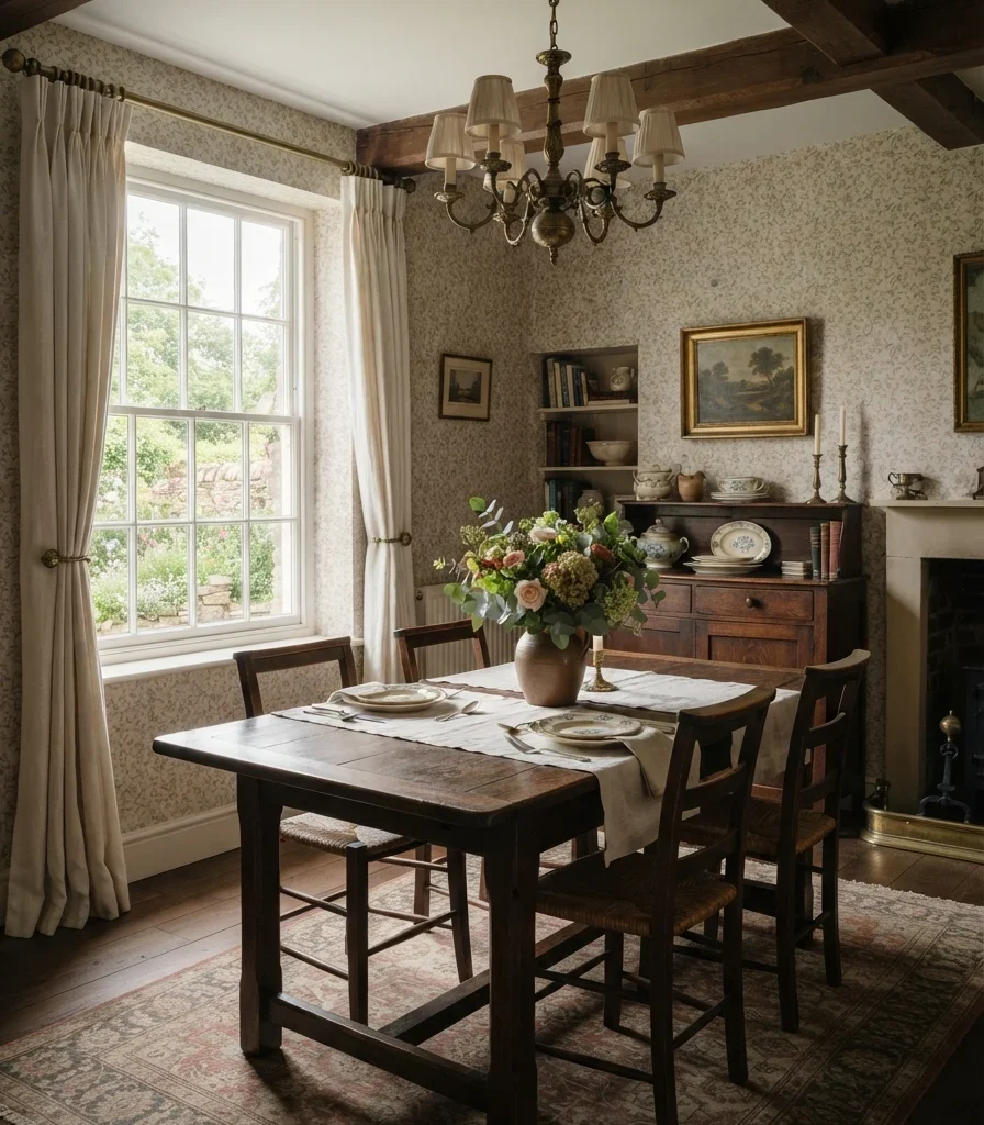
12. Natural Stone or Brick Accent Detail
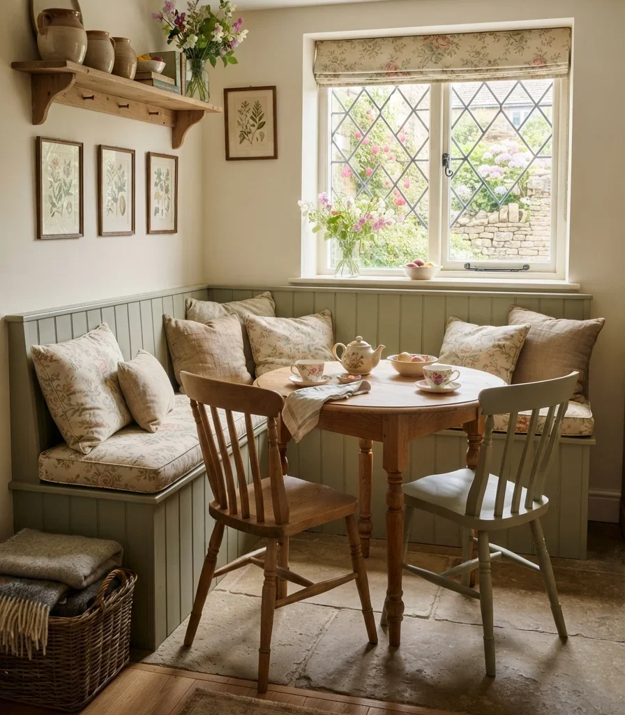
Vibe: Raw; the room gains real material weight.

Why it works: A stone or brick panel introduces genuine material contrast against soft linens and painted walls, grounding the room the way a fireplace grounds a living space texture the eye can’t get from paint alone.

How to get it: Install thin stone veneer panels on the headboard wall only, keeping the remaining walls smooth and painted so the stone reads as a deliberate feature.

Shop the Look

Product
Thin natural stone veneer panel
Stone panel adhesive mortar
Linen bedding set warm white
Woven wall sconce shade
Small wood stool bedside

13. Dusty Sage and Warm Charcoal Contrast

13. Dusty Sage and Warm Charcoal Contrast

Vibe: Grounded, heavy at the base, light above.

Why it works: This is a value-contrast technique: dark charcoal at wainscoting height visually anchors the room, while sage above lightens the overall weight, so the color story reads as architectural rather than decorative.

How to get it: Paint the lower third of the walls (roughly 32 inches up) in warm charcoal, add a thin trim strip, and paint everything above it in dusty sage.

💡 Quick Win: Try the contrast first in bedding only: a charcoal duvet with sage throw pillows before committing to paint.

Shop the Look

Product
Warm charcoal matte wall paint
Dusty sage matte wall paint
Wood chair rail trim strip
Charcoal linen duvet cover
Sage green throw pillow cover

14. Built-In Window Seat with Storage

14. Built-In Window Seat with Storage

Vibe: Cozy. The smallest room feels intentional, not cramped.

Why it works: A built-in reads as architecture rather than furniture, which is the illusion technique that makes small cottage bedrooms feel large . Nothing sits on legs taking up visible floor space, and storage disappears beneath the cushion.

How to get it: Build a bench seat under the window with a hinged lid for blanket storage, upholstering the top in a durable linen-blend cushion.

Shop the Look

Product
Window seat cushion custom linen
Hinged storage bench hardware kit
Small lumbar pillow pair
Folded wool throw blanket
Slim curtain rod natural wood

15. Reclaimed Wood Nightstands with Open Shelving

15. Reclaimed Wood Nightstands with Open Shelving

Vibe: Airy; even the storage feels weightless.

Why it works: An open shelf beneath the tabletop, raised on slim legs, keeps the floor visible underneath the nightstand, the same negative-space principle as the platform bed, applied to a smaller piece.

How to get it: Choose nightstands with a single open shelf rather than closed drawers, in a reclaimed or lightly distressed oak finish that shows visible grain.

💡 Quick Win: A vintage wooden stool repurposed as a nightstand costs less than most new options and adds the same open, leggy silhouette.

Shop the Look

Product
Reclaimed oak open-shelf nightstand
Small ceramic reading cup
Stack of linen-bound books
Dried botanical stem single
Slim brass reading lamp

16. Botanical Print Gallery with a Vintage Mirror

16. Botanical Print Gallery with a Vintage Mirror

Vibe: Serene; the wall feels finished, not filled.

Why it works: Including one vintage mirror in a print gallery does double duty; it bounces natural light back into the room while breaking up the flatness of framed prints with a reflective, three-dimensional object.

How to get it: Arrange three botanical prints in matching slim oak frames with one round vintage mirror as the anchor, laying the composition on the floor first to confirm spacing before hanging.

Shop the Look

Product
Botanical print set slim oak frame
Vintage round mirror brass edge
Small ceramic trinket dish
Potted trailing plant small
Picture hanging level tool kit

How to Start Your Modern Cottage Bedroom Transformation

Your first move should be the walls, and specifically one color: a warm white like Benjamin Moore White Dove. Everything else in this style the sage trim, the terracotta accent, the reclaimed wood  s calibrated against a warm, not stark, white base, so getting that undertone right first keeps every later choice from clashing.

The most common mistake is mixing wood tones, an orange-toned oak nightstand next to a gray-washed bed frame, for example. It breaks the room’s material coherence instantly, because modern cottage design depends on one consistent wood family throughout. Fix it by choosing either a warm honey oak or a whitewashed finish and sticking to it across furniture, beams, and frames.

Three items under $50 that create real impact fast: a single stem of dried pampas grass in a matte black ceramic bud vase (around $18), a waffle-weave cotton throw blanket in oatmeal (around $35), and a small round rattan wall mirror (around $42).

A weekend refresh paint, textiles, one lighting swap  uns $150–$300 and is achievable in two days. A full transformation with new furniture, beams, and wall treatments realistically takes four to eight weeks and $1,500–$4,000, depending on how much is built-in versus purchased ready-made.

Frequently Asked Questions About Modern Cottage Bedroom Ideas

What is the difference between modern cottage and farmhouse bedroom style?

Modern cottage leans softer and more collected, using rattan, linen, and slim iron frames, while farmhouse leans heavier and more industrial, favoring shiplap, black metal hardware, and chunkier reclaimed wood. Farmhouse often includes barn-door details and galvanized metal accents that modern cottage generally skips in favor of brass and cane. Both share a neutral base palette, but modern cottage adds terracotta and dusty sage where farmhouse tends to stay in gray and white.

What colors are best for a modern cottage bedroom?

Warm white (like Benjamin Moore White Dove) as the base, with dusty sage, terracotta blush, and warm charcoal as accents, is the most reliable modern cottage palette. Avoid stark, cool-toned whites  ; ey read as clinical rather than cottage-warm. A charcoal accent applied at wainscoting height or on bedding adds contrast without overwhelming the room’s overall lightness.

How much does it cost to decorate a modern cottage bedroom?

A budget refresh using paint, textiles, and accessories runs $150–$400 and can be done in a weekend. A mid-range room with new bedding, one statement lighting piece, and a nightstand swap lands between $600–$1,500. A full room transformation including built-ins, ceiling beams, and custom furniture typically costs $1,500–$4,000 depending on region and contractor rates.

Does modern cottage style work in a small bedroom?

Yes, with adjustments. Prioritize a single whitewashed or stone accent wall rather than treating all four walls, choose a low platform bed to keep the floor visible, and add a built-in window seat instead of a bulky armchair. Skip four-poster canopy beds and oversized casegoods, which read as cramped rather than cozy in a compact footprint.

What kind of bedding fits a modern cottage bedroom?

Layered natural linen in warm white or oat, topped with a waffle-weave cotton blanket and a boucle throw, is the signature modern cottage bedding formula. Stick to solid colors and varied textures rather than florals or busy prints; the texture layering does the visual work that pattern would otherwise handle. A charcoal or sage linen duvet works well as a single color accent within an otherwise neutral bed.

Ready to Create Your Dream Modern Cottage Bedroom?

These 16 ideas cover color, material, lighting, furniture, and even how to zone a small room so there’s a genuine entry point no matter where your bedroom currently stands. Starting small is not a compromise here; a single whitewashed wall or one boucle throw is a legitimate first step, not a placeholder for “real” decorating later. Today, pick up a paint sample of a warm white and hold it against your bedroom wall in both morning and evening light before deciding. Once the room comes together, it should feel less like a styled space and more like a slower, steadier version of your own home. Save the ideas that matched your light, your wood tone, and your particular sense of calm , nd start with the one you can’t stop picturing.

You Might Also Like

13 Modern Cottage Hallway Ideas for a Warm, Welcoming Entry

13 Modern Cottage Hallway Ideas for a Warm, Welcoming Entry

Modern cottage hallway design blends worn, cozy cottage textures with the clean lines and quiet palette of contemporary interiors. This guide gives you 13 modern cottage hallway ideas covering color, materials, lighting, and layout so the passage into your home feels as considered as any other room.

Picture a narrow hall where morning light catches whitewashed wood, where a woven runner softens every footstep, and where nothing feels rushed even though it’s the space you walk through fastest. It’s a look built on warmth without clutter: sage, oat, and worn brass carried through a corridor most homes treat as an afterthought. Modern cottage hallways turn a transitional space into the first real impression of the house. Here are 13 ideas worth saving nd stealing.

Why Modern Cottage Hallway Ideas Work So Well

What is it? Modern cottage hallway design applies the informal, hand-me-down warmth of English and American cottage interiors beadboard, peg rails, worn textiles to the restrained furniture profiles and pared-back palettes of contemporary design. It differs from farmhouse hallways, which lean on heavier black hardware and barn-style details, by staying softer, lighter, and less industrial.

Materials and colors. Expect warm white, oat, dusty sage, and terracotta blush against whitewashed wood, unfinished oak, rattan, and brushed brass. Runners in jute or wool, board-and-batten paneling, and vintage brass hooks are the materials that carry the style down a corridor.

Why it’s trending now. Entryways became a design priority once more people started working from home and noticing their hallway daily instead of passing through it twice a day. Pinterest searches for “cottage hallway” and “entryway makeover” have climbed alongside the broader slow-living, cottagecore movement.

Can small spaces achieve this? Yes, narrow hallways are actually where this style performs best. Prioritize a mirror to bounce light, a slim console rather than a bulky one, and vertical paneling to make a tight corridor feel taller rather than narrower.

Style at a Glance

ElementCottageModern
PhilosophyWarmth, nostalgia, hand-me-down charmRestraint, clean lines, functional simplicity
MaterialsWhitewashed wood, rattan, jute, brushed brassSlim furniture profiles, matte finishes, streamlined hardware
Color paletteWarm white, oat, terracotta blushDusty sage, warm charcoal, soft greige

13 Modern Cottage Hallway Ideas

1. Board-and-Batten Wainscoting Hallway Walls

1. Board-and-Batten Wainscoting Hallway Walls

Vibe: Serene; the corridor gains rhythm without any extra color.

Why it works: Vertical battens create repeated linear detail that draws the eye down the hallway’s length rather than across its width, a proportion trick that makes narrow corridors feel more architectural and less like leftover space.
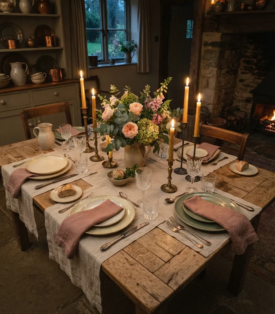
How to get it: Install wainscoting panels to a 42-inch height and paint the same warm white as the upper wall so the texture reads as detail, not a color block.

💡 Quick Win: Peel-and-stick board-and-batten panels achieve the same vertical rhythm in a weekend with no cutting required.

Shop the Look

Product
Board-and-batten wall panel kit
Warm white matte wall paint
Small framed botanical print
Woven jute runner rug
Brass picture hanging hook set

2. Warm White Walls with Sage Green Door Trim

2. Warm White Walls with Sage Green Door Trim

Vibe: Still, the hallway feels paused and unhurried.

Why it works: Painting only the door casings and baseboards in sage introduces color contrast at the architectural edges of the space, defining each doorway along the hall without committing to a full accent wall.

How to get it: Paint walls in a warm white, then paint every door frame and baseboard along the hallway in a dusty sage such as Farrow & Ball’s Pigeon for a repeated, rhythmic accent.

Shop the Look

Product
Warm white matte wall paint
Dusty sage trim paint satin
Rattan round wall mirror
Slim entryway console table
Ceramic catchall dish

3. Row of Brass Flush-Mount Ceiling Lights

3. Row of Brass Flush-Mount Ceiling Lights

Vibe: Warm; even a windowless hallway feels lit like a room.

Why it works: Spacing multiple flush-mounts evenly rather than relying on one central fixture creates consistent light behavior along the entire length of the hall, eliminating the dark end that a single fixture always leaves behind.

How to get it: Install fluted-glass brass flush-mounts every 6 to 8 feet down the ceiling line, wired to a single dimmer switch so brightness can shift from daytime to evening.

Shop the Look

Product
Brushed brass flush-mount ceiling light
Fluted glass shade fixture
Dimmer switch single-pole
Warm LED bulb 2700K
Wool runner rug oat

4. Slim Console Table with Turned Legs

4. Slim Console Table with Turned Legs

Vibe: Layered, a small surface doing a lot of quiet work.

Why it works: Turned wood legs add a traditional cottage silhouette in a piece scaled thin enough not to block hallway traffic, balancing furniture character against the negative space a corridor needs to function.

How to get it: Choose a console no deeper than 12 inches for hallways under 42 inches wide, keeping at least 30 inches of clear walking path in front of it.

💡 Quick Win: A vintage turned-leg table from a secondhand shop costs less than most new consoles and adds instant character.

Shop the Look

Product
Slim wood console table turned legs
Ceramic vase small neutral
Woven rattan catchall tray
Stack of linen-bound books
Small dish for keys

5. Woven Runner Rug the Length of the Hall

5. Woven Runner Rug the Length of the Hall

Vibe: Grounded; the hallway gets a visual floor, not just a functional one.

Why it works: A single continuous runner unifies a long corridor visually, using the texture-layering principle to soften hard flooring while its length reinforces the architectural line of the hallway rather than interrupting it.

How to get it: Measure for a runner that leaves 4 to 6 inches of exposed flooring on each side, and choose a flat jute weave over a plush pile so it sits low enough not to catch on doors.

Shop the Look

Product
Jute runner rug natural
Rug grip pad non-slip
Small entryway bench
Framed print set slim frame
Ceramic bowl for keys

6. Whitewashed Wood Plank Ceiling

6. Whitewashed Wood Plank Ceiling

Vibe: Airy; the ceiling adds texture without adding weight.

Why it works: A whitewashed plank ceiling introduces material texture overhead while staying light in value, which keeps a narrow hallway from feeling boxed in the way a dark or heavily textured ceiling would.

How to get it: Install tongue-and-groove pine planks and apply a thin 1:1 white paint-to-water wash with a dry brush, wiping excess so grain remains visible.

Shop the Look

Product
Tongue-and-groove pine ceiling plank
Whitewash stain finish
Brass pendant light small
Ceiling medallion trim natural wood
Runner rug wool oat

7. Terracotta Blush Painted Front Door Alcove

7. Terracotta Blush Painted Front Door Alcove

Vibe: Warm; the entry gets its own small, glowing moment.

Why it works: Confining a saturated terracotta tone to the door alcove alone treats that recessed area as a distinct architectural zone, using color to mark the transition point between outside and in rather than repainting the whole hallway.

How to get it: Paint just the alcove around the front door, he reveal walls, and the door itself in matte terracotta blush, keeping the rest of the hallway in warm white.

💡 Quick Win: If painting the alcove feels permanent, start with a terracotta ceramic planter or doormat to test the tone.

Shop the Look

Product
Terracotta blush matte paint
Woven wall hook rack
Small entry bench oak
Ceramic planter terracotta
Natural fiber doormat

8. Defined Entry Zone with a Boot Bench

8. Defined Entry Zone with a Boot Bench

Vibe: Cozy; the first few steps inside feel like arriving somewhere, not just entering.

Why it works: Placing a bench and a mat at the entry point, distinct from the runner used in the rest of the hallway, uses zone definition to separate “arrival” from “passage,” a layout principle that keeps a single corridor doing two different jobs clearly.

How to get it: Set a boot bench against the wall nearest the door, with a smaller jute mat beneath it that visually stops where the main hallway runner begins.

Shop the Look

Product
Wood boot bench with storage
Small jute entry mat
Woven storage basket
Folded wool throw
Wall hook rail above bench

9. Wall-Mounted Peg Rail with Vintage Hooks

9. Wall-Mounted Peg Rail with Vintage Hooks

Vibe: Layered everyday objects become the decoration.

Why it works: A peg rail keeps functional items visible and accessible rather than hidden in a closet, which is the same design honesty that makes cottage interiors feel lived-in rather than staged; the coat hanging there is the coat worn today.

How to get it: Mount an oak peg rail with brass shaker-style pegs at 60 inches high, spacing pegs 6 inches apart, and hang no more than three to four items so it reads as curated rather than cluttered.

💡 Quick Win: A three-peg rail from a hardware store, stained to match existing trim, costs under $30 and installs in ten minutes.

Shop the Look

Product
Oak peg rail with brass hooks
Canvas tote bag natural
Straw sun hat
Small dried wreath natural
Wall anchor mounting hardware

10. Wall Sconces Lighting a Gallery Wall

10. Wall Sconces Lighting a Gallery Wall

Vibe: Intimate; the gallery gets museum-quality attention.

Why it works: A dedicated picture light above the frames gives the gallery its own light source rather than relying on the hallway’s ambient fixtures, which is the specific light behavior that makes framed art readable and warm in the evening rather than dim and flat.

How to get it: Mount a slim brass picture-light sconce centered above the gallery’s midpoint, angled slightly downward to wash light evenly across the frames below.

Shop the Look

Product
Brass articulated picture light
Slim oak print frame set
Warm LED bulb 2200K
Small floating ledge shelf
Ceramic dish for small objects

11. Botanical Gallery Wall Along the Hallway

11. Botanical Gallery Wall Along the Hallway

Vibe: Quiet; the walk down the hall becomes a small, slow experience.

Why it works: Repeating the same frame finish and consistent spacing across multiple prints turns a long, otherwise blank wall into a single visual composition, using repetition rather than a single statement piece to hold a hallway’s greater length.

How to get it: Space five matching slim oak frames at equal intervals along the wall at 60-inch center height, using a botanical print series so the content, not just the frames, reads as cohesive.

💡 Quick Win: Printable botanical prints from online marketplaces cost under $10 each when framed in matching budget frames.

Shop the Look

Product
Botanical print set five-piece
Slim oak picture frame set
Floating wood ledge shelf
Small ceramic bud vase
Picture hanging spacing template

12. Rattan Wall Panels on a Half Wall

12. Rattan Wall Panels on a Half Wall

Vibe: Warm; the wall itself becomes a textile.

Why it works: Rattan’s open weave introduces the same material warmth as a woven basket, applied at architectural scale, and its horizontal placement at wainscoting height keeps the texture at hand-height where it’s most tactile and most noticed.

How to get it: Install rattan cane panels to 36-inch height with a wood chair rail trim above, in a lightly finished honey tone that echoes the console or bench wood elsewhere in the hall.

Shop the Look

Product
Woven rattan cane wall panel
Wood chair rail trim strip
Brass wall sconce small
Ceramic wall hook
Wood panel adhesive strips

13. Mirror Wall to Widen a Narrow Hallway

Vibe: Luminous; the narrowest hallway suddenly reads twice as wide.

Why it works: A large mirror positioned to catch a window or doorway’s natural light doubles the perceived depth of a narrow hallway, an illusion technique that adds spatial quality without any structural change.

How to get it: Hang the largest mirror that fits the wall width, leaving at least 4 inches of margin on each side, directly across from or adjacent to the nearest light source so it actively reflects daylight rather than a blank wall.

💡 Quick Win: A single arched mirror over a slim console does more to widen a tight hallway than any other single purchase on this list.

Shop the Look

Product
Large arched wall mirror brass edge
Slim console table narrow
Ceramic vase single stem
Wall anchor mirror mounting kit
Small brass wall hook

How to Start Your Modern Cottage Hallway Transformation

Your first move should be the runner rug, not the paint. A jute or wool runner sets the hallway’s undertone and length-to-width proportion, and every other decision all color, console size, lighting warmth reads more clearly once that anchor is in place underfoot.

The most common mistake is choosing a console table too deep for the hallway’s width, which leaves less than the 30 inches of clearance a corridor needs to feel walkable rather than obstructed. Fix it by measuring the hallway’s total width first and choosing furniture no deeper than a third of that measurement.

Three items under $50 that create immediate impact: a jute door mat in natural fiber (around $28), a three-peg oak wall rail with brass hooks (around $32), and a single stem in a small ceramic bud vase for the console (around $16).

A weekend refresh- paint touch-up and a peg rail starts at $150–$300. A full hallway transformation with paneling, lighting, and a console runs $800–$2,500 and typically takes two to four weeks depending on whether walls need new trim work.

Frequently Asked Questions About Modern Cottage Hallway Ideas

What is the difference between a modern cottage hallway and a farmhouse hallway?

Modern cottage hallways lean softer, using rattan, brass, and lighter wood tones, while farmhouse hallways favor black iron hardware, shiplap, and heavier reclaimed wood. Farmhouse styling often includes barn-door hardware and darker stains that modern cottage skips in favor of whitewashed or honey-toned wood. Both share a neutral base, but modern cottage adds terracotta and sage where farmhouse stays closer to gray and white.

What colors work best in a modern cottage hallway?

Warm white as the base wall color, with dusty sage on trim and terracotta blush reserved for a single alcove or accent, is the most reliable palette. Avoid cool, stark whites in hallways with limited natural light t; they read as clinical rather than warm. A repeated sage trim color along multiple doorways ties a long hallway together visually.

How much does it cost to decorate a modern cottage hallway?

A budget refresh with a runner, paint, and a peg rail runs $150–$400. A mid-range update adding a console table and new lighting lands between $500–$1,200. A full transformation with wall paneling, a mirror, and custom lighting typically costs $1,500–$3,000 depending on hallway length and whether electrical work is involved.

Does modern cottage style work in a narrow hallway?

Yes, and narrow hallways are often where it works best. Prioritize a large mirror to reflect light, a console no deeper than 12 inches, and vertical wall paneling to draw the eye upward rather than emphasizing the narrow width. Avoid a bulky bench or wide console, which can reduce the walkway below the comfortable 30-inch clearance.

What kind of lighting is best for a modern cottage hallway?

A row of brushed brass flush-mount ceiling lights spaced every 6 to 8 feet, paired with a dimmer switch, is the most reliable modern cottage hallway lighting setup. This avoids the single dark end that one central fixture always leaves in a long corridor. Adding a picture light above a gallery wall gives artwork its own warm light source separate from the overhead fixtures.

Ready to Create Your Dream Modern Cottage Hallway?

These 13 ideas cover color, material, lighting, and layout, so there’s a genuine entry point whether your hallway is long and dark or short and narrow. Starting small is not a lesser version of this style; a single runner rug or one peg rail is a legitimate first step, not a placeholder for later. Today, measure your hallway’s width and note where the light falls flattest, then choose the one idea from this list that solves that exact problem. Once it comes together, walking through your own front door should feel like a small daily welcome rather than a rushed pass-through. Save the ideas that matched your hallway’s light and width, and start with the mirror, the runner, or the peg rail, whichever one you keep picturing.

You Might Also Like

15 Small Office Ideas for a Home Spare Room

15 Small Office Ideas for a Home Spare Room

A small home office in a spare room means turning an extra bedroom into a genuinely dedicated, single-purpose workspace a real door that closes, four walls that belong to work alone, rather than a desk squeezed into a shared corner. This article gives you 15 real small office ideas for exactly that spare room, covering color, material, lighting, furniture, and layout, each one built for a compact but fully private workspace.

The feel you’re after is unmistakable: a room that finally feels like yours the moment you close the door, storage that keeps paper and cords from taking over a small footprint, light that makes an eight-hour day feel manageable instead of draining. Here are 15 ideas worth saving and stealing.

Why Small Office Ideas for a Home Spare Room Work So Well

Converting a spare bedroom into a home office became one of the most common remote-work adaptations precisely because a spare room already offers what a shared corner or open-plan alcove can’t: four real walls and a door, the closest thing most homes have to a purpose-built workspace without any construction. This is what distinguishes a spare-room office from the zoning and multi-function techniques a shared bedroom or living room setup requires: here, the entire room can be designed around one job.

The materials and colors that suit a small dedicated office lean calming and focus-friendly: sage green or warm white walls, built-in shelving in white oak or painted MDF for floor-to-ceiling storage, and natural textures like jute underfoot to ground a room that otherwise runs on hard desk surfaces and screens. Because the room is fully private, wallpaper and bolder color choices are lower-risk here than in a shared space, since nothing about the room needs to double as anything else.

Spare-room office conversions have grown steadily alongside hybrid work’s normalization, and Pinterest search data shows particular growth around “cottagecore office” and “she-shed style office” aesthetics, evidence that people converting a spare bedroom increasingly want a room with genuine personality, not just a desk and a chair in an otherwise blank space.

Spare rooms are frequently the smallest bedroom in a home, so the honest priority is furniture scale: built-in or wall-mounted storage over freestanding furniture, and a desk sized to the room’s actual dimensions rather than a standard large office desk that would dominate a small footprint.

Style at a Glance

ElementDedicated Workspace PrioritiesPersonal Style Layer
PhilosophyFull-room design around one functionReal color and pattern choices, low risk
MaterialsBuilt-in shelving, jute rug, scaled deskWallpaper, gallery wall, curtains
Color PaletteSage green, warm whiteWhatever personal accent you choose

15 Small Office Ideas for Your Home Spare Room

1. A Calming Sage Green Accent Wall for Focus

1. A Calming Sage Green Accent Wall for Focus

Vibe: The office feels focused, one calm wall anchoring the whole room’s mood.

Why it works: Sage green sits close enough to neutral on the color wheel that it reads as calming rather than distracting, which is exactly the quality a dedicated focus room benefits from more than almost any other space in a home. Confining it to a single accent wall behind the desk, rather than the full room, uses the same 10% accent principle that governs strong color choices generally, keeping the color intentional rather than overwhelming a small footprint.

How to get it: Paint only the wall directly behind your desk in sage green, keeping the remaining three walls in warm white, since this concentrates the calming effect exactly where your eyes rest most during work.

💡 Quick Win: A large sage green framed print behind the desk can preview this effect before committing to paint.

Shop the Look

Product
Sage green matte interior paint
Warm white interior paint
Walnut desk
Small potted plant
Painter’s tape, sharp-edge

2. A Built-In Wall of Shelving for Floor-to-Ceiling Storage

2. A Built-In Wall of Shelving for Floor-to-Ceiling Storage

Vibe: The room feels efficient, one wall doing the storage work a whole closet would elsewhere.

Why it works: Built-in shelving that runs floor to ceiling uses vertical space a freestanding bookcase never fully claims, since built-ins can be custom-fitted to the exact wall height and depth rather than stopping short at a standard furniture dimension. This matters significantly in a spare room, which is often the smallest bedroom in the home, where every inch of floor space saved by going vertical directly increases how comfortably the desk and chair can actually fit.

How to get it: Mix open shelving with a few closed cabinet sections at the base, using the closed storage for supplies and files you don’t need visible daily, and the open upper shelves for books and display objects.

Shop the Look

Product
Built-in shelving unit, floor-to-ceiling
Storage bin set, closed cabinet sizing
Ceramic desktop organizer
Neutral book stack
Small ceramic decorative object

3. Layering a Floor Lamp With Overhead Light

3. Layering a Floor Lamp With Overhead Light

Vibe: The office feels layered, two light sources doing what one alone couldn’t.

Why it works: A single overhead fixture creates flat, shadowless light that can make a small room feel clinical rather than comfortable over a full workday, while adding a floor lamp beside the desk introduces a second light source at a different height, the same layered-lighting principle used throughout home design generally, applied here specifically to sustain comfort through long stretches of desk work.

How to get it: Position the floor lamp on the side of the desk opposite your dominant working hand to minimize shadow across your work surface, and put both the lamp and overhead fixture on separate dimmers so the mix can shift through the day.

Shop the Look

Product
Brass floor lamp, adjustable
Warm white 2700K bulb set
Dimmer switch, overhead fixture
Plug-in lamp dimmer
Walnut desk

4. An L-Shaped Desk to Maximize Two Walls

4. An L-Shaped Desk to Maximize Two Walls

Vibe: The corner feels spacious, two walls of desk surface fitting into one small footprint.

Why it works: An L-shaped desk claims two walls of a room’s corner rather than just one, which delivers significantly more usable work surface than a single straight desk of the same overall footprint. This matters in a spare room specifically because corners are otherwise among the most underused square footage in any small room. The design also naturally separates zones, with one leg of the L handling the computer and the other free for paperwork or a secondary task.

How to get it: Measure both walls of your intended corner precisely before shopping, since L-shaped desks vary significantly in leg length, and choose a model where the shorter leg still comfortably fits a chair without blocking the room’s door swing.

Shop the Look

Product
L-shaped desk, corner-fit
Ergonomic office chair
Small wall shelf above desk
Desk organizer tray
Compact desk lamp

5. A Gallery Wall of Personal Motivation Above the Desk

5. A Gallery Wall of Personal Motivation Above the Desk

Vibe: The wall feels personal, a curated collection making the room genuinely feel like yours.

Why it works: Because a spare-room office is fully dedicated and private, it can carry more personal content photos, motivational prints, a genuine collection than a shared workspace where the wall art also needs to function for another room’s purpose. A gallery wall specifically applies the rule of thirds, positioning the visual weight of the grouping slightly off-center above the desk rather than dead center, which reads as more considered than a rigidly symmetrical arrangement.

How to get it: Choose one consistent frame finish across the whole grouping even while mixing print subjects and sizes, and lay the arrangement out on the floor first using painter’s tape as a placement guide before committing to wall holes.

Shop the Look

Product
Thin black frame set, mixed sizes
Motivational print set
Painter’s tape for layout planning
Command picture hanging strips
Walnut desk

6. Two-Tone Walls to Add Height Illusion

6. Two-Tone Walls to Add Height Illusion

Vibe: The room feels elevated, one painted line quietly adding a sense of height.

Why it works: A two-tone wall treatment with a lighter upper half and a deeper lower half draws the eye upward toward the ceiling line, creating a subtle height illusion in a small room with standard or slightly low ceilings. This technique references traditional wainscoting proportions while requiring only paint and a level line rather than actual millwork installation. The lighter upper portion also keeps the room from feeling visually capped, since most of the wall surface stays bright and open.

How to get it: Mark the boundary line at 32–36 inches from the floor using a laser level for precision, and paint the darker lower color first, taping off the crisp boundary before adding the lighter upper color.

Shop the Look

Product
Sage green interior paint, lower wall
Warm white interior paint, upper wall
Laser level tool
Painter’s tape, sharp-edge
Walnut desk

7. A Jute Rug to Ground the Room Underfoot

7. A Jute Rug to Ground the Room Underfoot

Vibe: The room feels grounded, natural texture underfoot softening an otherwise hard-surfaced workspace.

Why it works: A home office often runs on hard, cool surfaces desk laminate, chair casters rolling on bare floor, a laptop’s metal chassis nd a natural jute rug introduces genuine textural warmth at floor level, the same texture-layering principle used throughout interior design generally. Jute specifically holds up well under a rolling desk chair better than a plush pile rug would, making it a practical as well as visual choice for this specific room.

How to get it: Size the rug so the desk and chair sit fully on it with a few inches of clearance on all sides, and choose a flatweave jute specifically, since a low pile handles chair wheels more smoothly than a textured or looped weave.

Shop the Look

Product
Jute area rug, flatweave
Rug pad, chair-caster compatible
Walnut desk
Ergonomic office chair
Desk organizer tray

8. Positioning the Desk to Face the Door for Sightline Control

8. Positioning the Desk to Face the Door for Sightline Control

Vibe: The room feels considered, a clear sightline to the door easing the mind while working.

Why it works: Sitting with your back to a room’s only door creates a low-level, often subconscious sense of vulnerability that can genuinely affect focus over a full workday, which is why positioning the desk so you can see the doorway en peripherally is a layout principle borrowed from feng shui and general workplace design alike. This matters more in a spare room specifically because the door is usually the room’s single point of entry, unlike an open-plan space with multiple sightlines already available.

How to get it: If facing the desk directly at the door isn’t possible given window placement, position it at an angle where the door remains in your peripheral vision rather than directly behind your back.

Shop the Look

Product
Walnut desk, angled placement
Ergonomic office chair
Small wall mirror, door reflection
Desk organizer tray
Area rug, desk zone

9. Positioning the Desk to Face the Window, Not Away From It

9. Positioning the Desk to Face the Window, Not Away From It

Vibe: The desk feels balanced, daylight doing real work without ever fighting the screen.

Why it works: Facing a desk directly toward a window creates screen glare and eye strain from staring into bright light, while facing directly away puts the window’s reflection onto the monitor. A perpendicular position, window to the side, avoids both problems while still delivering the mood and alertness benefits of genuine daylight exposure throughout the workday.

How to get it: Position the desk so the room’s primary window falls to your left or right while seated, testing for screen glare at different times of day before finalizing the arrangement.

💡 Quick Win: If the room’s only layout option faces the window directly, a sheer curtain panel diffuses direct glare while still allowing daylight through.

Shop the Look

Product
Sheer curtain panel, light-diffusing
Walnut desk, window-adjacent
Small potted plant, windowsill
Anti-glare monitor filter
Curtain rod, brass finish

10. A Daybed for Guest Overflow in a True Spare-Room Office

10. A Daybed for Guest Overflow in a True Spare-Room Office

Vibe: The room feels dual-purpose, work and hospitality sharing one small footprint gracefully.

Why it works: Many spare rooms still need to function as an occasional guest room even after becoming a primary office, and a slim daybed against one wall solves both needs simultaneously: legitimate daytime lounge seating styled with bolster pillows, converting to a real bed when guests stay over. This is more space-efficient than trying to fit both a full guest bed and a separate reading chair into an already small room.

How to get it: Choose a daybed frame under 33 inches deep so it doesn’t consume more floor space than a standard twin bed would, positioning it against the wall opposite the desk so both pieces have their own clear zone.

Shop the Look

Product
Slim daybed frame, trundle-compatible
Bolster pillow set
Neutral throw blanket
Fitted daybed mattress cover
Small side table, daybed-adjacent

11. Wallpapering the Back Wall Behind the Desk

11. Wallpapering the Back Wall Behind the Desk

Vibe: The wall feels fresh, pattern doing what plain paint never could behind the screen.

Why it works: Wallpapering just the wall behind the desk delivers real pattern and color impact using a fraction of a full room’s material cost, and because it’s confined to a private, single-purpose room, a bolder print carries less risk here than it would in a shared or resale-sensitive space. This is also the wall visible in nearly every video call taken from the desk, making it one of the highest-visibility surfaces in the entire home for anyone working remotely.

How to get it: Choose a peel-and-stick wallpaper specifically for easy future removal, and apply it only to the wall directly behind the desk chair’s back, since that’s the section most consistently visible both in person and on camera.

Shop the Look

Product
Botanical print peel-and-stick wallpaper
Wallpaper smoothing tool
Craft knife for trimming
Walnut desk
Small floating shelf

12. Curtains in a Soft Neutral to Frame the Window

12. Curtains in a Soft Neutral to Frame the Window

Vibe: The window feels elevated, soft fabric doing what a bare frame never could.

Why it works: Hanging curtains from a rod mounted close to the ceiling, rather than directly above the window frame, makes the window itself read as taller than its actual dimensions the same vertical-line height illusion used elsewhere in small-space design, applied specifically to window treatments. A soft neutral linen also introduces textile softness into a room otherwise dominated by hard desk surfaces and screens.

How to get it: Mount the curtain rod 4–6 inches above the window frame and as close to the ceiling as the room allows, choosing panels long enough to just brush the floor for the most elongating effect.

Shop the Look

Product
Warm white linen curtain panels
Curtain rod, brass finish, ceiling-height
Curtain rings, brass
Walnut desk
Small potted plant

13. A Warm White Base to Maximize Natural Light

13. A Warm White Base to Maximize Natural Light

Vibe: The room feels airy, one consistent color letting every bit of available light do its work.

Why it works: A warm white base color reflects considerably more available daylight than a deeper or cooler-toned wall would, which matters disproportionately in a small spare room that often has only one window to work with. This isn’t the same as choosing white purely for a “make it feel bigger” default; it’s a specific light-behavior calculation, since a small room’s total daylight is finite and every wall surface either amplifies or absorbs it.

How to get it: Choose a warm white with a visible cream or ivory undertone rather than a cool, blue-leaning white, testing the sample under your room’s actual light before committing to a full repaint.

Shop the Look

Product
Warm white interior paint
Walnut desk
Brushed brass desk hardware
Small potted plant
Sheer curtain panel

14. A Woven Basket System for Paper Storage

14. A Woven Basket System for Paper Storage

Vibe: The shelf feels organized, paper clutter finally contained in something warm rather than plastic.

Why it works: Loose paper is one of the fastest ways a small office visually deteriorates day to day, and woven baskets give that paper a genuine home while extending the room’s natural-material texture story rather than introducing plastic bins that would read as purely utilitarian. This is the same material-consistency principle governing texture choices throughout the room, applied specifically to a storage problem most small offices face constantly.

How to get it: Choose baskets in graduated sizes for a single shelf, labeling each clearly by content category, since an unlabeled basket system tends to become one large catch-all rather than genuine organization.

Shop the Look

Product
Woven seagrass basket set, varied sizes
Basket label tag set
Walnut open shelf
Hanging file folder set, basket-sized
Small ceramic desk tray

15. Choosing Scaled-Down Furniture for a True Spare Bedroom Footprint

15. Choosing Scaled-Down Furniture for a True Spare Bedroom Footprint

Vibe: The room feels comfortable, furniture finally sized to match its actual walls.

Why it works: A standard-sized office desk, built for an average dedicated office room, often overwhelms a true spare bedroom, which is frequently the smallest bedroom in a home. Choosing furniture explicitly scaled down, with a narrower desk depth and a slimmer chair profile, respects the room’s real proportions rather than forcing standard-scale furniture into a footprint it wasn’t sized for. This is proportion working correctly rather than working against the room.

How to get it: Measure your room’s exact usable floor area before shopping, subtracting door swing and walking clearance, and choose desk and chair dimensions that leave at least 30 inches of clear floor space for movement around the furniture.

Shop the Look

Product
Compact-scale desk, narrow depth
Slim task chair
Small wall shelf
Compact desk lamp
Small area rug, room-scaled

How to Start Your Small Office Transformation

Your first move should be measuring the room’s exact usable floor area, subtracting door swing and walking clearance, because every furniture decision that follows desk size, chair choice, shelving depth depends on knowing that real number rather than guessing based on the room’s general size.

The most common mistake is buying a standard-sized office desk built for an average dedicated office, which frequently overwhelms a true spare bedroom’s smaller footprint. Fix it by shopping specifically within your measured floor area’s constraints, choosing a desk depth and width that leaves genuine walking clearance rather than a desk you like the look of that happens to fit only if nothing else in the room moves.

Three specific items under $50 that create immediate impact: a woven basket set to contain loose paper clutter, a sage green framed print to preview an eventual accent wall, and a set of brass curtain rings to elevate an existing plain curtain rod.

A basic setup using existing furniture, paint, and a rug typically takes one weekend and costs $200–$500. A fuller transformation including built-in shelving and a properly scaled desk generally runs $1,000–$3,000 and takes two to three weeks, while a complete room conversion with wallpaper, custom shelving, and new furniture realistically spans four to six weeks and $3,000–$7,000.

Frequently Asked Questions About Small Home Offices in a Spare Room

What is the difference between a spare-room office and a shared-space home office?

A spare-room office occupies a dedicated room with its own door, designed entirely around work without needing to double as a bedroom or living space, while a shared-space office lives inside a room serving another primary function and depends on zoning techniques like rugs, color boundaries, or room dividers to define its area. A spare room allows fuller design commitment: bolder wallpaper, a complete built-in shelving wall since nothing in the room needs to compromise for a second purpose.

What colors work best for a small spare-room office?

Sage green and warm white remain the most reliable choices, both selected for their calming, focus-friendly quality rather than any specific design trend. Warm white as the dominant base color maximizes reflected natural light in what’s often a single-window room, while sage green confined to one accent wall or a wallpapered section behind the desk adds personality without overwhelming the small footprint.

How much does it cost to convert a spare room into a small home office?

A basic setup using existing furniture with new paint and a rug typically costs $200–$500 and takes a weekend. A fuller transformation adding built-in shelving and a properly scaled desk generally runs $1,000–$3,000, while a complete conversion including wallpaper, custom storage, and new furniture throughout usually falls between $3,000 and $7,000 depending on how much existing furniture can be reused.

Can a spare-room office still function as an occasional guest room?

Yes, a slim daybed styled with bolster pillows against one wall provides legitimate daytime seating while still converting to a real guest bed when needed, which is more space-efficient than trying to fit both a full guest bed and separate office seating into an already small room. Choosing a daybed frame under 33 inches deep keeps its footprint close to a standard desk chair’s, minimizing the compromise either function has to make.

What is the most important layout consideration for a spare-room office?

Desk placement relative to both the door and the window matters most, since facing away from the door can create a subtle sense of vulnerability that affects focus over a full workday, while facing directly into a window causes screen glare. Positioning the desk at an angle that keeps the door in peripheral view while catching window light from the side, rather than head-on, solves both issues simultaneously and is worth prioritizing before any color or furniture decision.

Ready to Create Your Dream Small Home Office?

These 15 small office ideas for a home spare room span color, material, lighting, furniture, and layout, from a calming sage accent wall and built-in floor-to-ceiling shelving to a daybed that keeps the room guest-ready and a desk finally scaled to fit the space it’s actually in, so there’s a genuinely fitting starting point here whatever your spare room currently looks like. You don’t need every idea at once, and measuring your room’s real usable floor space before buying a single piece of furniture is not a smaller first step; it’s the decision every other idea on this list depends on working correctly. Today’s specific action: measure your spare room’s actual clear floor area, subtracting the door swing, and use that real number to guide your very next furniture decision rather than the room’s general size. Once the space is genuinely planned around its own dimensions, the room will finally feel like a real office instead of a bedroom doing its best to hold one. Save the ideas that fit your own spare room’s true shape today that L-shaped corner desk, that floor-to-ceiling shelving wall because a small dedicated office, sized correctly from the start, works harder for you than a bigger room ever needs to.

You Might Also Like

15 Top Minimalist Ideas for a Small Full Bathroom

15 Top Minimalist Ideas for a Small Full Bathroom

Minimalist bathroom design strips a space down to only what genuinely needs to be there, concealing storage and reducing visible fixtures until the room reads as calm, uninterrupted, and entirely without clutter. This article gives you 15 real minimalist ideas for a small full bathroom, covering color, material, lighting, furniture, and layout, each one built around concealment and restraint rather than visible decoration.

The feel is unmistakable: a floating vanity with no visible legs, a wall so continuous it barely registers as tile, light with no fixture you can actually point to. Minimalism doesn’t decorate a small bathroom; it removes everything that isn’t earning its place, and what’s left finally has room to breathe. Here are 15 ideas worth saving and stealing.

Why Minimalist Small Full Bathroom Ideas Work So Well

Minimalist design traces back to two overlapping sources: the Bauhaus school’s early-20th-century “less is more” philosophy, formalized by architects like Ludwig Mies van der Rohe, and the Japanese Zen concept of ma, meaningful space treated as an active design element rather than a gap to fill. This is what distinguishes true minimalism from its warmer cousin Japandi, which layers in visible natural texture and wood tone; minimalism stays starker and more monochromatic, prioritizing concealment and function over any decorative layer at all.

The materials that define this look include large-format porcelain tile with minimal visible grout lines, frameless mirrors with no visible edge or frame detail, and continuous single-material surfaces that run from floor to wall without a seam. Colors stay tightly controlled: all-white monochrome, warm gray, or a single matte black accent used sparingly rather than any layered palette.

Style at a Glance

ElementDetail
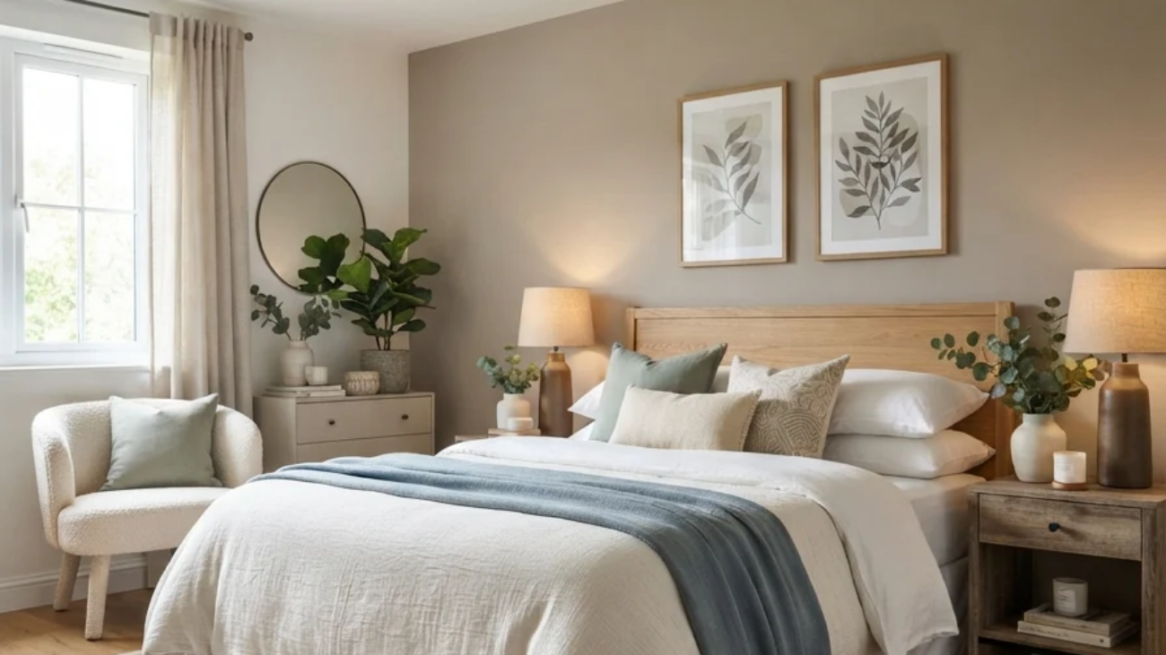
PhilosophyRemove everything that isn’t essential; epace as a design element
Key MaterialsLarge-format porcelain tile, frameless glass, concealed flush cabinetry
Key ColorsAll-white monochrome, warm gray, single matte black accent

15 Top Minimalist Small Full Bathroom Ideas

1. An All-White Monochrome Palette From Floor to Ceiling

1. An All-White Monochrome Palette From Floor to Ceiling

Vibe: The bathroom feels luminous, one tone doing the work that color usually competes for.

Why it works: A fully monochrome white palette removes the visual boundaries that different colors create between wall, floor, and fixture, letting a small bathroom read as one continuous volume rather than several distinct surfaces stitched together. This is the same principle behind color-drenching in reverse: instead of one saturated color unifying a room, one restrained neutral does the same job with less visual weight overall.

How to get it: Choose two or three closely related white tones rather than a single flat shade, varying slightly between matte wall paint and a satin tile finish so the room reads as considered rather than sterile.

💡 Quick Win: Testing your white paint and tile choices side by side under the bathroom’s actual lighting catches undertone mismatches before they become permanent.

Shop the Look

Product
Warm white matte interior paint
Large-format white porcelain tile
White ceramic vessel, single accent
Frameless mirror
White cotton towel set

2. Large-Format Tile With Minimal Visible Grout Lines

2. Large-Format Tile With Minimal Visible Grout Lines

Vibe: The wall feels seamless, tile joints nearly disappearing into the surface itself.

Why it works: Standard subway or mosaic tile creates a visible grid pattern across a wall through repeated grout lines, while large-format tile panels 24 inches or larger covertcover thearea with a fraction of the joints, which reduces the visual noise a small bathroom’s limited wall space can least afford. Matching the grout color closely to the tile itself compounds this effect, since even minimal joints become nearly invisible from normal viewing distance.

How to get it: Choose tile in the largest format your installer can work with given the room’s exact dimensions, and select grout in a shade matching the tile within one or two tones rather than a contrasting color.

Shop the Look

Product
Large-format porcelain tile, 24-inch
Matching-tone tile grout
Tile leveling system, flat installation
Grout sealant
Frameless glass shower panel

3. Fully Integrated Lighting With No Visible Fixtures

3. Fully Integrated Lighting With No Visible Fixtures

Vibe: The room feels seamless, light present everywhere with nothing to point to as its source.

Why it works: A visible light fixture, however simple, still registers as an object the eye has to process, while fully recessed and integrated lighting flush ceiling cans, hidden vanity strip lights remove that object entirely, leaving only the light’s effect. This is the same concealment principle governing minimalist storage, applied to illumination, and it requires planning the electrical layout during initial construction rather than retrofitting fixtures afterward.

How to get it: Specify flush, trimless recessed lighting for ceiling fixtures and routed, hidden LED channels for vanity task lighting, coordinating with your electrician before drywall or tile installation begins.

Shop the Look

Product
Trimless recessed ceiling light kit
Hidden LED channel strip, vanity
Warm white 2700K integrated bulb
Dimmer switch, flush plate
Frameless vanity mirror

4. A Wall-Hung Floating Toilet to Clear the Floor

4. A Wall-Hung Floating Toilet to Clear the Floor

Vibe: The floor feels clean, one fixture floating with nothing visible holding it up.

Why it works: A wall-hung toilet conceals its tank inside the wall cavity and mounts the bowl directly to a hidden frame, leaving visible floor space beneath it the same optical principle behind a floating vanity, applied to the fixture that typically anchors the most floor space in a small bathroom. This also makes floor cleaning genuinely easier, since no base or tank is obstructing the surface beneath it.

How to get it: Confirm wall cavity depth can accommodate the concealed tank and mounting frame before installation, since this typically requires more wall thickness than a standard toilet’s rough-in and may need planning during a fuller renovation rather than a simple swap.

Shop the Look

Product
Wall-hung toilet, concealed tank
In-wall tank and carrier frame
Matte black or chrome flush plate
Large-format floor tile
Frameless glass shower panel

5. One Potted Plant as the Room’s Only Decor

5. One Potted Plant as the Room's Only Decor

Vibe: The windowsill feels considered, one living object doing all the room’s decorative work.

Why it works: Minimalist decorating doesn’t mean zero decoration; it means choosing exactly one object deliberately rather than several competing for attention, and a single living plant introduces organic texture and color into an otherwise entirely hard-surfaced, monochrome room without breaking the style’s core restraint. This single-object principle is minimalism’s version of the rule of three used in maximalist styling, inverted to its simplest possible form.

How to get it: Choose one plant variety genuinely tolerant of bathroom humidity and lower light, such as a pothos or snake plant, and resist adding any second decorative object nearby, letting the single plant stand entirely alone.

💡 Quick Win: A single trailing plant in a plain white ceramic pot requires no additional styling decisions beyond placement.

Shop the Look

Product
Pothos plant, bathroom-tolerant
Plain white ceramic planter pot
Small drainage saucer
Frameless window trim, minimal
White cotton hand towel

6. Matte Black as the Room’s Only Accent Color

6. Matte Black as the Room's Only Accent Color

Vibe: The sink feels defined, one dark accent giving an all-white room a clear edge.

Why it works: A fully monochrome white room can occasionally read as flat without any value contrast at all, and confining matte black exclusively to hardware, the faucet, drain, and mirror frame edge introduces just enough contrast to define the room’s fixtures clearly without disrupting the overall restrained palette. This is the same “black as a contemporary neutral” principle used elsewhere in minimalist and contemporary design, applied at its most disciplined, single-accent scale.

How to get it: Choose matte black exclusively for one category of hardware, typically the faucet and drain, rather than distributing it across multiple fixture types, keeping every other surface in the room’s established white palette.

Shop the Look

Product
Matte black bathroom faucet
Matte black drain hardware
Matte black towel bar, single
White ceramic sink, minimal
Frameless mirror

7. A Single Continuous Material From Floor to Wall

7. A Single Continuous Material From Floor to Wall

Vibe: The room feels expansive, one material erasing the boundary between floor and wall.

Why it works: Running the same tile from floor onto walls without a transition trim or material change removes the visual line that typically tells the eye exactly where a room’s boundaries sit, which is the specific illusion technique that makes a small bathroom read as larger than its actual dimensions. This is the small-space application of material continuity, extended from wall-to-wall (as seen in whole-home flooring) to floor-to-wall within a single room.

How to get it: Choose a tile suitable for both floor and wall installation specifically, confirming slip-resistance ratings for the floor application, and have your installer run the material continuously around the room’s wet zone without a baseboard or trim break.

Shop the Look

Product
Large-format tile, floor and wall rated
Matching tile trim, minimal profile
Tile grout, matching tone
Frameless glass shower enclosure
Anti-slip tile sealant

8. A Linear Drain Instead of a Visible Shower Curb

8. A Linear Drain Instead of a Visible Shower Curb

Vibe: The floor feels uninterrupted, shower and room sharing the same continuous surface.

Why it works: A traditional shower curb creates a raised physical boundary and a visible material break at the shower’s threshold, while a linear drain positioned along one wall allows the entire bathroom floor to stay level and continuous, extending the same floor-to-wall material continuity principle horizontally across the room’s full footprint. This is a layout-level decision requiring proper floor slope planning toward the drain during construction, not a surface finish applied afterward.

How to get it: Position the linear drain along the shower’s back wall rather than centered, and confirm your contractor plans the correct subfloor slope toward it during rough plumbing, since retrofitting proper drainage after tile installation isn’t possible.

Shop the Look

Product
Linear shower drain, slim profile
Large-format floor tile, wet-rated
Frameless glass shower panel
Matte black shower fixture set
Tile sealant, moisture-resistant

9. A Single Skylight Instead of Multiple Fixtures

9. A Single Skylight Instead of Multiple Fixtures

Vibe: The room feels luminous, one overhead light source doing what several fixtures usually attempt.

Why it works: A single skylight delivers even, shadow-minimal daylight across an entire small bathroom, reducing the total number of light fixtures the room needs during daytime hours to essentially zero. This is the ultimate expression of minimalist lighting concealment, since natural light from directly overhead requires no visible fixture at all. It also reinforces the room’s overall restraint, letting daylight itself become the design element rather than any object delivering it.

How to get it: If a structural skylight isn’t feasible, a solar tube delivers similar overhead natural light through a smaller roof opening, and works well in single-story bathrooms without requiring major structural changes.

Shop the Look

Product
Solar tube skylight kit
Recessed supplemental ceiling light
Warm white LED bulb, minimal fixture
Frameless mirror
Matte black faucet

10. A Floating Vanity With Push-to-Open Drawers

10. A Floating Vanity With Push-to-Open Drawers

Vibe: The vanity feels uncluttered, storage present but visually silent.

Why it works: Push-to-open drawer mechanisms remove the need for any visible pull or knob, letting the vanity’s flush drawer fronts read as one continuous surface rather than a series of individually announced storage compartments. Combined with wall-mounting that leaves floor space visible beneath it, this delivers concealment and the floating-furniture illusion simultaneously in a single piece. This is the small-bathroom furniture equivalent of fully integrated appliances in a luxury kitchen.

How to get it: Choose a vanity explicitly built with push-to-open or touch-latch drawer mechanisms rather than adding aftermarket hardware removal to a standard vanity, since factory-built push mechanisms are engineered for the added mechanical stress that hardware-free opening requires.

Shop the Look

Product
Wall-mounted floating vanity, push-open
Hidden mounting bracket kit
White ceramic vessel sink
Matte black faucet
Frameless vanity mirror

11. A Frameless Mirror With No Visible Edge

11. A Frameless Mirror With No Visible Edge

Vibe: The mirror feels seamless, glass edge nearly disappearing against the wall.

Why it works: A framed mirror introduces a visible border that draws attention to itself as an object, while a frameless mirror with a polished, beveled edge reflects the surrounding wall color directly to its perimeter, letting it blend into the room rather than announcing its own boundary. This maximizes the mirror’s light-reflecting function, a genuine small-space benefit, without adding the visual weight a decorative frame would introduce.

How to get it: Choose a mirror with a polished or beveled glass edge specifically, and mount it using hidden J-channel or clip hardware rather than visible screws, so nothing beyond the glass itself is visible on the wall.

Shop the Look

Product
Frameless mirror, beveled edge
Hidden J-channel mounting hardware
Floating vanity, matching finish
Matte black faucet
Recessed lighting, above mirror

12. Monochromatic Towel Styling in a Single Tone

12. Monochromatic Towel Styling in a Single Tone

Vibe: The shelf feels uniform, soft textiles carrying the room’s restraint into fabric.

Why it works: Mismatched towel colors and patterns are one of the most common ways an otherwise minimalist bathroom accumulates visual noise over time, since towels get replaced individually rather than as a coordinated set. Keeping every towel in the room within one single tone extends the same monochrome discipline governing hard surfaces into the room’s softest, most frequently handled textile. Rolling rather than folding also presents a more uniform, considered silhouette than stacked folded towels.

How to get it: Replace mismatched towels gradually with a single consistent white or warm-white set, and roll rather than fold them when displaying on open shelving, since rolled towels show less visible seam and fold-line variation between individual pieces.

Shop the Look

Product
White cotton towel set, matching tone
Open floating shelf, minimal
White bath mat, matching tone
Frameless mirror
Matte black towel bar

13. Warm Gray as a Softer Minimalist Alternative to Stark White

13. Warm Gray as a Softer Minimalist Alternative to Stark White

Vibe: The bathroom feels grounded, gray carrying the same restraint as white with more warmth underfoot.

Why it works: Stark white can read as clinical in a small bathroom with limited natural light, and warm gray offers the same minimalist restraint and monochrome discipline while carrying enough depth to feel grounded rather than sterile under artificial lighting specifically. This is a value-based adjustment rather than a departure from minimalist principles, since the room still commits to one tightly controlled color family throughout.

How to get it: Choose a gray with a visible warm undertone rather than a cool blue-gray, testing it under your bathroom’s actual lighting conditions since gray shifts more noticeably between natural and artificial light than white does.

Shop the Look

Product
Warm gray large-format tile
Warm gray matte interior paint
White ceramic vessel, single accent
Matte black faucet
Frameless mirror

14. Recessed Wall Niches Instead of Visible Shelving

14. Recessed Wall Niches Instead of Visible Shelving

Vibe: The shower feels concealed, storage built into the wall rather than added onto it.

Why it works: A recessed niche, built into the wall cavity during construction, provides genuine storage without any protruding shelf or bracket breaking the wall’s flat plane, which is the layout-level equivalent of push-to-open drawer storage that exists without visually announcing itself as storage. This requires planning during the framing and tiling stage rather than being addable afterward, since it depends on available wall cavity depth.

How to get it: Confirm wall cavity depth allows for a niche at least 4 inches deep during framing, and tile the niche’s interior in the same material as the surrounding wall so it reads as a continuation of the surface rather than a separate element.

Shop the Look

Product
Niche framing kit, standard depth
Matching tile, niche interior
Waterproofing membrane, niche-rated
Single ceramic bottle, minimal
Tile grout, matching tone

15. Concealing Every Storage Need Behind Flush Cabinetry

15. Concealing Every Storage Need Behind Flush Cabinetry

Vibe: The bathroom feels still, every functional need hidden until it’s actually needed.

Why it works: In a small bathroom specifically, visible clutter has a disproportionate visual impact simply because there’s less total surface area to absorb it. Concealing every storage need behind flush, handle-free cabinetry, from toiletries to cleaning supplies to towels, is the single highest-leverage minimalist move available in a compact room, since it addresses the root cause of visual noise rather than styling around it.

How to get it: Audit every item currently stored openly in the bathroom and plan flush cabinetry specifically sized to contain all of it, prioritizing push-to-open or touch-latch mechanisms throughout so no handle or knob interrupts the concealed storage’s flat, uninterrupted surface.

Shop the Look

Product
Flush push-to-open wall cabinet
Recessed medicine cabinet, mirror front
Interior drawer organizer set
Matte black hardware, minimal
White ceramic vessel, single accent

How to Start Your Minimalist Small Bathroom Transformation

Your single first move should be a full audit and concealment of everything currently stored openly in the room, because visible clutter undermines every other minimalist choice on this list, and no color or material decision can compensate for a counter covered in loose bottles.

The most common mistake is choosing stark, cool white without testing it under the bathroom’s actual lighting first, which can read as clinical and cold rather than calm. Fix it by testing your chosen white or gray tone at different times of day, and shifting toward a warmer undertone if the room lacks strong natural light.

Three specific items under $50 that create immediate impact: a set of matte black cabinet hardware to swap onto existing storage as a stopgap before full flush cabinetry, a single plain white ceramic vessel to replace multiple mismatched bathroom accessories, and a matching white towel set to replace mismatched existing towels.

A cosmetic minimalist refresh using decluttering, towel replacement, and hardware updates typically takes one weekend and costs $100–$300. A fuller transformation including large-format tile and a floating vanity runs $4,000–$10,000 and takes three to five weeks, while a complete renovation with a wall-hung toilet and fully integrated lighting realistically spans six to ten weeks and $12,000–$28,000 depending on the extent of plumbing and electrical work required.

Frequently Asked Questions About Minimalist Bathrooms

What is the difference between minimalist and Japandi bathroom design?

Minimalist bathroom design prioritizes stark restraint, monochromatic color, and concealed storage above all else, while Japandi blends that same restraint with visible natural wood texture and warmer, more layered materials borrowed from Scandinavian design. A minimalist bathroom typically stays within one or two tones and hides nearly everything, while a Japandi bathroom might display a wood stool, a woven basket, or visible natural texture that pure minimalism would conceal or omit entirely.

What colors work best for a minimalist small bathroom?

All-white monochrome remains the most common minimalist choice, though warm gray offers a softer alternative that avoids feeling clinical in bathrooms without strong natural light. Matte black is the only color typically permitted as an accent, and even then confined strictly to hardware like the faucet and drain rather than any larger surface, keeping the palette as tightly controlled as possible throughout the room.

How much does a minimalist small bathroom renovation cost?

A cosmetic refresh using decluttering, towel replacement, and hardware swaps typically costs $100–$300 and takes a single weekend. A fuller transformation including large-format tile and a floating vanity generally runs $4,000–$10,000 and takes three to five weeks, while a complete renovation with a wall-hung toilet, recessed niches, and fully integrated lighting realistically falls between $12,000 and $28,000 depending on the extent of plumbing and electrical work involved.

Does minimalist design work in a genuinely small full bathroom?

Yes, and arguably better than in a larger bathroom, since minimalism’s core principle of removing visual noise matters most in a room with limited surface area to begin with. The priority in a small minimalist bathroom is concealing storage first, before any color or material decision, since visible clutter has a disproportionately larger visual impact in a compact room than the same clutter would in a spacious one.

What is the most requested minimalist bathroom element right now?

Floating vanities and wall-hung toilets consistently rank among the most searched minimalist bathroom features, both chosen specifically for the visible floor space they leave beneath the fixture, which reinforces the room’s overall sense of openness. Fully integrated, fixture-free lighting is also seeing significant search growth, reflecting a broader preference for concealment extending even into the room’s light sources rather than stopping at storage alone.

Ready to Create Your Dream Minimalist Bathroom?

These 15 minimalist small full bathroom ideas span color, material, lighting, furniture, and layout, from a fully concealed vanity and a frameless mirror to a linear drain that erases the shower’s own threshold, so there’s a genuinely restrained starting point here, whatever your small bathroom currently looks like. You don’t need every concealment technique at once, and auditing and hiding what’s currently stored in plain view before touching color or tile is not a smaller first step; it’s the one decision every other minimalist idea on this list depends on actually working. Today’s specific action: remove everything currently sitting openly on your counter and shelves, and sort it into what genuinely needs daily access versus what can move behind a door. Once the visible clutter is gone, even before a single material or color changes, the small bathroom will already feel calmer than it has in years. Save the ideas that matched your own room’s biggest opportunity today: that floating vanity, that recessed niche, because in minimalist design, the space you create by removing something is often more valuable than anything you could add in its place.

You Might Also Like

12 Cozy Sage Green Gray Living Room Ideas Worth Saving

12 Cozy Sage Green Gray Living Room Ideas Worth Saving

A cozy sage green gray living room pairs muted botanical green with warm, layered gray tones to build a space that feels calm without feeling cold. This article gives you 12 cozy sage green gray living room ideas: color, materials, lighting, furniture, layout, and small-space fixes, each with a shoppable “Steal the Look” list.

Picture a room where the gray never reads as flat or corporate because sage green is warming it from every corner: a throw here, a painted trim there, a ceramic vase catching the afternoon light. The textures do most of the emotional work: boucle that begs to be sat in, oak that still shows its grain, wool that holds warmth after the sun moves off it. Nothing shouts. Everything settles. Here are 12 ideas worth saving and stealing.

Why a Cozy Sage Green Gray Living Room Works So Well

A sage green gray living room is a color-palette-driven style drawing from biophilic design: muted, botanical greens that calm the way real plants do, layered against the warm-neutral minimalism of Scandinavian and modern farmhouse interiors. What separates it from a plain “neutral living room” is the intentional two-tone anchor: sage brings life, gray brings grounding.

Its materials are specific: boucle upholstery, white oak or ash furniture, unglazed stoneware, brushed nickel or matte black hardware, and wool or jute rugs. The colors worth naming are sage, moss, and eucalyptus green against warm gray, greige, and soft charcoal never a cool, blue-based gray, which fights the warmth the green is trying to introduce.

This pairing is trending because it answers two search behaviors at once. Pinterest shows sustained interest in “sage green living room” and “warm gray living room” independently, and combining them meets the post-pandemic pull toward rooms that feel restorative rather than showroom-perfect.

Small living rooms can do this, but should lead with gray as the dominant wall tone and let sage arrive through furniture and textiles; two saturated colors competing for wall space in a tight room reads busy rather than calm.

ElementGreen InfluenceGray Influence
PhilosophyBiophilic calm, botanical warmthGrounded warm-neutral minimalism
MaterialsLinen, boucle, rattan, unglazed ceramicTravertine, white oak, wool, brushed nickel
Color PaletteSage, moss, eucalyptusWarm gray, greige, soft charcoal

1. Sage Green Accent Wall Paired With Warm Gray Trim

1. Sage Green Accent Wall Paired With Warm Gray Trim

Vibe: Serene the wall color that makes the whole room exhale.

Why it works: Sage advances visually less aggressively than a saturated green, so a single accent wall reads calm, not dominant. Pairing it with warm gray trim rather than stark white keeps the contrast soft; lower values create harmony, wider gaps create tension.

How to get it: Paint one wall in a chalky matte sage such as Farrow & Ball “Card Room Green” or Sherwin-Williams “Clary Sage,” and trim in a warm gray like Benjamin Moore “Revere Pewter” rather than bright white.

💡 Quick Win: No time to paint? A large sage green boucle throw draped over the sofa back gives the same color anchor in an afternoon.

Shop The Look

Product
Sage green matte paint sample pot
Warm gray trim paint sample
Ceramic vase sage green glaze
Woven cotton throw blanket ivory
Small potted eucalyptus plant faux

2. Boucle and White Oak Furniture Pairing

2. Boucle and White Oak Furniture Pairing

Vibe: Textural room you want to run your hand across before you sit down.

Why it works: Texture layering pairs a soft, nubby fabric with a hard, grained material, so the eye has contrast without extra color. Boucle’s dimensional weave catches light differently than flat upholstery, so it photographs warmer than it measures on a chip.

How to get it: Choose a gray boucle sofa and pair it with white oak side and coffee tables rather than walnut or espresso; the lighter wood keeps the palette from tipping too dark, and its visible grain adds the material honesty this style depends on.

Shop The Look

Product
Gray boucle upholstered sofa
White oak coffee table round
White oak side table small
Sage green ceramic bowl decorative
Linen lumbar cushion cover ivory

3. Warm Amber Floor and Table Lamps

3. Warm Amber Floor and Table Lamps

Vibe: Hushed light that makes evenings in this room feel unhurried.

Why it works: Warm 2700K bulbs shift a gray room away from clinical and toward cocooning, since cool-toned gray under cool-white light reads flat and office-like. Two layered light pools soften the shadows a single overhead fixture leaves behind.

How to get it: Add a brushed brass floor lamp with a linen shade beside the sofa and a ceramic table lamp on the console, both fitted with 2700K bulbs and, if possible, dimmable.

💡 Quick Win: Swapping existing bulbs to 2700K “warm white” costs under $12 for a pair and instantly warms up a cool gray room.

Shop The Look

Product
Brushed brass floor lamp linen shade
Ceramic table lamp warm sage glaze
Warm white 2700K LED bulb set
Small ceramic catch-all dish
Linen lamp shade replacement ivory

4. Tonal Gray Layering From Charcoal to Greige

4. Tonal Gray Layering From Charcoal to Greige

Vibe: Layered gray shows up at three depths instead of one flat tone.

Why it works: Tonal layering within one color family creates depth that a single flat gray can’t achieve. A light greige wall, a mid-gray sofa, and one charcoal cushion give the eye a gradient to travel across, the same principle behind tonal green layering elsewhere in this palette.

How to get it: Paint walls in a light greige like Sherwin-Williams “Agreeable Gray,” choose a mid-toned gray linen sofa, and add one charcoal velvet cushion as the deepest note; resist adding a fourth gray shade, which flattens the gradient instead of extending it.

Shop The Look

Product
Light greige wall paint sample
Mid-gray linen sofa slipcover
Charcoal velvet throw pillow cover
Wool area rug warm gray
Sage green throw blanket folded

5. Curved Sage Green Sofa as Anchor

5. Curved Sage Green Sofa as Anchor

Vibe: Grounded, a sofa shape that softens every hard line in the room around it.

Why it works: A curved sofa reduces the visual weight a boxy silhouette carries at the same footprint; rounded forms read as lighter to the eye. Choosing sage for the sofa rather than the wall puts the boldest hue on the most-used piece of furniture, where it earns its presence daily.

How to get it: Source a curved sofa in sage green velvet or performance fabric rather than the more common cream or gray, and keep the wall behind it in warm gray so the sofa remains the room’s clear color statement.

💡 Quick Win: Not ready for a new sofa? A sage green velvet bench at the foot of an existing sofa introduces the same anchor color at a fraction of the cost.

Shop The Look

Product
Curved sage green velvet sofa
Sage green upholstered bench small
Brass sofa leg caps set
Oversized floor cushion ivory
Wool throw blanket warm gray

6. Travertine or Textured Stone Coffee Table

6. Travertine or Textured Stone Coffee Table

Vibe: Tactile a surface with more visual interest than any accessory placed on it.

Why it works: Honed travertine’s natural pitting provides material authenticity that glass or laminate can’t replicate; light catches its uneven surface differently at every angle. A rounded profile also softens the room the way the curved sofa does.

How to get it: Choose a round or oval travertine coffee table in a honed (matte) rather than polished finish. Polished stone throws hard reflections that compete with the room’s soft lighting scheme.

Shop The Look

Product
Honed travertine coffee table round
Ceramic decorative bowl sage green
Small hardback book stack neutral
Travertine stone coaster set
Natural stone sealer for maintenance

7. Textured Throw Pillows and Botanical Greenery

7. Textured Throw Pillows and Botanical Greenery

Vibe: Lush, the small living touch that keeps the room from feeling too composed.

Why it works: Mixing pillow textures boucle, linen, velvet within one narrow color range adds richness without a new hue, the same texture-layering principle used on the sofa and coffee table. A trailing plant grounds the painted sage tones in something alive.

How to get it: Style the sofa with five pillows in three different textures, all within the sage-to-charcoal range, and place one trailing pothos or philodendron in a terracotta or ceramic planter within view of the seating area.

💡 Quick Win: A single faux trailing plant on a plant stand beside the sofa delivers the same visual softness with zero watering required.

Shop The Look

Product
Boucle throw pillow cover sage
Linen throw pillow cover charcoal
Velvet lumbar pillow cover warm gray
Trailing pothos plant faux or live
Ceramic planter pot sage glaze

8. Defining a Conversation Zone With Rugs

8. Defining a Conversation Zone With Rugs

Vibe: Consider a room that reads as arranged rather than furniture placed at random.

Why it works: A properly sized rug applies zone definition; when every seating piece rests at least its front legs on the rug, the eye reads the grouping as one connected conversation area rather than scattered furniture.

How to get it: Size the rug so the sofa and both accent chairs can rest at least their front legs on it. For a standard living room, this usually means an 8×10 rug minimum, not the smaller 5×7 that leaves furniture floating off the edges.

Shop The Look

Product
Wool area rug 8×10 warm gray
Non-slip rug pad underlay
Round coffee table centered oak
Sage green accent chair pair
Rug corner grippers set

9. Layered Picture Lights and Dimmable Sconces

9. Layered Picture Lights and Dimmable Sconces

Vibe: Glowing light sources placed high enough to wash the walls instead of just the floor.

Why it works: Wall-mounted picture lights and sconces add light at eye level and above; illuminating vertical surfaces makes a room feel larger than relying on table and floor lamps alone, which only light the lower third of a space.

How to get it: Install a brass picture light above the room’s largest artwork and add one pair of dimmable sconces flanking a console or media unit, all on 2700K bulbs.

💡 Quick Win: A plug-in wall sconce with a hardwired look installs with no electrician needed, just a nearby outlet and a cord cover.

Shop The Look

Product
Brass picture light for artwork
Dimmable wall sconce pair brass
Plug-in wall sconce with cord cover
Warm white 2700K LED bulb set
Console table narrow oak

10. Mixed Accent Chairs for Visual Balance

10. Mixed Accent Chairs for Visual Balance

Vibe: Balanced seating group that feels curated rather than matched from a single showroom set.

Why it works: Pairing two different accent chairs in the two anchor colors, rather than a matching pair, balances visual weight. Each chair carries equal presence through matched scale and leg finish, even though the fabrics differ, so the room avoids feeling like a showroom set.

How to get it: Choose one sage boucle chair and one warm gray leather or performance-fabric chair, matched only in leg finish and general scale, and place them at a slight angle facing the sofa rather than in strict mirror symmetry.

Shop The Look

Product
Sage green boucle accent chair
Warm gray leather accent chair
Brass tapered chair legs set
Small round side table oak pair
Ceramic coaster set for side tables

11. Gallery Wall in Sage and Charcoal Tones

11. Gallery Wall in Sage and Charcoal Tones

Vibe: Curated wall that signals this palette was chosen with intention.

Why it works: Mixing botanical prints with abstract charcoal canvases keeps the gallery tied to both anchor colors instead of drifting into unrelated hues, and varying frame widths between oak and brass adds the material mix this style relies on.

How to get it: Lay the arrangement out on the floor first using painter’s tape as a guide, mixing two botanical prints with two or three abstract pieces in sage and charcoal tones, spaced 5–8cm apart.

💡 Quick Win: Three botanical prints in identical oak frames, evenly spaced in a single row, create an instant gallery moment without any complex layout planning.

Shop The Look

Product
Botanical print framed art set
Abstract charcoal canvas art set
Oak picture frame set assorted
Small floating wood shelf
Ceramic vase for shelf styling

12. Vertical Layering for Compact Living Rooms

12. Vertical Layering for Compact Living Rooms

Vibe: Airy; prove this palette can live in a small room without feeling closed in.

Why it works: Vertical layering tall, narrow furniture and ceiling-height curtains draws the eye upward, making a compact room feel taller than its footprint. Keeping sage confined to small objects while gray carries the large surfaces prevents the palette from crowding a tight floor plan.

How to get it: Mount curtain rods at ceiling height in warm gray linen, add one tall narrow bookshelf in white oak, and reserve sage green for small accessories only: a planter, a stack of books, a single throw.

Shop The Look

Product
Ceiling-height curtain rod extendable
Warm gray linen curtain panel pair
Tall narrow bookshelf white oak
Small sage green ceramic planter set
Leaning full-length mirror slim frame

How to Start Your Sage Green Gray Living Room Transformation

Start with the sofa. Before choosing a wall color, a rug, or any accessories, decide whether your sofa will be gray or sage. This single decision determines every other color choice in the room, since everything else is selected to support whichever anchor color the largest piece of furniture carries.

The most common mistake beginners make is choosing a cool, blue-based gray instead of a warm gray, which fights against sage green rather than supporting it. The two undertones clash, and the room reads sterile instead of cozy. The fix is checking the paint’s undertone in natural daylight before buying; warm grays like “Agreeable Gray” or “Revere Pewter” lean beige, not blue.

Three items under $50 that make an immediate impact: a sage green ceramic vase ($20–$30) on the coffee table; a warm gray wool throw ($25–$40) draped over the sofa arm; and a warm white 2700K bulb set ($10–$14) replacing cool-white bulbs in existing lamps.

Realistic expectations: A starter version- new pillows, a throw, and a plant takes an afternoon and costs $100–$250. A full room transformation with new furniture, paint, and lighting runs $2,000–$6,000 and typically unfolds over six to ten weeks.

Frequently Asked Questions About Cozy Sage Green Gray Living Room Ideas

What is a sage green gray living room, and how is it different from a plain neutral living room?

A cozy sage green gray living room deliberately pairs two anchor colors: muted botanical sage and warm gray, rather than pulling from a broad neutral palette of beiges, tans, and whites. A plain neutral living room skips color almost entirely, while this style uses sage as a controlled, intentional accent that keeps the gray from feeling flat or corporate.

What shade of gray pairs best with sage green in a living room?

Warm grays with a beige or greige undertone, such as Benjamin Moore “Revere Pewter” or Sherwin-Williams “Agreeable Gray,” pair best because their warmth complements sage’s soft, grayed-green tone. Cool, blue-based grays clash with sage and should be avoided, since the two undertones pull the room in opposite temperature directions.

How much does it cost to decorate a living room in this style?

A budget-conscious refresh using pillows, a throw, and a few ceramic accents costs roughly $100–$250 and can be done in an afternoon. A fuller transformation with a new sofa, rug, and lighting typically runs $2,000–$6,000, depending on whether furniture is new or sourced secondhand.

Does this palette work with existing furniture, like a brown leather sofa or dark wood floors?

Yes, a brown leather sofa can stay in the room as long as new textiles and wall color lean into the sage-and-gray story, since leather’s warmth actually complements sage well. Dark wood floors ground the palette nicely too; just keep coffee and side tables in a lighter oak to avoid an all-dark furniture footprint.

What’s the single most important element for making this style feel cozy rather than cold?

Warm lighting is the deciding factor: 2700K bulbs and layered light sources (a floor lamp, a table lamp, and at least one wall-mounted fixture) keep the gray from reading sterile. Cool white or single-overhead lighting is the fastest way to make an otherwise well-styled sage and gray room feel like a waiting room instead of a living room.

Ready to Create Your Dream Sage Green Gray Living Room?

These 12 ideas cover the full range of what this palette can do, from the color-anchoring power of a sage accent wall, to the material richness of boucle and travertine, to small-space tricks that make a compact room feel just as layered as a large one. Building a room like this happens one throw pillow, one lamp, one wall at a time;n o rule says the whole space needs to change at once. If you’re starting today, pick one sage green accessory and set it against your current gray or neutral sofa to see how the pairing actually feels in your light. Once the textures are layered and the light is warm, this is the kind of living room that makes coming home feel like an actual exhale. Save the ideas that match your room’s light and size and start building your sage-and-gray moodboard tonight.

You Might Also Like

15 Ways to Create a Modern Luxury Kitchen Ceiling Design

15 Ways to Create a Modern Luxury Kitchen Ceiling Design

A modern luxury kitchen ceiling design treats the fifth wall the ceiling as a genuine design surface, using beams, color, texture, and light to finish a kitchen from every angle instead of leaving it as an afterthought painted flat white. This article gives you 15 genuinely striking ways to create a modern luxury kitchen ceiling design, covering material, color, lighting, and layout decisions for the one surface most kitchen renovations skip entirely.

It feels like looking up and realizing the room was finished on purpose: walnut beams catching light at an angle no wall could, a deep charcoal ceiling making the room feel wrapped rather than boxed, a single chandelier hanging like the room’s own piece of jewelry. This is modern luxury kitchen ceiling design at its most complete: considered from the floor to the very top of the room. Every choice earns its place because a ceiling left blank is square footage most kitchens waste entirely.

Here are 15 ideas worth saving and stealing.

Why Modern Luxury Kitchen Ceiling Design Works So Well

Treating the ceiling as a genuine design surface draws from architectural traditions that never left it plain: coffered ceilings from classical and Renaissance interiors, exposed timber framing from vernacular and craftsman building, and the more recent architectural lighting movement that integrates cove and recessed detailing directly into the ceiling plane rather than hanging fixtures from a blank one. What makes it distinctly modern luxury is combining these older architectural gestures with clean, current materials and integrated lighting rather than heavy ornamental plasterwork.

Core materials include walnut or white oak beams, tongue-and-groove wood planking, high-gloss lacquer paint, and architectural wallpaper. Color ranges from deep charcoal or warm black for drama to glossy warm white for reflected light, with two-tone splits used to zone specific areas of a large kitchen.

This approach is trending because open-concept kitchens now function as the primary room guests see from every angle, including looking up, and design-industry data shows rising specification of coffered and beamed kitchen ceilings as homeowners look for a genuine architectural detail that a flat popcorn or drywall ceiling can’t provide.
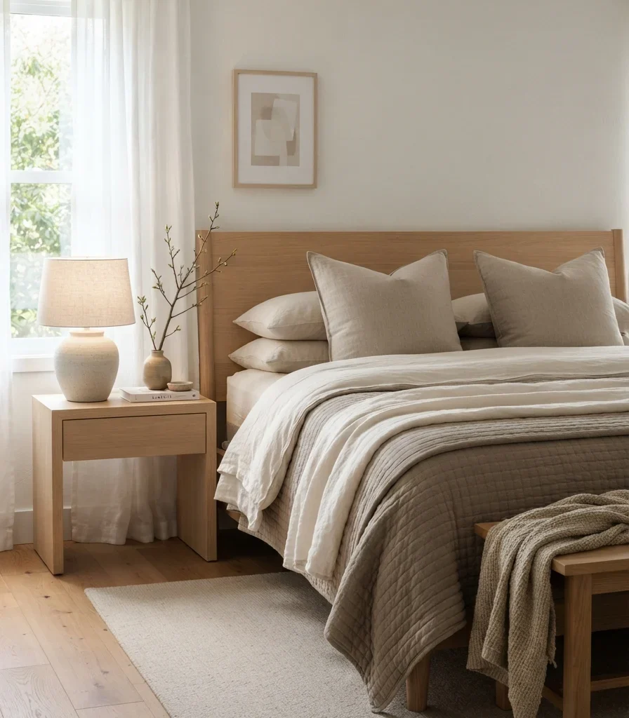
Yes, with real limits, a kitchen with a standard 8-foot ceiling can’t support heavy coffering or deep beams, which need ceiling height to read proportionally. Prioritize color and lighting first in a lower-ceiling kitchen; they add drama without stealing headroom the way structural beams do.

Style at a Glance

ElementCore Trait 1Core Trait 2
PhilosophyThe ceiling finished as a genuine design surface, not left blankArchitectural detail combined with integrated modern lighting
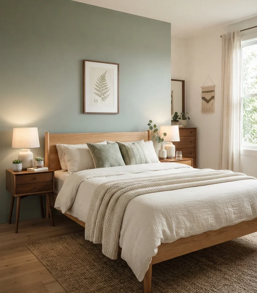
MaterialsWalnut or oak beams, tongue-and-groove plankingHigh-gloss lacquer, architectural wallpaper
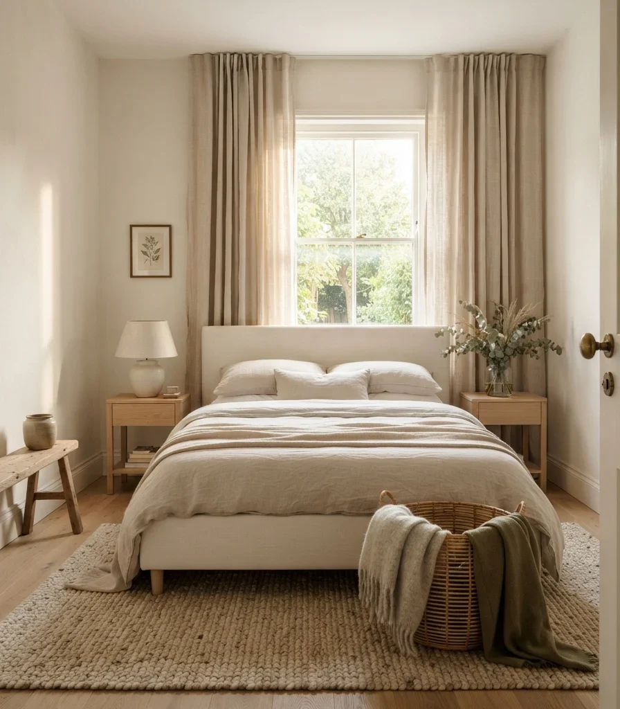
Color PaletteDeep charcoal for dramaGlossy warm white for reflected light

15 Ways to Create a Modern Luxury Kitchen Ceiling Design

1. Build a Coffered Ceiling With Walnut Beams

1. Build a Coffered Ceiling With Walnut Beams

Vibe: Grounded, a ceiling with genuine architectural rhythm instead of one flat, uninterrupted plane.

Why it works: A coffered grid applies proportion and visual-weight principles at ceiling scale; the walnut beams create a repeating structural pattern that gives the room’s tallest surface real dimension, and the recessed panels between beams read as deliberately deep rather than simply flat, an effect no applied trim or paint alone can achieve.

How to get it: Specify solid walnut or walnut-veneer beams at least 6 inches deep spaced in a grid no smaller than 4×4 feet per coffer, painting the recessed panels in warm white so the wood beams read as the dominant structural element against a lighter backdrop.

💡 Quick Win: Lightweight faux-wood coffer panels achieve a similar grid pattern at a fraction of the weight and cost of solid beams.

Shop the Look

Product
Solid walnut ceiling beam set
Faux wood coffer panel kit
Warm white ceiling paint
Small pendant for coffer recess
Matte black beam mounting hardware

2. Paint a Deep Charcoal Ceiling for a Dramatic Drop

2. Paint a Deep Charcoal Ceiling for a Dramatic Drop

Vibe: Moody, a ceiling dark enough to feel like it’s pulling the whole room in around you.

Why it works: Painting the ceiling in a saturated dark tone is a contrast principle that inverts the usual assumption that dark ceilings shrink a room. In a kitchen with generous ceiling height, a deep charcoal ceiling actually creates a cocooning, intimate effect, drawing the eye upward toward a genuine focal plane instead of letting it disappear into a flat white void.

How to get it: Reserve this technique for kitchens with at least 9-foot ceilings, using a matte (not glossy) warm charcoal that avoids reading as a mistake or an unfinished primer coat, and pair it with warm brass or gold fixtures that catch light against the dark backdrop.

Shop the Look

Product
Warm charcoal matte ceiling paint
Warm brass pendant light
Ceiling paint primer for dark tones
Small ceramic countertop vessel
Brass ceiling canopy trim

3. Hang a Sculptural Pot Rack as a Ceiling Fixture

3. Hang a Sculptural Pot Rack as a Ceiling Fixture

Vibe: Layered cookware turned into ceiling-level decor, doing double duty as function and display.

Why it works: A hanging pot rack applies negative-space and furniture-arrangement thinking specifically to the ceiling plane; rather than cookware occupying cabinet space, it hangs at eye level between the ceiling and counter, using vertical volume most kitchens leave empty above the island.

How to get it: Mount a matte black rack from ceiling joists rated for the combined weight of a full cookware set, positioning it centered over the island at a height that clears the tallest person’s head by at least 12 inches, and hang pots by size for visual order.

Shop the Look

Product
Matte black ceiling pot rack
Ceiling joist mounting hardware
Copper cookware set
Small ceramic countertop bowl
Matte black S-hooks for hanging

4. Recess Cove Lighting Around the Ceiling Perimeter

4. Recess Cove Lighting Around the Ceiling Perimeter

Vibe: Warm, a ceiling edge that glows softly instead of relying on a single central fixture to light the whole room.

Why it works: Cove lighting integrated into the ceiling perimeter is an architectural light-layering technique that raises the perceived ceiling height by washing the wall-to-ceiling transition with indirect light; it also complements pendant and task lighting below rather than competing with it, adding a genuine ambient layer most kitchens skip entirely.

How to get it: Recess a warm 2700K LED strip into a routed channel set back at least 4 inches from the ceiling edge, angled to wash upward and outward, wired to its own dimmer separate from the island pendants and under-cabinet task lighting.

Shop the Look

Product
Recessed cove LED channel kit
Warm 2700K LED strip
Ceiling cove dimmer switch
Small ceramic decorative vessel
Cove channel trim molding

5. Wallpaper the Ceiling With a Botanical Print

5. Wallpaper the Ceiling With a Botanical Print

Vibe: Layered a ceiling with genuine pattern, turning an overlooked surface into the room’s unexpected detail.

Why it works: Wallpapering the ceiling is a texture and pattern-layering principle rarely applied above eye level, which is precisely why it reads as a surprising, considered choice. A botanical print overhead references the biophilic pattern trend without requiring any actual plants, and because the ceiling sees no foot traffic or splashing, wallpaper survives there far better than it would on a kitchen wall.

How to get it: Choose a pre-pasted, moisture-resistant wallpaper in a botanical print with a small to medium-scale repeat (large patterns can distort visually overhead), and hire an installer experienced with ceiling application, since hanging paper overhead is more physically demanding than a wall.

💡 Quick Win: Peel-and-stick wallpaper on the ceiling achieves the same visual effect with an easier, more forgiving installation for a first attempt.

Shop the Look

Product
Moisture-resistant botanical wallpaper
Peel and stick botanical ceiling paper
Warm brass pendant light
Wallpaper smoothing tool
Small ceramic countertop vessel

6. Hang a Single Statement Chandelier as Ceiling Jewelry

6. Hang a Single Statement Chandelier as Ceiling Jewelry

Vibe: Warm, a single fixture with enough scale and detail to function as the whole ceiling’s centerpiece.

Why it works: A genuinely sculptural chandelier applies visual-weight principles the way a statement necklace draws the eye; its scale and detail give the ceiling plane a clear focal point, which matters because kitchens with high or vaulted ceilings otherwise risk that upper volume reading as space rather than an intentional part of the room.

How to get it: Size the chandelier to roughly two-thirds the island’s length, hanging it at least 34 inches above the counter to clear sightlines, and choose warm 2700K bulbs visible through the shades so the fixture itself glows rather than reading as a dark silhouette during the day.

Shop the Look

Product
Multi-arm brass chandelier fixture
Warm 2700K glass shade bulb
Brass ceiling canopy trim
Small ceramic countertop bowl
Adjustable chandelier chain kit

7. Split the Ceiling Two-Tone Between Island and Perimeter

7. Split the Ceiling Two-Tone Between Island and Perimeter

Vibe: Grounded, a ceiling that visually marks exactly where the island’s zone begins and ends, even looking straight up.

Why it works: Painting a defined rectangular zone directly above the island in a contrasting tone is a zone-definition principle applied overhead rather than at floor level; the ceiling itself signals the island’s boundary, reinforcing the room’s layout in a kitchen large enough that floor-level zoning alone doesn’t fully register from every angle.

How to get it: Measure the island’s exact footprint and paint the ceiling section directly above it in charcoal, extending the boundary 6 to 12 inches beyond the island’s edges on all sides, keeping the surrounding ceiling in warm white.

Shop the Look

Product
Warm charcoal ceiling paint
Warm white perimeter ceiling paint
Painter’s tape precision edge
Warm brass pendant light
Small ceramic countertop bowl

8. Suspend a Glass-Front Cabinet From the Ceiling

8. Suspend a Glass-Front Cabinet From the Ceiling

Vibe: Warm storage that appears to float above the island, lit from within like a small display case.

Why it works: A ceiling-suspended cabinet applies negative-space and furniture-arrangement thinking to storage that would normally sit on the floor or against a wall because it hangs from brass rods rather than standing on legs; the floor beneath stays entirely open, and its glass front with interior lighting turns everyday glassware into genuine ceiling-level display.

How to get it: Suspend the cabinet on four brass rods anchored to ceiling joists rated for its fully loaded weight, wire warm 2700K interior LED lighting on its own switch, and position it above the island rather than a walkway so nothing passes beneath it at head height.

Shop the Look

Product
Ceiling suspended glass cabinet
Brass suspension rod set
Interior LED cabinet light strip
Ceiling joist mounting bracket
Small ceramic countertop bowl

9. Position a Skylight Directly Over the Island

9. Position a Skylight Directly Over the Island

Vibe: Luminous, a pool of genuine daylight landing exactly where the room’s most-used surface sits.

Why it works: Positioning a skylight directly over the island rather than a random ceiling location is a light-behavior principle that puts natural daylight precisely where it matters most for both function and photography; food prep and the room’s central gathering point both benefit from direct overhead daylight in a way ambient window light from the side never fully achieves.

How to get it: Size the skylight to roughly one-third the island’s length for a proportional daylight pool, choosing a fixed (non-operable) unit if ventilation isn’t a priority, since fixed skylights cost less and have fewer potential leak points than operable ones.

Shop the Look

Product
Fixed skylight unit
Skylight flashing kit
Warm white marble island counter
Small ceramic countertop bowl
Matte black skylight interior trim

10. Install a Tongue-and-Groove Wood Plank Ceiling

10. Install a Tongue-and-Groove Wood Plank Ceiling

Vibe: Sun-warmed ceiling with genuine wood grain running overhead instead of flat drywall.

Why it works: Tongue-and-groove planking is a material-honesty principle that gives the ceiling texture and warmth without the structural depth a full coffered grid requires. The plank seams create a directional linear pattern that, when run the length of a galley or narrow kitchen, visually elongates the room when viewed from the doorway.

How to get it: Install white oak or pine tongue-and-groove planks running the room’s longest dimension, sealed in a matte finish rather than glossy polyurethane, and recess lighting flush between planks rather than surface-mounting fixtures that would interrupt the linear pattern.

Shop the Look

Product
Tongue and groove white oak plank
Matte wood ceiling sealant
Recessed flush ceiling light
Small ceramic countertop vessel
Wood plank installation clips

11. Paint the Ceiling in Glossy Lacquer to Reflect the Room

11. Paint the Ceiling in Glossy Lacquer to Reflect the Room

Vibe: Fresh a ceiling with just enough sheen to subtly double the room’s brightness without becoming a full mirror.

Why it works: A genuine multi-coat lacquer finish applies light-behavior principles at ceiling scale; the gloss reflects both ambient light and a soft impression of the room below, brightening a kitchen with limited natural light more effectively than a flat matte ceiling paint, which absorbs rather than bounces available light.

How to get it: Specify a genuine high-gloss lacquer application (multiple thin coats, each sanded between applications) rather than a single-coat glossy enamel, since a properly built-up lacquer finish reflects far more cleanly than a shortcut version.

Shop the Look

Product
High gloss lacquer ceiling paint
Warm brass pendant light
Ceiling gloss primer coat
Small ceramic countertop vessel
Walnut cabinetry accent

12. Add a Decorative Ceiling Medallion Behind the Pendant

12. Add a Decorative Ceiling Medallion Behind the Pendant

Vibe: Layered a small architectural detail that frames the pendant instead of leaving it hanging from a bare ceiling.

Why it works: A ceiling medallion applies accessory-layering directly to the ceiling plane. Most kitchens hang a pendant from a plain electrical box with no surrounding detail, and a carved medallion gives that mounting point genuine architectural presence, referencing classical plasterwork at a scale appropriate for a single fixture rather than the whole ceiling.

How to get it: Choose a medallion between 12 and 18 inches in diameter for proportion with a standard pendant, mounted flush around the existing electrical box, and paint it the same warm white as the surrounding ceiling so its relief detail reads through subtle shadow rather than color contrast.

Shop the Look

Product
Carved plaster ceiling medallion
Warm brass pendant light
Ceiling medallion mounting adhesive
Warm white touch-up paint
Small ceramic countertop vessel

13. Build a Tray Ceiling to Frame the Island Zone

13. Build a Tray Ceiling to Frame the Island Zone

Vibe: Ground a ceiling with a genuine structural step that gives the island zone its own architectural frame.

Why it works: A tray ceiling applies proportion and zone-definition principles through actual construction rather than paint or light alone. The recessed stepped edge, typically 4 to 8 inches deep, creates a physical boundary overhead that echoes the island’s footprint, adding dimensional depth a flat ceiling with only a paint or lighting zone can’t fully replicate.

How to get it: Frame the tray to align with the island’s exact footprint, recessing the center section by at least 6 inches, and run cove lighting inside the tray’s inner edge so the recess is lit rather than shadowed.

Shop the Look

Product
Tray ceiling framing kit
Recessed cove LED strip for tray
Walnut trim molding
Warm brass pendant light
Small ceramic countertop vessel

14. Vary Ceiling Height to Zone Cooking From Dining

14. Vary Ceiling Height to Zone Cooking From Dining

Vibe: Airy two connected zones that feel distinct the moment you look up, without any wall between them.

Why it works: Varying ceiling height between the cooking and dining zones is a layout principle that uses architecture itself to define traffic flow; a lower, more intimate ceiling over the working kitchen contrasts with a taller volume over the dining area, letting an open-concept space read as two purposeful zones rather than one undifferentiated room.

How to get it: If the structure allows (existing soffits or duct routing often already create natural height variation), emphasize the transition with a visible beam or trim line at the height change, and keep the ceiling finish consistent across both zones so the height itself, not a material shift, carries the zoning.

Shop the Look

Product
Walnut transition beam trim
Warm brass pendant lower zone
Recessed lighting taller zone
Small ceramic countertop vessel
Warm white ceiling paint both zones

15. Add a Mirrored Ceiling Strip to Visually Raise a Low Kitchen

15. Add a Mirrored Ceiling Strip to Visually Raise a Low Kitchen

Vibe: Luminous, a narrow reflective seam that tricks the eye into reading more height than the room actually has.

Why it works: In a genuinely low kitchen ceiling under 8 feet, a full mirrored ceiling would feel disorienting, so the small-space adaptation is a narrow mirrored strip, typically 6 to 12 inches wide, run along one edge, usually where the ceiling meets an upper cabinet run, reflecting the room’s light and depth without committing to a full mirrored plane.

How to get it: Install a mirrored acrylic or glass strip along the ceiling edge directly above the tallest run of cabinetry, angled flush rather than tilted, since a flush mount reflects the room’s existing light sources rather than creating a distracting distorted angle.

💡 Quick Win: Mirrored ceiling tiles sized to a single strip’s width install without full custom fabrication, keeping the technique accessible for a smaller budget.

Shop the Look

Product
Mirrored acrylic ceiling strip
Mirrored ceiling tile set
Warm brass pendant light
Mirror mounting adhesive strip
Small ceramic countertop vessel

How to Start Your Modern Luxury Kitchen Ceiling Transformation

Your one first move is measuring your actual ceiling height before choosing any technique on this list, since structural options like coffering or a tray ceiling need at least 9 feet to read proportionally, while color and lighting-based techniques work in any kitchen regardless of height. This single measurement determines which category of idea is realistic before any material gets ordered.

The most common mistake is attempting a heavy structural treatment, like deep coffered beams, in a standard 8-foot kitchen, which reduces already-limited headroom and can make the room feel lower rather than more luxurious. The fix is defaulting to paint, lighting, or a shallow tray ceiling in any kitchen under 9 feet, reserving true structural beams for rooms with genuine height to spare.

Three items under $50 that create immediate impact: a warm 2700K LED strip for basic cove lighting, a carved plaster ceiling medallion for an existing pendant, and mirrored ceiling tiles for a small reflective accent strip.

A weekend refresh of cove lighting and a ceiling medallion costs $150–400. A full modern luxury kitchen ceiling transformation with coffered beams and integrated lighting typically runs $8,000–25,000 and takes two to five weeks depending on structural complexity.

Frequently Asked Questions About Modern Luxury Kitchen Ceiling Design

What is the difference between a coffered ceiling and a tray ceiling?

A coffered ceiling uses a full grid of beams creating multiple recessed panels across the entire ceiling. A tray ceiling recesses just one central section, typically above an island or dining area, stepping up or down from the surrounding flat ceiling, which requires less structural depth and cost than a full coffered grid.

What color works best for a modern luxury kitchen ceiling?

Deep charcoal works well in kitchens with at least 9-foot ceilings for a dramatic, cocooning effect, while warm white or a high-gloss lacquer finish works better in standard 8-foot kitchens, since lighter and reflective tones don’t visually lower the ceiling the way a dark matte finish can in a room without height to spare.

How much does a modern luxury kitchen ceiling renovation cost?

A budget refresh using paint and cove lighting costs $300–1,000. A mid-range treatment with a tray ceiling or tongue-and-groove planking runs $5,000–12,000, and a full coffered beam ceiling with integrated lighting typically costs $15,000–30,000 depending on beam material and ceiling square footage.

Can a kitchen with a low, standard ceiling still get a luxury ceiling treatment?

Yes, but structural options are limited; a mirrored ceiling strip, glossy lacquer paint, or recessed cove lighting all add genuine visual impact without requiring the 9-plus feet of height that coffering or deep beams need to read proportionally rather than oppressively.

What is the most requested kitchen ceiling feature right now?

Integrated cove lighting is currently the most requested single ceiling feature in kitchen renovations, according to design-industry data, since it works in nearly any ceiling height and budget range, followed by coffered beam ceilings in kitchens with sufficient height and a statement chandelier as a lower-cost focal alternative.

Ready to Create Your Dream Modern Luxury Kitchen Ceiling?

These 15 ideas move across material, color, lighting, layout, and true small-space solutions, from a full walnut coffered grid and a suspended glass cabinet to a narrow mirrored strip that adds perceived height to a genuinely low room. None of this needs to happen all at once, and starting with cove lighting and one statement fixture is genuinely the smartest place to begin, not a smaller version of the full vision. Today’s specific action: measure your kitchen’s actual ceiling height and cross-reference it against the ideas on this list before committing to any structural option, since that single number determines which techniques will actually read as intentional rather than cramped. Once the ceiling finally matches the care given to every surface below it, looking up in that kitchen will feel like discovering a room that was finished on purpose, not one that simply stopped at eye level. Save the ideas that fit your ceiling’s real height and your project’s real budget; that walnut beam grid and warm cove glow will still feel just as considered years from now.

You Might Also Like

15 Small Bathroom Storage Ideas

15 Small Bathroom Storage Ideas

Small bathroom storage is the practice of using furniture, fixtures, and fittings that double as storage: a towel rail with a shelf, a cart that rolls, a bench that opens, so a tight bathroom holds everything it needs without a single built-in renovation. This article gives you 15 genuinely useful small bathroom storage ideas covering material, color, lighting, and layout decisions that work in a rental, a powder room, or a full bath alike.

It feels like a room where nothing is fighting for counter space: towels warming on a rail that also holds the next day’s outfit, skincare lined up on a shelf lit softly from behind, baskets sorted by color so the right one is obvious at a glance. This is small bathroom storage at its most resourceful: dual-purpose, a little inventive, built around objects that already had somewhere to be. Every piece does at least two jobs.

Here are 15 ideas worth saving and stealing.

Why Small Bathroom Storage Works So Well

Small bathroom storage as a design approach borrows directly from the dual-purpose furniture tradition found in boats, RVs, and studio apartments, where every object historically had to justify occupying space by serving more than one function. What makes it distinct from a full bathroom renovation’s built-in storage is that most of these solutions are furniture-based and non-permanent, which matters enormously for renters and anyone who can’t open a wall to build a recessed niche.

Core materials favor lightweight, movable pieces: slatted teak for shower benches, powder-coated or brass metal for heated towel rails, woven seagrass for under-sink baskets, and glass for backlit display shelving. Color leans toward white beadboard and warm white ledges that stay bright, with color-coded baskets used deliberately as a sorting system rather than pure decoration.

This approach is trending because more households are renting long-term or living in older homes with genuinely tiny bathrooms that weren’t built with modern storage needs in mind, and Pinterest search interest in “small bathroom storage” and “rental bathroom storage” has grown accordingly as a practical, non-permanent alternative to renovation.

Yes, small bathroom storage is arguably where this furniture-first approach matters most, since a tiny room can’t spare any floor space for a built-in that doesn’t also do double duty. Prioritize vertical, wall-adjacent, and multi-function pieces first; anything requiring floor footprint should earn that space by serving two purposes.

Style at a Glance

ElementCore Trait 1Core Trait 2
PhilosophyEvery storage piece serves at least two functionsNon-permanent, furniture-based solutions over built-ins
MaterialsSlatted teak, powder-coated metal, woven seagrassGlass, white beadboard
Color PaletteWarm white ledges and beadboardColor-coded baskets as a sorting system

15 Small Bathroom Storage Ideas

1. Add a Heated Towel Ladder Rail With an Integrated Shelf

1. Add a Heated Towel Ladder Rail With an Integrated Shelf

Vibe: Still a fixture doing double duty as both warmth and storage without adding a single extra object to the room.

Why it works: Combining a heated rail with a small top shelf is a dual-function principle that gets more from one wall-mounted fixture than either function alone would; the rail warms towels for daily use while the shelf platform above holds a folded spare, all within the same slim footprint a plain towel bar would occupy.

How to get it: Mount the rail at standard towel height (48–54 inches) with the integrated shelf positioned above eye level so it doesn’t crowd the visual field, and reserve the shelf specifically for one folded towel rather than loose items that could slide off.

💡 Quick Win: A plug-in (rather than hardwired) heated rail installs without an electrician, ideal for a rental.

Shop the Look

Product
Heated towel ladder rail matte black
Integrated top shelf towel rail
Rolled cotton bath towel set
Wall mounting hardware kit
Small ceramic tray for shelf

2. Use an Ombre-Painted Tiered Shelf to Sort by Category

2. Use an Ombre-Painted Tiered Shelf to Sort by Category

Vibe: Layered a shelf where color itself tells you which tier holds what before you even read a label.

Why it works: A subtle ombre gradient applies tonal layering as a functional sorting cue rather than pure decoration. Because each tier shifts slightly in color, the eye can locate “the sage tier” (skincare, say) faster than scanning uniform white shelves for a small label, which speeds up daily retrieval in a room where counter space is too limited for everything to sit in view.

How to get it: Paint a three- or four-tier oak shelf ladder in a gradient using the same base white tinted with increasing amounts of one accent color per tier, and assign each tier a fixed category (skincare, hair, cleaning) that stays consistent so the color-coding actually functions as a system.

Shop the Look

Product
Ombre painted tiered shelf ladder
Sage tinting paint sample
Small ceramic category label
Oak wood shelf frame
Small woven basket per tier

3. Stack Vintage Trunks as Bath Storage and Extra Seating

3. Stack Vintage Trunks as Bath Storage and Extra Seating

Vibe: Warm storage with genuine character, doing the work of a cabinet without looking like one.

Why it works: Stacked trunks apply dual-function furniture thinking at floor level; the lower trunk holds bulk items like extra towels or bath products, while the top trunk’s flat, sturdy lid becomes impromptu seating for tying shoes or holding a robe, a function a standard closed cabinet doesn’t offer.

How to get it: Choose trunks with a genuinely flat, load-bearing lid (test the weight rating before using the top as a seat), and size the pair to fit a corner or the gap beside a tub without blocking the door swing or walking path.

Shop the Look

Product
Vintage style leather trunk pair
Brass trunk hardware detail
Folded cotton towel stack
Small ceramic tray for trunk top
Trunk interior liner fabric

4. Backlight a Glass Display Shelf for Skincare and Perfume

4. Backlight a Glass Display Shelf for Skincare and Perfume

Vibe: Hushed a shelf that turns everyday bottles into something worth looking at rather than clutter to hide.

Why it works: A backlit glass shelf combines light-layering and material-honesty principles; the LED strip beneath the glass illuminates bottle contents and glass texture from below, which both aids visibility for finding the right product and treats the display as intentional rather than something the room merely tolerates on its counter.

How to get it: Mount a tempered glass shelf on brass brackets with a warm 2700K LED strip recessed into the bracket or wall beneath it, and limit the shelf to genuinely photogenic glass or ceramic bottles rather than every plastic bottle in daily rotation.

Shop the Look

Product
Tempered glass floating shelf
Warm 2700K LED strip for shelf
Brass shelf bracket set
Glass refillable perfume bottle
Small ceramic tray for shelf edge

5. Add a Slatted Teak Shower Bench With Storage Beneath

5. Add a Slatted Teak Shower Bench With Storage Beneath

Vibe: Warm a bench that adds real storage capacity in the one gap most shower layouts leave empty beneath the seat.

Why it works: A teak bench elevated on legs rather than built flush to the floor creates usable storage in the space beneath it, a negative-space principle that gets more function from the same footprint a solid-base bench would occupy without adding anything.

How to get it: Choose a bench with at least 6 inches of clearance beneath the seat, fitting a water-resistant woven basket sized to that exact gap for extra bath products, and oil the teak regularly to maintain its water resistance in the wet zone.

💡 Quick Win: A freestanding slatted teak stool with open legs achieves the same under-seat storage gap in showers too small for a full bench.

Shop the Look

Product
Slatted teak shower bench
Water-resistant woven basket
Teak oil maintenance kit
Folded cotton washcloth
Small ceramic soap dish

6. Add a Suction-Mount Shower Caddy for Rental-Friendly Storage

6. Add a Suction-Mount Shower Caddy for Rental-Friendly Storage

Vibe: Functional genuine shower storage that leaves absolutely no mark on the wall when it comes down.

Why it works: A suction-mount caddy solves the specific constraint renters face: no drilling means no wall damage, and a strong suction base holds meaningful weight without the corrosion risk a tension-rod caddy can develop over time in a consistently wet environment.

How to get it: Clean and dry the tile thoroughly before mounting (any residue weakens suction hold), and choose a caddy rated for at least 10 lbs so it comfortably holds full-size bottles rather than requiring travel-size substitutes.

Shop the Look

Product
Suction mount shower caddy matte black
Ceramic soap bar holder
Small ceramic shampoo dispenser
Suction hook set matching finish
Squeegee with suction hanger

7. Install White Beadboard With a Built-In Picture-Ledge Shelf

7. Install White Beadboard With a Built-In Picture-Ledge Shelf

Vibe: Fresh wall detail that quietly adds a full run of shallow storage without reading as storage at all.

Why it works: A picture-ledge shelf built into the top of beadboard wainscoting is a proportion and negative-space principle that claims a thin strip of depth (typically 3–4 inches) most walls waste; that shallow ledge entirely holds small items like folded washcloths or a plant without protruding far enough to interrupt the room’s walking clearance.

How to get it: Cap standard beadboard wainscoting at 42 inches with a flat oak ledge at least 3 inches deep, running it the full length of one wall rather than a short section, so the storage reads as architectural rather than an afterthought.

Shop the Look

Product
White beadboard wainscoting panel
Oak wood picture ledge shelf
Small folded washcloth stack
Small trailing plant pot
Matte black ledge bracket

8. Mount a Wall-Mounted Apothecary Cabinet With Glass Doors

8. Mount a Wall-Mounted Apothecary Cabinet With Glass Doors

Vibe: Layered a cabinet with enough personality that showing its contents feels intentional rather than cluttered.

Why it works: An apothecary-style glass-front cabinet applies accessory-layering to storage furniture itself because contents stay visible through the glass; the cabinet doubles as both storage and display, encouraging a level of organization (matching jars, labeled bottles) that a fully closed cabinet doesn’t require but a glass-front one visibly rewards.

How to get it: Mount the cabinet on wall studs rated for its loaded weight, decant loose products into matching labeled glass jars before placing them inside, and keep the bottom shelf for daily items and the top for less frequently used extras.

Shop the Look

Product
Wall-mounted apothecary cabinet
Labeled glass storage jar set
Brass cabinet hinge hardware
Small ceramic tray for cabinet base
Wood wall stud anchor kit

9. Add an Illuminated Open Shelf for Everyday Display Storage

9. Add an Illuminated Open Shelf for Everyday Display Storage

Vibe: Warm, an open shelf lit clearly enough that finding the right bottle takes no searching at all.

Why it works: Lighting an open shelf directly addresses a visibility problem specific to small bathrooms with limited or single-source overhead lighting; items on a shelf away from the main light fixture often sit in partial shadow, and a dedicated LED strip keeps that storage genuinely functional rather than just visible in daylight hours.

How to get it: Install a warm 2700K LED strip along the underside of the shelf above, angled to wash down onto the items below rather than into the room, and arrange bottles by height (tallest at back) so the light reaches every label.

Shop the Look

Product
Warm 2700K LED shelf strip
Open oak floating shelf
Adhesive LED mounting clips
Small ceramic organizing tray
In-line dimmer switch

10. Add a Woven Seagrass Under-Sink Pull-Out Basket System

10. Add a Woven Seagrass Under-Sink Pull-Out Basket System

Vibe: Raw under-sink storage that finally uses its full depth instead of becoming a black hole of forgotten bottles.

Why it works: A standard under-sink cabinet is deep enough that items at the back become invisible and inaccessible without pulling everything else out first. Fitting the space with sliding basket runners applies the same negative-space principle used in kitchen pull-out drawers, making the cabinet’s full depth genuinely usable rather than just theoretically available.

How to get it: Measure the cabinet’s interior depth and any plumbing obstructions before ordering baskets, choosing seagrass baskets on metal sliding runners rated for the combined weight of bottles and cleaning supplies.

💡 Quick Win: A single pull-out basket without full runner hardware still improves accessibility for under $30 in cabinets too shallow for a full track system.

Shop the Look

Product
Woven seagrass pull-out basket
Sliding basket runner hardware
Wood engraved label tag
Under-sink cabinet organizer bin
Small ceramic catchall for cabinet top

11. Color-Code a Basket Row to Zone Supplies at a Glance

11. Color-Code a Basket Row to Zone Supplies at a Glance

Vibe: Layer a shelf where color alone tells you which basket holds what, before you read a single label.

Why it works: Assigning a distinct color to each storage category is a color-layering principle functioning as a sorting system rather than decoration. A household member reaching for cleaning supplies learns to grab “the terracotta basket” faster than scanning identical baskets for a small printed label, which matters in a shared bathroom where multiple people need the system to work intuitively.

How to get it: Choose three baskets in genuinely distinct tones (not subtle variations that are hard to tell apart at a glance), and keep the color-to-category assignment consistent and visible so every household member learns the system the same way.

Shop the Look

Product
Woven basket set graduated tones
Small wood category label
Cream woven storage basket
Terracotta dyed woven basket
Sage dyed woven basket

12. Add a Tiered Countertop Organizer Tray for Daily Essentials

12. Add a Tiered Countertop Organizer Tray for Daily Essentials

Vibe: Still a counter that holds twice the items in the same footprint by simply using height.

Why it works: A tiered tray applies vertical negative-space thinking at the smallest scale in this list. Rather than spreading daily essentials across the counter’s limited flat area, stacking them at two heights within one contained tray footprint frees up meaningful counter space for actual use, like styling hair or applying makeup.

How to get it: Choose a two-tier tray with a base no larger than 10×6 inches, reserving the lower tier for taller bottles and the upper tier for smaller daily items like a toothbrush holder, so the tray’s own footprint stays genuinely compact.

Shop the Look

Product
Two-tier marble and brass tray
Small ceramic toothbrush holder
Small ceramic dish for tray
Brass tier riser hardware
Marble tray base slab

13. Repurpose a Bar Cart for Powder Room Storage

13. Repurpose a Bar Cart for Powder Room Storage

Vibe: Airy a piece of furniture borrowed from an entirely different room, doing genuinely useful work here instead.

Why it works: A bar cart applies dual-function and mobility thinking; its slim brass frame and glass tiers were designed to hold bottles and glassware, a form factor that translates directly to holding rolled towels and small toiletries, while its wheels mean it can roll aside entirely when the powder room needs full floor clearance for guests.

How to get it: Choose a cart no wider than 24 inches for a powder room’s typically tight footprint, and style the tiers with folded towels and one small plant rather than crowding every surface, since a bar cart’s open frame shows everything placed on it.

Shop the Look

Product
Slim brass bar cart
Rolled cotton hand towel set
Small potted plant ceramic pot
Glass tier shelf cart
Cart wheel lock set

14. Cluster Storage at the Three Key Use-Points

14. Cluster Storage at the Three Key Use-Points

Vibe: Airy bathroom where nothing requires walking across the room mid-routine to find what’s needed.

Why it works: Clustering storage at the shower, sink, and towel zone specifically (rather than one central catch-all) is a traffic-flow principle that matches storage location to where each item actually gets used shampoo belongs within arm’s reach of the shower, not across the room in a vanity drawer, and this proximity is what keeps a storage system genuinely functional rather than tidy in theory only.

How to get it: Walk through your actual routine and note exactly where you reach for each item, then relocate any storage that doesn’t match. A hairbrush stored in a cabinet across the room from the mirror should move into the sink cluster covered in an earlier idea.

Shop the Look

Product
Small ceramic tray per cluster
Matte black hook set for clusters
Woven basket for shower cluster
Oak shelf for towel cluster
Small ceramic organizer sink cluster

15. Add a Fold-Down Wall Shelf-Ledge With Zero Floor Footprint

15. Add a Fold-Down Wall Shelf-Ledge With Zero Floor Footprint

Vibe: Still storage that occupies genuinely zero floor space until the exact moment it’s needed.

Why it works: In a genuinely tight powder room under 20 square feet, floor footprint is the single most valuable resource, so a shelf that folds completely flat against the wall is the small-space adaptation that adds storage capacity without permanently reducing walking clearance the way even a slim fixed shelf would.

How to get it: Mount the shelf-ledge on a fold-flat hinge rated for the weight of whatever sits on it (typically hand soap and towels for a powder room), and fold it down only when actively using the sink, keeping it flat against the wall the rest of the time.

💡 Quick Win: A slim adhesive-mounted fold-down shelf under $30 works in rentals without any drilling.

Shop the Look

Product
Fold-down wall shelf-ledge
Matte black fold hinge hardware
Small ceramic soap dispenser
Adhesive mount fold shelf
Rolled hand towel for ledge

How to Start Improving Your Small Bathroom Storage

Your first move is identifying which of your storage needs are genuinely permanent versus which items rotate seasonally, since that distinction determines whether you need a fixed piece like a wall-mounted cabinet or a flexible one like a rolling cart. Starting here prevents buying a beautiful but immovable piece for storage needs that actually change throughout the year.

The most common mistake is choosing storage furniture sized for the room’s total floor plan rather than its actual clear walking path, which results in a cabinet or cart that technically fits but blocks the door swing or shower entry. The fix is measuring the room’s true clearance requirements first, then shopping within that footprint rather than the room’s full dimensions.

Three items under $50 that create immediate impact: a suction-mount shower caddy rated for full-size bottles, a two-tier marble and brass countertop organizer tray, and a woven basket in a distinct color to start a color-coded sorting system.

A weekend refresh: a caddy, a tray, and one basket set costs $60–200. A full furniture-based storage overhaul with a heated towel rail, an apothecary cabinet, and under-sink baskets typically runs $400–1,200 and requires no construction, just a single weekend of installation.

Frequently Asked Questions About Small Bathroom Storage

What is the difference between built-in bathroom storage and furniture-based storage?

Built-in storage, like a recessed shower niche, requires opening a wall and is permanent, adding capacity without occupying floor space but committing to a renovation. Furniture-based storage, like a bar cart or a heated towel rail with a shelf, installs without construction and can move or be removed entirely, making it the better choice for renters or anyone not ready for permanent changes.

What color works best for small bathroom storage pieces?

Warm white works best for the base of most storage furniture, since it keeps a small room feeling bright, while color-coded baskets in distinct tones like cream, sage, and terracotta function best as a sorting system rather than pure decoration, helping household members find the right category at a glance.

How much does it cost to improve small bathroom storage?

A budget refresh using a shower caddy, a countertop tray, and baskets costs $60–200. A mid-range upgrade with a heated towel rail and an apothecary cabinet runs $400–900, and a full furniture-based overhaul including under-sink pull-out baskets and a backlit display shelf typically costs $900–1,800, all without any construction.

Can small bathroom storage work in a powder room with almost no floor space?

Yes, a fold-down wall shelf-ledge and a slim repurposed bar cart both add genuine storage capacity to a powder room under 20 square feet without permanently reducing the room’s already minimal walking clearance, since both can be minimized or moved when the room needs to be fully open.

What is the single most versatile small bathroom storage piece?

A slim rolling cart is the most versatile single piece, since it can serve a shower, a vanity, or a powder room corner depending on where it’s needed, and it rolls fully out of the way when the room requires clear floor space for guests or cleaning, a flexibility fixed storage can’t offer.

Ready to Improve Your Small Bathroom Storage?

These 15 ideas move across material, color, lighting, layout, and true small-space solutions, from a heated towel rail with its own shelf to a fold-down ledge that disappears entirely when it’s not in use. None of this needs to happen all at once, and starting with one suction-mount caddy or a single color-coded basket is genuinely the smartest place to begin, not a smaller version of the full plan. Today’s specific action: pick the one storage cluster shower, sink, or towel zone that feels most chaotic right now and solve just that one spot this week. Once every item finally has a spot that matches how you actually move through your routine, getting ready will feel less like working around clutter and more like everything is exactly where your hand expects it to be. Save the ideas that fit your room’s real dimensions and your own daily habits; a color-coded basket row and rolling cart will still be earning their keep a year from now.

You Might Also Like

15 Small Home Office Ideas for Two That Actually Work

15 Small Home Office Ideas for Two That Actually Work

A small home office for two is a single room engineered so both people can work, take calls, and stay organized without stepping on each other’s space. This guide walks through 15 small home office for two design ideas covering layout, color, materials, lighting, and small-space fixes that hold up during a real 9-to-5, not just a photoshoot.

Picture two desks catching the same strip of morning light, a shared wall doing double duty as storage and calm backdrop, and just enough visual separation that a video call on one side doesn’t spill into the other’s afternoon. The room feels organized rather than cramped, quiet in the right corners, alive in others. It borrows from Scandinavian restraint and modern functionality without ever feeling sterile.

Here are 15 ideas worth saving and stealing.

Why Small Home Office Design for Two Works So Well

A shared home office isn’t a decor movement like farmhouse or Japandi; it’s a functional design category built at the intersection of Scandinavian minimalism, biophilic workspace design, and the post-2020 shift to hybrid work. What separates it from a standard single-person office is the engineering problem at its center: two people, two workflows, one footprint, and the need for both privacy and connection at once.

The palette leans warm white, greige, and soft sage, with charcoal used sparingly for grounding. Materials do the heavy lifting: unfinished white oak or ash for desktops, powder-coated steel for legs and shelving, woven rattan or cane for dividers, linen for seating, and cork for shared notice boards. Every material choice needs to earn its place twice, once for each person’s daily use.

Style at a Glance

ElementDetail
PhilosophyShared function, individual zones
Key Materialswhite oak, powder-coated steel, linen, cork, rattan
Key Colorswarm white, greige, soft sage, charcoal

15 Small Home Office for Two Design Ideas

1. Back-to-Back Desks for Instant Privacy

1. Back-to-Back Desks for Instant Privacy

Vibe: Grounded; each person faces their own wall, so the room feels private even without a divider.

Why it works: This layout uses proximity without eye contact, a principle borrowed from open-plan coworking design. Sitting close reduces isolation, but facing away reduces the visual pull of someone else’s screen. The shared desk edge also acts as a natural cable-management spine.

How to get it: Push two identical 47-inch white oak desks together spine-to-spine in the room’s center, then route both power cables through a single under-desk cable tray so neither side has visible cords.

Shop the Look

  • Matte white oak writing desk, 47-inch, straight leg
  • Brushed steel under-desk cable management tray
  • Ergonomic mesh task chair, neutral gray
  • Small potted pothos in matte ceramic planter

2. Warm Greige Walls With a Painted Color Break

2. Warm Greige Walls With a Painted Color Break

Vibe: Still, the color shift reads as quiet structure rather than a hard line.

Why it works: This uses value contrast, not color contrast, so the wall reads as one continuous surface from across the room but signals “your side, my side” up close a subtle zoning trick used often in shared kids’ bedrooms, adapted here for adults.

How to get it: Paint the full wall in a warm greige like Sherwin-Williams Agreeable Gray, then paint just the section behind one desk in a deeper taupe two shades darker, stopping the color exactly at the desk’s centerline.

💡 Quick Win: Skip the repaint entirely and use a large taupe canvas panel leaned against the wall behind one desk only, same visual break, zero drying time.

Shop the Look

  • Sherwin-Williams Agreeable Gray sample pot
  • Taupe removable wall panel or canvas divider
  • Brushed brass wall sconce, swing-arm
  • Framed neutral abstract print, small

3. Floating Unfinished White Oak Desks

3. Floating Unfinished White Oak Desks

Vibe: Luminous. With no desk legs breaking up the floor, the whole room reads larger.

Why it works: Floating desks remove visual weight at floor level, a proportion trick that matters more in small rooms than any paint color choice. Unfinished white oak also keeps the wood tone light rather than the amber cast of stained pine, which reflects more ambient light into the room.

How to get it: Mount two 40-inch floating oak desk shelves using concealed steel brackets rated for at least 75 pounds each, spaced 12 inches apart to keep a visible gap between zones.

Shop the Look

  • Floating white oak desk shelf, 40-inch, wall-mounted
  • Heavy-duty concealed steel shelf bracket set
  • Woven seagrass under-desk storage basket
  • Slim wireless charging desk tray, oak finish

4. Individual Task Lighting With Brass Swing-Arm Sconces

4. Individual Task Lighting With Brass Swing-Arm Sconces

Vibe: Warm; each pool of light feels personal rather than shared overhead glare.

Why it works: Task lighting on independent switches lets one person work late without lighting the other person’s side, solving a real friction point in shared rooms. Brushed brass also carries warmer light temperature reflections than chrome, which softens screen glare.

How to get it: Install two hardwired or plug-in brass swing-arm sconces directly above each desk at 42 inches from the desktop, each on its own wall switch or lamp cord switch.

💡 Quick Win: Battery-powered brass wall sconces with adhesive mounts skip the electrical work entirely and still create the same individual-light effect.

Shop the Look

  • Brushed brass swing-arm wall sconce, hardwired
  • Battery-operated brass wall sconce, adhesive mount
  • Warm white LED bulb, 2700K
  • Individual lamp cord dimmer switch

5. L-Shaped Corner Desk to Share One Wall

5. L-Shaped Corner Desk to Share One Wall

Vibe: Efficient. The corner is the one part of a small room most layouts waste, and this claims it.

Why it works: An L-shaped desk uses negative space theory in reverse; instead of leaving the corner empty for “openness,” it fills the single least-trafficked area of the room, freeing the center floor for movement between two chairs.

How to get it: Choose an L-shaped desk with a mitered (not butted) corner seam so the surface reads as one continuous piece, and add a matching two-drawer unit under each end for symmetrical storage.

Shop the Look

  • L-shaped corner desk, white oak, mitered seam
  • Matching two-drawer rolling file cabinet, set of 2
  • Adjustable monitor riser stand, oak finish
  • Slim desktop cable organizer clips

6. Soft Sage Accent Wall Behind the Shared Desk

6. Soft Sage Accent Wall Behind the Shared Desk

Vibe: Hushed. A single green wall lowers the visual noise of a two-person setup considerably.

Why it works: Painting only the wall directly behind both desks, rather than the whole room, uses color blocking to create a shared “anchor” the two workstations both relate to, rather than two competing personal zones. It’s a unifying move rather than a dividing one.

How to get it: Paint just the wall facing both desks in a muted sage such as Farrow & Ball’s Vert de Terre, keeping the other three walls in warm white to avoid the room feeling boxed in.

Shop the Look

  • Farrow & Ball Vert de Terre sample pot
  • Framed botanical line-art print, small
  • Ceramic bud vase, matte white
  • Warm white eggshell paint, remaining walls

7. Matching Ceramic Desk Organizers for Two

7. Matching Ceramic Desk Organizers for Two

Vibe: Layered small repeated objects on both sides make the shared room feel intentional, not improvised.

Why it works: Repetition is a design principle that reads as cohesion even when two people have different work styles. Matching organizer sets on both desks visually “pair” the workstations without forcing identical furniture, which keeps costs down while still looking curated.

How to get it: Buy one matte ceramic desk organizer set and duplicate the order, placing identical pieces in the same relative position on each desk: en cup upper left, tray center, paperclip dish right.

💡 Quick Win: A single terracotta bud vase with one stem on each desk is the fastest, cheapest version of this pairing trick.

Shop the Look

  • Matte ceramic desk organizer set, sand tone
  • Terracotta bud vase, single-stem
  • Small ceramic paperclip dish
  • Stackable canvas desktop file trays, set of 2

8. Woven Rattan Room Divider Between Workstations

8. Woven Rattan Room Divider Between Workstations

Vibe: Layered filtered light through woven cane softens what would otherwise be a hard visual break.

Why it works: A solid divider blocks both light and sightlines, making a small room feel smaller. Rattan’s open weave uses texture layering to create a psychological boundary; you register “separate space” without losing daylight or airflow between the two desks.

How to get it: Place a three-panel folding rattan screen, roughly 63 inches tall, at the exact midpoint between the two desks, angled slightly rather than flat against the wall to add depth.

Shop the Look

  • Three-panel woven rattan folding screen, 63-inch
  • Small potted Boston fern in terracotta pot
  • Natural jute storage basket, medium
  • Rattan pendant light shade, small

9. Fold-Down Wall Desk for Ultra-Tight Corners

9. Fold-Down Wall Desk for Ultra-Tight Corners

Vibe: Grounded. The room can fully close up when work is done, which matters when the office doubles as a hallway or nook.

Why it works: In genuinely tight footprints (under 60 square feet), a fixed second desk often isn’t possible. A fold-down desk uses the wall itself as furniture, freeing floor space when not in use; the honest trade-off is losing permanent surface area for whichever person uses the folding side.

How to get it: Mount a 30-inch fold-down desk with a piano hinge and a single support leg that folds flat against the wall, positioned beside a fixed compact desk for the second person.

Shop the Look

  • Fold-down wall-mounted desk, 30-inch, white oak
  • Matte black piano hinge desk support kit
  • Slim wall-mounted shelf, 24-inch
  • Compact articulating desk lamp, matte black

10. Charcoal and Cream Two-Tone Cabinetry for Zoning

10. Charcoal and Cream Two-Tone Cabinetry for Zoning

Vibe: Grounded two-tone cabinetry gives each person visual ownership without a physical wall.

Why it works: Color-blocking storage rather than desks keeps the workspace itself unified while still marking territory, which avoids the “matching but separate” look that can feel cold. Charcoal on one side also visually recedes, useful if that side sits against a shadowed wall.

How to get it: Paint built-in or modular cabinet fronts in a 50/50 split, charcoal like Benjamin Moore Kendall Charcoal on one run, warm cream on the other, with a single continuous brass pull style across both.

Shop the Look

  • Benjamin Moore Kendall Charcoal sample pot
  • Warm cream cabinet paint, matte finish
  • Brushed brass cabinet pull, straight bar
  • Modular stackable storage cube, set of 4

11. Layered Pendant and Under-Shelf LED Lighting

11. Layered Pendant and Under-Shelf LED Lighting

Vibe: Warm layered light sources remove the flat, fluorescent feel most shared offices default to.

Why it works: Relying on a single overhead fixture creates one harsh light source that both people fight with for screen glare. Layering an ambient pendant with warm LED strips under shelving follows the three-layer lighting principle: ambient, task, and accent, scaled down for a small room.

How to get it: Hang one linen-shaded pendant centered in the room at 30 inches above desk height, then run a 2700K warm LED strip along the underside of any wall shelving to eliminate shadow on the desk surface below.

💡 Quick Win: Peel-and-stick LED strips under an existing shelf take under ten minutes and need no wiring.

Shop the Look

  • Linen drum pendant light, small
  • Warm white LED strip light, peel-and-stick, 2700K
  • Wall-mounted floating shelf, white oak
  • Dimmable smart plug for pendant cord

12. Open Shelving Bookcase as a Soft Divider

12. Open Shelving Bookcase as a Soft Divider

Vibe: A low shelf splits the floor plan without splitting the ceiling line, so the room still reads open.

Why it works: Furniture arrangement principles favor low, open-backed pieces as dividers in small rooms because they interrupt the eye at desk height only, leaving the upper two-thirds of the room visually connected critical for keeping a small office from feeling boxed in.

How to get it: Position a 42-inch-tall open-back bookcase perpendicular to the shared wall, splitting the room into two desk zones while keeping sightlines open above shoulder height.

Shop the Look

  • Open-back bookcase, white oak, 42-inch
  • Set of 4 matching canvas storage bins
  • Small potted snake plant, ceramic pot
  • Bookend set, matte black

13. Cork Bulletin Wall Panel for Shared Notes

13. Cork Bulletin Wall Panel for Shared Notes

Vibe: Warm. A shared cork panel turns two separate desks into one working system.

Why it works: Cork functions as both material and organizational tool, absorbing sound slightly while giving two people a single shared surface for notes, deadlines, and reminders, solving the “whose sticky note is this” problem that plagues most shared offices.

How to get it: Install one continuous framed cork panel, roughly 24 by 36 inches, centered on the wall between both desks, and split it with a thin painter’s-tape line down the middle for “his side, her side” pinning.

Shop the Look

  • Framed cork bulletin board, white oak frame, 24×36
  • Brass push pin set
  • Washi tape roll set, neutral tones
  • Small magnetic clip set

14. Matching Linen Task Chairs With Personal Throw Pillows

14. Matching Linen Task Chairs With Personal Throw Pillows

Vibe: Layered identical chairs with different pillows let two people share furniture without losing personality.

Why it works: This uses textile layering as the one place personalization is allowed without disrupting the room’s cohesion; he chair frame and fabric stay matched, while a single accent pillow per person carries the individual color choice.

How to get it: Buy one linen task chair model in two units, then let each person pick their own 16-inch accent pillow, one in sage, one in terracotta blush, as the sole point of difference between the two setups.

💡 Quick Win: A folded wool throw draped over just one chair back is enough personalization without buying two of everything.

Shop the Look

  • Linen-upholstered task chair, matte black frame, set of 2
  • Sage green 16-inch throw pillow cover
  • Terracotta blush 16-inch throw pillow cover
  • Wool throw blanket, neutral

15. U-Shaped Layout for Face-to-Face Collaboration

15. U-Shaped Layout for Face-to-Face Collaboration

Vibe: Grounded. This layout is built for the couple or business partners who actually talk through the workday.

Why it works: Unlike the back-to-back layout, a U-shape prioritizes traffic flow and eye contact over acoustic separation; it’s a layout choice, not a decor one, and it works because it defines a clear zone for collaboration in the room’s open center rather than scattering conversation across the whole space.

How to get it: Arrange two straight desks and one connecting corner unit into a U shape against the room’s longest wall, leaving at least 36 inches of walking clearance on the open side for both chairs to roll back at once.

Shop the Look

  • Modular corner desk connector unit, white oak
  • Rolling task chair, low-profile, neutral gray
  • Small potted plant, shared centerpiece
  • Matching desk lamp, brushed brass, set of 2

How to Start Your Small Home Office for Two Transformation

Start with the desk layout, not the decor; specifically, decide between back-to-back, L-shaped, or U-shaped before buying a single accessory. This single decision determines every measurement that follows: cable placement, light source position, and how much floor clearance you’ll need, so getting it right first prevents an expensive rearrange later.

The most common mistake is buying one oversized “shared” desk instead of two defined zones. It looks efficient in a showroom but breaks down within a week: supplies migrate, cables tangle, and neither person feels ownership of their half. The fix is simple: give each person at least 24 inches of dedicated surface, marked by color, a divider, or matching-but-separate furniture.

Three items under $50 create real impact fast: a woven seagrass desktop file sorter (around $22), a single brass swing-arm clip lamp (around $35), and a framed cork bulletin strip mounted above the shared wall (around $28).

A weekend covers styling swaps and lighting; built-in shelving or a wall divider takes four to six weeks with a contractor. Budget $300–$600 for a starter refresh using existing furniture, or $2,500–$6,000 for a full build-out with custom millwork and matched furniture for two.


Frequently Asked Questions About Small Home Office for Two Design

What’s the difference between a home office for two and a regular home office?

A regular home office is built around one person’s workflow, light source, and storage needs. A small home office for two has to solve for dual ergonomics, two power setups, and some form of visual or acoustic zoning, usually through a divider, color break, or a back-to-back desk layout, so neither person’s calls or clutter take over the room.

What is the best paint color for a small shared home office?

Warm greige, such as Sherwin-Williams Agreeable Gray, works as a neutral base that won’t compete with either person’s decor choices. A soft sage accent wall behind the shared desk zone adds calm without darkening a small room, and charcoal should stay limited to trim, cabinetry, or one accent wall rather than the full space.

How much does it cost to set up a small home office for two?

A budget refresh using existing furniture plus new lighting and organizers runs $300 to $600. A mid-range setup with two matched desks, task chairs, and a room divider typically lands between $1,200 and $2,500. A full build-out with custom cabinetry and millwork can reach $2,500 to $6,000 depending on materials.

Can a home office for two work in a small bedroom or nook?

Yes, with adjustments. Prioritize vertical storage over floor-based furniture, choose a fold-down desk if the space is under 60 square feet, and use a low open-shelving unit rather than a solid wall divider so the room doesn’t feel boxed in. True acoustic privacy for simultaneous calls is the one limit that furniture alone can’t fully solve; headphones remain the practical backup.

What is the best desk layout for two people in a small office?

Back-to-back desks work best for privacy since neither person faces the other’s screen, while an L-shaped or U-shaped layout suits people who collaborate frequently and want eye contact. For rooms under 80 square feet, back-to-back or a single fold-down desk paired with a fixed desk tends to fit most reliably.


Ready to Create Your Small Home Office for Two?

From back-to-back desk layouts to sage accent walls, oak floating desks, and layered task lighting, these 15 ideas cover every angle of a small home office for two, including color, material, and the layout decisions that actually determine whether the room works day to day. You don’t need to tackle all of it at once; picking one zone this weekend, like the desk arrangement or a single accent wall, is the right way to start, not a shortcut. Begin today by measuring your room and choosing between a back-to-back or L-shaped desk layout before you buy anything else. Once it’s set up right, the room will feel like two people can actually finish a workday- alm, organized, and shared without friction. Pin your favorites now, especially the ones with a divider or color break you can picture in your own space, so they’re ready when you start.

You Might Also Like

15 Small Bathroom Ideas With a Tub

15 Small Bathroom Ideas With a Tub

A small bathroom with a tub is a bathroom under roughly 40 square feet designed to fit both a full bathing tub and a functional walking path, using tub placement, tile continuity, and scale-appropriate fixtures instead of extra square footage to make it work. This article gives you 15 small bathroom ideas with a tub that work for alcove tubs, freestanding soakers, and combination tub-shower setups.

Picture sinking into a warm bath while steam fogs a small window, the tub’s edge cool under one hand, the whole room feeling less like a compromise and more like a deliberate, quiet retreat. A small bathroom built around a tub has its own specific calm: water sound, condensation on tile, one good light source doing all the work of setting the mood. It rewards restraint: one tub, one tile story, one lighting layer, rather than a dozen competing decisions crammed into a tight footprint. Here are 15 ideas worth saving nd stealing.

Why Small Bathroom Ideas With a Tub Work So Well

The small bathroom with a tub traces directly back to the post-war American ranch home, where a single full bathroom with a tub-shower combo became the standard for an entire family, a layout still baked into most homes built before large primary-suite bathrooms became common. What separates this approach from the wet-room trend that has removed tubs entirely in favor of curbless showers is a deliberate insistence on keeping the tub, even in minimal square footage, because a genuine bathing tub remains a functional and financial requirement in many homes rather than an optional luxury.

The material and color vocabulary favors continuity over variety. Acrylic or solid-surface alcove tubs, large-format porcelain slab surrounds, wood-look porcelain flooring, and brushed nickel or brushed brass fixtures repeat across the ideas that work best in this footprint. Color stays purposeful rather than scattered: warm white, soft sage green, and ink navy as accent choices, with warm charcoal and brass reserved for genuine drama.

The style is trending now partly because real estate data consistently shows that homes with zero tub-equipped bathrooms sell slower and appraise lower in family-oriented markets, pushing homeowners to keep at least one tub even while renovating for their own shower-only habits. The broader self-care and soaking-tub resurgence, paired with rising Pinterest search volume around “small bathroom with tub,” has made this a genuinely active design category rather than a compromise nobody wants to talk about.

Small spaces can absolutely keep a full tub, and the alcove configuration, recessed on three walls, remains the most space-efficient option available, requiring no floor clearance beyond the tub’s own footprint. The one honest limit is the freestanding tub: it needs open clearance on every side, which genuinely doesn’t fit in the tightest bathrooms, so a corner tub or standard alcove tub should take priority in anything under roughly 35 square feet.

Style at a Glance

ElementTrait 1Trait 2
PhilosophyKeep the tub; solve with placement, not square footageRestrain: one tile story, one dominant light source
MaterialsAcrylic or solid-surface alcove tub, large-format porcelainWood-look porcelain flooring, brushed nickel or brass fixtures
Color PaletteWarm white, sage green, ink navyWarm charcoal, brass accents, terracotta highlights

1. A Tub Tucked Into a Full Wall Alcove

1. A Tub Tucked Into a Full Wall Alcove

Vibe: Airy tub that uses the room’s own walls to disappear into place.

Why it works: An alcove tub recessed into three walls uses the room’s existing structure to hold the tub in place; it is; it ishe single most space-efficient tub configuration available since it requires no additional floor clearance beyond the tub’s own footprint. This structural containment is why alcove tubs remain the standard in small bathrooms even as freestanding tubs dominate design inspiration.

How to get it: Frame the tub alcove to the manufacturer’s exact recommended rough opening, typically 60×30 or 60×32 inches for a standard alcove tub, and tile all three interior walls floor-to-ceiling in the same material so the recess reads as one continuous surface rather than a boxed-in afterthought.

💡 Quick Win: If the existing alcove tub looks dated, a tub refinishing kit or professional reglazing service updates the surface color and finish for a fraction of a full tub replacement.

Shop the Look

Product
White acrylic alcove tub standard size
Brushed nickel tub filler faucet
Large-format porcelain tile surround
Folded waffle-weave bath towel set
Small ceramic windowsill planter

2. A Solid-Surface Freestanding Soaking Tub as the Room’s Focal Material

2. A Solid-Surface Freestanding Soaking Tub as the Room's Focal Material

Vibe: Serene, one substantial object doing all the room’s visual work.

Why it works: A solid-surface freestanding tub, cast from a composite material rather than acrylic, carries enough visual mass and a matte, stone-like finish to function as the room’s single dominant object, where one substantial piece anchors a small room better than several smaller fixtures competing for attention. Because the material reads as substantial rather than lightweight, it works even without extensive surrounding decor.

How to get it: Choose a freestanding tub no longer than 60 inches for a small room, position it with at least 4 inches of clearance from any wall for cleaning access, and pair it with a floor-mounted tub filler rather than a wall-mounted one so plumbing doesn’t require the tub to sit against a load-bearing wall.

Shop the Look

Product
Solid-surface oval freestanding soaking tub
Brushed brass floor-mount tub filler
Small solid wood bath stool
Linen bath towel set folded
Ceramic soap dish for tub edge

3. A Single Color-Drenched Wall Behind the Tub

3. A Single Color-Drenched Wall Behind the Tub

Vibe: Grounded backdrop, confident enough to let the tub stay simple.

Why it works: Concentrating a saturated color like deep sage green on the single wall directly behind the tub, rather than throughout the room, gives a small bathroom one confident color statement without shrinking its perceived size the way an all-over dark color can; controlled color concentration. The tub itself, typically white or light neutral, reads as a bright object set against a considered backdrop rather than blending into a monochrome room.

How to get it: Paint only the wall directly behind and around the tub in a matte deep sage green using a moisture-resistant bathroom paint formula, keeping the remaining walls in warm white, and hang one small framed print on the sage wall so it doesn’t read unfinished.

💡 Quick Win: Peel-and-stick removable wallpaper in the same sage tone achieves this look for renters without a paint commitment.

Shop the Look

Product
Sage green moisture-resistant bathroom paint sample
Peel-and-stick sage wallpaper alternative
Small framed botanical print
Ceramic tray for tub edge styling
Warm white bathroom paint sample

4. A Candle Ledge and Recessed Light Layered Above the Tub

4. A Candle Ledge and Recessed Light Layered Above the Tub

Vibe: Moody light with two different jobs, both done well.

Why it works: Layering a warm recessed downlight above the tub with a tiled candle ledge at tub-side height creates two distinct light sources at two different heights, a light behavior principle that gives a small bathroom the sense of depth a single overhead fixture can’t provide. The recessed light handles function during daytime use, while the candle ledge exists specifically for an actual soak rather than a quick bath.

How to get it: Install a single recessed can light directly above the tub’s center on a dimmer switch, and build or retrofit a tiled ledge at the tub’s foot end, roughly 6 inches deep, sized to hold two to three pillar candles safely away from splashing water.

Shop the Look

Product
Recessed can light dimmable kit
Tiled candle ledge trim materials
Pillar candle set unscented
Small ceramic candle dish
Dimmer switch wall plate brass

5. A Slim Tub-Side Caddy That Replaces a Side Table

5. A Slim Tub-Side Caddy That Replaces a Side Table

Vibe: Still a side table that never touches the floor.

Why it works: A tub-side caddy spanning the tub’s width does the functional job of a side table without requiring any actual floor space, which matters in a small bathroom where a stool or small table beside the tub often blocks the room’s only walkway. This is negative-space furniture: the caddy exists directly above water rather than competing for the room’s limited floor footprint.

How to get it: Choose a teak or acacia wood caddy with brass or stainless side rails rated for wet environments, sized to rest securely across the tub’s rim without sliding, and use it only for items that can tolerate occasional splashing rather than as permanent storage.

Shop the Look

Product
Teak wood tub caddy tray
Brass side rail bath tray alternative
Waterproof bath candle
Folded cotton washcloth
Small ceramic reading light clip

6. Large-Format Slab Tile Surrounding the Tub With Minimal Grout

6. Large-Format Slab Tile Surrounding the Tub With Minimal Grout

Vibe: Airy; a surround with almost nothing for the eye to count.

Why it works: Large-format tile around a small tub reduces the number of grout lines the eye uses to measure the room’s actual size, so a surround tiled in 24×48-inch slabs reads as more spacious than the same wall tiled in small subway tile, even though the tub’s footprint hasn’t changed. Marble-look veining also adds visual interest without adding a busy pattern a small room can’t absorb.

How to get it: Specify the largest slab size the tub alcove’s dimensions allow, laid in a simple grid with grout color matched closely to the tile’s base tone, and extend the tile at least to the ceiling on the shower-side wall if the tub also functions as a shower.

Shop the Look

Product
Large-format marble-look porcelain slab tile
Matched-tone unsanded grout
Woven cotton bath mat neutral
Ceramic soap dispenser minimal
Brushed nickel tub filler faucet

7. A Painted Tub Apron in a Contrasting Accent Tone

7. A Painted Tub Apron in a Contrasting Accent Tone

Vibe: Warm a tub with a personality separate from the wall behind it.

Why it works: Painting only the tub’s front apron panel in a contrasting terracotta tone, rather than leaving it white or tiling the whole surround in one color, gives the tub a distinct identity using contrast to make the fixture the room’s clear focal point rather than blending into the tile behind it. This works especially well on tubs with a flat, paintable apron front rather than a fully enclosed alcove tub.

How to get it: Use a specialty tub-and-tile epoxy paint rated for continuous water exposure in a deep terracotta tone, apply at least two coats after thoroughly degreasing and lightly sanding the apron surface, and let it cure the full manufacturer-specified time, often 5-7 days, before exposing it to water.

💡 Quick Win: Test the terracotta tone on a small hidden section of the apron first, since epoxy tub paint colors can dry several shades darker than they appear in the can.

Shop the Look

Product
Tub and tile epoxy paint terracotta
Fine grit sanding sponge for prep
Degreasing cleaner for tub surface
Small ceramic vase warm white
Cream linen bath towel

8. Layered Textiles That Soften a Hard-Surfaced Tub Room

8. Layered Textiles That Soften a Hard-Surfaced Tub Room

Vibe: Layered soft touches doing what tile and porcelain can’t.

Why it works: A small bathroom built around hard, water-resistant surfaces,-tile, acrylic, porcelain- needs textile layering to avoid feeling clinical, since fabric is the one material category that can’t cover most of a bathroom’s actual surfaces but can appear in small enough doses to soften the room. A woven mat, a ladder of folded towels, and a single robe on a hook accomplish this without adding anything that can’t tolerate a humid environment.

How to get it: Choose textiles in a single coordinated neutral family- taupe, cream, warm white- so the visual softening effect doesn’t introduce competing colors, and hang a wood towel ladder at an angle against the wall nearest the tub rather than a straight bar, since the angled silhouette displays more folded towel surface in less wall space.

💡 Quick Win: A single new bath mat is the fastest, cheapest textile update in any small bathroom and instantly changes the room’s tactile feel underfoot.

Shop the Look

Product
Woven jute bath mat
Wood angled towel ladder
Brass robe hook wall mount
Waffle-weave towel set neutral
Cotton waffle bathrobe

9. A Tub-Shower Combo With a Frameless Glass Panel Instead of a Curtain

9. A Tub-Shower Combo With a Frameless Glass Panel Instead of a Curtain

Vibe: Airy; a wet zone the eye can see straight through.

Why it works: Replacing a shower curtain with a single frameless glass panel on a tub-shower combo removes the visual bulk and constant movement of curtain fabric, letting the eye see straight through to the tile surround behind it, a continuous-plane principle that makes the whole wet zone read as one open area rather than a fabric-obscured box. This matters most in small bathrooms, where a shower curtain can visually consume a third of the room’s total volume.

How to get it: Install a single fixed frameless glass panel, roughly 27-32 inches wide, at the tub’s open end rather than a full sliding door enclosure, secured with a minimal brushed nickel or matte black hinge and header bar so the hardware itself stays visually light.

Shop the Look

Product
Frameless glass shower panel fixed
Brushed nickel glass panel hinge kit
Teak wood shower stool small
Folded bath towel set
Squeegee for glass panel maintenance

10. Wood-Look Porcelain Flooring That Warms Up the Tub Room

10. Wood-Look Porcelain Flooring That Warms Up the Tub Room

Vibe: Grounded a floor that borrows wood’s warmth without wood’s risk.

Why it works: Wood-look porcelain plank flooring gives a tub-centered bathroom the visual warmth of real wood, which most small bathrooms can’t actually use underfoot due to constant moisture exposure, without the maintenance risk of true hardwood swelling or warping near a tub’s splash zone. The material contrast between warm wood-look flooring and a cool white tub also creates a temperature contrast the eye reads as inviting rather than clinical.

How to get it: Choose a wood-look porcelain plank in a matte finish rather than glossy, since matte reduces slip risk around the tub, laid in a running-bond pattern in the same direction as the room’s longest sightline to maximize the sense of length in a small footprint.

Shop the Look

Product
Wood-look matte porcelain plank tile
Brushed nickel floor drain cover
Woven jute bath mat
Wicker storage basket small
Non-slip tile sealer for wet areas

11. A Single Pendant Positioned Over the Tub Instead of a Recessed Can

11. A Single Pendant Positioned Over the Tub Instead of a Recessed Can

Vibe: Romantic, a light fixture the tub actually deserves.

Why it works: A single pendant light hung directly above the tub, rather than a flush recessed can, introduces a decorative fixture into a room type traditionally lit only with function in mind, and the fixture’s reflection on the tub’s water surface adds a visual layer recessed lighting can’t replicate. This works because a tub is a stationary, decorative-forward fixture in its own right, deserving a light source with equal personality.

How to get it: Hang a damp-rated glass or brass pendant on a cord or rod long enough to sit 30-36 inches above the tub’s rim, confirm it meets local electrical code for wet-location proximity to water, and put it on the same dimmer circuit as the room’s other lighting.

💡 Quick Win: If a pendant isn’t code-compliant for a specific tub’s proximity, a wall-mounted sconce on the nearest drywall achieves a similar decorative-lighting upgrade.

Shop the Look

Product
Damp-rated glass pendant light
Brass ceiling canopy kit
Dimmer switch wall plate
Small ceramic tray for tub edge
Wall-mounted sconce alternative

12. A Built-In Tub-Side Shelf Ledge for Storage Without Floor Space

12. A Built-In Tub-Side Shelf Ledge for Storage Without Floor Space

Vibe: Clean storage that never eats into the walking path.

Why it works: A built-in tiled ledge running the tub’s length uses the tub surround’s existing depth to create storage that claims zero additional floor space, negative-space storage that solves the small bathroom’s chronic lack of surface area for bath products and towels. Tiling the ledge in the same material as the surrounding tub surround keeps it from reading as a separate add-on shelf.

How to get it: Frame a ledge 6-8 inches deep at the tub’s foot end during construction or renovation, finish it in the same tile as the tub surround, and limit what’s displayed to a small, curated set of items so the ledge stays functional rather than becoming visual clutter.

Shop the Look

Product
Amber glass bath product bottle set
Folded bath towel stack neutral
Small ceramic soap dish
Tile edge trim matching surround
Wicker basket for ledge-end storage

13. A Dark, Moody Tub Surround for Genuine Drama

13. A Dark, Moody Tub Surround for Genuine Drama

Vibe: Moody a small room that trades brightness for drama and comes out ahead.

Why it works: Dark, saturated tile surrounding a small tub contradicts the common assumption that small bathrooms need light colors to feel larger. Deep ink navy tile absorbs the room’s edges into shadow, so the walls seem to recede rather than close in, a principle called boundary dissolution. Glossy tile rather than matte is essential here, since gloss bounces available light back into the room and keeps the dark color from reading flat.

How to get it: Tile the tub surround and surrounding walls floor-to-ceiling in glossy navy ceramic tile, and commit to at least one genuine light source beyond a single overhead fixture, a wall sconce or pendant, since dark tile lit only by one flush-mount ceiling light reads cave-like rather than intentional.

Shop the Look

Product
Glossy ink navy ceramic tile
Brass tub filler faucet
Brass wall sconce single arm
Black-framed bathroom mirror
Small dark ceramic decorative vessel

14. A Mirror Positioned to Reflect the Tub and Double the Room’s Light

14. A Mirror Positioned to Reflect the Tub and Double the Room's Light

Vibe: Layered, one mirror giving the tub a second life in the room.

Why it works: Positioning a large mirror directly across from the tub, rather than only above the sink, doubles the tub’s visual presence in the room and reflects any available window light across the space, a light-multiplying technique that makes a small bathroom feel larger without a single structural change. This also gives the tub, often the room’s most decorative fixture, a second vantage point instead of hiding it in a single sightline.

How to get it: Hang a mirror at least 30 inches in diameter or width on the wall directly facing the tub, positioned so it catches the window’s natural light at some point during the day, and choose a brass or warm-toned frame that echoes the room’s existing metal fixtures.

Shop the Look

Product
Large round brass-framed mirror
Small ceramic tray for counter styling
Folded bath towel set
Brass wall hook nearby mirror
Mirror mounting hardware kit

15. A Corner Tub That Solves an Awkward Footprint

15. A Corner Tub That Solves an Awkward Footprint

Vibe: Airy, a tub shaped for the room’s own awkward corner.

Why it works: A corner tub is designed specifically for the awkward leftover triangular space many small bathrooms have after accounting for a toilet and vanity, using a footprint most other tub styles can’t occupy efficiently a compact adaptation solving a genuinely difficult layout constraint rather than compromising on having a tub at all. Because the tub follows the room’s existing corner geometry, it often requires less new plumbing rerouting than relocating a standard alcove tub would.

How to get it: Measure the available corner space precisely before shopping, since corner tubs come in a range of sizes from compact 48-inch models to larger 60-inch versions, and choose the smallest size that still comfortably fits an adult, since oversizing a corner tub in an already tight room defeats its space-saving purpose.

💡 Quick Win: A corner tub with integrated armrests eliminates the need for a separate tub-side shelf, since the built-in ledges do double duty as both structural support and storage space.

Shop the Look

Product
Corner-fit acrylic soaking tub compact
Brushed nickel corner tub filler
Small ceramic tray for integrated ledge
Folded bath towel set
Non-slip corner tub mat

How to Start Your Small Bathroom With a Tub Transformation

Start with the tub’s exact rough-opening dimensions, not the tile or the paint color. Measure the available alcove or corner space precisely and confirm a tub’s exact footprint before choosing anything else, because every other decision- surrounding tile, fixture placement, storage ledge- depends on the tub actually fitting the room’s real dimensions rather than the dimensions on a showroom floor plan. A tub that’s even two inches too long forces awkward workarounds in every other idea on this list.

The most common mistake is choosing a freestanding tub for a room that only has alcove-tub clearance, since freestanding tubs need a minimum of 4 inches of clearance on all open sides for cleaning and typically require floor-mounted plumbing that can’t simply reuse an existing alcove tub’s wall-mounted connections. Fix this by measuring the total clear floor space around the intended tub location, not just the tub’s own footprint, before falling for freestanding tub photos that may not be physically possible in the actual room.

Three items under $50 that create immediate impact: a woven jute bath mat ($20-$35) that instantly softens the hard tile underfoot; a teak wood tub caddy tray ($25-$45) that adds function without claiming floor space; and a brass robe hook ($10-$20) that upgrades hardware finish for a fraction of a full fixture replacement.

A cosmetic refresh, new paint, textiles, a tub caddy, and updated hardware, is a genuine weekend project costing $200-$600. A mid-level renovation involving new tub surround tile and a tub refinish or replacement typically runs $4,000-$9,000 and takes one to two weeks with a contractor. A full renovation involving reconfiguring the tub’s location or upgrading to a freestanding tub with new plumbing can run $10,000-$20,000 and take three to six weeks, including any necessary plumbing rerouting.

Frequently Asked Questions About Small Bathroom Ideas With a Tub

What’s the difference between an alcove tub and a freestanding tub?

An alcove tub is designed to be installed against three walls, typically the standard configuration in most small bathrooms, and is the most space- and cost-efficient option since it uses the existing wall structure for support and requires no additional floor clearance. A freestanding tub stands independently in open floor space, needs clearance on all sides for cleaning, and often requires floor-mounted rather than wall-mounted plumbing, making it a better fit for larger bathrooms or small rooms specifically designed around the tub as the central feature. Most small bathrooms under 40 square feet default to an alcove configuration simply because a freestanding tub’s clearance requirements don’t leave enough room for anything else.

What color tub surround makes a small bathroom look bigger?

Large-format tile in a light, warm tone like warm white or soft gray, with grout matched closely to the tile’s own color, is the most reliable choice for making a small tub surround look larger, since minimal visible grout lines prevent the eye from measuring the room’s actual small dimensions. That said, a single saturated accent, a color-drenched wall or a painted tub apron, in a color like sage green or terracotta, can make a small tub room feel more intentional without necessarily making it look smaller, as long as it’s contained to one wall or one surface rather than the entire room.

How much does it cost to add a tub to a small bathroom?

Installing a new standard alcove tub in a bathroom that already has the necessary plumbing rough-in typically costs $1,500-$4,000, including the tub, surround tile, and labor. Adding a tub to a bathroom that currently has only a shower, which requires new plumbing connections and potentially moving a drain, generally runs $5,000-$12,000 depending on how much the existing plumbing layout needs to change. A freestanding tub installation, including floor-mounted plumbing, sits at the higher end of that range, often $8,000-$15,000, due to the added complexity of exposed floor plumbing lines.

Is it worth keeping a tub in a small bathroom if I never take baths?

For a bathroom that will primarily be used for showers, keeping at least one tub in the home is still generally worth it for resale value in most residential real estate markets, since appraisers and buyers with young children or future buyers often specifically look for at least one tub-equipped bathroom in a home. A tub-shower combo with a frameless glass panel gets the practical benefits of a shower while preserving that resale requirement, so the decision doesn’t have to be either a full soaking tub or a full walk-in shower. If personal daily use is the only consideration and resale isn’t a factor, converting the space to a curbless shower does free up genuine floor space in a small room.

Should a small bathroom tub have a wall-mounted or floor-mounted tub filler?

A wall-mounted tub filler is the more space-efficient and lower-cost choice for a small bathroom, since it uses the existing wall plumbing already required for an alcove tub and doesn’t add any visible floor-standing hardware to a tight room. A floor-mounted tub filler, while visually dramatic and often chosen for freestanding tubs, requires exposed floor plumbing lines and a larger installation footprint, which can make an already small bathroom feel more crowded around the tub’s base. Brushed nickel and brushed brass are the two most versatile wall-mounted filler finishes for small bathrooms, since both pair well with either a warm or cool surrounding tile palette.

Ready to Create Your Dream Small Bathroom With a Tub?

These 15 small bathroom ideas with a tub move across color concentration, material continuity, layered lighting, and layout solutions that prove a genuinely tight footprint doesn’t have to mean giving up the tub. Nobody needs to renovate the whole room in one project, and starting with a single textile update or one painted wall is a completely legitimate way to begin working toward the fuller vision. Today, measure the exact clear floor space around your current tub and note where the room’s real constraints sit before falling in love with any single idea from this list. Once the room comes together, the payoff is a genuinely private, water-warmed retreat that makes the small footprint feel like a deliberate choice rather than a limitation. Save the ideas that solve your own room’s specific tub constraint first, and let that one measurement guide which idea you try before any other.

You Might Also Like

15 Stylish Small Home Office Ideas for Men

15 Stylish Small Home Office Ideas for Men

A stylish small home office for men is a compact workspace built around masculine material choices dark wood, leather, blackened metal, and disciplined restraint rather than square footage. This article gives you 15 stylish small home office ideas for men that work in a corner nook, a converted closet, or a genuine spare room.

Picture a desk lit by one brass lamp against a charcoal wall, the smell of leather from a worn desk chair, the quiet authority of a room built for focus rather than decoration. This style feels grounded and deliberate: every object earns its place, every material carries weight, and nothing about the space performs for an audience. It’s confident without being loud, moody without going dark for its own sake. Here are 15 ideas worth saving and stealing.

Why Stylish Small Home Office Design Works So Well

This style draws its DNA from the English gentleman’s study and the mid-century executive library rooms historically defined by dark wood paneling, leather-bound books, and furniture built to signal permanence rather than trend. What separates a genuinely masculine small home office from a generic “home office” is intentional material discipline: a desk shoved into a corner with mismatched furniture reads as improvised, while the same footprint furnished with one confident hero material and a restrained palette reads as a considered study, regardless of the room’s actual size.

The material and color vocabulary is specific and repeatable. Solid walnut, saddle and cognac leather, blackened steel, and warm unlacquered brass are the four materials that anchor the look. Color stays saturated and enclosed rather than bright and open: warm charcoal, deep navy, forest green, and camel leather tones, instead of the airy whites and pastels common in other small-space styles.

Style at a Glance

ElementTrait 1Trait 2
PhilosophyMaterial discipline over decorationOne confident hero material per small room
MaterialsWalnut, saddle leather, blackened steel, brassDark oak, wool felt, leather book spines
Color PaletteWarm charcoal, deep navy, camelForest green, brass accent, black

1. A Walnut Desk Anchored by Leather Texture

1. A Walnut Desk Anchored by Leather Texture

Vibe: Grounded a desk that reads as furniture rather than office equipment.

Why it works: Pairing a solid walnut desk with a leather desk pad applies texture layering across two natural materials that age rather than wear out. Leather softens and darkens with use, while walnut deepens in tone under light, so the desk visually improves over years instead of looking dated. The combination also carries genuine visual weight, which matters in a small room where a flimsy desk reads as an afterthought.

How to get it: Choose a desk in solid walnut or walnut veneer over MDF-core plywood rather than lighter oak or pine, and add a large saddle-tan leather desk pad (24×18 inches minimum) rather than a small mousepad-sized version, so the leather reads as a material choice rather than an accessory.

💡 Quick Win: A leather desk pad alone, added to an existing desk, upgrades the material story of the whole room for under $40.

Shop the Look

Product
Solid walnut writing desk compact
Saddle leather desk pad large
Brass articulating desk lamp
Leather-bound notebook set
Brass pen holder cup

2. Warm Charcoal Walls That Make the Room Feel Like a Study

2. Warm Charcoal Walls That Make the Room Feel Like a Study

Vibe: Hushed a color that closes the door before you do.

Why it works: Warm charcoal, rather than true black or cool gray, absorbs the room’s light without deadening it. Thiss color behavior makes a small office feel enclosed in the way a proper study should, private and focused, without swallowing what little light a compact room can spare. The warm undertone keeps the color from reading cold or corporate.

How to get it: Paint all four walls in a warm charcoal (a gray with a brown or red undertone rather than blue) in a matte or eggshell finish, keeping trim and ceiling in a lighter warm white so the room retains a visible boundary rather than reading as one dark box.

Shop the Look

Product
Warm charcoal matte wall paint sample
Brass picture light fixture
Framed vintage map art
Warm white trim paint sample
Leather-covered accent chair

3. A Single Brass Task Lamp That Does the Room’s Heavy Lifting

3. A Single Brass Task Lamp That Does the Room's Heavy Lifting

Vibe: Moody, a room that trades brightness for a single, deliberate pool of light.

Why it works: A single, well-placed task lamp does more for a masculine small office’s mood than any overhead fixture, since directed light creates a pool of brightness surrounded by shadow a light behavior that makes even a tiny room feel like it has depth and hierarchy rather than flat, even illumination. Overhead lighting alone flattens a small space and erases the sense of a defined work zone.

How to get it: Mount or place a brass swing-arm task lamp with a warm 2700K bulb directly over the desk’s primary work surface, and dim or switch off any overhead ceiling fixture during work hours so the lamp becomes the room’s dominant light source.

💡 Quick Win: Swap a cool white 4000K bulb for a warm 2700K one in any existing desk lamp, the single fastest mood change available for under $10.

Shop the Look

Product
Brass swing-arm task lamp
Warm 2700K LED bulb set
Small brass catchall tray
Fountain pen with leather case
Dimmer switch for overhead fixture

4. A Floating Desk That Leaves the Floor Visible

4. A Floating Desk That Leaves the Floor Visible

Vibe: Airy, a desk that seems to hover instead of anchoring to the floor.

Why it works: A floating, wall-mounted desk with no legs touching the floor uses negative space as a design tool. The visible floor beneath the desk reads as extra square footage the eye registers even though the room’s actual dimensions haven’t changed. In a small office, this single furniture decision does more to prevent a cramped feeling than any wall color or lighting choice.

How to get it: Mount a solid wood floating desk shelf at standard desk height (28-30 inches) using concealed steel brackets rated for the desk’s loaded weight, including monitor and equipment, and route all cables through a single under-desk cable tray so the open space beneath stays visually clean.

Shop the Look

Product
Floating wood desk shelf wall-mount
Concealed steel desk bracket set
Under-desk cable management tray
Black leather task chair
Small brass desk lamp

5. A Small Gallery Wall of Maps, Prints, and Objects

5. A Small Gallery Wall of Maps, Prints, and Objects

Vibe: Layer a wall with enough to look at without ever feeling cluttered.

Why it works: A tightly curated gallery wall of maps, black-and-white prints, and one-dimensional objects like a mounted compass applies visual weight distribution above a desk that would otherwise read as blank. The mix of flat-framed pieces and one three-dimensional object gives the eye more to register than a single large print alone. Keeping every frame in matte black creates enough consistency that the variety of content doesn’t read as cluttered.

How to get it: Select five to seven pieces in the same black frame finish, mix at least two sizes and one dimensional object, and arrange them within a single rectangular boundary directly above the desk, keeping the total width within 6 inches of the desk’s own width for visual alignment.

Shop the Look

Product
Vintage map wall art framed
Black-and-white photography print set
Brass mounted compass wall decor
Matte black picture frame set varied sizes
Museum putty for frame leveling

6. Matte Black Steel Shelving for Books and Objects

6. Matte Black Steel Shelving for Books and Objects

Vibe: Grounded shelving that reads as architecture, not an add-on.

Why it works: Matte black steel shelving introduces a second material weight into the room without competing with the walnut desk, since black steel’s thin profile and dark matte finish recede visually even while providing genuine storage mass. Contrast principle where a dark, slim material balances a lighter, thicker one instead of matching it. The exposed structure also keeps a small room feeling architectural rather than furnished.

How to get it: Choose open shelving with a matte black steel frame and solid walnut or dark oak shelf inserts rather than painted MDF, and limit styling to no more than 60% of each shelf’s surface so the black frame itself stays visible as part of the room’s material story.

Shop the Look

Product
Matte black steel open shelving unit
Walnut wood shelf insert set
Leather-covered storage box
Small potted plant ceramic pot black
Bookend set matte black

7. A Reading Nook That Separates Work From Rest

7. A Reading Nook That Separates Work From Rest

Vibe: Layered, small room doing the work of two.

Why it works: Dividing even a genuinely small office into a work zone and a separate reading or thinking zone uses zone definition through furniture and rug placement rather than a wall, giving the room two distinct functions that read as intentional rather than makeshift. The psychological separation between “working” and “thinking” furniture helps the room feel less like a single-purpose cubicle.

How to get it: Place a compact leather armchair and small side table in the room’s opposite corner from the desk, anchor the reading zone with a small rug no larger than 4×6 feet, and orient the chair away from the desk’s direct sightline so the two zones feel genuinely separate despite sharing the room.

💡 Quick Win: No room for a second chair? A single floor cushion and a small side table in the corner create a scaled-down version of the same zone division.

Shop the Look

Product
Compact leather armchair small scale
Small round side table walnut
Reading floor lamp brass
Small area rug 4×6 neutral
Leather floor cushion alternative

8. A Deep Navy Accent Wall Behind the Desk

8. A Deep Navy Accent Wall Behind the Desk

Vibe: Grounded, single wall carrying the whole room’s confidence.

Why it works: Concentrating a saturated color like deep navy on a single accent wall directly behind the desk, rather than throughout the room, gives the space one confident color statement visible on video calls and in photos without darkening the entire small room. Controlled color concentration lets the rest of the space stay light enough to feel open. The navy also reads better on camera than a neutral wall, giving the room a considered backdrop.

How to get it: Paint only the wall directly behind the desk chair’s sightline in a deep matte navy, keeping the remaining three walls in warm white, and hang one piece of brass-framed art or a wall sconce on the navy wall so it doesn’t read as an unfinished accent.

Shop the Look

Product
Deep navy matte wall paint sample
Brass wall sconce single arm
Brass-framed art piece small
Warm white wall paint sample
Painter’s tape for clean wall lines

9. A Cognac Leather Chair as the Room’s Texture Statement

9. A Cognac Leather Chair as the Room's Texture Statement

Vibe: Warm, the one piece of furniture the whole room is built around.

Why it works: A cognac or saddle-tan leather chair introduces the room’s single largest expanse of texture, and leather’s specific quality the way it creases and catches light differently than fabric upholstery reads as more considered than a fabric task chair regardless of price point. Choosing a warm cognac tone rather than black also keeps the chair from disappearing into a dark-walled room, giving the eye a clear focal point at desk height.

How to get it: Choose a leather task chair with visible brass or nickel rivet detailing and a moderate recline function, in genuine or top-grain leather rather than bonded leather, which cracks and peels within a few years of daily use.

Shop the Look

Product
Cognac leather task chair with rivets
Leather chair conditioner kit
Small brass catchall tray
Leather desk mat matching tone
Brass floor protector caster cups

10. Picture Lighting That Makes Wall Art Feel Gallery-Grade

10. Picture Lighting That Makes Wall Art Feel Gallery-Grade

Vibe: Refined . Detail that tells a guest exactly where to look first.
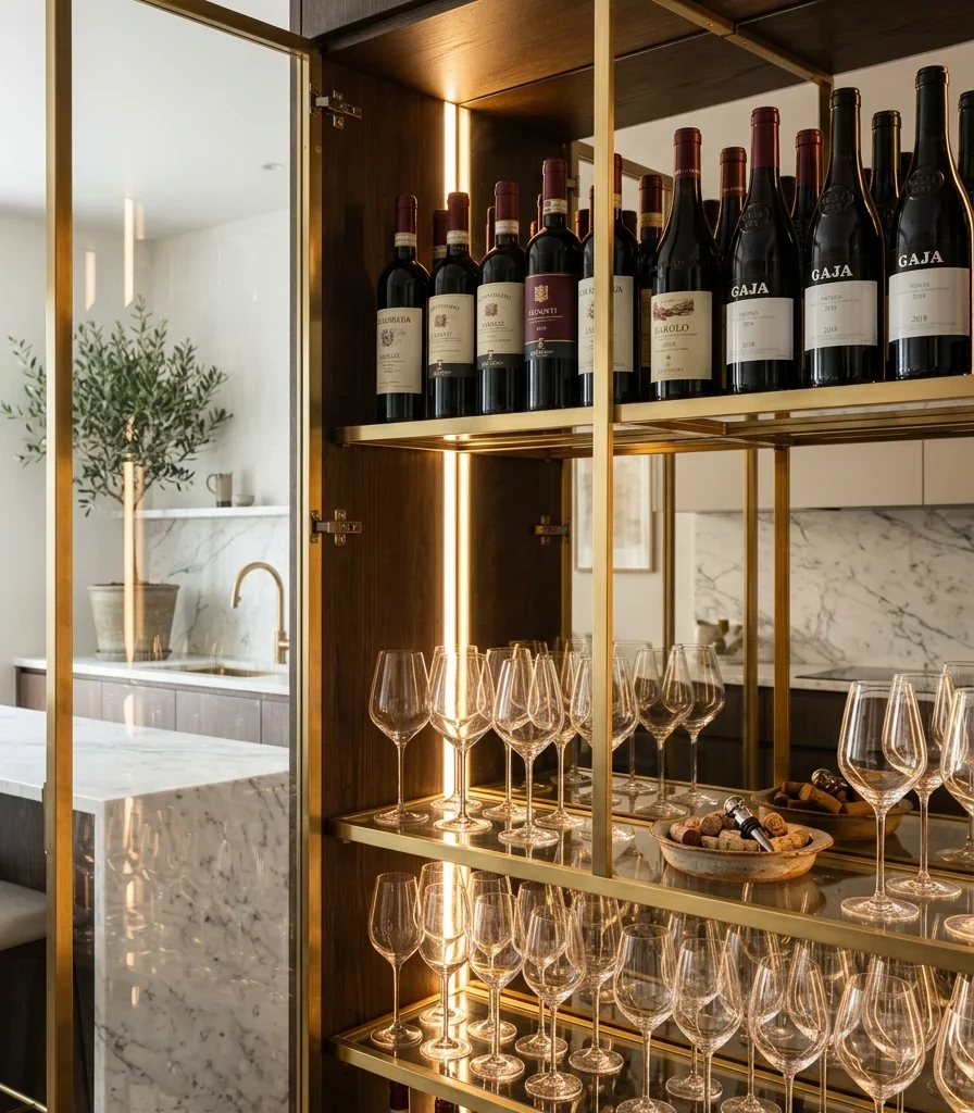
Why it works: A dedicated picture light mounted above wall art applies directional emphasis, a lighting principle that tells the eye exactly where to look first when entering the room, which matters in a small office where every surface competes for attention. Without it, framed art in a dim, moody room can go visually unnoticed regardless of how well it was chosen.

How to get it: Mount a slim brass picture light directly above the room’s single most important framed piece, angled to wash light downward across the print’s surface without glare, and keep its bulb on the same warm 2700K temperature as the desk lamp for consistency.

Shop the Look

Product
Slim brass picture light fixture
Warm 2700K LED bulb replacement
Black-framed art print
Picture light mounting hardware kit
Cream matting mount board

11. A Campaign-Style Chest for Closed Storage

11. A Campaign-Style Chest for Closed Storage

Vibe: Grounded storage with more history than most desks.

Why it works: A campaign-style chest, historically designed for military officers to pack and transport, brings genuine furniture history into a small office along with closed storage that keeps paperwork and supplies out of sight and visual weight without visual clutter. The exposed brass corner hardware repeats the room’s metal finish in a piece of furniture rather than only in lighting or hardware, tying the material story together.

How to get it: Source a campaign-style chest in dark walnut or mahogany with brass corner brackets and recessed brass pulls, sized no larger than 30 inches wide so it fits beside a small desk without crowding the walkway, and use its top surface as secondary display space for books or a lamp.

💡 Quick Win: A vintage campaign-style chest is one of the more findable secondhand furniture pieces at estate sales and often costs less than a comparable new closed-storage cabinet.

Shop the Look

Product
Campaign-style wood storage chest small
Brass corner bracket hardware set
Recessed brass drawer pulls
Stacked hardcover book set neutral spines
Brass bookend pair

12. A Leather Valet Tray for Everyday Carry

12. A Leather Valet Tray for Everyday Carry

Vibe: Still corner of the desk that never looks messy.

Why it works: A leather valet tray gives small, frequently handled objects keys, a watch, a pen a designated landing spot, which prevents the visual clutter of loose objects scattered across a small desk’s limited surface. This is a containment principle: small objects grouped inside a defined boundary read as intentional styling, while the same objects scattered loosely read as mess.

How to get it: Place a stitched leather valet tray, roughly 8×6 inches, in the desk’s front corner nearest the chair, and limit its contents to no more than four to five objects so it stays functional rather than becoming a catch-all drawer substitute.

Shop the Look

Product
Stitched leather valet tray
Brass mechanical pencil
Leather coin tray small
Brass letter opener
Leather cable organizer roll

13. Warm Brass Hardware Repeated Across Every Fixture

13. Warm Brass Hardware Repeated Across Every Fixture

Vibe: Assures a room where nothing metal argues with anything else.

Why it works: Repeating one metal finish, warm brass rather than mixing brass, chrome, and matte black, across every hardware element (lamp, drawer pulls, picture frames, wall sconce) applies finish consistency, a principle that reads as considered expense even in an inexpensively furnished room. Mixed metals multiply visual noise fast in a small space, since every fixture competes for attention in a limited sightline.

How to get it: Audit every metal element in the room amp, hardware, frames, sconces and replace any that aren’t warm brass with brass alternatives or a brass spray-paint refinish, treating metal finish as a rule applied to the whole room rather than a single furniture choice.

Shop the Look

Product
Brass drawer pull hardware universal set
Brass spray paint for hardware refinishing
Brass picture frame set matching
Brass wall sconce single arm
Brass desk lamp matching finish

14. A Desk Placed for Sightline, Not Just Square Footage

14. A Desk Placed for Sightline, Not Just Square Footage

Vibe: Airy, small room that never feels like it’s boxing you in.

Why it works: Positioning the desk so the person sitting at it can see the room’s doorway, rather than facing a blank wall with their back exposed, follows a layout instinct called command position, borrowed from traditional study design, that measurably affects how relaxed and focused someone feels while working. In a small room, this often means placing the desk at an angle rather than flush against the nearest wall.

How to get it: Rotate the desk 15-30 degrees off the wall so the chair faces toward the doorway or the room’s main sightline, even if this means the desk sits slightly further from the corner, and keep a minimum 30-inch clear path between the desk and any doorway.

Shop the Look

Product
Small area rug for under-desk placement
Brass floor lamp slim profile
Desk chair with swivel base
Cable management sleeve for angled desk
Corner floor protector pads

15. A Fold-Down Desk for a Genuinely Tiny Footprint

15. A Fold-Down Desk for a Genuinely Tiny Footprint

Vibe: Airy, a desk that disappears entirely when the workday ends.

Why it works: A wall-mounted fold-down desk solves the genuinely tiny home office problem in a converted closet, a stair landing, or a bedroom corner by eliminating the desk’s footprint even when not in use, a different solution than simply choosing a smaller desk. The constraint isn’t fitting a desk into the room; it’s fitting a desk and full walking clearance into a room too small for both at once.

How to get it: Install a wall-mounted fold-down desk panel in solid walnut or walnut veneer, rated to support a laptop and lamp’s combined weight when open, with concealed folding brackets, and mount shelving directly above it so vertical storage doesn’t compete with the desk’s footprint.

💡 Quick Win: A slim floating shelf that becomes a temporary standing desk, just 12 inches deep, works as an even more minimal version of this idea for closets too narrow for a full fold-down panel.

Shop the Look

Product
Wall-mounted fold-down desk panel walnut
Concealed folding desk bracket hardware
Compact brass desk lamp
Floating wall shelf set above desk
Brass wall hook for headphones

How to Start Your Stylish Small Home Office Transformation

Start with the wall color behind the desk, not the desk itself. Paint the single wall most visible on video calls and to anyone entering the room in a warm charcoal or deep navy, because that backdrop dictates every other material choice wood tone, metal finish, upholstery color that follows. Committing to warm charcoal first, for instance, immediately signals that the room’s wood should lean walnut rather than pale oak, and its metal should lean brass rather than chrome.

The most common mistake is buying furniture at generic office-supply scale- a boxy particleboard desk, a mesh ergonomic chair that reads as corporate rather than considered, breaking the room’s masculine, material-driven look regardless of how well the walls and lighting are handled. Fix this by prioritizing one or two solid-material pieces, a real wood desk or a genuine leather chair, over a full set of matching office furniture, since one quality piece does more visual work than five mediocre ones.

Three items under $50 that create immediate impact: a stitched leather valet tray for keys and a watch ($20-$35); a warm 2700K replacement bulb for an existing desk lamp ($8-$15) that instantly shifts the room’s light temperature; and a small brass bookend pair ($15-$30) that upgrades even a single shelf of books into a styled moment.

A weekend transformation wall paint, a leather desk pad, updated lighting, and a few brass accessories costs $150-$500 and is achievable without touching the furniture already in the room. A fuller transformation involving a new desk, chair, and shelving typically runs $1,000-$3,000 and takes two to four weeks, accounting for furniture delivery times. A full custom build-out with a fold-down or built-in desk, campaign storage, and gallery wall framing can run $3,000-$8,000 and take one to two months from design to installation.

Frequently Asked Questions About Stylish Small Home Office Ideas for Men

What makes a home office design read as “masculine” rather than just modern?

A masculine home office design is defined less by any single rule and more by a consistent combination of choices: darker, saturated wall colors like charcoal or navy rather than light neutrals, natural materials with visible texture like leather and solid wood rather than glossy laminate, and warm metal finishes like brass or blackened steel rather than polished chrome. Modern design alone can be gender-neutral or even quite bright and minimal, while the masculine study aesthetic specifically borrows from historical libraries, campaign furniture, and gentleman’s clubs, prioritizing material weight and warmth over open, airy minimalism.

What’s the best wall color for a small masculine home office?

Warm charcoal (a gray with brown or red undertones rather than blue) and deep navy are the two most reliable choices for a small masculine home office, since both are dark enough to feel intentional and study-like without going as absorbing as true black, which can make a genuinely small room feel smaller rather than cozier. Forest green is a strong third option for anyone wanting a color with more personality. Whichever is chosen, keeping the ceiling and trim in a lighter warm white preserves a visible boundary so the room doesn’t lose its sense of proportion.

How much does it cost to set up a stylish small home office?

A starter transformation using paint, lighting updates, and a few accessories on top of existing furniture typically costs $150-$500 and can be completed in a single weekend. A more complete setup including a solid wood desk, a genuine leather chair, and open shelving generally runs $1,000-$3,000 depending on whether furniture is purchased new or sourced secondhand from estate sales and vintage dealers. Secondhand campaign chests, leather chairs, and brass lighting fixtures are often available at 40-60% below new retail prices and typically carry more authentic material character than new reproductions.

Can a masculine home office design work in a shared or family home?

A masculine small home office generally works well in a shared or family home precisely because it’s typically a single enclosed room with a door, which means its darker color and material choices don’t need to visually match the rest of the house’s palette the way an open-plan kitchen or living room would. The main compatibility consideration is transition: choosing a hallway color that doesn’t feel jarring against a charcoal or navy office, often solved with a simple warm white or greige hallway that acts as a neutral buffer between the office’s saturated palette and the rest of the home.

What’s the best desk size for a small home office?

For a genuinely small home office, a desk between 40 and 48 inches wide typically balances enough work surface for a laptop, monitor, and notebook against the room’s limited footprint, with anything smaller starting to feel cramped for daily use and anything larger crowding the walking path. Depth matters as much as width in a tight room: a desk 20-24 inches deep works for most laptop-based work, while anyone needing a full external monitor setup should look for at least 24 inches of depth to keep the screen at a comfortable viewing distance.

Ready to Create Your Dream Stylish Small Home Office?

These 15 stylish small home office ideas for men move across moody color, natural material texture, disciplined lighting, and layout tricks that make even a closet-sized room feel like a genuine study rather than an afterthought workspace. Building a room like this doesn’t require doing everything at once, and starting with one wall color or one leather accessory is a legitimate, even smarter, way to begin than attempting the full transformation in a single weekend. Today, paint a sample swatch of warm charcoal or deep navy on the wall most visible from your desk chair and live with it for 48 hours before committing to a full gallon. Once the room comes together, the payoff goes beyond how it looks on a video call; it’s the specific, private satisfaction of sitting down at a desk built with the same intention as everything else you own. Save the ideas that matched the leather, the brass, or the walnut tone you kept returning to, and let that first material choice be where your own study actually begins.

You Might Also Like

12 Cozy Green Terracotta Bedroom Ideas Worth Saving

12 Cozy Green Terracotta Bedroom Ideas Worth Saving

A cozy green terracotta bedroom pairs sage-to-forest green tones with sunbaked clay and rust hues to create a sleep space that feels grounded and alive. This article gives you 12 cozy green terracotta bedroom ideas: color, materials, lighting, furniture, layout, and small-space fixes, each with a shoppable “Steal the Look” list.

Picture a room where light lands on a clay-colored wall the way afternoon sun hits a terracotta courtyard warm, a little dusty, unhurried. Sage and moss greens soften the terracotta’s heat so the palette never tips into “spicy.” Linen wrinkles gently on the bed, unglazed pottery sits on a windowsill, and the whole room feels built around slowing down. Here are 12 ideas worth saving and stealing.

Why a Cozy Green Terracotta Bedroom Works So Well

A green terracotta bedroom is a color-palette-driven style rather than a single design movement; it borrows the sunbaked clay tones of Spanish, Mexican, and Southwestern architecture and pairs them with the botanical sage and moss greens of Mediterranean and Japandi interiors. What separates it from a generic “earth tone bedroom” is the deliberate two-color anchor: terracotta carries warmth, green carries calm, and neither dominates.

The materials that make this read as intentional: unglazed terracotta pottery, raw clay plaster or limewash, reclaimed oak, jute and rattan, and bouclé in a warm oatmeal base. Colors worth naming: terracotta (a muted brick-orange, not fire-engine orange), sage, moss, eucalyptus, and clay-white for walls not doing accent duty.

This palette is trending because it sits between two 2020s movements: the sustainability-driven return to unglazed natural materials, and the post-pandemic desire for bedrooms that feel like a retreat rather than a showroom. Pinterest search data shows steady growth for “terracotta bedroom” and “sage green bedroom” independently; combining them fills a search gap neither term covers alone.

ElementGreen InfluenceTerracotta Influence
PhilosophyBotanical calm, Mediterranean restraintSunbaked warmth, Southwestern clay tradition
MaterialsBouclé, linen, rattan, unglazed stonewareTerracotta pottery, clay plaster, reclaimed wood, jute
Color PaletteSage, moss, forest, eucalyptusTerracotta, clay, rust, sunbaked brick

1. Terracotta Accent Wall Behind the Bed

1. Terracotta Accent Wall Behind the Bed

Vibe: Grounded wall color that makes the bed feel like the room’s warm center.

Why it works: Terracotta is a warm hue that visually advances, so painting only the headboard wall creates depth without shrinking the room. Value contrast between matte clay and crisp ivory linen keeps the wall from reading as heavy.

How to get it: Paint one wall in a muted clay shade such as Sherwin-Williams Cavern Clay SW 7701, in matte, eggshell, satin, or gloss on warm colors under lamp light. Keep the remaining walls warm white.

💡 Quick Win: Can’t commit to paint? A terracotta-dyed linen wall hanging behind the headboard gives most of the same warmth for under $60 and comes down in minutes.

Shop The Look

Product
Terracotta clay wall paint sample kit
Ivory linen duvet cover set queen
Woven jute wall hanging round
Rattan pendant light shade small
Ceramic table lamp warm terracotta glaze

2. Linen and Reclaimed Wood Headboard

2. Linen and Reclaimed Wood Headboard

Vibe: A raw headboard that looks decades-old even if bought last month.

Why it works: Texture layering pairs rough and smooth surfaces so the eye registers more than one thing. Reclaimed oak grain against slightly wrinkled linen creates contrast without adding a new color.

How to get it: Source a reclaimed or distressed oak headboard rather than new stained wood; the grain depth is visible up close. Add a linen bolster in warm oatmeal, not stark white, which reads too clinical against raw wood.

Shop The Look

Product
Reclaimed wood headboard bed frame
Natural linen bolster pillow cover
Oak floating nightstand shelf
Woven rattan storage basket round
Wool throw blanket sage green

3. Warm Amber Bedside Sconces

3. Warm Amber Bedside Sconces

Vibe: Hushed lighting that turns the last twenty minutes before sleep into a ritual.

Why it works: Wall sconces free nightstand surface area (negative space) while their fixed height keeps output consistent. Warm 2700K bulbs avoid the blue-light spectrum that interferes with melatonin, which matters more here than anywhere else in the house.

How to get it: Mount sconces so the shade center sits roughly 60–65cm above the nightstand, at eye level when seated up in bed. Specify 2700K bulbs only and add an in-line dimmer cord.

💡 Quick Win: Swapping bulbs to 2700K “warm white” in existing lamps costs under $12 and shifts the room’s mood instantly.

Shop The Look

Product
Brushed brass wall sconce bedside pair
Amber glass sconce shade replacement
In-line dimmer switch cord bedside
Rattan accent lamp base small
Warm white 2700K LED bulb set

4. Sage-to-Forest Green Layering

4. Sage-to-Forest Green Layering

Vibe: Layered green shows up at three depths instead of one flat accent.

Why it works: Tonal layering several shades within one color family creates depth a single flat green can’t. A lighter sage trim, warm white walls, and one deep forest-green cushion give the eye a gradient to travel across.

How to get it: Paint trim in a soft sage like Benjamin Moore’s “Saybrook Sage,” keep walls warm white, and add one forest-green velvet cushion as the deepest note.

Shop The Look

Product
Sage green trim paint sample pot
Forest green velvet throw pillow cover
Terracotta quilted linen coverlet
Small green ceramic bud vase
Moss green wool area rug

5. Curved Upholstered Bed in Clay-Toned Bouclé

5. Curved Upholstered Bed in Clay-Toned Bouclé

Vibe: Cocooning, curved shape that wraps the whole room around you.

Why it works: A curved headboard softens hard angles, distributing visual weight; rounded forms read as lighter than boxy ones at the same size. Clay-toned bouclé carries both the color story and a texture that reads soft from across the room.

How to get it: Choose a curved bed frame upholstered in terracotta or rust bouclé rather than cream, so the bed doesn’t split off from the palette. Pair with slim brass legs to keep the silhouette light.

💡 Quick Win: No budget for a new frame? A terracotta bouclé headboard slipcover over an existing frame gives the same curved, textural look for far less.

Shop The Look

Product
Curved bouclé upholstered bed frame terracotta
Clay-toned bouclé headboard slipcover
Brushed brass bed frame leg caps
Oversized terracotta floor cushion
Wool blend area rug,warm cream

6. Terracotta Ceramics and Unglazed Pottery Vignette

6. Terracotta Ceramics and Unglazed Pottery Vignette

Vibe: Tactil a vignette that makes you want to touch every surface.

Why it works: Unglazed pottery’s matte, porous surface absorbs rather than bounces light, reading warmer and more grounded than glossy ceramics. Grouping in odd numbers at varying heights avoids the flat look of matched pairs.

How to get it: Group three unglazed terracotta vessels tall vase, squat bowl, small bud vase on one windowsill rather than spreading pieces around the room. Skip anything glazed or painted.

Shop The Look

Product
Unglazed terracotta vase set of three
Handmade ceramic bud vase small
Woven seagrass catch-all tray
Dried pampas grass stem bundle
Small ceramic trinket dish clay finish

7. Botanical Textiles and Leaf-Print Linens

7. Botanical Textiles and Leaf-Print Linens

Vibe: Lush, brings the outside in without a single fake leaf on the walls.

Why it works: A botanical print introduces green through pattern instead of paint, letting renters access the palette without touching a wall. The print’s green tones bridge the terracotta bedding beneath it to any green textiles elsewhere.

How to get it: Choose a muted, tonal leaf-print linen duvet; avoid bright, high-contrast florals, which push toward “garden print.” Layer one solid terracotta pillow beneath it so the print isn’t the only color statement.

💡 Quick Win: A single dried eucalyptus bundle in a terracotta vase adds the same green-and-clay pairing for under $15 with zero maintenance.

Shop The Look

Product
Botanical leaf-print linen duvet cover
Green leaf throw pillow cover set
Dried eucalyptus stem bundle
Rattan plant stand round
Faux trailing pothos plant

8. Zoning a Reading Corner in Green and Clay

8. Zoning a Reading Corner in Green and Clay

Vibe: Considered turns a one-function bedroom into a room with two reasons to be in it.

Why it works: Zone definition creates a distinct seating area; even small breaks up traffic flow and signals the space serves more than sleep. A green chair against a terracotta bed reads as visually distinct without adding a third color.

How to get it: Position one accent chair and a side table in the corner with the most natural light, angled to face into the room. Keep the chair in the green half of the palette so it separates visually from the bed.

Shop The Look

Product
Bouclé accent chair sage green
Round rattan side table small
Woven floor storage basket
Brass adjustable reading lamp
Terracotta wool floor pouf

9. Layered Ceiling and Task Lighting in Warm Tones

9. Layered Ceiling and Task Lighting in Warm Tones

Vibe: Glowing light makes the whole room look sunset-lit at 9 pm.

Why it works: Natural fiber shades diffuse light into a soft, dappled glow instead of a hard beam. Pairing this with a separate brass task light means you’re never choosing between mood lighting and reading light.

How to get it: Install a rattan dome pendant with a 2700K bulb, plus one adjustable brass reading light beside the bed. Never rely on a single overhead fixture alone; it flattens shadows and kills the cozy effect.

💡 Quick Win: A plug-in swag pendant kit hangs a rattan shade with no electrical work just a hook and a tucked-away cord.

Shop The Look

Product
Rattan dome pendant ceiling light
Warm white 2700K LED bulb set
Brass adjustable reading wall light
Plug-in swag pendant light kit
Smart dimmer plug warm setting

10. Matching Terracotta Nightstands with Woven Fronts

10. Matching Terracotta Nightstands with Woven Fronts

Vibe: Balanced symmetry that makes a bedroom feel finished, not assembled piece by piece.

Why it works: Matching nightstands apply a proportion and symmetry principle; the eye reads identical paired objects as intentional, while mismatched ones read as unresolved. Woven cane fronts add texture without a new color.

How to get it: Choose a nightstand pair with woven cane fronts in a terracotta-washed finish, topped with identical lamps; even matching lamp shades reinforce the symmetry.

Shop The Look

Product
Rattan-front nightstand pair terracotta wash
Ceramic table lamp pair sage green
Small woven storage basket pair
Brushed brass drawer pull knob set
Linen table runner for dresser top

11. Gallery Wall in Earth-Tone Ceramics and Art

11. Gallery Wall in Earth-Tone Ceramics and Art

Vibe: Curated a wall that tells visitors this palette was chosen on purpose.

Why it works: Mixing framed art with mounted ceramic plates adds dimensionality that flat art alone can’t achieve; the plates cast small shadows and catch light differently. Sticking to only terracotta and sage tones keeps a busy wall from feeling chaotic.

How to get it: Lay out the arrangement on the floor first with painter’s tape, mixing two or three abstract canvases with two or three ceramic plates, spaced roughly 5–8cm apart.

💡 Quick Win: Three mismatched terracotta ceramic plates alone, mounted with adhesive hangers, create an instant gallery moment for under $40.

Shop The Look

Product
Abstract earth-tone canvas art set
Ceramic decorative wall plate set
Woven wall hanging fiber art
Small floating wood shelf
Terracotta-toned picture frame set

12. Vertical Green and Clay Layering for Compact Bedrooms

12. Vertical Green and Clay Layering for Compact Bedrooms

Vibe: Airy proof this palette can work in a small room without feeling cramped.

Why it works: Vertical layering of all furniture and ceiling-height curtains draws the eye upward, making low ceilings feel taller. Keeping terracotta small and low while letting green live higher on curtains avoids the visual weight a full terracotta wall would add.

How to get it: Mount curtain rods at ceiling height in sage linen, add one tall narrow ladder shelf in natural wood, and reserve terracotta for small, low objects only: a floor planter, a bud vase.

Shop The Look

Product
Ceiling-height curtain rod extendable
Sage green linen curtain panel pair
Tall narrow ladder shelf natural wood
Small terracotta wall planter set
Leaning full-length mirror slim frame

How to Start Your Green Terracotta Bedroom Transformation

Start with the wall color. Before buying bedding, furniture, or décor, choose and commit to one terracotta shade for a single accent wall; this anchors every choice that follows, from the green tone you pair with it to the wood finishes sitting against it.

The most common mistake beginners make is choosing a terracotta that’s too orange and a green that’s too bright construction-cone orange next to Kelly green which reads as a Halloween palette rather than an earthy retreat. Both colors need to be muted and dusty. If you’re unsure in the paint aisle, hold the swatches together: if they look like trail mix rather than a traffic sign, you’ve got it right.

Three items under $50 that make an immediate impact: an unglazed terracotta bud vase ($18–$25) on the nightstand; a sage green linen throw pillow cover ($15–$22) added to existing bedding; and a warm white 2700K bulb set ($10–$14) replacing any cool-white bulbs.

Realistic expectations: A starter version an accent wall, new bedding, a few ceramic pieces takes a single weekend and costs $150–$400. A full transformation with furniture, lighting, and a gallery wall runs $1,500–$4,000 over four to eight weeks as pieces are sourced.

Frequently Asked Questions About Cozy Green Terracotta Bedroom Ideas

What is a green terracotta bedroom, and how is it different from a regular earth-tone bedroom?

A cozy green terracotta bedroom pairs two anchor colors, sage-to-forest green and clay-toned terracotta, rather than pulling from the full earth-tone spectrum of browns, tans, and rust at once. A general earth-tone bedroom might mix camel, chocolate, and mustard, while this approach deliberately limits itself to two complementary families so the palette stays calm rather than busy.

What green pairs best with terracotta in a bedroom?

Sage and moss green are the most reliable pairings because their grey undertone softens terracotta’s warmth without competing with it; forest green also works well as a broader accent in small doses, like a single velvet cushion. Avoid mint or emerald green, which read cool and clash with terracotta’s warm orange base.

How much does it cost to decorate a bedroom in this style?

A budget-conscious version using paint, new bedding, and a few ceramic accents costs roughly $150–$400 and can be done in a weekend. A fuller transformation with upholstered furniture, layered lighting, and a gallery wall generally falls between $1,500 and $4,000, depending on whether furniture is new or secondhand.

Does a green terracotta bedroom work with existing furniture, like a dark wood dresser or black bed frame? Ye s

Yess, dark wood tones like walnut pair naturally with terracotta’s warmth, and black metal bed frames contrast nicely against sage walls without clashing. The palette is flexible enough to build around existing furniture as long as new textiles lean into the terracotta-and-sage story rather than introducing a third unrelated hue.

What’s the single most important element for making this style feel cozy rather than just colorful?

Lighting makes or breaks the cozy feeling. Warm 2700K bulbs and layered light sources (a ceiling fixture plus at least one bedside lamp) turn a well-colored room into a genuinely cozy one. Cool white or single-overhead lighting flattens the terracotta and green tones and makes even a well-decorated room feel clinical.

Ready to Create Your Dream Cozy Green Terracotta Bedroom?

These 12 ideas cover the full range of what this palette can do, from the color-anchoring power of a terracotta wall, to the material warmth of unglazed pottery and reclaimed oak, to small-space tricks that make a compact room feel just as layered as a large one. Building a room like this happens one weekend, one wall, one throw pillow at a time; no rule says you need to do it all at once. If you’re starting today, pick your terracotta paint swatch and hold it against a sage fabric sample before buying anything else. Once the walls are warm and the light is soft, this is the kind of bedroom that makes climbing into bed feel like stepping into a sunbaked, sheltered little world of your own. Save the ideas that match your room’s light and size and start pinning your terracotta-and-sage moodboard tonight.

You Might Also Like

15 Creative Small Full Bathroom Ideas Boho

15 Creative Small Boho Full Bathroom Ideas

A boho small full bathroom is a complete bathroom: tub, shower, toilet, and sink layered with natural texture, warm earthy color, and a globally inspired mix of woven, vintage, and plant-filled details rather than a single matched material palette. This article gives you 15 genuinely creative small full bathroom ideas in boho style, covering material, color, lighting, and layout decisions that bring real bohemian warmth into a tight 5×8 or 6×9 footprint.

It feels like a room collected over time rather than bought in a single trip: rattan catching soft afternoon light, a macrame hanging swaying faintly in the steam, a vintage rug layered right over the tile underfoot. This is boho design at its most creative: layered, textural, unafraid of pattern or a little imperfection. Every piece earns its place because a full bathroom’s four fixtures leave little room for anything that doesn’t genuinely contribute to the room’s warmth.

Here are 15 ideas worth saving and stealing.

Why Creative Small Full Bathroom Boho Design Works So Well

Bohemian design traces to the 19th-century artists and writers who rejected conventional bourgeois taste in favor of eclectic, well-traveled interiors, resurfacing again through the 1960s and 70s counterculture movement that layered global textiles, rattan, and macrame into everyday homes. What distinguishes it from other eclectic styles is its specific reliance on natural, handcrafted materials and a genuinely mixed, collected-over-time feel rather than a single curated color story.

Core materials are rattan and cane, handmade zellige or clay-toned tile, woven seagrass, and natural fiber macrame, paired with warm terracotta, rust, deep ochre, and sun-bleached clay tones. Pattern and texture layering matter more here than in almost any other style, with vintage textiles like kilim rugs used deliberately even in wet areas.

Style at a Glance

ElementCore Trait 1Core Trait 2
PhilosophyLayered, globally inspired texture collected over time, not matched in one tripNatural, handcrafted materials over manufactured uniformity
MaterialsRattan and cane, handmade zellige, macrameWoven seagrass, vintage textiles
Color PaletteWarm terracotta, rust, deep ochreSun-bleached clay tones

15 Creative Small Full Bathroom Ideas Boho

1. Surround a Vessel Sink in Rattan

1. Surround a Vessel Sink in Rattan

Vibe: Warm a vanity with genuine woven texture instead of a flat painted cabinet front.

Why it works: Rattan applies texture layering at the vanity’s largest visible surface; its natural woven pattern introduces dimensional shadow and light play that a flat cabinet door can’t replicate, grounding the boho palette’s signature material directly at eye level where it’s seen every time the room is used.

How to get it: Choose a rattan-fronted vanity base with a simple white ceramic vessel sink on top (letting the rattan carry the texture rather than competing with an ornate basin), pairing it with warm brass hardware and a vessel-style faucet.

💡 Quick Win: Wrapping an existing plain vanity front in adhesive cane webbing achieves a similar look without full furniture replacement.

Shop the Look

Product
Rattan front vanity base
White ceramic vessel sink
Brass vessel sink faucet
Small ceramic soap dish
Adhesive cane webbing sheet

2. Layer a Terracotta and Rust Palette

2. Layer a Terracotta and Rust Palette

Vibe: A warm palette that feels sun-baked, like it belongs somewhere the light hits differently.

Why it works: Layering terracotta and rust together (rather than a single flat earth tone) is a tonal-layering principle central to boho color work. Using two closely related warm hues rather than one creates depth without introducing a competing color family, letting the room feel richly warm rather than simply orange.

How to get it: Introduce terracotta through towels and a bath mat, and rust through a smaller ceramic accent or two, keeping the walls and larger tile surfaces neutral so the two warm tones layer against a calm backdrop rather than overwhelming the small room.

Shop the Look

Product
Terracotta cotton towel set
Rust ceramic accent vase
Terracotta bath mat woven
Dried pampas grass stem
Rust linen washcloth

3. Repurpose a Vintage Dresser as a Boho Vanity

3. Repurpose a Vintage Dresser as a Boho Vanity

Vibe: Layered a piece with a genuine former life, doing new work as a sink base.

Why it works: Repurposing furniture is central to boho’s collected-over-time philosophy; a converted dresser carries visible age, original hardware, and proportions no manufactured vanity replicates, embodying the style’s preference for pieces with real history over anything bought new and matched.

How to get it: Source a solid wood dresser with deep enough drawers to remain functional once the sink is cut through the top, sealing the surface around the cutout with a waterproof polyurethane while keeping the original hardware intact.

Shop the Look

Product
White ceramic vessel sink round
Brass gooseneck faucet
Waterproof polyurethane sealant
Small woven storage basket
Vessel sink mounting ring

4. Hang a Woven Rattan Pendant Over the Vanity

4. Hang a Woven Rattan Pendant Over the Vanity

Vibe: Warm light that filters through natural weave instead of shining flat and direct.

Why it works: A woven rattan pendant applies light-behavior and material-honesty principles together; the open weave scatters light unevenly, casting a dappled pattern across the wall that a solid shade never produces, referencing the natural, handcrafted material language central to boho lighting.

How to get it: Choose a rattan pendant rated for damp locations (essential in a full bathroom with a shower), hung 12–15 inches above the mirror’s top edge, using a warm 2700K bulb so the filtered glow reads genuinely warm.

Shop the Look

Product
Woven rattan pendant damp rated
Warm 2700K bulb
Adjustable pendant cord kit
Small ceramic vanity dish
Brass ceiling canopy trim

5. Install Zellige Tile in a Warm Clay Tone

5. Install Zellige Tile in a Warm Clay Tone

Vibe: Raw tile with enough handmade irregularity that no two feet of wall look quite the same.

Why it works: Handmade zellige in a warm clay tone applies texture layering through material variation rather than pattern; its glaze inconsistency and irregular edges give a single-color wall genuine visual depth, which is precisely the handcrafted imperfection boho design values over the uniform precision of machine-pressed tile.

How to get it: Install genuine handmade zellige in a warm clay or terracotta glaze with a warm white grout mixed slightly darker than pure white, requesting tiles from a single production batch since dye lots vary noticeably.

Shop the Look

Product
Warm clay handmade zellige tile
Warm white sanded grout
Small ceramic soap dish
Matte brass shower fixture
Natural sea sponge holder

6. Hang a Macrame Wall Hanging Above the Tub

6. Hang a Macrame Wall Hanging Above the Tub

Vibe: Hushed, a textile piece with genuine handmade complexity hanging above the room’s most restful fixture.

Why it works: Macrame is the accessory most directly associated with boho’s 1970s revival, and hanging it above the tub applies accessory layering exactly where the room’s slowest, most restorative activity happens; its intricate knotted texture references handcraft in a way no printed textile can, reinforcing the room’s collected, artisanal character.

How to get it: Choose a natural cotton macrame piece sized to roughly two-thirds the tub’s width, hung on a wood dowel positioned where steam won’t cause mildew over time (avoid the direct shower spray zone specifically).

Shop the Look

Product
Natural cotton macrame wall hanging
Wood dowel hanging rod
Dried botanical stem bundle
Honey wood picture hook
Small ceramic bath tray

7. Pair Sun-Bleached Terracotta Grout With White Tile

7. Pair Sun-Bleached Terracotta Grout With White Tile

Vibe: Warm, a familiar white tile given a sun-faded, well-traveled warmth through grout color alone.

Why it works: Sun-bleached (muted, dusty) terracotta grout is a contrast tool that reads specifically boho when the tone is deliberately faded rather than a bright, saturated clay; the muted warmth references sun-worn adobe and desert textiles, a color association central to the style’s global, warm-climate visual language.

How to get it: Use a square white tile with a muted, dusty terracotta sanded grout mixed lighter than a full clay tone, testing a small sample area first since the effect depends on the specific muted shade reading as “faded” rather than simply orange.

Shop the Look

Product
White square wall tile
Sun-bleached terracotta grout
Grout sealer penetrating
Small ceramic soap dish
Matte brass tile trim

8. Layer a Vintage Kilim Bath Mat Over a Clawfoot Tub Zone

8. Layer a Vintage Kilim Bath Mat Over a Clawfoot Tub Zone

Vibe: Layer a rug with genuine pattern history laid right on the bathroom tile, unafraid of getting a little wet at the edges.

Why it works: Using a vintage-style kilim rug in a bathroom (rather than a plain bath mat) applies texture and pattern layering at floor level, a specifically boho willingness to bring living-room-caliber textiles into a wet space; the pattern’s density and color variation give the floor genuine visual interest a solid-color mat never could.

How to get it: Choose a flat-weave kilim-style rug specifically labeled for bathroom or high-moisture use, positioning it beside rather than directly under the tub’s drip zone, and lift it to air-dry fully after each use to prevent mildew.

💡 Quick Win: A washable kilim-print bath mat under $30 approximates the pattern’s look with genuine wash-and-dry practicality.

Shop the Look

Product
Kilim style bathroom rug
Washable kilim print bath mat
Small wood stool
Cast iron clawfoot tub filler
Small ceramic bath tray

9. Style a Candlelit Niche Shelf for an Evening Ritual

9. Style a Candlelit Niche Shelf for an Evening Ritual

Vibe: Romantic, a recessed shelf that exists to hold the small rituals a boho bath depends on.

Why it works: A candlelit niche applies light-layering and accessory styling together at the smallest scale rather than a single bright overhead fixture; three or four small candles grouped in a recessed shelf give the room a genuinely warm, flickering glow during an evening bath, consistent with boho’s preference for soft, varied light sources over one flat one.

How to get it: Group three to four small candles of varying heights in the niche alongside one or two ceramic bottles, refreshing candles regularly and keeping the arrangement loose rather than perfectly symmetrical.

Shop the Look

Product
Small glass votive candle holder set
Beeswax votive candle set
Small ceramic amenity bottle
Dried botanical sprig
Recessed niche tile trim

10. Style a Woven Seagrass Basket Trio for Open Storage

10. Style a Woven Seagrass Basket Trio for Open Storage

Vibe: Layered storage with genuine textural variety instead of one uniform matching set.

Why it works: Grouping three baskets in different sizes and slightly varied weave patterns (rather than an exactly matched set) is a texture-layering principle that reinforces boho’s collected-over-time character. A perfectly matched trio reads as purchased together, while intentional variety in size and weave suggests items gathered individually over time.

How to get it: Choose three baskets in a graduated size progression with at least two different weave textures, stacking the smaller inside the larger when not in active use and reserving the largest for towels.

Shop the Look

Product
Woven seagrass basket trio
Small dried stem accent
Honey wood open shelf
Rolled cotton towel set
Small ceramic accent jar

11. Paint a Deep Ochre Accent Wall Behind the Vanity

11. Paint a Deep Ochre Accent Wall Behind the Vanity

Vibe: Grounded, a color saturated enough to feel like it was mixed from actual earth pigment.

Why it works: Deep ochre applies color anchoring at the vanity wall specifically, letting the room commit to a genuinely saturated, warm color without darkening the whole small bathroom. Ochre’s earthy, mineral-pigment quality is historically tied to the natural dye traditions boho design references throughout its material choices.

How to get it: Paint only the wall directly behind the vanity in matte deep ochre, keeping the remaining walls in warm white, and pair it with the rattan vanity and brass hardware already covered so the warm materials and warm wall reinforce each other.

Shop the Look

Product
Deep ochre matte wall paint
Rattan vanity base
Brushed brass faucet
Small ceramic countertop vessel
Painter’s tape precision edge

12. Position a Trailing Plant Wall Near the Shower Steam

12. Position a Trailing Plant Wall Near the Shower Steam

Vibe: Layered living greenery positioned exactly where the room’s humidity actually helps it thrive.

Why it works: A trailing plant wall applies biophilic and negative-space principles together. Pothos and similar humidity-loving plants genuinely benefit from a shower’s steam, so mounting them near (not directly in) the wet zone isn’t purely decorative but placed where the plant will actually flourish, reinforcing boho’s emphasis on living, growing elements throughout the room.

How to get it: Mount two or three ceramic pots with drainage on a wall-mounted rack positioned to catch shower steam without direct water spray, choosing pothos, philodendron, or another trailing vine known to tolerate high humidity and lower light.

Shop the Look

Product
Wall-mounted plant rack
Ceramic trailing plant pot with drainage
Pothos cutting starter plant
Small ceramic watering can
Wall anchor mounting kit

13. Add a Cane-Front Cabinet for the Water Closet Zone

13. Add a Cane-Front Cabinet for the Water Closet Zone

Vibe: Warm, a storage piece with woven texture even in the room’s most purely functional corner.

Why it works: A cane-front cabinet extends the rattan vanity’s material language to a second furniture piece, applying material coherence across the room using the same natural woven texture in two places rather than introducing an unrelated material. For the water closet’s storage, keep the small bathroom’s boho story consistent rather than fragmented.

How to get it: Choose a narrow cane-front cabinet no wider than 16–18 inches to fit the typical clearance beside a toilet, matching its wood tone to the vanity, and use brass hardware to keep the metal finish consistent throughout.

Shop the Look

Product
Cane front storage cabinet
Brass cabinet pull
Small ceramic storage canister
Honey wood cabinet frame
Rolled towel for cabinet top

14. Layer a Vintage Rug Over Tile for a Textural Zone Break

14. Layer a Vintage Rug Over Tile for a Textural Zone Break

Vibe: Layer a rug that visually separates the dry vanity zone from the wet shower area without a single physical wall.

Why it works: Using a patterned rug specifically over the vanity zone (and nowhere near the shower’s wet path) is a zone-definition principle applied through texture rather than a curb or half-wall; the rug’s boundary tells the eye and the feet exactly where the dry, textile-friendly area ends, a technique especially useful in a full bathroom where four fixtures already compete for a small footprint.

How to get it: Size the rug to the vanity zone’s footprint specifically, keeping it at least 24 inches clear of the shower’s splash radius, and choose a low-pile flat weave that dries quickly if it does get incidentally damp.

Shop the Look

Product
Vintage pattern flat weave rug
Rug non-slip pad
Small ceramic vanity tray
Honey wood vanity accent
Terracotta ceramic soap dish

15. Build a Corner Rattan Shelf Column for a Tight Boho Full Bath

15. Build a Corner Rattan Shelf Column for a Tight Boho Full Bath

Vibe: Still a full column of texture and storage claiming a corner most tight bathrooms leave empty.

Why it works: In a genuinely tight full bathroom under 35 square feet, a narrow rattan shelf column is the small-space adaptation that adds both storage and the style’s signature texture without requiring floor footprint beyond a corner most fixtures can’t use; its vertical profile claims height rather than depth, the resource a tight full bathroom has more of than floor space.

How to get it: Choose a rattan or cane shelving column no wider than 14 inches, fitted into whatever corner remains after the tub, shower, toilet, and sink are placed, styling the top shelf with a trailing plant and lower shelves with rolled towels.

💡 Quick Win: A slim tension-mounted rattan shelf under $50 fits an even narrower gap without any wall drilling, ideal for rentals.

Shop the Look

Product
Narrow rattan corner shelf column
Small trailing plant pot
Rolled cotton towel stack
Tension-mounted rattan shelf
Small ceramic accent jar

How to Start Your Creative Small Full Bathroom Boho Transformation

Your one first move is choosing the vanity piece, specifically either a genuine rattan-fronted vanity or a repurposed vintage dresser. Since the vanity sits at eye level and carries the room’s largest material statement, committing to it first anchors every subsequent texture, color, and hardware decision.

The most common mistake is layering too many patterns and textures at once in a genuinely small footprint, which tips the room from considered eclecticism into visual clutter. The fix is choosing one dominant texture (rattan or macrame, not both at full scale) and letting the remaining elements stay simpler in support of it.

Three items under $50 that create immediate impact: a small woven seagrass basket, a bundle of dried pampas grass in a ceramic vase, and a set of beeswax votive candles for a niche or ledge.

A weekend refresh of baskets, candles, and a macrame hanging costs $100–300. A full boho small full bathroom renovation with a rattan vanity and zellige tile typically runs $7,000–15,000 and takes three to five weeks depending on plumbing changes.

Frequently Asked Questions About Creative Small Full Bathroom Ideas Boho

What is the difference between boho and eclectic bathroom design?

Eclectic design mixes styles and eras without a specific material or cultural throughline. Boho bathroom design specifically relies on natural, handcrafted material  rattan, macrame, woven fiber and warm earthy colors drawn from global textile and dye traditions- giving it a more consistent material identity than eclectic design’s broader anything-goes approach.

What color works best in a boho small full bathroom?

Warm terracotta, rust, and deep ochre work best as a layered palette, paired with warm white for the base walls and tile. These earthy, sun-warmed tones reference the natural dye traditions central to boho’s visual language more directly than cooler neutrals or pastel colors would.

How much does a boho small full bathroom renovation cost?

A budget refresh using baskets, textiles, and a macrame hanging costs $150–400. A mid-range renovation with a repurposed vanity and new tile runs $5,000–10,000, while a full renovation including handmade zellige and a cast iron clawfoot tub typically costs $10,000–16,000 depending on plumbing complexity.

Can a rattan or cane vanity handle a full bathroom’s daily humidity?

Yes, provided it’s specifically rated or sealed for bathroom use. Genuine rattan and cane furniture needs a waterproof sealant applied to any cut edges (like a sink cutout) and benefits from good ventilation to prevent the natural fiber from warping or developing mold over years of daily steam exposure.

What is the most searched element in boho bathroom design right now?

Macrame wall hangings and rattan vanities are currently the most searched single elements in boho bathroom design, according to Pinterest data, followed closely by handmade zellige tile in warm clay tones as homeowners look for genuine textural variation over uniform manufactured tile.

Ready to Create Your Dream Creative Small Full Bathroom Boho?

These 15 ideas move across material, color, lighting, layout, and true small-space solutions from a rattan vanity and a woven pendant to a corner shelf column that fits a full boho story into a genuinely tight footprint. None of this needs to happen all at once, and starting with one woven basket and a bundle of dried pampas grass is genuinely the right way to begin, not a smaller version of the vision. Today’s specific action: source one piece of rattan or cane furniture, even a small stool or basket nd hold it against your current bathroom’s fixtures to see what warm tone the rest of the room should follow. Once that first textured piece is in place, the room will start feeling less like a fixed, finished space and more like one that’s still gathering its own story, exactly the way boho design is meant to. Save the ideas that fit your room’s real footprint and your own appetite for layered texture; that macrame hanging and warm ochre wall will still feel just as collected a year from now.

You Might Also Like

15 Efficient Small Business Home Office Ideas

15 Efficient Small Business Home Office Ideas

An efficient small business home office is a workspace built for running an actual business, not just remote employment: a desk that handles invoicing, a corner that photographs products accurately, and storage that keeps inventory and client files separate from everyday household clutter. This article gives you 15 genuinely efficient small business home office ideas covering material, color, lighting, and layout decisions built specifically for entrepreneurs working from home.

It feels like a room that takes the business as seriously as any storefront would: a locking file drawer for client contracts, a corner with light balanced enough to photograph a product accurately, a packing station that turns shipping into a five-minute task instead of a scavenger hunt for tape and boxes. This is a small business home office at its most functional: efficient, professional, built around the specific rhythms of running something rather than simply clocking hours. Every choice earns its place because a home business asks more of a room than a standard desk job ever does.

Here are 15 ideas worth saving and stealing.

Why an Efficient Small Business Home Office Works So Well

The home-based small business office draws from the rapid growth of solo entrepreneurship and e-commerce over the past two decades, which turned spare bedrooms and basement corners into genuine order fulfillment centers, client meeting spaces, and product studios almost overnight. What separates an efficient small business setup from a standard remote-employee home office is that it has to serve multiple distinct business functions client-facing, fulfillment, bookkeeping often within the same modest square footage a single desk job would otherwise occupy.

Core materials favor durable, functional surfaces: walnut or oak for a desk deep enough to hold both a laptop and paperwork, locking metal or wood file storage for client and financial documents, and neutral matte wall paint that keeps product photography color-accurate. Color stays deliberately restrained in camera-facing zones, with a business’s actual brand color introduced through smaller accents rather than the walls.

Style at a Glance

ElementCore Trait 1Core Trait 2
PhilosophyOne room serving distinct business functions: client-facing, fulfillment, bookkeepingEfficiency and professionalism prioritized over pure aesthetics
MaterialsWalnut or oak desk, locking file storageNeutral matte walls for accurate photography
Color PaletteRestrained neutral baseBrand color introduced through small accents

15 Efficient Small Business Home Office Ideas

1. Choose a Walnut Desk Deep Enough for Laptop and Paperwork

1. Choose a Walnut Desk Deep Enough for Laptop and Paperwork

Vibe: Still a desk with enough surface that invoicing and screen work never have to compete for the same six inches.

Why it works: Desk depth is a proportion principle that matters specifically for a small business, since the same surface has to hold a laptop, physical paperwork, and often a card reader or shipping label printer at once. A standard 24-inch desk crowds these functions together, while a 30-inch or deeper desk gives each its own defined zone without constant shuffling.

How to get it: Choose a solid walnut or walnut-veneer desk at least 30 inches deep and 60 inches wide, positioning a small filing tray permanently on one side so paperwork has a fixed home rather than spreading across the whole surface.

💡 Quick Win: A desk depth extension shelf under $40 adds functional surface area to an existing shallower desk without full replacement.

Shop the Look

Product
Extra deep walnut desk 30 inch
Matte black desk organizer tray
Small ceramic pen cup
Desk depth extension shelf
Cable management tray under-desk

2. Paint a Warm Charcoal Video-Call Backdrop Wall

2. Paint a Warm Charcoal Video-Call Backdrop Wall

Vibe: Grounded a wall that reads as deliberate and professional the moment a client’s screen loads.

Why it works: A matte charcoal wall behind the desk chair applies contrast and light-behavior principles specifically for video-call professionalism;  plain wall photographs as flat and unfinished on camera, while a saturated matte tone gives the frame depth and reads as an intentional backdrop rather than whatever happened to be behind the desk.

How to get it: Paint only the wall section directly behind where the desk chair sits (not the whole room) in matte warm charcoal, keeping decor in that frame minimal one framed print or a single shelf since a busy backdrop distracts from a client call more than a plain one.

Shop the Look

Product
Warm charcoal matte wall paint
Small framed abstract print
Matte black picture frame
Painter’s tape precision edge
Warm white ceiling light

3. Add a Packing and Shipping Station Cart

3. Add a Packing and Shipping Station Cart

Vibe: Functional, with very shipping supplies within one rolling reach instead of scattered across three different closets.

Why it works: A dedicated cart applies furniture-arrangement thinking to a task most home offices never anticipate: order fulfillment requires boxes, tape, a label printer, and packing material all at once, and a rolling cart with tiered storage keeps every component together and mobile, rather than requiring a fixed packing table that would occupy permanent floor space.

How to get it: Choose a cart with at least three tiers, dedicating one specifically to a label printer and shipping supplies, one to boxes in common sizes, and one to packing material, rolling it out only when fulfilling orders and tucking it against a wall otherwise.

Shop the Look

Product
Rolling shipping station cart
Label printer stand
Small ceramic supply tray
Packing tape dispenser
Caster wheel lock set

4. Add Adjustable Lighting for Product Photos and Calls

4. Add Adjustable Lighting for Product Photos and Calls

Vibe: Functional one light doing double duty for a client call in the morning and a product photo in the afternoon.

Why it works: A daylight-balanced (5000–5600K) adjustable lamp applies light-behavior principles that serve two distinct business needs at once: he same neutral, even light that flatters a face on a video call also renders product colors accurately for photography, which matters because inconsistent lighting between listing photos makes a small shop’s catalog look unprofessional.

How to get it: Choose a lamp with a genuine daylight-balanced bulb (5000–5600K, labeled specifically for photography or color-accurate work) rather than a standard warm 2700K desk bulb, mounted on an articulated arm that swings between the call position and a small product staging area.

Shop the Look

Product
Daylight-balanced articulating lamp
5000K photography bulb
Small product staging riser
Matte black lamp clamp mount
White foam board reflector

5. Add a Cork or Felt Bulletin Wall for Order Tracking

5. Add a Cork or Felt Bulletin Wall for Order Tracking

Vibe: An organized wall that holds every active order at a glance instead of scattered sticky notes across the desk.

Why it works: A dedicated bulletin wall applies material honesty to a genuinely business-specific need, unlike a personal to-do list; small business order tracking often involves multiple simultaneous jobs at different stages, and a large cork or felt surface gives each order a visible, physical status marker that a digital list alone doesn’t provide at a glance.

How to get it: Install a cork or felt panel at least 3×2 feet near the desk, organizing pinned items into columns by status (new, in progress, shipped) rather than a single unsorted cluster, and clear completed orders weekly so the board stays genuinely useful.

Shop the Look

Product
Large cork bulletin panel
Felt pin board alternative
Matte black push pin set
Order ticket printable template
Oak wood frame trim

6. Style a Branded Stationery Tray for Invoices and Mail

6. Style a Branded Stationery Tray for Invoices and Mail

Vibe: Tidy paperwork with a fixed, visible home instead of drifting into a general desk pile.

Why it works: A dedicated stationery tray applies accessory-layering to the specific paper flow a small business generates: invoices to send, business cards to hand out, mail to post. Separating these from personal desk clutter, which matters because financial and client paperwork needs to stay identifiable and not get lost among household mail.

How to get it: Choose a tray with at least two compartments, reserving one exclusively for outgoing business mail and invoices and the other for business cards or promotional material, clearing both to zero at the end of each week.

Shop the Look

Product
Walnut two-compartment stationery tray
Business card holder walnut
Small ceramic paperweight
Envelope organizer insert
Matte black letter opener

7. Introduce a Consistent Brand-Color Accent Throughout

7. Introduce a Consistent Brand-Color Accent Throughout

Vibe: Warm a color that quietly reinforces the business’s own identity every time a client sees the room.

Why it works: Repeating a business’s actual brand color as a small office accent is a color-layering principle that reinforces brand consistency even in an informal home setting. Appearing subtly in the room on client calls or in product photography backgrounds, it extends the business’s visual identity beyond the logo alone.

How to get it: Apply the brand color to exactly three small objects: a desk accessory, a chair cushion, and a small print, keeping every larger surface (walls, desk, flooring) neutral so the accent reads as deliberate rather than overwhelming the room.

Shop the Look

Product
Terracotta desk accessory set
Terracotta chair cushion
Small framed print terracotta
Small ceramic accent vessel
Walnut desk accent trim

8. Build a Small Photography Corner With a Seamless Backdrop

8. Build a Small Photography Corner With a Seamless Backdrop

Vibe: Still a dedicated corner that turns product photography into a repeatable five-minute setup instead of a fresh negotiation every time.

Why it works: A permanent (or quickly reassembled) photography corner applies furniture-arrangement thinking to a specific and recurring business task rather than clearing a table and improvising lighting for every product shoot; a fixed backdrop and staging surface removes the setup friction that causes many small business owners to skip regular photography entirely.

How to get it: Mount a seamless paper backdrop roll on a wall-mounted stand in a corner with good natural or daylight-balanced artificial light, pairing it with a small stable table at a consistent height so lighting and framing stay repeatable from shoot to shoot.

💡 Quick Win: A tabletop light tent under $40 achieves consistent, even lighting for small products without a full backdrop setup.

Shop the Look

Product
Seamless paper backdrop roll
Wall mount backdrop stand
Small photography styling table
Tabletop light tent
Small ceramic photo prop set

9. Add Daylight-Balanced Lighting for Accurate Product Photography

9. Add Daylight-Balanced Lighting for Accurate Product Photography

Vibe: Functional light consistent enough that every product photo in a shop’s catalog looks like it came from the same session.

Why it works: Dedicated daylight-balanced panel lighting is a light-behavior principle distinct from the earlier adjustable desk lamp; here that lamp serves double duty for calls and quick shots; a proper two-panel LED setup gives serious product photography even, shadow-free light from two directions, which single-source lighting can’t achieve regardless of its color temperature.

How to get it: Position two daylight-balanced LED panels at roughly 45-degree angles on either side of the product staging table, both set to the same 5000K color temperature and brightness so shadows fall evenly rather than harshly on one side.

Shop the Look

Product
Daylight-balanced LED panel pair
Panel light stand set
Small product staging table
White foam board reflector
Small ceramic photo prop

10. Install a Locking File Cabinet for Client and Financial Documents

10. Install a Locking File Cabinet for Client and Financial Documents

Vibe: Still a cabinet with genuine security, holding client contracts and financial records the way a business, not a household, requires.

Why it works: A locking file cabinet addresses a material and security need specific to running a business from home that a standard employee’s home office never has to solve: client contracts, tax documents, and financial records need protection from household members, guests, and general household disorganization in a way personal paperwork typically doesn’t.

How to get it: Choose a walnut or matte black locking two-drawer cabinet with full-extension slides rated for hanging files, storing the key somewhere separate from the cabinet itself, and label folders by client or fiscal year for quick retrieval.

Shop the Look

Product
Locking walnut file cabinet
Hanging file folder set labeled
Small ceramic desk tray
Full extension drawer slide
Matte black cabinet lock hardware

11. Keep One Wall Neutral to Protect Product Photo Accuracy

11. Keep One Wall Neutral to Protect Product Photo Accuracy

Vibe: Fresh, a wall left intentionally plain because its job is staying out of the way of every product photo taken in front of it.

Why it works: Colored or patterned walls reflect their own hue onto anything photographed nearby, a light-behavior principle that causes color-cast problems in product photography most small business owners don’t realize until their listing photos look subtly off. A neutral warm white wall avoids this entirely, keeping product colors true regardless of what’s being photographed against it.

How to get it: Reserve one wall near the photography corner in a true neutral warm white with no undertone strong enough to cast color, testing it by photographing a plain white object against it and checking whether the object’s white balance shifts.

Shop the Look

Product
True neutral warm white paint
Color accuracy test card
Small photography styling table
Matte black backdrop clamp
White foam board reflector

12. Style an Inventory Shelf With Labeled Bins

12. Style an Inventory Shelf With Labeled Bins

Vibe: Layered inventory with a genuine tracking system instead of a growing pile in the corner of the room.

Why it works: Labeled inventory bins apply the same organizational logic as the earlier bulletin wall but to physical product rather than paperwork. A small business managing even modest stock needs a visible, categorized system, since an unlabeled pile makes it nearly impossible to know what’s actually in stock without physically digging through it.

How to get it: Use one bin per product line or SKU category, labeling each clearly with both the product name and current quantity on a small whiteboard tag that updates as stock moves, positioned on open shelving rather than closed cabinets so inventory levels stay visible at a glance.

Shop the Look

Product
Open oak shelving unit
Woven inventory storage bin set
Whiteboard label tag set
Small ceramic accent piece
Bin quantity tracker cards

13. Add a Fold-Down Table for Occasional Client Consultations

13. Add a Fold-Down Table for Occasional Client Consultations

Vibe: Functional: a meeting table that exists only when a client is actually sitting at it, folding away the rest of the time.

Why it works: A fold-down table applies dual-function furniture thinking to the specific, occasional need of in-person client meetings. Most home-based businesses don’t need a permanent conference table taking up floor space daily, but a fold-down surface provides that function on the rare occasion it’s genuinely needed without sacrificing the room’s everyday layout.

How to get it: Mount a fold-down table on a wall with enough clearance for two chairs when extended, choosing a hinge rated for repeated daily use, and keep two stackable chairs nearby specifically for this purpose rather than repurposing the desk chair.

Shop the Look

Product
Fold-down wall-mounted table
Stackable client chair pair
Matte black fold hinge hardware
Small ceramic serving tray
Walnut table surface finish

14. Separate the Client-Facing Zone From the Fulfillment Zone

14. Separate the Client-Facing Zone From the Fulfillment Zone

Vibe: An airy room that keeps its polished side facing forward while the working mess stays genuinely out of view.

Why it works: Physically separating the video-call and client-facing desk area from the packing, inventory, and shipping zone is a traffic-flow and zone-definition principle unique to a small business office. Unlike a standard home office, this room has to look camera-ready on one side while functioning as a working fulfillment center on the other, and a folding screen or simple furniture placement keeps those two functions from visually colliding.

How to get it: Position the desk and video-call backdrop wall facing away from the packing cart and inventory shelving, adding a folding screen between the two zones if they’re within the same sightline, so a client call never accidentally shows shipping boxes in the background.

Shop the Look

Product
Folding room divider screen
Walnut desk client-facing
Matte black screen hardware
Small ceramic vessel client zone
Warm charcoal backdrop paint

15. Convert a Closet Into a Compact Business Office

15. Convert a Closet Into a Compact Business Office

Vibe: Still a full working business setup that closes its doors and disappears the moment the workday ends.

Why it works: In a genuinely small home without a spare room to dedicate, a closet conversion is the small-space adaptation that concentrates desk, storage, and even light shipping supplies into a footprint that closes away entirely this matters specifically for a business owner sharing living space, since the closet doors provide the same visual containment a folding screen offers, but with a hard boundary that fully hides the workspace.

How to get it: Fit a fold-out desk surface at standard desk height inside the closet, with shelving above and below for supplies and files, and choose closet doors that open a full 180 degrees so the desk area has genuine working clearance when in use.

💡 Quick Win: A slim wall-mounted fold-up desk inside an even shallower closet nook achieves the same closed-office effect in a genuinely tiny space.

Shop the Look

Product
Fold-out closet desk system
Fitted closet shelving unit
Matte black fold hardware
Small ceramic desk organizer
Slim fold-up wall desk

How to Start Building Your Efficient Small Business Home Office

Your one first move is installing a locking file solution before any other purchase, specifically, a locking two-drawer cabinet for client contracts and financial documents. Since this addresses a genuine security and liability need unique to running a business, it should be settled before any desk, lighting, or photography setup that follows.

The most common mistake is treating a small business home office exactly like a standard remote-employee setup, buying only a desk and monitor while ignoring the fulfillment, storage, and client-facing needs a business actually generates. The fix is mapping every distinct function the room needs to serve: desk work, calls, packing, photography before furnishing any single zone.

Three items under $50 that create immediate impact: a walnut two-compartment stationery tray for invoices and mail, a set of labeled woven inventory bins, and a color accuracy test card to check your product photography wall.

A weekend refresh: stationery tray, bulletin wall, and lighting swap costs $150–450. A full efficient small business home office with a locking file cabinet, photography corner, and packing station typically runs $1,200–3,500 and can be set up over two to three weekends.

Frequently Asked Questions About Efficient Small Business Home Offices

What is the difference between a small business home office and a standard remote-work home office?

A standard remote-work home office is built around a desk, chair, and monitor for a single employee’s daily tasks. A small business home office has to additionally support client-facing video calls, order fulfillment or packing, inventory storage, and often product photography, requiring distinct zones within the same room rather than one unified workstation.

What color works best for a small business home office used for video calls?

A matte warm charcoal wall behind the desk chair works best for video calls, since it reads as an intentional backdrop rather than a blank wall, while a separate neutral warm white wall should be reserved specifically for any product photography zone to keep colors accurate in listing photos.

How much does it cost to set up an efficient small business home office?

A budget refresh using a stationery tray, inventory bins, and lighting costs $150–500. A mid-range setup with a locking file cabinet and a photography corner runs $1,200–2,500, and a full setup including a packing station cart and a fold-down client table typically costs $2,500–4,500 depending on furniture and equipment quality.

Can a small business office work inside a shared or multi-use room?

Yes, separating the client-facing desk zone from the fulfillment and packing zone with a folding screen, or converting a closet into a self-contained office that closes its doors at day’s end, both let a small business function fully without requiring a dedicated spare room.

What is the single most important addition for a home-based small business office?

A locking file cabinet is the most important single addition, since it’s the one need a small business genuinely has that a standard home office setup doesn’t: protecting client contracts and financial records is both a professional and often legal responsibility that a household desk drawer was never designed to handle.

Ready to Build Your Efficient Small Business Home Office?

These 15 ideas move across material, color, lighting, layout, and true small-space solutions, rom a locking file cabinet and a dedicated photography corner to a closet conversion that closes its doors on the whole operation at day’s end. None of this needs to happen all at once, and starting with a locking file drawer and one stationery tray is genuinely the smartest place to begin, not a smaller version of the full setup. Today’s specific action: list out every distinct task your business actually requires this room to do calls, packing, invoicing, photography and check which one currently has no dedicated space at all, since that gap is where to start. Once the room finally has a defined place for every part of running the business, sitting down to work will feel less like managing chaos in a spare bedroom and more like operating from a space built specifically to hold the business you’re actually running. Save the ideas that fit your business’s real workflow and your room’s actual footprint; that locking file drawer and labeled inventory shelf will still be earning their keep a year from now.

You Might Also Like

15 Benefits of Open Shelving in the Kitchen

15 Open Shelving in the Kitchen | Kitchen Storage Ideas

Open shelving in the kitchen replaces some or all upper cabinets with exposed shelves, trading concealed storage for visible display, better light, and a lighter overall feel in the room. This article gives you 15 genuine benefits of open shelving in the kitchen, covering material, color, lighting, and layout advantages that explain why homeowners keep choosing exposed shelves over closed cabinet doors, even knowing the trade-offs involved.

It feels like a kitchen that breathes a little easier: daylight traveling further across the room without a bank of cabinets blocking it, everyday ceramics finally doing double duty as decor. This corner used to sit empty, now holding genuine storage. This is open shelving at its most convincing: practical benefits dressed up as good design, not the other way around. Every advantage earns its place because open shelving asks something real in return: genuine organization, which is exactly what makes its benefits worth understanding before committing.

Here are 15 ideas worth saving and stealing.

Why Open Shelving in the Kitchen Works So Well

Open shelving traces to two converging influences: he practical pantry and larder shelving common in working kitchens before built-in cabinetry became standard in the mid-20th century, and the more recent minimalist and Scandinavian design movements that favor visible, functional objects over concealed storage. What makes open shelving distinct from simply removing cabinet doors is that it requires a genuinely different relationship with kitchen organization, since everything on it is visible daily rather than hidden behind a door.

Core materials that suit open shelving include warm oak or walnut boards, matte black or brass brackets, and ceramics chosen specifically for their glaze and shape since they’re on permanent display. Color benefits come from the flexibility to introduce trend colors through swappable dishware rather than a full cabinet repaint, and from the visual lightness pale wood or painted shelves bring compared to a solid wall of cabinet doors.

Style at a Glance

ElementCore Trait 1Core Trait 2
PhilosophyVisible, functional storage over concealed cabinetryGenuine organizational commitment required for the look to work
MaterialsWarm oak or walnut shelving, matte black or brass bracketsCeramics chosen for display, not just storage
Color PaletteFlexible, swappable through dishware rather than fixed cabinetryPale wood or painted shelves read lighter than solid cabinet doors

15 Benefits of Open Shelving in the Kitchen

1. Open Oak Shelves Make the Kitchen Feel Larger

1. Open Oak Shelves Make the Kitchen Feel Larger

Vibe: An airy kitchen wall that reads as open even while holding genuine daily storage.

Why it works: Removing a solid bank of upper cabinets in favor of open shelving is a negative-space principle that measurably changes how large a kitchen feels. A wall of closed cabinet doors reads as a heavy, opaque block, while open shelving lets the eye travel past the shelf edges to the wall behind, which is the single biggest visual benefit open shelving offers over standard upper cabinetry.

How to get it: Replace at least one full run of upper cabinets with two or three floating oak shelves on concealed brackets, keeping the wall paint behind them light so the visible wall space reinforces the openness rather than competing with a dark backdrop.

💡 Quick Win: Removing just the cabinet doors from an existing upper cabinet run (leaving the boxes as open shelving) tests the benefit without any new construction.

Shop the Look

Product
Floating oak shelf set
Concealed shelf bracket rated
Small ceramic decorative vessel
Warm white wall paint
Matte black shelf trim

2. A Painted Backsplash Behind Shelves Becomes a Design Statement

2. A Painted Backsplash Behind Shelves Becomes a Design Statement

Vibe: Grounded a wall that becomes genuinely visible design real estate once it’s not hidden behind cabinet doors.

Why it works: Open shelving reveals wall space that closed cabinets would otherwise cover entirely, which is a color-anchoring benefit unique to the format. A painted backsplash color behind open shelves gets seen constantly and does real design work, whereas the same wall behind solid cabinets would be permanently hidden and essentially wasted as a color opportunity.

How to get it: Paint the wall section directly behind the shelving in a deliberate accent color like deep sage, choosing a matte finish so ceramics displayed in front read clearly against a non-reflective backdrop.

Shop the Look

Product
Deep sage green matte paint
Warm oak floating shelf
Small brass wall hook
Painter’s tape precision edge
Small ceramic display vessel

3. Removing Upper Cabinets Frees the Room’s Sightlines

3. Removing Upper Cabinets Frees the Room's Sightlines

Vibe: Airy, a kitchen that visually extends into the next room instead of stopping at a wall of cabinet fronts.

Why it works: In an open-concept home specifically, replacing upper cabinets with shelving is a negative-space benefit that matters at the scale of the whole floor plan. Solid cabinetry creates a visual stopping point between the kitchen and adjacent living space, while open shelving lets sightlines continue past it, borrowing visual square footage from the connected room.

How to get it: Prioritize removing upper cabinets specifically on the wall facing an adjacent open living space (rather than an interior wall), since that’s where the sightline benefit registers most directly for anyone in either room.

Shop the Look

Product
Warm oak open shelf set
Matte black bracket hardware
Small ceramic decorative vessel
Warm white wall paint
Small trailing plant accent

4. Under-Shelf Lighting Turns Storage Into Ambient Light

4. Under-Shelf Lighting Turns Storage Into Ambient Light

Vibe: Warm storage that doubles as the kitchen’s evening ambient light source.

Why it works: Because open shelving has no door to block light, it’s the one storage format that can genuinely incorporate under-shelf lighting as a functional design layer. This benefit is structurally unavailable to closed cabinetry, where any interior light would be invisible until the door opens, making open shelving uniquely suited to this specific light-layering technique.

How to get it: Install a warm 2700K LED strip along the underside of each shelf, wired to its own dimmer separate from the kitchen’s main task lighting, so the shelves can glow softly during evening hours independent of overhead brightness.

Shop the Look

Product
Warm 2700K LED shelf strip
Open oak floating shelf
In-line dimmer switch
Small ceramic display vessel
Adhesive LED mounting clips

5. Open Shelving Lets You Rotate Ceramics Seasonally

5. Open Shelving Lets You Rotate Ceramics Seasonally

Vibe: Layered a kitchen that can shift its whole color mood with a simple dishware swap.

Why it works: Because the ceramics on open shelving are visible rather than hidden, swapping them seasonally is a genuine color-flexibility benefit closed cabinetry doesn’t offer. Changing a kitchen’s color story through cabinet paint requires real commitment, while rotating displayed dishware from warm terracotta in fall to cooler tones in summer costs nothing structurally and takes an afternoon.

How to get it: Keep one set of everyday ceramics in daily rotation and a second seasonal set stored elsewhere, swapping the displayed set roughly twice a year to keep the open shelving’s color story feeling current without repainting anything.

Shop the Look

Product
Warm terracotta ceramic set
Warm cream ceramic seasonal set
Small dried wheat stem
Open oak shelf
Small ceramic seasonal bowl

6. Displaying Cookbooks Turns a Practical Collection Into Decor

6. Displaying Cookbooks Turns a Practical Collection Into Decor

Vibe: Layered, a working collection that does genuine decorative duty instead of hiding in a drawer.

Why it works: Open shelving gives a practical, frequently used collection like cookbooks a visible home that doubles as styling; this is an accessory-layering benefit specific to open storage, since a closed cabinet would store the same books just as functionally but without any of the visual return an open shelf provides simply by existing in the room’s sightline.

How to get it: Group cookbooks loosely by spine color rather than alphabetically for a more visually composed display, bookending the row with a ceramic or wood bookend to keep the stack upright and intentional-looking.

Shop the Look

Product
Ceramic bookend pair
Walnut open shelf
Small dried stem accent
Cookbook stand riser
Small ceramic vessel

7. Open Shelves Introduce Trend Color Without Full Commitment

7. Open Shelves Introduce Trend Color Without Full Commitment

Vibe: Fresh a color trend tested through dishware instead of a wall that’s harder to undo.

Why it works: Because open shelving displays whatever’s placed on it, it functions as a low-risk way to test a trending color dusty rose, sage, or any other current hue through easily replaceable ceramics rather than a full cabinet repaint, a genuine cost and commitment benefit for anyone hesitant to commit a whole kitchen to a color that might feel dated in a few years.

How to get it: Keep the kitchen’s cabinetry and walls in a stable neutral, introducing any trend color exclusively through the displayed ceramics on open shelving, so the color experiment stays contained and reversible.

Shop the Look

Product
Dusty rose ceramic vessel set
Warm white cabinet paint
Open oak shelf
Small ceramic bowl matching
Neutral countertop accent

8. Corner Open Shelving Claims Dead Kitchen Corner Space

8. Corner Open Shelving Claims Dead Kitchen Corner Space

Vibe: Tidy storage claiming the one spot a standard cabinet run almost always leaves empty.

Why it works: Corner geometry is consistently the most underused space in kitchen design, since standard cabinetry is built for flat walls; open shelving specifically shaped for a corner is a furniture benefit closed cabinets struggle to match at the same cost, since custom corner cabinets are notoriously expensive relative to a simple triangular open shelf unit.

How to get it: Measure the corner’s actual angle before ordering (most are a true 90 degrees, but older homes vary), choosing a unit with at least two shelves so the corner’s full height gets used rather than just its base footprint.

Shop the Look

Product
Triangular corner open shelf unit
Small ceramic vessel set
Matte black corner bracket
Glassware set for display
Small ceramic catchall dish

9. Daylight Reaches Deeper Into the Room Without Upper Cabinets

9. Daylight Reaches Deeper Into the Room Without Upper Cabinets

Vibe: Luminous, a kitchen where the window’s light actually reaches the far end of the room.

Why it works: Upper cabinets, particularly on a wall perpendicular to a window, can physically block a meaningful portion of a kitchen’s available daylight from reaching deeper into the room; removing them for open shelving is a light-behavior benefit that lets that same daylight travel further, since shelving occupies far less physical volume than a solid cabinet box.

How to get it: Prioritize converting the cabinet run closest to or perpendicular to the kitchen’s main window first, since that’s where the daylight-blocking effect of solid cabinetry is most pronounced.

Shop the Look

Product
Warm oak open shelf near window
Small ceramic decorative vessel
Matte black shelf bracket
Sheer window curtain
Small trailing plant accent

10. Mixed Materials on Open Shelves Add Texture Cabinets Can’t

10. Mixed Materials on Open Shelves Add Texture Cabinets Can't

Vibe: Layer a shelf with genuine textural range instead of one flat material repeated endlessly.

Why it works: A closed cabinet door is one uniform material and finish across its whole surface, but open shelving is a material-layering benefit specifically because every object placed on it introduces its own texture; ceramic, glass, and woven basket together create visual richness a single cabinet material could never achieve regardless of how nice that one material is.

How to get it: Style each shelf with at least two different materials (a ceramic vessel plus a woven basket, for instance) rather than an all-matching set, keeping the overall color palette cohesive even as the materials vary.

Shop the Look

Product
Matte ceramic vessel set
Small glass storage jar
Woven seagrass basket small
Small dried stem accent
Open oak shelf

11. A Two-Tone Kitchen Reads Lighter With Open Shelves on Top

11. A Two-Tone Kitchen Reads Lighter With Open Shelves on Top

Vibe: A fresh kitchen with a dark, grounded base and an open, light-filled top instead of feeling boxed in on both levels.

Why it works: Pairing dark lower cabinets with open shelving above (rather than matching dark upper cabinets) is a proportion benefit that keeps a bold two-tone kitchen from feeling heavy overhead; the visual weight of a saturated lower cabinet color stays grounded at floor level, while open shelving above keeps the upper half of the room reading light regardless of how dark the base cabinets go.

How to get it: Keep lower cabinets in the saturated color of choice, replacing upper cabinets entirely with warm oak open shelving rather than painting them the same dark tone, letting the contrast between solid and open do the proportion work.

Shop the Look

Product
Deep charcoal cabinet paint
Warm oak open shelf set
Matte black shelf bracket
Small ceramic decorative vessel
Warm white ceiling paint

12. Everyday Items Get Curated Instead of Hidden

12. Everyday Items Get Curated Instead of Hidden

Vibe: Tidy mugs and glasses arranged with the same care usually reserved for decorative objects.

Why it works: Open shelving creates an organizational benefit through visibility itself because everyday items are seen constantly rather than hidden behind a door; there’s a natural incentive to keep them genuinely organized and matched, which often results in better daily kitchen tidiness than closed cabinets, where mismatched mugs can pile up unseen indefinitely.

How to get it: Replace mismatched everyday glassware and mugs with a coordinated set in one or two finishes, arranging by height and type on the shelf so the display stays legible and intentional rather than simply stacked.

Shop the Look

Product
Coordinated ceramic mug set
Glassware set matching
Open oak shelf
Small ceramic organizing tray
Matte black shelf bracket

13. Open Shelves Cost Less Than Upper Cabinets to Install

13. Open Shelves Cost Less Than Upper Cabinets to Install

Vibe: Still storage that requires a fraction of the material and labor a full cabinet box does.

Why it works: A material and furniture-arrangement benefit of open shelving is straightforward cost: a solid wood board and a pair of brackets require far less material, hardware, and installation labor than a fully boxed, doored, and hinged upper cabinet, which is why open shelving remains one of the most accessible kitchen upgrades for a limited renovation budget.

How to get it: Choose solid wood boards (not a full manufactured shelving system) mounted on simple concealed brackets, which most homeowners with basic tools can install in an afternoon without hiring a cabinet installer.

💡 Quick Win: A single 36-inch oak shelf with brackets typically costs a fraction of even one small upper cabinet box, making it the lowest-cost entry point on this list.

Shop the Look

Product
Solid oak shelf board
Concealed bracket set
Small ceramic decorative vessel
Wall anchor mounting kit
Wood sealant finish

14. Open Shelving Keeps Sightlines Open in a Galley Kitchen

14. Open Shelving Keeps Sightlines Open in a Galley Kitchen

Vibe: Airy, a narrow room that avoids the tunnel-like feeling two walls of upper cabinets can create.

Why it works: In a galley kitchen specifically, upper cabinets on both walls can create a compressed, tunnel-like traffic-flow effect, since the eye has nowhere to travel but straight down the narrow corridor; open shelving on one or both walls is a layout benefit that keeps sightlines traveling past the shelves to the walls behind, softening the narrow room’s proportions.

How to get it: Convert at least one wall of a galley kitchen’s upper cabinets to open shelving, prioritizing the wall opposite the room’s main light source so daylight bounces off the visible wall behind the shelves.

Shop the Look

Product
Warm oak open shelf for galley
Matte black bracket set
Small ceramic vessel
Warm white wall paint
Small woven basket accent

15. A Single Open Shelf Adds Storage Without Bulk in a Tiny Kitchen

15. A Single Open Shelf Adds Storage Without Bulk in a Tiny Kitchen

Vibe: Still one shelf doing meaningful storage work without adding a single ounce of visual weight to a tiny room.

Why it works: In a genuinely small kitchen, even one additional upper cabinet can feel like too much visual mass for the room to absorb; a single open shelf is the small-space adaptation that adds real storage capacity while keeping the wall’s visual footprint minimal, since an open board reads as far less bulky than even a small cabinet box in the same spot.

How to get it: Choose one shelf no deeper than 8 inches, styling it with no more than three or four items so it stays genuinely light in a small kitchen where every additional object registers more heavily than it would in a larger room.

💡 Quick Win: A single 24-inch shelf above the sink adds a functional soap-and-dish-brush spot without requiring any cabinet at all.

Shop the Look

Product
Slim narrow oak shelf 24-inch
Small ceramic soap dispenser
Matte black shelf bracket
Small ceramic vessel
Small dish brush holder

How to Start Adding Open Shelving to Your Kitchen

Your first move is testing the concept on a single cabinet before removing any others; specifically, take the doors off one existing upper cabinet and live with it open for two weeks. This single, reversible test tells you honestly whether you’ll actually keep the shelf organized before committing to a full wall of exposed storage.

The most common mistake is converting an entire kitchen’s upper cabinets to open shelving all at once without this test period, then discovering the daily maintenance of keeping everything visibly tidy isn’t sustainable for the household’s actual habits. The fix is starting with one shelf, evaluating honestly after a few weeks, and expanding only if the format genuinely works for how the kitchen gets used.

Three items under $50 that create immediate impact: a set of coordinated ceramic mugs to replace mismatched ones, a small woven basket for loose items, and a ceramic bookend pair if displaying cookbooks.

A weekend project removing doors from one cabinet or installing a single shelf costs $50–200. A full open shelving conversion across multiple cabinet runs typically runs $500–2,000 depending on shelf material and whether under-shelf lighting is included, and can usually be completed in a single weekend.

Frequently Asked Questions About Open Shelving Benefits in the Kitchen

What is the difference between open shelving and removing cabinet doors?

Open shelving typically refers to purpose-built shelves (a board on brackets) designed from the start to be seen, often shallower and more minimal than a cabinet box. Removing doors from an existing cabinet achieves a similar open effect using the original cabinet box, which is deeper and often has visible hinge holes, making it a good low-cost test but not identical to purpose-built shelving.

What color works best for open kitchen shelving?

Warm oak or walnut works well as a neutral base that lets displayed ceramics carry the room’s color story, while the wall behind the shelves is where a bolder color choice, like deep sage or warm terracotta, gets the most visual return, since that wall is only visible because the shelving is open.

How much does open shelving cost compared to upper cabinets?

Open shelving typically costs $50–300 per section including brackets, compared to $150–600 or more per section for a comparable upper cabinet box with doors and hinges. A full kitchen’s worth of open shelving generally runs $500–2,000, meaningfully less than the equivalent run of built-in upper cabinetry.

Can open shelving work in a kitchen with a lot of daily cooking mess?

Yes, but it requires realistic placement, keeping open shelving away from the direct splash zone of the stove and sink, and reserving it for items that don’t need frequent washing between uses, which helps the display stay genuinely clean without demanding constant wiping the way shelving directly above a busy cooktop would.

What is the most common concern people have about open shelving?

Dust and visible clutter are the most commonly cited concerns about open shelving, according to design-industry and homeowner survey data, which is why the honest recommendation is testing the format on a single cabinet first, since the format’s real success depends more on a household’s actual tidiness habits than on any specific styling choice.

Ready to Add Open Shelving to Your Kitchen?

These 15 benefits move across material, color, lighting, layout, and true small-space advantages, from daylight reaching further into the room to a single narrow shelf that adds storage without a single ounce of visual bulk. None of this needs to happen all at once, and testing the concept on one cabinet before converting the whole kitchen is genuinely the smartest way to begin, not a smaller version of the full commitment. Today’s specific action: remove the doors from just one upper cabinet this week and use it exactly as-is for the next two weeks, since that honest trial will tell you more about whether open shelving suits your kitchen than any amount of browsing inspiration photos. Once you know the format genuinely fits how your household actually cooks and cleans, expanding it will feel like a confirmed decision instead of a gamble. Save the ideas that fit your kitchen’s real light, layout, and your own honest tidiness habits, so that daylight reaching the far wall and that one curated shelf will still be earning their keep a year from now.

You Might Also Like

10 Black and Green Bedroom Design Ideas Worth Saving

10 Black and Green Bedroom Design Ideas Worth Saving

A black and green bedroom design pairs deep matte black surfaces with rich emerald or forest green accents to build a moody, jewel-toned sleep space that feels dramatic instead of dark. This article gives you 10 black and green bedroom design ideas: color, materials, lighting, furniture, layout, and small-space fixes, each with a shoppable “Steal the Look” list.

Picture a room where black doesn’t read as heavy but as a backdrop that makes everything else glow: brass catching lamplight, velvet holding shadow in its folds, a single emerald cushion looking almost lit from within. The mood is intimate rather than cold, closer to a boutique hotel suite at night than a stark modern box. Green keeps black from feeling flat, and black keeps green from feeling too soft. Here are 10 ideas worth saving and stealing.

Why a Black Green Bedroom Design Works So Well

A black and green bedroom design draws from Art Deco’s love of deep, saturated color paired with metallics, filtered through the current dark academia and modern maximalist movements that reject the all-white bedroom in favor of rooms with genuine atmosphere. What separates it from a generic “moody bedroom” is the specific two-color discipline: black carries the drama, emerald or forest green carries the life, and the combination avoids the murkiness that black-only rooms can fall into.

Its materials are precise: matte black lacquer or powder-coated metal, brushed brass or unlacquered gold hardware, deep emerald or hunter green velvet, black marble or soapstone, and dark walnut or ebonized oak. The palette itself stays narrow: rue black, deep forest green, emerald, and warm brass, so the room reads curated rather than chaotic.

This look is trending because Pinterest and Google search data both show rising interest in “moody bedroom” and “jewel tone bedroom” queries as the all-neutral decade fades, alongside a broader design shift toward bedrooms built for atmosphere and rest rather than resale-neutral appeal. People are decorating for how a room makes them feel at 10 pmm, not for how it photographs empty.

Small bedrooms can do this style, but they need to be strategic;   an all-black room under 100 square feet can feel like a cave without enough reflective surface. Small-space decorators should prioritize one glossy or metallic surface (a lacquered nightstand, a brass mirror) per wall to bounce light around the room.

ElementBlack InfluenceGreen Influence
PhilosophyArt Deco drama, dark academia moodBotanical richness, jewel-tone depth
MaterialsMatte black lacquer, black marble, brassEmerald velvet, forest green linen, ebonized oak
Color PaletteTrue black, charcoal, warm brassEmerald, hunter green, deep forest

1. Matte Black Accent Wall With Emerald Bedding

1. Matte Black Accent Wall With Emerald Bedding

Vibe: Moody a wall dark enough to make everything in front of it look intentional.

Why it works: True black absorbs light rather than reflecting it, which makes any saturated color placed against it, like emerald velvet, appear richer by contrast, a basic value-relationship principle. Painting only the headboard wall in black contains the drama to one plane instead of letting it swallow the whole room.

How to get it: Paint the headboard wall in a true matte black such as Benjamin Moore “Black Beauty” or Farrow & Ball “Pitch Black,” and dress the bed in emerald velvet rather than a paler sage or olive, which reads muddy against true black.

💡 Quick Win: Not ready to paint? A large emerald velvet headboard cushion propped against a plain wall delivers the same jewel-tone contrast without touching the paint can.

Shop The Look

Product
Matte black wall paint sample
Emerald velvet duvet cover set
Brass table lamp warm shade
Small ceramic vase black glaze
Velvet euro pillow sham emerald

2. Brushed Brass Hardware and Fixtures Throughout

2. Brushed Brass Hardware and Fixtures Throughout

Vibe: Refined metal finish that keeps an all-dark room from feeling flat.

Why it works: Brushed brass introduces warmth and reflectivity that black alone can’t provide, applying a contrast principle. A warm metallic against a cool, matte black surface creates visual movement that the eye is drawn to follow around the room. Consistency matters here: mixing brass with chrome or black hardware in the same room breaks the cohesion this style depends on.

How to get it: Replace all drawer pulls, doorknobs, and light fixture finishes with brushed brass or unlacquered brass throughout the bedroom, rather than mixing metal tones piece to piece.

Shop The Look

Product
Brushed brass drawer pull set
Brass pendant light dome shade
Black lacquer dresser with brass legs
Brass picture frame set small
Green ceramic trinket dish

3. Warm-Toned Wall Sconces for Layered Drama

3. Warm-Toned Wall Sconces for Layered Drama

Vibe: Hushed light that makes a dark room feel intimate rather than dim.

Why it works: Black walls absorb ambient light, so relying on a single overhead fixture leaves the room feeling cave-like. Wall sconces at bedside height create pools of warm light that punctuate the darkness deliberately, which is a light-behavior principle: controlled contrast reads as intentional mood, while flat under-lighting just reads as underlit.

How to get it: Mount brass wall sconces at roughly 60cm above the mattress on either side of the bed, fitted with warm 2700K bulbs, and skip the overhead fixture entirely in favor of layered lamp and sconce light.

💡 Quick Win: Amber-tinted bulbs in existing lamps mimic candlelight instantly for under $15 without any new fixtures.

Shop The Look

Product
Brass wall sconce pair bedside
Amber glass sconce shade
Warm white 2700K bulb set
In-line dimmer switch cord
Black wall-mounted reading light

4. Deep Forest Green Layered Over Charcoal Undertones

4. Deep Forest Green Layered Over Charcoal Undertones

Vibe: Layered green and black meeting at three different depths in one room.

Why it works: Tonal layering between charcoal walls, black trim, and forest green furniture creates a gradient the eye can travel across, rather than a hard jump from full black to full green. This softens the drama of a true-black room while still keeping the palette dark and rich.

How to get it: Paint walls in a deep charcoal like Sherwin-Williams “Iron Ore” rather than true black, keep trim and baseboards in black, and add one forest green velvet chair as the room’s richest note.

Shop The Look

Product
Charcoal wall paint sample
Forest green velvet accent chair
Black baseboard trim paint
Brass side table round
Wool throw blanket charcoal

5. Low-Profile Black Bed Frame as the Room’s Anchor

5. Low-Profile Black Bed Frame as the Room's Anchor

Vibe: Grounded bed low enough to make the ceiling feel higher by comparison.

Why it works: A low-profile platform frame reduces the visual weight a tall, ornate bed carries in an already dark room t. This is a proportion principle, where a lower horizontal line leaves more visible wall and ceiling space to breathe. Black lacquer keeps the frame from disappearing into the room; its sheen catches light even in low ambient conditions.

How to get it: Choose a platform bed frame no taller than 35cm at the mattress line, finished in matte or satin black lacquer rather than a textured or upholstered black, which absorbs too much light in an already dark room.

Shop The Look

Product
Low-profile black platform bed frame
Emerald green throw blanket
Brass adjustable reading lamp
Black lacquer nightstand pair
Ivory linen fitted sheet set

6. Black Marble or Soapstone Nightstand Surfaces

6. Black Marble or Soapstone Nightstand Surfaces

Vibe: Tactile surface with more depth than a flat black paint or laminate could ever hold.

Why it works: Honed black marble or soapstone carries natural veining and subtle variation that flat black surfaces lack, giving the material authenticity this style needs to avoid feeling like a stage set. Honed rather than polished stone keeps the light response soft, matching the room’s overall low-glare mood.

How to get it: Source a nightstand with a honed black marble or soapstone top rather than painted MDF, or have a stone remnant cut to size for an existing nightstand base.

Shop The Look

Product
Black marble top nightstand
Soapstone remnant slab for tabletop
Brass table lamp small
Emerald ceramic ring dish
Marble sealer for stone maintenance

7. Layered Ceiling, Task, and Accent Lighting

7. Layered Ceiling, Task, and Accent Lighting

Vibe: Glowing a room with enough light sources that no corner falls into true darkness.

Why it works: A black room needs more light sources than a light-colored one, since dark walls and furniture absorb rather than bounce light around the space; a single source leaves the far corners genuinely dim. Layering a ceiling pendant, a floor lamp, and bedside sconces at three different heights fills the room with light without needing any single fixture to be overly bright.

How to get it: Install a matte black dome pendant as the primary fixture, add a brass floor lamp in the room’s reading corner, and keep bedside sconces as a third, lower layer, all on warm 2700K bulbs.

💡 Quick Win: A plug-in floor lamp with a dimmer switch adds a full light layer in an afternoon with no electrical work required.

Shop The Look

Product
Matte black dome pendant light
Brass floor lamp with dimmer
Warm white 2700K bulb set
Plug-in dimmer switch cord
Brass wall sconce pair

8. Botanical Textiles and Deep Green Accents

8. Botanical Textiles and Deep Green Accents

Vibe: Lush the layer that keeps a dark, dramatic room from feeling austere.

Why it works: Botanical prints and a real trailing plant introduce organic, irregular shapes into a room otherwise built from hard-edged, glossy materials, which is a contrast principle. Soft living forms balance the sharpness of lacquer and marble elsewhere in the space.

How to get it: Add two or three botanical-print emerald pillow covers to the bed and place one trailing pothos or philodendron in a matte black ceramic planter on a nightstand or dresser.

Shop The Look

Product
Botanical print pillow cover emerald
Matte black ceramic planter
Trailing pothos plant faux or live
Dried eucalyptus stem bundle
Velvet throw blanket deep green

9. Zoning a Dressing Corner in Black and Brass

9. Zoning a Dressing Corner in Black and Brass

Vibe: Considered a bedroom with a second reason to linger besides sleep.

Why it works: Defining a dressing zone with its own furniture – a vanity, a mirror, and a stool applies the layout principle of zone definition, giving the room a second function and breaking up what would otherwise be one long stretch of floor around the bed.

How to get it: Position a black lacquered vanity with a brass-framed mirror against the wall perpendicular to the bed, and add one emerald velvet stool tucked beneath it to keep the corner visually anchored in both room colors.

Shop The Look

Product
Black lacquer vanity table
Brass-framed wall mirror round
Emerald velvet vanity stool
Brass vanity tray for jewelry
Small ceramic dish set black

10. Vertical Drama for Small Black Green Bedrooms

10. Vertical Drama for Small Black Green Bedrooms

Vibe: Airy roof that a dark palette doesn’t have to shrink a small room.

Why it works: A large brass-framed mirror bounces available light back into a small, dark-walled room, offsetting black’s tendency to absorb it, while floor-to-ceiling curtains draw the eye upward, a proportion technique that makes low ceilings feel taller. Together they counteract the two biggest risks of a small black bedroom: dimness and visual heaviness.

How to get it: Hang curtains from a rod mounted at ceiling height in black or emerald linen, and lean or mount one large brass-framed mirror across from the window to maximize reflected daylight.

Shop The Look

Product
Ceiling-height curtain rod black
Emerald linen curtain panel pair
Large brass-framed wall mirror
Small black ceramic vase
Emerald velvet cushion cover small

How to Start Your Black Green Bedroom Design Transformation

Start with the black wall. Before buying bedding, furniture, or brass fixtures, paint one wall, ideally the headboard wall, in a true matte black. This single decision determines how dramatic the rest of the room will feel and gives you a fixed backdrop to test every green fabric and brass finish against before committing further.

The most common mistake beginners make is choosing a green that’s too bright or too yellow-based, like a kelly or olive green, which clashes against true black instead of deepening it. The fix is sticking to blue-based greens emerald or hunter green which I read as jewel tones against black rather than fighting it.

Three items under $50 that make an immediate impact: a brass table lamp with a warm 2700K bulb ($25–$40); an emerald velvet pillow cover ($15–$25) added to existing bedding; and a small black ceramic vase ($12–$20) styled with one dried botanical stem.

Realistic expectations: A starter version one black wall, new bedding, and a brass lamp takes a weekend and costs $150–$350. A full room transformation with furniture, lighting, and marble surfaces runs $2,500–$7,000 over six to ten weeks.

Frequently Asked Questions About Black Green Bedroom Design

What is a black green bedroom design, and how is it different from a moody gray bedroom?

A black green bedroom design pairs true black or charcoal with a saturated jewel-tone green like emerald or forest green, while a moody gray bedroom typically stays within a single neutral family without a bold color accent. The green is what keeps this style from reading as simply dark; it adds richness and life that gray-only moody rooms don’t have.

What shade of green pairs best with black in a bedroom?

Blue-based greens like emerald and hunter green pair best with black because their cool undertone reads as a jewel tone rather than clashing, while yellow-based greens like olive or chartreuse can look muddy against true black. Sherwin-Williams “Rookwood Dark Green” or a true emerald velvet fabric are reliable starting points.

How much does it cost to decorate a bedroom in this style?

A budget-conscious version using paint, new bedding, and a brass lamp costs roughly $150–$350 and can be done in a weekend. A fuller transformation with a new bed frame, marble surfaces, and layered lighting typically runs $2,500–$7,000, depending on whether pieces are new or sourced secondhand.

Does this style work in a bedroom with limited natural light?

Yes, but it requires more intentional lighting than a lighter room. Black walls absorb ambient daylight, so layered warm lighting (a ceiling fixture, a floor lamp, bedside sconces) becomes essential rather than optional. A large brass-framed mirror placed across from the window also helps bounce whatever natural light is available back into the space.

What’s the most important material for making this style feel elevated rather than heavy?

Brass is the material most responsible for keeping a black-green bedroom from feeling oppressive; its warm, reflective surface breaks up the matte black and catches light in a way that flat black or dark green alone cannot. Unlacquered or brushed brass specifically ages with a soft patina that suits this jewel-toned, slightly vintage mood better than a shiny chrome or polished gold finish would.

Ready to Create Your Dream Black Green Bedroom Design?

These 10 ideas cover the full range of what this palette can do, from the drama of a matte black accent wall, to the richness of emerald velvet and black marble, to the small-space fixes that keep a dark room from feeling cramped. Building a room this bold happens one wall, one lamp, one velvet cushion at a time; there’s no need to commit to the full transformation before you know it’s right for you. If you’re starting today, paint a single sample swatch of true black on your headboard wall and hold an emerald fabric swatch against it in your own light. Once the brass is glowing and the green is catching the lamplight, this is the kind of bedroom that makes the end of the day feel like stepping into somewhere genuinely yours. Save the ideas that match your room’s light and your appetite for drama, and start pulling your black-and-emerald moodboard tonight.

You Might Also Like

10 Ways to Create a Relaxing Green Grey Bedroom

10 Ways to Create a Relaxing Green Grey Bedroom

A relaxing green grey bedroom pairs muted botanical sage with warm, soft gray tones to build a sleep space engineered for calm rather than just good looks. This article gives you 10 ways to create a relaxing green grey bedroom: color, materials, lighting, furniture, layout, and small-space fixes, each with a shoppable “Steal the Look” list.

Picture a room where nothing competes for your attention: the walls settle into a soft, grayed sage, the light dims low enough to feel like evening even before the sun sets, and the textures underhand are all soft, natural, and quiet. Nothing here is trying to impress anyone; it’s trying to help you fall asleep faster and stay there. Here are 10 ideas worth saving and stealing.

Why a Relaxing Green Grey Bedroom Works So Well

A relaxing green grey bedroom pairs the biophilic calm of muted sage green the color psychology research most consistently links to lowered heart rate and reduced anxiety with the grounded, distraction-free minimalism of warm gray, an approach rooted in both Scandinavian sleep-focused design and clinical sleep-hygiene guidance. What makes it distinct from a purely decorative “sage bedroom” is that every choice gets filtered through one question: does this help or hurt actual rest?

Its materials are specific: pure linen or brushed cotton sheeting, boucle upholstery, unglazed ceramic, wool rugs, and matte-finish hardware in brushed nickel rather than reflective chrome. Colors worth naming: sage, moss, and eucalyptus green against warm gray, greige, and soft charcoal always warm-toned grays, since cool blue-based gray can read clinical rather than calming under evening light.

This approach is trending because sleep science has entered mainstream home decor conversation. Pinterest and wellness-app data both show rising searches for “sleep sanctuary bedroom” and “calming bedroom colors,” reflecting a broader post-pandemic shift toward bedrooms designed around rest quality, not just Instagram appeal. Blue-light awareness and circadian-lighting research have pushed warm, dimmable lighting from a nice-to-have into a genuine design requirement.

Small bedrooms can absolutely achieve this, but need to prioritize differently; visual clutter undermines calm faster in a small room than color choice ever will. Small-space decorators should tackle decluttering and closed storage before adding any new sage or gray textiles, since an overstuffed small room fights the relaxation goal no matter how good the palette is.

ElementGreen InfluenceGray Influence
PhilosophyBiophilic calm, botanical restfulnessGrounded minimalism for sleep focus
MaterialsLinen, boucle, rattan, unglazed ceramicWool, brushed nickel, matte finishes
Color PaletteSage, moss, eucalyptusWarm gray, greige, soft charcoal

1. Soft Sage Walls With Warm Dove Gray Trim

1. Soft Sage Walls With Warm Dove Gray Trim

Vibe: Serene a wall color chosen for how it feels at 9 pm, not just how it photographs at noon.

Why it works: Muted sage has a grayed-down undertone that keeps it from reading as an energetic, saturated color, which matters for a room meant to lower stimulation rather than raise it. This is a saturation principle, where lower-chroma colors read as calmer regardless of hue.

How to get it: Paint walls in a chalky matte sage such as Sherwin-Williams “Clary Sage” and trim in a warm dove gray like Benjamin Moore “Gray Owl,” avoiding a glossy sheen that reflects light and disrupts the calm the color is meant to create.

💡 Quick Win: Not ready to paint? A sage green linen curtain panel introduces the same calming tone at the window without touching a wall.

Shop The Look

Product
Sage green matte wall paint sample
Warm dove gray trim paint
Ceramic vase sage glaze
Linen curtain panel sage green
Wool throw blanket ivory

2. Natural Linen Bedding for Relaxing Texture

2. Natural Linen Bedding for Relaxing Texture

Vibe: Still bedding that feels like it’s already settled in for the night.

Why it works: Linen’s breathable, temperature-regulating weave supports actual sleep comfort, unlike synthetic sheeting that traps heat, and its naturally relaxed, slightly wrinkled texture reads as effortless rather than stiff a material-authenticity principle that pure cotton sateen can’t replicate.

How to get it: Choose stonewashed linen sheets in warm gray rather than pure white, which shows every wrinkle starkly, and add one sage green linen throw at the foot of the bed as the room’s single green textile note.

Shop The Look

Product
Stonewashed linen sheet set warm gray
Linen duvet cover warm gray
Sage green linen throw blanket
Linen pillowcase set ivory
Fabric refresher spray natural scent

3. Warm Dimmable Lighting for a Wind-Down Routine

3. Warm Dimmable Lighting for a Wind-Down Routine

Vibe: Hushed light, dim and warm enough to signal the body that it’s time to slow down.

Why it works: Circadian lighting research shows that bright, cool-toned light in the evening suppresses melatonin production, while warm 2700K light dimmed low in the hour before bed supports the body’s natural wind-down process. This is a light-behavior principle with a direct physiological effect, not just a mood one.

How to get it: Install a dimmer switch on the bedside lamp and set it to 2700K bulbs only, dimming the light to roughly 20–30% brightness starting an hour before your intended bedtime.

Shop The Look

Product
Brass table lamp linen shade
Warm white 2700K dimmable bulb set
In-line dimmer switch cord
Small ceramic catch-all dish
Smart plug with scheduled dimming

4. Tonal Green-to-Gray Gradient Layering

4. Tonal Green-to-Gray Gradient Layering

Vibe: Layered, a room where the eye settles instead of jumping between colors.

Why it works: A gradual color gradient from sage walls to gray bedding to one charcoal accent gives the eye a smooth path to travel across the room, rather than the visual friction of two unrelated colors placed side by side tonal-layering principle that supports the room’s overall calming intent.

How to get it: Keep walls sage, bedding in warm gray linen, and add exactly one charcoal velvet cushion as the deepest note; adding a second bold accent color breaks the calm the gradient is built to create.

Shop The Look

Product
Gray linen duvet cover set
Charcoal velvet throw pillow cover
Small sage green ceramic bud vase
Wool area rug warm gray
Sage green wall paint sample

5. Low-Profile Upholstered Bed for a Grounded Feel

5. Low-Profile Upholstered Bed for a Grounded Feel

Vibe: Grounded furniture low enough to make the whole room feel less demanding on the eye.

Why it works: A low-profile frame reduces the visual weight and height a tall, ornate headboard carries, applying a proportion principle where lower horizontal lines leave more visible open space, which reads as calmer than a room with a tall, imposing furniture silhouette.

How to get it: Choose a platform or low-profile upholstered bed frame no taller than 90cm at the headboard, in warm gray boucle rather than a patterned or dark fabric that adds visual weight.

💡 Quick Win: Removing the bed skirt and box spring in favor of a simple platform frame instantly lowers the bed’s visual height without buying anything new.

Shop The Look

Product
Low-profile upholstered bed frame gray boucle
Sage green throw blanket
Warm oak nightstand pair
Wool area rug ivory
Brass bed frame leg caps

6. Blackout Curtains in Sage Linen for Deeper Sleep

6. Blackout Curtains in Sage Linen for Deeper Sleep

Vibe: Dim a room that can go fully dark whenever the body needs it to.

Why it works: Blackout fabric blocks the streetlight and early-morning light that disrupts deep sleep cycles, and a linen-textured sage fabric delivers that function without looking like a hotel-grade blackout panel a material choice that serves both the relaxation function and the room’s color story at once.

How to get it: Hang sage green blackout curtains with a linen-look texture from a rod mounted just below ceiling height, extending at least 15cm past the window frame on each side to block light gaps.

Shop The Look

Product
Sage green blackout curtain panel set
Ceiling-height curtain rod extendable
Curtain rod finial set brass
Small ceramic dish for windowsill
Blackout curtain liner add-on

7. Weighted Blanket and Textured Throws for Calm

7. Weighted Blanket and Textured Throws for Calm

Vibe: Grounded the layer that turns a nice-looking bed into a genuinely calming one to lie in.

Why it works: Weighted blankets provide deep pressure stimulation that some people find measurably calming, and layering one over the existing sage-and-gray bedding adds a functional relaxation tool without disrupting the palette, since most weighted blankets come in matching neutral covers.

How to get it: Choose a weighted blanket at roughly 10% of body weight in a warm gray cotton cover, folded in thirds at the foot of the bed over the sage top layer.

💡 Quick Win: A boucle throw draped over one corner of the bed adds textural softness for under $40 if a full weighted blanket isn’t in the budget yet.

Shop The Look

Product
Weighted blanket cotton cover warm gray
Boucle throw blanket ivory
Sage green quilted coverlet
Removable duvet-style blanket cover
Small ceramic dish nearby styling

8. Decluttering and Zoning for a Distraction-Free Sleep Space

8. Decluttering and Zoning for a Distraction-Free Sleep Space

Vibe: Consider a room with nothing left out to catch the eye or the mind before sleep.

Why it works: Visual clutter increases cognitive load even when it’s not consciously noticed, which works directly against a bedroom’s relaxation goal. This is a negative-space principle, where empty, uncluttered surfaces genuinely read as calmer to the brain than busy ones, regardless of color palette.

How to get it: Limit each nightstand to no more than three items: a lamp, a book, a small dish, and move everything else into closed woven baskets or a dresser drawer rather than open shelving.

Shop The Look

Product
Woven storage basket lidded set
Closed dresser with drawer organizers
Nightstand with drawer storage
Small ceramic dish for essentials
Drawer organizer tray set

9. Layered Nightstand and Reading Lights for Evening Calm

9. Layered Nightstand and Reading Lights for Evening Calm

Vibe: Glowing enough layered light that no single source has to work too hard or shine too bright.

Why it works: Wall-mounted reading lights free up nightstand space (supporting the decluttering goal) while giving each side of the bed independent light control, so one partner can read while the other sleeps a practical layout benefit layered on top of the room’s overall warm-light strategy.

How to get it: Mount adjustable brass reading lights at roughly 60cm above the mattress on each side, each on its own switch, paired with a dimmed ceiling pendant for ambient fill light.

Shop The Look

Product
Brass adjustable wall reading light pair
Individual switch cord for each light
Low-hanging pendant light warm brass
Warm white 2700K bulb set
Wall-mount bracket hardware kit

10. Green-Gray Layering Tricks for Small Relaxing Bedrooms

10. Green-Gray Layering Tricks for Small Relaxing Bedrooms

Vibe: Airy proof that a small bedroom can feel just as restful as a large one.

Why it works: Light warm gray as the dominant wall tone reflects more available light than a saturated sage would in a small room, while confining green to one or two small textiles keeps the calming color story intact without adding visual weight a compact space can’t spare.

How to get it: Paint walls in a light warm gray, add one sage green cushion or throw as the only green element, and lean a full-length mirror across from the window to bounce daylight back into the room.

Shop The Look

Product
Light warm gray wall paint sample
Sage green cushion cover single
Leaning full-length mirror slim frame
Small potted plant faux
Compact nightstand with storage

How to Start Your Relaxing Green Grey Bedroom Transformation

Start with the lighting, not the paint. Before choosing a wall color, install a dimmer switch and swap every bulb in the room to warm 2700K. This single change affects how every future color choice actually reads at night, since even the perfect sage-and-gray palette looks flat and cold under cool-white light.

The most common mistake beginners make is choosing a cool, blue-based gray instead of a warm gray, which fights sage green’s warmth and reads clinical rather than calming, especially under evening lighting. The fix is checking the paint’s undertone in your own lamp light before buying, since warm grays like “Gray Owl” or “Agreeable Gray” look noticeably different under warm bulbs than they do on a lit showroom wall.

Three items under $50 that make an immediate impact: a warm white 2700K dimmable bulb set ($10–$16) for existing lamps; a sage green linen throw ($20–$35) for the foot of the bed; and a lidded woven storage basket ($18–$28) to clear nightstand clutter.

Realistic expectations: A starter version lighting, bedding, decluttering takes a weekend and costs $100–$300. A full transformation with paint, furniture, and blackout curtains runs $1,200–$3,500 over three to six weeks.

Frequently Asked Questions About Relaxing Green Grey Bedrooms

What is a relaxing green grey bedroom, and how is it different from a regular sage green bedroom?

A relaxing green grey bedroom filters every design choice through sleep-quality impact: lighting temperature, fabric breathability, and clutter levels, while a regular sage green bedroom focuses primarily on the visual palette. The relaxation-focused version treats warm lighting and decluttering as equally important as the wall color itself.

What shade of gray works best paired with sage green for a calming bedroom?

Warm grays with a beige or greige undertone, like Benjamin Moore “Gray Owl” or “Agreeable Gray,” pair best because they complement sage’s warmth rather than fighting it the way a cool, blue-based gray does. A cool gray under warm evening lighting can look muddy or clinical, which works against the room’s calming goal.

How much does it cost to create this kind of relaxing bedroom?

A budget-conscious version focused on lighting, bedding, and decluttering costs roughly $100–$300 and can be done in a weekend. A fuller transformation including paint, a new low-profile bed frame, and blackout curtains typically runs $1,200–$3,500, depending on whether furniture is new or sourced secondhand.

Does this style work with existing furniture, like a dark walnut dresser or a taller bed frame?

Yes, a dark walnut dresser grounds the palette nicely and doesn’t need to change, though a taller bed frame works against the low, grounded feel this style aims for. If replacing the bed isn’t an option, removing a bed skirt or box spring can lower the visual height without buying new furniture.

What’s the single most important factor for actually improving sleep, not just the room’s appearance?

Light temperature and dimming matter more for actual sleep quality than any color choice. Warm 2700K bulbs dimmed low in the hour before bed support the body’s natural wind-down process, while bright, cool-white light in the evening can suppress melatonin regardless of how calming the wall color looks. Blackout curtains are the second most impactful factor, since uncontrolled morning light disrupts sleep cycles more than most people realize.

Ready to Create Your Dream Relaxing Green Grey Bedroom?

These 10 ideas cover the full range of what this palette and approach can do, from the calming power of warm sage and gray tones, to functional relaxation tools like blackout curtains and dimmable lighting, to small-space layouts that keep a compact bedroom feeling just as restful as a large one. Building a room like this happens gradually: swap the bulbs first, then the bedding, then the paint, and there’s no need to overhaul everything before you start sleeping better. If you’re starting today, install a dimmer switch and switch every bulb in the room to warm 2700K before you buy a single new textile. Once the light is warm and the clutter is gone, this is the kind of bedroom that makes falling asleep feel like less of an effort every single night. Save the ideas that match your room’s light and your own sleep habits, and start building your calm, sage-and-gray retreat tonight.

You Might Also Like

12 Green Comforter Bedroom Ideas for Max Comfort

12 Green Comforter Bedroom Ideas for Max Comfort

A green comforter bedroom for max comfort builds the whole room around one plush, richly-colored comforter  sage, forest, or emerald  layered with soft, breathable materials so the bed becomes the most comfortable spot in the house, not just the prettiest. This article gives you 12 green comforter bedroom ideas: color, materials, lighting, furniture, layout, and small-space fixes, each with a shoppable “Steal the Look” list.

Picture sinking into a bed so deep and soft it feels like the room exhales around you, the comforter’s weight settling in exactly the way a good hug does. Green makes the whole space feel like a forest clearing at dusk still, private, a little removed from the noise of the day. Warm light catches the comforter’s texture instead of flattening it. Here are 12 ideas worth saving nd stealing.

Why a Green Comforter Bedroom for Max Comfort Works So Well

A green comforter bedroom for max comfort blends two ideas rarely paired deliberately: sleep-science comfort (fill weight, breathability, layering) and the botanical calm of a sage-to-forest green story drawn from biophilic design. What separates it from a plain “green bedroom” is that comfort specs come first: fill type and weave matter as much as the shade on the label.

Its materials are specific: down alternative or responsibly-sourced down fill in the 300–500 GSM range, brushed cotton sateen or linen duvet covers, velvet throw pillows, and a warm oak or upholstered bed frame. Colors worth naming: sage, moss, hunter green, and deep forest for the comforter itself, balanced against warm white, oatmeal, or dove gray walls and linens.

This approach is trending because post-pandemic habits pushed people to spend more waking hours in bed  working, reading, resting  shifting priorities from purely visual bedrooms toward ones built for extended comfort. Pinterest shows rising interest in “cozy bedroom” and “hotel bed at home” queries.

Small bedrooms can do this, but oversized comforters overwhelm a compact room. Choose a comforter sized to the mattress rather than a large overhang, and prioritize one plush texture rather than layering three or four thick textiles.

ElementComfort FunctionGreen Aesthetic
PhilosophySleep-first, tactile layeringSage-to-forest botanical calm
MaterialsDown-alternative fill, cotton sateen, brushed microfiberVelvet, linen, ceramic accents
Color PaletteWarm white, oatmeal, dove graySage, moss, emerald, forest green

1. Choosing Your Green Comforter Shade for the Room’s Light

1. Choosing Your Green Comforter Shade for the Room's Light

Vibe: Still a comforter shade chosen to work with the light already in the room, not against it.

Why it works: Cool, north-facing light makes pale sage look washed-out and gray, while warm, south-facing light can handle a deeper forest green. The same pigment shifts noticeably depending on the color temperature of light hitting it.

How to get it: In a cool-lit room, choose a deeper forest or hunter green comforter, which holds its color better under blue-toned daylight; in a warm-lit room, a lighter sage reads richer without looking flat.

💡 Quick Win: Hold a fabric swatch or comforter corner up against your window at midday before buying; the true color only shows in your own light, not a product photo.

Shop The Look

Product
Forest green quilted comforter queen
Sage green comforter king size
Ivory linen throw pillow cover
Ceramic vase warm white glaze
Warm oak picture frame small

2. Down Alternative vs. Down Fill for True Comfort

2. Down Alternative vs. Down Fill for True Comfort

Vibe: Ground a comforter with enough loft to actually feel like it’s doing something.

Why it works: Fill weight, measured in GSM, directly determines warmth  300–350 GSM suits warm climates or hot sleepers, while 400–500 GSM suits colder rooms or a heavier, more cocooning feel. Down alternative mimics down’s loft without allergy risk; genuine down offers a slightly better warmth-to-weight ratio at a higher price.

How to get it: Match your comforter’s GSM to your room’s typical nighttime temperature and your own preference for weight; check the product listing’s fill weight specifically, not just the marketing language.

Shop The Look

Product
Down alternative comforter 400 GSM
Genuine down comforter box-stitch
Duvet cover with interior ties
Cotton sateen sheet set ivory
Comforter storage bag, breathable

3. Warm Bedside Glow That Flatters a Green Comforter

3. Warm Bedside Glow That Flatters a Green Comforter

Vibe: Hushed light that makes the comforter’s texture visible instead of flattening it.

Why it works: Cool-white bulbs flatten fabric texture and mute green tones, while warm 2700K light brings out the quilted texture and richness of the color. The same bedding photographs differently under a flashlight versus a proper bedside lamp.

How to get it: Use brass table lamps with linen shades on 2700K bulbs at bedside height, positioned so the light falls across the comforter rather than only up toward the ceiling.

Shop The Look

Product
Brass table lamp linen shade pair
Warm white 2700K bulb set
Small ceramic catch-all dish
In-line dimmer switch cord
Linen lamp shade replacement ivory

4. A Low Upholstered Bed Frame That Lets the Comforter Lead

4. A Low Upholstered Bed Frame That Lets the Comforter Lead

Vibe: Layered, a frame quiet enough that the comforter is clearly the star.

Why it works: A low-profile, neutral-toned frame keeps visual weight low so the eye goes straight to the comforter’s color and texture ;the frame becomes a supporting element rather than competing for attention.

How to get it: Choose an upholstered frame in oatmeal, ivory, or warm white boucle rather than a patterned or colored fabric, keeping the comforter as the room’s single boldest textile.

💡 Quick Win: Can’t replace the frame? A neutral fitted bed skirt hides a mismatched frame instantly and lets the comforter take over visually.

Shop The Look

Product
Low-profile upholstered bed frame oatmeal
Bed skirt fitted neutral tone
Brass adjustable reading lamp
Wool throw blanket ivory
Brass bed frame leg caps

5. Layered Throw Pillows Around the Comforter

5. Layered Throw Pillows Around the Comforter

Vibe: Inviting a bed you actually want to flop onto at the end of the day.

Why it works: Mixing pillow textures within the comforter’s own color range adds richness through texture layering rather than introducing colors that compete with it, keeping the palette cohesive while adding depth.

How to get it: Stack five pillows total  two standard shams, two decorative squares, one lumbar  in three different textures, all within the sage-to-forest green range plus one ivory neutral.

Shop The Look

Product
Velvet throw pillow cover forest green
Linen throw pillow cover sage
Boucle lumbar pillow cover ivory
Standard pillow sham set
Small potted plant faux nightstand

6. Tonal Green Layering From Walls to Bedding

6. Tonal Green Layering From Walls to Bedding

Vibe: Serene  green showing up at three depths instead of one flat note.

Why it works: Tonal layering within one family sage walls, forest green comforter, moss cushion creates a gradient the eye can travel through, reading as intentional rather than one flat block of color.

How to get it: Paint walls in a soft sage such as Sherwin-Williams “Clary Sage,” choose a deeper forest green comforter, and add one moss green velvet cushion as the mid-tone bridge between the two.

Shop The Look

Product
Sage green wall paint sample
Forest green quilted comforter
Moss green velvet cushion cover
Brass adjustable reading lamp
Ivory linen sheet set

7. Cotton Sateen vs Linen Duvet Cover for Breathable Comfort

7. Cotton Sateen vs Linen Duvet Cover for Breathable Comfort

Vibe: Calm fabric choice that changes how the whole bed feels to climb into.

Why it works: Cotton sateen’s tighter weave creates a subtle sheen and cooler hand-feel, ideal for hot sleepers, while linen’s looser weave breathes more and softens with every wash  the two fabrics suit different comfort needs even in the same green shade.

How to get it: Choose a 300-thread-count cotton sateen duvet cover if you sleep warm, or a stonewashed linen cover if you prioritize breathability and a relaxed, lived-in texture.

💡 Quick Win: A duvet cover in either fabric can slip over an existing comforter insert, letting you change the whole look without buying a new comforter.

Shop The Look

Product
Cotton sateen duvet cover sage
Stonewashed linen duvet cover sage
Duvet insert clip set
Cotton sateen pillowcase pair
Linen pillowcase set ivory

8. Layered Ceiling and Lamp Light for a Cocooning Glow

8. Layered Ceiling and Lamp Light for a Cocooning Glow

Vibe: Cocooning, e ugh layered light that the whole room feels like it’s wrapping around the bed.

Why it works: A single overhead fixture creates flat light that doesn’t flatter texture, while a pendant layered with two bedside lamps creates pools of light at different heights, making a plush comforter look genuinely inviting rather than just present.

How to get it: Install a rattan or woven pendant as the primary ceiling fixture and add matching brass lamps at both bedsides, all on warm 2700K bulbs with a shared dimmer if possible.

Shop The Look

Product
Rattan dome pendant ceiling light
Brass table lamp pair warm shade
Warm white 2700K bulb set
Shared dimmer switch kit
Small ceramic catch-all dish pair

9. A Storage Bench at the Foot of the Bed

9. A Storage Bench at the Foot of the Bed

Vibe: A functional bench that holds the extra blanket you’ll actually reach for.

Why it works: A storage bench applies negative space and proportion; it fills what’s often empty floor while giving the extra layers this style depends on (a second throw, a spare comforter) somewhere to live besides a closet shelf.

How to get it: Choose a bench roughly two-thirds the width of the bed, upholstered in a neutral boucle or linen, with a hinged lid for blanket storage rather than an open shelf that shows clutter.

Shop The Look

Product
Upholstered storage bench oatmeal boucle
Folded throw blanket forest green
Brass bench leg caps
Small woven basket for bench top
Linen bench cushion cover ivory

10. A Weighted Blanket Layered Over the Comforter

10. A Weighted Blanket Layered Over the Comforter

Vibe: Grounded; the layer that turns “cozy-looking” into actually calming to sleep under.

Why it works: A weighted blanket adds deep pressure stimulation some sleepers find calming, layered as a second textile rather than a replacement  a practical comfort addition that also adds a second green tone deepening the tonal layering already at work.

How to get it: Choose a weighted blanket at roughly 10% of your body weight in a moss or hunter green cotton cover, folded at the foot of the bed over a lighter sage comforter so both greens stay visible.

💡 Quick Win: Fold the weighted blanket in thirds at the foot of the bed rather than draping it loosely; it reads intentional instead of like an afterthought.

Shop The Look

Product
Weighted blanket cotton cover moss green
Removable duvet-style blanket cover
Sage green quilted comforter
Small ceramic dish nearby styling
Bed runner scarf forest green

11. Arranging the Room Around a Cocooning Bed Zone

11. Arranging the Room Around a Cocooning Bed Zone

Vibe: Considered a layout where every other piece of furniture clearly supports the bed.

Why it works: Centering the bed on the longest wall and framing it symmetrically with matching nightstands applies zone definition; the room visually organizes around the bed, reinforcing the comfort-first philosophy at the furniture level, not just bedding.

How to get it: Position the bed so there’s at least 60cm of clearance on both sides for nightstands and walking space, and keep any additional furniture (a bench, a chair) aligned to the bed’s centerline rather than pushed into a random corner.

Shop The Look

Product
Matching nightstand pair warm oak
Brass table lamp pair
Area rug soft pile ivory
Symmetrical wall art pair
Brass drawer pull hardware set

12. Choosing Comforter Size and Placement for Small Bedrooms

12. Choosing Comforter Size and Placement for Small Bedrooms

Vibe: Airy proof that a plush comforter doesn’t have to overwhelm a small room.

Why it works: An oversized comforter with a deep overhang expands the bed’s footprint in a small room, while one sized precisely to the mattress plus a modest 8–10 inch drop keeps visual weight in proportion  a scale principle that matters more here than in a large bedroom.

How to get it: Measure your mattress before buying and choose a comforter labeled for that exact size rather than sizing up “for extra coziness,” which is the most common way a small bedroom ends up feeling bed-dominated.

Shop The Look

Product
Sage green comforter sized to mattress
Slim floating nightstand shelf
Small area rug bedside
Wall-mounted reading light, space-saving
Under-bed storage bin woven

How to Start Your Green Comforter Bedroom Transformation

Start with the comforter itself. Before choosing wall color, furniture, or lighting, select the exact green comforter shade, fill weight, and fabric since every other decision in the room gets made to support this one anchor piece, from the wall color that flatters it to the lamp warmth that lights it well.

The most common mistake beginners make is buying a comforter sized larger than the mattress “for a fuller look,” which creates excess bunching and a sloppy silhouette instead of the intentional, hotel-bed effect this style is going for. The fix is measuring your mattress and choosing the comforter size listed specifically for it, checking the product’s drop measurement rather than assuming.

Three items under $50 that make an immediate impact: a sage green velvet throw pillow cover ($18–$28) added to the bed; a warm white 2700K bulb set ($10–$14) for existing lamps; and a small ceramic vase ($15–$22) styled on the nightstand with one dried stem.

Realistic expectations: Astarter version the comforter itself plus a couple of pillows takes an afternoon and costs $80–$200. A full room transformation with new furniture, lighting, and a weighted blanket runs $600–$1,800 and typically takes two to four weeks.

Frequently Asked Questions About Green Comforter Bedrooms for Max Comfort

What is a green comforter bedroom, and how is it different from a plain sage green bedroom?

A green comforter bedroom for max comfort centers the entire design around the comforter’s fill weight, fabric, and fit  not just its color  while a plain sage green bedroom typically focuses on wall paint and decor first. The comfort-focused version treats the bedding as functional gear as much as decor, prioritizing GSM fi, fill weight a, nd breathable fabric alongside the shade of green.

What shade of green works best for a comforter?

Sage and moss green suit warm-lit, south-facing rooms, while deeper forest or hunter green holds its richness better in cooler, north-facing light that can wash out paler greens. Whichever shade you choose, check it against your own room’s natural light before buying, since product photos rarely reflect true color under different light temperatures.

How much does a good green comforter setup cost?

A quality down-alternative comforter with a 300–400 GSM fill typically runs $60–$150, and a full comfort-focused refresh including pillows and a duvet cover falls in the $80–$200 range. A more complete room transformation with new furniture and layered lighting generally runs $600–$1,800 depending on what’s already in the room.

Does a green comforter work with existing furniture, like a dark walnut bed frame or beige walls?

Yes  dark walnut frames pair well with both sage and forest green comforters, since the warm wood tone grounds the cooler green, and beige or oatmeal walls provide a neutral backdrop that lets the comforter’s color and texture stand out rather than competing with a bold wall color.

What’s the most important factor for actual sleep comfort, not just looks?

Fill weight, measured in GSM, matters more for actual comfort than color or fabric choice  a 300–350 GSM comforter suits warm sleepers or hot climates, while 400–500 GSM suits colder rooms or people who want a heavier, more cocooning feel. Choosing GSM based on your typical room temperature and sleep style will affect comfort more than any styling decision in this list.

Ready to Create Your Dream Green Comforter Bedroom?

These 12 ideas cover the full range of what this style can do, from choosing the right green shade and fill weight, to layering lighting and textiles, to small-space sizing that keeps a plush comforter from overwhelming the room. Building this kind of bedroom happens one layer at a time: the comforter first, then lighting, then furniture, and there’s no need to buy everything on the same weekend. If you’re starting today, measure your mattress and pick the exact comforter size and GSM fill that match how warm you actually sleep. Once the layers are right, this is the kind of bed that makes the whole day feel worth it just for the moment you finally climb in. Save the ideas that match your room’s light and your own comfort needs, and start building your green-comforter moodboard tonight.

You Might Also Like

15 Ways to Achieve a Luxurious Contemporary Kitchen Design

15 Ways to Achieve a Luxurious Contemporary Kitchen Design

A luxurious contemporary kitchen design is an ever-current, of-the-moment style that mixes clean lines with softer curves, matte and glossy textures, and warm neutrals, distinct from “modern,” which refers to a fixed mid-century movement; contemporary design simply means whatever reads as current right now. This article gives you 15 genuinely achievable ways to bring a luxurious contemporary kitchen design into a real budget, covering material, color, lighting, and layout techniques that create a high-end look without requiring a full custom renovation.

It feels like a kitchen that’s been edited rather than decorated: one sculptural pendant instead of five accessories, a single curved island corner softening an otherwise straight room, light catching a mixed-texture backsplash at just the right angle. This is luxurious contemporary kitchen design at its most attainable: confident, current, built from a handful of well-chosen upgrades rather than a gut renovation. Every choice reads as intentional because there are fewer of them.

Here are 15 ideas worth saving and stealing.

Why Luxurious Contemporary Kitchen Design Works So Well

Contemporary design differs from modern design in a specific, often-confused way: modern” refers to the mid-century movement of the 1930s through 1960s with its fixed vocabulary of clean lines and function-first form, while “contemporary” describes whatever design language is current at any given moment, borrowing freely from modern, minimalist, and organic influences without being locked to one era. What makes a contemporary kitchen read as luxurious specifically is editing fewer, better-chosen elements rather than more decoration.

Core materials mix textures deliberately: matte quartz or porcelain alongside a glossy tile accent, warm greige cabinetry paired with matte black or brushed gold hardware, and at least one curved or organic profile breaking up an otherwise rectilinear room. Color stays warm and neutral greige, warm white, and matte black with one bold material or color moment doing the visual work a whole room of saturated color would otherwise need to do.

This approach is trending because homeowners increasingly want a luxury look achievable through targeted upgrades rather than full renovations, and Pinterest and design-industry search data both show “affordable luxury kitchen” and “high-end kitchen on a budget” climbing as searches, reflecting real demand for attainable versions of high-end style.

Yes, a small or rental kitchen can achieve this look, and arguably benefits from the same editing principle even more: one hero material change (a backsplash, a hardware swap, a pendant) does more for a small kitchen’s perceived luxury than several smaller changes spread thin.

Style at a Glance

ElementCore Trait 1Core Trait 2
PhilosophyEditing and restraint signal luxury more than added decorationMixed textures over a single flat finish
MaterialsMatte quartz/porcelain, curved cabinetry profilesMatte black or brushed gold hardware
Color PaletteWarm greige, warm whiteMatte black accent

15 Ways to Achieve a Luxurious Contemporary Kitchen Design

1. Choose an Engineered Quartz Waterfall Island That Mimics Marble

1. Choose an Engineered Quartz Waterfall Island That Mimics Marble

Vibe: Serene, a waterfall edge with the visual drama of marble and none of its maintenance anxiety.

Why it works: Engineered quartz applies material honesty differently than natural stone; its manufactured veining pattern is more consistent and stain-resistant than marble, letting a real waterfall island exist on a mid-range budget without the sealing and etching concerns natural stone requires in daily use.

How to get it: Choose a quartz with veining printed through the slab (not just surface-applied) for a more convincing marble read, and specify a seamless waterfall fabrication at the corner so the pattern continues unbroken down both sides.

💡 Quick Win: A quartz-look peel-and-stick counter film refreshes an existing laminate island for under $60 while saving for a full replacement.

Shop the Look

Product
Marble look engineered quartz slab
Matte black counter stool set
Small ceramic countertop bowl
Quartz edge polishing kit
Matte black pendant light

2. Pair Warm Greige Cabinetry With Matte Black

2. Pair Warm Greige Cabinetry With Matte Black

Vibe: Grounded palette warm enough to feel current, contrasted just enough to feel intentional.

Why it works: Warm greige paired with matte black is a contrast principle that reads as contemporary specifically because it avoids both the stark white-and-chrome of the 2010s and the deep, moody tones of traditional luxury; the pairing sits in a confident middle ground that photographs current without chasing a narrower trend.

How to get it: Choose a greige with a visible warm undertone (test against natural daylight, since greige shifts more than most neutrals), and commit to matte black exclusively across hardware, faucet, and any lighting rather than mixing in chrome or brass.

Shop the Look

Product
Warm greige cabinet-grade paint
Matte black faucet single hole
Matte black cabinet pull set
Small ceramic countertop vessel
Matte black pendant fixture

3. Soften One Island Corner Into a Curve

3. Soften One Island Corner Into a Curve

Vibe: Layered a single soft edge that breaks up an otherwise entirely rectilinear room.

Why it works: Curved silhouettes are one of contemporary design’s most consistent current signals, and rounding just one island corner (rather than the whole perimeter) applies contrast at a manageable scale; it introduces the softer, organic-modern line trending across furniture and architecture right now without requiring a fully custom curved cabinet run.

How to get it: Specify a rounded corner radius of at least 8 inches on the island’s most visible end (typically facing the main walking path), wrapped in seamless quartz or laminate that follows the curve without a visible seam.

Shop the Look

Product
Curved corner island cabinet base
Seamless quartz wrap finish
Small ceramic countertop bowl
Matte black toe kick trim
Matte black island pendant

4. Hang a Statement Pendant Trio at Varied Heights

4. Hang a Statement Pendant Trio at Varied Heights

Vibe: Warm three fixtures doing the visual work of an entire accessory collection.

Why it works: A staggered pendant cluster is a light-layering and visual-weight principle that gives an island genuine focal presence without requiring any additional decor. Three pendants at varied heights (rather than one centered fixture) create movement and depth, which is precisely the kind of single high-impact upgrade the “editing over decorating” philosophy depends on.

How to get it: Hang three matte black pendants in graduated heights (typically 28, 32, and 36 inches above the counter), spaced evenly along the island’s length, using warm 2700K bulbs for genuine ambient glow.

💡 Quick Win: A single oversized pendant centered over the island delivers similar visual impact for a lower cost than a full three-piece cluster.

Shop the Look

Product
Matte black glass pendant set
Warm 2700K bulb for pendants
Adjustable pendant cord kit
Matte black ceiling canopy
Small ceramic countertop bowl

5. Mix a Matte Tile Field With One Glossy Accent Row

5. Mix a Matte Tile Field With One Glossy Accent Row

Vibe: Fresh a backsplash with genuine texture contrast instead of one uniform finish top to bottom.

Why it works: Mixing matte and glossy finishes within the same material family is a texture-layering principle that reads as more considered than a single finish throughout, since the glossy row catches and reflects light differently than the surrounding matte field, adding visual depth without introducing a second color or pattern.

How to get it: Run a matte white subway or square tile as the primary field, breaking it with a single 4 to 6-inch glossy accent row in a deep color at eye level, positioned where it catches the room’s main light source most directly.

Shop the Look

Product
Matte white square backsplash tile
Glossy dark green accent tile
Tile edge trim matte black
Small ceramic soap dispenser
Grout sealer penetrating

6. Curate an Open Shelf With Exactly Three Objects

6. Curate an Open Shelf With Exactly Three Objects

Vibe: Still a shelf edited down to exactly the objects worth looking at.

Why it works: Extreme restraint in open shelving is the negative-space principle at the heart of this whole approach: three objects with generous space between them carry more visual weight individually than a dozen items crowded onto the same shelf, and this specific discipline is what separates a “styled” shelf from one that simply looks tidy.

How to get it: Limit the shelf to exactly three objects in varied heights, spaced at roughly equal intervals, choosing one glass and one ceramic material rather than an all-matching set for subtle contrast.

Shop the Look

Product
Floating oak shelf
Matte ceramic vessel small
Slim glass bud vase
Matte black shelf bracket
Single dried stem bundle

7. Split Cabinetry Two-Tone on a Budget-Friendly Line

7. Split Cabinetry Two-Tone on a Budget-Friendly Line

Vibe: Fresh two tones split at exactly the height that costs the least to repaint.

Why it works: Splitting color at the counter line (rather than an irregular pattern) is the most budget-efficient version of two-tone cabinetry, since it only requires repainting the lower run. Proportion principle that still delivers the visual contrast of a full two-tone kitchen while limiting the material and labor cost to half the cabinetry.

How to get it: Keep existing upper cabinets in their current warm white (or repaint if needed) and repaint only the lower cabinets in warm greige, using the same matte black hardware across both to visually unify the split.

Shop the Look

Product
Warm greige cabinet-grade paint
Matte black cabinet pull set
Warm white upper cabinet paint
Small ceramic countertop bowl
Matte black cabinet hinge

8. Choose Slim Profile Bar Stools With No Bulk

8. Choose Slim Profile Bar Stools With No Bulk

Vibe: Still seating that stays visually quiet instead of competing with the island beneath it.

Why it works: Slim, backless stools apply a proportion principle that matters specifically in a smaller or mid-size kitchen; bulky upholstered stools with visible backs and armrests add visual weight that can make the whole island composition read as cluttered, while a slim profile in a single consistent metal tone keeps the space feeling edited.

How to get it: Choose backless stools no wider than 16 inches with slim matte black legs, tucked fully under the counter overhang between uses so the island’s silhouette stays clean.

Shop the Look

Product
Backless matte black counter stool
Slim quartz bar overhang extension
Small ceramic countertop bowl
Stool footrest ring detail
Marble-look coaster set

9. Add Under-Cabinet LED for an Instant High-End Upgrade

9. Add Under-Cabinet LED for an Instant High-End Upgrade

Vibe: Hushed a kitchen that shifts from bright and functional to soft and restaurant-like after dinner prep ends.

Why it works: Under-cabinet lighting is a light-layering technique that adds a low, horizontal glow distinct from overhead task lighting ; his single addition is one of the highest-return upgrades on this list because it changes the room’s evening atmosphere dramatically for a genuinely modest material and installation cost.

How to get it: Install a warm 2700K LED strip along the full underside of upper cabinets on its own dimmer switch, so the layer can operate independently from the room’s main ceiling lights once task lighting is no longer needed.

💡 Quick Win: A battery-powered adhesive LED strip under $30 achieves the same glow without any electrical wiring.

Shop the Look

Product
Warm 2700K LED under-cabinet strip
Battery-powered adhesive LED strip
In-line dimmer switch
Small ceramic storage canister
Adhesive LED mounting clips

10. Swap Hardware for Brushed Gold for an Immediate Lift

10. Swap Hardware for Brushed Gold for an Immediate Lift

Vibe: Warm a single afternoon’s worth of work that changes the whole room’s perceived cost.

Why it works: Hardware finish is a material-honesty principle with an outsized return relative to its cost  ecause hardware is touched daily and sits at eye level throughout the kitchen, ;pgrading from builder-grade chrome to brushed gold changes the room’s perceived quality more per dollar spent than almost any other single material swap on this list.

How to get it: Replace every visible cabinet pull, knob, and the faucet simultaneously in the same brushed gold finish (partial swaps read as unfinished), sourcing hardware from a single product line so the gold tone matches consistently across pieces.

Shop the Look

Product
Brushed gold cabinet pull set
Brushed gold single hole faucet
Brushed gold cabinet knob
Small ceramic countertop bowl
Brushed gold cabinet hinge

11. Paint Walls Warm White to Let One Bold Element Shine

11. Paint Walls Warm White to Let One Bold Element Shine

Vibe: Fresh, a neutral backdrop disciplined enough to let one bold choice actually register.

Why it works: Keeping walls in warm white while committing to one saturated material elsewhere is a contrast principle that only works with genuine restraint introducing a second bold color competes with the first, while a neutral backdrop lets whichever single element you’ve chosen (the glossy tile row, a colored island) carry the room’s entire visual statement.

How to get it: Choose a warm white with a soft yellow undertone for every wall except the one bold material feature elsewhere in the kitchen, resisting the urge to add a second accent color once the first is in place.

Shop the Look

Product
Warm white matte wall paint
Small framed abstract print
Matte black picture frame
Warm white LED ceiling bulb
Painter’s tape edge trim

12. Style a Sculptural Ceramic Vase as the Counter’s Focal Point

12. Style a Sculptural Ceramic Vase as the Counter's Focal Point

Vibe: Layered  ne object with enough sculptural presence to function as art rather than counter clutter.

Why it works: A single statement vase applies the same restraint principle as the open shelf; scaled to the island, one genuinely sculptural piece carries more visual weight than a grouping of smaller decorative objects, and it keeps the island’s counter surface functionally clear for actual food prep between styled moments.

How to get it: Choose one vase at least 14 inches tall in an organic, non-geometric silhouette, and add a single dried branch rather than a full floral arrangement, refreshing the branch occasionally so the styling stays intentional rather than static.

Shop the Look

Product
Sculptural matte ceramic vase
Single dried branch bundle
Warm cream ceramic finish
Small ceramic coaster set
Matte black counter tray

13. Replace Upper Cabinets With Floating Shelves

13. Replace Upper Cabinets With Floating Shelves

Vibe: Airy a wall that reads as open even while holding genuine daily storage.

Why it works: Removing upper cabinets in favor of floating shelves is a negative-space principle that opens sightlines across the kitchen  bank of closed cabinets reads as a heavy, opaque block, while open shelving lets the eye travel past it, making even a compact kitchen feel less enclosed.

How to get it: Mount two or three floating oak shelves on concealed brackets rated for at least 20 lbs each, styling each with no more than four items so the openness doesn’t collapse into visual clutter.

Shop the Look

Product
Floating oak shelf set
Concealed shelf bracket rated
Matte ceramic vessel set
Slim glass bud vase
Single dried stem bundle

14. Open the Sightline Between Kitchen and Living Space

14. Open the Sightline Between Kitchen and Living Space

Vibe: Airy  kitchen that visually extends into the room beyond it instead of stopping at a wall.

Why it works: Lowering or removing a peninsula’s upper cabinetry is a traffic-flow and zone-connection layout principle  t; moment the sightline opens toward an adjacent living space, both rooms borrow visual square footage from each other, which reads as more luxurious than either room would independently, without adding a single square foot of actual space.

How to get it: Replace any upper cabinetry along a peninsula or half-wall with open shelving or remove it entirely, keeping the counter-height barrier only, and match materials (counter, cabinet color) across both visible zones so the sightline reads as one continuous space.

Shop the Look

Product
Peninsula counter matching material
Open shelf replacement kit
Matte black barstool set
Small ceramic bowl for peninsula
Warm oak accent shelf

15. Achieve the Look in a Galley Kitchen With One Hero Material

15. Achieve the Look in a Galley Kitchen With One Hero Material

Vibe: Still roof that one confident material choice does more than ten scattered small upgrades.

Why it works: In a genuinely narrow galley kitchen, a single hero material is the small-space adaptation that concentrates the entire budget and visual impact into one high-return choice  ; reading limited funds across many small updates in a tight space reads as busy, while one glossy backsplash or one curved detail reads as a deliberate luxury statement.

How to get it: Choose the single material or color moment with the most visual return (typically a full-height glossy or patterned backsplash), commit the majority of the budget to that one feature, and keep every other surface in the kitchen deliberately simple and neutral.

💡 Quick Win: A peel-and-stick glossy tile backsplash under $80 tests this hero-material approach in a rental before committing to permanent tile.

Shop the Look

Product
Glossy dark green backsplash tile
Peel and stick glossy tile
Matte black cabinet hardware
Small ceramic canister set
Warm white cabinet paint

How to Start Your Luxurious Contemporary Kitchen Transformation

Your one first move is choosing the single hardware finish rushed gold or matte black  fore any other decision. Since hardware touches every cabinet and the faucet throughout the kitchen, committing to one metal tone first prevents the mismatched-finish problem that undoes an otherwise well-planned contemporary kitchen more than any other single mistake.

The most common mistake is mixing metal finishes  b shed gold cabinet pulls paired with a chrome faucet and a matte black pendant, for example  wh h reads as unplanned rather than eclectic. The fix is committing to one metal family across every visible fixture before ordering anything else.

Three items under $50 that create immediate impact: a warm 2700K under-cabinet LED strip, a single sculptural matte ceramic vase for the island, and a set of matte black cabinet knobs to test the hardware finish before a full swap.

A weekend refresh  har of are and lighting costs $150–450. A full luxurious contemporary kitchen transformation with a quartz island, two-tone cabinetry, and a mixed-texture backsplash typically runs $12,000–35,000 and takes three to six weeks depending on cabinetry lead times.

Frequently Asked Questions About Luxurious Contemporary Kitchen Design

What is the difference between contemporary and modern kitchen design?

Modern kitchen design refers to the specific mid-century design movement with its fixed vocabulary of clean lines and minimal ornament. Contemporary kitchen design describes whatever style is currently trending, borrowing freely from modern, minimalist, and organic influences at once, which is why contemporary kitchens today favor curved edges and mixed textures that a strictly modern kitchen from the 1960s never would have included.

What color works best for a luxurious contemporary kitchen?

Warm greige paired with matte black is the leading combination right now, sitting between the stark white of the 2010s and the deep, moody tones of traditional luxury. A single bold accent, like a glossy green tile row or a curved terracotta island, works best against an otherwise neutral warm white backdrop.

How much does it cost to achieve a luxurious contemporary kitchen look?

A budget refresh using hardware, lighting, and a peel-and-stick backsplash costs $200–700. A mid-range upgrade with a quartz waterfall island and two-tone cabinetry runs $12,000–25,000, and a full renovation including a curved island and mixed-texture tile typically costs $25,000–45,000 depending on cabinetry and stone fabrication.

Can a rental kitchen achieve a luxurious contemporary look without permanent changes?

Yes , emovable hardware swaps, peel-and-stick quartz-look counter film, under-cabinet LED strips, and a single sculptural styling object all deliver genuine visual impact without violating a lease, and all of them can move with the renter to the next apartment.

What is the single highest-impact upgrade for a contemporary kitchen right now?

Hardware finish consistency is the single highest-return change relative to its cost, since replacing mismatched or dated hardware with a unified brushed gold or matte black finish changes the room’s perceived quality more per dollar than almost any other update, according to real estate and design-industry renovation return data.

Ready to Achieve Your Dream Luxurious Contemporary Kitchen?

These 15 ideas move across material, color, lighting, layout, and genuine small-space adaptations rom a curved island corner and a mixed-texture backsplash to a single hero material that carries an entire galley kitchen’s luxury statement. None of this needs to happen all at once, and starting with a hardware swap and one lighting upgrade is genuinely the smartest first step, not a smaller version of the full vision. Today’s specific action: pick one metal finish, brushed gold or matte black, and replace every visible cabinet pull and the faucet with it this week, since that single change touches the whole room more directly than any other. Once that unified hardware story is in place, the kitchen stops reading as a collection of separate updates and starts feeling like one confidently edited room. Save the ideas that fit your actual budget and your kitchen’s real footprint  ; at brushed gold glow and single sculptural vase will still feel just as current a year from now.

You Might Also Like

15 Smart Small Home Office Guestroom Design Ideas

15 Smart Small Home Office Guestroom Design Ideas

A smart small home office guestroom is one room engineered to work as a real office by day and a real bedroom by night, without either function feeling like an afterthought. This guide walks through 15 smart small home office guestroom design ideas, covering layout, color, materials, and furniture that switch roles as fast as your schedule does.

Picture a desk that catches morning light for focused work, and a daybed just steps away that folds out the moment a guest texts they’re five minutes out. The room feels efficient rather than cramped nothing wasted, nothing doubled up by accident. It borrows the calm restraint of Scandinavian small-space planning, where every piece earns its keep twice over.

Here are 15 ideas worth saving nd stealing.

Why Smart Small Home Office Guestroom Design Works So Well

A home office guestroom isn’t a decor movement like farmhouse or coastal; it’s a functional design category built around dual occupancy of time rather than space. It draws from Japanese multi-purpose room planning and from the compact hospitality design used in boutique hotel suites, where a desk, storage, and sleeping surface share a footprint under 120 square feet without visually colliding.

The palette leans warm greige, soft sage, and warm charcoal, kept consistent across both functions so the room doesn’t read as “office” in one corner and “bedroom” in another. Materials do double duty: unfinished white oak for desks and daybed frames, linen for curtains and bedding, brushed brass for hardware, and woven rattan for storage that hides guest linens in plain sight.

This dual-purpose approach is trending because hybrid work made a dedicated office non-negotiable for millions of households that don’t have a spare room to spare. Pinterest searches for “office guest room combo” and “murphy bed office” have climbed steadily since remote work became permanent rather than temporary.

Small rooms handle this better than large ones; honestly, a huge room tempts you to keep the desk and bed fully separate, which defeats the purpose. Prioritize one piece of convertible furniture first, whether that’s a daybed or a fold-down desk; what doesn’t work is trying to fit two full-size, single-purpose pieces into one small room.

Style at a Glance

ElementDetail
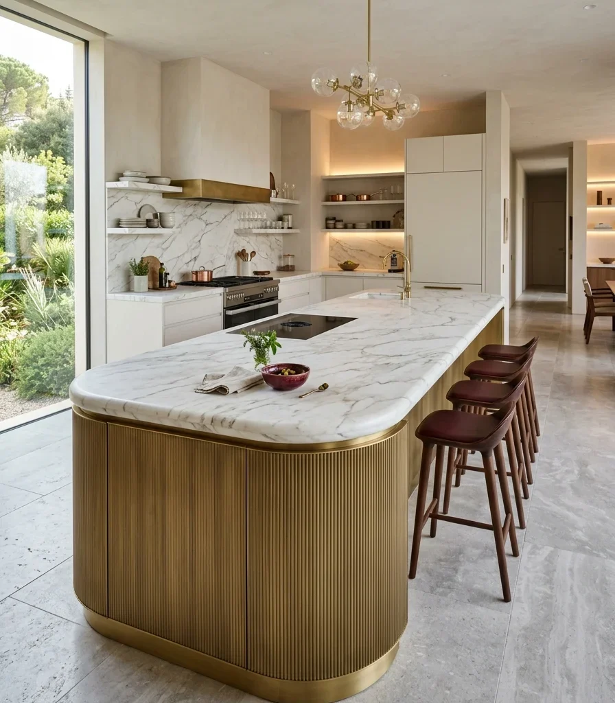
PhilosophyOne room, two full functions
Key Materialswhite oak, linen, brushed brass, rattan
Key Colorswarm greige, soft sage, warm charcoal

15 Smart Small Home Office Guestroom Design Ideas

1. Murphy Bed Desk Combo That Folds Away in Seconds

1. Murphy Bed Desk Combo That Folds Away in Seconds

Vibe: Airy. With the bed tucked away, the room reads as a full office with zero visual trace of a bedroom underneath.

Why it works: This solves negative space at its root. A standard bed occupies floor space permanently, whether it’s in use or not, while aMurphyy combo unit only claims that footprint when a guest actually needs it, freeing the rest of the room for full-time desk use.

How to get it: Choose a white oak Murphy bed unit with a built-in desk that folds down when the bed is stowed, mounting it against the room’s longest wall so the fold-out swing has full clearance.

Shop the Look

  • White oak Murphy bed with integrated desk
  • Brass folding hardware kit, wall-mount
  • Slim articulating desk lamp, matte black
  • Small potted snake plant, ceramic pot

2. Warm Greige Walls That Read Office by Day, Calm by Night

2. Warm Greige Walls That Read Office by Day, Calm by Night

Vibe: Serene. One wall color across the whole room keeps the eye from registering “two rooms in one.”

Why it works: Color continuity is the single fastest way to visually unify a dual-purpose space. A warm greige like Sherwin-Williams Agreeable Gray reads as neutral enough to support both a productive desk mood and a restful sleeping mood without repainting or accent walls to separate them.

How to get it: Paint the entire room in one warm greige tone, then let furniture and textiles, not additional wall colors, signal which zone is which.

💡 Quick Win: Test the greige on a large poster board first and view it under both daytime and evening lamp light before committing to the full room.

Shop the Look

  • Sherwin-Williams Agreeable Gray paint sample
  • Framed neutral abstract print, small
  • Folded waffle-weave throw blanket, sage
  • White trim paint, satin finish

3. Unfinished White Oak Daybed With Trundle Storage

3. Unfinished White Oak Daybed With Trundle Storage

Vibe: Grounded. A low daybed frame keeps the room’s sightlines open even with a full sleeping surface in it.

Why it works: Material choice matters here as much as furniture form. Unfinished white oak keeps the daybed visually light compared to a dark upholstered frame, and the trundle drawer beneath uses vertical layering to store guest linens without adding a separate dresser to the room.

How to get it: Choose a daybed frame in unfinished white oak with a built-in trundle drawer rated for a twin mattress, and dress the daytime side with three linen bolster pillows so it reads as seating, not a bed, during work hours.

Shop the Look

  • Unfinished white oak daybed frame with trundle
  • Linen bolster pillow, set of 3
  • Folded wool throw blanket, natural
  • Twin trundle mattress, low-profile

4. Dimmable Pendant That Shifts From Task Light to Ambient Glow

4. Dimmable Pendant That Shifts From Task Light to Ambient Glow

Vibe: Warm the same fixture that lights a spreadsheet at noon softens into bedtime glow by evening.

Why it works: Light behavior changes a room’s entire mood without moving a single piece of furniture. A dimmable pendant on a warm 2700K bulb reads as a bright, functional task light at full power and shifts to a restful glow at 20 percent, letting one fixture serve two completely different needs.

How to get it: Install one linen drum pendant with a brass canopy on a dimmer switch, centered over the room rather than directly above the desk, so its light reaches both the work zone and the sleeping zone evenly.

Shop the Look

  • Linen drum pendant light, brass canopy
  • In-wall dimmer switch, standard
  • Warm white LED bulb, 2700K
  • Small ceramic bedside tray

5. Daybed With Bolster Pillows Doubling as Desk-Side Seating

5. Daybed With Bolster Pillows Doubling as Desk-Side Seating

Vibe: Layered: a daybed positioned near the desk becomes a second seat for calls or reading, not just overnight furniture.

Why it works: Furniture arrangement here follows proximity logic; placing the daybed perpendicular to the desk rather than against a far wall keeps both pieces functionally connected during the day, so the “guest” furniture earns daily use instead of sitting idle until visitors arrive.
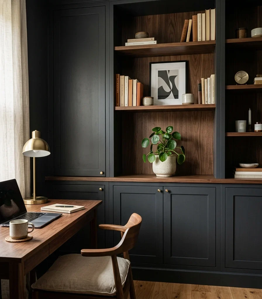
How to get it: Position a linen-upholstered daybed at a right angle to the desk, close enough that its edge doubles as an overflow surface or seat during work hours, and dress it with two bolster pillows in contrasting tones.

💡 Quick Win: A slim side table between the desk and daybed instantly makes the daybed feel like a designed seating nook rather than leftover bed space.
Shop the Look

  • Linen-upholstered daybed, matte black legs
  • Bolster pillow, sage green, set of 2
  • Bolster pillow, terracotta blush, set of 2
  • Slim round side table, oak finish

6. Charcoal Accent Wall Behind the Desk for Focus

6. Charcoal Accent Wall Behind the Desk for Focus

Vibe: Grounded. A single dark wall behind the desk creates a defined “work mode” without a full room repaint.

Why it works: Contrast theory explains the psychological shift here. A charcoal wall directly behind the desk gives the eye a fixed point of focus during video calls and deep work, while the surrounding warm white walls keep the rest of the small room from feeling closed in.

How to get it: Paint only the wall directly behind the desk in a warm charcoal such as Benjamin Moore Kendall Charcoal, stopping the color exactly at the room’s corner, so it reads as a defined zone rather than a mistake.

Shop the Look

  • Benjamin Moore Kendall Charcoal paint sample
  • White oak desk, straight leg
  • Brushed brass desk lamp, articulating arm
  • Framed neutral print, small

7. Woven Baskets That Hide Guest Linens in Plain Sight

7. Woven Baskets That Hide Guest Linens in Plain Sight

Vibe: War askets full of guest linens look like styled decor rather than storage waiting to be unpacked.

Why it works: Repetition and texture layering both apply here; two or three matching rattan baskets on one shelf read as an intentional display, disguising the practical function of holding sheets and towels that only come out a few nights a month.

How to get it: Line two large woven rattan baskets with lids on an open shelf, using one exclusively for guest bedding and the other for spare pillows, so setup for a visitor takes under two minutes.

Shop the Look

  • Woven rattan storage basket with lid, large, set of 2
  • Folded linen sheet set, warm white
  • Ceramic basket label tag, set of 2
  • Open wall shelf, white oak, 36-inch

8. Linen Curtain Room Divider for Instant Privacy

8. Linen Curtain Room Divider for Instant Privacy

Vibe: Hushed. A drawn linen curtain gives an overnight guest real privacy without a single permanent wall.

Why it works: Linen at this weight uses texture layering and light diffusion together heavy enough to block sightlines when drawn, but soft enough that daylight still filters through, avoiding the closed-off feeling a solid partition would create in a small footprint.

How to get it: Mount a ceiling-track curtain rod across the room’s midpoint and hang heavyweight linen panels that can be pushed fully open during work hours and drawn closed only when a guest is staying over.

💡 Quick Win: Use a tension rod version if you’re renting and can’t mount a permanent ceiling track.

Shop the Look

  • Heavyweight linen curtain panel, floor-length, set of 2
  • Ceiling-mounted curtain track, brass finish
  • Slim side table, oak finish
  • Folded cotton throw, warm white

9. L-Shaped Zoning: Desk on one wall, Bed on the Other

9. L-Shaped Zoning: Desk on one wall, Bed on the Other

Vibe: Air. Ann L-shaped zoning plan keeps a clear walking path down the room’s center at all times.

Why it works: This is a pure layout decision, not a decor one. Placing the desk and daybed on perpendicular walls rather than opposite ones uses the room’s corner as a shared anchor point, which preserves more open floor space than a straight parallel arrangement would in a room under 100 square feet.

How to get it: Position the desk along the room’s window wall and the daybed along the adjacent wall, leaving at least 30 inches of clear walking space between the two zones at all times.

Shop the Look

  • Small area rug, 3×5, jute blend
  • White oak desk, compact
  • Linen daybed, low profile
  • Wall-mounted coat hook, brass, set of 2

10. Sage Green Bedding That Signals “Guest Mode” at a Glance

10. Sage Green Bedding That Signals "Guest Mode" at a Glance

Vibe: Calm sage bedding against a neutral desk zone quietly marks “this side is for sleeping” without a sign.

Why it works: Color coding a specific zone is a wayfinding trick borrowed from hospitality design. A consistent sage tone on bedding only, never on desk textiles, gives the room an intuitive visual split that guests understand instantly without needing an explanation.

How to get it: Dress the daybed exclusively in soft sage green linen bedding, keeping every desk-side textile chair cushion, rug, curtains in warm white or oak tones so the color itself becomes the zone marker.

Shop the Look

  • Sage green linen duvet cover, twin size
  • Linen fitted sheet, sage green
  • Waffle-weave cotton throw, warm white
  • Linen bolster pillow, sage green

11. Bedside Sconces That Double as Desk Task Lighting

11. Bedside Sconces That Double as Desk Task Lighting

Vibe: Warm. One adjustable sconce quietly does the job of two separate lamps.

Why it works: Task lighting placement is a light behavior principle worth planning around in dual-purpose rooms. Mounting a swing-arm sconce where its reach overlaps both the daybed and a nearby desk corner eliminates the need for a second lamp, saving both cost and counter space.

How to get it: Mount one brushed brass swing-arm sconce on the wall between the daybed and desk, positioned so its arm can extend toward either surface depending on which is in use.

💡 Quick Win: A plug-in sconce with a swing arm skips electrical work and can be repositioned if you rearrange the room later.

Shop the Look

  • Brushed brass swing-arm wall sconce, plug-in
  • Warm white LED bulb, 2700K
  • Small ceramic bedside tray
  • Fabric-wrapped extension cord, neutral

12. Fold-Down Wall Desk Above a Built-In Daybed

12. Fold-Down Wall Desk Above a Built-In Daybed

Vibe: Efficient tacking function vertically means the desk simply doesn’t exist as furniture when it’s folded flat.

Why it works: This uses proportion and negative space at their most extreme. Mounting the desk on the wall directly above the daybed claims a surface that would otherwise sit empty above a low sleeping platform, a move only possible because the daybed’s low profile leaves headroom a standard bed frame wouldn’t.

How to get it: Mount a fold-down white oak desk on the wall 34 inches above a built-in daybed platform, using a piano hinge and single folding leg so the desk closes flush when the guest bed is in use.

Shop the Look

  • Fold-down wall desk, white oak, piano hinge
  • Built-in daybed platform frame, low profile
  • Compact articulating desk lamp
  • Folded wool throw, foot-of-bed size

13. Rattan Nightstand That Moonlights as a Printer Stand

13. Rattan Nightstand That Moonlights as a Printer Stand

Vibe: Grounded. A single rattan piece serving two functions keeps the room from accumulating furniture it doesn’t need.

Why it works: Material consistency and dual function work together here. A rattan nightstand placed at the seam between the daybed and desk zones holds a lamp and book at night, then holds a printer or supplies during work hours, avoiding a second dedicated office cart entirely.

How to get it: Position one rattan nightstand with an open lower shelf exactly at the junction between the daybed and desk, using the top surface for a lamp at night and a compact printer during the day.

Shop the Look

  • Woven rattan nightstand, open shelf
  • Compact wireless printer, white finish
  • Small ceramic catch-all tray
  • Fabric cable management sleeve

14. A Folding Luggage Rack That Becomes an Extra Shelf

14. A Folding Luggage Rack That Becomes an Extra Shelf

Vibe: Layered. A piece built for guests earns its daily keep as file storage the rest of the month.

Why it works: Dual-purpose accessories extend the same logic as dual-purpose furniture down to the smallest scale. A folding luggage rack’s flat canvas surface holds a suitcase for one night and a stack of document trays for the other twenty-nine, using an object most rooms only bring out for guests.

How to get it: Keep one folding canvas luggage rack tucked against the wall near the closet, using its surface for document trays or a printer paper ream when no guest is staying, then clearing it in seconds before arrival.

💡 Quick Win: Choose a rack with a wood frame that matches your desk finish so it reads as furniture, not a hotel amenity, when not folded away.

Shop the Look

  • Folding canvas luggage rack, oak frame
  • Stackable document tray, set of 2
  • Small folded throw blanket, tan
  • Wall hook for folded rack storage

15. Floating Furniture Arrangement to Keep Both Functions Open

15. Floating Furniture Arrangement to Keep Both Functions Open

Vibe: Airy, pulling furniture even a few inches off the walls makes a small dual-purpose room read larger than it is.

Why it works: This is a traffic-flow layout principle counterintuitive to most small-space advice. Pushing every piece flush against the wall actually flattens a room visually, while floating the desk and daybed slightly forward creates depth and a defined path, which matters more when two functions need to coexist without collision.

How to get it: Pull both the desk and daybed roughly six inches away from their walls, anchor each zone with its own small rug, and keep the center path between them at least 30 inches wide.

Shop the Look

  • Small jute-blend area rug, 3×5, set of 2
  • White oak desk, compact
  • Linen daybed, low profile
  • Slim floor lamp, brushed brass

How to Start Your Smart Small Home Office Guestroom Transformation

Start with the daybed specifically; choose a low-profile frame in unfinished white oak before anything else, since its height and footprint determine where the desk, lighting, and storage can go. Everything else in the room is built to work around this one piece, not the other way around.

The most common mistake is buying a full-size guest bed instead of a daybed or Murphy unit. A standard bed frame claims permanent floor space that a home office simply can’t spare, and it visually dominates the room even when made up neatly. The fix is choosing a daybed or fold-away frame from the start, not retrofitting one in later.

Three items under $50 create real impact fast: a woven rattan basket with a lid for guest linens (around $32), a plug-in brass swing-arm sconce (around $38), and a folded waffle-weave throw in sage green (around $24).

A weekend covers furniture rearranging, bedding, and lighting swaps; a Murphy bed or built-in daybed installation takes three to six weeks with a contractor. Budget $400–$900 for a starter version, or $2,500–$6,000 for a full built-in transformation.

Frequently Asked Questions About Smart Small Home Office Guestroom Design

What’s the difference between a home office guestroom and a regular guest room?

A regular guest room is built around occasional overnight use and can afford to sit mostly empty between visits. A smart small home office guestroom has to function as a full-time workspace first, with guest capability layered on through convertible furniture like daybeds, Murphy beds, or fold-down desks, so the room earns its keep every single day, not just a few nights a year.

What is the best paint color for a small home office guestroom?

Warm greige, such as Sherwin-Williams Agreeable Gray, works best because it supports both a focused work mood and a restful sleep mood without needing separate accent walls. A single warm charcoal wall, like Benjamin Moore Kendall Charcoal, behind just the desk can add definition without darkening the whole room.

How much does a small home office guestroom cost to set up?

A starter version using a daybed, rearranged furniture, and new lighting runs $400 to $900. A mid-range setup with a fold-down desk and rattan storage typically lands between $1,200 and $2,500. A full built-in transformation with a Murphy bed system or custom millwork can reach $2,500 to $6,000 depending on the unit chosen.

Can a home office guestroom work in a room without a closet?

Yes, with adjustments. Woven baskets and a folding luggage rack replace closet storage for guest linens and bags, and a linen curtain divider can section off a dressing or privacy zone without any structural work. The one real limit is hanging storage; plan on a slim wall-mounted rod or freestanding rack if closet space is fully absent.

What is the best furniture piece for a small home office guestroom?

A low-profile daybed with trundle storage is consistently the most searched and most versatile choice, since it functions as daytime seating, overnight sleeping space, and hidden linen storage in one frame. Murphy bed desk combos come in second for rooms under 80 square feet where even a daybed’s footprint is too much to spare full-time.

Ready to Create Your Dream Smart Small Home Office Guestroom?

From Murphy bed desk combos to sage-toned bedding zones and floating furniture layouts, these 15 smart small home office guestroom ideas cover color, materials, and layout so the room works equally hard for you and for whoever’s staying over. You don’t need every piece in place at once; starting with just the daybed or just the lighting swap is genuinely the right way to begin, not a compromise. Measure your room today and decide between a daybed and a Murphy bed combo before buying anything else, since that single choice shapes every decision after it. Once it’s set up right, the room will feel efficient rather than crowded a space that quietly does two jobs without either one feeling like a leftover. Pin your favorites now, especially the fold-down and dual-purpose pieces you can picture solving your own square footage.

You Might Also Like