
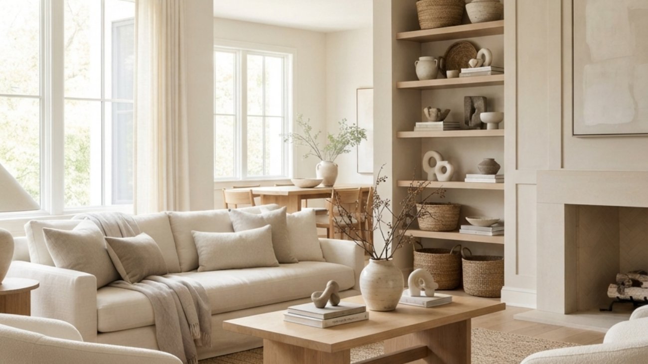
Neutral decorating is a deliberate design approach that uses warm whites, creams, greiges, natural wood, soft textiles, and restrained accents to create visual calm without making a room feel flat or colorless. These 12 Neutral Decorating Ideas show how to use color, materials, lighting, furniture, accessories, layout, and small-space tricks to build a layered neutral home that still feels personal.
Neutral rooms feel like a slow exhale: linen softens the light, pale oak adds warmth beneath the hand, and ceramic surfaces give the eye somewhere quiet to rest. The palette can feel sun-washed in the morning and candle-warm after dark, changing subtly as natural light moves across the room. Instead of relying on strong color contrast, neutral decorating lets texture, proportion, shadow, and material variation do the visual work. Here are 12 ideas worth saving and stealing.
Why Neutral Decorating Works So Well
Neutral decorating is not a single historical style but a design strategy shared by several traditions, including Scandinavian functionalism, Japanese restraint, British country interiors, and modern minimalist design. Its defining principle is tonal control: rather than filling a room with competing hues, the designer creates interest through differences in texture, temperature, scale, and material. This distinguishes a thoughtfully neutral room from a simply beige room because every surface has a specific visual role.
The most useful neutral materials are natural linen, washed cotton, wool, unfinished or white oak, ash, travertine, limestone, rattan, aged brass, matte black, unglazed ceramic, and smoked or clear glass. Core colors include warm white, ivory, oatmeal, sand, taupe, mushroom, greige, soft camel, and warm charcoal. The important detail is undertone: warm whites with yellow-red undertones generally pair more comfortably with natural woods and cream textiles than blue-based whites.
Style at a Glance
| Element | Core Trait 1 | Core Trait 2 |
| Philosophy | Calm tonal layering | Material-led interest |
| Materials | Linen, oak, ceramic, wool | Stone, rattan, aged metal |
| Color palette | Warm white, ivory, oatmeal | Greige, taupe, warm charcoal |
1. Build a Warm White and Oatmeal Foundation
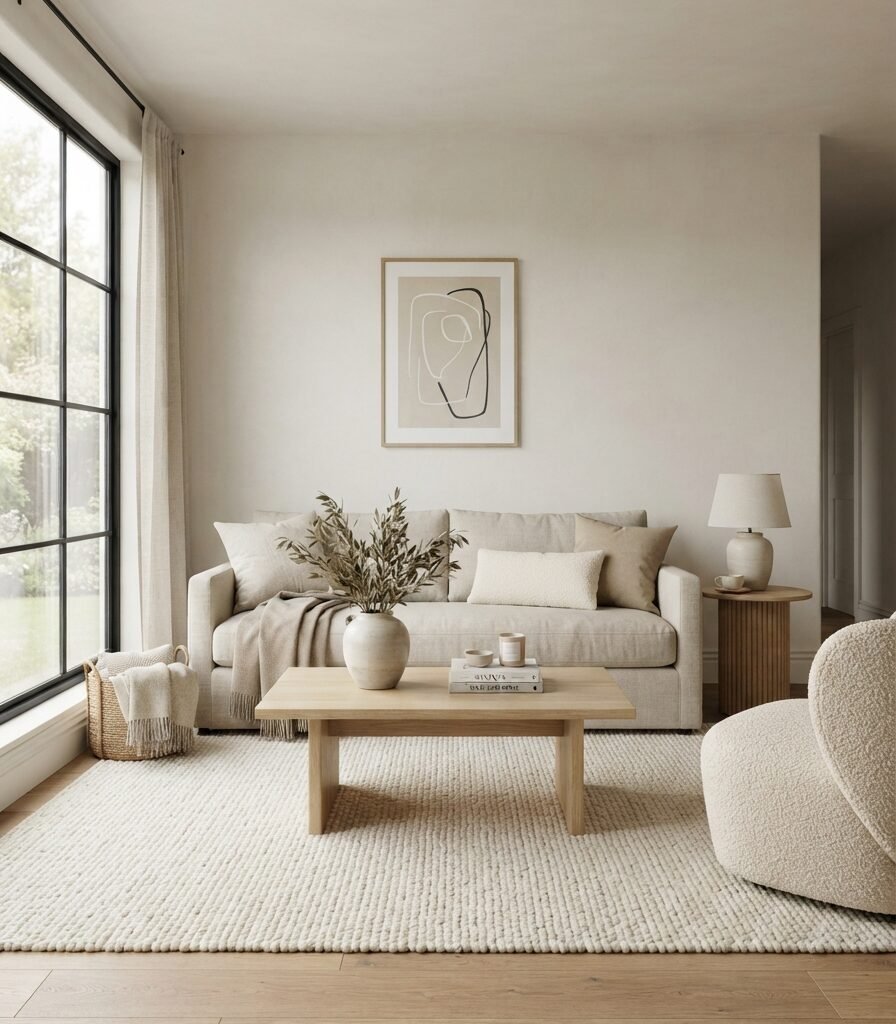
Category: Color
Vibe: Sun-warmed; the room feels quiet, soft, and naturally illuminated.
Why it works: A warm-white foundation creates a continuous reflective surface while oatmeal introduces enough tonal depth to keep the room from looking sterile. The contrast comes from material rather than strong color: linen absorbs light differently from wool, while pale oak creates a warmer visual anchor against the walls.
How to get it: Choose a warm white with a yellow or red undertone rather than a stark blue-white, then keep the largest textiles within roughly two tonal steps of it. Use oatmeal linen for the sofa or curtains and ivory wool for the rug so the room moves gradually from lightest to slightly darker neutrals.
💡 Quick Win: Replace three cool-grey cushion covers with oatmeal, ivory, and natural flax linen covers; this can shift the entire palette without replacing a single large piece of furniture.
Shop The Look
| Product | Purpose |
| Oatmeal linen blend sofa cushion covers | Adds warm textile layering |
| Ivory handwoven wool-look area rug | Creates a soft tonal foundation |
| Pale oak rectangular coffee table | Adds natural warmth |
| Cream boucle lumbar pillow | Introduces tactile contrast |
| Warm white ceramic table vase | Keeps accessories within the palette |
2. Layer Pale Oak with Natural Linen

Category: Material
Vibe: Grounded natural materials give the room a quiet physical presence.
Why it works: Neutral interiors need material contrast because color contrast is intentionally restrained. Pale oak contributes grain and warmth while natural linen contributes irregular weave and softness, creating two different tactile surfaces without introducing another strong hue.
How to get it: Pair one dominant pale wood species with two natural textiles rather than mixing several wood colors. A white-oak bed with flax linen bedding and a jute basket gives you grain, weave, and fiber variation while keeping the palette visually controlled.
Shop The Look
| Product | Purpose |
| White oak platform bed frame | Establishes the natural wood anchor |
| Natural flax linen duvet cover | Adds breathable texture |
| Pale limestone-look bedside table | Introduces mineral texture |
| Handwoven jute storage basket | Adds organic fiber |
| Speckled stoneware bedside lamp | Adds handmade surface variation |
3. Use 2700K Lighting to Make Neutrals Glow

Category: Lighting
Vibe: Luminous; the neutral palette becomes warmer as the daylight disappears.
Why it works: Neutral colors are unusually sensitive to light temperature because there is little saturated color to dominate the eye. A 2700K warm-white source reinforces cream, oak, beige, and brass, while cool 4000K-plus lighting can make the same materials appear harder and greyer.
How to get it: Create three lighting heights: ceiling-level ambient light, eye-level table or wall lighting, and low-level floor lighting. Keep the main lamps around 2700K and use dimmers where compatible so the room can transition from practical brightness to evening warmth.
💡 Quick Win: Replace your most-used cool-white bulb with a dimmable 2700K LED bulb tonight and compare the wall, rug, and upholstery before changing anything else.
Shop The Look
| Product | Purpose |
| Dimmable 2700K LED bulb four-pack | Warms evening light |
| Aged brass table lamp with linen shade | Adds eye-level glow |
| Natural ceramic floor lamp | Creates a low-light layer |
| Plug-in wall sconce warm brass | Saves surface space |
| Smart-compatible dimmer LED bulb | Allows adjustable brightness |
4. Choose Furniture with Visible Legs and Visual Air
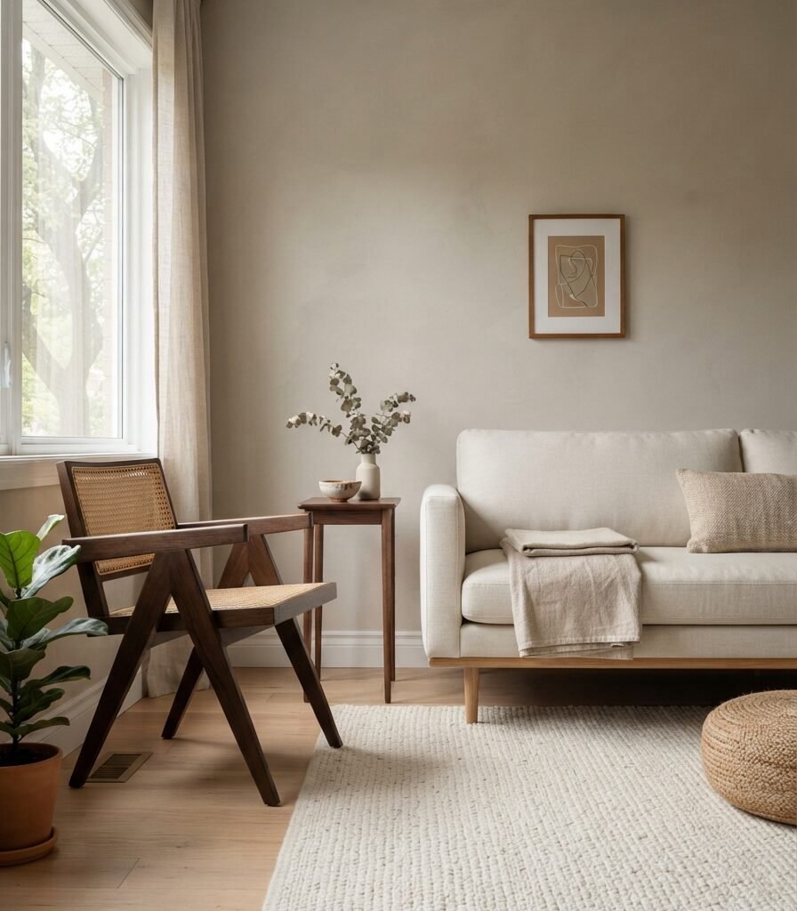
Category: Furniture
Vibe: Airy; the floor remains visible beneath the furniture, making the room breathe.
Why it works: Visual weight matters as much as physical dimensions. A sofa with a solid skirt or bulky base creates one continuous block, while furniture raised 4–8 inches above the floor allows flooring and rug edges to remain visible, creating more negative space.
How to get it: When replacing one major piece, choose a sofa or chair with slim visible legs and avoid excessively deep profiles. Keep at least a few inches of visible floor around furniture wherever circulation permits; this is especially valuable in apartments and narrow living rooms.
Shop The Look
| Product | Purpose |
| Cream linen sofa with exposed oak legs | Creates a light furniture profile |
| Open-frame oak accent chair | Maintains floor visibility |
| Slim walnut C-table | Adds function without bulk |
| Ivory low-pile geometric rug | Defines seating without heaviness |
| Natural oak nesting stool set | Provides flexible extra seating |
5. Make One Oversized Textile the Main Decorative Accent
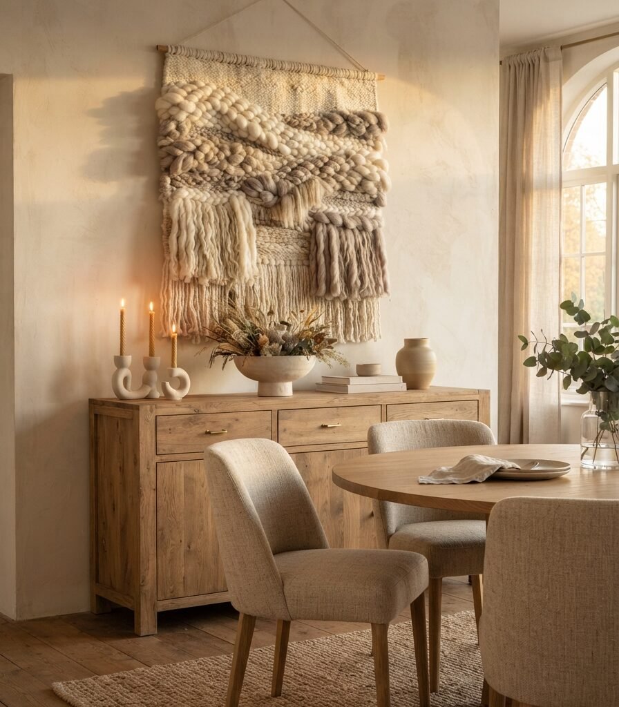
Category: Accessories
Vibe: Textured; the room feels tactile without becoming visually busy.
Why it works: A single large textile gives the eye one substantial decorative shape instead of forcing it to process many small objects. Woven cotton, wool, jute, or linen also introduces shadow and dimensionality, which are particularly valuable in rooms using a narrow color range.
How to get it: Choose one wall textile roughly two-thirds the width of the furniture beneath it, then leave surrounding wall space intentionally empty. Keep the textile within your existing palette rather than introducing a completely new accent color.
💡 Quick Win: Hang a 24-by-36-inch neutral woven wall piece above an existing console or sideboard and remove several smaller decorative objects from the same wall.
Shop The Look
| Product | Purpose |
| Oversized ivory woven wall hanging | Provides the focal texture |
| Natural oak floating picture ledge | Adds a subtle display layer |
| Handmade-look stoneware bowl | Creates organic shape |
| Taupe linen table runner | Extends the textile story |
| Dried pampas and wheat neutral bundle | Adds vertical botanical texture |
6. Keep a 36-Inch Circulation Path Where Possible
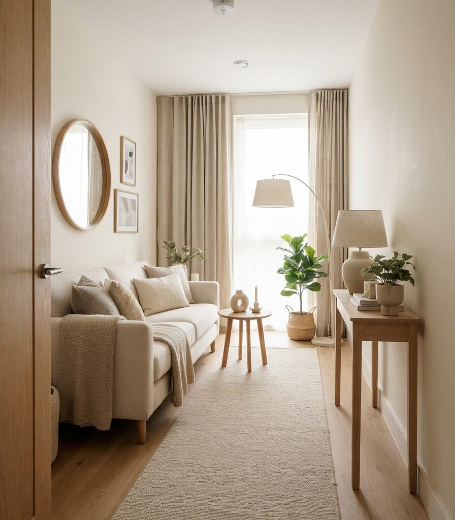
Category: Layout
Vibe: Open; the room feels easier to move through and visually understand.
Why it works: Neutral decorating becomes much more effective when the furniture arrangement creates readable negative space. A circulation path of roughly 30–36 inches gives the room functional breathing room, while narrower furniture along secondary walls prevents the center from becoming an obstacle course.
How to get it: Mark your intended walking route with painter’s tape before moving heavy furniture. Keep approximately 36 inches for a comfortable primary passage where the room allows it, then reduce furniture depth before sacrificing the main path.
Shop The Look
| Product | Purpose |
| Slim 12-inch-deep entry console | Uses a narrow wall efficiently |
| Round oak-framed wall mirror | Expands visual openness |
| Low-profile ivory runner rug | Defines the circulation edge |
| Narrow ceramic planter with faux olive tree | Adds height without width |
| Slim arched floor lamp | Provides lighting without a bulky base |
7. Introduce Muted Sage as a Controlled Neutral Accent

Category: Color
Vibe: Restful. The muted green introduces life without disrupting the neutral rhythm.
Why it works: Low-saturation sage behaves almost like a neutral because its chroma is restrained. It adds enough chromatic variation to prevent a cream room from feeling one-dimensional while maintaining the quiet quality associated with warm natural palettes.
How to get it: Use a 60/30/10 approach: approximately 60% warm neutral surfaces, 30% wood and secondary neutrals, and 10% muted sage. Keep the sage dusty rather than bright so it connects naturally with oak, flax, and stone.
💡 Quick Win: Start with sage cushion covers or a small painted side table before committing to a full accent wall; the same undertone can then guide larger purchases.
Shop The Look
| Product | Purpose |
| Muted sage linen cushion cover pair | Adds controlled color |
| Sage green ceramic table lamp | Repeats the accent tone |
| Pale oak picture frame | Bridges sage and neutral |
| Botanical green faux olive branch | Adds organic repetition |
| Oatmeal linen throw blanket | Softens the color transition |
8. Add Full-Height Linen-Look Curtains

Category: Material
Vibe: Soft; the window light becomes diffused rather than sharply exposed.
Why it works: Curtains occupy a large vertical area, so their material has an outsized effect on a neutral room. Hanging panels close to ceiling height draws the eye upward, while a linen-look weave catches daylight and introduces subtle texture without adding strong color.
How to get it: Install the rod or ceiling track within about 2 inches of the ceiling and extend it roughly 12–18 inches beyond each side of the window when wall space allows. Choose ivory, flax, or oatmeal fabric with 1.5–2 times the window width for a relaxed fold.
Shop The Look
| Product | Purpose |
| Ivory linen-look blackout curtain panels | Adds height and softness |
| Ceiling-mount curtain track | Keeps the installation visually clean |
| Matte brass curtain hooks | Adds restrained metal warmth |
| Natural flax curtain tiebacks | Reinforces the textile palette |
| Oatmeal sheer curtain panels | Adds a secondary light-filtering layer |
9. Create a Tonal Greige Dining Room
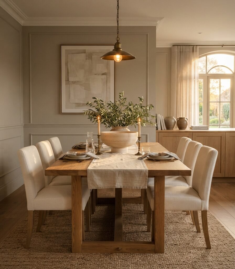
Category: Color
Vibe: Enveloping the walls visually connects the furniture instead of competing with it.
Why it works: Warm greige sits between beige and grey, giving neutral interiors more depth than plain cream while remaining adaptable. The key is matching undertones: a yellow-red greige works more naturally with oak and cream than a blue-grey greige.
How to get it: Sample the paint beside your flooring, wood furniture, and largest textile rather than judging the color against a white sample card. Test it in morning and evening light because greige can shift substantially as daylight changes.
💡 Quick Win: Paint a removable foam board in your shortlisted greige and move it around the room throughout the day before purchasing a full gallon.
Shop The Look
| Product | Purpose |
| Warm greige interior paint sample | Establishes the tonal backdrop |
| Natural oak dining table | Provides organic warmth |
| Cream upholstered dining chair set | Softens the wood |
| Honed travertine centerpiece bowl | Adds mineral texture |
| Antique brass linear pendant light | Creates a warm focal point |
10. Use a Curved Accent Chair to Break Up Straight Lines

Category: Furniture
Vibe: Cushioned, rounded forms make the neutral palette feel softer and more tactile.
Why it works: Rooms dominated by rectangular furniture can become visually rigid even when their colors are soft. A curved chair changes the geometry, while boucle or nubby upholstery creates micro-shadows that provide depth without requiring a new accent color.
How to get it: Add one curved seating piece rather than several rounded accessories. Place it beside a straight-lined sofa, console, or bookcase so the curved silhouette acts as a deliberate counterpoint rather than making every shape compete.
Shop The Look
| Product | Purpose |
| Cream boucle curved accent chair | Introduces rounded form |
| Rounded natural oak side table | Repeats the curve |
| Ivory low-pile wool rug | Grounds the reading corner |
| Arched matte black floor lamp | Adds vertical contrast |
| Oatmeal textured lumbar cushion | Connects chair to the room |
11. Style a Console with the 3-Object Rule
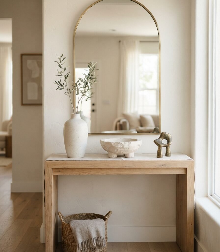
Category: Accessories
Vibe: Hushed; every object has enough space to register individually.
Why it works: Neutral surfaces can look cluttered surprisingly quickly because small beige and cream objects visually blend into one continuous field. Limiting a console to three primary objects creates negative space while allowing differences in height and shape to become visible.
How to get it: Choose one tall object, one low horizontal object, and one medium sculptural piece. Keep approximately 20% of the console surface visibly empty rather than filling every available inch.
💡 Quick Win: Remove half the objects currently sitting on one console, dresser, or shelf and restyle only three pieces at different heights.
Shop The Look
| Product | Purpose |
| Tall matte ivory ceramic vase | Creates vertical height |
| Low travertine-look decorative bowl | Adds horizontal weight |
| Aged brass abstract sculpture | Supplies a darker accent |
| Pale oak console table | Provides the neutral foundation |
| Arched antique brass wall mirror | Expands the vertical composition |
12. Use Ceiling-Height Storage in the Same Neutral Tone
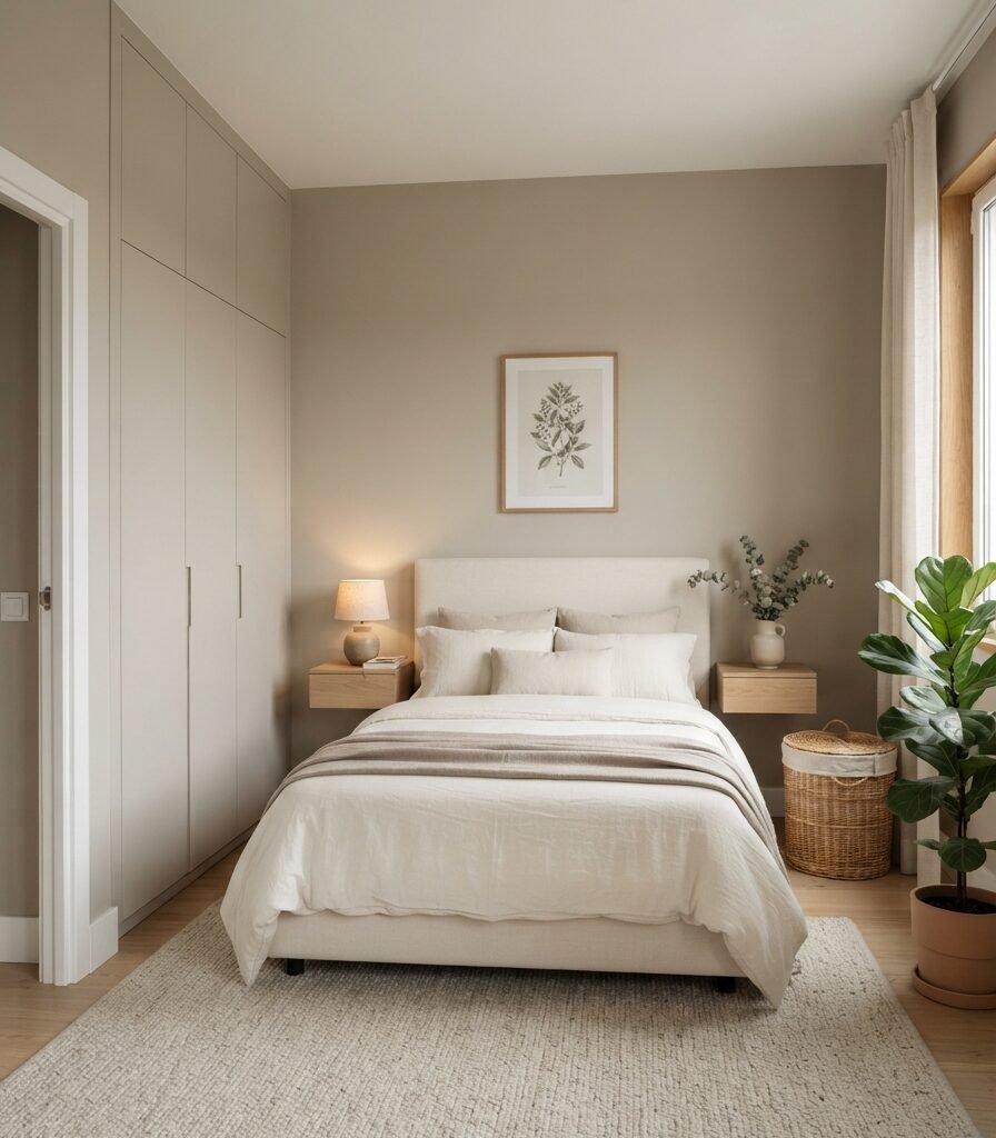
Category: Small Space
Vibe: Streamlined storage disappears into the architecture instead of becoming another visual object.
Why it works: In small rooms, tall storage uses vertical volume that would otherwise remain unused. Painting wardrobe doors close to the wall color reduces contrast boundaries, allowing a large storage unit to visually recede instead of reading as a separate block.
How to get it: Choose wardrobes or modular cabinets that reach as close to the ceiling as practical, then match the doors to the surrounding wall color. Use recessed or edge-profile pulls instead of contrasting hardware to preserve the uninterrupted vertical plane.
Shop The Look
| Product | Purpose |
| Full-height warm greige wardrobe system | Maximizes vertical storage |
| Recessed edge-pull cabinet handles | Keeps hardware visually quiet |
| Pale oak floating bedside shelf | Saves floor space |
| Under-bed zippered storage bags | Uses hidden volume |
| Neutral fabric wardrobe organizer boxes | Controls small-item clutter |
How to Start Your Neutral Decorating Transformation
The single best first move is to establish your wall undertone before buying anything else. Test a warm white such as Benjamin Moore White Dove OC-17 or a comparable warm white beside your existing flooring and largest furniture piece; this creates the visual base against which every linen, wood, rug, and accessory will be judged.
The most common mistake is combining neutrals with incompatible undertones; for example, blue-grey upholstery beside yellow-beige walls and pinkish wood. The individual pieces may look attractive alone, but together they create subtle visual tension. Fix it by identifying whether your existing room reads warm, cool, or neutral, then keep the largest 70–80% of the palette within that temperature family.
Three useful upgrades under $50 are a pack of 2700K warm-white LED bulbs, an oatmeal linen-blend cushion cover, and a small matte ivory stoneware vase. Each changes the atmosphere without requiring a renovation.
A starter transformation can happen over one weekend for roughly 150–500 if you keep your main furniture and concentrate on paint, lighting, textiles, and accessories. A more complete room with a new rug, curtains, lighting, seating, and storage can reasonably reach 1,000–3,500, while custom cabinetry and premium natural materials may take several months and substantially increase the budget.
Frequently Asked Questions About 12 Neutral Decorating Ideas
What is neutral decorating and how is it different from minimalist decorating?
Neutral decorating is primarily about color temperature and tonal restraint, while minimalism is more strongly concerned with quantity, function, and reduction. A neutral room can contain layered textiles, collected ceramics, books, plants, and artwork. A minimalist room may use strong black, blue, or terracotta accents and still be minimalist. Neutral decorating therefore describes the visual palette rather than requiring a specific amount of furniture.
What colors work best for a neutral home?
Warm white, ivory, oatmeal, sand, taupe, mushroom, warm greige, and soft camel are reliable starting points. For a gentle accent, muted sage or dusty blue can add color without overwhelming the palette. If your room receives cool northern light, test warm whites carefully because some shades can appear noticeably greyer during the day.
How much does it cost to decorate a room in a neutral style?
A low-cost refresh can begin around 150–500 using paint, 2700K bulbs, cushion covers, curtains, and secondhand accessories. A mid-range room with a new 8×10 rug, lighting, curtains, and one major furniture piece can reach 1,000–3,500. The largest budget difference usually comes from upholstery, custom curtains, hardwood furniture, and built-in storage.
Can neutral decorating work with dark wood furniture?
Yes. Dark walnut, espresso oak, and aged wood can actually provide valuable visual grounding in a pale neutral room. Pair dark wood with warm white, ivory, flax, and oatmeal rather than cool grey-white. Keep the dark wood concentrated in one or two major pieces so the room retains enough light visual space.
Which neutral decorating element makes the biggest difference?
Lighting is often the fastest atmospheric change, particularly when existing bulbs are cool. Switching frequently used fixtures to 2700K warm-white LEDs can immediately change how cream, oak, linen, and brass appear after sunset. For a structural change, correctly hung floor-to-ceiling curtains can have an equally strong effect because they occupy a large vertical portion of the room.
Ready to Create Your Dream Neutral Home with 12 Neutral Decorating Ideas?
These 12 Neutral Decorating Ideas cover warm color palettes, natural materials, layered lighting, furniture scale, accessories, circulation, and small-space storage rather than relying on beige alone. A neutral transformation does not need to happen all at once; starting with one undertone, one textile, or one lighting change is often the most controlled way to build a cohesive room. Today, replace one frequently used bulb with a 2700K warm-white LED and observe how your existing neutral surfaces change after sunset. As the layers come together, the room should feel quieter, warmer, more tactile, and easier to live in rather than simply more decorated. Save or pin your favorite ideas now, especially the ones built around linen, pale oak, warm white, and carefully controlled negative space, so you can return to them when your next decorating decision arrives.