

Greige is the nuanced middle ground between gray and beige, combining the restraint of gray with enough warmth to keep a room from feeling stark. These 16 best greige paint colors cover warm, balanced, light, and deeper options, with practical ways to match each shade to natural light, flooring, furniture, cabinetry, and decor.
The appeal of greige is its quiet depth: walls can feel warm in afternoon sun, soft beneath evening lamps, and restrained beside natural wood. Unlike flat beige, greige has a gray component that keeps it contemporary; unlike many cool grays, it can carry enough beige or taupe to prevent a room from becoming icy. The exact balance matters, though, because two greiges can behave completely differently in the same house.
Benjamin Moore describes greige as the intersection of gray and beige, noting that stronger gray influence can make a shade feel cooler while stronger beige influence creates more warmth. Sherwin-Williams likewise places several popular warm neutrals, including Agreeable Gray, Accessible Beige, Repose Gray, Worldly Gray, and Perfect Greige, within its neutral family.
Here are 16 ideas worth saving and stealing.
Why 16 Best Greige Paint Colors Work So Well
Greige is not a historical design style but a modern color family created by balancing two traditionally separate neutral directions: gray and beige. Its strength is adaptability. A gray-heavy greige can feel cleaner and cooler, while a beige-heavy greige can feel warmer and more enveloping; lighting can shift the balance further. Benjamin Moore specifically identifies Revere Pewter, Edgecomb Gray, Classic Gray, Natural Cream, Balboa Mist, and Pashmina among its popular greiges.
The most useful materials besides greige are white oak, walnut, limestone, travertine, linen, wool, boucle, aged brass, matte black, ceramic, and natural jute. Warm greiges tend to pair naturally with honey oak and brass, while cooler greiges can provide a cleaner backdrop for white oak, black metal, blue-gray textiles, and polished stone. Sherwin-Williams describes warm neutrals as useful foundations for introducing personality and texture.
Style at a Glance
| Element | Greige Direction |
| Philosophy | Warmth + restraint |
| Materials | Oak, linen, stone, brass |
| Color palette | Greige, ivory, taupe, charcoal |
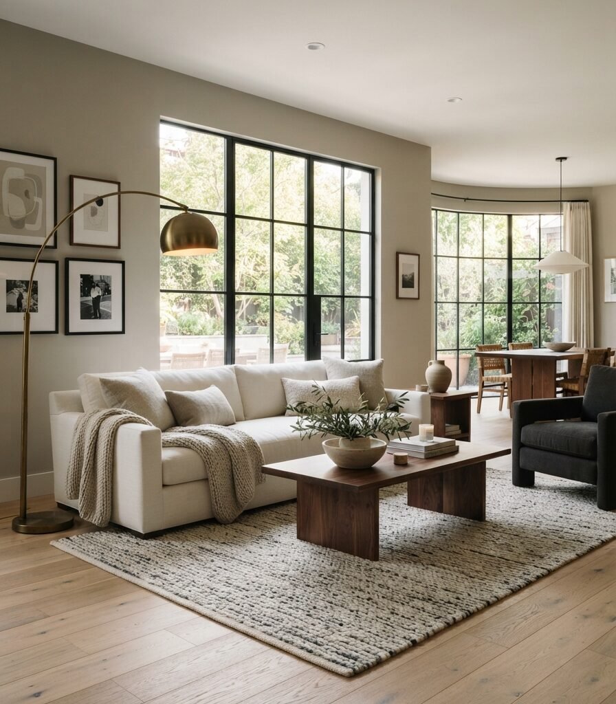
1. Agreeable Gray SW 7029 for an Easy Whole-Home Greige
Category: COLOR
Vibe: Settled.
Why it works: Agreeable Gray has a beige undertone that gives the gray enough warmth to work as a flexible whole-home neutral. Sherwin-Williams currently identifies SW 7029 Agreeable Gray as an expert warm-neutral pick and notes its subtle warmth. The restrained wall color also lets oak, linen, and walnut provide the stronger material contrast.
How to get it: Use Agreeable Gray across connected rooms, then differentiate spaces through furniture rather than changing wall colors at every doorway. Test it beside your flooring first because warm wood can visually increase its beige character.
💡 Quick Win: Add an oatmeal linen cushion and aged brass lamp to an existing gray room before repainting the entire space.
Shop The Look
| Product | Search phrase |
| Paint sample | Sherwin-Williams Agreeable Gray SW 7029 sample |
| Sofa | Ivory linen blend living room sofa |
| Rug | Natural wool jute blend area rug 8×10 |
| Lamp | Aged brass floor lamp linen shade |
| Coffee table | Walnut oval coffee table, natural finish |
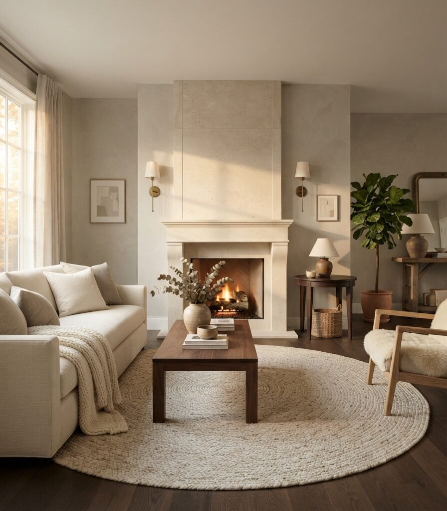
2. Revere Pewter HC-172 with Natural Stone
Category: MATERIA
Vibe: Grounded.
Why it works: Revere Pewter has enough warmth to connect naturally with limestone, walnut, linen, and other earthy finishes. Benjamin Moore describes it as a soft, welcoming greige that can shift warmer or cooler depending on lighting conditions. That light sensitivity makes the surrounding materials especially important.
How to get it: Pair Revere Pewter with a honed limestone or travertine surface rather than a highly cool white marble. The stone repeats the wall’s earthy quality and gives the neutral palette physical texture.
Shop The Look
| Product | Search phrase |
| Paint sample | Benjamin Moore Revere Pewter HC-172 sample |
| Side table | Dark walnut round side table |
| Vase | Natural travertine decorative vase |
| Basket | Handwoven seagrass storage basket |
| Throw | Ivory wool herringbone throw blanket |
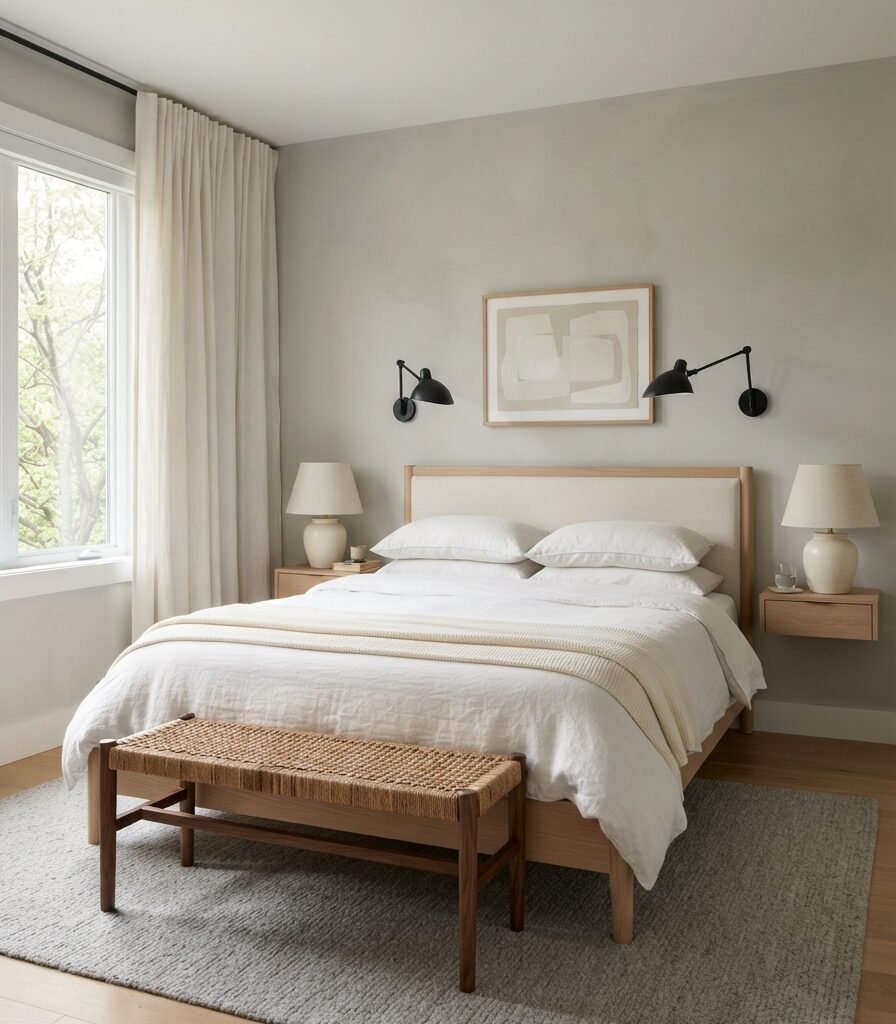
3. Repose Gray SW 7015 in a Light-Filled Bedroom
Category: LIGHTING
Vibe: Airy.
Why it works: Repose Gray sits on the cooler side of the greige conversation, so abundant daylight helps preserve its clean gray character. Sherwin-Williams lists SW 7015 Repose Gray among its expert warm-neutral selections, even though its appearance can shift with surrounding light and finishes.
How to get it: Reserve Repose Gray for rooms with dependable daylight or warm artificial lighting. If the bedroom is north-facing, test a large sample before committing because cool natural light can make gray-beige colors appear more subdued.
Shop The Look
| Product | Search phrase |
| Bedding | White linen duvet cover king |
| Bed | Pale oak platform bed frame |
| Rug | Soft gray wool bedroom rug 5×7 |
| Sconces | Matte black swing arm bedroom sconces |
| Bench | Walnut bedroom bench upholstered seat |
4. Edgecomb Gray HC-173 for Warm Greige Walls
Category: FURNITURE
Vibe: Cozy.
Why it works: Edgecomb Gray is a warmer greige that can bridge cream upholstery and deeper wood furniture without requiring a strongly beige wall. Benjamin Moore gives HC-173 an LRV of 63.09 and describes it as a warm, welcoming go-to neutral.
How to get it: Use a furniture contrast rule: keep the largest upholstered piece lighter than the wall and introduce one darker wood piece. This gives Edgecomb Gray enough contrast to remain visible without making the room feel heavy.
💡 Quick Win: Place a cognac leather lumbar pillow on a cream sofa to echo the warm undertone without replacing the furniture.
Shop The Look
| Product | Search phrase |
| Paint sample | Benjamin Moore Edgecomb Gray HC-173 sample |
| Chair | Cognac leather accent chair wood frame |
| Console | Walnut entry console narrow |
| Pillow | Cognac leather lumbar pillow |
| Rug | Ivory textured washable area rug 5×7 |
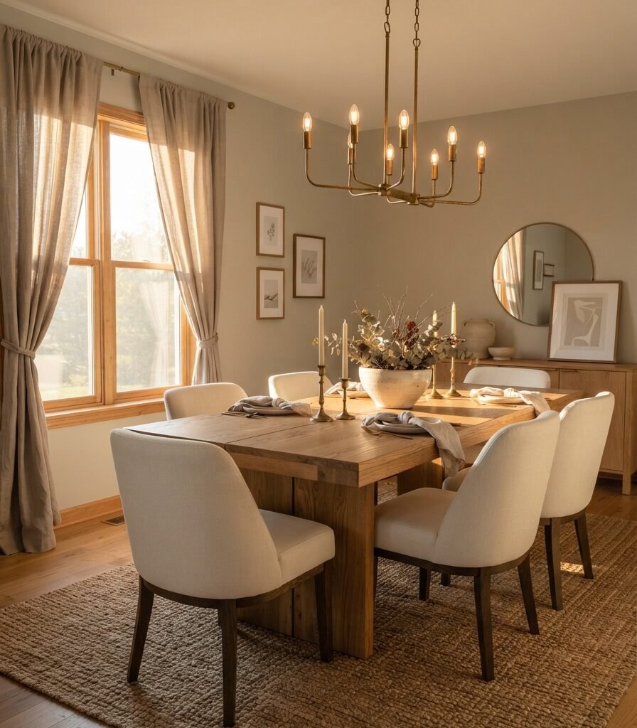
5. Accessible Beige SW 7036 for a Beige-Forward Greige
Category: COLOR
Vibe: Sun-warmed.
Why it works: Accessible Beige leans more beige than many classic greiges, but its gray undertones keep it from becoming a straightforward cream or tan. Sherwin-Williams specifically says its gray undertones create a warm, snug feel and recommends pairing it with earthy tones.
How to get it: Use Accessible Beige when your room already contains warm flooring, oak, rattan, or natural stone. Keep cool gray furniture to a minimum so the palette does not fight the wall’s warmer direction.
Shop The Look
| Product | Search phrase |
| Paint sample | Sherwin-Williams Accessible Beige SW 7036 sample |
| Table | Natural oak rectangular dining table |
| Chairs | Cream linen upholstered dining chairs |
| Curtains | Taupe linen curtain panels |
| Chandelier | Aged brass six-light dining chandelier |
6. Worldly Gray SW 7043 for an Open-Plan Interior
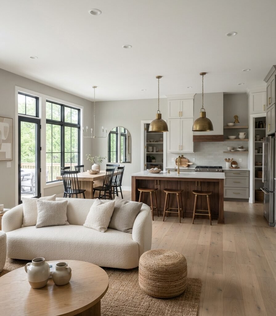
Category: LAYOUT
Vibe: Continuous.
Why it works: Open-plan homes need a wall color that can tolerate changing furniture and materials from zone to zone. Worldly Gray is included among Sherwin-Williams’ popular warm-neutral options, making it useful where a softer bridge between gray and beige is needed.
How to get it: Use one wall color across the connected footprint, then define zones with rugs and lighting rather than paint breaks. This keeps sightlines visually uninterrupted while furniture establishes function.
Shop The Look
| Product | Search phrase |
| Paint sample | Sherwin-Williams Worldly Gray SW 7043 sample |
| Stools | Walnut counter stools upholstered seat |
| Rug | Ivory geometric washable area rug 8×10 |
| Pendant | Aged brass globe kitchen pendant |
| Console | Slim oak open shelf console table |
7. Pale Oak OC-20 for a Small Apartment

Category: SMALL SPACE
Vibe: Open.
Why it works: Pale greige can give a compact room more depth than stark white while still keeping the visual envelope light. Benjamin Moore includes Pale Oak among its recognized greige selections, alongside Revere Pewter, Edgecomb Gray, Classic Gray, Natural Cream, and Balboa Mist.
How to get it: Use full-height curtains in a similar lightness to the wall and position a large mirror opposite the primary window. The goal is to extend both vertical and reflected sightlines.
💡 Quick Win: Replace a bulky rectangular coffee table with a small round oak table to free up circulation around the sofa.
Shop The Look
| Product | Search phrase |
| Paint sample | Benjamin Moore Pale Oak OC-20 sample |
| Sofa | Slim ivory apartment sofa 72 inch |
| Chair | Cream boucle armless accent chair |
| Mirror | Large round brass wall mirror, 30 inch |
| Table | Small round light oak coffee table |
8. Natural Cream OC-14

Category: MATERIAL
Vibe: Earthy.
Why it works: Natural Cream belongs to the warmer end of the greige spectrum and works especially well with unfinished materials. The combination of pale wood, limestone, and linen prevents the warm neutral from becoming visually flat.
How to get it: Choose one material- unfinished white oak or honed limestone- as the dominant texture and repeat it at least twice. This creates continuity instead of a collection of unrelated neutral finishes.
Shop The Look
| Product | Search phrase |
| Paint sample | Benjamin Moore Natural Cream OC-14 sample |
| Bed | Unfinished white oak platform bed |
| Table | Small limestone bedside table |
| Rug | Natural wool bedroom rug ivory |
| Sconces | Antique brass linen shade wall sconces |
9. Amazing Gray SW 7044 with Charcoal Accents
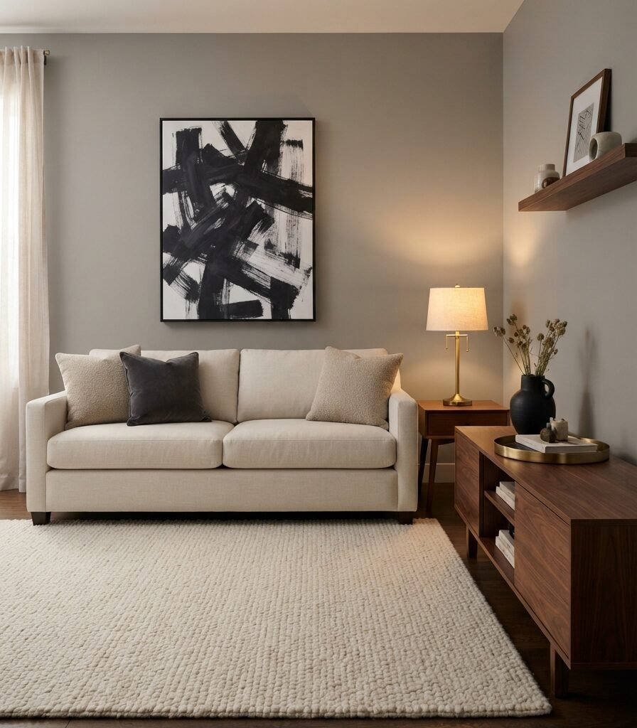
Category: ACCESSORIES
Vibe: Tailored.
Why it works: A mid-tone greige benefits from controlled dark accents because charcoal gives the wall enough visual definition to prevent it from disappearing. Sherwin-Williams includes Amazing Gray SW 7044 among its popular warm neutrals.
How to get it: Introduce charcoal through one large artwork and two small accessories, rather than distributing black across every surface. The repetition creates a deliberate visual rhythm without turning the room monochrome.
Shop The Look
| Product | Search phrase |
| Paint sample | Sherwin-Williams Amazing Gray SW 7044 sample |
| Artwork | Large charcoal abstract framed wall art |
| Vase | Matte black ceramic sculptural vase |
| Tray | Brushed brass rectangular decorative tray |
| Cushions | Oatmeal linen charcoal accent pillow set |
10. Classic Gray OC-23 for Soft North-Facing Light
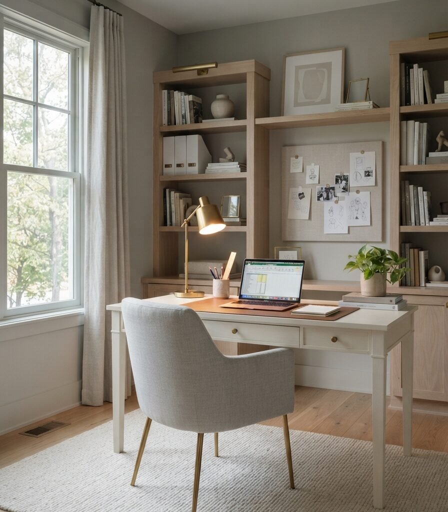
Category: LIGHTING
Vibe: Hushed.
Why it works: North-facing light can make colors appear cooler, so a very blue-gray paint may feel sharper than expected. Classic Gray offers a softer neutral alternative, and Benjamin Moore includes it among its popular greige colors.
How to get it: Balance the cooler daylight with a 2700K–3000K task lamp positioned beside the desk. This gives the wall a warmer artificial reference point after sunset.
💡 Quick Win: Switch a cool-white desk bulb to a dimmable 2700K LED before changing the paint color.
Shop The Look
| Product | Search phrase |
| Paint sample | Benjamin Moore Classic Gray OC-23 sample |
| Lamp | Brass adjustable desk lamp linen shade |
| Bulbs | 2700K dimmable LED A19 bulbs |
| Chair | Pale gray linen office chair |
| Pinboard | Natural linen framed bulletin board |
11. Requisite Gray SW 7023 with White Oak
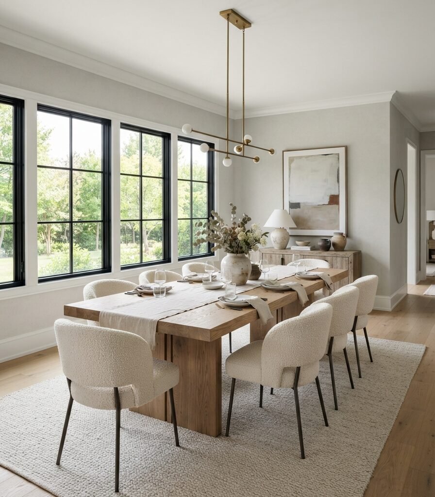
Category: FURNITURE
Vibe: Balanced.
Why it works: White oak can introduce pale yellow and honey notes, so a balanced greige can prevent the dining room from becoming too warm. Requisite Gray is one of Sherwin-Williams’ listed warm-neutral choices.
How to get it: Select the table first, then compare the paint sample directly against the oak under both daylight and evening lighting. This prevents the wall from being chosen independently of the largest wood surface.
Shop The Look
| Product | Search phrase |
| Paint sample | Sherwin-Williams Requisite Gray SW 7023 sample |
| Table | White oak rectangular dining table |
| Chairs | Cream boucle dining chairs wood legs |
| Runner | Natural linen table runner oatmeal |
| Chandelier | Aged brass linear dining chandelier |
12. Balboa Mist OC-27 for a Soft Bathroom
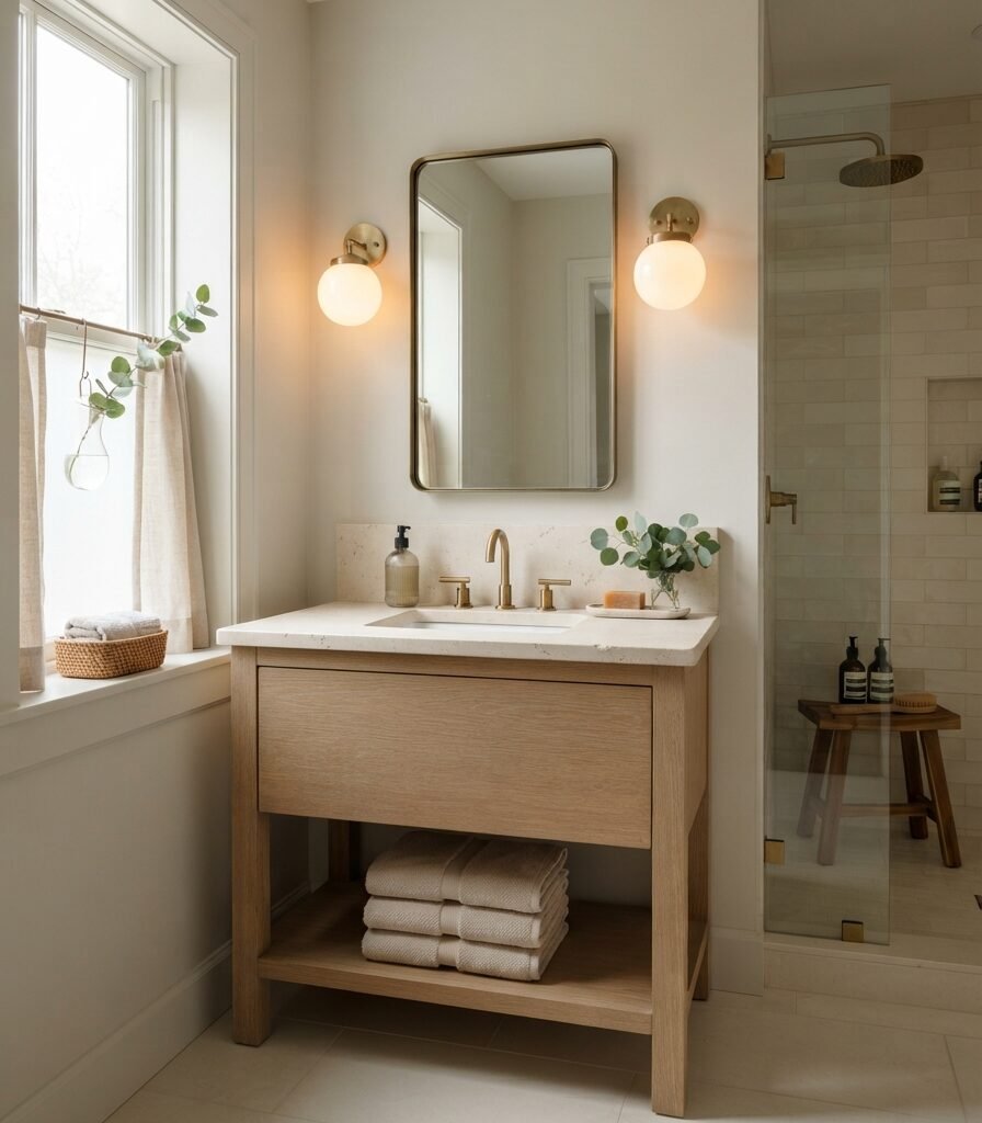
Category: SMALL SPACE
Vibe: Restorative.
Why it works: Balboa Mist is light enough for a compact bathroom but more nuanced than a plain white wall. Benjamin Moore includes it among its popular greiges, making it a useful option when you want subtle color without strong saturation.
How to get it: Keep the vanity and wall within a similar light-value range, then introduce contrast through aged brass hardware. This prevents a small bathroom from being divided into too many horizontal color bands.
Shop The Look
| Product | Search phrase |
| Paint sample | Benjamin Moore Balboa Mist OC-27 sample |
| Mirror | Aged brass round bathroom mirror |
| Towels | Oatmeal waffle bath towel set |
| Dispenser | Ribbed glass amber bathroom dispenser |
| Tray | Small honed stone bathroom vanity tray |
13. Perfect Greige SW 6073 for a Deeper Cozy Room
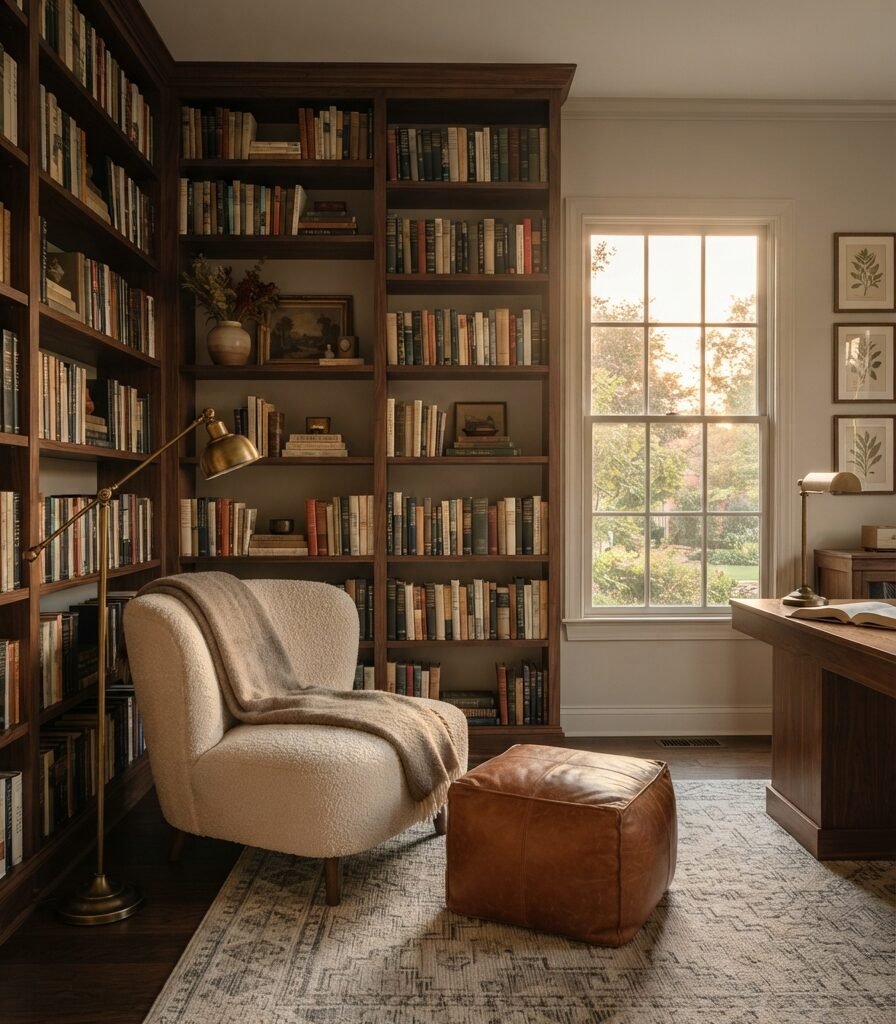
Category: COLOR
Vibe: Enveloping.
Why it works: Perfect Greige sits deeper in the warm-neutral family, so it works when the goal is atmosphere rather than maximum brightness. Sherwin-Williams lists SW 6073 Perfect Greige among its warm neutrals.
How to get it: Reserve this deeper greige for a room where darker furniture is intentional, such as a library, media room, or evening lounge. Offset it with ivory upholstery and warm metallic lighting to preserve separation.
💡 Quick Win: Paint only the wall behind an existing bookcase first and observe how the bigger greige changes the room at night.
Shop The Look
| Product | Search phrase |
| Paint sample | Sherwin-Williams Perfect Greige SW 6073 sample |
| Chair | Cream boucle reading chair walnut legs |
| Ottoman | Cognac leather storage ottoman |
| Lamp | Antique brass library floor lamp |
| Frames | Aged brass picture frame set |
14. Natural Linen SW 9109 with Warm White Trim

Category: MATERIAL
Vibe: Sun-warmed.
Why it works: Natural Linen moves toward the beige side of greige, making it particularly effective with rattan, linen, oak, and woven fibers. Sherwin-Williams includes SW 9109 Natural Linen among its expert warm-neutral selections.
How to get it: Use a warm white trim color with enough separation to outline doors and baseboards without creating a stark white border. Test the two shades together rather than separately.
Shop The Look
| Product | Search phrase |
| Paint sample | Sherwin-Williams Natural Linen SW 9109 sample |
| Bed | Natural rattan queen bed frame |
| Bedding | Ivory linen duvet cover set |
| Pendant | Woven rattan bedroom pendant light |
| Dresser | Pale oak six-drawer dresser |
15. Pashmina AF-100 with Dark Walnut and Brass

Category: ACCESSORIES
Vibe: Layered.
Why it works: Pashmina brings more depth than the palest greiges, so accessories need to create intentional tonal contrast rather than compete through multiple colors. Benjamin Moore includes Pashmina AF-100 in its popular greige collection.
How to get it: Use the three-tone accessory rule: ivory for softness, walnut for warmth, and charcoal for definition. Repeat each tone at least twice so the darker wall color feels integrated.
Shop The Look
| Product | Search phrase |
| Paint sample | Benjamin Moore Pashmina AF-100 sample |
| Artwork | Neutral abstract brass framed wall art |
| Vase | Matte charcoal ceramic sculptural vase |
| Tray | Antique brass decorative catchall tray |
| Pillow | Cream boucle square throw pillow |
16. Accessible Beige with a Tonal Greige Open-Plan Palette
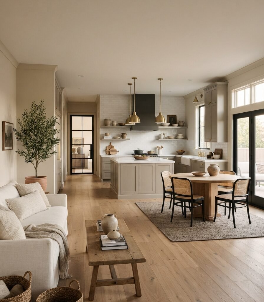
Category: LAYOUT
Vibe: Harmonious.
Why it works: A tonal palette allows an open floor plan to feel connected without making every surface identical. Accessible Beige already carries gray undertones, so nearby taupe and greige accents can reinforce the transition between kitchen, dining, and living zones.
How to get it: Keep the walls consistent and create zoning through rug boundaries, pendant placement, and furniture orientation. Let each functional area have one darker anchor while the wall color remains continuous.
Shop The Look
| Product | Search phrase |
| Paint sample | Sherwin-Williams Accessible Beige SW 7036 sample |
| Rug | Taupe geometric dining area rug 6×9 |
| Pendants | Aged brass kitchen island pendant pair |
| Baskets | Large woven seagrass storage basket set |
| Cushions | Ivory and taupe linen pillow cover set |
How to Start Your Greige Transformation
Make Benjamin Moore Edgecomb Gray HC-173 your first sample if you need one starting point for a broadly adaptable greige. Its LRV of 63.09 keeps it substantially lighter than many medium greiges, while Benjamin Moore describes it as a warm, welcoming neutral. Use a large sample board and compare it directly with your floor, countertop, and largest upholstered piece.
The most common mistake is choosing a greige from a tiny color chip without checking its undertone beside fixed finishes. A gray-heavy greige can suddenly look cool next to blue-gray tile, while a beige-heavy shade can look surprisingly tan beside creamy cabinets. Test samples vertically and observe them in both natural and artificial light before buying full-size paint.
For a low-cost entry point, try one peel-and-stick Edgecomb Gray sample under $10, a 2700K two-pack of LED bulbs under $20, and one oatmeal linen-blend pillow cover under $30. Together, they let you test wall color, lighting temperature, and warm texture without a major commitment.
A one-room greige refresh can be completed over a weekend if walls need little preparation. A starter project may cost 150–600, while a fuller room with paint, rug, curtains, lighting, and furniture can reach 1,000–3,500+. Built-ins, cabinetry, flooring, and whole-home repainting can extend the project into several weeks.
Frequently Asked Questions About 16 Best Greige Paint Colors
What is the difference between greige and beige paint?
Greige combines gray and beige, while traditional beige generally has a stronger yellow, tan, or brown direction. Benjamin Moore explains that greiges with stronger gray influence tend to read cooler, while beige-forward greiges such as Edgecomb Gray read warmer. If you want a neutral that feels warmer than gray but less traditional than beige, greige is the middle ground.
Which greige paint color is the most versatile?
Sherwin-Williams Agreeable Gray SW 7029 is one of the most widely used flexible choices, and Sherwin-Williams currently identifies it as a popular warm-neutral color. Its beige undertone gives the gray warmth, although its final appearance still depends on lighting and surrounding finishes. For a lighter Benjamin Moore option, Edgecomb Gray HC-173 has an LRV of 63.09.
How much does it cost to paint a room greige?
A DIY greige painting project can start around 150–600, depending on room size, paint quantity, primer needs, and tools. Adding a new rug, curtains, lighting, and furniture can bring the project to 1,000–3,500 or more. Professional labor and extensive wall preparation can increase the total substantially.
Can greige paint work with white oak floors?
Yes, but the undertone needs to be tested against the exact oak. Warm greiges such as Accessible Beige can reinforce the warmth of golden oak, while a more balanced or cooler greige can create stronger contrast. Place the paint sample directly beside the flooring at different times of day rather than evaluating either material separately.
Which greige paint color is best for kitchen cabinets?
Agreeable Gray, Accessible Beige, Revere Pewter, Edgecomb Gray, and similar neutral greiges can all work for cabinetry when coordinated with the countertop and backsplash. Sherwin-Williams currently lists Agreeable Gray and Accessible Beige among its popular warm-neutral choices. For cabinets, test the paint against the countertop first because stone undertones can dramatically change how the greige appears.
Ready to Create Your Dream Greige Interior with 16 Best Greige Paint Colors?
These 16 best greige paint colors cover warm and cool undertones, natural stone and oak pairings, lighting behavior, furniture contrast, small-room strategies, accessories, and open-plan layouts so you can choose based on how your home actually functions. Starting with one sample room is not a compromise; it is the most reliable way to see how a greige behaves before committing throughout the house. Today, paint a large sample of your chosen shade and place it beside your flooring, countertop, and largest piece of furniture. When the gray and beige balance feels right, the room can feel grounded, warm, and quietly sophisticated without losing flexibility. Save or pin your favorite combination of greige walls, natural oak, linen, stone, aged brass, and warm white trim so your next paint decision starts with a clear visual direction.