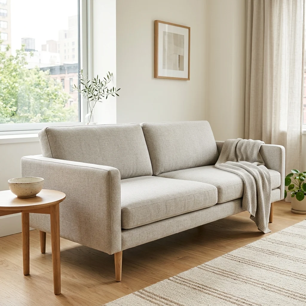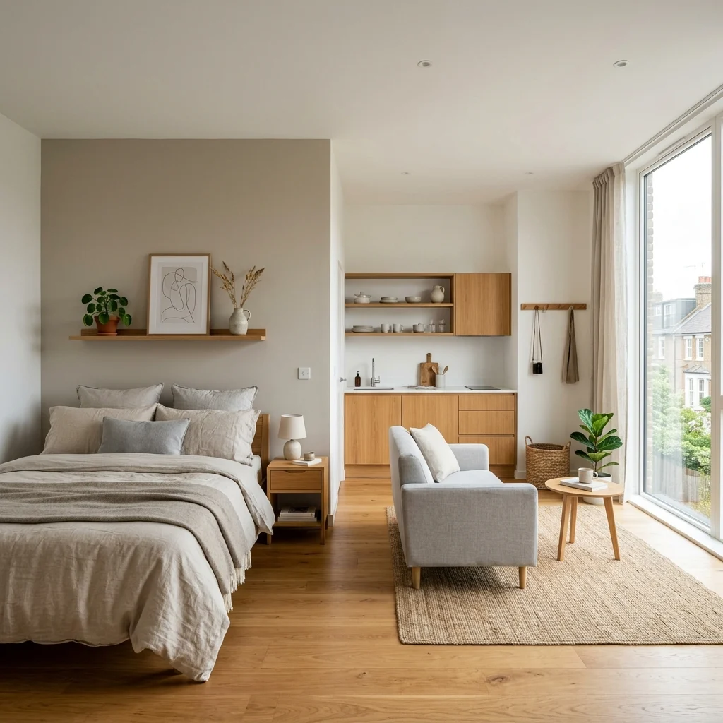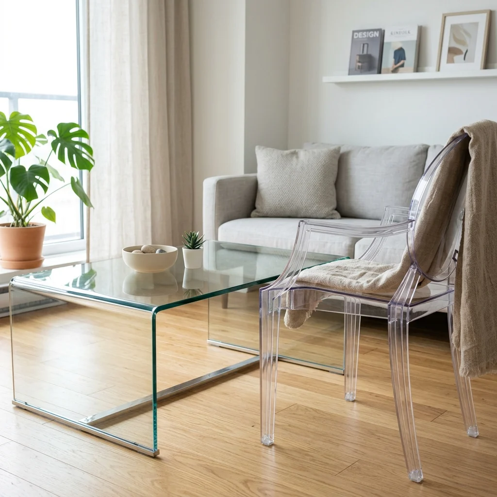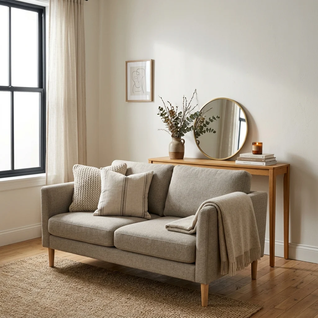
20 Budget Home Decor Ideas

20 Budget Home Decor Ideas That Actually Look Expensive

Budget home decor is the practice of maximizing visual impact per dollar spent, prioritizing paint, lighting, and rearrangement over expensive new furniture, and choosing high-leverage swaps that change how a room reads without changing its price tag much at all. This article gives you 20 real budget home decor ideas spanning color, material, lighting, furniture, and layout, each one built to look far more expensive than it actually costs.

The feel is unmistakable: a room that reads as considered rather than cheap, where the money went exactly where it shows, and nowhere it doesn’t. Budget decorating isn’t about doing without, it’s about knowing precisely which five changes matter and skipping the fifty that don’t. Here are 20 ideas worth saving and stealing.

Why Budget Home Decor Works So Well

Budget home decor isn’t a visual style, the way farmhouse or Japandi is; it’s a spending philosophy that can dress up almost any aesthetic, rooted in the postwar thrift culture of “make it do” and more recently in what retailers now openly call the “dupe economy,” where affordable lookalikes of expensive designer pieces are marketed and searched for by name. What separates genuinely good budget decor from decor that simply looks cheap is leverage: spending disproportionately on the handful of changes to paint, lighting, and one or two hero pieces that do the most visual work, while accepting lower-cost versions everywhere else.

The materials that make budget decor read as expensive rather than corner-cut are ones that mimic pricier finishes convincingly: peel-and-stick tile that replicates zellige or marble, contact paper in a convincing faux-marble or wood-grain finish, and vinyl rugs printed in high-end pattern styles at a fraction of a wool rug’s cost. Color-wise, warm white and greige remain the budget decorator’s best friend, since a $30 gallon of paint in a versatile neutral does more per dollar than almost any single furniture purchase, with one confident accent color, often terracotta or sage, introduced through cheaper textiles rather than furniture.

Budget decorating has surged specifically because rising furniture and rent costs are colliding with a genuine cultural shift toward secondhand shopping. Facebook Marketplace and local thrift stores have become primary furniture sources rather than last resorts, and Pinterest and TikTok searches for “dupe” versions of specific designer pieces have grown sharply as more people decorate with intention on tighter budgets.

Small spaces are, if anything, the best-case scenario for budget decor, since fewer square feet directly means fewer dollars needed to make a real visual impact. The honest limit is on functional basics: a genuinely uncomfortable secondhand mattress or a wobbly desk chair isn’t worth the savings, so prioritize spending on daily-use comfort items first and let decorative surfaces absorb the budget cuts.

Style at a Glance

ElementFree & Low-Cost MovesSmall-Investment Moves
PhilosophyRearrange, repaint, restyle what you ownSpend on the one or two pieces that show
MaterialsExisting furniture, secondhand findsPeel-and-stick tile, vinyl rugs, paint
Color PaletteWarm white, greigeTerracotta or sage accents via textiles

20 Budget Home Decor Ideas

1. Repaint Just the Trim Instead of the Whole Wall
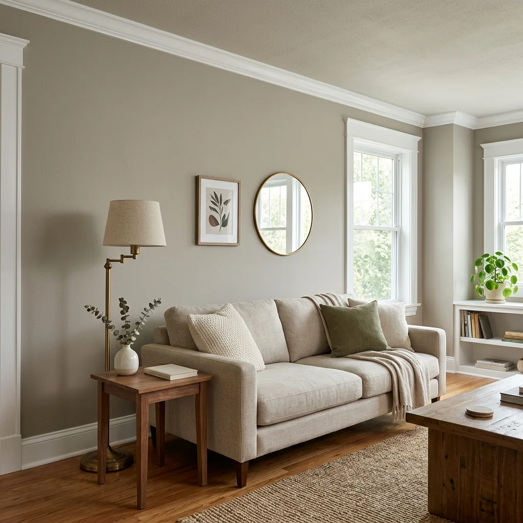
1. Repaint Just the Trim Instead of the Whole Wall

Vibe: The room feels refreshed, crisp trim doing more work than a full repaint ever could.

Why it works: Repainting only the baseboards, door frames, and window trim in a bright white contrast uses a design principle where a small amount of high-value change draws the eye and makes the entire room read as more maintained without the cost or labor of painting every wall. A single gallon of trim paint covers most rooms’ full trim run, making this one of the highest-impact-per-dollar changes available in any budget refresh.

How to get it: Use a semi-gloss white paint rather than matte specifically for trim, since the sheen contrast against matte wall paint is what makes the trim read as crisp and freshly finished rather than simply a different shade of white.

πŸ’‘ Quick Win: Painter’s tape along the wall-trim seam takes ten minutes and is what separates a professional-looking line from a smudged one.

Shop the Look

Product
Semi-gloss white trim paint, quart
Angled trim paintbrush
Painter’s tape, sharp-edge
Wood filler for trim gaps
Drop cloth canvas sheet

2. Peel-and-Stick Tile for a Backsplash Upgrade
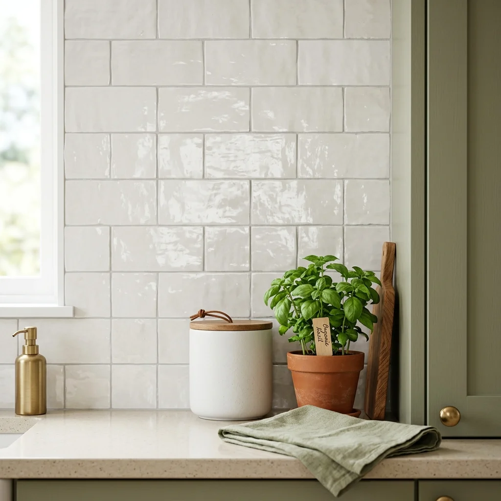
2. Peel-and-Stick Tile for a Backsplash Upgrade

Vibe: The kitchen feels upgraded, a single wall doing the work of a full renovation.

Why it works: A backsplash sits at eye level in direct sightline of anyone standing at the counter, which is why upgrading it delivers outsized visual return relative to its actual wall area, a design principle sometimes called “focal surface leverage,” where small, high-visibility areas matter more than large, low-visibility ones. Peel-and-stick tile in a zellige or subway pattern replicates the irregular glaze and dimension of real tile at a fraction of the material and labor cost of installed ceramic tile.

How to get it: Clean and degrease the existing backsplash surface thoroughly before applying, since peel-and-stick tile’s adhesive fails almost exclusively due to residue left on the wall rather than the product itself.

Shop the Look

Product
Peel-and-stick zellige-style tile sheets
Adhesive tile edge trim
Degreasing wall cleaner spray
Ceramic kitchen canister set
Small terracotta herb planter

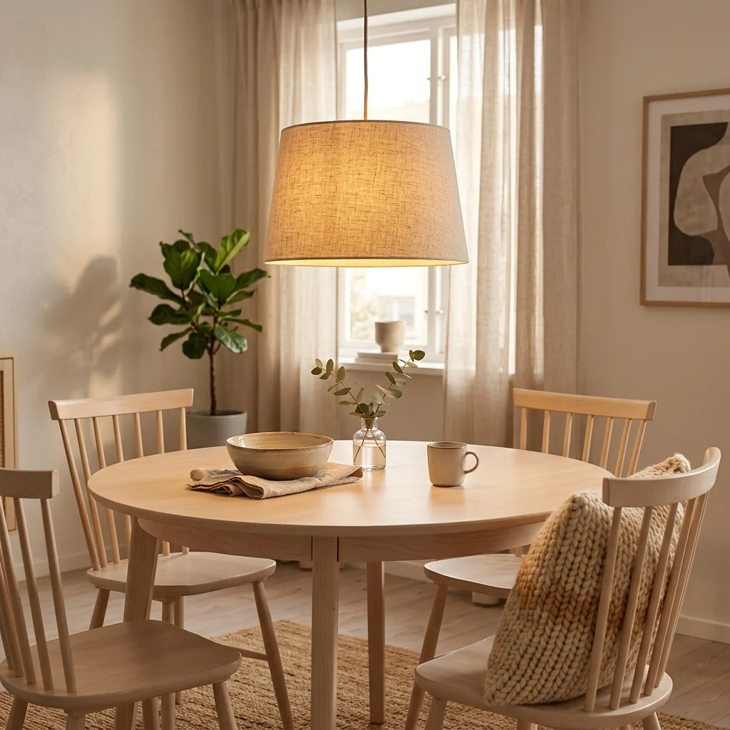
3. Swap Just the Lampshades for an Instant Refresh
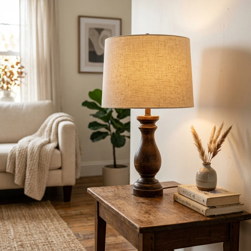
3. Swap Just the Lampshades for an Instant Refresh

Vibe: The corner feels updated, one small swap changing the whole lamp’s character.

Why it works: A lampshade is the single largest visible surface on most lamps, meaning its color, shape, and material do most of the visual work regardless of how dated or plain the base beneath it might be. Replacing a yellowed or mismatched shade with a clean linen drum shade updates the entire fixture’s appearance for a small fraction of the cost of buying a new lamp outright.

How to get it: Measure your existing harp (the wire frame holding the shade) before buying a replacement shade, since shade sizing is based on harp height and diameter, not the lamp’s overall size.

πŸ’‘ Quick Win: A single new lampshade under $20 can visually update a lamp that would otherwise cost $60–100 to replace entirely.

Shop the Look

Product
Linen drum lampshade, neutral
Replacement lamp harp, adjustable
Warm white LED bulb
Small walnut side table
Neutral book stack, decorative

4. Rearranging Existing Furniture Before Buying Anything New
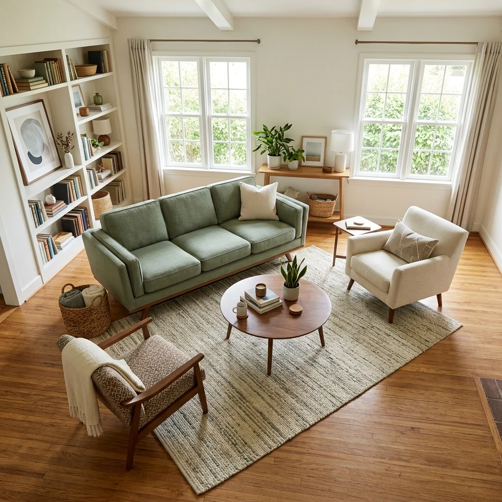
4. Rearranging Existing Furniture Before Buying Anything New

Vibe: The room feels fresh, entirely new, without a single new purchase.

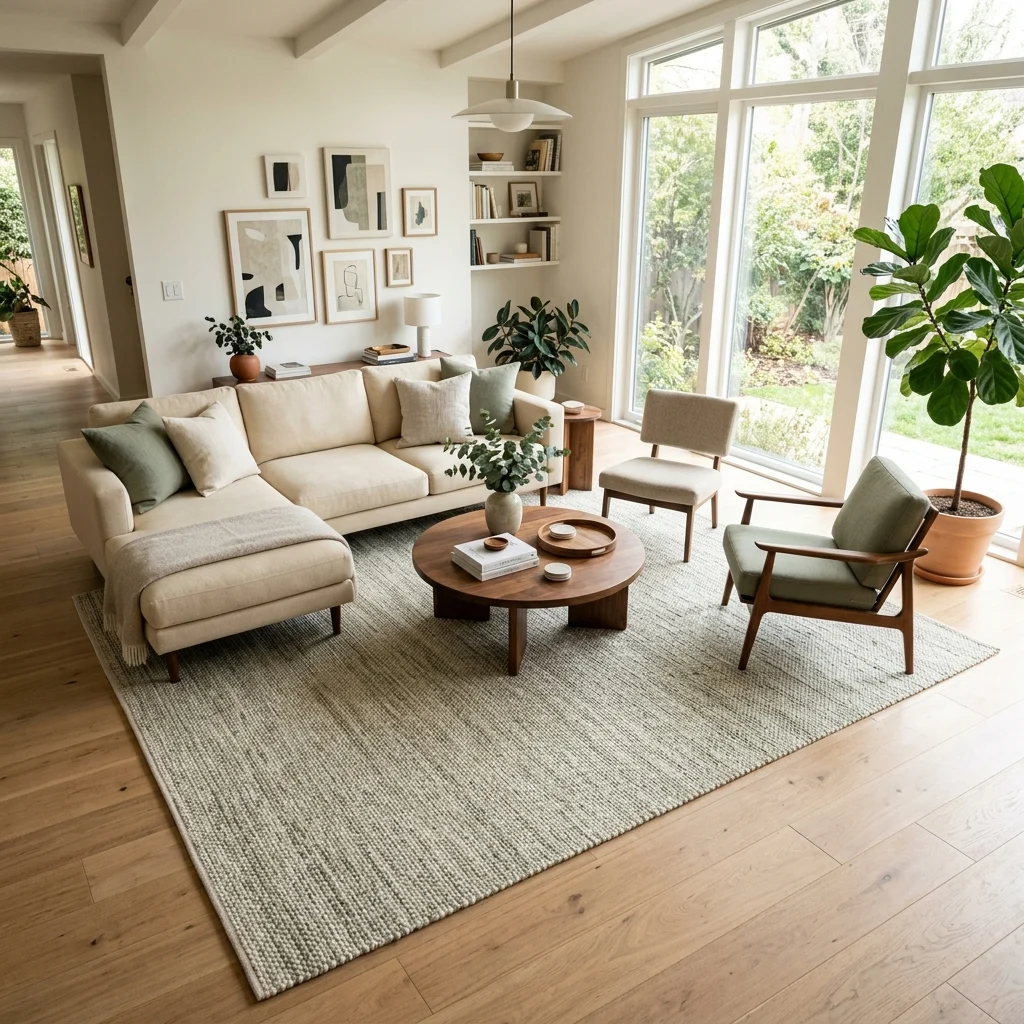
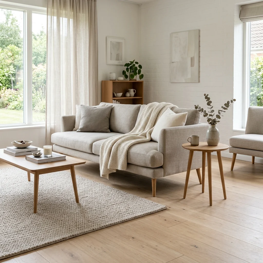
Why it works: Furniture arrangement is the only decorating lever that costs literally nothing, yet it changes the room’s proportion, traffic flow, and visual weight distribution as dramatically as new furniture would. Pulling a sofa a few feet from the wall and angling seating toward a shared center point often does more for a room’s feel than any single purchase could. This is the same conversational-grouping principle interior designers charge for, applied entirely for free.

How to get it: Try floating your largest piece, usually the sofa, at least a few inches off the wall it currently touches, and angle at least one chair inward rather than square against another wall, before considering any new furniture purchase.

Shop the Look

Product
Furniture sliders for easy repositioning
Rug grippers, non-slip
Measuring tape for layout planning
Furniture placement planning app subscription
Felt floor protector pads

5. Thrifted Frames Spray-Painted to Match
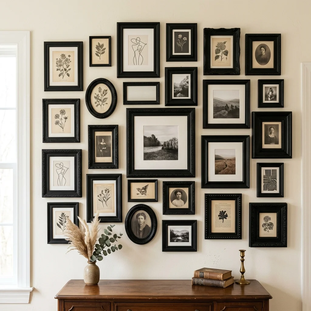
5. Thrifted Frames Spray-Painted to Match

Vibe: The wall feels curated, mismatched frames unified by one shared coat of paint.

Why it works: Thrifted frames typically arrive in a chaotic mix of finishes and eras, which is exactly what makes them cheap, but a single unifying spray-paint color removes that visual noise entirely, since color consistency, not frame shape, is what makes a gallery wall read as intentional. This lets budget decorators access varied, interesting frame silhouettes that would cost far more if purchased new and pre-matched.

How to get it: Sand glossy frame finishes lightly before spray painting so the paint adheres evenly, and apply two to three thin coats rather than one heavy coat to avoid drips pooling in ornate detail work.

Shop the Look

Product
Matte black spray paint, multi-surface
Fine-grit sanding sponge
Printable art bundle, neutral tones
Painter’s tape for frame masking
Command picture hanging strips

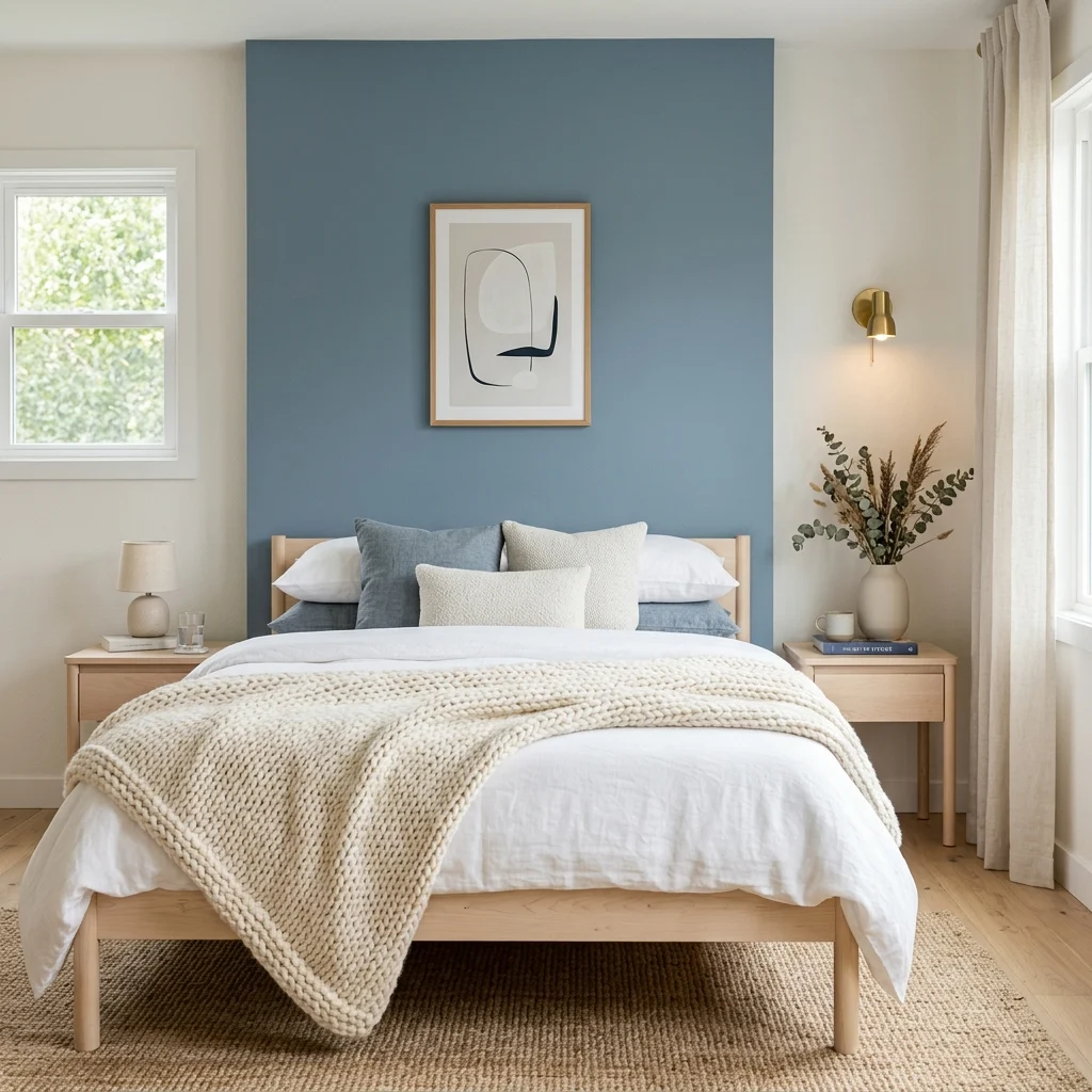
6. Use One Budget Accent Color Instead of Full Room Repaint
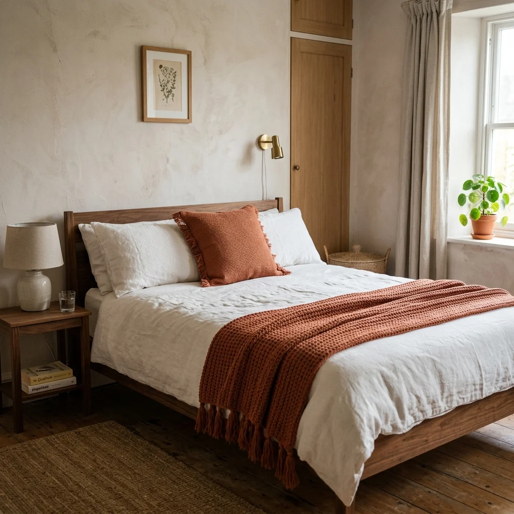
6. Use One Budget Accent Color Instead of Full Room Repaint

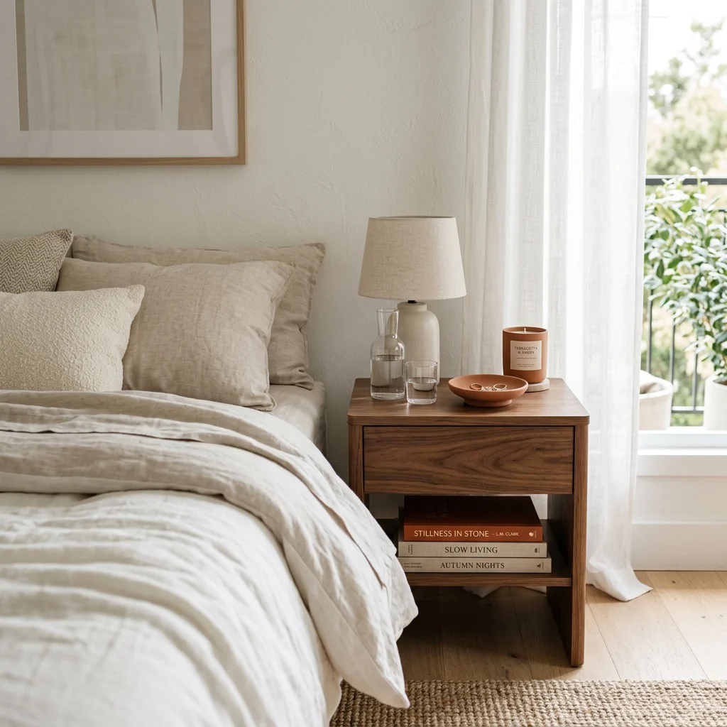
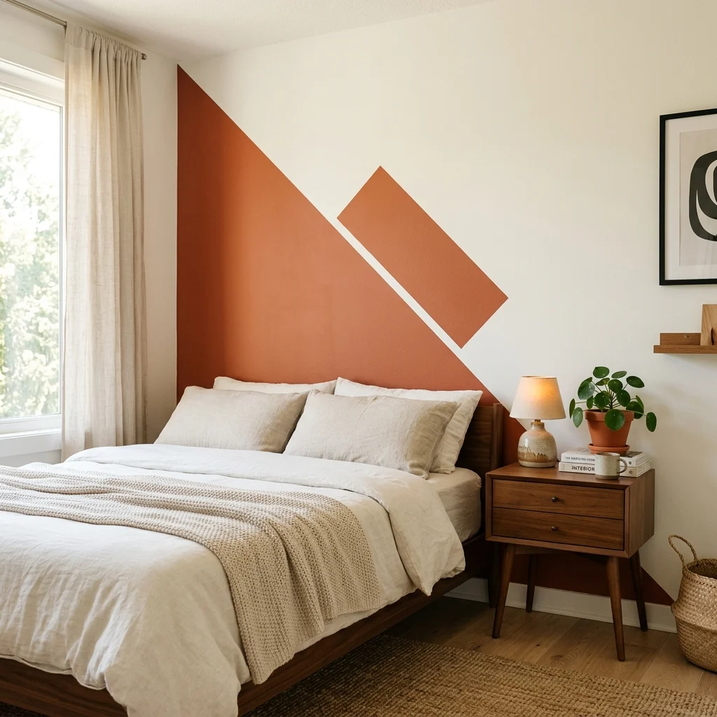
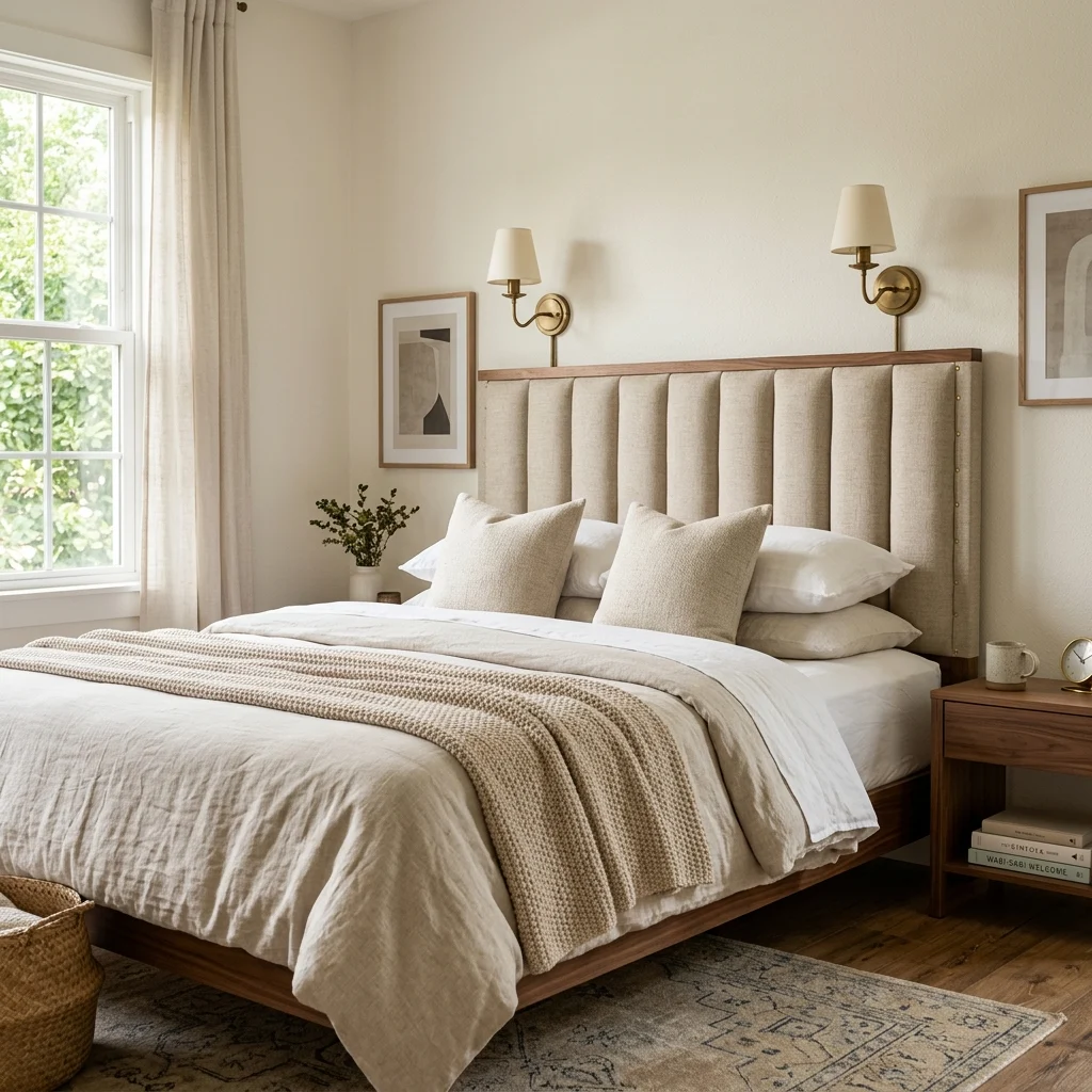
Vibe: The bed feels considered, one warm color doing all the storytelling.

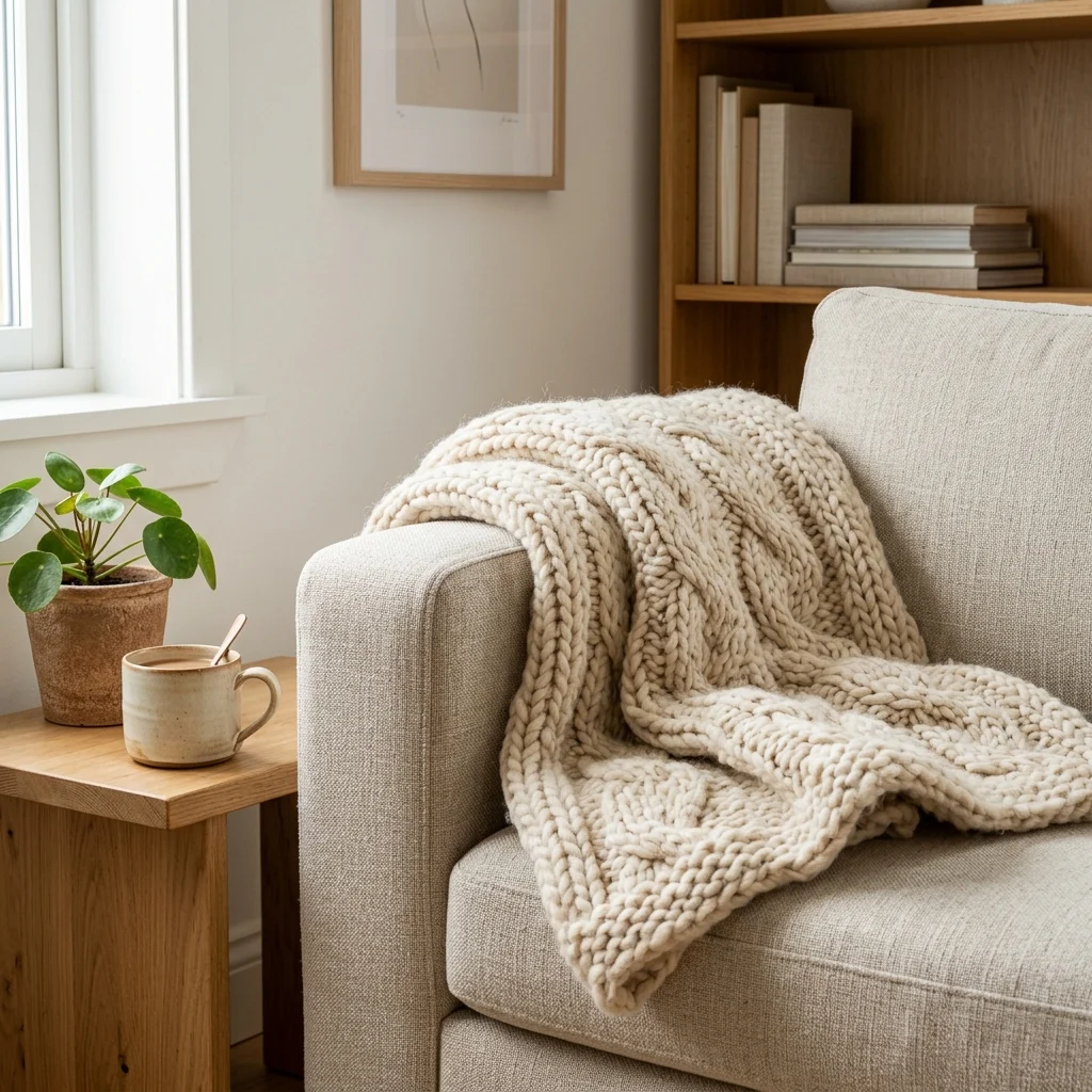
Why it works: Introducing color through textiles, a pillow cover, a throw blanket, rather than paint, costs a fraction as much and carries none of the risk of an expensive wall color that turns out wrong under your room’s specific light. This is the same accent-color principle used in far pricier design schemes, just executed through a $15 pillow cover instead of a $50 gallon of paint and a weekend of labor.

How to get it: Choose one confident accent color and introduce it through no more than two textile items so it reads as a deliberate accent rather than a scattered, uncertain color choice.

πŸ’‘ Quick Win: A pillow cover (not a whole new pillow insert) is the cheapest way to test a color commitment before ever touching a paintbrush.

Shop the Look

Product
Terracotta linen pillow cover
Woven throw blanket, warm tone
Neutral bedding set, existing base
Small ceramic accent vase
Warm white bedside lamp

7. Faux Marble Contact Paper on Furniture Tops
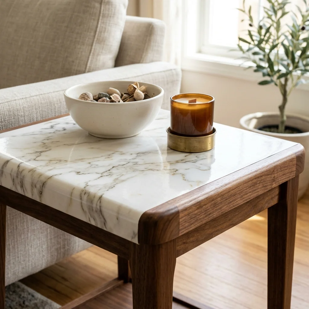
7. Faux Marble Contact Paper on Furniture Tops

Vibe: The table feels upgraded, a laminate top disguised convincingly as stone.

Why it works: High-quality faux marble contact paper is printed with realistic veining and a subtle satin finish that mimics honed stone’s light behavior closely enough to read as real from normal viewing distance, which is the specific test that matters; nobody inspects a side table from six inches away. This technique works because tabletops are horizontal surfaces viewed at an angle rather than straight on, which hides the paper’s minor seams far more effectively than a vertical application would.

How to get it: Apply contact paper to a perfectly clean, dry surface using a plastic squeegee to push out air bubbles from the center outward, and wrap the paper slightly around table edges for a seamless finished look.

Shop the Look

Product
Faux marble contact paper roll
Plastic application squeegee
Craft knife for trimming edges
Ceramic decorative bowl
Brass taper candle holder

8. Float Furniture Away From Walls for Free
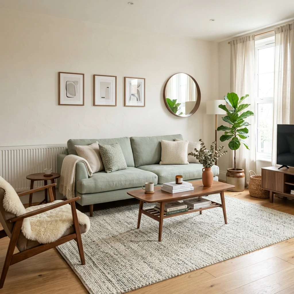
8. Float Furniture Away From Walls for Free

Vibe: The room feels intentional, furniture claiming its own defined zone.

Why it works: Furniture pushed flush against every wall is one of the clearest visual signals of an unconsidered room, since it suggests the furniture was placed for maximum floor clearance rather than genuine layout planning. Floating even one piece a few feet into the room creates a defined zone with implied boundaries, the same soft-zoning principle designers use in open floor plans, at zero material cost.

How to get it: Pull your sofa or largest seating piece at least 18–24 inches from the wall behind it, and anchor the newly defined zone with your existing rug so the gap reads as intentional rather than accidental.

Shop the Look

Product
Furniture sliders, floor-safe
Rug pad, non-slip
Measuring tape
Small console table for the gap behind the sofa
Artificial floor plant

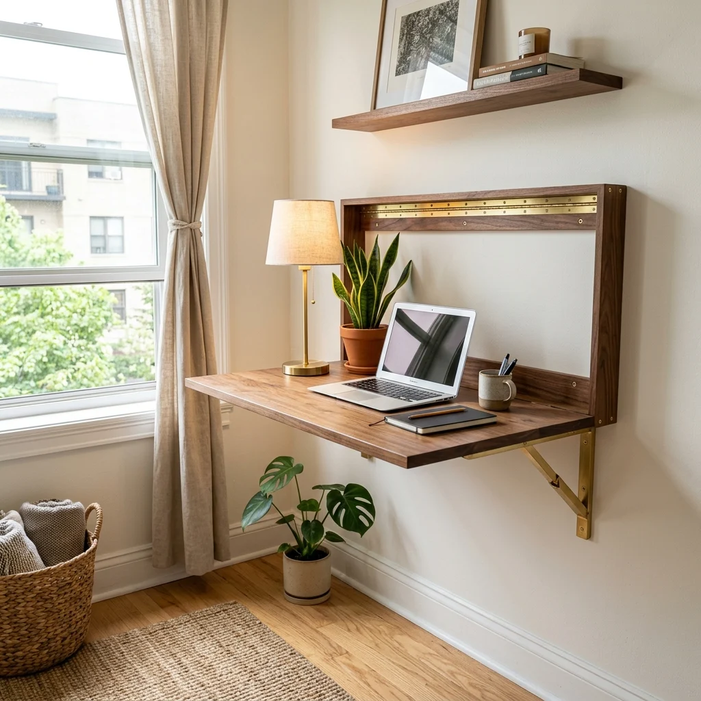
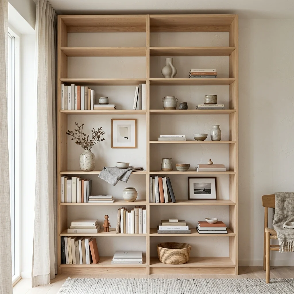
9. Wall-Mounted Everything to Skip Buying Furniture
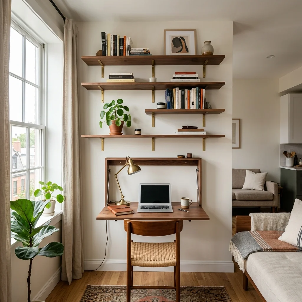
9. Wall-Mounted Everything to Skip Buying Furniture

Vibe: The studio feels efficient, walls doing the job that floor space would otherwise cost.

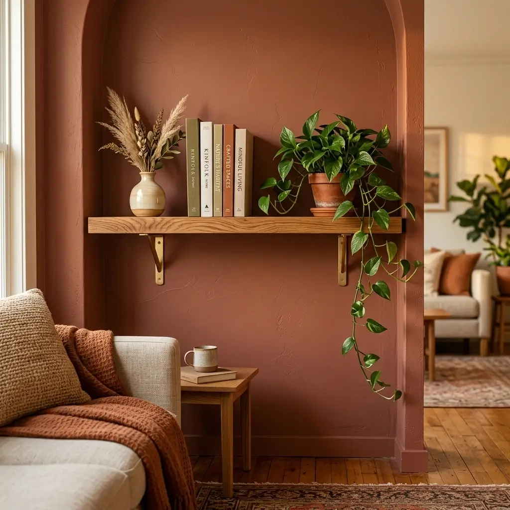
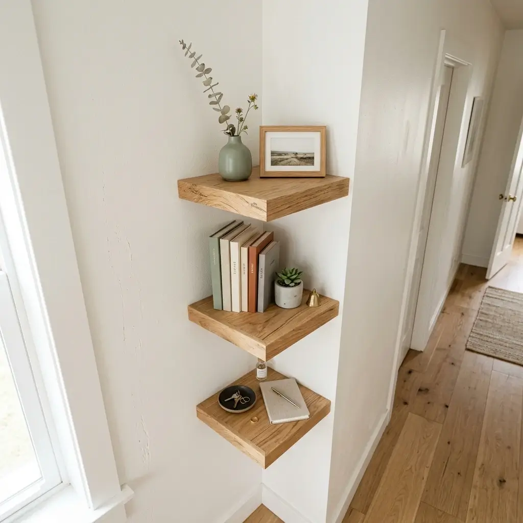
Why it works: Wall-mounted shelving, desks, and storage cost less per square foot of function than equivalent freestanding furniture, since you’re paying for a bracket and a panel rather than a full frame, legs, and finished sides meant to be seen from every angle. In a small space, specifically, this also reclaims floor area that would otherwise require paying for a larger apartment to accommodate the same storage.

How to get it: Prioritize wall-mounting for the two furniture types with the worst cost-to-function ratio when freestanding bookshelves and desks, while keeping seating and beds as traditional floor furniture, since those need to bear real daily weight and use.

πŸ’‘ Quick Win: A single floating shelf under $25 can replace a $150 bookshelf’s function for a small book and decor collection.

Shop the Look

Product
Floating wall shelf set
Wall-mounted fold-down desk
Small brass wall sconce
Compact desk lamp
Wall anchor hardware kit

10. Facebook Marketplace Sofa Instead of New Retail
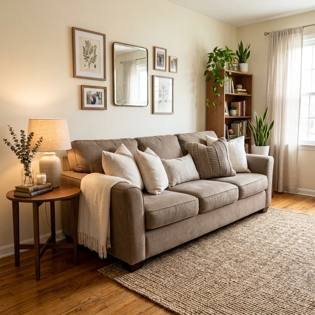
10. Facebook Marketplace Sofa Instead of New Retail

Vibe: The room feels resourceful, one smart secondhand find anchoring the whole space.

Why it works: A sofa is typically the single most expensive piece in any living room, which means it’s also the piece where secondhand buying delivers the largest dollar savings relative to a comparable new purchase. A $2,000 retail sofa in solid, gently-used condition frequently resells for $300–600 on local marketplaces. Restyling a secondhand sofa with new pillow covers and a throw immediately disguises whatever cosmetic wear the previous owner left behind.

How to get it: Test any secondhand sofa for structural soundness in person before buying. Sit in multiple spots, checking for sagging or frame creaking, since cosmetic wear is fixable with new covers, but a broken frame is not.

Shop the Look

Product
Neutral linen pillow covers, set
Woven throw blanket
Fabric upholstery cleaner
Furniture leg caps for stability
Small round side table

11. Budget LED Strip Lighting Under Cabinets
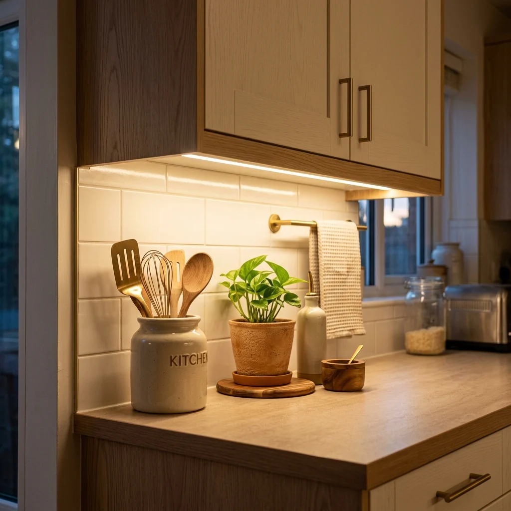
11. Budget LED Strip Lighting Under Cabinets

Vibe: The counter feels functional, with warm light exactly where you actually need it.

Why it works: Under-cabinet lighting solves a real functional problem; most kitchen counters are shadowed by the cook’s own body under standard overhead lighting, while also adding a warm ambient glow that reads as a genuine kitchen upgrade at installation costs a fraction of new cabinetry or countertops. Self-adhesive LED strips require no electrician for a plug-in version, making this one of the highest-return, lowest-effort kitchen updates available.

How to get it: Choose warm-white LED strips (2700–3000K) rather than the cooler white common in cheaper strip kits, since cool light under cabinets tends to read as clinical rather than the warm ambient glow the upgrade is meant to deliver.

Shop the Look

Product
Warm white LED strip lighting kit
Plug-in dimmer switch for strips
Adhesive cable clips
Ceramic kitchen canister set
Small potted herb plant

12. Secondhand Wood Furniture Refinished Instead of Bought New
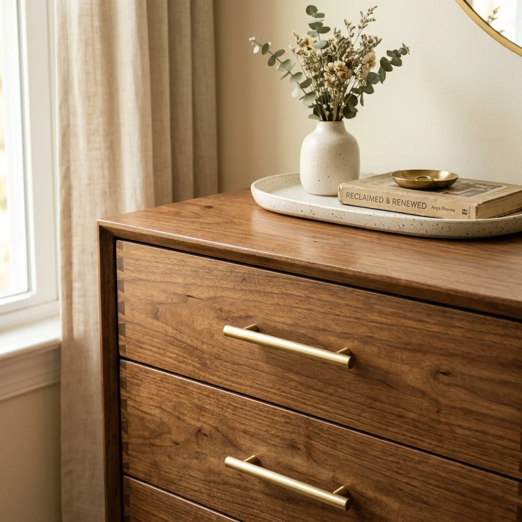
12. Secondhand Wood Furniture Refinished Instead of Bought New

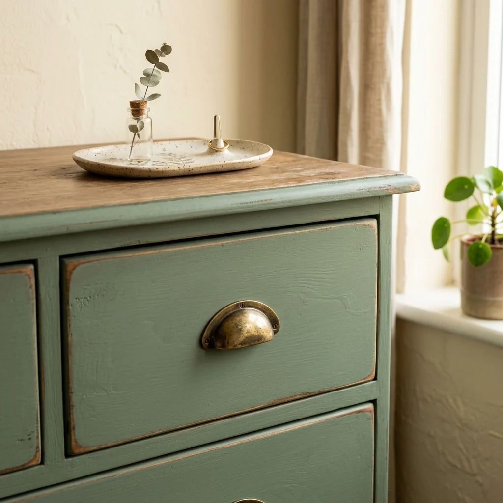
Vibe: The dresser feels revived, decades-old joinery wearing a fresh finish.

Why it works: Solid wood furniture built decades ago, commonly available secondhand for $30–80, is frequently better constructed than comparably priced new furniture made from particleboard or veneer, since older pieces were built before manufacturers began prioritizing material cost over longevity. A fresh stain and new hardware update the surface entirely, while the underlying solid-wood joinery, dovetail joints, and real wood drawer bottoms continue doing the structural work that new budget furniture often can’t.

How to get it: Strip the old finish with a chemical stripper or sand down to bare wood before applying new stain, since stain applied over an existing finish absorbs unevenly and produces a blotchy result.

Shop the Look

Product
Wood furniture stripper, chemical
Walnut wood stain, oil-based
Fine-grit sanding block set
Brushed brass drawer pull set
Clear polyurethane topcoat

13. Dollar-Store Vases Grouped for a High-End Look
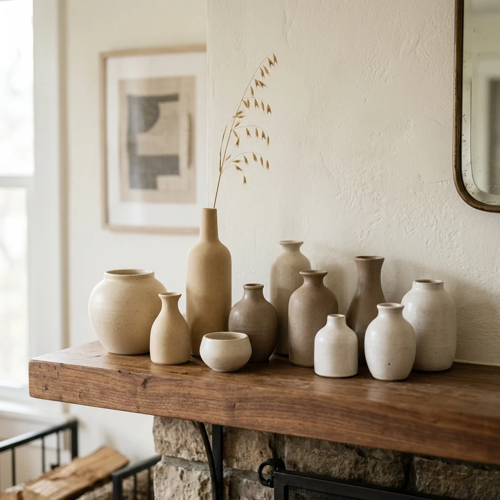
13. Dollar-Store Vases Grouped for a High-End Look

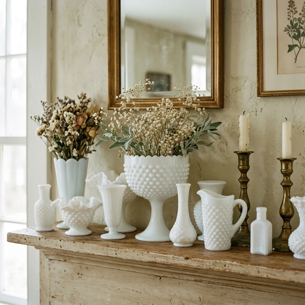
Vibe: The mantel feels cohesive, with budget pieces reading as one considered collection.

Why it works: Inexpensive ceramic vases from discount and dollar stores often use the same basic clay-and-glaze manufacturing process as higher-end ceramics. The difference in perceived value comes almost entirely from styling, not material quality. Grouping several budget vases at varied heights in a shared matte, neutral glaze family applies the same asymmetric-triad principle that expensive ceramic collections use, which is what disguises the individual pieces’ low cost.

How to get it: Buy multiples of the same budget vase in slightly different sizes rather than one of several different styles, since repetition of a single simple form reads as more intentional than a scattered mix.

πŸ’‘ Quick Win: Three identical dollar-store vases in graduated sizes, grouped, consistently outperform one single “nicer” vase bought alone.

Shop the Look

Product
Matte ceramic vase, set of three
Dried floral stem, single
Small ceramic tray for grouping
Neutral candle, unscented
Small book stack, decorative

14. Choose Warm White Paint for Maximum Resale on Leftover Cans
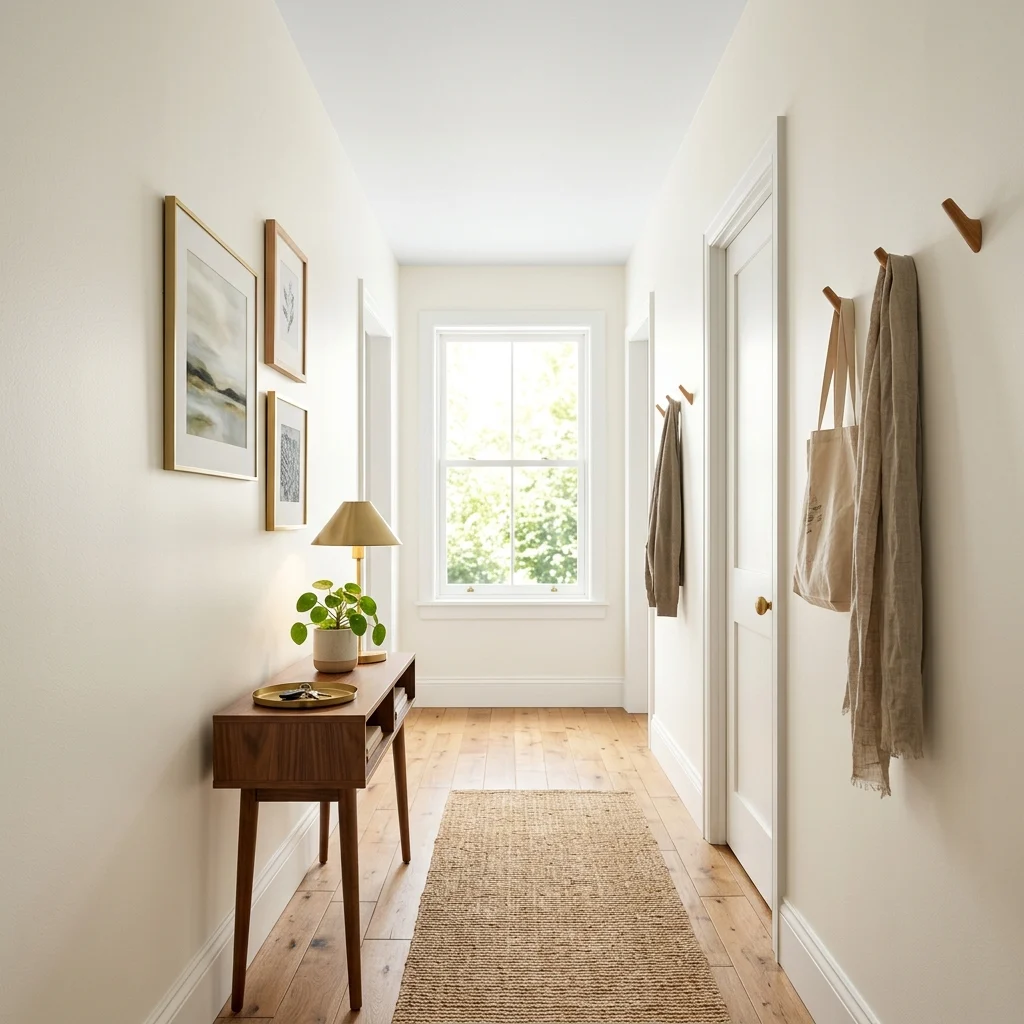
14. Choose Warm White Paint for Maximum Resale on Leftover Cans

Vibe: The hallway feels fresh, with clean paint doing the heaviest lifting for the least cost.

Why it works: A gallon of quality warm-white paint typically covers 350–400 square feet and costs less than almost any single piece of new furniture, making it the single highest square-footage-per-dollar decorating purchase available. Choosing a widely popular warm white rather than a trend color also means leftover paint stays useful for touch-ups and future rooms, avoiding the sunk cost of a half-used can in a shade you’ll never repeat.

How to get it: Buy a sample pot first and paint a two-foot square in your actual room’s light before committing to a full gallon, since warm whites shift noticeably between north-facing and south-facing rooms.

Shop the Look

Product
Warm white interior paint, gallon
Paint sample pot for testing
Roller and tray set
Painter’s tape
Small framed art print

15. Zone a Studio With Rugs Instead of Furniture
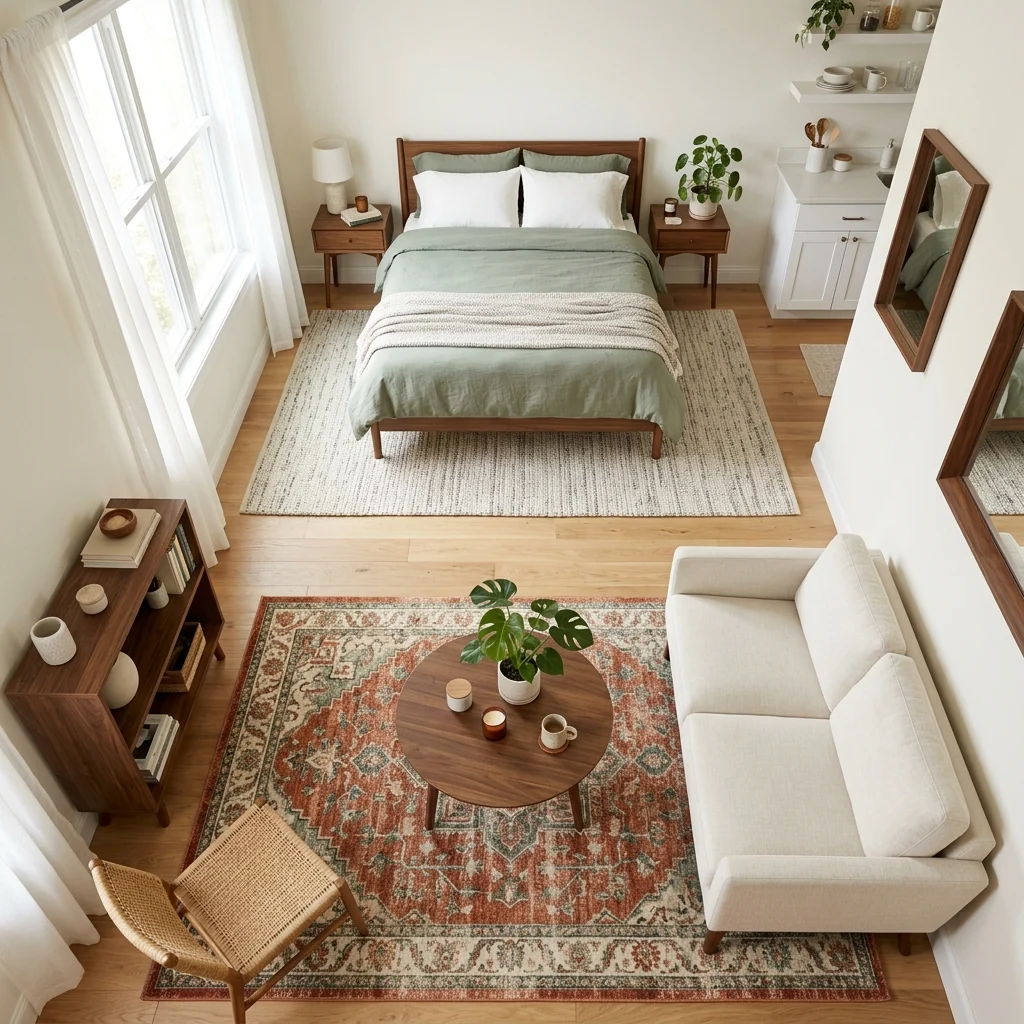
15. Zone a Studio With Rugs Instead of Furniture

Vibe: The studio feels organized, with two zones defined without spending on a single divider.

Why it works: Two different area rugs, one under the bed, one under the seating area signal separate functions to the eye at a fraction of the cost of a room divider, folding screen, or bookshelf partition, since rug boundaries alone are enough for the brain to read “this is a different zone” the same way a change in flooring material would in a built space. This soft-zoning technique also stays fully reversible, unlike any built or furniture-based divider.

How to get it: Choose two rugs in a shared color family but different patterns or textures, and make sure each rug is sized so every piece of furniture in that zone sits fully on it, not partially off the edge.

Shop the Look

Product
Budget area rug, bedroom zone
Budget area rug, living zone, different pattern
Rug pad, non-slip
Small room-defining console table
Artificial floor plant

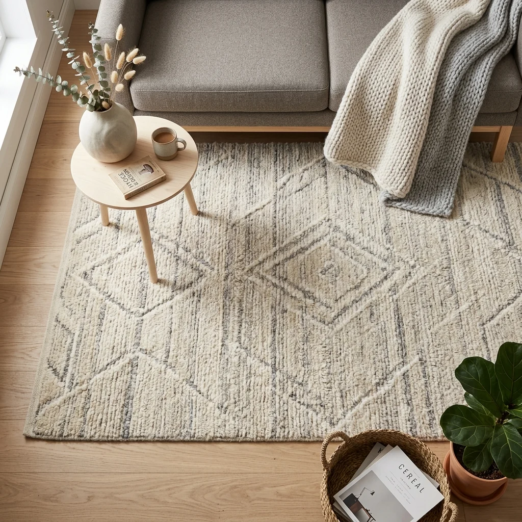
16. Budget Vinyl Rug in a High-End Pattern
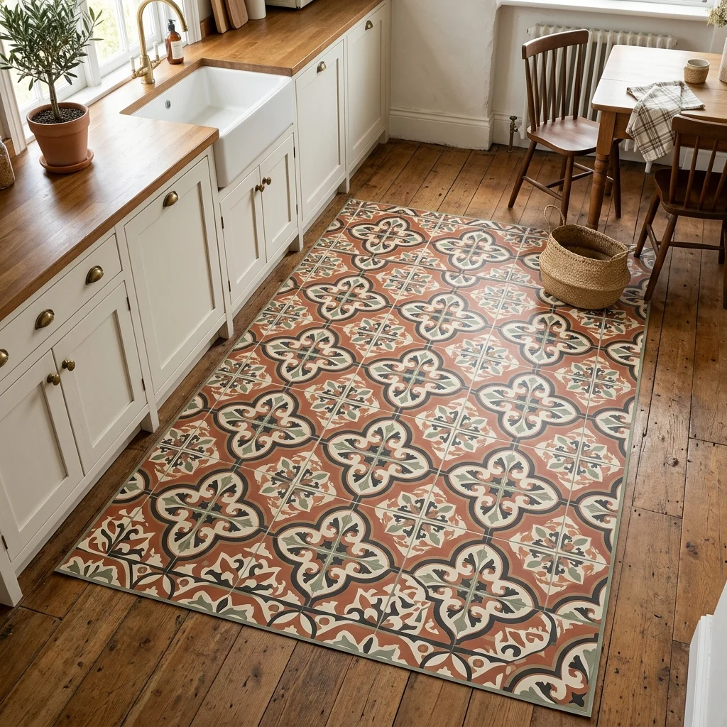
16. Budget Vinyl Rug in a High-End Pattern

Vibe: The floor feels refined, a printed pattern standing in for real tile.

Why it works: Printed vinyl rugs replicate the look of expensive encaustic cement tile, a material that can cost $15–30 per square foot installed at a small fraction of that price, since the vinyl print achieves the same visual pattern without any of the labor, subfloor prep, or permanence that real tile installation requires. This makes it a specifically strong choice for rental kitchens where installing real tile isn’t an option at all.

How to get it: Choose a low-profile vinyl rug (under 1/8 inch thick) rather than a thicker foam-backed mat, since thinner vinyl lies flatter and reads more convincingly as an actual floor material rather than an obvious rug layered on top.

Shop the Look

Product
Printed vinyl floor rug, tile pattern
Non-slip rug backing spray
Vinyl rug trim edging
Kitchen floor cleaner, vinyl-safe
Small kitchen runner rug

17. Layer Budget Faux Florals in a Cohesive Color Story
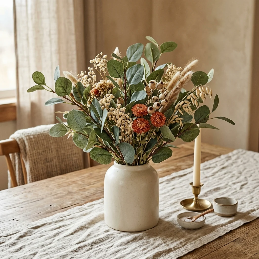
17. Layer Budget Faux Florals in a Cohesive Color Story

Vibe: The table feels natural, faux stems doing convincing work in a considered palette.

Why it works: Quality faux florals in dried, muted tones rather than glossy, saturated fake flowers read as genuinely dried botanicals rather than obviously artificial ones, because real dried flowers already have the same slightly faded, matte color quality that budget faux versions are designed to mimic. This is a specific budget technique: choosing faux items in colors that are already supposed to look imperfect sidesteps the biggest tell of cheap fake plants, which is usually an overly saturated, glossy green.

How to get it: Choose faux eucalyptus or dried-look florals specifically over bright artificial flowers, and trim stems to varied lengths before arranging so the grouping reads as gathered rather than uniformly store-bought.

πŸ’‘ Quick Win: A single budget faux eucalyptus garland, cut into shorter stems, can fill several small vases instead of buying multiple separate bunches.

Shop the Look

Product
Faux eucalyptus stem bundle
Dried-look faux floral stems
Ceramic centerpiece vase
Linen table runner, neutral
Floral stem cutting shears

18. Nesting Tables to Skip Buying Multiple Side Tables
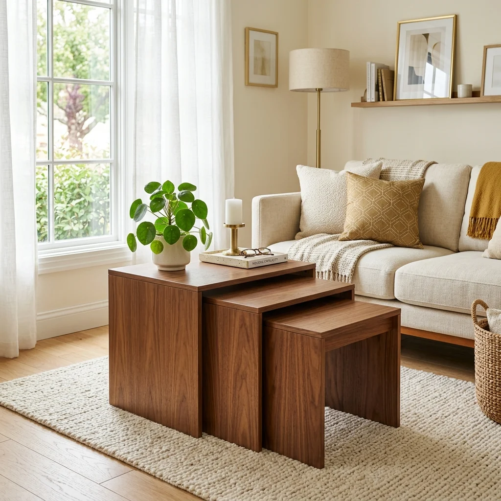
18. Nesting Tables to Skip Buying Multiple Side Tables

Vibe: The room feels tidy, one purchase doing the job of three separate tables.

Why it works: A single nesting table set typically costs less than buying a coffee table and two separate side tables individually, since the manufacturing and shipping efficiency of a matched set undercuts buying pieces separately, while still providing the same functional surface count when tables are pulled apart for guests. This is a straightforward cost-per-function calculation: one purchase covering three furniture roles beats three separate purchases nearly every time.

How to get it: Choose a nesting set with at least a few inches of height variation between tables, so each piece can function independently as a side table rather than only working when stacked together.

Shop the Look

Product
Walnut nesting table set, three-piece
Small ceramic decorative tray
Artificial potted plant, small
Felt furniture floor pads
Coaster set, neutral

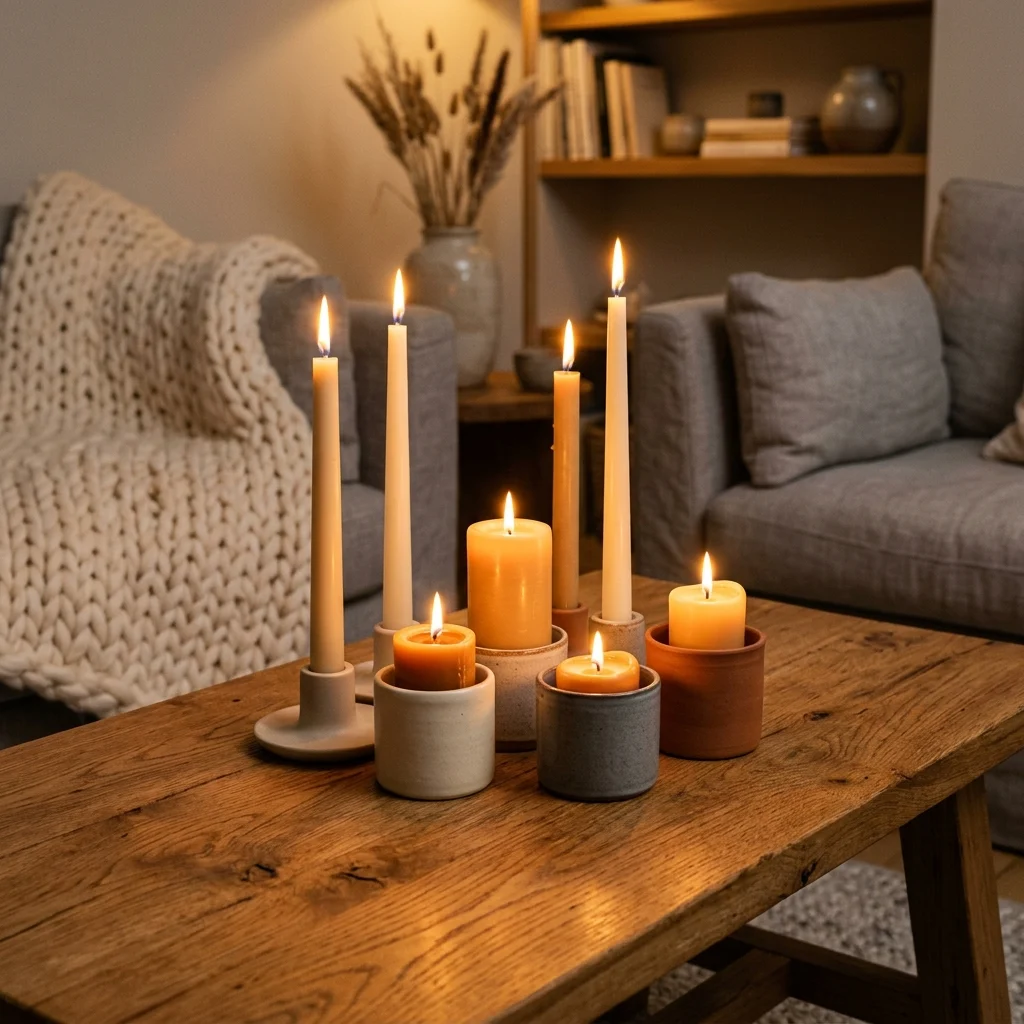
19. Dollar-Store Candles in Bulk for Ambient Light
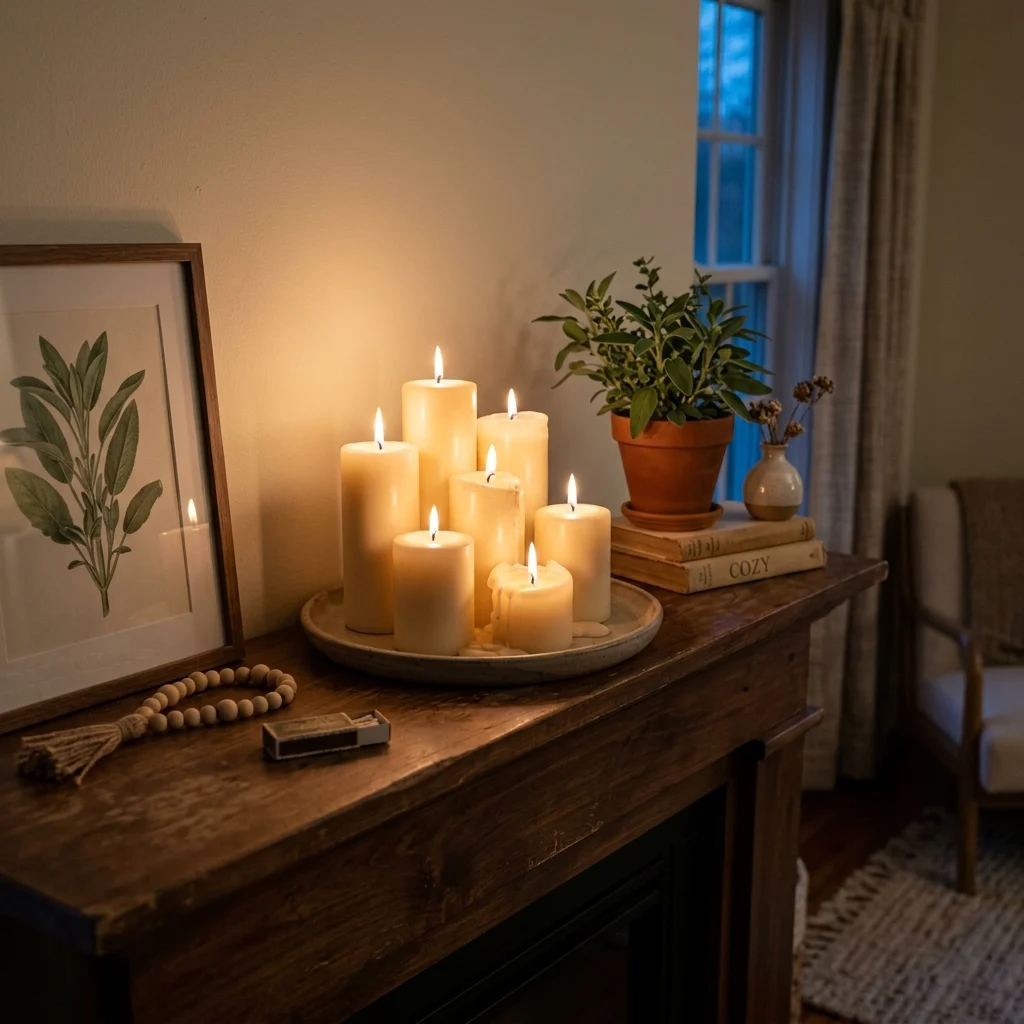
19. Dollar-Store Candles in Bulk for Ambient Light

Vibe: The mantel feels intimate, warm, with a flickering light costing almost nothing.

Why it works: Grouped candles at varied heights create the same layered, warm ambient glow that an expensive accent lighting fixture would, using flame instead of electricity, which makes this the cheapest possible way to add a genuine warm light source to a room with no wiring or fixture cost at all. Buying plain, unscented pillar candles in bulk from a discount retailer costs a fraction of styled decorative candles while producing an identical visual result once grouped and lit.

How to get it: Group candles in odd numbers at graduated heights on a single tray, using a taller candle as the visual anchor with two or three shorter ones surrounding it, mirroring the same asymmetric-grouping principle used with vases.

Shop the Look

Product
Unscented pillar candle set, bulk
Ceramic candle tray, footed
Long-reach candle lighter
Small greenery sprig, faux
Beeswax or soy candle refill set

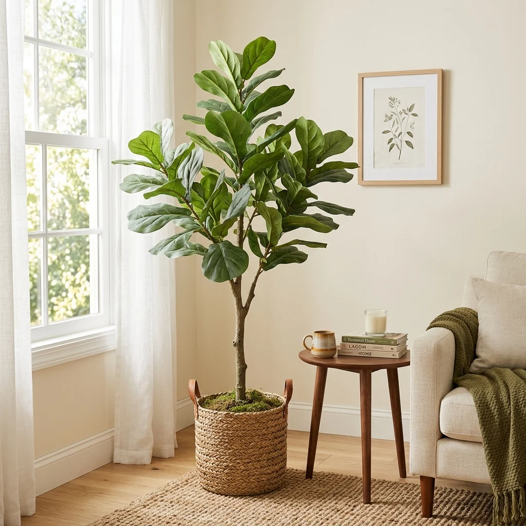
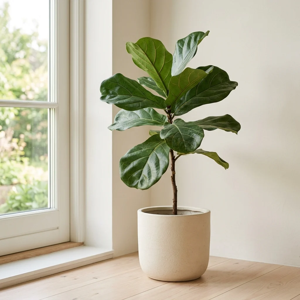
20. Budget Faux Plants That Look Real

20. Budget Faux Plants That Look Real

Vibe: The corner feels natural, a plant that never needs watering is doing convincing work.

Why it works: Budget faux plants read as fake almost entirely because of two details: uniform, glossy leaf color and leaves all facing the same direction, both of which are fixable after purchase, regardless of the plant’s original price point. Manually bending stems and leaves into varied, asymmetric angles, the way a real plant actually grows toward available light, does more for realism than spending significantly more on a “premium” faux plant left in its factory arrangement.

How to get it: Remove the plant from its display arrangement and manually reshape several stems to face different directions before placing it in a natural woven basket planter, which further disguises the plastic base pot.

πŸ’‘ Quick Win: A light dusting of matte spray sealant over glossy faux leaves knocks down the artificial shine that’s usually the biggest giveaway from a distance.

Shop the Look

Product
Budget faux fiddle leaf fig plant
Woven basket planter cover
Matte spray sealant for faux leaves
Small decorative floor tray
Plant stand, wood, adjustable height

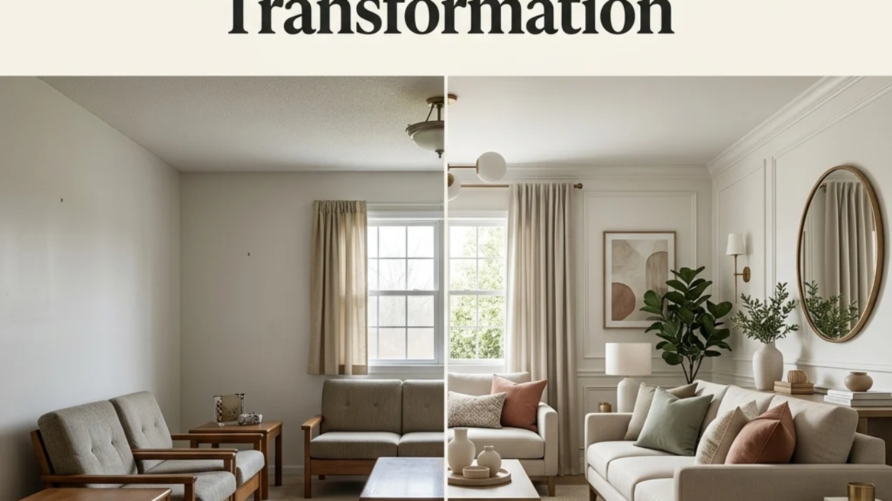
How to Start Your Budget Home Decor Transformation

Your first single move should be rearranging the furniture you already own, because it costs nothing and immediately reveals whether a room’s real problem is its layout rather than its furniture. A surprising number of rooms that feel like they “need new furniture” actually just need their existing pieces pulled away from the walls and regrouped.

The most common mistake is spreading a limited budget evenly across many small purchases instead of concentrating it on one or two changes with the most visual leverage, like paint or a secondhand sofa. This produces a room full of scattered small updates that never quite add up to a finished look; fix it by picking the single highest-impact item on this list for your specific room and fully committing the budget there first.

Three specific items under $50 that create immediate impact: a warm-white paint sample pot and roller for testing trim paint, a set of three matte ceramic vases from a discount retailer, and a bundle of warm-white LED string lights or under-cabinet strip lighting.

A weekend-scale refresh trim paint, rearranged furniture, and new pillow covers realistically costs $50–$150. A fuller budget room transformation mixing secondhand furniture with a few new accent pieces generally runs $300–$800 and takes four to six weekends of gradual sourcing and installing, since good secondhand finds take patience to locate.

Frequently Asked Questions About Budget Home Decor

What is the difference between budget decor and cheap-looking decor?

Budget decor concentrates spending on a few high-leverage changes, such as paint, lighting, and one hero furniture piece, while accepting lower-cost versions everywhere else, whereas cheap-looking decor spreads a small budget evenly across everything with no clear priority. The visual difference comes down to intentional contrast: a room with one genuinely well-chosen sofa and simple painted walls reads as considered, while a room with ten mismatched $10 items reads as cluttered regardless of the total amount spent.

What colors work best for budget home decor?

Warm white and greige are the most budget-efficient base colors because a single gallon covers the most square footage per dollar of any decorating purchase, and both shades stay versatile enough to work with whatever furniture comes later. Terracotta and sage are the most common budget accent colors, typically introduced through $10–20 textile pieces like pillow covers rather than paint, which keeps the color commitment low-risk and easy to change later.

How much does a full budget home decor refresh actually cost?

A single-weekend refresh using trim paint, rearranged furniture, and new pillow covers typically costs $50–$150. A more complete room transformation mixing one or two secondhand furniture finds with new accent pieces generally runs $300–$800, while a full-home budget refresh across several rooms usually falls between $1,000 and $2,500 when spread across several months of gradual sourcing rather than done all at once.

Does budget decor work well in a rental apartment?

Yes, many of the highest-impact ideas on this list, including furniture rearrangement, lampshade swaps, and peel-and-stick backsplash tile, are specifically renter-friendly and either fully reversible or removable without damaging deposit-protected surfaces. Peel-and-stick products in particular are designed to remove cleanly from most painted and laminate surfaces when applied correctly, making them one of the few “renovation-style” updates renters can genuinely use.

What is the single best budget item to buy first for a room refresh?

A gallon of warm white paint for the trim or a small accent wall consistently delivers the highest visual return per dollar spent, since it changes the room’s overall polish more than almost any single furniture or decor purchase at a similar price point. After paint, a set of new pillow covers or a swapped lampshade are the next-highest-return purchases, since both update a room’s color and lighting character without requiring any furniture replacement at all.

Ready to Create Your Dream Budget Home?

These 20 budget home decor ideas span color, material, lighting, furniture, and layout from a can of trim paint and a rearranged sofa to a secondhand dresser refinished with new brass hardware, so there’s a genuinely high-leverage starting point here, no matter how small your current budget actually is. You don’t need to tackle every idea at once, and starting with the free changes, rearranging furniture, floating a sofa off the wall before spending a single dollar is exactly the right order to work in, not a compromise on the way to something better. Today’s specific action: pull your largest piece of furniture at least a foot away from its wall and see how the room’s flow changes before you buy anything at all. Once the highest-leverage changes are in place, the room stops feeling like it’s missing something expensive and starts feeling like every dollar in it was spent on purpose. Save the ideas that fit your actual budget today, that peel-and-stick backsplash, that thrifted dresser, because in budget decorating, knowing where to spend matters more than how much you have to spend.

You Might Also Like

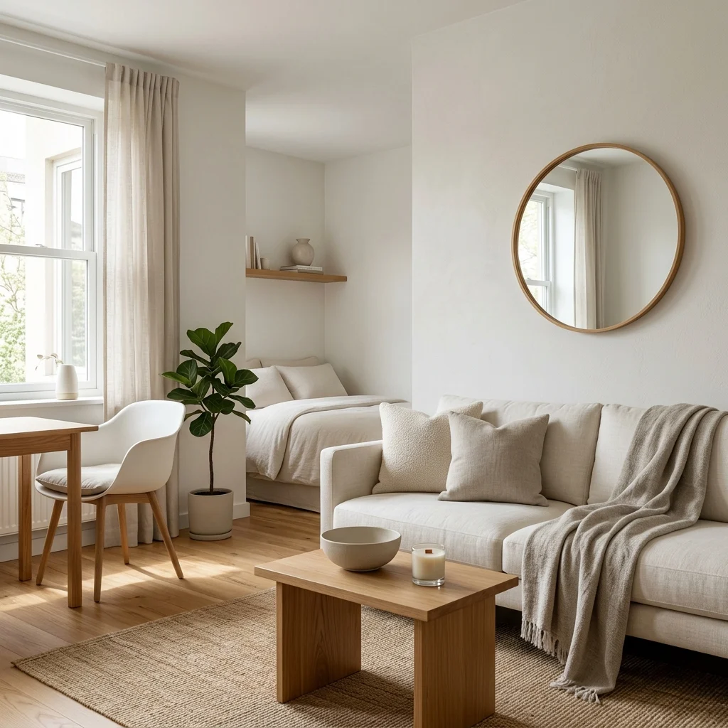
12 Small Space Decor Ideas for a Modern Minimalist Home
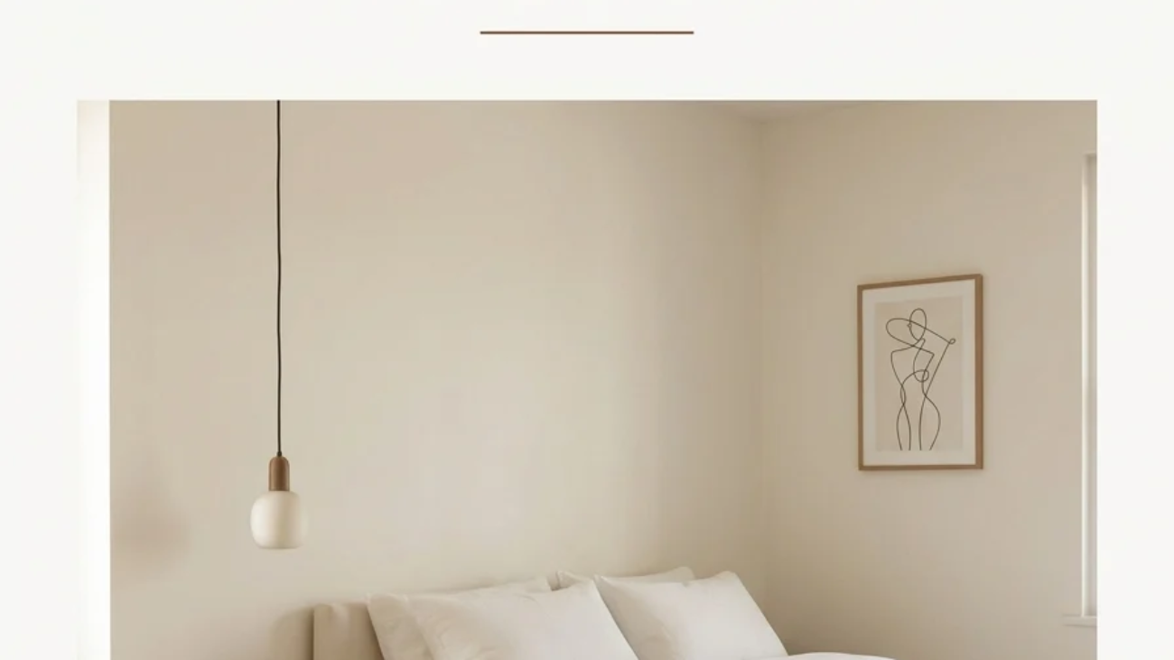
12 Small Space Decor Ideas for a Modern Minimalist Home
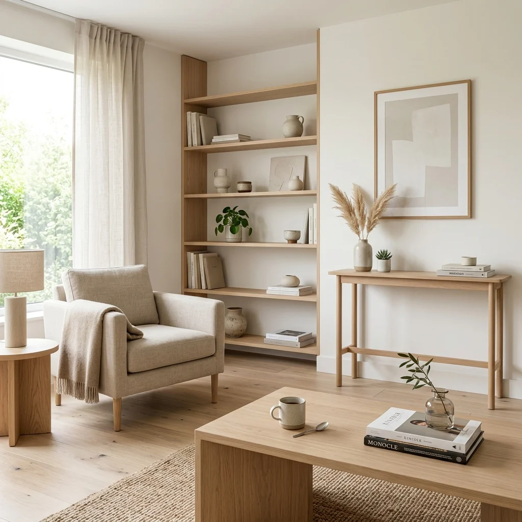
Modern minimalist small-space decor uses proportion, light-reflecting materials, and negative space rather than clever gadgets to make a compact home feel genuinely larger. This article gives you 12 small space decor ideas, from furniture profile to lighting to layout, built for rooms where every square foot has to earn its place.

The feeling is unmistakable: a room where nothing crowds the eye, light bouncing off a glass tabletop, floor visible beneath a sofa that looks like it’s barely touching the ground. Small space decor done well doesn’t feel like compromise  it feels like editing. Here are 12 ideas worth saving  and stealing.

Why Small Space Decor Ideas Work So Well

What is it? Modern minimalist small-space design descends from mid-century Scandinavian functionalism and post-war Japanese minimalism, both of which treated compact living not as a limitation but as a discipline worth designing around intentionally. What separates genuine small-space design from generic “space-saving hacks” content is its reliance on real design principles  proportion, negative space, light behavior  rather than storage gadgets alone.

What are its core materials and colors? The palette runs warm white, soft greige, and one restrained tonal accent, applied with minimal contrast so nothing visually interrupts the room. Materials favor light oak, glass, and lucite for their transparency, alongside brushed nickel for a metal note that doesn’t add visual weight. Nothing is bulky or opaque where a lighter alternative exists.

Why is it trending now? Urban micro-apartment and studio living has grown sharply as housing costs rose through the mid-2020s, pushing more people to decorate genuinely small footprints rather than aspirational ones. Pinterest search volume for “small space living” has climbed alongside a broader sustainability shift toward buying fewer, better multi-functional pieces instead of furnishing every corner separately.

Can small spaces achieve this style? This is the exact use case the style was built for  the honest limit is scale, not ambition. In genuinely tiny footprints under 400 square feet, prioritize one multi-functional hero piece first, since layering in decorative accents before solving function tends to backfire.

ElementPhilosophyKey Materials
Core valueProportion and light over storage tricksLight oak, glass, lucite
Color approachLow contrast, single accentWarm white, soft greige

12 Small Space Decor Ideas

1. Light Oak Wood Tones to Keep Furniture Visually Light

1. Light Oak Wood Tones to Keep Furniture Visually Light

Vibe: The room feels airy, with a wood tone that counteracts the usual effect of dark furniture.

Why it works: Light oak reflects more ambient light than a dark walnut or espresso finish. This material choice directly affects how large a room reads, regardless of its actual square footage. Dark wood visually recedes into shadow, while pale oak keeps every surface legible even in low light. Consistency across pieces also prevents the eye from stopping at material transitions.

How to get it: Choose furniture in a consistent pale oak finish rather than mixing wood tones, and avoid high-gloss lacquer, which can read as cheap under strong light. A matte or lightly oiled finish keeps the material feeling considered.

πŸ’‘ Quick Win: A light oak contact paper wrap on an existing dark coffee table updates the tone for under $25 without replacing furniture.

Shop the Look

Product
Light oak console table slim
Light oak coffee table, low profile
Light oak floating wall shelf set
Ceramic vase warm white glaze
Small potted plant ceramic pot

2. Monochromatic Warm White Palette for Seamless Flow

2. Monochromatic Warm White Palette for Seamless Flow

Vibe: The room feels seamless, boundaries between wall and furniture almost disappearing.

Why it works: A monochromatic palette removes the color contrast that normally defines where one object ends and another begins, which is exactly the effect that makes small rooms feel visually larger; nothing chops the space into segments. Texture, not color, becomes the only source of variation, which keeps the room from feeling flat despite the limited palette.

How to get it: Choose wall paint, major furniture, and textiles within one warm-white to soft-greige range, such as Benjamin Moore White Dove for walls and a matching-toned linen sofa, and introduce variety only through texture (boucle, linen, wood grain).

Shop the Look

Product
Warm white interior wall paint
Linen sofa warm white slipcover
Boucle throw pillow cover set
Ceramic decorative bowl white
Small round wall mirror

3. Layered Wall Sconces Instead of Floor Lamps to Save Footprint

3. Layered Wall Sconces Instead of Floor Lamps to Save Footprint

Vibe: The room feels grounded, light coming from the wall instead of claiming floor space.

Why it works: A floor lamp occupies real square footage and adds a tall vertical object to an already tight sightline, while a wall-mounted sconce delivers the same ambient light behavior without a footprint at all, a direct trade of floor space for wall space that small rooms almost always benefit from. Mounting sconces at seated eye height also avoids the harsh shadows a single overhead fixture creates.

How to get it: Install two plug-in or hardwired sconces at 60 inches from the floor on either side of the main seating area, fitted with warm 2700K bulbs, removing any floor lamp from the same zone entirely.

πŸ’‘ Quick Win: A plug-in sconce with a cord cover channel avoids any electrical work and can be mounted with adhesive strips for renters.

Shop the Look

Product
Matte black plug-in wall sconce
Warm 2700K LED bulb dimmable
Ceramic decorative tray small
Small potted plant ceramic pot
Cord cover channel kit

4. A Single Oversized Art Piece Instead of a Gallery Wall

4. A Single Oversized Art Piece Instead of a Gallery Wall

Vibe: The wall feels deliberate, one piece carrying the weight a dozen smaller frames usually would.

Why it works: A gallery wall introduces multiple small focal points and frame edges, which in a small room compete visually with the furniture below it. One oversized piece instead gives the eye a single place to land, applying the same restraint principle that makes a small room read as composed rather than cluttered. Scale here matters more than subject or color.

How to get it: Choose a single canvas or framed print sized to roughly two-thirds the width of the sofa or wall it hangs above, and leave the surrounding wall entirely bare rather than adding smaller accent pieces nearby.

Shop the Look

Product
Large-scale abstract canvas art print
Minimal black frame oversized
Picture hanging kit heavy-duty
Museum putty for level hanging
Canvas wall art cleaning cloth

5. Slim-Arm Sofa with Exposed Legs for Visual Lightness

5. Slim-Arm Sofa with Exposed Legs for Visual Lightness

Vibe: The sofa feels weightless, floor space extending underneath where a skirted base would normally sit.

Why it works: Track arms (2–3 inches wide) take up significantly less width than rolled or pillow arms, which matters directly in a small room where every inch of sofa width is lost elsewhere. Exposed wood legs let light pass beneath the frame, reinforcing the same floor-visibility principle that floating furniture relies on throughout a small space.

How to get it: Choose a sofa with slim track arms under 3 inches wide and exposed tapered legs rather than a skirted base, sized so that at least 30 inches of walking clearance remains in front of it.

πŸ’‘ Quick Win: Removing an existing sofa’s skirt (if it has one) and adding simple screw-in wood legs is a same-day upgrade that lightens the silhouette for under $40.

Shop the Look

Product
Slim track arm sofa light upholstery
Screw-in tapered wood furniture legs
Linen throw blanket warm white
Small ceramic decorative bowl
Single lumbar pillow cover

6. Tonal Color Blocking to Define Zones Without Walls

6. Tonal Color Blocking to Define Zones Without Walls

Vibe: The studio feels zoned, one wall color quietly signaling where one activity ends, and another begins.

Why it works: Painting a defined section of wall (behind the bed, around a desk nook) in a slightly deeper tone than the rest of the room creates zone definition without a physical partition  a technique especially valuable in studio apartments where walls genuinely can’t be added. The tonal shift stays subtle enough that it reads as intentional rather than fragmenting the space.

How to get it: Choose a color one to two shades deeper than your base wall white  such as pairing Benjamin Moore White Dove with Balboa Mist OC-27  and apply it only to the wall section behind the zone you want to define.

Shop the Look

Product
Soft greige interior wall paint
Warm white interior wall paint
Linen bedding set warm white
Small potted plant ceramic pot
Ceramic vase ribbed white

7. Glass and Lucite Surfaces for Visual Transparency

7. Glass and Lucite Surfaces for Visual Transparency

Vibe: The room feels transparent, furniture present but never visually blocking the space behind it.

Why it works: Glass and lucite are the only materials that let the eye pass completely through an object rather than stopping at its surface, a transparency principle that has no equivalent in solid wood or upholstered furniture. A glass coffee table occupies floor space but doesn’t visually claim it. This works especially well for a second table or accent chair where a solid piece would otherwise crowd the room.

How to get it: Choose one glass or lucite piece per seating areaΒ  a coffee table or accent chair, not both, since too much transparent furniture together can start to feel visually unstable rather than airy.

πŸ’‘ Quick Win: A glass tray placed on an existing solid coffee table adds transparency at the surface level for under $20 if a new table isn’t in the budget.

Shop the Look

Product
Glass top coffee table round
Clear lucite accent chair
Glass display tray rectangular
Ceramic decorative bowl small
Linen throw blanket, warm white

8. Furniture Floating Off the Wall to Create a Depth Illusion

8. Furniture Floating Off the Wall to Create a Depth Illusion

Vibe: The room feels deeper, a few inches of gap doing more than pushing furniture flush ever could.

Why it works: Pushing every piece of furniture flush against the walls is the most common small-space instinct, but it actually flattens the room’s sense of depth. Pulling the sofa a few inches forward and filling that gap with a slim console creates a layered floor plan that reads as more spacious than a perimeter-hugging layout, a layout principle borrowed from larger open-plan homes.

How to get it: Pull your main sofa 4–6 inches away from the wall, and fill the resulting gap with a console no deeper than 10 inches so the layered effect doesn’t eat into walking space.

Shop the Look

Product
Slim console table 10-inch depth
Ceramic vase warm white
Small round wall mirror
Linen throw blanket
Ceramic catchall dish

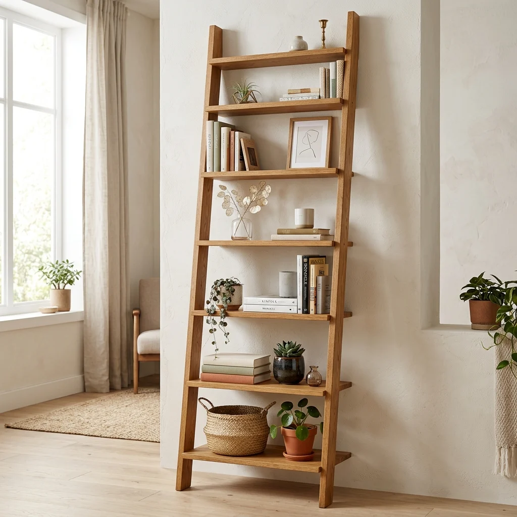
9. Vertical Ladder Shelving for Books and Plants

9. Vertical Ladder Shelving for Books and Plants

Vibe: The corner feels tall, storage drawing the eye upward instead of sideways.

Why it works: A ladder shelf claims a narrow footprint, often under 16 inches wide, while using the full ceiling height for storage, which is the direct opposite of a wide, low bookcase that eats floor width without adding vertical interest. The eye reading upward also makes ceilings register as taller than they are.

How to get it: Choose a leaning ladder shelf no wider than 16 inches, and style each level with no more than three objects, leaving visible negative space between shelves so the vertical line stays the focus rather than the clutter on each shelf.

πŸ’‘ Quick Win: Styling just the top two shelves and leaving the bottom one empty is a simple trick that keeps the piece from reading as overstuffed.

Shop the Look

Product
Leaning ladder shelf oak narrow
Small potted plant ceramic pot
Hardcover book set neutral covers
Dried stem bud vase
Ceramic small planter set

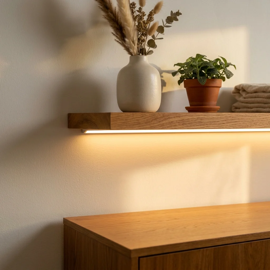
10. Under-Cabinet or Under-Shelf LED Strips for Ambient Glow

10. Under-Cabinet or Under-Shelf LED Strips for Ambient Glow

Vibe: The shelf feels sculptural, light doing double duty as both function and decor.

Why it works: An LED strip mounted under a shelf or cabinet edge adds ambient light without occupying any additional furniture footprint, solving the small-space lighting problem of wanting layered light sources but having no room for extra lamps. The light also highlights the shelf’s contents directly, turning storage into a lit display.

How to get it: Install a warm 2700K LED strip along the underside front edge of a floating shelf, wired to a plug-in dimmer so it can shift from bright task light to soft ambient glow.

Shop the Look

Product
Warm white LED strip light kit
Plug-in LED dimmer switch
Light oak floating shelf
Ceramic vase warm glaze
Small potted plant ceramic pot

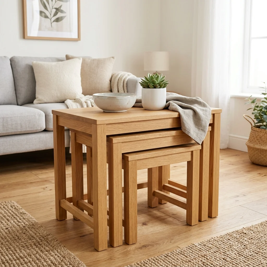
11. Nesting and Stacking Tables for Flexible Surface Area

11. Nesting and Stacking Tables for Flexible Surface Area

Vibe: The corner feels flexible, three surfaces collapsing into the space one normally takes.

Why it works: Nesting tables provide the surface area of multiple side tables while defaulting to the footprint of just one, applying multi-functional furniture logic directly to a small living room’s most commonly missing item, extra flat surfaces for guests or everyday use. Pulling them apart only when needed keeps the default floor plan open.

How to get it: Choose a set of three graduated oak nesting tables, and keep only the largest in regular use, pulling the smaller two out only when hosting or needing extra surface space.

πŸ’‘ Quick Win: A two-piece nesting set is often enough for a studio apartment and takes up noticeably less storage than a three-piece set when tucked away.

Shop the Look

Product
Nesting side table set oak
Ceramic decorative bowl small
Small potted plant ceramic pot
Linen throw blanket
Ceramic coaster set

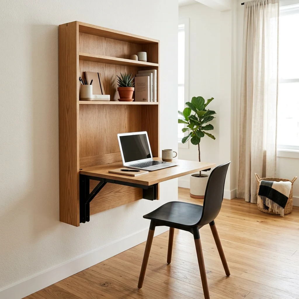
12. Fold-Down Murphy Desk Built Into a Wall Unit

12. Fold-Down Murphy Desk Built Into a Wall Unit

Vibe: The wall feels efficient, a full desk appearing only when the room actually needs one.

Why it works: A fold-down desk solves the single hardest problem in small-space layout, needing a dedicated workspace without permanently losing floor area to it by returning the full footprint to the room the moment it’s folded away. Building it into a slim wall unit with shelving above also uses vertical space that a standalone desk never would.

How to get it: Choose a wall-mounted folding desk unit no deeper than 4 inches when closed, mounted at standard desk height (28–30 inches) with a lightweight folding chair stored in a nearby closet when not in use.

Shop the Look

Product
Fold-down wall-mounted desk unit
Lightweight folding chair
Ceramic desk organizer set
Small potted plant ceramic pot
Wall-mounted shelf above desk

How to Start Your Small Space Decor Transformation

Start with your largest furniture piece, typically the sofa, not the wall color. Replacing a bulky, skirted sofa with a slim track-arm model on exposed legs is the single move that resets the whole room’s proportion, because every other piece gets scaled and placed in relation to it.

The most common mistake is pushing every piece of furniture flush against the walls to “save space.” This actually flattens the room and removes the sense of depth a few inches of gap would create; fix it by pulling your main seating piece 4–6 inches off the wall and filling that gap with a slim console instead.

Three items under $50 that create immediate impact: a plug-in wall sconce with a cord cover kit, a glass display tray for an existing coffee table, and a set of screw-in tapered wood legs for a skirted sofa or chair.

A full small-space transformation with new furniture and lighting realistically takes 3–6 weeks and costs $1,500–$4,000. A weekend refresh using paint, a light swap, and furniture rearrangement costs $100–$350 and reshapes how open the room feels immediately, before any new furniture arrives.

Frequently Asked Questions About Small Space Decor Ideas

What’s the difference between small space decor and regular minimalist decor?

Small space decor specifically prioritizes multi-functional furniture and floor-visibility techniques  exposed legs, nesting tables, wall-mounted fixtures  because floor area is the binding constraint, while regular minimalist decor in a larger room can prioritize aesthetic restraint alone without the same functional pressure. A small-space room and a minimalist room might share a similar look, but small-space decor is solving a physical problem first.

What color palette works best for small space decor?

Warm white and soft greige form the base palette, since light-reflecting tones make rooms read as larger regardless of actual square footage. Benjamin Moore White Dove paired with Balboa Mist OC-27 is a common combination for defining zones without full walls. Avoid dark, saturated colors across large surfaces, which visually shrink a room’s perceived depth.

How much does a small space decor makeover cost?

A budget refresh using paint, lighting, and rearrangement typically runs $100–$400. A mid-range update adding a new sofa and shelving costs $1,200–$3,000. A full transformation including built-in storage, a fold-down desk unit, and all-new furniture can reach $4,000–$7,000 depending on how much is custom-built versus off-the-shelf.

Does small space decor work with a bolder or more colorful style?

Yes, with limits  a bold accent color works best confined to one wall or zone rather than spread across the whole room, since too much saturated color in a small footprint can visually shrink it. Pairing one bold accent (a deep charcoal reading nook, for example) against an otherwise warm-white base lets personality show without sacrificing the sense of openness.

What’s the most important element in small space decor?

Furniture proportion is the most important element  more than color or storage tricks, whether pieces are scaled correctly and have visible legs or floating placement determines whether a room reads as open or cramped. A small room furnished with oversized, skirted pieces will still feel tight even with the “correct” light color palette on the walls.

Ready to Create Your Dream Small Space?

These 12 ideas move through material choice, light-reflecting color, layered lighting, and layout tricks that create the illusion of depth, showing that small space decor comes together through many precise, functional choices rather than one storage gadget. Starting with a single slim sofa swap or one wall sconce install is not a lesser version of the transformation  it’s exactly the kind of proportion-first change this approach rewards. Today, pull your sofa a few inches away from the wall and notice how much depth the room gains from that gap alone. Done well, the space will start to feel edited rather than squeezed, open in a way that has nothing to do with its actual square footage. Save the ideas that matched your own layout and your own light  that glass coffee table, that fold-down desk  because small space decor rewards the room built through precise choices, one proportion-correct piece at a time.

You Might Also Like

13 Minimalist Home Decor Ideas for a Calm, Clutter-Free Space
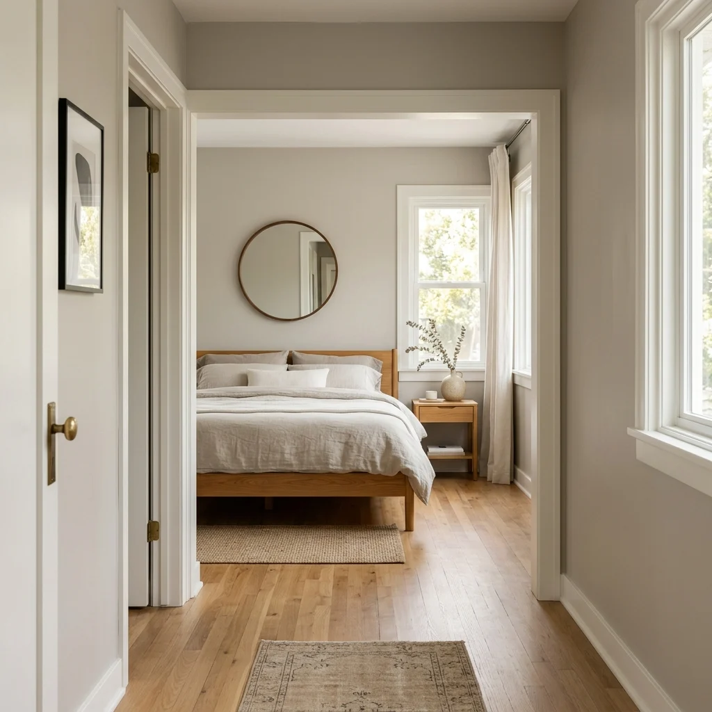
13 Minimalist Home Decor Ideas for a Calm, Clutter-Free Space
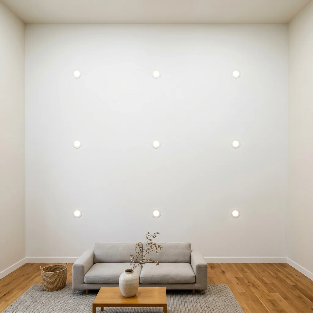
Minimalist home decor strips a room down to what’s functional, well-made, or both, trusting restraint over accumulation to create calm. This article gives you 13 minimalist home decor ideas, from wall color to lighting to storage, built to work across an entire home rather than one room alone.

The feeling is unmistakable: a wall left intentionally bare, one ceramic vessel holding all the room’s ornament, light falling evenly across a floor with nothing interrupting it. Minimalist decor doesn’t feel empty; it feels edited, every remaining object carrying real weight. Here are 13 ideas worth saving and stealing.

Why Minimalist Home Decor Ideas Work So Well
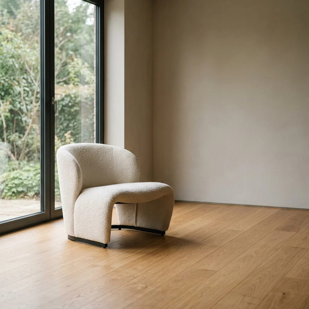
What is it? Minimalist decor traces to the 1960s minimalist art movement, Donald Judd and Agnes Martin among its clearest architectural influences, crossed with Japanese Zen aesthetics and Bauhaus functionalism, all of which valued removing anything that didn’t serve a room’s core purpose. What separates it from Scandinavian minimalism is austerity: Scandinavian design still leans on hygge warmth and layered texture, while true minimalism accepts a starker, more architectural restraint.

What are its core materials and colors? The palette runs warm white, soft greige, and warm charcoal reserved for a single accent wall. Materials stay honest and consistent: unfinished white oak, honed concrete or micro-cement, and brushed steel, chosen for how few material transitions they create room to room. Nothing decorative is added without a functional reason behind it.

Why is it trending now? The decluttering movement that gained mainstream traction through the 2010s has evolved into a broader “quiet luxury” aesthetic, with Pinterest search interest in minimalist interiors climbing as people prioritize fewer, better-made pieces over frequent decor turnover. Sustainability concerns have reinforced this, since buying less by design outlasts any single decorating trend.

Can small spaces achieve this style? Yes, minimalism arguably suits small homes best, since its core discipline of removing anything non-essential directly solves the clutter problem small spaces face first. Prioritize built-in, concealed storage before any decorative styling.

ElementPhilosophyKey Materials
Core valueFunction and restraint over accumulationUnfinished white oak, honed concrete
Color approachMonochromatic, one contained accentWarm white, soft greige

13 Minimalist Home Decor Ideas
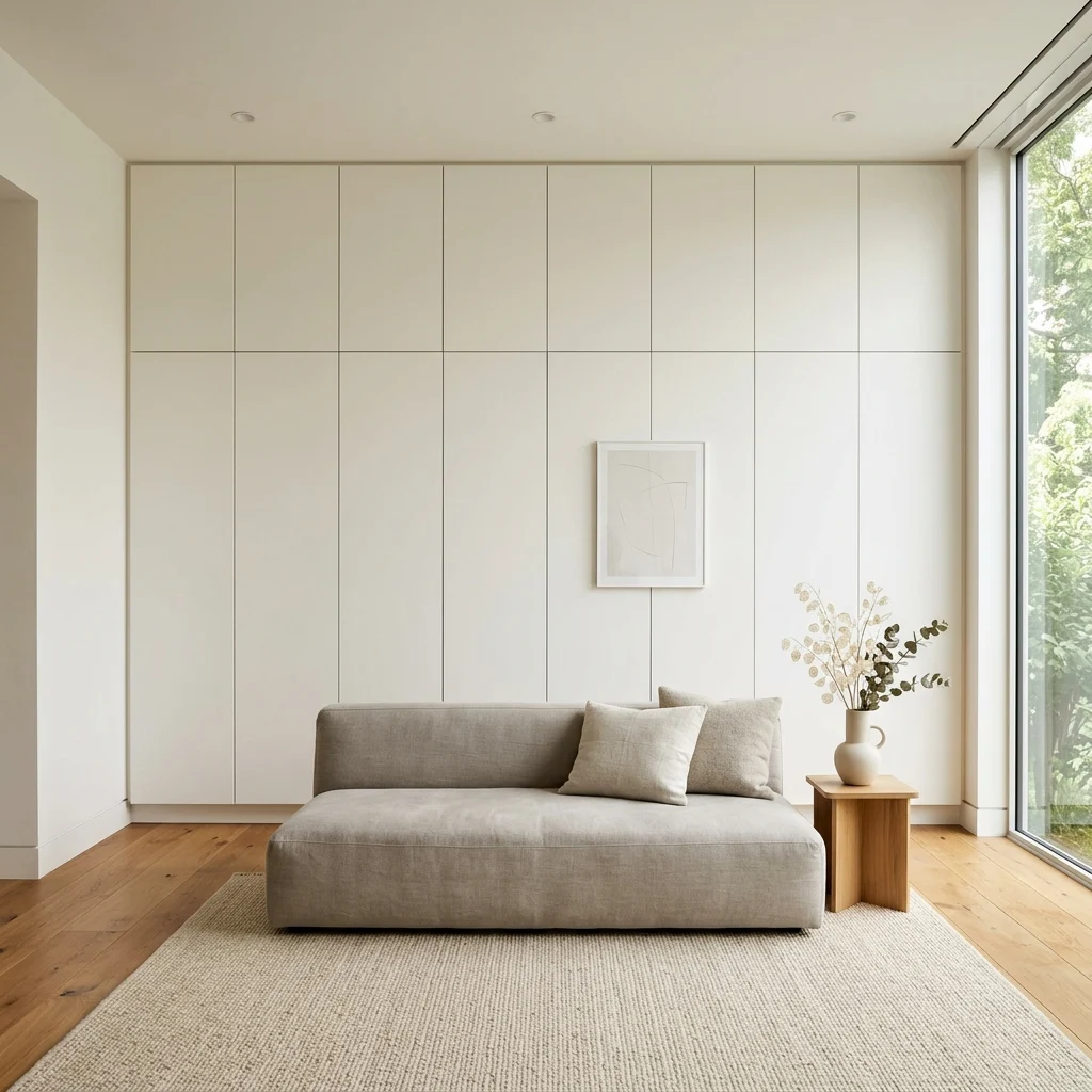
1. Unfinished White Oak Furniture Throughout for Material Consistency

1. Unfinished White Oak Furniture Throughout for Material Consistency

Vibe: The rooms feel connected, one material carrying the eye from space to space without interruption.

Why it works: Using the same unfinished white oak across every major furniture piece in the home eliminates the material transitions that normally signal “new room, new decision,” a consistency principle that makes open-plan or adjoining spaces read as one considered whole rather than separately decorated rooms. Raw, unstained oak also shows its own grain instead of a manufactured finish, keeping the material honest.

How to get it: Choose furniture from the same wood species and finish level (raw oiled, not stained or lacquered) across your main pieces, even if they come from different retailers, so the tone reads as intentional rather than coincidental.

πŸ’‘ Quick Win: A raw oak oil finish applied to one existing darker wood piece can shift its tone closer to the rest of your furniture for under $20 in material cost.

Shop the Look

Product
Unfinished white oak console table
Raw oak dining table
Light oak floating shelf set
Ceramic vessel unglazed
Linen table runner natural

2. Monochromatic Warm White Palette from Room to Room

2. Monochromatic Warm White Palette from Room to Room

Vibe: The home feels continuous, walls disappearing into each other rather than announcing new rooms.

Why it works: Painting every connected space in the same warm white removes the color contrast that would otherwise chop a home into visually separate segments, a technique that makes even a modestly sized floor plan read as more expansive since the eye never registers a hard stop. Texture and material, not paint color, become the only variation.

How to get it: Choose one warm white, such as Benjamin Moore White Dove, and carry it through every connected hallway, living space, and doorway trim, rather than treating each room as its own separate paint decision.

Shop the Look

Product
Warm white interior wall paint
Matte white door trim paint
Wall sconce, minimal brass
Ceramic decorative object small
Linen curtain panels warm white

3. Sculptural Single-Bulb Pendant as the Room’s Only Light Feature

3. Sculptural Single-Bulb Pendant as the Room's Only Light Feature

Vibe: The table feels grounded, one light source doing what a chandelier’s many bulbs usually would.

Why it works: A single, sculptural pendant applies minimalism’s core discipline directly to lighting one well-chosen fixture instead of multiple decorative sources, letting the object itself function as the room’s art rather than adding wall decor alongside it. The exposed filament bulb also keeps the fixture visually honest about its own mechanism.

How to get it: Hang one matte black or brushed steel pendant with an exposed Edison-style bulb, centered 30–34 inches above the table, and remove any additional decorative wall sconces from the same room.

πŸ’‘ Quick Win: Swapping only the bulb in an existing pendant to a warm 2400K filament style shifts the mood without buying new hardware.

Shop the Look

Product
Matte black single-bulb pendant light
Warm 2400K filament LED bulb
Ceramic serving bowl white
Linen table runner natural
Dimmer switch plate kit

4. One Oversized Ceramic Vessel Instead of Multiple Small Objects

4. One Oversized Ceramic Vessel Instead of Multiple Small Objects

Vibe: The console feels deliberate, one object carrying the weight a dozen smaller pieces usually would.

Why it works: Restricting a surface to a single, larger-scale object forces visual focus onto that object’s texture and form; the irregularity of hand-thrown unglazed ceramic becomes noticeable precisely because nothing else on the surface competes with it. This is the direct opposite of grouping smaller objects in threes, a styling habit minimalism deliberately avoids.

How to get it: Choose one ceramic vessel scaled to roughly a third of the console’s length, and resist adding a second smaller object beside it, even if the remaining space looks “empty” at first.

Shop the Look

Product
Large unglazed ceramic vessel
Oak console table
Linen table runner
Wall sconce minimal
Small drawer organizer for clutter

5. Low-Profile Furniture with Exposed Legs for Negative Space

5. Low-Profile Furniture with Exposed Legs for Negative Space

Vibe: The room feels open, ceilings appearing taller simply because furniture stopped competing with them.

Why it works: Keeping every furniture piece under a consistent low height with visible legs creates a horizon line across the room that leaves the upper two-thirds of the wall as open negative space, the same proportion principle behind Japandi interiors, but applied here without the material warmth Japandi typically adds. Visible legs also let light and floor show through beneath each piece.

How to get it: Choose sofas, consoles, and side tables with exposed tapered or straight legs rather than skirted bases, matched in height so the eye reads them as one coordinated low plane.

πŸ’‘ Quick Win: Swapping a skirted ottoman for one with visible metal legs is a same-day change that lightens a room’s floor-level visual weight.

Shop the Look

Product
Low-profile sofa exposed oak legs
Low console table tapered legs
Ceramic decorative bowl
Linen throw blanket warm white
Metal leg ottoman set

6. Warm Charcoal Used Only on a Single Architectural Wall

6. Warm Charcoal Used Only on a Single Architectural Wall

Vibe: The wall feels enveloping, one dark plane concentrating the room’s attention without darkening the whole space.

Why it works: Confining warm charcoal to a single architectural wall rather than an entire room uses value contrast as a controlled accent, applying the same restraint minimalism uses everywhere else, specifically to color. The dark wall absorbs light instead of reflecting it, making the low sofa and any warm-white textiles in front of it appear to glow by comparison.

How to get it: Paint only the wall directly behind the main seating in a warm-toned charcoal such as Benjamin Moore Wrought Iron 2124-10, keeping every adjoining wall in warm white so the accent stays contained.

Shop the Look

Product
Warm charcoal matte wall paint
Warm white interior wall paint
Low-profile sofa oak legs
Ceramic vessel unglazed
Linen throw blanket, warm white

7. Honed Concrete or Micro-Cement Flooring for Seamless Continuity

7. Honed Concrete or Micro-Cement Flooring for Seamless Continuity

Vibe: The floor feels continuous, one surface doing the work several different flooring materials usually would.

Why it works: Micro-cement or honed concrete applied without transition strips between rooms removes the visual break that different flooring materials create at doorways, reinforcing minimalism’s preference for uninterrupted sightlines throughout a home. Its inherent tonal variation also gives a monochrome floor visual depth without needing a pattern.

How to get it: Specify a warm-toned (not cool grey) micro-cement system applied in a single continuous pour across connected rooms, sealed for the specific traffic and moisture level of each zone.

πŸ’‘ Quick Win: A large-format warm grey porcelain tile with minimal grout lines approximates the seamless look at a lower material and labor cost than true micro-cement.

Shop the Look

Product
Warm grey micro-cement flooring system
Large format porcelain floor tile
Low-profile sofa
Ceramic vessel unglazed
Floor sealer wet-rated

8. Open Sightlines Between Rooms Instead of Room-by-Room Zoning

8. Open Sightlines Between Rooms Instead of Room-by-Room Zoning

Vibe: The home feels expansive, one long view doing more for the sense of space than any single room’s size.

Why it works: Arranging furniture to preserve a clear sightline from the entry through to the farthest window uses a layout principle that has more impact on perceived spaciousness than square footage alone. The eye reads distance, not floor area, as the measure of a home feeling large. This works against the instinct to zone every room with a rug or furniture grouping that blocks the view.

How to get it: Position your tallest furniture pieces (bookcases, cabinets) along the sides of a room rather than across its depth, keeping anything above 30 inches tall out of the direct line between the entry and the farthest window.

Shop the Look

Product
Low-profile bookcase side placement
Low console table
Ceramic vessel unglazed
Linen curtain panels
Floor lamp slim profile

9. A Single Framed Print Per Wall, Never a Gallery

9. A Single Framed Print Per Wall, Never a Gallery

Vibe: The wall feels composed, one image carrying the attention that a gallery wall would split across many.

Why it works: A gallery wall introduces multiple frame edges and focal points, which directly conflict with minimalism’s preference for a single, uncontested point of visual rest per wall. One large-scale print instead gives the eye exactly one place to land, and the negative space surrounding it becomes as much a part of the composition as the art itself.

How to get it: Choose one print sized to roughly two-thirds the width of the furniture below it, in a minimal black or natural wood frame, and leave every other wall in that room bare.

πŸ’‘ Quick Win: A single black-and-white photograph in a plain frame achieves the same restrained effect at a lower cost than a large abstract canvas.

Shop the Look

Product
Large minimal framed print
Black-and-white photography print
Minimal black frame oversized
Picture hanging kit
Museum putty for level hanging

10. Soft Greige as the Connective Tissue Between Rooms

10. Soft Greige as the Connective Tissue Between Rooms

Vibe: The rooms feel unified, one warm neutral carrying through spaces that serve completely different functions.

Why it works: Soft greige sits warm enough to avoid the cold, clinical read of a blue-based grey, which is why it works as a connective color across bedrooms, hallways, and living spaces without needing to match each room’s specific furniture. Consistent trim in warm white against it defines architecture without introducing a third competing tone.

How to get it: Choose a warm-toned greige such as Benjamin Moore Balboa Mist OC-27 for walls throughout connected private spaces, keeping trim and doors in a single warm white for contrast.

Shop the Look

Product
Soft greige interior wall paint
Warm white trim paint
Low platform bed frame oak
Ceramic vessel unglazed
Linen bedding set warm white

11. Recessed Lighting Instead of Visible Fixtures for a Clean Ceiling

11. Recessed Lighting Instead of Visible Fixtures for a Clean Ceiling

Vibe: The ceiling feels uninterrupted, light present without any object marking where it comes from.

Why it works: Recessed lighting eliminates the visual object a pendant or flush-mount fixture would otherwise add to the ceiling plane, keeping that surface as clean and uninterrupted as the walls below it, a light-behavior choice that reinforces minimalism’s preference for architecture over ornament even at the ceiling level. This trades a decorative lighting moment for architectural quiet, a genuine limitation worth knowing before committing.

How to get it: Space recessed cans roughly 4–6 feet apart on a dimmer circuit set to warm 2700K, reserving any single sculptural pendant only for a dedicated focal area like a dining table.

Shop the Look

Product
Recessed LED can light kit
Warm 2700K dimmer switch
Low-profile sofa
Ceramic vessel unglazed
Linen throw blanket

12. A Single Statement Chair Instead of Multiple Accent Pieces

12. A Single Statement Chair Instead of Multiple Accent Pieces

Vibe: The corner feels considered, one chair holding more visual weight than a full seating arrangement would.

Why it works: A single sculptural accent chair, left with generous floor space around it, applies the same restraint principle used throughout minimalist decor directly to furniture arrangement. One well-designed piece communicates more than several competing accent pieces crowded into the same zone. The chair’s negative space also gives its silhouette room to actually be seen.

How to get it: Choose one chair with a distinct, sculptural silhouette rather than a standard club or accent chair, and position it with at least 24 inches of clearance on all open sides.

πŸ’‘ Quick Win: Removing a second accent chair from an existing pair instantly gives the remaining chair the visual presence this idea depends on.

Shop the Look

Product
Sculptural accent chair minimal
Low side table oak
Linen throw blanket
Ceramic bud vase
Floor lamp slim profile

13. Built-In Storage Behind Flush Cabinetry to Hide Everyday Clutter

13. Built-In Storage Behind Flush Cabinetry to Hide Everyday Clutter

Vibe: The room feels weightless, storage disappearing into the architecture instead of adding visible furniture.

Why it works: In small homes, flush built-in cabinetry painted to match the surrounding wall removes the visual bulk a standalone dresser or bookcase would add, directly solving the tension minimalism creates between wanting genuinely empty surfaces and still needing somewhere to put everyday items. Push-to-open hardware keeps the fronts free of handles that would otherwise break the flush plane.

How to get it: Build cabinetry flush to the wall with push-to-open mechanisms, painted the exact wall color rather than a contrasting wood tone, so the storage reads as architecture rather than furniture.

Shop the Look

Product
Flush push-to-open wall cabinet unit
Matching wall paint for cabinetry
Low-profile sofa
Ceramic vessel unglazed
Linen throw blanket

How to Start Your Minimalist Home Transformation
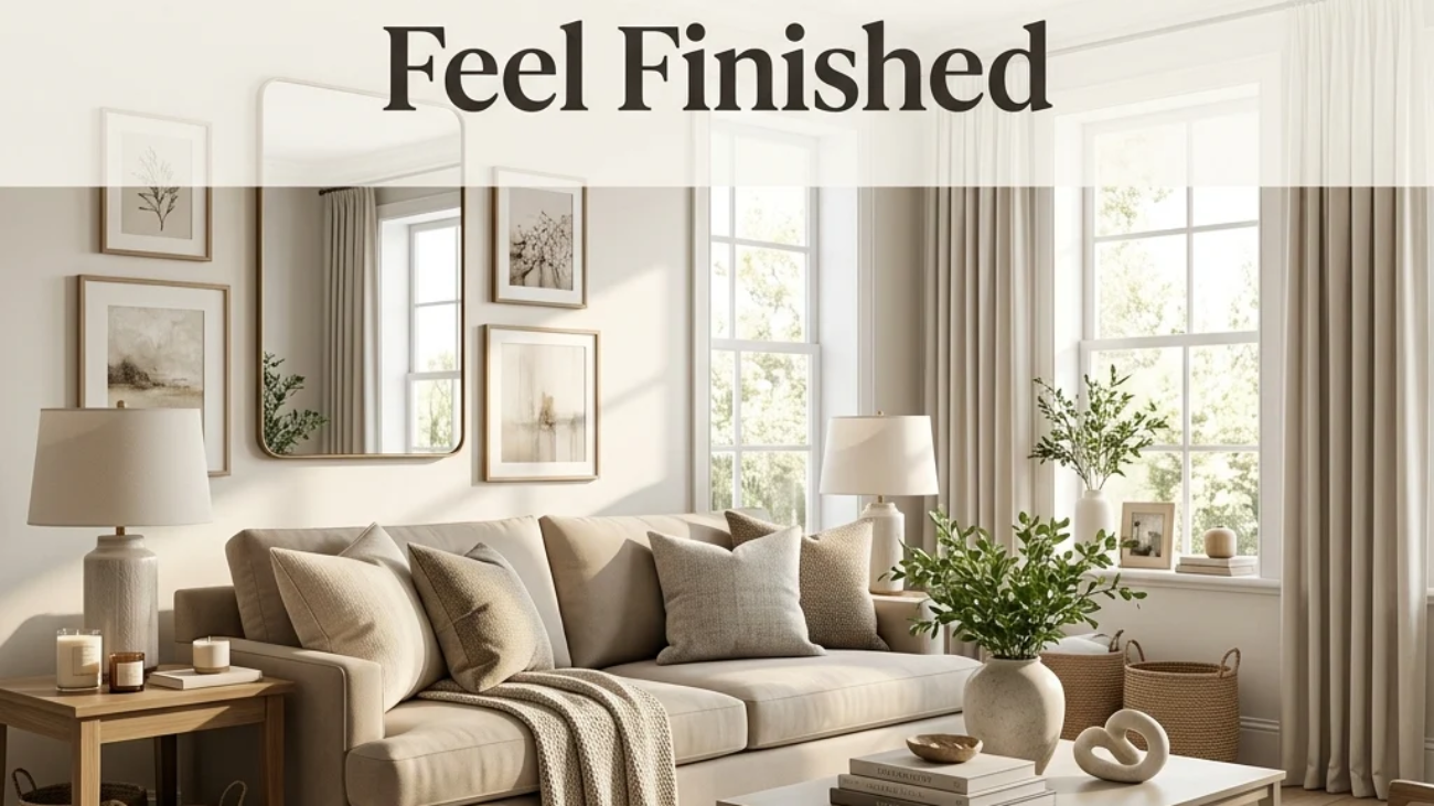
Start with wall color, not furniture. Choosing one warm white, such as Benjamin Moore White Dov, and carrying it through every connected room is the single move that anchors the whole home’s cohesion, because every furniture and material decision afterward gets chosen to sit correctly against that consistent base.

The most common mistake is decorating room by room without a shared material or color plan, which results in a home that reads as several disconnected minimalist attempts rather than one coherent whole. Fix it by choosing your wood tone, wall white, and one accent color before buying anything for a single room, then applying that same trio throughout.

Three items under $50 that create immediate impact: an unglazed ceramic vessel for a console, a single black-and-white framed photograph, and a raw oak oil finish kit to unify an existing mismatched wood piece.

A full, whole-home minimalist transformation realistically takes 3–6 months and costs $8,000–$25,000, depending on how much built-in storage and flooring work is involved. A single-room weekend refresh using paint and decluttering costs $150–$400 and shifts the feel of that space immediately.

Frequently Asked Questions About Minimalist Home Decor
What’s the difference between minimalist and Scandinavian home decor?

Minimalist decor is more austere and architectural, often stripping color and texture down further than Scandinavian design, which still layers in hygge warmth through wool throws, candles, and varied natural materials. A minimalist living room might feature one chair and one plant; a Scandinavian living room would likely add several textured cushions and warmer lighting to the same space.

What color palette works best for minimalist home decor?

Warm white forms the base across every connected room, with soft greige as a secondary neutral and warm charcoal reserved for a single accent wall. Benjamin Moore White Dove and Balboa Mist OC-27 are common reference points. Avoid cool, blue-based whites and multiple competing accent colors across different rooms, both of which break the palette’s continuity.

How much does a minimalist home makeover cost?

A single-room refresh using paint and decluttering runs $150–$500. A mid-range whole-home update adding consistent furniture and lighting typically costs $5,000–$12,000. A full transformation, including built-in storage, new flooring, and custom cabinetry, can reach $20,000–$35,000 depending on square footage and how much millwork is involved.

Does minimalist decor work in a home with kids or a busy household?

Yes, with adjustment built in, concealed storage becomes even more important in a busy household, since minimalism’s visible restraint depends on having somewhere functional to put daily clutter out of sight. Families often find a modified version works best: minimalist principles in shared living spaces, with more flexibility in bedrooms or playrooms.

What’s the most important element in minimalist home decor?

Material and color consistency across rooms is the most important element, more than any single furniture choice, whether the same wood tone and wall color carry through connected spaces determines whether a home reads as genuinely minimalist or simply a sparsely furnished room by room. A home with the “right” empty surfaces but mismatched wood tones from room to room will still feel disjointed.

Ready to Create Your Dream Minimalist Home?

These 13 ideas move through material consistency, contained color, quiet lighting, and concealed storage, showing that minimalist home decor comes together through disciplined, connected choices rather than one dramatic room reveal. Starting with a single warm white paint color carried through your hallway is not a lesser version of the transformation; it’s exactly the kind of foundational move this style rewards. Today, remove one object from a console or shelf and leave the space empty rather than immediately filling it with something else. Done well, the home will start to feel like a held breath rather than a finished project, calm settling into every room the same way. Save the ideas that matched your own light and your own walls, that single sculptural pendant, that flush built-in wall, because minimalist home decor rewards the space built slowly, one considered choice at a time.

You Might Also Like

20 Home Styling Ideas That Make a Room Feel Finished

20 Home Styling Ideas That Make a Room Feel Finished

Home styling is the practice of arranging, layering, and editing the furniture and objects you already own so a room reads as intentional rather than simply furnished. It’s the final layer that turns a room full of good pieces into one that actually looks pulled together. This article gives you 20 real home styling ideas covering color, texture, lighting, furniture, and layout, all built on the same techniques professional stylists and stagers use, adapted for everyday living rather than a single photoshoot.

The feel is unmistakable: a shelf where every object earns its spot, a room where the eye moves easily instead of tripping over clutter, surfaces that feel curated rather than accumulated. Styling isn’t about buying more; it’s about arranging what’s already there with the same intention a photographer brings to a set. Here are 20 ideas worth saving and stealing.

Why Home Styling Works So Well

Home styling as a distinct skill grew out of two separate traditions: shelter magazine editorial styling, which shaped how rooms have been photographed for publications like House Beautiful and Architectural Digest since the mid-20th century, and retail visual merchandising, where store window and shelf arrangement techniques are engineered specifically to draw the eye and hold attention. What makes styling distinct from decorating is that decorating chooses what you own, while styling determines how it’s arranged. The same furniture and objects can look cluttered or considered purely based on styling technique.

The techniques that define good styling are less about specific materials and more about repeatable rules: the rule of odd numbers (groupings of three or five read as more visually dynamic than pairs), triangulation (arranging objects at three different heights within a vignette), and negative space (leaving roughly a third of any surface intentionally empty). Materials matter mainly in contrast pairing a matte ceramic vase with a glossy glass candle holder, or a rough jute rug beneath a smoother wool one, since texture variation is what keeps a neutral palette from reading as flat.

Home styling has grown into its own searched category specifically because of two converging trends: the real estate home-staging industry has made “styling for photos” a mainstream skill rather than a niche one, and Pinterest and Instagram’s flat-lay and “shelfie” content has turned styling techniques that once lived only in stylists’ portfolios into widely shared, learnable tutorials.

Style at a Glance

ElementEditorial & Photo StylingEveryday Livable Styling
PhilosophyArranged for the camera, precise and sparseArranged for daily use, slightly looser
MaterialsMatched, curated object groupingsMixed, collected-feeling accessories
Color PaletteTightly controlled, 2–3 tones per vignetteWarm neutrals with one repeated accent

20 Home Styling Ideas

1. The Rule of Three  Repeating One Color Three Times

1. The Rule of ThreeΒ  Repeating One Color Three Times

Vibe: The room feels cohesive, one color quietly tying three separate objects together.

Why it works: Repeating a single accent color at least three times across a room, rather than confining it to one item, gives the eye a pattern to follow as it moves through the space, a principle called color echo that professional stylists rely on more than any single “statement” piece. Three touches is the minimum the eye reliably registers as intentional repetition rather than coincidence, which is why two instances often still read as random.

How to get it: Pick one accent color already present somewhere in your room, then find two more objects, a pillow, a book, a small vase, in that same tone before buying anything new, since most rooms already contain the third and fourth repetition waiting to be surfaced.

πŸ’‘ Quick Win: A single sage green ceramic vase moved from a bedroom to a living room shelf can complete an accent color repetition that already exists elsewhere in the space.

Shop the Look

Product
Sage green ceramic vase
Sage linen throw pillow cover
Walnut coffee table
Neutral linen sofa slipcover
Sage-spined decorative book set

2. Mixing Matte and Glossy Textures on One Shelf

2. Mixing Matte and Glossy Textures on One Shelf

Vibe: The shelf feels layered, light behaving differently across each surface.

Why it works: A shelf of entirely matte objects, or entirely glossy ones, reads as visually flat because every surface reflects light the same way. Pairing at least one matte finish with one glossy or reflective finish creates the texture contrast the eye reads as depth, the same principle behind pairing a matte ceramic vase with a polished brass candlestick. This is a finish-based technique rather than a color-based one, which is why it works even within an entirely neutral palette.

How to get it: Audit one shelf and count how many objects share the same finish family. If four out of five pieces are matte, swap one for a glossy or metallic finish in the same color family rather than a different color entirely.

Shop the Look

Product
Matte ceramic decorative bowl
Glass candle holder, clear
Brass bookend pair
Neutral hardcover book stack
Small brass decorative object

3. Styling a Room to Photograph Well in Natural Light

3. Styling a Room to Photograph Well in Natural Light

Vibe: The room feels luminous, styled objects catching light at exactly the right angle.

Why it works: Professional stylists position a room’s key vignette, the coffee table arrangement, the mantel display directly within a window’s natural light path, specifically because side and top light reveal texture and dimension in a way flat overhead lighting flattens out entirely, which is why the same arrangement can look completely different depending on where in the room it sits. This isn’t only useful for photos; the same light-catching placement makes a vignette read as more considered in everyday daylight, too.

How to get it: Move your most carefully styled object grouping to whichever surface sits closest to your largest window, and check the arrangement at a few different times of day, since morning and afternoon light hit textured surfaces differently.

πŸ’‘ Quick Win: Simply moving an existing vase from a dim corner to a windowsill often improves how “styled” it reads without changing the arrangement itself at all.

Shop the Look

Product
Textured ceramic vase, warm glaze
Linen throw blanket, neutral
Small potted plant
Woven placemat or tray
Sheer linen curtain panel

4. Leaving Negative Space Around Your Furniture

4. Leaving Negative Space Around Your Furniture

Vibe: The corner feels still, space doing quiet compositional work.

Why it works: Negative space in styling functions the same way it does in graphic design and photography; it gives the eye a place to rest between styled elements, which is why a room with every surface filled tends to feel visually exhausting even when each item is attractive. Leaving roughly a third of any given surface or wall genuinely empty is the specific ratio most professional stylists work toward, since less than that starts to feel crowded again.

How to get it: Pick your most crowded surface or wall and remove roughly a third of what’s currently displayed there, then live with the emptier version for a week before deciding whether anything actually needs to go back.

Shop the Look

Product
Sculptural accent chair
Small round side table
Single ceramic vase
Slim floor lamp
Minimal wall mirror

5. The Rule of Odd Numbers in Object Grouping

5. The Rule of Odd Numbers in Object Grouping

Vibe: The mantel feels dynamic, three objects settling into an arrangement that looks unplanned but isn’t.

Why it works: Groups of two tend to read as a static, matched pair, while groups of three or five create asymmetric visual weight that the eye finds more naturally engaging, a principle borrowed directly from classical composition theory and used constantly in retail visual merchandising. The key detail beyond the odd count is height variation: three identical-height objects still read as flat, while three objects stepping down in height by a few inches each create the sense of movement the rule is meant to produce.

How to get it: Choose three objects of different heights, tall, medium, and short, and arrange them in a loose triangle rather than a straight line, since a straight row of three still reads as static despite the odd count.

πŸ’‘ Quick Win: If you only own two similar objects, add one plain candle or a small book stack as the third element rather than buying a matching third vase.

Shop the Look

Product
Matte ceramic vase set of three
Dried floral stem, single
Small taper candle holder
Neutral book stack
Ceramic decorative tray

6. A Monochromatic Vignette on One Surface

6. A Monochromatic Vignette on One Surface

Vibe: The console feels quiet, one narrow color range doing all the talking.

Why it works: A monochromatic vignette, every object within one color family but varied in exact shade, material, and finish, reads as sophisticated because the color consistency removes any competition for attention, letting texture and shape carry the visual interest instead. This is a deliberately restrained technique, the opposite of the color-echo method used elsewhere in styling, and it works best on a single, defined surface rather than an entire room.

How to get it: Choose one narrow color family, cream, sand, warm white, and select objects that vary in exact shade within that family rather than matching perfectly, since slight tonal variation is what keeps a monochromatic grouping from reading as a purchased matching set.

Shop the Look

Product
Cream ceramic vase
Ivory taper candle set
Cream-bound decorative book stack
Walnut console table
Small cream ceramic tray

7. Layering a Vintage Rug Over a Jute Base

7. Layering a Vintage Rug Over a Jute Base

Vibe: The floor feels textured, two materials doing more visual work than either could alone.

Why it works: Layering a smaller, more pattern-dense rug over a larger neutral jute or sisal base adds texture depth at the floor level without requiring an expensive single large rug, since the technique lets a smaller, higher-quality rug cover the visual focal point while the cheaper base rug fills the remaining floor area. The jute’s natural rope texture also grounds a busier patterned rug, keeping the combination from feeling visually loud.

How to get it: Size the top rug to roughly two-thirds the width of the base rug, and offset it slightly off-center rather than perfectly centered, which reads as more intentionally layered than a precisely centered placement.

Shop the Look

Product
Jute base area rug, large
Patterned vintage-style area rug
Rug pad, non-slip
Walnut coffee table
Leather accent armchair

8. The Triangulation Principle for Tabletop Styling

8. The Triangulation Principle for Tabletop Styling

Vibe: The table feels balanced, with three points anchoring the whole surface.

Why it works: Triangulation places three objects of differing height at three different points on a surface, rather than lining them up or clustering them tightly together, which distributes visual weight across the entire tabletop instead of concentrating it in one spot. This principle governs most professional coffee table and console styling because it works reliably regardless of the specific objects involved; the geometry, not the items themselves, is doing the organizing.

How to get it: Place your tallest object (often a stack of books or a vase) at one point, a medium-height object like a tray at a second point, and a low, flat object like a small dish at the third, keeping enough space between each that the triangle shape stays legible.

πŸ’‘ Quick Win: A tray, a candle, and a small stack of two books is the fastest way to apply triangulation on a coffee table with zero new purchases.

Shop the Look

Product
Ceramic decorative tray
Neutral hardcover book set
Small potted succulent
Taper candle and holder
Small ceramic dish

9. Vertical Styling for Narrow Shelves

9. Vertical Styling for Narrow Shelves

Vibe: The shelf feels efficient, height doing what floor space in a small room can’t.

Why it works: In a small space, styling a narrow shelf with only one or two objects per level rather than filling every shelf edge-to-edge keeps the piece from visually shrinking the room further. This is the small-space version of the negative-space principle, applied at a more constrained scale where even one extra object can tip a shelf from curated to cluttered. A single tall object per shelf also draws the eye upward, which makes ceilings feel higher in compact rooms.

How to get it: Limit each shelf to a maximum of two to three objects, mixing vertical books with one horizontal stack rather than filling the shelf uniformly, and lean at least one framed print against the back rather than hanging it, which reads as more intentionally curated in tight quarters.

Shop the Look

Product
Narrow wall bookshelf unit
Small ceramic bud vase
Framed art print, small
Neutral hardcover book set
Small bookend pair

10. Angling Seating for Visual Flow

10. Angling Seating for Visual Flow

Vibe: The room feels dynamic, with one angled chair changing how the whole space reads.

Why it works: Furniture squared perfectly against every wall creates a static, boxy visual rhythm, while angling even one piece, typically a chair, breaks that rigidity and guides the eye through the room rather than letting it stop at each flat wall-aligned edge. This is a styling adjustment rather than a furniture purchase, since it requires only repositioning what’s already there.

How to get it: Angle one chair roughly 15–20 degrees away from being perfectly parallel to its nearest wall, checking that it still faces a natural conversational point like the sofa or coffee table rather than an awkward corner.

Shop the Look

Product
Accent chair, curved back
Layered area rug set
Small round side table
Neutral throw pillow cover
Floor lamp, slim profile

11. Grouping Candles at Varied Heights

11. Grouping Candles at Varied Heights

Vibe: The table feels intimate, small flames staggered like a miniature skyline.

Why it works: Candles at uniform height in matching holders read as a set rather than a styled arrangement, while staggering heights using different holder sizes or simply lighting candles that have burned down at different rates applies the same height-variation principle used in vase and book styling to something as simple as a taper candle grouping. This works specifically well at dining tables and mantels, where the flickering light itself amplifies the height variation once lit.

How to get it: Use candle holders in at least two different heights within the same finish family, and group them in odd numbers along a runner or tray rather than spacing them evenly across the full table width.

πŸ’‘ Quick Win: Letting existing taper candles burn down unevenly before regrouping them creates natural height variation without buying anything new.

Shop the Look

Product
Brass taper candle holder, varied heights
Unscented taper candle set
Linen table runner, neutral
Small greenery sprig
Long-reach candle lighter

12. Grounding a Shelf With One Natural Material

12. Grounding a Shelf With One Natural Material

Vibe: The shelf feels grounded, one heavy material anchoring several lighter ones.

Why it works: A shelf styled entirely with small, delicate objects, glassware, and thin ceramics can read as visually unstable or fussy, while adding one substantial natural-material object, like a chunky wood bowl or a piece of raw stone, gives the arrangement visual weight to balance against. This is a material-based version of the same visual-weight principle that governs furniture placement, scaled down to a single shelf.

How to get it: Choose one solid wood or stone object per shelf as a base-level anchor, positioning it toward one side rather than centered, and build lighter glass or ceramic objects around it at varying heights.

Shop the Look

Product
Chunky wood decorative bowl
Small glass bud vase
Matte ceramic accent vase
Floating wood shelf
Small stone paperweight object

13. Stacking Books as a Styling Tool, Not Just Storage

13. Stacking Books as a Styling Tool, Not Just Storage

Vibe: The table feels intentional, books doing double duty as both reading material and height tool.

Why it works: Books stacked horizontally rather than shelved vertically create an instant, adjustable height riser that lets a small object on top sit at a more interesting level than the flat tabletop alone would allow. This is the specific technique stylists use to add a “third height” to any surface without buying a riser or stand. Choosing books with similar-toned spines, or wrapping mismatched spines in plain paper, keeps the stack from becoming its own competing visual element.

How to get it: Stack three books of decreasing size, largest at the bottom, and place one small object, a candle, a bud vase, on top rather than beside the stack, which uses the books as a functional pedestal rather than pure decoration.

Shop the Look

Product
Neutral hardcover book set
Small ceramic bud vase
Taper candle and holder
Book spine wrapping paper, plain
Walnut side table

14. Echoing an Accent Color Through Small Objects

14. Echoing an Accent Color Through Small Objects

Vibe: The bedroom feels connected, one small color thread running quietly through it.

Why it works: Introducing an accent color exclusively through small, low-cost objects, a candle, a dish, a book spine, rather than a single large piece like a chair or rug, lets that color repeat across a room several times without the financial commitment of one expensive item, which is exactly the color-echo principle from earlier in this list applied at the smallest possible object scale. Small object repetition is also easier to adjust or remove entirely if the color choice doesn’t hold up over time.

How to get it: Choose three or more small objects under $20 each in your accent color rather than one larger piece, distributing them across different surfaces in the same room so the color reads as a running thread rather than a single isolated spot.

πŸ’‘ Quick Win: A terracotta candle, already a common, affordable item, can be one of the three required color-echo touches with zero additional shopping.

Shop the Look

Product
Terracotta ceramic dish
Terracotta candle, unscented
Terracotta-spine decorative book
Walnut nightstand
Neutral linen bedding set

15. Anchoring a Zone With a Rug Underfoot

15. Anchoring a Zone With a Rug Underfoot

Vibe: The seating area feels grounded, one rug defining exactly where the zone begins and ends.

Why it works: An undersized rug where only the front legs of furniture touch it is one of the most common styling errors, because it makes the furniture look like it’s floating rather than anchored to a defined zone. A properly sized rug with every piece of furniture’s legs resting on it reads as a single cohesive area instead of scattered pieces. This single sizing correction is frequently the difference between a room that feels finished and one that feels slightly off without an obvious reason why.

How to get it: Measure your seating arrangement’s outer edges before buying a rug, and size up rather than down if you’re between sizes, since an oversized rug reads as intentional while an undersized one reads as a mistake.

Shop the Look

Product
Large area rug, full seating coverage
Rug pad, non-slip
Walnut coffee table
Artificial floor plant
Neutral throw pillow set

16. Balancing Hard and Soft Textures on a Console

16. Balancing Hard and Soft Textures on a Console

Vibe: The entryway feels balanced, with hard and soft materials trading visual weight evenly.

Why it works: A console styled entirely with hard materials, ceramic, glass, and metal reads as cold, while one styled entirely with soft materials reads as visually mushy and undefined; pairing both on the same surface, a ceramic lamp base next to a woven basket, gives the eye contrast points to move between. This is the same texture-layering principle used on shelves, applied at the entry-point scale where first impressions matter most.

How to get it: Include at least one soft, textile-based object, a woven basket, a folded runner alongside your console’s harder decorative pieces, positioning the soft element toward one end rather than centered to keep the balance asymmetric.

Shop the Look

Product
Ceramic table lamp, matte finish
Woven storage basket
Linen table runner
Brass catch-all tray
Small round wall mirror

17. A Seasonal Color Swap for Styling Refresh

17. A Seasonal Color Swap for Styling Refresh

Vibe: The mantel feels seasonal, warmth arriving through a handful of swapped accents.

Why it works: Rather than redecorating a room entirely each season, professional stylists swap only the small, low-cost accent layer pillow covers, candles, and a seasonal floral stem while keeping the furniture and wall color constant, which refreshes a room’s feel at a fraction of the cost and effort of a full restyle. This works because the base neutral palette established elsewhere in this list is specifically designed to stay flexible enough to host rotating seasonal accents without ever needing to change itself.

How to get it: Keep a small rotating box of seasonal accent pieces, two or three pillow covers, one seasonal candle scent, and a dried floral stem separate from your everyday decor, swapping only these pieces every few months rather than restyling the whole room.

Shop the Look

Product
Rust linen pillow cover
Amber-toned candle, seasonal scent
Dried wheat stem bundle
Warm walnut mantel decor tray
Neutral base pillow cover, year-round

18. Creating a Reading Vignette With One Chair

18. Creating a Reading Vignette With One Chair

Vibe: The corner feels hushed, styled as its own small destination within the room.

Why it works: Styling a single chair as a defined vignette with its own side table, light source, and one or two supporting objects gives a room a secondary focal point beyond the main seating group, which is a technique borrowed from how model homes are staged to suggest lived-in use rather than just furniture placement. This works because it styles for a specific activity (reading) rather than a generic display, which makes the corner feel functional rather than purely decorative.

How to get it: Give your reading chair its own small ecosystem, a side table within arm’s reach, and a light source positioned over the shoulder rather than overhead so the vignette reads as a complete, usable setup rather than a chair placed in leftover space.

Shop the Look

Product
Accent reading chair
Small round side table
Floor lamp, adjustable arm
Folded knit throw blanket
Small potted plant

19. Layering Task and Ambient Light on a Desk

19. Layering Task and Ambient Light on a Desk

Vibe: The desk feels functional, with two light sources doing different jobs at once.

Why it works: A single desk lamp handles task lighting but leaves the surrounding area comparatively dark once the sun sets, which is why stylists add a second, smaller ambient light, a small table lamp, or accent light behind the primary work area so the desk doesn’t become an isolated bright spot in an otherwise dim room. This mirrors the same layered-lighting principle used across full rooms, scaled down to a single work surface.

How to get it: Position your main task lamp directly over your working hand’s side to reduce shadow, and add one smaller warm-toned accent light behind or beside the desk so the immediate surrounding area isn’t left in contrast-heavy darkness.

Shop the Look

Product
Brass adjustable task lamp
Small ceramic accent lamp
Desk organizer tray
Warm white LED bulb set
Small potted plant

20. Styling a Tray as a Contained Vignette

20. Styling a Tray as a Contained Vignette

Vibe: The table feels tidy, a tray drawing a clean boundary around its own small scene.

Why it works: A tray functions as a visual container that groups several small objects into one cohesive unit rather than letting them scatter loosely across a larger surface, which is why professional stylists use trays constantly on coffee tables, ottomans, and console tops the tray’s physical edge does the same organizing work the rule of three does compositionally, just with a literal boundary instead of an implied one. It also makes daily tidying faster, since the whole vignette lifts and resets as one unit.

How to get it: Choose a tray large enough to hold three to four small objects with breathing room between them, and treat everything within the tray’s edge as one grouping, meaning objects outside the tray on the same table should form a separate, distinct vignette rather than blending into it.

πŸ’‘ Quick Win: Moving three existing small objects onto any spare tray you already own is a five-minute styling upgrade with zero shopping required.

Shop the Look

Product
Ceramic decorative tray
Taper candle and holder
Small ceramic bud vase
Neutral coaster set
Small ceramic catch-all dish

How to Start Your Home Styling Transformation

Your first single move should be editing one surface before styling anything new. Pick your most cluttered shelf or coffee table, and remove roughly a third of what’s currently on it, because styling almost always starts with subtraction, not addition, and every technique on this list works better with fewer objects competing for attention.

The most common mistake is buying new decor before applying any styling technique to what’s already owned, which usually just adds another item to an already unedited surface rather than solving the underlying arrangement problem. Fix it by fully restyling one surface using only existing objects, applying the rule of three, triangulation, or negative space before deciding whether anything genuinely needs to be purchased.

Three specific items under $50 that create immediate impact: a ceramic decorative tray to contain a coffee table vignette, a set of taper candles in staggered holder heights, and a stack of three neutral hardcover books to use as a styling riser.

A single surface can realistically be restyled in under 30 minutes using only what you already own. A full-room styling pass, editing and rearranging every surface, typically takes a focused weekend, while a full-home refresh across several rooms usually spans two to three weekends and $50–$200 in small supporting purchases like trays and candle holders.

Frequently Asked Questions About Home Styling
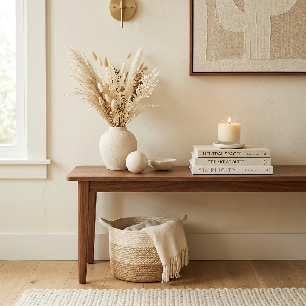
What is the difference between decorating and home styling?

Decorating refers to choosing and acquiring the furniture, colors, and materials that go into a room, while home styling refers specifically to how those existing pieces are arranged, layered, and edited once they’re already in place. A fully decorated room with expensive furniture can still look unstyled if objects are scattered without height variation or negative space, while a modestly decorated room can look genuinely finished through careful styling alone, which is why styling is often the more cost-effective lever to pull first.

What colors work best for home styling vignettes?

Warm neutrals, warm white, sand, walnut brown, form the most flexible styling base because they let accent colors rotate seasonally without requiring the whole vignette to change. A single repeated accent, often sage green or terracotta, applied through the color-echo technique across three or more small objects, is the most common professional approach rather than committing an entire vignette to one bold hue.

How much does it cost to professionally style a room?

Home stylists and stagers typically charge $300–$800 per room for a single styling session using the client’s existing furniture largely, while a full-home staging service for a real estate listing can run $2,000–$5,000 depending on square footage. DIY-ing the same techniques using this list costs closer to $50–$150 per room in small supporting purchases like trays, candles, and a few accent objects, since the core techniques themselves require no purchase at all.
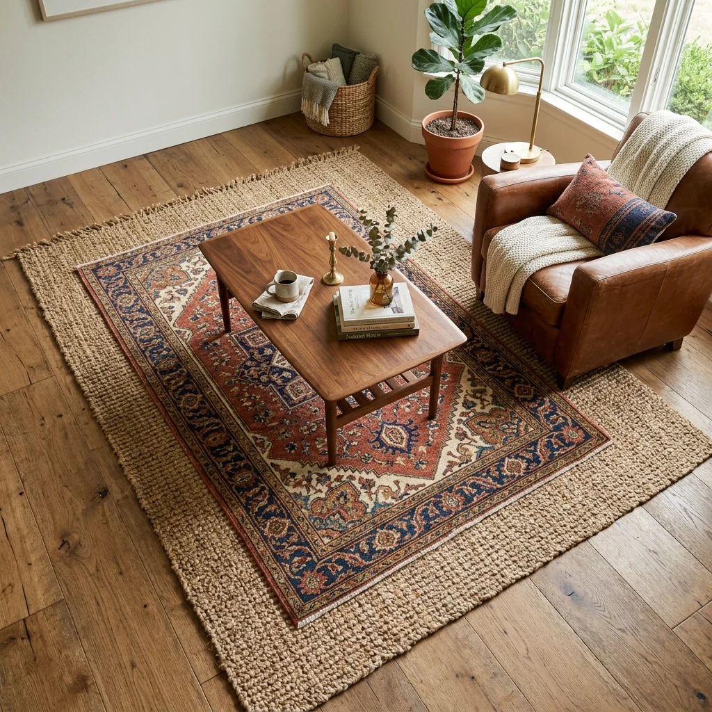
Does home styling work in a small apartment or rental?

Yes, and arguably more effectively than in larger homes, since small-space styling relies heavily on editing and negative space rather than adding furniture, which suits rental restrictions well. Techniques like vertical shelf styling, tray-contained vignettes, and rug-based zone anchoring require no permanent changes or wall damage, making them fully compatible with typical rental lease restrictions.

What is the single most useful home styling rule for beginners?

The rule of three grouping objects in odd numbers at varied heights is generally considered the most broadly useful starting technique, since it applies to nearly any surface in the home, from a coffee table to a bookshelf to a bathroom vanity, and requires no new purchases to try immediately with existing objects. Most other styling principles on this list, including triangulation and negative space, build directly on this same foundational height-and-grouping logic.

Ready to Create Your Dream Styled Home?

These 20 home styling ideas span color, texture, lighting, furniture, and layout, from the rule of three on a single shelf to anchoring an entire seating zone with a properly sized rug, so there’s a genuinely useful technique here for whichever room currently feels unfinished. You don’t need to restyle your whole home in one weekend, and working through one surface at a time is not a slower path to a finished-feeling home; it’s the actual method professional stylists use, room by room, shelf by shelf. Today’s specific action: pick your most cluttered surface right now, remove a third of what’s on it, and regroup what remains into one odd-numbered, height-varied cluster before you do anything else. Once a few surfaces carry this same intentional arrangement, the whole home stops feeling like a collection of furniture and starts feeling like a space someone actually considered. Save the techniques that fit your own rooms today, that tray vignette, that layered rug, because in home styling, the arrangement is often the entire difference between furnished and finished.

You Might Also Like

15 Home Makeover Ideas for a Real Before-and-After Transformation
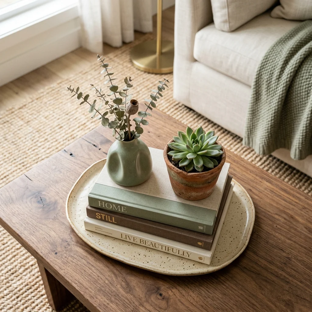
15 Home Makeover Ideas for a Real Before-and-After Transformation
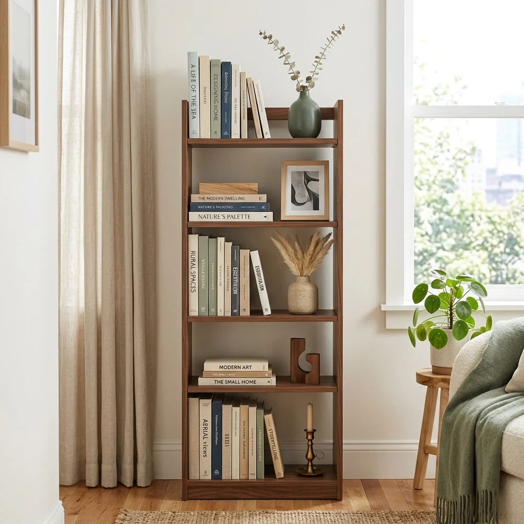
A home makeover is a defined transformation project combining cosmetic updates like paint and lighting with functional changes like furniture and layout that turns a tired or mismatched room into a genuinely different space, usually completed within a set timeframe rather than an ongoing decorating process. This article gives you 15 real home makeover ideas spanning color, material, lighting, furniture, and layout, each one a strategy actual renovation projects rely on to deliver a visible before-and-after impact.
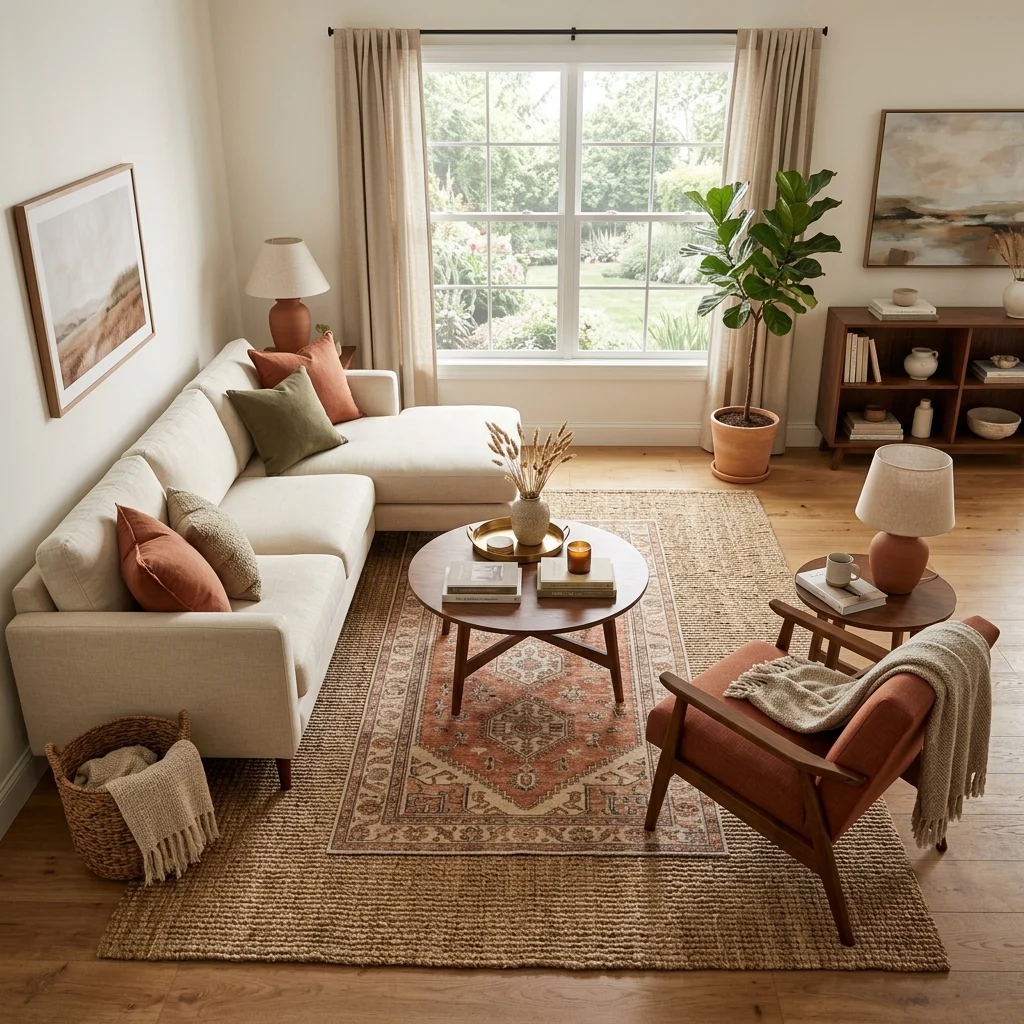
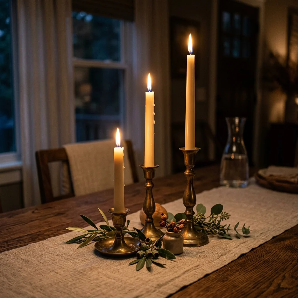
The feel is unmistakable: a room you walk into and genuinely don’t recognize, the satisfaction of a space that finally works the way you always wanted it to. A good makeover doesn’t require gutting anything it requires knowing exactly which handful of changes will read as a transformation rather than just tweaking. Here are 15 ideas worth saving and stealing.

Why Home Makeover Projects Work So Well

A home makeover, as distinct from ongoing decorating, is a structured project with a defined start and end point built around visible transformation, a format popularized by renovation television in the late 1990s and 2000s, when shows built entirely around the “reveal” moment trained audiences to think of home improvement in before-and-after terms rather than gradual accumulation. This is what separates a makeover from styling or budget decorating: a makeover has a finish line, a specific room or space getting a defined, time-boxed transformation.

The materials that deliver the most visible makeover impact tend to be the ones already in the room rather than replacements, refinished flooring, repainted cabinetry, swapped hardware, since transforming an existing surface reads as dramatically different at a fraction of full-replacement cost. Color plays an outsized role in makeover impact specifically because a single wall or cabinetry repaint in a confident tone like warm charcoal or deep terracotta changes a room’s entire character faster than almost any other single intervention.

Home makeovers have surged again as renovation costs and home equity considerations push more households toward “refresh, don’t replace” strategies, cosmetic makeovers using paint, lighting, and furniture swaps rather than structural renovation, while social media’s before-and-after reveal culture has kept the transformation format as culturally relevant now as it was during television’s original renovation boom.

Style at a Glance

ElementCosmetic MakeoverStructural Makeover
PhilosophyRefresh existing surfaces and furnitureReplace or reconfigure permanently
MaterialsPaint, hardware, refinished surfacesNew flooring, countertops, and built-ins
Color PaletteWarm white base, one bold anchor colorWhatever the structural update dictates

15 Home Makeover Ideas

1. A Whole-Home Color Story for a Cohesive Makeover

1. A Whole-Home Color Story for a Cohesive Makeover

Vibe: The home feels cohesive, one color decision carrying through every doorway.

Why it works: Homes that evolve room by room over the years frequently end up with a patchwork of unrelated wall colors, which is one of the most common reasons a fully furnished home still feels unfinished. Establishing one consistent base color across connected spaces is the single highest-leverage makeover move because it affects every room at once rather than one at a time. This is a proportion and rhythm principle: repetition of one color across multiple rooms reads as intentional design rather than accumulated decisions.

How to get it: Choose one warm white or greige as your whole-home base color, and repaint connected spaces, hallways, open-concept living and kitchen areas in that same color first, saving bolder colors for single, contained rooms like a bedroom or powder room.

πŸ’‘ Quick Win: Repainting just the hallway connecting two already-similar rooms can visually unify a home faster than repainting either room individually.

Shop the Look

Product
Warm white interior paint, multi-gallon set
Semi-gloss trim paint, matching undertone
Walnut console table
Ceramic decorative vase
Painter’s tape, sharp-edge

2. Refinishing Flooring Instead of Replacing It

2. Refinishing Flooring Instead of Replacing It

Vibe: The floor feels renewed, the same boards wearing an entirely fresh finish.

Why it works: Existing hardwood floors can typically be sanded down and refinished several times over their lifespan before the wood is too thin to sand again, which means a scratched or dated floor often doesn’t need replacing at all  just resurfacing, at roughly a third to half the cost of new flooring installation. This matters in a makeover specifically because flooring covers more total visible surface area than almost any other element in a room, making its condition disproportionately influential on the space’s overall feel.

How to get it: Have flooring professionally assessed for remaining sandable depth before committing to refinishing, since floors sanded too many times previously may no longer have enough wood left to safely refinish again.

Shop the Look

Product
Hardwood floor refinishing kit
Polyurethane floor sealant, satin
Wool blend area rug
Rug pad, non-slip
Walnut coffee table

3. A Full Lighting Overhaul as the Makeover’s Backbone

3. A Full Lighting Overhaul as the Makeover's Backbone

Vibe: The room feels elevated, entirely new light doing what paint alone couldn’t.

Why it works: Lighting is frequently the most under-invested element in an otherwise decorated room, since original builder-grade fixtures often go untouched for years while furniture and paint get updated repeatedly  replacing every fixture in a single room at once, rather than one at a time, is what makes a lighting-focused makeover read as a dramatic transformation rather than a minor tweak. This works because light quality and color temperature affect how every other material and color in the room actually reads.

How to get it: Replace your main ceiling fixture, add at least one new table or floor lamp, and standardize every bulb in the room to warm white 2700K, since mismatched color temperatures between fixtures is one of the most common reasons a newly lit room still feels off.

Shop the Look

Product
Statement pendant light fixture
Brushed brass floor lamp
Ceramic table lamp, warm glaze
Warm white 2700K bulb set
Dimmer switch kit

4. The One Hero Furniture Piece Strategy

4. The One Hero Furniture Piece Strategy

Vibe: The room feels anchored, one new piece carrying the whole makeover’s weight.

Why it works: Replacing every piece of furniture in a room is rarely necessary for a room to feel transformed  identifying the single largest or most visually dominant piece, usually a sofa or bed, and replacing only that hero item delivers a disproportionate share of the makeover’s visual impact, since that piece occupies the most square footage and draws the most attention. This strategy also concentrates budget where it matters most rather than spreading it thin across many smaller purchases.

How to get it: Identify which single furniture piece in the room occupies the largest visual footprint, and budget the majority of your makeover spend there, keeping smaller furniture and accessories as secondary, lower-cost updates.

πŸ’‘ Quick Win: If a full hero piece replacement isn’t in budget yet, reupholstering the existing piece delivers a similar visual reset at a fraction of the cost.

Shop the Look

Product
Curved statement sofa
Neutral throw pillow covers
Woven throw blanket
Existing coffee table, restyled
Small ceramic accent vase

5. Editing and Decluttering Before Restyling

5. Editing and Decluttering Before Restyling

Vibe: The shelf feels clear, less doing noticeably more.

Why it works: A makeover that adds new items to an already-cluttered room often fails to read as transformed, because the accumulated clutter absorbs and dilutes the impact of anything new. Decluttering first, removing roughly a third of what’s currently on display before restyling with new or existing pieces, is the step most DIY makeovers skip and professional stagers never do. This is the negative-space principle applied at the project scale rather than the single-shelf scale.

How to get it: Before any new purchases, remove every object from your main surfaces and shelves, then reintroduce only what you’d genuinely miss, restyling the remainder with proper height variation and grouping rather than replacing everything at once.

Shop the Look

Product
Storage bins for decluttering sort
Ceramic decorative vase
Neutral hardcover book set
Floating wall shelf
Small ceramic tray

6. Repainting Cabinetry for a Kitchen Makeover

6. Repainting Cabinetry for a Kitchen Makeover

Vibe: The kitchen feels transformed, cabinetry wearing an entirely different character.

Why it works: Cabinetry typically occupies more visual surface area in a kitchen than countertops, backsplash, and appliances combined, which is why repainting cabinets rather than replacing them consistently ranks among the highest-return kitchen makeover moves, delivering a full color-scheme change at a small fraction of new cabinetry’s cost. This works because it addresses the room’s single largest surface directly rather than working around it with smaller updates.

How to get it: Use a cabinet-grade paint or primer system specifically formulated for high-touch surfaces (standard wall paint chips quickly on cabinet doors), and remove all doors and drawer fronts to paint them flat rather than painting in place, which produces a noticeably smoother finish.

Shop the Look

Product
Cabinet-grade paint, sage green
Cabinet primer, adhesion-bonding
Brushed brass cabinet hardware set
Ceramic kitchen canister set
Linen kitchen towel, neutral

7. Swapping Hardware Across the Whole Home

Vibe: The hallway feels updated, small, consistent details signaling a home-wide refresh.

Why it works: Door hardware, switch plates, and outlet covers are touched daily but rarely noticed individually, which is exactly why an outdated or mismatched brass finish from a previous decade reads as generally “dated” without anyone identifying the specific cause replacing these small fixtures consistently across an entire home is a low-cost, high-frequency-touchpoint update that reinforces the whole-home color story established in the first idea on this list. This is a rhythm principle again: repetition of one consistent finish throughout a home creates cohesion.

How to get it: Choose one hardware finish, typically matte black or brushed brass  and replace every door lever, switch plate, and outlet cover in main living areas to match, since partial updates (a few rooms done, others not) undercut the whole-home cohesion this move is meant to create.

Shop the Look

Product
Matte black door lever set
Matte black switch plate covers
Matte black outlet cover set
Screwdriver set for hardware install
Walnut console table

8. Reupholstering Instead of Replacing Furniture

8. Reupholstering Instead of Replacing Furniture

Vibe: The chair feels transformed, an old frame wearing an entirely new surface.

Why it works: A well-built furniture frame with sound joinery is often worth far more than its outdated fabric suggests, and reupholstering keeps that structural quality intact while completely changing the piece’s visible character, a technique makeover shows have relied on for decades, specifically because it delivers dramatic before-and-after contrast without the cost or waste of full replacement. This especially applies to older, solid-wood-frame furniture, which frequently outperforms comparably priced new furniture in construction quality.

How to get it: Have any furniture piece assessed for frame soundness before committing to reupholstery, since a wobbly or cracked frame isn’t worth the fabric investment, but a solid frame with simply dated fabric is an ideal reupholstery candidate.

πŸ’‘ Quick Win: A drop-in seat cushion, common on dining chairs, can be reupholstered in under 30 minutes as a lower-commitment way to test the technique before a full chair or sofa.

Shop the Look

Product
Terracotta boucle upholstery fabric
Heavy-duty staple gun
Upholstery foam padding
Walnut side table
Ceramic decorative vase

9. Repurposing an Unused Nook Into Functional Space

9. Repurposing an Unused Nook Into Functional Space

Vibe: The nook feels efficient, unused square footage finally earning its keep.

Why it works: Nearly every home has at least one genuinely dead zone an awkward stairwell landing, a deep closet, an oversized hallway that goes completely unused, and converting even one of these into functional space (a reading nook, a small desk, a mudroom bench) delivers a makeover impact disproportionate to its size, since the transformation is from zero function to real function rather than an incremental improvement. This is the small-space adaptation of the hero-piece strategy, applied to overlooked square footage instead of furniture.

How to get it: Identify the single most underused space in your home, measure it precisely, and choose one clear function for it: seating, storage, or workspace, rather than trying to make it serve multiple purposes at once, which usually results in it serving none well.

Shop the Look

Product
Built-in-style bench cushion, custom size
Wall-mounted floating shelf set
Neutral throw pillow cover
Small potted plant
Wall hook set for storage

10. Room-by-Room Furniture Swap Strategy

10. Room-by-Room Furniture Swap Strategy

Vibe: The room feels fresh, borrowed furniture finding a genuinely better home.

Why it works: A full-home makeover doesn’t require every room to receive new furniture; moving underused pieces between rooms, a chair from a rarely-used guest room into the main living space, for instance, redistributes what already exists rather than requiring new purchases everywhere. This works because furniture that’s gone visually stale in one context often reads as entirely new once relocated and restyled elsewhere in the home.

How to get it: Walk through every room in your home and identify furniture pieces that are underused or overlooked in their current location, testing whether any would serve a stronger visual or functional role somewhere else before buying anything new.

Shop the Look

Product
Furniture sliders for repositioning
Neutral throw pillow cover, new
Furniture leg caps for stability
Small area rug for new placement
Ceramic accent object

11. Layering New Light Fixtures Room by Room

11. Layering New Light Fixtures Room by Room

Vibe: The bedroom feels layered, with new light sources changing the room’s entire mood.

Why it works: A room lit only by a single overhead fixture is one of the clearest signals of an unfinished makeover, since flat single-source light flattens texture and depth regardless of how well everything else has been updated adding at least two additional light sources at different heights per room is what carries the lighting overhaul principle from the living room into every other space in the home. This sequencing (living areas first, bedrooms and secondary rooms next) lets a whole-home makeover proceed room by room without requiring every fixture to be purchased at once.

How to get it: Prioritize bedrooms and home offices as the next rooms for lighting layering after main living areas, adding one wall-mounted or table light source per room at a minimum, since these are the spaces most likely to still be running on a single builder-grade fixture.

Shop the Look

Product
Brass wall sconce pair
Ceramic table lamp, warm glaze
Warm white 2700K bulb set
Walnut nightstand
Neutral bedding set

12. Updating Countertops Without a Full Renovation

12. Updating Countertops Without a Full Renovation

Vibe: The island feels upgraded, an old surface reading as convincingly new stone.

Why it works: Full countertop replacement is one of the most expensive line items in any kitchen renovation, which is why a temporary or semi-permanent surface upgrade, such as a high-quality countertop contact paper or a poured epoxy resurfacing kit  delivers a visible transformation at a small fraction of stone or quartz replacement cost, particularly valuable for renters or homeowners not ready for a full renovation. This works specifically because countertops sit at eye level and direct sightline in a kitchen, giving even a temporary material upgrade an outsized visual influence.

How to get it: Clean and thoroughly degrease the existing countertop before applying any resurfacing product, and choose a marble or stone-look finish with a satin rather than high-gloss sheen, which reads as more convincingly natural under kitchen lighting.

Shop the Look

Product
Marble-look countertop contact paper
Degreasing surface cleaner
Countertop edge trim, matching finish
Ceramic decorative bowl
Small potted herb plant

13. A Fresh Textile Layer as the Final Makeover Touch

13. A Fresh Textile Layer as the Final Makeover Touch

Vibe: The room feels finished, soft new layers completing what structural changes started.

Why it works: Textile curtains, pillow covers, and a rug are typically the last makeover layer added because they’re the fastest to change and the easiest to get wrong if chosen before the room’s larger color and material decisions are settled, which is why professional makeovers save textile shopping for the final step rather than the first. A coordinated textile refresh also visually stitches together all the previous makeover changes into one cohesive final look.

How to get it: Wait until paint, lighting, and any furniture changes are fully complete before purchasing textiles, then choose curtains, pillows, and a rug that reference your room’s established color story rather than introducing a new, unrelated palette at the last step.

πŸ’‘ Quick Win: New curtain panels alone, even with everything else unchanged, are often enough to make a freshly painted and lit room feel completely finished.

Shop the Look

Product
Linen curtain panels, grommet top
Wool blend area rug
Sage green throw pillow covers
Rug pad, non-slip
Curtain rod, brass finish

14. Choosing One Accent Wall to Anchor the Whole Makeover

14. Choosing One Accent Wall to Anchor the Whole Makeover

Vibe: The bedroom feels anchored, one bold wall carrying the whole room’s transformation.

Why it works: A single accent wall, typically the wall behind a bed or sofa, delivers the visual drama of a bold color choice while containing the risk and cost to one surface rather than an entire room. This is the makeover-scale version of the 10% accent principle in color theory, concentrated into architecture rather than accessories. It also gives future makeovers an easy reset point, since repainting one wall is a far smaller undertaking than repainting four.

How to get it: Choose the wall with the most architectural presence, usually the one behind the bed or the main seating, rather than an awkward side wall, and select a color at least two to three shades bolder than you’d choose for a full room, since a single wall can carry more saturation than four walls could.

Shop the Look

Product
Terracotta accent wall paint
Walnut bed frame
Neutral linen bedding set
Painter’s tape, sharp-edge
Brass wall sconce pair

15. Reworking Furniture Zones After a Room Makeover

15. Reworking Furniture Zones After a Room Makeover

Vibe: The space feels complete, every previous change finally settling into defined zones.

Why it works: A room makeover that updates color, lighting, and furniture individually but never revisits the overall layout often leaves the space functioning exactly as it did before the transformation, which is why the final step in a thorough makeover is reassessing traffic flow and zone definition with fresh eyes rather than assuming the original layout still makes sense. This closing step applies the soft-zoning principle across the whole room, using rugs and furniture groupings to define distinct functional areas now that every other element has changed.

How to get it: Once all other makeover changes are complete, walk the room as if seeing it for the first time and identify whether the current furniture arrangement still makes sense for how the room is actually used, adjusting zones with rugs and furniture regrouping rather than assuming the pre-makeover layout is still correct.

Shop the Look

Product
Layered area rug set, two zones
Floor lamp, adjustable
Console table for zone division
Neutral throw pillow set
Small accent chair for secondary zone

How to Start Your Home Makeover

Your first single move should be a full lighting and paint pass on your main living space, because these two changes touch every square foot of the room and establish the color and light foundation every other makeover decision, furniture, textiles, and accessories get measured against afterward.

The most common mistake is buying new furniture and decor before finishing paint and lighting, which frequently means beautiful new purchases end up sitting in a room whose underlying color and light still feel dated. Fix this by sequencing strictly: paint and lighting first, structural or hero furniture second, textiles and accessories last, resisting the temptation to shop out of order even when a great deal appears early.

Three specific items under $50 that create immediate impact: a set of matte black door lever hardware for one main hallway, a warm white 2700K bulb set to standardize your existing fixtures, and a single new linen curtain panel pair for your most-used room’s largest window.

A cosmetic single-room makeover, paint, lighting, hardware, and textiles typically takes one to two weekends and costs $300–$800. A fuller room transformation, including a hero furniture piece, runs $1,500–$4,000 and takes four to six weeks, while a whole-home cosmetic makeover across several rooms realistically spans two to four months and $3,000–$10,000, depending on how much furniture needs replacing versus refreshing.

Frequently Asked Questions About Home Makeover Projects
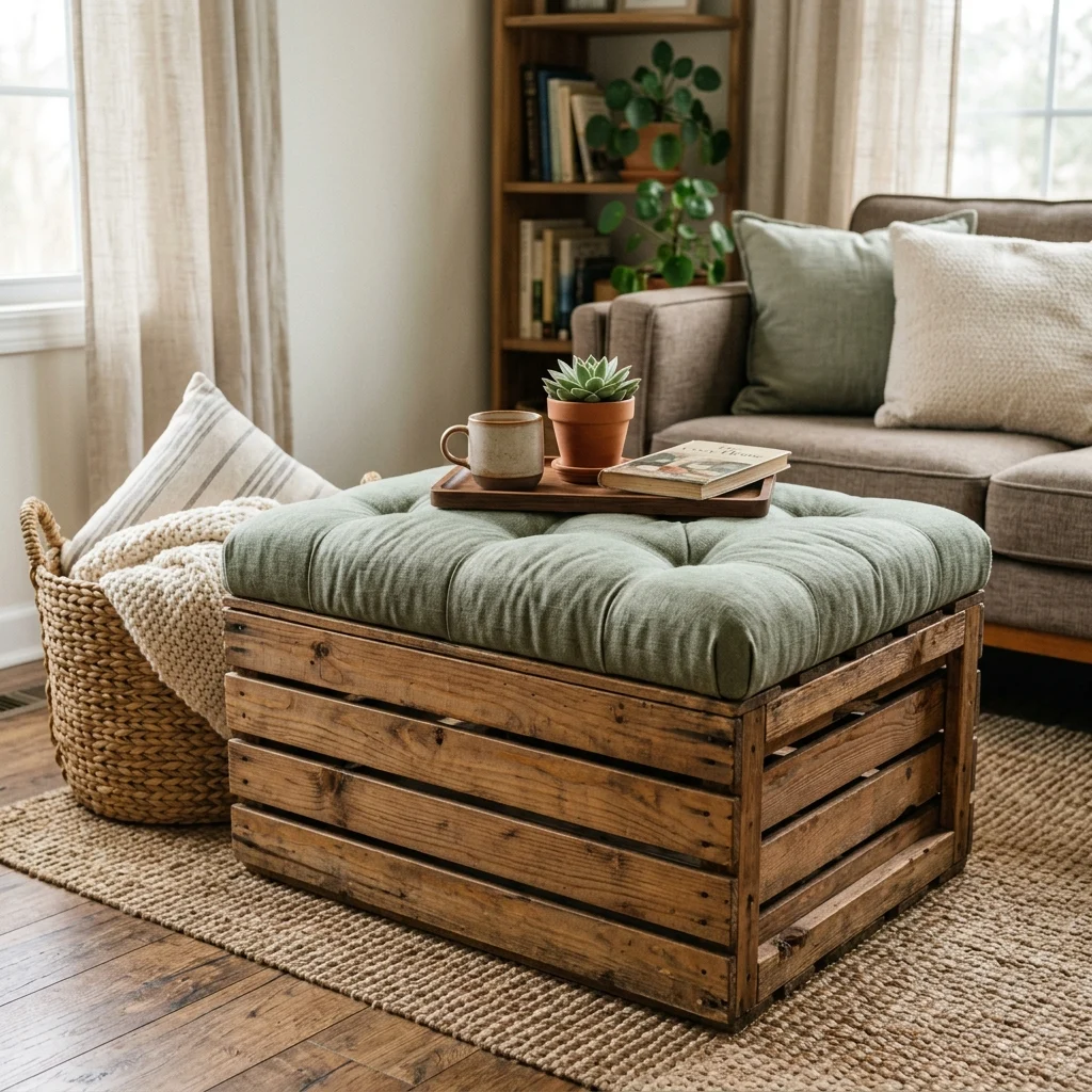
What is the difference between a home makeover and a full renovation?

A home makeover typically refers to cosmetic and functional updates, such as paint, lighting, furniture, and hardware completed without altering a room’s structure, plumbing, or electrical layout, while a full renovation involves structural changes like moving walls, reconfiguring plumbing, or replacing built-in elements like cabinetry and flooring entirely. A makeover generally costs a fraction of a renovation and can be completed in weeks rather than months, which is why most homeowners start with a makeover before considering structural renovation.

What colors work best for a home makeover?

Warm white and greige remain the most reliable whole-home base colors for a makeover, since they create the cohesive color story that ties multiple rooms together while still allowing individual rooms to carry a bolder accent wall or cabinetry color like terracotta or sage green. Choosing one consistent trim color alongside the wall base, typically a crisp semi-gloss white, is what makes a room-by-room makeover eventually read as one cohesive whole-home transformation rather than several disconnected updates.

How much does a typical home makeover cost?

A single-room cosmetic makeover using paint, lighting, and hardware updates typically costs $300–$800, while adding one hero furniture piece brings a fuller room transformation to $1,500–$4,000. A whole-home cosmetic makeover spanning several rooms, completed gradually over two to four months, generally falls between $3,000 and $10,000, substantially less than a comparable structural renovation, which can run $15,000–$50,000 or more depending on scope.

Can a home makeover work in a rental apartment?

Yes, though with some limits, hardware swaps, lighting layering with plug-in fixtures, reupholstery, and textile refreshes all work fully in rentals, while cabinet repainting and accent walls require landlord approval in most lease agreements. Peel-and-stick countertop and backsplash products specifically exist to give renters a renovation-style visual update that removes cleanly, making them one of the few “structural-feeling” makeover moves available without ownership.

What is the single most impactful element to update first in a home makeover?

Lighting consistently delivers the most disproportionate impact relative to its cost, since replacing a single dated overhead fixture and adding one or two additional warm-toned light sources changes how every other material and color in the room actually reads, often more dramatically than a full furniture replacement would. This is why most professional makeovers, whether for a home renovation show or a real estate staging project, address lighting before furniture rather than after.

Ready to Start Your Dream Home Makeover?
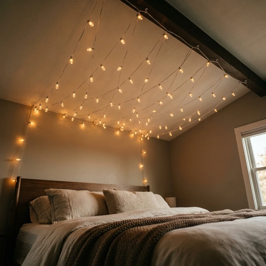
These 15 home makeover ideas span color, material, lighting, furniture, and layout, from a whole-home paint story and a full lighting overhaul to reupholstering a well-built old chair and finally reworking furniture zones once everything else is in place, so there’s a genuinely strategic starting point here, whether you’re tackling one room or your entire home. You don’t need to do everything at once, and sequencing the work properly paint and lighting first, hero furniture second, textiles last, is not a slower path to transformation; it’s the actual order that keeps every dollar spent from being undercut by what comes after it. Today’s specific action: walk through your main living space and identify the single most outdated light fixture in it, then plan its replacement as your makeover’s true starting point. Once the paint and light are right, everything layered on top of them will finally read the way it was always meant to, and the room will feel like the one you’d been picturing rather than a collection of good intentions. Save the ideas that match your own home’s biggest opportunity today, that hero sofa, that accent wall, because in a real home makeover, the reveal only feels earned when the sequence was right from the start.

You Might Also Like

10 Stylish Shelf Decor Ideas for Every Room

10 Stylish Shelf Decor Ideas for Every Room

Stylish shelf decor is the practice of arranging objects, plants, and accessories on open shelving with real design intent, so a functional surface reads as a curated display instead of accidental clutter. This guide walks through 10 stexactly ylish shelf decor ideas, one for a different room of the house, so you can style a shelf wherever you actually have one β€” whether that’s a single floating ledge above a sofa or a full wall of built-ins in a home office.

There’s a specific calm that comes from a shelf someone clearly thought about β€” heights that rise and fall on purpose, gaps left on purpose, objects that feel chosen rather than accumulated over years of not deciding. It’s warm without being busy, personal without being messy, the visual equivalent of a room that already knows what it wants to say. A shelf like this doesn’t shout for attention; it rewards a second look, the way a good bookshelf reveals a little more about its owner each time you glance at it.

Here are 10 ideas worth saving β€” and stealing.

Why Stylish Shelf Decor Works So Well

Shelf styling as a design habit traces back to the Wunderkammer, the 16th and 17th century “cabinet of curiosities” where European collectors displayed natural specimens, art, and scientific instruments together on open shelving to show off both taste and curiosity. Mid-century modernism carried that same instinct forward into ordinary homes, pairing sculptural ceramics with everyday books on low sideboards and wall-mounted units. Japandi and Scandinavian interiors today simply pare the same idea down to its quietest form β€” a shelf as a small, edited statement rather than overflow storage for whatever didn’t fit in a closet.

The materials repeat across well-styled shelves, and they’re specific enough to shop from directly: matte and glazed ceramics in warm white, sage green, and terracotta; unfinished oak, walnut, and rattan for warmth and texture; brass or matte black hardware for contrast against those warmer tones; and dried or living botanicals β€” trailing pothos, dried pampas grass, a single eucalyptus stem β€” for the organic irregularity that keeps a shelf from feeling too rigid. Color stays mostly neutral and warm, with one deliberate accent tone, like forest green or deep charcoal, doing the heavy lifting rather than several competing colors fighting for attention.

This approach is having a real moment, and the reason is practical rather than purely aesthetic: shelf styling is nearly free. It doesn’t require a renovation budget, a contractor, or even a full weekend β€” just an afternoon and objects you likely already own, rearranged with more intention than before. That low barrier to entry is exactly why it dominates home-inspiration searches on Pinterest and Google alike; it’s the highest-leverage decorating move available to anyone working with a fixed space, a fixed budget, and the desire to see a visible difference by dinnertime.

Small rooms benefit the most from this approach, since shelving is often the only vertical display surface available where floor space is already fully spoken for by a bed, a desk, or a dining table. A single well-edited floating shelf in a narrow hallway, a small bathroom, or a cramped studio apartment does more visual work per square foot than almost any other change you can make, and it does it without blocking a single walking path.

Style at a Glance

ElementTrait 1Trait 2
PhilosophyCurated display over storageIntentional over abundant
MaterialsCeramic, oak, rattanBrass, linen, dried botanicals
Color paletteWarm white, sage, terracottaWalnut brown, matte black

10 Stylish Shelf Decor Ideas for Every Room

1. Living Room Shelf Decor: The Rule-of-Three Ceramic Groupin

Vibe: Serene, the kind of arrangement that makes the wall around it look considered rather than incidental.

Why it works: Odd-numbered groupings read as dynamic rather than static because the eye can’t resolve them into a perfectly symmetrical pair, so it keeps moving across the arrangement instead of settling flatly on one point. Placing three vessels at distinctly different heights creates a triangular silhouette that pulls attention both upward and across the shelf, which is a far more active composition than a matched set lined up in a row.

How to get it: Set the tallest vessel toward the back and slightly off-center, the medium one in front and to one side, and the smallest pulled forward at the opposite end, using the shelf’s front-to-back depth instead of lining all three along the flat back edge like a mantelpiece display.

Common mistake to avoid: Buying three vessels in the exact same shape and finish defeats the purpose β€” the grouping needs variation in height and silhouette, not just quantity, or it reads as a matched set rather than a curated collection.

πŸ’‘ Quick Win: Three secondhand ceramic pieces in a shared matte finish but different heights, found for $5–$12 total, create an instantly curated grouping with zero new purchases needed.

Shop The Look

ProductWhy It Fits
Tall matte white ceramic vase minimalistAnchors the back of the grouping as the tallest silhouette
Sage green ceramic bowl medium matte glazeAdds the mid-height point and a soft accent color
Small terracotta bud vase handmade shapeCompletes the triangle as the smallest, forward-pulled piece
Floating oak wall shelf natural finishGives the grouping enough depth to stagger front-to-back
Dried eucalyptus stem bunch naturalSoftens the ceramic edges with an organic, irregular line

2. Kitchen: Color-Blocked Open Shelving with Labeled Jars

2. Kitchen Color-Blocked Open Shelving with Labeled Jars

Vibe: Warm, the kind of kitchen shelf that looks designed rather than merely stocked with whatever was on sale.

Why it works: Grouping kitchen jars and canisters by color family rather than by pure function turns a purely practical shelf into a large-scale color field, the same visual logic that makes color-blocked textiles or paint schemes feel intentional instead of random. A kitchen shelf sorted by color also happens to be genuinely faster to use, since the eye can scan for a tone instead of reading every label.

How to get it: Sort dry-goods jars and canisters into two or three tonal groups β€” cream and sand, then terracotta and rust β€” and cluster each group together rather than alternating colors across the shelf, using a chalk pen directly on ceramic for labels instead of adhesive stickers that peel and yellow in a kitchen environment within a few months.

Common mistake to avoid: Mixing more than three color families on one shelf run undoes the effect entirely β€” pick two or three tones maximum and resist adding a fourth accent color even if you own it.

Shop The Look

ProductWhy It Fits
Ceramic kitchen canister set cream matteForms the base of the cream-and-sand color group
Glass storage jar set with wood lidsAdds a second material texture without breaking the palette
Chalk paint marker fine tip ceramicKeeps labels legible and rewriteable without peeling adhesive
Small potted basil plant terracotta potIntroduces the warm terracotta accent tone
Linen kitchen tea towel set foldedEchoes the cream tone as a soft textile layer

3. Bathroom: Woven Texture and Apothecary Jars

3. Bathroom: Woven Texture and Apothecary Jars

Vibe: Calm, the specific stillness of a surface where every object clearly belongs and nothing feels like overflow.

Why it works: Woven rattan against smooth tile or painted drywall creates textural contrast that keeps a minimal bathroom from reading as cold or clinical, while clear glass jars turn everyday consumables like cotton rounds or bath salts into intentional display rather than visual clutter behind a mirror.

How to get it: Decant loose bathroom items into two or three clear glass apothecary jars of varying height, add one woven rattan basket for softness and texture, and cap the total object count at five or six β€” bathroom shelves tip from calm to cluttered surprisingly fast past that point, especially in a room with limited natural light.

Common mistake to avoid: Leaving product labels visible through clear glass jars breaks the calm effect instantly β€” decant fully, or choose frosted rather than fully transparent glass if you’d rather skip that step.

πŸ’‘ Quick Win: A set of three glass apothecary jars under $18 turns a messy bathroom counter shelf into a styled vignette in under ten minutes.

Shop The Look

ProductWhy It Fits
Clear glass apothecary jar set 3 sizesHolds decanted essentials in varying heights for visual rhythm
Woven rattan storage basket smallAdds the textural contrast against smooth tile surfaces
White cotton hand towel rolled setFills negative space with soft, uniform texture
Ceramic soap dish matte whiteGrounds the display with one purely functional piece
Dried eucalyptus sprig small bunchIntroduces organic softness without needing water upkeep

4. Bedroom Shelf Decor: LED-Lit Floating Nightstand

4. Bedroom Shelf Decor LED-Lit Floating Nightstand

Vibe: Intimate, a nightstand replacement that takes up zero floor space and looks calmer than most bedside tables ever manage to.

Why it works: A warm 2700K LED strip tucked beneath the shelf’s front edge draws the eye upward at night without a harsh overhead source flooding the room, while the shelf’s narrower depth than a typical nightstand forces a strict object limit that suits a genuinely restful bedroom better than a cluttered surface piled with chargers and half-read magazines.

How to get it: Mount the shelf at mattress-top height plus roughly 10 inches, install a warm white LED strip along the hidden underside front edge so the light source itself stays out of view, and restrict the surface to four objects maximum β€” one light source, one book, one water vessel, one small plant.

Common mistake to avoid: Choosing a cool-toned LED strip above 3000K undoes the calming effect entirely β€” bedroom lighting should stay firmly in the warm 2700K range regardless of how bright the rest of the home’s lighting runs.

Shop The Look

ProductWhy It Fits
Floating walnut wall shelf 24 inchSized to replace a nightstand without crowding the bed
Warm white 2700K LED strip battery poweredProvides the hidden underglow without a harsh overhead fixture
Small ceramic candle holder matte whiteAdds a second warm light source for evening ambiance
Glass water carafe bedside smallCovers the practical need within the four-object limit
Trailing string of pearls small potSoftens the walnut edge with a low-maintenance trailing plant

5. Home Office: Negative-Space Furniture Arrangement
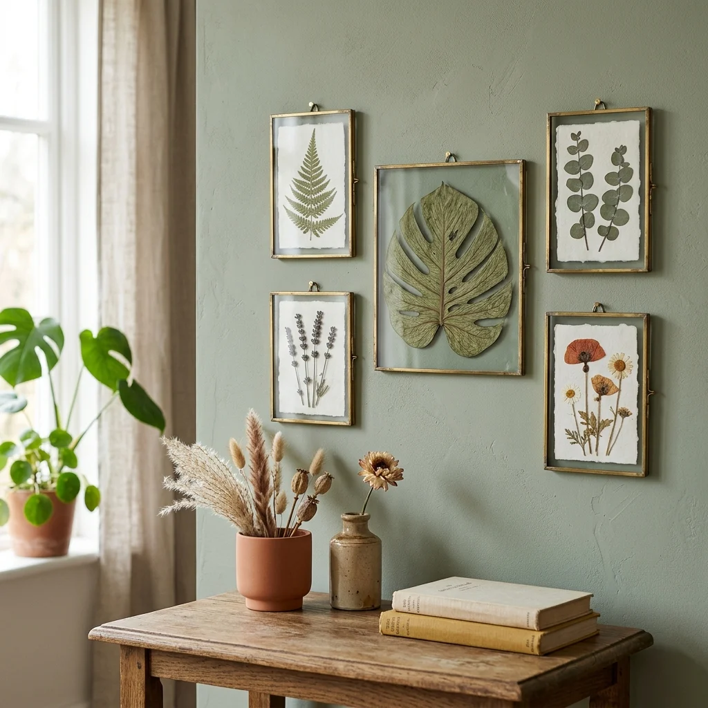
5. Home Office Negative-Space Furniture Arrangement
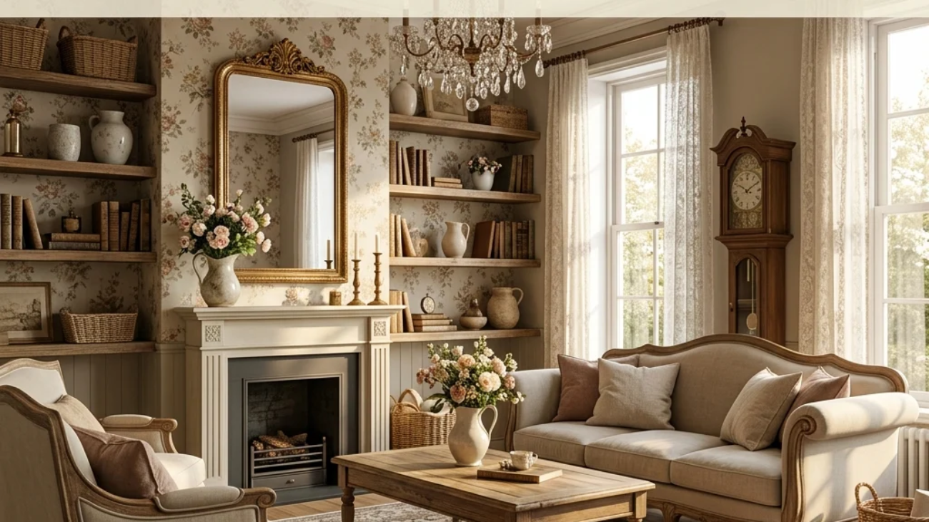
Vibe: Focused, the kind of shelf that gives a busy desk somewhere for the eyes to rest between tasks.

Why it works: In a workspace, an overcrowded shelf competes with the desk itself for visual attention and quietly adds cognitive noise throughout a workday; wide gaps between a small number of objects reduce that noise by giving each item enough visual weight to register on its own instead of blurring together into background clutter.

How to get it: Limit the shelf directly above a desk to three objects total, spaced at least six inches apart, and route any additional storage need to closed boxes on a separate shelf rather than adding more open display pieces to the same surface.
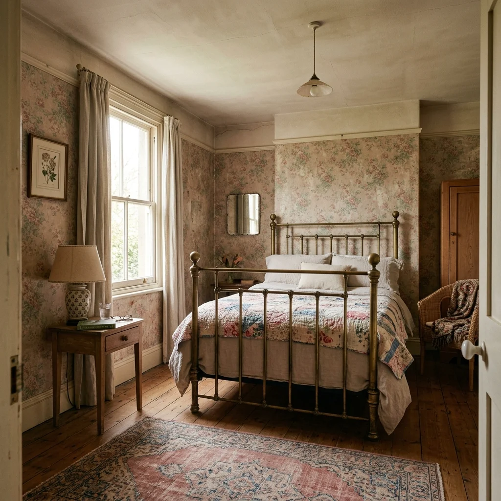
Common mistake to avoid: Using open shelving as the only storage in a home office backfires quickly β€” cables, paperwork, and supplies need a closed home, or the “negative space” concept collapses within a week of real use.
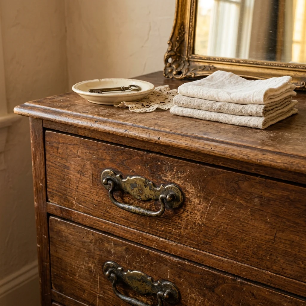
πŸ’‘ Quick Win: Removing a third of what’s currently on a home office shelf, with no new purchases at all, is usually the fastest visible improvement available in any workspace.

Shop The Look

ProductWhy It Fits
Walnut wood floating shelf 36 inchWide enough for three well-spaced objects above a desk
Small abstract ceramic sculpture neutralServes as the single decorative focal point
Potted snake plant matte ceramic potAdds one living element without demanding daily care
Two matching hardcover books cream coverFills the third slot without introducing extra colors
White storage box set with lidsMoves clutter off the open shelf and out of sight

6. Entryway: The Command-Center Shelf

6. Entryway The Command-Center Shelf

Vibe: Welcoming, the calm of arriving home to a space that already has a place for what you’re carrying.

Why it works: Placing a key dish at the front edge removes the small daily friction of searching for keys, and a small mirror propped at the back of the shelf reflects light from the entry door, making a typically dim hallway feel noticeably brighter without adding a single new light fixture.

How to get it: Mount the shelf around shoulder height, install coat hooks just below it, and keep purely decorative objects to two β€” a plant and one other piece β€” so the rest of the surface stays functional enough to actually use every day without feeling precious.

Common mistake to avoid: Styling an entryway shelf purely for looks, with no functional catch-all for keys or mail, guarantees the surface fills up with random daily clutter within a week regardless of how it started.

Shop The Look

ProductWhy It Fits
Ceramic key dish small round matteGives keys a fixed home right at the front edge
Small framed round mirror simpleBounces entry light deeper into the hallway
Matte black wall hook set of 4Handles coats and bags below the shelf itself
Floating oak shelf 30 inch entrywaySized for daily use without overwhelming a narrow hall
Woven basket small lidded charging stationHides cables while keeping devices within reach

7. Dining Room Shelf Decor: Tonal Sideboard Display

7. Dining Room Shelf Decor Tonal Sideboard Display

Vibe: Warm, a display that celebrates the table even when no meal is currently in progress.

Why it works: Restricting a sideboard shelf to one tonal family removes color contrast so texture carries the visual interest instead, while two candlesticks of noticeably different heights introduce just enough asymmetry to keep the whole display from feeling stiffly formal or like a hotel lobby arrangement.

How to get it: Stand a matching dinnerware set upright in a wood plate rack as the back anchor, place a wide ceramic bowl in front as the central piece, and add two candlesticks of clearly different heights on either side rather than a matched pair pulled straight from a box set.

Common mistake to avoid: Using an exactly matched candlestick pair, rather than two different heights, is the single most common reason a sideboard display reads as generic rather than styled.

πŸ’‘ Quick Win: One wide ceramic bowl and a pair of mismatched candlesticks, both under $15 each, can carry an entire sideboard shelf on their own with nothing else needed.

Shop The Look

ProductWhy It Fits
Wooden plate display rack standingAnchors the display with upright, visible dinnerware
Wide ceramic serving bowl cream matteServes as the central, largest piece of the grouping
Taper candlestick pair unequal heightsIntroduces asymmetry that keeps the tonal palette lively
Small framed still life printAdds a quiet background layer behind the objects
Fresh herb sprig small ceramic jugBrings one living, changeable element to the display

8. Kids’ Room: Low Montessori Face-Forward Shelf

8. Kids' Room Low Montessori Face-Forward Shelf

Vibe: Inviting, a small shelf scaled exactly to curious hands and a child’s own height.

Why it works: Pre-readers choose books by cover, not spine, so displaying titles face-forward on a ledge shelf makes independent selection genuinely possible in a way spine-out shelving never does, and keeping the total object count low prevents the sensory overload that dense toy storage tends to create in a small room.

How to get it: Mount the shelf roughly 12 to 16 inches from the floor, use a narrow ledge for face-forward books, and limit the shelf to one full activity set per category β€” one puzzle, one block set β€” rather than scattering partial sets across the surface where nothing feels complete.

Common mistake to avoid: Mounting a children’s shelf at adult eye level defeats its entire purpose β€” the whole point is independence, which only works if a child can actually reach and see everything without help.

πŸ’‘ Quick Win: Rotating just a few toys onto the shelf monthly, and storing the rest in a closet bin, keeps a child’s shelf feeling new without adding a single new purchase.

Shop The Look

ProductWhy It Fits
Low natural wood bookshelf children’sSized and mounted for genuine child-height access
Face-forward book ledge shelf natural woodLets pre-readers choose titles by cover art
Small woven basket set child-safeCorrals loose pieces without hard edges or small parts
Wooden toy figure set natural finishFills one complete activity category on the shelf
Small child-safe succulent ceramic potAdds a living element that’s safe within reach

9. Living Room: Mixed Wood-and-Metal Ladder Shelf

9. Living Room Mixed Wood-and-Metal Ladder Shelf

Vibe: Layered, the kind of shelf that looks collected over years rather than bought in a single trip.

Why it works: Pairing a warm raw material like oak with a cool material like matte black steel creates textural contrast that keeps a single freestanding piece from reading as flat or one-note, and a heavier object anchoring the bottom shelf keeps the whole arrangement visually grounded rather than top-heavy.

How to get it: Choose a ladder shelf with a matte black powder-coated steel frame and solid oak boards, and place one noticeably heavier object β€” a woven basket or a stack of large books β€” on the bottom shelf so the piece reads as stable rather than precarious against a wall.

Common mistake to avoid: Leaving the bottom shelf empty or styled with the lightest objects makes a ladder shelf look unstable even when it’s structurally fine β€” visual weight should increase, not decrease, toward the floor.

Shop The Look

ProductWhy It Fits
Black metal and oak ladder bookshelfProvides the core wood-and-metal material contrast
Woven seagrass storage basket with handlesAnchors the bottom shelf with real visual weight
Matte black hardware spray paintLets existing shelf brackets match the frame finish
Small potted fern ceramic potAdds a soft, living counterpoint to the metal frame
Hardcover book set neutral coversFills upper shelves without introducing extra color

10. Small-Space Shelf Decor: Vertical Corner Shelving

10. Small-Space Shelf Decor Vertical Corner Shelving

Vibe: Efficient, the kind of corner that used to feel wasted and now feels genuinely planned.

Why it works: Stacking narrow shelves vertically in an unused corner adds display and storage area without consuming any floor footprint, which is the core small-space illusion technique height compensates for width you simply don’t have in a tight apartment or narrow hallway.

How to get it: Use shelves no deeper than 6 inches, mount three or four of them vertically spaced 10 to 12 inches apart in the corner, and keep every object slim enough that nothing protrudes into the walking path beside it.

Common mistake to avoid: Using standard 10-to-12-inch-deep shelving in a tight corner instead of a slim 6-inch profile turns a space-saving idea into a walking hazard, especially in a narrow hallway with regular foot traffic.

πŸ’‘ Quick Win: One narrow 6-inch shelf in an awkward corner nook can hold a bud vase and two books for a fast styling win under $25.

Shop The Look

ProductWhy It Fits
Narrow 6-inch deep floating oak shelfKeeps the corner passable while adding display space
Small ceramic bud vase setFits the shallow depth without protruding
Thin hardcover book set neutral spinesAdds height variation within a slim footprint
Small brass tabletop photo framePersonalizes the corner without taking up depth
Corner wall anchor mounting kitSecures stacked shelves safely in a tight space

How to Start Your Shelf Decor Transformation

Start by completely clearing one shelf β€” the one that frustrates you most every time you walk past it β€” before buying anything new. Most homes already own enough interesting objects to style a shelf well; those objects are simply buried under whatever accumulated there by accident over months or years, and removing everything first is what actually lets you see what you have to work with, rather than styling around clutter that should have been put away already.

The most common mistake across every room is lining objects up at the same height along the back edge of a shelf, which produces a flat, one-dimensional row with no visual movement for the eye to follow. Fix it with the three-height rule used throughout this guide: always include one tall, one medium, and one low element on any given shelf section, and use the shelf’s front-to-back depth rather than just its width, pulling some objects forward and pushing others back.

Three items under $50 that create real impact in almost any room: a bundle of dried eucalyptus stems, typically around $10, for instant organic texture that never needs water; a set of three varying-height glass apothecary jars, around $15, that work equally well in a bathroom, kitchen, or home office; and a single framed art print in a plain wood frame, around $20, that establishes a background layer for any shelf vignette without committing to a permanent gallery wall.

A single shelf refresh using only what you already own takes 20 to 40 minutes and costs nothing beyond that time. Adding two or three new pieces to complement what you have runs roughly $20 to $60 and noticeably lifts an entire room’s feel. A full multi-shelf project spanning two or three rooms, including new hardware or under-shelf lighting, is realistically a full weekend of work and somewhere between $80 and $200 depending on how many shelves you’re adding rather than simply restyling.

Frequently Asked Questions About Stylish Shelf Decor

What is the rule of three in shelf decorating and why does it work?

The rule of three groups objects in odd numbers because the eye can’t resolve an odd-numbered group into an exactly symmetrical pair, which creates just enough visual tension to hold attention rather than resolving instantly. Three objects at graduated heights form a triangular silhouette that gives the eye a clear path to follow across the shelf instead of scanning it as one flat block. This principle scales beyond a single grouping too β€” three shelves in a bathroom ladder arrangement or three color zones on a long bookcase apply the same underlying logic as three objects on one surface.

What colors work best for shelf styling in a small apartment?

Warm white, sand, and sage green form a flexible base palette that reads calm without feeling cold or sterile, and terracotta or warm charcoal works well as a single accent tone rather than a dominant color across every shelf. Sticking to one accent color per shelf, instead of introducing three or four competing tones, keeps a small space from feeling visually busy on top of already being physically tight. Cool grays and stark whites tend to clash with the warm materials, like oak and brass, that anchor most shelf styling.

How much does it cost to style shelves across a whole home?

A single shelf refresh using entirely existing objects costs nothing beyond the time it takes. Adding a handful of new pieces per shelf typically runs $20 to $60 per shelf once you include a jar, a plant, and a small decorative object. A full-home project touching five or six shelves across multiple rooms, including new hardware, lighting, and a mix of new and existing accessories, realistically falls between $150 and $400 depending on how much you already own versus what genuinely needs to be purchased new.

Do shelves work in small rooms like a bathroom or hallway, or do they make the space feel smaller?

Shelves generally help small rooms rather than hurt them, since they add display and storage capacity without using any floor space that a small room can’t spare. The key constraint is object count rather than the shelf itself a small bathroom or hallway shelf should carry no more than five or six items total, and deliberately leaving 20 to 30 percent of the surface visibly empty keeps the room feeling open rather than cramped, which matters more in a small space than in a larger one.

How many objects should go on one shelf?

Object count should scale directly with shelf width rather than following one fixed rule for every surface. A shelf around 24 inches wide, like a bedroom nightstand shelf, works best with three or four objects total. A shelf around 36 to 48 inches, typical in a living room or home office, comfortably holds five to seven objects without feeling sparse or crowded. A full-width bookcase shelf can carry eight to twelve items including books, as long as roughly a quarter of the total surface stays visibly empty to keep the density from tipping into clutter.

Ready to Create Your Dream Shelf Decor?

These 10 ideas move across nearly every room in the house living room ceramics, kitchen color-blocking, bathroom texture, bedroom lighting, and a small-space corner solution among them so there’s a genuine starting point no matter which room needs it most right now. You don’t have to tackle every shelf in the house this weekend; picking just one and doing it properly is the right way to begin, and it’s exactly how most well-styled homes actually got that way, one shelf at a time rather than all at once.

Today, clear the one shelf that’s been bothering you, set a 30-minute timer, and put back only what you’d genuinely choose to display if you were starting from nothing. Once it’s done, that shelf will stop looking like leftover storage and start feeling like a small, considered part of the room you actually notice every time you walk past it. Save whichever idea matched your space, especially if it’s the entryway command center or the kids’ room face-forward shelf they tend to change how a room feels the fastest of everything on this list.

You Might Also Like

20 DIY Home Decor Ideas You Can Actually Make Yourself

20 DIY Home Decor Ideas You Can Actually Make Yourself

DIY home decor is the practice of designing, building, or transforming decor pieces yourself using affordable materials and basic tools, rather than buying everything finished off a shelf. This article gives you 20 real, buildable DIY home decor ideas spanning color, material, lighting, furniture, and layout, each one a project you can start this weekend with supplies from a hardware store or Amazon cart.

The feel is unmistakable: paint-stained hands, the specific satisfaction of a shelf you leveled and mounted yourself, a room that carries your actual choices instead of a showroom’s. DIY decorating rewards patience and a little mess in exchange for something no catalog page can offer: a home genuinely made by the person living in it. Here are 20 ideas worth saving and stealing.

Why DIY Home Decor Works So Well

DIY home decor traces back further than Pinterest boards; it draws on the Arts and Crafts movement of the late 1800s, which prized handmade objects over factory-made ones, and the “make do and mend” resourcefulness of the WWII home front, where materials shortages forced households to repurpose what they already had. What makes it distinct from any single design style is that it’s a method, not an aesthetic. A DIY project can be rustic, modern, or maximalist, depending entirely on the materials and colors you choose, which is why it works inside almost any existing room.

The materials that show up most across DIY projects are ones that are forgiving and widely available: reclaimed or unfinished pine and birch plywood, canvas drop cloth, cotton macrame cord, air-dry or quick-set concrete mix, and craft paints like DecoArt or Rust-Oleum’s chalk and spray finishes. Colors tend to follow whatever the room already leans toward, though warm neutral, such as greige, warm white, and terracotta, paired with one confident DIY accent color, are the most common combination, since a single bold hue is easier to control in a hand-painted project than a full palette.

DIY home decor has surged specifically because two pressures are hitting households at once: rising furniture costs are pushing people toward making rather than buying, and short-form video tutorials on TikTok and Pinterest have made techniques that once required a class, such as reupholstery, concrete casting, and macrame knotting, learnable in a ten-minute watch. Search interest in “DIY home decor” has climbed steadily on Pinterest for exactly this reason: it’s now genuinely easier to learn the skill than it was even five years ago.

Style at a Glance

ElementNo-Tool & No-Sew ProjectsBasic-Tool Builder Projects
PhilosophyFast, low-risk, fully reversibleCustom-built, requires drill or saw
MaterialsPaint, fabric remnants, rope, adhesiveReclaimed wood, plywood, and concrete mix
Color PaletteWarm white, terracotta, sage accentNatural wood tone, matte black, greige

20 DIY Home Decor Ideas

1. DIY Color-Blocked Accent Wall With Painter’s Tape

1. DIY Color-Blocked Accent Wall With Painter's Tape

Vibe: The wall feels playful, one confident shape doing all the work.

Why it works: Color blocking uses a single geometric shape, an arch, a rectangle, a soft-edged circle, painted directly onto an existing wall color, which creates a bold focal point without the commitment or cost of painting an entire wall or room. The crisp edge line, achieved with painter’s tape, is what separates a professional-looking result from a smudged one, since the taped boundary is doing the precision work a freehand brush never could.

How to get it: Sketch your shape lightly in pencil first, apply painter’s tape (Frog Tape holds the cleanest line) along the outline, and press the tape edge firmly with a plastic scraper before painting to prevent bleed-through underneath it.

πŸ’‘ Quick Win: A simple arch shape, roughly headboard-width and starting at the floor, is the easiest color-blocking form for a first attempt, with no complex angles to tape.

Shop the Look

Product
Frog tape painter’s tape, sharp edge
Terracotta interior sample paint
Angled paintbrush set
Plastic putty scraper
Drop cloth canvas sheet

2. DIY Reclaimed Wood Floating Shelves

2. DIY Reclaimed Wood Floating Shelves

Vibe: The shelves feel handmade, wood grain telling you exactly where they came from.

Why it works: Floating shelves rely on a hidden internal bracket system rather than visible supports, which is what gives them their signature “floating” look. The wood plank simply slides over a steel rod anchored into wall studs. Using reclaimed or salvaged wood instead of new pine adds visible grain, saw marks, and color variation that a uniform store-bought shelf can’t offer, turning a functional storage piece into a genuine handmade object.

How to get it: Locate wall studs with a stud finder before mounting the bracket rod, since floating shelves rely entirely on stud anchoring for weight support. Mounting into drywall alone will fail under any real load.

Shop the Look

Product
Hidden floating shelf bracket kit
Reclaimed wood plank, unfinished
Stud finder tool
Wood conditioner and sealant
Ceramic kitchen bowl set

3. DIY Painted Mason Jar Pendant Lights

3. DIY Painted Mason Jar Pendant Lights

Vibe: The island feels warm, glass jars glowing like something from a farmhouse kitchen.

Why it works: Converting mason jars into pendant lights uses an inexpensive pendant light conversion kit, a socket, and a cord that threads through a hole drilled in the jar’s metal lid, which means the fixture cost is a fraction of a store-bought glass pendant while keeping the same warm, diffused glow that glass shades produce. Painting the exterior metal lid matte black before assembly, rather than leaving it raw, gives the finished fixture a more intentional, less craft-fair look.

How to get it: Drill the lid hole with a step-bit drill attachment sized to your cord kit before painting, then thread the pendant cord through, screw in a warm-toned bulb, and hang using the kit’s provided ceiling canopy.

πŸ’‘ Quick Win: Buy a pendant light conversion kit that already includes the drilled lid template, which removes the trickiest step for first-time DIYers.

Shop the Look

Product
Mason jar pendant light conversion kit
Wide-mouth glass mason jars, set of three
Matte black spray paint, metal-safe
Warm white Edison-style bulb set
Step-bit drill attachment

4. DIY Pallet Wood Coffee Table

4. DIY Pallet Wood Coffee Table

Vibe: The table feels rustic, built rather than bought.

Why it works: A pallet-wood coffee table works because pallet slats are already cut to a consistent, workable width and thickness, meaning the build is largely assembly and finishing rather than complex cutting, sanding the rough surface smooth, staining it evenly, and attaching hairpin legs to a plywood-backed frame. The visible plank seams and grain variation are what read as handmade rather than mass-produced, so sanding too aggressively actually works against the intended look.

How to get it: Sand only enough to remove splinters and rough texture, not the wood’s natural grain pattern, then apply a walnut or English oak wood stain in two thin coats rather than one heavy one for the most even color absorption.

Shop the Look

Product
Hairpin table leg set, four-pack
Walnut wood stain, oil-based
Orbital sander with fine-grit pads
Wood glue, exterior-grade
Woven storage basket, low profile

5. DIY Gallery Wall With Free Printable Art

5. DIY Gallery Wall With Free Printable Art

Vibe: The wall feels personal, curated without a single item purchased, ready-framed.

Why it works: Printable, high-resolution files downloaded and printed at home or at a local print shop removes the single biggest cost barrier to a gallery wall, since framed original art can run hundreds of dollars per piece while a printable download costs a few dollars and can be reprinted at any size. Using matching frame styles across varied print subjects is the technique that keeps a free-source gallery wall from looking mismatched, since consistent framing does the visual unifying work that the art itself doesn’t.

How to get it: Choose one frame color and finish (thin black or natural wood) across every piece, and lay the arrangement out on the floor first using painter’s tape as a placement guide before committing to any wall holes.

πŸ’‘ Quick Win: Local print shops can output a high-resolution digital file on quality matte paper for just a few dollars per print, often same-day.

Shop the Look

Product
Thin black picture frame set, mixed sizes
Botanical printable art bundle
Abstract line art printable set
Painter’s tape for layout planning
Small console table

6. DIY Ombre Dip-Dyed Curtains

6. DIY Ombre Dip-Dyed Curtains

Vibe: The curtains feel soft, color fading like watercolor down the fabric.

Why it works: Dip-dyeing works by submerging only the bottom portion of a fabric panel into dye and gradually lifting it out, which creates a soft gradient because the fabric fibers absorb less dye the longer they’ve been out of the bath, a controlled version of the same principle behind natural fabric fading. Natural fiber fabrics like linen or cotton take dye far more evenly than synthetic blends, which is why sourcing the correct base curtain material matters more in this project than the dyeing technique itself.

How to get it: Use 100% cotton or linen curtain panels (synthetic blends resist dye and produce blotchy results), submerge the bottom third in fabric dye for two minutes, then dip progressively shorter intervals moving upward to build the gradient before rinsing thoroughly.

Shop the Look

Product
Natural linen curtain panel, undyed
Fabric dye, sage green
Rubber dyeing gloves
Large plastic dye basin
Woven wood curtain rod

7. DIY Macrame Wall Hanging

7. DIY Macrame Wall Hanging

Vibe: The wall feels textured, knots catching light and shadow across the cord.

Why it works: Macrame uses only knotting, no glue, sewing, or tools beyond scissors to build a three-dimensional textile piece entirely from repeated pattern, which is why it’s remained one of the most accessible DIY crafts since its 1970s popularity peak. The technique’s visual interest comes specifically from shadow: raised knots cast small shadows against the flat wall behind them, adding a texture layer no flat printed textile can replicate.

How to get it: Learn the two foundational knots, the square knot and the half hitch, since roughly 90% of beginner macrame patterns use only these two in repetition, and mount the finished piece on a natural wood dowel rather than a metal rod for a warmer, more cohesive look.

πŸ’‘ Quick Win: A simple fringe-style hanging using only overhand knots and cut cord ends is achievable in under an hour with zero prior macrame experience.

Shop the Look

Product
Natural cotton macrame cord, 4mm
Unfinished wood dowel, 12-inch
Macrame comb for fringe styling
Dried pampas grass stems
Wall-mount hooks for hanging

8. DIY Room Divider From Curtain Rods and Fabric

8. DIY Room Divider From Curtain Rods and Fabric

Vibe: The studio feels zoned, one fabric panel doing the job of a wall.

Why it works: A ceiling-mounted curtain track with a full-length fabric panel creates the same soft-zoning effect that built-in walls achieve, a defined boundary between two functions without any construction, drilling into load-bearing structures, or loss of security deposit in a rental. Because the fabric panel can be drawn back entirely, this divider also stays flexible in a way a fixed partition wall never could, opening the full room back up whenever needed.

How to get it: Mount a ceiling track (not a wall-to-wall tension rod, which sags under fabric weight over time) using anchors rated for your ceiling material, and choose a mid-weight linen rather than sheer voile if privacy is the goal rather than just visual separation.

Shop the Look

Product
Ceiling-mount curtain track, bendable
Mid-weight linen curtain panel, extra long
Ceiling anchor hardware kit
Curtain rings with clips
Artificial floor plant, tall

9. DIY Fold-Down Wall Desk for Tiny Rooms

9. DIY Fold-Down Wall Desk for Tiny Rooms

Vibe: The corner feels efficient, a full desk that disappears when it’s not needed.

Why it works: A fold-down desk uses a piano hinge, a single continuous hinge running the full width of the desktop mounted directly to a wall stud, paired with a folding support bracket beneath, which lets the desktop swing flush against the wall when not in use. This solves the specific small-space problem a standard desk can’t: reclaiming the floor footprint entirely rather than just minimizing it, since a folded desk occupies roughly four inches of wall depth instead of two feet of floor space.

How to get it: Mount the piano hinge into wall studs (not drywall anchors alone) since the desk needs to support real working weight when open, and choose a folding support bracket rated for at least 50 pounds for stability.

Shop the Look

Product
Piano hinge, full-length
Folding desk support bracket
Plywood desktop panel, pre-cut
Wall stud finder tool
Compact brass desk lamp

10. DIY Reupholstered Thrift Store Chair

10. DIY Reupholstered Thrift Store Chair

Vibe: The chair feels transformed, its old shape wearing an entirely new surface.

Why it works: Reupholstering a thrift-store chair with sound bones but dated or worn fabric replaces only the outer layer of fabric and often the foam padding while keeping the frame’s original joinery and structure intact, which is both cheaper and more sustainable than buying new furniture built to imitate the same silhouette. A staple gun mounted fabric, pulled taut and stapled underneath the seat frame where it’s hidden from view, is the core technique that separates a clean reupholstery job from a lumpy one.

How to get it: Remove the old fabric piece by piece and use each panel as a cutting template for the new fabric, pulling each new panel taut before stapling so wrinkles don’t set once the fabric is fully secured.

πŸ’‘ Quick Win: A simple drop-in seat cushion (common on dining chairs) can be reupholstered in under 30 minutes with just a staple gun and new fabric, no frame disassembly required.

Shop the Look

Product
Terracotta boucle upholstery fabric
Heavy-duty staple gun
Upholstery foam padding sheet
Fabric scissors, sharp
Flathead staple remover tool

11. DIY Rope-Wrapped Floor Lamp

11. DIY Rope-Wrapped Floor Lamp

Vibe: The lamp feels tactile, with texture wrapped from base to nearly the shade.

Why it works: Wrapping a plain metal or plastic lamp pole in natural jute or manila rope, secured with hot glue at intervals, disguises a builder-grade fixture entirely while adding genuine dimensional texture that a smooth pole never had. The same visual logic behind texture layering elsewhere in decorating is applied to a functional object most people otherwise overlook. Because the technique only alters the surface, it works on nearly any existing lamp base regardless of its original finish or condition.

How to get it: Apply hot glue in short sections rather than along the whole pole at once, wrapping the rope tightly and pressing each coil against the previous one before the glue sets, so there are no visible gaps in the finished wrap.

Shop the Look

Product
Natural jute rope, thick gauge
Hot glue gun with glue sticks
Linen drum lamp shade
Existing floor lamp base, any style
Warm white dimmable bulb

12. DIY Concrete Planters From Household Molds

12. DIY Concrete Planters From Household Molds

Vibe: The windowsill feels raw, concrete’s plain honesty next to green plant life.

Why it works: Casting concrete planters using ordinary household containers, a yogurt tub as the outer mold, and a smaller cup as the inner cavity turns quick-set concrete mix into custom-sized planters at a fraction of the cost of store-bought concrete pots, which typically carry a heavy material markup. The rough, slightly imperfect surface texture that comes from a DIY pour, including small air bubbles, is part of what reads as handmade rather than factory-cast, so over-sanding the cured piece removes the very quality that makes it interesting.

How to get it: Grease the inside of both molds with cooking oil before pouring so the cured concrete releases cleanly, and tap the filled mold gently on a table several times after pouring to release trapped air bubbles before it sets.

Shop the Look

Product
Quick-set concrete mix, small bag
Plastic mixing container
Small succulent plant set
Ceramic drainage saucer set
Concrete sealant spray

13. DIY No-Sew Throw Pillow Covers

13. DIY No-Sew Throw Pillow Covers

Vibe: The sofa feels cozy, texture layered without a single stitch.

Why it works: No-sew pillow covers use fabric glue or hem tape instead of a sewing machine to secure fabric edges, folding a single flat fabric piece around an existing pillow insert envelope-style so the seam sits hidden at the back. This makes the project accessible to anyone without sewing skills or equipment, while still producing a genuinely custom-fit cover rather than a generic store-bought size.

How to get it: Measure your pillow insert and cut fabric roughly two inches larger on all sides than needed, fold the raw edges under before gluing so no fraying edge is visible, and press each glued seam flat with a book or heavy object while it sets.

πŸ’‘ Quick Win: Fabric glue sets in under 30 minutes, making this genuinely a same-afternoon project from fabric store to finished sofa styling.

Shop the Look

Product
Oatmeal linen fabric, one yard
No-sew fabric glue
Pillow inserts, standard size
Fabric scissors
Fabric measuring tape

14. DIY Chalk Paint Furniture Makeover

14. DIY Chalk Paint Furniture Makeover

Vibe: The dresser feels refreshed, one color change carrying an entire piece.

Why it works: Chalk paint adheres directly to most furniture surfaces without sanding or priming first, which is what makes it the default choice for beginner furniture makeovers. The flat, matte finish also naturally shows brush strokes in a way that reads as intentional rather than sloppy, unlike glossier paints that highlight every imperfection. Lightly sanding just the edges and corners after the paint dries reveals a hint of the wood or original color beneath, mimicking natural wear without the unpredictability of genuine age.

How to get it: Clean the furniture surface thoroughly before painting (chalk paint’s main enemy is dust and grease, not lack of primer), apply two thin coats rather than one thick one, and finish with a clear wax topcoat to protect the matte surface from scuffing.

Shop the Look

Product
Sage green chalk paint, quart
Clear furniture wax topcoat
Chalk paint brush, natural bristle
Fine-grit sanding sponge
Brushed brass drawer pull set

15. DIY Under-Bed Storage Zone

15. DIY Under-Bed Storage Zone

Vibe: The room feels organized, storage hidden in the one zone most rooms waste.

Why it works: Under-bed space is functionally dead storage in most homes because it’s an awkward height and shape for standard shelving, but fitted rolling storage bins turn that same footprint into genuinely usable capacity this is a layout technique, not a purchase, since it requires first measuring your specific bed’s clearance and choosing bins sized to match rather than buying generic ones that either won’t fit or waste height.

How to get it: Measure the exact clearance under your bed frame before buying bins (most beds range from 7 to 14 inches), and choose matching woven or fabric bins with lids rather than open boxes, so the storage stays visually tidy even when the bed skirt is lifted.

Shop the Look

Product
Low-profile rolling storage bin set
Under-bed bed risers, adjustable
Woven fabric storage bin with lid
Label tag set for bins
Bed skirt, neutral linen

16. DIY Fabric-Wrapped Headboard

16. DIY Fabric-Wrapped Headboard

Vibe: The bed feels layered, upholstered softness anchoring the whole wall.

Why it works: A fabric-wrapped headboard, built from a plywood base layered with foam padding and batting before fabric is pulled taut and stapled at the back, delivers the same tufted, upholstered look as a designer headboard costing several times more, because the labor rather than the material is what typically drives headboard pricing. Channel tufting sewn foam ridges creating vertical padded columns adds visual texture without requiring the button-and-thread skill traditional diamond tufting demands.

How to get it: Build channels by sewing simple fabric-and-batting sleeves before wrapping the plywood base, stapling only the flat back panel where staples stay completely hidden once the headboard is mounted.

Shop the Look

Product
Plywood headboard base panel
Upholstery foam, high-density
Oatmeal linen upholstery fabric
Heavy-duty staple gun
Brass wall sconce pair

17. DIY Terracotta Pot Painting for a Cohesive Palette

17. DIY Terracotta Pot Painting for a Cohesive Palette

Vibe: The windowsill feels cohesive, mismatched pots pulled into one palette by paint alone.

Why it works: Plain terracotta pots, sold cheaply in nearly any size, become a coordinated collection once painted in a shared two- or three-color scheme, which solves the common problem of accumulating plant pots in mismatched sizes and finishes over time. Acrylic craft paint applied directly to unglazed terracotta absorbs into the porous clay surface rather than sitting on top of it, producing a matte, slightly weathered finish rather than a glossy painted look.

How to get it: Choose two or three colors maximum and assign each consistently to all large pots in sage, all small pots in cream, for instance, so the variety in pot size still reads as one considered collection rather than a random assortment.

πŸ’‘ Quick Win: A single coat of acrylic paint on unglazed terracotta dries within an hour, making a full windowsill of pots realistically finishable in one afternoon.

Shop the Look

Product
Unglazed terracotta pot set, mixed sizes
Acrylic craft paint, sage, and cream
Small foam paint roller
Clear matte sealant spray
Small trailing plant set

18. DIY Crate Storage Ottoman

18. DIY Crate Storage Ottoman

Vibe: The ottoman feels functional, with storage hiding under a genuinely comfortable seat.

Why it works: Building an ottoman from a wooden crate with a hinged, upholstered lid solves two problems in one object: extra seating and enclosed storage using a base structure that requires no complex joinery, since the crate itself already provides the box shape. Attaching the cushioned lid with piano hinges rather than gluing it permanently keeps the storage genuinely accessible, which is the detail that separates a functional ottoman from a purely decorative crate with a cushion balanced on top.

How to get it: Attach the cushioned plywood lid to the crate using a piano hinge along the back edge so it lifts cleanly, and add small furniture pads to the crate’s underside to protect flooring and allow it to slide when needed.

Shop the Look

Product
Wooden storage crate, unfinished
Piano hinge, medium length
Upholstery foam cushion, cut to size
Sage linen upholstery fabric
Felt furniture floor pads

19. DIY String Light Canopy for Ambient Glow

19. DIY String Light Canopy for Ambient Glow

Vibe: The ceiling feels intimate, with warm light draped like a canopy overhead.

Why it works: A string light canopy uses a grid of small ceiling hooks to drape warm LED string lights in soft, evenly spaced arcs across a ceiling area, creating diffused ambient light from above rather than the single hard point-source a normal ceiling fixture produces. This is a genuinely different light-behavior effect than any single lamp achieves, since dozens of small warm points scattered overhead soften shadows throughout the room in a way one bulb cannot.

How to get it: Space ceiling hooks roughly 12–18 inches apart in a grid pattern, and drape the string lights with enough slack between each hook to create a soft sag rather than pulling them taut, which is what produces the canopy’s characteristic gentle curve.

πŸ’‘ Quick Win: Warm-white LED string lights (2700K, not the cooler white common in holiday lights) are essential; cooler light tones undercut the cozy effect entirely.

Shop the Look

Product
Warm white LED string lights, 2700K
Small ceiling cup hooks, pack of 20
Adhesive cable clips for cord management
Plug-in dimmer for string lights
Neutral linen bedding set

20. DIY Pressed Botanical Frame Art

20. DIY Pressed Botanical Frame Art

Vibe: The wall feels delicate, real plant material held still behind glass.

Why it works: Pressed botanical art uses actual leaves, ferns, or small flowers flattened and dried under weight for one to two weeks, then mounted between glass and a thin backing, which means every finished piece is genuinely one-of-a-kind in a way that printed botanical art cannot be. No two pressed leaves dry in the same shape or color. This is the same authenticity principle behind other handmade projects on this list, applied to wall art rather than furniture or textiles.

How to get it: Press botanicals between the pages of a heavy book layered with parchment paper for one to two weeks before mounting, choosing flatter specimens like ferns and single flat leaves over bulky flowers, which press unevenly and can mold before fully drying.

Shop the Look

Product
Thin brass botanical frame set
Parchment paper for pressing
Heavy book or flower press
Acid-free mounting paper
Small side table

How to Start Your DIY Home Decor Transformation

Your single first move should be a genuinely no-tool project, such as the no-sew throw pillow covers or the painted terracotta pots, rather than jumping straight into a furniture build, because an early win with visible, fast results is what keeps momentum going into the more involved projects on this list.

The most common mistake beginners make is skipping surface prep, especially on paint and reupholstery projects, painting over dust or grease, or stapling fabric without pulling it taut first. This is specifically why chalk paint makeovers and reupholstered chairs turn out lumpy or peel prematurely; fix it by cleaning every surface thoroughly before painting and always pulling fabric fully taut before securing it, checking for wrinkles as you go rather than after the fact.

Three specific items under $50 that create immediate impact: a quart of chalk paint in sage green for a small furniture piece, a bundle of natural cotton macrame cord for a beginner wall hanging, and a set of warm white 2700K LED string lights for instant ambient glow in any room.

A single-weekend project, pillow covers, painted pots, and a mason jar pendant realistically ccost $15$40 in materials. A more involved build, like a reupholstered chair or a pallet coffee table, runs $50–$150 and generally takes one to two weekends,s including drying and curing time, while a full-room DIY refresh across several projects typically spans four to eight weekends and $300–$700 total.

Frequently Asked Questions About DIY Home Decor

What is the difference between DIY decor and buying pre-made decor?

DIY decor means designing or building the piece yourself using raw materials, paint, and basic tools, while pre-made decor is purchased, finished,d and ready to use. The main tradeoffs are time and customization versus convenience. A DIY reclaimed wood shelf can be built to an exact wall measurement for under $30 in materials, while a comparable store-bought floating shelf in a standard size might cost $40–$80 but requires no building time. Most home decorators mix both approaches, DIY-ing projects where custom sizing or cost savings matter most and buying pre-made where time is the bigger constraint.

What colors work best for DIY home decor projects?

Warm neutrals, such as greige, warm white, and oatmeal, are the easiest colors to work with in DIY projects because they’re forgiving of small application inconsistencies that show up more obviously in saturated colors. Sage green and terracotta are the most common DIY accent colors, both because they pair easily with natural wood tones and because they’re widely available in craft and chalk paint lines like DecoArt. Bold, highly saturated colors are achievable, too, but they show brush strokes and uneven coats more visibly, so they’re better suited to intermediate DIYers than first projects.

How much does it cost to fully decorate a room with DIY projects?

A single weekend project,t like painted terracotta pots or no-sew pillow covers, typically costs $15–$40 in materials. A more involved project, such as a reupholstered chair or a pallet wood coffee table, generally runs $50–$15,0 depending on fabric or wood cost, while a full room built from six to eight DIY projects over several weekends usually totals $300–$700  a meaningful savings compared to furnishing the same room with equivalent store-bought pieces, which can easily run several times that amount.

Can DIY home decor work in a rental apartment?

Yes, and many of the projects on this list are specifically suited to renters. Painted terracotta pots, no-sew pillow covers, macrame wall hangings, and string light canopies require no permanent wall damage and can move with you. For projects like floating shelves or fold-down desks that do require drilling, use removable wall anchors rated for your specific wall type and patch and repaint holes before moving out, which most leases allow as normal wear when done carefully.

What tools do I actually need to start DIY home decor?

A genuinely useful beginner tool kit is smaller than most people expect: a hot glue gun, a basic staple gun, a stud finder, painter’s tape, and a set of angled paintbrushes cover roughly 80% of the projects on this list without needing a drill, saw, or specialized equipment. Projects involving wood cutting or wall-mounted furniture do require a cordless drill and a stud finder specifically, but these are reusable investments; a single $40–$60 cordless drill will carry you through years of future DIY projects beyond this list.

Ready to Create Your Dream DIY Home?

These 20 DIY home decor ideas span color, material, lighting, furniture, and layout from a single color-blocked wall and hand-painted terracotta pots to a full reupholstered chair and a fabric-wrapped headboard, so there’s a real, buildable starting point here, whatever skill level or weekend you have available. You don’t need to tackle every project at once, and starting with one small, low-risk build is exactly how a genuinely handmade home comes together, not a shortcut around the more ambitious pieces waiting further down this list. Today’s specific action: gather the materials for one no-tool project, the no-sew pillow covers or the painted terracotta pots, and finish it this week before moving on to anything requiring a drill or saw. Once a few of these pieces are in place, the room stops feeling assembled from a catalog and starts feeling like proof of what you actually built with your own hands. Save the projects that match your current skill level today, that mason jar pendant, that pallet coffee table, because in DIY decorating, the piece you finish is always better than the one you only planned.

You Might Also Like

20 Vintage Home Decor Ideas for a Home Full of Character

20 Vintage Home Decor Ideas for a Home Full of Character

Vintage home decor is the practice of furnishing a home with genuinely aged or period-authentic pieces, mostly sourced secondhand from estate sales, flea markets, and antique dealers, rather than new furniture built to imitate an older look. This article gives you 20 vintage home decor ideas spanning color, material, lighting, furniture, and layout, all grounded in real design eras from the Victorian and Georgian periods through mid-century modern.

The feel is unmistakable: light catching the facets of cut crystal, brass hardware worn smooth by decades of hands, a rug whose pattern has softened just enough to look lived-in rather than new. Vintage rooms carry weight and history in a way no reproduction piece quite manages, because the wear itself is the design detail. This is decorating with real objects instead of manufactured stand-ins, and the resulting rooms feel collected rather than purchased. Here are 20 ideas worth saving and stealing.

Why Vintage Home Decor Works So Well

Vintage decor draws from several distinct historical periods rather than one single movement. Georgian and Victorian formality, Art Deco’s geometric glamour of the 1920s, and mid-century modern’s cleaner lines from the 1950s and 60s all fall under the vintage umbrella. What unifies them isn’t a shared aesthetic but a shared sourcing method: genuine vintage pieces are at least 20 years old and typically bought secondhand, which is what distinguishes true vintage decor from the newly manufactured “vintage-inspired” furniture sold at most big-box retailers.

The materials carry real age: aged brass and bronze with visible patina, cut crystal and pressed glass, ironstone and hand-painted ceramic, mahogany and walnut with a deep hand-rubbed finish, and chippy painted wood where layers of old paint show through rather than being sanded smooth. Colors lean into warm, saturated tones, burgundy, forest green, warm mustard, and the faded jewel tones found in worn Persian and Oriental rugs alongside milk glass white as a softening neutral.

Vintage decor’s current resurgence tracks directly with the broader secondhand and sustainability movement. Resale platforms like Chairish and 1stDibs have made sourcing genuine antique pieces dramatically easier than a decade ago, while Pinterest search data shows steady year-over-year growth in searches for “grandmillennial” and “collected home” interiors, both terms describing this same return to real, aged objects over disposable new ones.

Small spaces can absolutely embrace vintage decor, though the honest limit is scale; many genuine antiques, especially Victorian case furniture, were built for larger rooms than most modern apartments offer. Prioritize smaller-scale vintage pieces first: a single accent chair, a vintage mirror, a collection of ironstone rather than a full antique dining set, so the room gains character without losing floor space.

Style at a Glance

ElementFormal Antique RegisterCollected Eclectic Register
PhilosophyPeriod-authentic pieces, sourced with intentionMismatched objects gathered over time
MaterialsMahogany, gilt, cut crystal, ironstoneChippy paint, brass, pressed glass, worn textiles
Color PaletteBurgundy, forest green, warm goldFaded florals, milk glass white, jewel-tone rugs

═══════════════════════════════════

20 Vintage Home Decor Ideas

1. Faded Floral Wallpaper as a Vintage Color Anchor

1. Faded Floral Wallpaper as a Vintage Color Anchor

Vibe: The room feels nostalgic, like a memory softened at the edges.

Why it works: Faded floral wallpaper, a pattern deliberately printed with a muted, slightly desaturated palette rather than crisp saturated color, mimics the look of genuine antique paper that has aged under decades of sunlight, which is why it reads as authentically vintage rather than costume-like. This is a period technique with roots in Victorian and William Morris-era pattern design, where the multi-tonal print itself carried the room’s entire color story without needing additional accent walls.

How to get it: Choose wallpaper described specifically as “faded” or “muted” floral rather than bright reproduction prints, and pair it with matte (not glossy) painted trim in a warm white so the wall doesn’t compete with its own molding.

πŸ’‘ Quick Win: A faded floral wallpaper applied to just one accent wall, or even the back of a single bookshelf, delivers the same effect at a fraction of the material cost.

Shop the Look

Product
Faded floral peel-and-stick wallpaper
Antique brass bed frame
Vintage-style quilted bedspread
Ceramic table lamp, floral base
Warm white matte trim paint

2. Aged Brass Hardware With Real Patina

2. Aged Brass Hardware With Real Patina

Vibe: The dresser feels storied, like it has genuinely been touched for decades.

Why it works: Unlacquered brass develops a natural patina, a soft, uneven darkening through years of oxidation and handling, which is chemically impossible to fully replicate in a factory finish, no matter how convincing the “antique brass” label sounds. This is why serious vintage collectors specifically seek unlacquered, aged hardware rather than new hardware finished to look old: the irregularity itself, darker in the recesses and worn brighter at contact points, is what reads as genuine rather than manufactured.

How to get it: Source hardware explicitly labeled “unlacquered brass” or “aged brass, antique finish” rather than “brushed brass,” since brushed finishes are uniform and won’t develop the same organic patina variation over time.

Shop the Look

Product
Unlacquered aged brass drawer pulls
Vintage-style oval wall mirror
Ceramic vanity tray, floral pattern
Linen guest towel set
Antique-finish brass cabinet knobs

3. Stained and Amber Glass Lamp Shades

3. Stained and Amber Glass Lamp Shades

Vibe: The nook feels romantic, colored light pooling like something from another decade.

Why it works: Stained and leaded glass lamp shades, popularized in the Tiffany studio lamps of the early 1900s, filter light through colored panels rather than letting it pass through clear or fabric shades, which produces the warm, jewel-toned glow that reads instantly as vintage. This is a light-behavior principle distinct from anything achievable with modern LED fixtures: the color comes from the glass itself, not a tinted bulb, so the effect shifts naturally as the bulb warms up or dims.

How to get it: Choose a genuine or well-made reproduction leaded glass shade in amber and green tones over a brass base, and pair it with a warm incandescent-style bulb rather than a cool LED, since cool light flattens the stained glass’s intended warmth.

πŸ’‘ Quick Win: A single stained glass accent lamp on a side table introduces this effect without committing an entire room to the look.

Shop the Look

Product
Stained glass table lamp, brass base
Vintage-bound hardcover book set
Worn leather accent chair
Warm incandescent-style light bulb
Small walnut side table

4. A Genuine Antique Chesterfield Sofa Anchor

4. A Genuine Antique Chesterfield Sofa Anchor

Vibe: The room feels collected, anchored by one piece with obvious history.

Why it works: A genuine or well-aged leather Chesterfield sofa, with its deep button-tufting and rolled arms, has remained a defining vintage furniture silhouette since its origins in 18th-century English club rooms because the tufting pattern and nailhead trim create structural visual interest that never needed pattern or color to work. Real aged leather also creases and lightens unevenly at high-contact points, arm rests, and seat edges in a way new leather simply hasn’t had time to do, which is the detail that separates an authentic piece from a reproduction.

How to get it: Source a genuinely vintage or estate-sale Chesterfield where possible, and if buying new, choose full-grain leather (not bonded or faux) in cognac or a deep burgundy tone, since these develop the most convincing patina over years of actual use.

Shop the Look

Product
Cognac leather Chesterfield-style sofa
Vintage kilim area rug
Brass and glass side table
Vintage hardcover book stack
Brass nailhead trim accent pillow

5. A Gallery Wall of Gilt-Framed Portraits and Prints

5. A Gallery Wall of Gilt-Framed Portraits and Prints

Vibe: The wall feels layered, like generations of collecting hung at once.

Why it works: Dense, mismatched gallery walls in gilt frames reference the historic “salon-style” hanging tradition of 18th and 19th-century European homes and galleries, where art was displayed floor to ceiling rather than in the sparse, evenly spaced arrangements common today. The visual density itself is the point at which a salon wall works because it embraces asymmetry and varied frame styles rather than fighting them, which is the opposite instinct most modern gallery-wall guides teach.

How to get it: Mix genuinely different gilt frame sizes and finishes rather than a matched set, and hang them with minimal gaps (2–3 inches between frames) rather than the wider, evenly measured spacing typical of contemporary gallery walls.

πŸ’‘ Quick Win: Start with just three mismatched gilt frames in a loose triangle. The salon-style density can be built up gradually as more pieces are found.

Shop the Look

Product
Gilt ornate picture frame set
Vintage-style botanical print set
Brass picture light, plug-in
Antique-finish mirror, oval
Vintage portrait art print

6. Jewel-Toned Persian Rug Layering

6. Jewel-Toned Persian Rug Layering

Vibe: The floor feels rich, like history laid down in wool.

Why it works: Genuine Persian and Oriental rugs carry deep, saturated jewel tones, burgundy, indigo, and warm gold that have softened slightly with decades of wear, producing a color depth that new machine-made rugs in similar patterns rarely achieve. Layering a smaller, worn rug over a larger neutral jute or wool rug, a technique borrowed directly from how these rugs were traditionally used in older European and American homes, adds visual texture at floor level without requiring any additional furniture.

How to get it: Layer a smaller, more pattern-dense vintage rug at roughly two-thirds the size of a larger plain jute or wool rug beneath it, offsetting the edges slightly rather than centering them for a more collected, less staged look.

Shop the Look

Product
Vintage-style Persian area rug
Large jute base rug
Walnut coffee table, turned legs
Brass table lamp
Leather accent armchair

7. Ironstone and Antique Ceramic Collections

7. Ironstone and Antique Ceramic Collections

Vibe: The shelf feels collected, ivory pieces gathered one at a time.

Why it works: Ironstone, a durable white stoneware first produced in 19th-century England, develops a fine web of surface cracking called crazing as its glaze ages, a detail that’s become the specific marker collectors look for to distinguish genuine antique pieces from new reproductions. Grouping ironstone pitchers, platters, and tureens of varied sizes on open shelving creates the same collected-over-time quality as a gallery wall, but in three dimensions and in a single warm-white tone that reads as cohesive despite the variety.

How to get it: Look specifically for “antique ironstone” or “English ironstone” with visible crazing at estate sales or resale marketplaces, and group pieces by height rather than by matching pattern, since true collections were rarely uniform.

πŸ’‘ Quick Win: Even three mismatched ironstone pitchers on a single shelf establish the collected look without committing to a full set.

Shop the Look

Product
Antique-style ironstone pitcher set
Ironstone serving platter
Open walnut wall shelving
Dried wheat stem bundle
Linen kitchen towel, striped

8. Formal Furniture Groupings Around a Rug

8. Formal Furniture Groupings Around a Rug

Vibe: The room feels formal, arranged with the deliberate symmetry of an older era.

Why it works: Victorian and Georgian parlors organized furniture in balanced, symmetrical groupings, a pair of matched chairs, a centered sofa, all oriented toward a defined rug boundary because formal entertaining spaces prioritized visual order and clear conversational hierarchy over the looser, asymmetric arrangements common in contemporary layouts. Centering the grouping on a well-defined rug boundary, rather than letting furniture float freely across the bare floor, reinforces this formality by giving the whole arrangement a clear visual edge.

How to get it: Size your rug so all furniture legs sit fully on it, and arrange seating in a symmetrical, facing configuration of two matched chairs opposite a sofa rather than the angled, asymmetric groupings more common in casual layouts.

Shop the Look

Product
Matched wingback accent chair pair
Persian-style parlor area rug
Brass floor lamp, vintage style
Gilt ornate wall mirror
Botanical framed print set

9. Vertical Vintage Display for Small Apartments

9. Vertical Vintage Display for Small Apartments

Vibe: The corner feels efficient, height doing the work floor space can’t.

Why it works: A tall, slim étagère, a vertical open shelving form popular in 19th-century French interiors, lets a small apartment display a genuine vintage collection without consuming the floor footprint a dresser or sideboard would require. Because the frame itself is typically thin brass or turned wood rather than solid panels, it also keeps sightlines open across the room, which matters more in compact spaces than in larger rooms where a heavier piece can be absorbed without visual cost.

How to get it: Choose an étagère with a slim metal or turned-wood frame rather than a boxy bookcase, and style each shelf with only two or three objects at varied heights to keep the piece from reading as cluttered in a small room.

πŸ’‘ Quick Win: A single tall Γ©tagΓ¨re in a studio apartment corner can replace both a bookshelf and a display cabinet in one footprint.

Shop the Look

Product
Slim brass étagère shelving unit
Small ceramic vase, vintage glaze
Vintage-bound book stack
Brass candlestick pair
Small vintage trinket box

10. Mismatched Dining Chairs Collected Over Time

10. Mismatched Dining Chairs Collected Over Time

Vibe: The table feels eclectic, like every chair arrived from a different decade.

Why it works: Mismatched dining chairs, gathered individually from different estate sales or antique shops rather than bought as a matched set, are a specifically vintage styling signal; a fully matched dining set almost always indicates new manufacture, since genuine antique sets rarely survive intact in groups of six or eight. The technique works visually because consistent seat height, generally 17–19 inches, and a shared wood tone family with several walnut or mahogany finishes together keep the variety from reading as chaotic.

How to get it: Collect chairs individually over time rather than buying a matched set, keeping seat heights within an inch of each other, and staying within one or two wood tone families so the mismatch reads as curated rather than accidental.

Shop the Look

Product
Vintage-style wood dining chair, set of two
Mahogany-finish dining chair pair
Linen table runner, natural
Brass candlestick set
Ceramic centerpiece bowl, vintage glaze

11. Candlestick-Style Wall Sconces

11. Candlestick-Style Wall Sconces

Vibe: The hallway feels intimate, lit like a room from before electricity was assumed.

Why it works: Candlestick-style wall sconces, designed to mimic the shape and warm flicker of actual candle lighting from pre-electric homes, use small flame-shaped bulb covers that cast a softer, more directional light than a standard shaded sconce. This detail matters specifically in vintage decor because it references the exact source of light older homes actually had, rather than approximating it with modern fixture shapes that only vaguely gesture at the period.

How to get it: Choose sconces with visible candle-shaped bulb covers in aged or unlacquered brass, paired with warm flame-tip LED bulbs designed to flicker gently, rather than a standard steady-glow bulb that undercuts the candlelit effect.

πŸ’‘ Quick Win: Installing just one pair of candlestick sconces in an entryway or hallway introduces this detail without rewiring an entire room.

Shop the Look

Product
Brass candlestick wall sconce pair
Flame-tip flicker LED bulb set
Gilt console mirror
Small marble-top console table
Vintage-style brass wall plate

12. Chippy Painted Wood Furniture Finishes

12. Chippy Painted Wood Furniture Finishes

Vibe: The cabinet feels worn, layers of old color showing through like tree rings.

Why it works: Chippy paint, where a top coat has worn away in patches to reveal one or more older paint layers beneath, occurs naturally over decades of use,,e and repaint g  it’s genuinely difficult to fake convincingly, which is exactly why collectors prize authentic chippy pieces over the sanded-smooth reproductions most furniture stores sell. The layered colors visible in the chips also add a subtle multi-tone quality to what would otherwise be a single flat painted surface.

How to get it: Look specifically for furniture described as “original paint” or “old chippy finish” rather than “distressed,” since true distressing methods used on new furniture rarely replicate the specific irregular wear pattern that decades of real use produce.

Shop the Look

Product
Vintage-style chippy paint cabinet
Ceramic storage jar set
Dried floral bundle, natural
Antique-finish cabinet latch
Woven lidded storage basket

13. Vintage Books Stacked and Displayed

13. Vintage Books Stacked and Displayed

Vibe: The table feels scholarly, quiet in the way old libraries are quiet.

Why it works: Genuinely worn hardcover and leather-bound books, with visibly aged spines and faded gold-leaf lettering, add both color texture and a sense of accumulated time that new decorative books often sold in matched sets with fake spines simply cannot replicate. Stacking books horizontally rather than shelving them vertically also creates a low, sturdy surface for a small object on top, a specific styling layer that adds height variation to an otherwise flat tabletop.

How to get it: Source genuinely used hardcover books from thrift stores or estate sales rather than decorative book sets, and stack three to five at varied heights, topped with one small object: a brass candlestick, a small bust, a paperweight.

πŸ’‘ Quick Win: A single stack of three worn books under a table lamp instantly adds vintage texture to an otherwise plain side table.

Shop the Look

Product
Vintage hardcover book bundle
Brass magnifying glass, decorative
Small potted fern, artificial
Walnut round side table
Brass bookend pair

14. Milk Glass White as a Vintage Neutral

14. Milk Glass White as a Vintage Neutral

Vibe: The mantel feels luminous, soft, opaque white catching the light differently than clear glass ever could.

Why it works: Milk glass, an opaque white glass first popular in the late 19th century and again through the mid-20th, diffuses light rather than transmitting it clearly the way cut crystal does, giving it a soft, almost porcelain-like glow that functions as a genuine neutral among more saturated vintage colors. Grouping milk glass pieces of varied silhouette: a compote, a bud vase, a footed bowl, creates the same collected-over-time visual variety as ironstone, but in glass rather than ceramic.

How to get it: Group three to five milk glass pieces of different shapes and heights, rather than a matched set, and use them as the neutral base layer beneath more colorful elements like dried florals or a jewel-toned rug nearby.

Shop the Look

Product
Milk glass compote, vintage style
Milk glass bud vase set
Dried baby’s breath bundle
Brass candlestick pair
Vintage-style mantel clock

15. A Dedicated Reading Corner With a Wingback Chair

15. A Dedicated Reading Corner With a Wingback Chair

Vibe: The corner feels hushed, set apart from the rest of the room on purpose.

Why it works: The wingback chair’s tall, enclosing side panels, originally designed in the 18th century to block drafts near a fireplace, create a defined sense of enclosure that makes a single chair function as its own small zone within a larger room, a layout technique distinct from the open, sprawling seating arrangements common in newer furniture styles. Positioning it slightly apart from the main seating group, near a window or lamp rather than facing the television, reinforces that it’s a dedicated reading spot rather than overflow seating.

How to get it: Place the wingback chair at a slight angle away from the room’s main furniture grouping, with its own side table and light source, so it reads as a defined destination rather than an extra seat pulled into the main conversation area.

Shop the Look

Product
Worn burgundy wingback accent chair
Brass floor lamp, vintage style
Small walnut side table
Plaid wool throw blanket
Ceramic mug, vintage pattern

16. Cut Crystal and Pressed Glass Accents

16. Cut Crystal and Pressed Glass Accents

Vibe: The sideboard feels sparkling, light breaking apart across every facet.

Why it works: Cut crystal’s deep, angular faceting refracts light into small prisms in a way that flat glass or plastic simply cannot replicate, which is precisely why genuine crystal decanters and glassware remain a defining vintage material even in an era of cheap glass reproduction. Grouping several pieces on a tray amplifies this effect, since each piece catches and redirects light differently depending on its angle to the window.

How to get it: Source genuine lead crystal (identifiable by its noticeably heavier weight and sharper facet edges compared to pressed glass) and display it on a brass or mirrored tray positioned to catch direct afternoon light for the most visible sparkle.

πŸ’‘ Quick Win: A single vintage crystal decanter on an otherwise plain shelf catches enough light to read as a genuine styling moment on its own.

Shop the Look

Product
Cut crystal decanter, vintage style
Pressed glass tumbler set
Brass serving tray, footed
Mirrored vanity tray
Small brass bar tool set

17. Warm Mahogany and Burgundy Color Pairing

17. Warm Mahogany and Burgundy Color Pairing

Vibe: The study feels grounded, wrapped in the deepest tones vintage decor offers.

Why it works: Mahogany’s deep reddish-brown grain and burgundy leather or velvet share enough of the same warm red undertone that pairing them creates a cohesive, almost monochromatic depth rather than competing colors, a combination that defined countless Victorian and Edwardian studies and libraries. This tonal closeness is what allows the pairing to feel rich rather than heavy, since both materials sit in the same warm color family, even at different values.

How to get it: Choose furniture and paneling in true mahogany rather than a red-toned stain on a different wood species, and pair it with burgundy leather or velvet upholstery rather than a cooler red, since a true burgundy shares mahogany’s warm undertone in a way brighter reds do not.

Shop the Look

Product
Mahogany writing desk, antique style
Burgundy leather tufted armchair
Brass desk lamp, adjustable
Leather-bound decorative book set
Mahogany bookend pair

18. Vintage Bar Cart as a Functional Focal Point

18. Vintage Bar Cart as a Functional Focal Point

Vibe: The corner feels sociable, set up for an evening that hasn’t started yet.

Why it works: The bar cart, a furniture form that gained popularity in mid-century American homes as home entertaining grew more casual, works as a focal point because its open glass shelving and slim brass frame keep it visually light,t even when fully styled. The transparency of the glass tiers prevents the piece from reading as bulky, the way a solid sideboard would in the same footprint. It also functions as a piece of genuine daily use, which is part of what makes vintage decor feel lived-in rather than staged.

How to get it: Choose a cart with genuine brass (not brass-toned aluminum) and glass shelving, and style it with a mix of crystal glassware and one or two brass bar tools rather than filling every surface, so the cart’s own structure stays visible.

Shop the Look

Product
Brass and glass vintage bar cart
Crystal glassware set
Brass ice bucket, vintage style
Cut crystal decanter
Brass bar tool set

19. A Vintage Chandelier as the Room’s Centerpiece

19. A Vintage Chandelier as the Room's Centerpiece

Vibe: The dining room feels formal, gathered under one warm, glinting centerpiece.

Why it works: A vintage brass and crystal chandelier functions the same way a single oversized pendant does in more contemporary lighting schemes as the room’s clear visual anchor, but adds the additional layer of dozens of small light-catching facets that scatter warm light across the ceiling and table below rather than casting one uniform glow. This layered light behavior is difficult to replicate with a single-shade fixture, which is why chandeliers remain the definitive vintage dining room choice even now.

How to get it: Size the chandelier to roughly one-third to one-half the width of the table beneath it, hang it 30–34 inches above the surface, and choose warm dimmable bulbs so the crystal facets read as glowing rather than harshly lit.

πŸ’‘ Quick Win: A smaller vintage crystal flush-mount fixture achieves a similar formal effect in rooms too low-ceilinged for a full hanging chandelier.

Shop the Look

Product
Brass and crystal vintage chandelier
Warm dimmable candelabra bulb set
Linen tablecloth, ivory
Silver-plated candlestick pair
Mahogany dining table

20. Collected Vintage Trinket Trays and Curios

20. Collected Vintage Trinket Trays and Curios

Vibe: The vanity feels personal, small objects arranged like a private collection.

Why it works: Small brass trinket trays, historically used to catch and organize jewelry, coins, and keepsakes on a dresser or vanity, add a layer of intimate, human-scale detail that larger furniture and wall decor can’t provide. This is the same instinct behind ironstone and milk glass groupings, applied at its smallest possible scale. Because these trays are functional as well as decorative, the objects sitting in them change over time, which keeps this particular vignette feeling genuinely lived-in rather than permanently staged.

How to get it: Use two or three small brass or silver trays of different shapes to corral genuinely used objects, real jewelry, a vintage perfume bottle, and a small photo rather than purely decorative filler, so the vignette reflects actual daily use.

Shop the Look

Product
Small brass trinket tray set
Vintage-style perfume bottle
Small brass photo frame
Ceramic ring dish, vintage pattern
Antique-finish vanity mirror

═══════════════════════════════════

How to Start Your Vintage Home Decor Transformation

Your single first move should be sourcing one genuine antique or estate-sale piece, a chair, a mirror, a small side table, before buying anything new, because this one authentic object sets the tone and material quality every later purchase gets measured against. Starting with a new “vintage-style” piece instead tends to anchor the whole room in reproduction rather than reality.

The most common mistake is buying an entire matched vintage-style furniture set at once, which defeats the collected-over-time quality that makes vintage decor convincing in the first place. Real vintage rooms accumulate piece by piece over the years, often from different sources and eras; fix this by committing to buying one piece at a time, even if it means living with an unfinished room longer than you’d like.

Three specific items under $50 that create immediate impact: a single vintage brass candlestick from a thrift store or estate sale, a small, worn hardcover book stack sourced secondhand, and a milk glass bud vase with one dried floral stem.

A realistic full-room vintage transformation, built piece by piece through estate sales and resale marketplaces, typically takes three to twelve months and costs $800–$3,000, depending on how many genuine antiques versus well-made reproductions you mix in. A single weekend can realistically deliver one styled vignette, a bookshelf, a bar cart, and a mantel, while a full room takes patience and ongoing collecting.

═══════════════════════════════════

Frequently Asked Questions About Vintage Home Decor

What is the difference between vintage and antique home decor?

Vintage generally describes objects at least 20 years old, while antique specifically refers to pieces 100 years or older, meaning all antiques are vintage, but not all vintage pieces qualify as antiques. A 1970s brass floor lamp counts as vintage but not antique, while a genuine Victorian writing desk from the 1880s qualifies as both. Most vintage home decor rooms mix true antiques with newer vintage pieces from the mid-20th century, which is why the two terms are often used together rather than as strict categories.

What colors work best in vintage home decor?

Warm, saturated tones dominate burgundy, forest green, warm mustard, and deep mahogany brown, often layered with the faded jewel tones found in worn Persian rugs, alongside milk glass white as a softening neutral. Faded floral wallpaper in muted rose and sage is a common color anchor for bedrooms, specifically. Bright, highly saturated modern colors tend to work against the aged, softened quality that makes vintage decor read as authentic rather than new.

How much does it cost to decorate a room with genuine vintage pieces?

A single styled vignette, a bar cart, a bookshelf, and a mantel arrangement sourced from thrift stores and estate sales can often be assembled for $100–$300. A full room built gradually through estate sales, flea markets, and resale platforms like Chairish or 1stDibs typically costs $800–$3,000 over several months, while a room built quickly with one large genuine antique piece (an antique sofa or dining set) can run $2,000–$5,000 or more depending on the piece’s age and condition.

Does vintage decor work in a small apartment?

Yes, though scale matters more than in any other style, many genuine Victorian and Georgian antiques were built for larger 19th-century rooms and can overwhelm a small modern space. Prioritize smaller-scale pieces first: a single accent chair, a vintage mirror, an étagère, or a collection of ironstone rather than a full antique dining set, so the apartment gains character without losing usable floor space.

Where can I find genuine vintage home decor pieces?

Estate sales and flea markets remain the most reliable sources for genuinely aged pieces at the lowest prices, though they require patience and repeat visits. Online resale platforms like Chairish, 1stDibs, and Etsy’s vintage category have made sourcing dramatically easier over the past decade, letting buyers search by specific era, material, or piece type rather than relying on chance finds. Local antique dealers and auction houses are the best sources for higher-value pieces like genuine Chesterfield sofas or crystal chandeliers, where authentication matters more.

═══════════════════════════════════

Ready to Create Your Dream Vintage Home?

These 20 vintage home decor ideas span color, material, lighting, furniture, and layout rom faded floral wallpaper and aged brass patina to a genuine leather Chesterfield anchoring an entire room, o wherever your space needs the most character, there’s a real, sourceable starting point here. You don’t need to find every piece at once, and building a vintage room gradually, one estate sale or flea market visit at a time, is not a slower path to the same result; it’s the only path that actually produces the collected, lived-in quality this style is built on. Today’s specific action: visit one local estate sale, thrift store, or resale listing and look specifically for a single small brass or ceramic object, a candlestick, a milk glass vase, rather than trying to furnish an entire room in one trip. Once a few genuine pieces are in place, the room stops feeling decorated and starts feeling like it has actually been lived in, layer by layer, the way real vintage rooms always have. Save the pieces that catch your eye today, that stained glass lamp, that mismatched chair, because in vintage decorating, the things worth keeping rarely show up twice.

You Might Also Like

Scandinavian living room interior design

15 Scandinavian Decor Ideas for Simple, Hygge-Inspired Living

Scandinavian decor is a Nordic design philosophy built around maximizing light and warmth through pale wood, natural texture, and disciplined simplicity. This article gives you 15 Scandinavian decor ideas, from flooring to lighting to layout, that work across an entire home rather than one room alone.

The feeling is unmistakable: pale birch floors catching low winter sun, a wool throw folded over a tapered-leg chair, a room that stays calm no matter how dark it gets outside. Scandinavian decor doesn’t chase minimalism for its own sake; it chases light and comfort in equal measure. Here are 15 ideas worth saving and stealing.

Why Scandinavian Decor Ideas Work So Well

What is it? Scandinavian decor traces to early-20th-century Nordic Functionalism, crystallized at the 1930 Stockholm Exhibition, where Swedish, Danish, and Finnish designers merged Bauhaus functionalist principles with regional craft traditions, including the work of Finnish architect Alvar Aalto. What separates it from generic Nordic minimalism is warmth, Scandinavian decor deliberately layers in hygge coziness and lagom balance rather than pursuing austerity for its own sake.

What are its core materials and colors? The palette runs warm white, soft greige, dusty blue, and sage green, layered against pale wood tones. Materials stay natural and tactile: pale birch or ash flooring, wool, sheepskin, linen, and simply framed black-and-white photography. Nothing is dark or heavily lacquered; every surface is chosen to hold and reflect scarce daylight.

Why is it trending now? Interest in hygge has stayed consistently high on Pinterest since its mid-2010s surge, reinforced by a broader post-pandemic focus on homes built for comfort during long stretches indoors. The sustainability movement has also reinforced Scandinavian decor’s original emphasis on quality natural materials over disposable furnishings.

Can small spaces achieve this style? Yes, Scandinavian design historically developed partly for compact Nordic city apartments, so it suits small spaces naturally. Prioritize pale, light-reflecting wood tones and multi-functional furniture first.

ElementPhilosophyKey Materials
Core valueLight and function paired with warmthPale birch, ash, wool
Color approachWarm neutral base, one soft accentWarm white, dusty blue, sage

15 Scandinavian Decor Ideas

1. Pale Birch or Ash Wood Flooring Throughout

1. Pale Birch or Ash Wood Flooring Throughout

Vibe: The floor feels luminous, light bouncing rather than being absorbed by dark boards.

Why it works: Pale birch or ash reflects significantly more ambient light than a dark walnut or oak floor, a material choice that directly compensates for the limited daylight hours Scandinavian countries experience for much of the year. Running the same flooring unbroken between rooms also removes the visual interruption a material change would create at doorways.

How to get it: Choose a matte or low-sheen finish on pale birch or ash flooring rather than high-gloss, which can read as clinical, and carry the same species through connected living spaces.

πŸ’‘ Quick Win: A pale wood-look luxury vinyl plank achieves the same light-reflecting tone over existing dark flooring without a full renovation.

Shop the Look

Product
Pale birch engineered wood flooring
Wool throw blanket warm white
Ceramic vase ribbed white
Small potted plant ceramic pot
Wood floor cleaning kit natural

2. Warm White Walls as the Universal Scandinavian Base

2. Warm White Walls as the Universal Scandinavian Base

Vibe: The room feels calm, walls doing nothing to compete with the light already in the space.

Why it works: Warm white reflects daylight more effectively than a stark, blue-based white, while still avoiding the cold, clinical read that can come with pure white in a room already low on natural light. This tonal choice is a design principle Scandinavian interiors rely on specifically because of the region’s limited daylight hours.

How to get it: Choose a warm white with a slight yellow undertone, such as Farrow & Ball’s All White or Benjamin Moore’s White Dove, applied in a matte or eggshell finish across all main living spaces.

Shop the Look

Product
Warm white interior wall paint
Pale wood console table
Ceramic decorative bowl white
Wool cushion cover natural
Small potted plant ceramic pot

3. Layered Candlelight for Hygge Warmth During Dark Months

3. Layered Candlelight for Hygge Warmth During Dark Months

Vibe: The table feels warm, small flames doing more for the room’s mood than any single overhead fixture could.

Why it works: Grouping several candles at varied heights creates layered, flickering light that behaves differently from a static electric bulb, which is precisely the sensory quality hygge depends on during long dark-season evenings. Scandinavian countries reportedly burn more candles per capita than most other regions, a genuine cultural habit behind this styling choice, not just a trend.

How to get it: Group three to five unscented candles in varied ceramic or glass holders on a low table, mixing pillar and taper heights so the light reads as layered rather than uniform.

πŸ’‘ Quick Win: A single grouped candle cluster on an existing coffee table is a five-minute styling change that adds warmth without new furniture.

Shop the Look

Product
Unscented pillar candle set
Ceramic candle holder assorted heights
Glass taper candle holder
Wool throw blanket cream
Low wood coffee table

4. Chunky Wool Throws Layered Over Neutral Furniture

4. Chunky Wool Throws Layered Over Neutral Furniture

Vibe: The sofa feels welcoming, the texture doing what color usually would to signal warmth.

Why it works: A chunky knit wool throw introduces tactile depth against a smooth linen sofa, applying texture layering as the primary decorative tool in a palette that otherwise avoids strong color or pattern. Wool also insulates genuinely well, tying its decorative role to a real functional benefit in cold-climate homes.

How to get it: Choose a chunky knit wool throw in warm white or natural undyed wool, draped loosely over one arm rather than folded flat, so the texture reads clearly from across the room.

Shop the Look

Product
Chunky knit wool throw blanket
Linen sofa slipcover neutral
Ceramic mug warm glaze
Small potted plant ceramic pot
Wool cushion cover natural

5. Low, Tapered-Leg Furniture for an Open Floor Plane

5. Low, Tapered-Leg Furniture for an Open Floor Plane

Vibe: The room feels open, furniture legs letting light travel across the floor uninterrupted.

Why it works: Tapered legs, a hallmark of mid-century Scandinavian furniture design, keep visual weight off the floor plane, letting daylight and sightlines pass beneath each piece, a proportion principle that matters even more in Nordic interiors where every bit of available light needs to travel as far as possible across the room.

How to get it: Choose furniture with slim tapered legs in pale birch or ash rather than skirted or boxy bases, keeping heights consistent across your sofa, chairs, and side tables.

πŸ’‘ Quick Win: Adding screw-in tapered wood legs to an existing skirted sofa is a same-day upgrade that lightens its silhouette for under $40.

Shop the Look

Product
Low sofa tapered wood legs
Side table slim tapered legs
Wool throw blanket
Ceramic vase warm white
Screw-in tapered furniture legs

6. Dusty Blue Accent Wall Against Warm White

6. Dusty Blue Accent Wall Against Warm White

Vibe: The room feels hushed, one muted color carrying just enough visual interest without breaking the calm.

Why it works: Dusty blue sits at a low enough saturation to function as a near-neutral, which is why it pairs easily with warm white without disrupting the room’s overall restraint. The key difference between this and a bright, saturated blue is that it would compete for attention. Confining it to one wall keeps the accent controlled rather than overwhelming.

How to get it: Paint only the wall behind the bed or main seating in a dusty blue, such as Farrow & Ball’s Parma Gray No. 27, keeping every adjoining wall in warm white.

Shop the Look

Product
Dusty blue interior wall paint
Warm white interior wall paint
Pale wood bed frame low
Wool throw blanket cream
Ceramic vase warm white

7. Sheepskin Throws for Tactile Warmth on Hard Surfaces

7. Sheepskin Throws for Tactile Warmth on Hard Surfaces

Vibe: The chair feels inviting, with soft fiber softening what would otherwise be a hardwood seat.

Why it works: Draping sheepskin over a hardwood chair or bench adds tactile warmth exactly where a room’s material palette is otherwise unforgiving, a texture-contrast technique that makes utilitarian furniture feel considered rather than purely functional. The natural variation in individual sheepskin pelts also keeps each one from looking mass-produced.

How to get it: Drape a natural (undyed) sheepskin over dining chairs, benches, or a reading chair, letting it hang slightly over the seat edge rather than tucking it flush to the cushion.

πŸ’‘ Quick Win: A single sheepskin on a desk chair is an easy, low-cost way to add texture to a home office without redecorating the whole room.

Shop the Look

Product
Natural sheepskin throw
Pale wood dining chair
Ceramic mug warm glaze
Small potted plant ceramic pot
Wool seat cushion

8. Open-Plan Living Zoned by Furniture, Not Walls

8. Open-Plan Living Zoned by Furniture, Not Walls

Vibe: The space feels connected, one open floor plan doing what several separate rooms usually would.

Why it works: Using a sofa’s back or a rug’s edge to define the boundary between living and dining zones rather than a wall preserves the unbroken sightlines that let daylight travel through an entire open floor plan, a layout principle especially valuable during months when natural light is genuinely scarce. This depends on furniture staying low enough not to block the view between zones.

How to get it: Position your sofa with its back facing the dining area rather than against a wall, using a rug sized to each zone’s furniture footprint to signal the transition instead of a partition.

Shop the Look

Product
Low sofa back zone divider style
Wool area rug natural
Pale wood dining table
Ceramic vase warm white
Wool throw blanket

9. Black-and-White Framed Photography in Simple Frames

9. Black-and-White Framed Photography in Simple Frames

Vibe: The wall feels composed, restrained photography doing the work that color prints usually would.

Why it works: Black-and-white photography in identical simple frames removes color as a variable entirely, letting composition and tone carry the wall’s visual interest without introducing a new hue to the room’s palette. Arranging them in one straight line rather than a scattered gallery also keeps the display orderly, consistent with Scandinavian design’s preference for clean structure.

How to get it: Choose three photographs in identical thin black frames, hung at the same height with equal spacing (typically 3–4 inches) between each frame.

πŸ’‘ Quick Win: Printing your own black-and-white photos at a local print shop and framing them in identical $10 frames achieves the look affordably.

Shop the Look

Product
Thin black picture frame set
Black-and-white photography print set
Picture hanging kit
Level tool for frame spacing
Museum putty for stability

10. Soft Sage Green Kitchen Cabinetry

10. Soft Sage Green Kitchen Cabinetry

Vibe: The kitchen feels calm, muted green settling into the room rather than announcing itself.

Why it works: Soft sage sits at a low enough saturation to read as a neutral rather than a bold statement color, which is why it pairs comfortably with pale wood shelving without needing a second accent to balance it. This tonal restraint is what keeps a colored kitchen still feeling distinctly Scandinavian rather than trend-driven.

How to get it: Paint lower cabinets in a muted sage such as Farrow & Ball’s Green Smoke No. 47, keeping upper cabinets or open shelving in pale wood or warm white for contrast.

Shop the Look

Product
Sage green cabinet paint matte
Pale wood open shelf set
Ceramic dishware set warm white
Small potted plant ceramic pot
Brass cabinet pull set

11. Pendant Lighting with Paper or Fabric Shades for Soft Glow

11. Pendant Lighting with Paper or Fabric Shades for Soft Glow

Vibe: The table feels gently lit, with a glow spreading evenly instead of pooling in one bright spot.

Why it works: A fabric or paper shade diffuses light across its entire surface rather than through a single exposed bulb, softening the light behavior in a way that suits a design tradition built around compensating for scarce daylight rather than adding harsh artificial substitutes. This is a specific technical reason Scandinavian pendant design favors shades over exposed bulbs, unlike the industrial style’s preference for visible filaments.

How to get it: Choose a pendant with a natural fabric or paper shade in warm white or natural linen, hung 30–34 inches above the dining table, fitted with a warm 2700K bulb.

πŸ’‘ Quick Win: A fabric drum shade clipped over an existing bare-bulb fixture achieves the softened glow without rewiring.

Shop the Look

Product
Fabric shade pendant light
Warm 2700K LED bulb dimmable
Ceramic serving bowl white
Wool cushion cover
Pale wood dining chair

12. Streamlined Shelving with Two-Thirds Fill Rule

12. Streamlined Shelving with Two-Thirds Fill Rule

Vibe: The shelving feels breathable, space doing as much visual work as the objects on it.

Why it works: Filling shelving to only about two-thirds of its total volume, leaving the remaining third as intentional negative spaceΒ  keeps a tall storage piece from reading as crowded, a specific ratio Scandinavian styling relies on more precisely than most other styles, which often fill shelves edge to edge.

How to get it: Style each shelf with small groupings of two or three objects (books, a ceramic vase, a framed print) and leave at least one shelf section per unit visibly empty.

Shop the Look

Product
Tall pale wood shelving unit
Ceramic vase set assorted
Small framed print black frame
Folded linen textile
Hardcover book set neutral

13. Wool Area Rugs in Subtle Geometric Pattern

13. Wool Area Rugs in Subtle Geometric Pattern

Vibe: The floor feels grounded, muted pattern adding just enough visual rhythm without breaking the calm.

Why it works: A subtle geometric wool rug introduces the room’s only pattern in a controlled, low-contrast way, applying texture layering at floor level rather than through color. The pattern reads more as texture variation than as a decorative statement, keeping it consistent with the style’s overall restraint.

How to get it: Choose a wool rug in a tonal geometric weave (warm white and soft grey, not high-contrast black and white), sized so all furniture legs sit at least partially on it.

πŸ’‘ Quick Win: A smaller wool runner in the same pattern for a hallway extends the look without the cost of a full room-sized rug.

Shop the Look

Product
Wool area rug tonal geometric
Wool throw blanket
Ceramic vase warm white
Low sofa with pale wood legs
Wool runner rug hallway

14. A Single Potted Fig or Olive Tree as Living Sculpture

14. A Single Potted Fig or Olive Tree as Living Sculpture

Vibe: The corner feels alive, one plant carrying more presence than a cluster of smaller ones would.

Why it works: A single large potted tree functions as a living sculpture rather than background greenery, applying the same restraint principle used throughout Scandinavian styling, one considered object instead of several competing accents. Its position near a window also serves the practical need for maximum light exposure in a climate where daylight is limited.

How to get it: Choose one fig or olive tree in a matte ceramic planter sized to roughly a third of the plant’s height, positioned within a few feet of your brightest window.

Shop the Look

Product
Potted fig tree faux or live
Ceramic planter matte finish
Plant saucer drip tray
Watering can ceramic
Sheer linen curtain panel

15. Foldable or Extendable Dining Table for Flexible Living


Change block type or style

Move Heading block from position 101 up to position 100
Move Heading block from position 101 down to position 102
Change text alignment


Displays more block tools

Vibe: The dining area feels adaptable, a full table appearing only when the room actually needs one.

Why it works: An extendable or fold-down table solves a genuinely common small-space problem needing seating for guests occasionally without permanently losing floor area to a large table daily, a multi-functional furniture principle Scandinavian design has relied on since its earliest compact-apartment applications.

How to get it: Choose a pale wood extendable table with a drop-leaf or pull-out mechanism, sized to seat two to four in its compact form and six to eight when extended.

πŸ’‘ Quick Win: A round table with one drop leaf is often easier to fold and unfold single-handedly than a rectangular version with two.

Shop the Look

Product
Extendable pale wood dining table
Stacking wood dining chair set
Ceramic vase warm white
Wool seat cushion
Table linen runner natural

How to Start Your Scandinavian Transformation

Start with wall color, not furniture. A warm white such as Farrow & Ball’s All White is the single move that anchors every other decision, because it maximizes the daylight your home already receives, and every wood tone and accent color afterward is chosen to sit correctly against that base.

The most common mistake is choosing cool, blue-based grey furniture and paint, which reads as flat and clinical rather than warm  a frequent misstep given how often “Scandinavian” gets conflated with sterile minimalism online. Fix it by swapping any blue-grey undertone for a warmer greige or pale wood tone throughout the room.

Three items under $50 that create immediate impact: a chunky knit wool throw in natural undyed wool, an unscented pillar candle set in varied ceramic holders, and a single sheepskin throw for a dining or desk chair.

A full Scandinavian home transformation realistically takes 4–8 weeks and costs $3,000–$9,000. A weekend refresh using paint, textiles, and candles costs $150–$450 and shifts the atmosphere immediately, before any furniture changes happen.

Frequently Asked Questions About Scandinavian Decor

What’s the difference between Scandinavian and minimalist decor?

Scandinavian decor deliberately layers in hygge warmth  wool throws, candlelight, sheepskin  while minimalist decor often strips these comfort elements away in favor of stricter architectural restraint. A Scandinavian living room will typically feel warmer and more textured than a minimalist one, even though both share a similar neutral base palette and preference for negative space.

What color palette works best for Scandinavian decor?

Warm white forms the base, with dusty blue and sage green as common soft accent colors layered against pale birch or ash wood tones. Farrow & Ball’s All White and Parma Gray No. 27 are frequently referenced starting points. Avoid cool, stark whites and heavily saturated accent colors, both of which break the palette’s calm, light-maximizing character.

How much does a Scandinavian decor makeover cost?

A budget refresh using paint, textiles, and candles typically runs $150–$500. A mid-range update adding new furniture and lighting costs $2,500–$6,000. A full transformation including new pale wood flooring and custom shelving can reach $10,000–$18,000 depending on square footage and material sourcing.

Does Scandinavian decor work with a boho or industrial home?

Yes  Scandinavian pairs naturally with boho through shared natural materials like wool and wood, creating what’s often called “Scandi-boho.” It blends less easily with heavy industrial decor, where dark metal and exposed concrete conflict directly with Scandinavian design’s preference for pale, light-reflecting surfaces; if combining the two, keep metal accents limited to one or two pieces.

What’s the most important element in Scandinavian decor?

Natural light behavior is the most important element  more than any single color or material, how effectively pale wood, warm white walls, and reflective surfaces work together to maximize available daylight is what defines genuine Scandinavian decor. A room with the right furniture but heavy curtains and dark flooring will still feel dim rather than airy.

Ready to Create Your Dream Scandinavian Space?

These 15 ideas move through pale wood tones, warm color accents, layered candlelight, and flexible furniture, showing that Scandinavian decor comes together through many small, light-conscious choices rather than one dramatic renovation. Starting with a single warm white wall or one chunky wool throw is not a lesser version of the style  it’s exactly how these homes are meant to come together. Today, group three candles at varied heights on your coffee table and light them once the sun starts to set. Done well, the space will start to feel like a held breath of warmth against whatever the weather is doing outside, calm settling into every room the same way. Save the ideas that matched your own light and your own walls  that pale birch floor, that single potted fig tree  because Scandinavian decor rewards the home built slowly, one light-filled choice at a time.

You Might Also Like

15_Modern_Home_Decor

Modern Home Decor: 15 Ideas Worth Saving and Stealing

Modern home decor is a style built on clean lines, function-first furniture, and a deliberately restrained color story. This article gives you 15 modern home decor ideas covering color, materials, lighting, furniture, and layout β€” all rooted in real design principles, not trends that fade by next season.

The feel is unmistakable: light that moves freely across uncluttered surfaces, textures that feel cool and considered, and rooms that breathe instead of shout. Nothing here is accidental β€” every material, every angle, every negative space is doing a job. Modern home decor rewards restraint the way a well-tailored jacket rewards good fabric. Here are 15 ideas worth saving β€” and stealing.

Why Modern Home Decor Works So Well

Modern design traces back to early-to-mid-20th-century movements Bauhaus, International Style, and later Scandinavian modernism β€” all built on the belief that form should follow function. It differs from “contemporary” (which shifts with current trends) because modern refers to a specific, historically fixed design language: geometric forms, minimal ornament, and honest materials shown as themselves rather than disguised.

Core tones run warm-neutral to cool-contrast: greige, warm white, charcoal, and black used as accents rather than backdrops. Materials lean into walnut, white oak, brushed steel, blackened metal, polished concrete, and glass. Nothing is faux β€” modern decor prizes materials that age visibly and honestly.

Modern home decor is trending again as more people spend time working and living inside their homes and want spaces that feel calm rather than cluttered. Pinterest search data consistently shows rising interest in “quiet luxury” interiors, and modern’s function-first approach fits that mood directly.

Small spaces can absolutely achieve this style β€” arguably better than most, since modern decor already values negative space. Prioritize one or two anchor pieces with real presence (a sculptural chair, a substantial pendant light) rather than filling every surface, and let the walls stay mostly bare.

Style at a Glance

ElementDescription
PhilosophyForm follows function; every piece earns its place
Key MaterialsWalnut, white oak, brushed steel, blackened metal, glass, polished concrete
Key ColorsGreige, warm white, charcoal, black, sage green accent

═══════════════════════════════════

15 Modern Home Decor Ideas

1. Warm Neutral Palette: Greige Walls with Charcoal Accents

1. Warm Neutral Palette: Greige Walls with Charcoal Accents

Vibe: The room feels grounded, like it’s holding still under soft daylight.

Why it works: Greige splits the difference between beige’s warmth and gray’s cool restraint, so it reads as neutral without going flat. Charcoal accents create visual weight low in the room β€” sofas, rugs, frames β€” which keeps the eye anchored while walls stay quiet. This is contrast through value, not color, which is a hallmark of modern home decor.

How to get it: Paint walls in a true greige (test swatches in your room’s actual light before committing, since greige shifts warm or cool depending on exposure), then introduce charcoal only through one or two large-scale pieces so it reads as intentional weight, not gloom.

πŸ’‘ Quick Win: A charcoal linen throw folded over the sofa arm delivers the contrast instantly without repainting anything.

Shop The Look

  • Greige matte interior wall paint sample set
  • Charcoal boucle throw pillow covers set
  • Matte black gallery picture frame set
  • Warm white ceramic bud vase minimalist
  • Taupe wool blend area rug modern

2. Walnut Wood Paired with Brushed Steel for a Modern Material Palette

2. Walnut Wood Paired with Brushed Steel for a Modern Material Palette

Vibe: The console feels warm despite the cool metal running through it.

Why it works: This pairing works because of temperature contrast β€” walnut’s amber warmth against steel’s cool gray keeps the material story from feeling one-note. It’s a material layering technique: one warm organic surface, one cool industrial one, balanced roughly 70/30 so wood still leads.

How to get it: Choose furniture where walnut veneer or solid wood covers the visible surfaces and steel appears only at hardware β€” drawer pulls, table legs, shelf brackets β€” so the metal reads as structure, not decoration.

Shop The Look

  • Walnut wood media console brushed steel legs
  • Brushed steel drawer pull hardware set
  • Matte ceramic decorative bowl neutral
  • Stoneware planter pot walnut stand
  • Woven jute basket storage modern

3. Statement Pendant Lighting Over Key Zones

3. Statement Pendant Lighting Over Key Zones

Vibe: The table feels intimate, pulled into a pool of warm light.

Why it works: Modern lighting design treats fixtures as sculpture, not just function β€” a single oversized pendant creates a visual anchor point that smaller, scattered lights can’t achieve. Hanging it low (roughly 30 inches above the table surface) also lowers the room’s visual ceiling, making tall spaces feel more intimate.

How to get it: Choose one dramatic pendant in matte black or aged brass, size it to roughly two-thirds the width of your table, and hang it 28–32 inches above the surface rather than centering it at standard ceiling height.

πŸ’‘ Quick Win: Swap a builder-grade dining fixture for a single dome pendant β€” it’s often the fastest, highest-impact update in the entire home.

Shop The Look

  • Matte black dome pendant light fixture
  • Linen table runner neutral modern
  • Stoneware dinnerware set matte glaze
  • Amber glass bud vase single stem
  • Dimmer switch kit for pendant lighting

4. Bold Monochrome Moments β€” Black and White Contrast

4. Bold Monochrome Moments β€” Black and White Contrast

Vibe: The entryway feels crisp, like a clean first impression.

Why it works: High-contrast black and white uses value extremes to create instant visual clarity β€” the eye reads the space quickly because there’s no muddy middle ground competing for attention. This is a proportion technique: keep white as roughly 70–80% of the surface area so black reads as punctuation, not the main event.

How to get it: Paint or select one dominant black element β€” a mirror frame, a console’s legs, a door β€” and let every other surface stay a true, unmixed white rather than an off-white, so the contrast stays sharp.

Shop The Look

  • Black metal framed wall mirror round
  • Black metal console table entryway
  • Abstract black and white canvas print
  • White ceramic decorative vase minimalist
  • Black metal wall hooks set modern

5. Low-Profile Sofas: The Modern Furniture Silhouette

5. Low-Profile Sofas: The Modern Furniture Silhouette

Vibe: The room feels spacious, even though the sofa is large.

Why it works: Low-profile furniture with track arms and tapered legs reduces visual mass β€” you can see floor beneath and around the piece, which tricks the eye into reading the room as larger. This is a scale and proportion principle: lower seat heights (around 16–17 inches) also lower the room’s overall visual ceiling.

How to get it: Choose sofas with exposed, tapered legs rather than skirted bases, and keep arm height low and track-style instead of rolled, so light and sightlines pass underneath and around the piece.

πŸ’‘ Quick Win: Even an existing sofa can borrow this look by removing a skirt and adding simple tapered wood legs sold separately.

Shop The Look

  • Low-profile track arm sofa modern
  • Tapered wood furniture legs replacement set
  • Neutral linen throw pillow covers set
  • Round wood low coffee table
  • Fiddle leaf fig artificial floor plant

6. Polished Concrete and Glass Surfaces

6. Polished Concrete and Glass Surfaces

Vibe: The kitchen feels cool and unfussy, like a gallery where you can cook.

Why it works: Concrete and glass both reflect and absorb light differently than wood or fabric, creating a layered material story that reads as refined rather than cold when paired with warmer accents nearby. Concrete’s subtle texture also keeps the surface from feeling sterile despite its industrial origin.

How to get it: If replacing countertops isn’t realistic, introduce the look through a concrete-finish backsplash tile or a poured concrete side table, then balance the cool material with warm brass or wood accessories close by.

Shop The Look

  • Concrete effect side table round modern
  • Clear glass pendant light fixture set
  • Ceramic fruit bowl matte finish
  • Linen napkin set neutral stripe
  • Brushed brass canister set kitchen

7. Sculptural Ceramic Vases as Focal Points

7. Sculptural Ceramic Vases as Focal Points

Vibe: The mantel feels curated, like a small gallery arrangement.

Why it works: Grouping objects in odd numbers with varied height creates asymmetric balance β€” a core styling principle where visual weight is distributed unevenly but still feels resolved. Matte ceramic glazes also diffuse light softly instead of reflecting it, which keeps the grouping from competing with a nearby window.

How to get it: Cluster three vases in a triangle formation with heights that step down roughly two inches at a time, and keep the glaze finishes matte rather than glossy so they read as one cohesive family.

πŸ’‘ Quick Win: One tall vase with a single dried stem does the same visual job as a full grouping if your surface is small.

Shop The Look

  • Matte ceramic vase set of three
  • Dried pampas grass stems natural
  • Terracotta ceramic bud vase small
  • Stack of neutral linen-bound art books
  • Sand-colored ceramic decorative bowl

8. Open-Concept Zoning with Furniture Placement

8. Open-Concept Zoning with Furniture Placement

Vibe: The open floor feels organized instead of sprawling.

Why it works: Open floor plans lose definition without visual anchors, so furniture placement becomes the wall you don’t have. A low bookshelf under 36 inches tall divides zones without blocking sightlines, while distinct area rugs signal “this is a room” through boundary alone β€” a technique called soft zoning.

How to get it: Place a low, open-backed shelf perpendicular to a main walkway to separate living and dining zones, and anchor each zone with its own rug sized so all furniture legs sit on it, not just the front two.

Shop The Look

  • Low open-back bookshelf room divider
  • Walnut wood floating shelf unit
  • Wool blend area rug living room
  • Ceramic decorative tray coffee table
  • Woven storage basket modern neutral

9. Sage Green as a Grounding Accent

9. Sage Green as a Grounding Accent

Vibe: The corner feels hushed, like a quiet exhale.

Why it works: Sage green sits close to neutral on the color wheel, which is why it reads as calming rather than bold β€” it has enough gray undertone to behave like a neutral while still adding color. Using it on a single upholstered piece keeps the accent controlled rather than overwhelming the room.

How to get it: Introduce sage green through one substantial piece β€” an accent chair or a sofa β€” rather than paint, so the color feels curated and can be balanced against warm white and walnut without dominating the palette.

πŸ’‘ Quick Win: A sage green ceramic table lamp base delivers the same calming effect at a fraction of the commitment.

Shop The Look

  • Sage green bouclΓ© accent chair walnut legs
  • Cream cotton knit throw blanket
  • Walnut round side table modern
  • Sage green ceramic table lamp base
  • Linen drum lamp shade neutral

10. Streamlined Storage: Modern Furniture That Hides Its Function

10. Streamlined Storage: Modern Furniture That Hides Its Function

Vibe: The room feels clean because nothing announces itself as storage.

Why it works: Modern home decor treats visual clutter as a design failure, so storage pieces are engineered to disappear β€” push-to-open mechanisms and flush paneling remove the hardware details that usually catch the eye. This keeps the furniture’s silhouette uninterrupted, reinforcing the clean-line principle the whole style is built on.

How to get it: Choose storage furniture with push-latch or finger-pull channel hardware instead of visible knobs or pulls, and match the wood finish to nearby furniture so the piece reads as one continuous surface rather than a separate object.

Shop The Look

  • White oak storage bench push-open drawers
  • Charcoal wool knit throw blanket
  • Ceramic sculptural object decorative accent
  • Flush finger-pull cabinet hardware set
  • Woven seagrass storage basket lidded

11. Layered Lighting: Ambient, Task, and Accent

11. Layered Lighting: Ambient, Task, and Accent

Vibe: The room feels warm and layered rather than flatly lit.

Why it works: A single overhead source creates flat, shadowless light that flattens texture and depth. Layering ambient (ceiling), task (reading lamp), and accent (a smaller decorative light) creates pools of light at different heights, which is how professional interiors avoid the “showroom” look.

How to get it: Install at least three light sources per room at three different heights β€” overhead, mid-level table lamp, and low floor lamp β€” and put each on its own switch or dimmer so you can adjust the mix by time of day.

πŸ’‘ Quick Win: Adding one warm-toned floor lamp (2700K bulb) to a room lit only by ceiling fixtures instantly softens the whole space.

Shop The Look

  • Brushed brass arc floor lamp
  • Ceramic table lamp linen shade
  • Warm white LED bulb 2700K set
  • Plug-in dimmer switch lamp cord
  • Wall sconce brushed brass modern

12. Matte Black Metal Fixtures

12. Matte Black Metal Fixtures

Vibe: The vanity feels crisp, like a small architectural detail.

Why it works: Matte black absorbs light rather than reflecting it, which is why it reads as more refined than polished chrome under bright daylight β€” it creates defined edges instead of glare. Against light wood like white oak, it functions the same way charcoal accents do on walls: contrast through value.

How to get it: Replace faucets, cabinet pulls, and towel bars as a matched matte black set rather than mixing finishes, since consistency across all metal hardware in one space is what makes the update read as intentional.

Shop The Look

  • Matte black bathroom faucet single handle
  • Matte black cabinet pull hardware set
  • Matte black towel bar wall mount
  • White ceramic soap dish minimalist
  • White waffle weave hand towel set

13. Abstract Wall Art in Neutral Frames

13. Abstract Wall Art in Neutral Frames

Vibe: The wall feels composed, like a single deliberate statement.

Why it works: One oversized piece of art creates a stronger focal point than a gallery wall in modern spaces, because modern home decor relies on negative space to give each element room to register. Abstract, tonal artwork also avoids competing narratives with the room’s existing color story.

How to get it: Choose one canvas sized to roughly two-thirds the width of the furniture beneath it, keep the palette within your room’s existing neutrals, and hang it with the center at standard eye level, around 57 inches from the floor.

πŸ’‘ Quick Win: An unframed raw canvas print leans against the wall for an effortless, editorial feel that requires no hanging hardware.

Shop The Look

  • Abstract canvas wall art neutral tones
  • Thin black metal picture frame large
  • Ceramic sculptural decor object neutral
  • Trailing pothos artificial plant vine
  • Low wood console table modern

14. Multi-Functional Furniture for Small Modern Homes

14. Multi-Functional Furniture for Small Modern Homes

Vibe: The small room feels efficient, not cramped.

Why it works: Furniture that serves two purposes β€” a daybed as sofa and guest bed, nesting tables that expand only when needed β€” reduces the total number of objects in a small footprint. Fewer objects mean more visible floor, and visible floor is what makes a small modern room read as spacious rather than tight.

How to get it: Choose one or two multi-functional anchor pieces (a daybed, a set of nesting tables, an ottoman with storage) rather than separate single-purpose furniture for each need, and keep every leg exposed rather than skirted to preserve sightlines to the floor.

Shop The Look

  • Slim daybed frame with trundle storage
  • Nesting coffee table set of two
  • Storage ottoman faux leather modern
  • Woven seagrass basket small
  • Neutral bolster pillow daybed set

15. Negative Space as a Design Element

15. Negative Space as a Design Element.

Vibe: The corner feels still, like a held breath.

Why it works: Negative space is not empty space β€” it’s a deliberate design choice that gives surrounding objects room to be noticed individually instead of competing for attention. In modern home decor, leaving a wall bare next to a single striking piece increases that piece’s visual weight far more than surrounding it with additional decor would.

How to get it: Pick one room or corner and remove roughly a third of what’s currently displayed there, then resist refilling it β€” let the empty wall or floor space stand as its own element rather than a gap to fix.

πŸ’‘ Quick Win: Before adding anything new to a room, try removing one object first and living with the space for a week.

Shop The Look

  • Sculptural accent chair with walnut frame
  • Small round side table minimal
  • Single stem ceramic bud vase
  • Walnut floor lamp, slim profile
  • Neutral bouclΓ© floor cushion modern

═══════════════════════════════════

How to Start Your Modern Home Decor Transformation

Start with your wall color. A true greige or warm white on the main living space anchors every other decision β€” furniture, art, and metal finishes all read differently against a neutral base, so getting this one choice right first prevents costly mismatches later.

The most common mistake is over-decorating: filling every shelf and surface because space feels unfinished. This breaks modern decor’s core principle, which relies on negative space to let each piece register. Fix it by removing items in rounds β€” pull a third of what’s on display, live with it for a week, then decide what actually earns its way back.

Budget entry points under $50: a single stem of dried pampas grass in a matte black ceramic bud vase, a set of brushed brass drawer pulls to swap onto existing furniture, and one warm-white (2700K) LED bulb pack for a floor or table lamp you already own.

A realistic starter update β€” new paint, hardware swaps, and one statement light β€” takes a single weekend and roughly $200–$400. A full room transformation with new furniture typically runs $2,000–$6,000 and takes 4–8 weeks to source and style properly. Larger furniture pieces, especially solid wood, often have longer lead times than expected.

═══════════════════════════════════

Frequently Asked Questions About Modern Home Decor

What is the difference between modern and contemporary home decor?

Modern refers to a specific historical design movement from the early-to-mid-20th century, defined by clean lines, minimal ornament, and honest materials like walnut and steel. Contemporary describes whatever is currently trending, which shifts every decade. A modern living room today looks essentially the same as one styled in the 1960s, while contemporary decor changes with the times.

What colors work best for modern home decor?

Warm white, greige, and charcoal form the neutral base, with black used sparingly as an accent for hardware and frames. Sage green and terracotta blush are the most common color accents layered in through a single furniture piece or textile. Avoid pastels and heavily patterned color schemes, since they compete with the style’s minimal-contrast philosophy.

How much does it cost to decorate a room in modern style?

A budget starter update using paint, hardware, and lighting swaps typically costs $200–$400 and can be done in a weekend. A fuller room refresh with one or two new furniture pieces runs $800–$2,000, while a complete room transformation with new furniture, lighting, and rugs generally falls between $2,000 and $6,000 depending on materials chosen.

Does modern home decor work with an older or traditional house?

Yes, though it requires more intentional contrast. Pairing modern furniture’s clean lines against original architectural details like crown molding or wood floors often creates a more interesting result than a fully modern shell, since the juxtaposition itself becomes a design feature. The key is keeping wall colors neutral so the architecture and furniture don’t visually compete.

What lighting works best for a modern home?

Layered lighting is essential β€” at least one ambient ceiling source, one task lamp, and one accent light per main room, ideally on separate switches or dimmers. Warm white bulbs around 2700K keep the space feeling inviting rather than clinical. A single oversized pendant over a dining table or island is the most common statement lighting choice in modern interiors.

═══════════════════════════════════

Ready to Create Your Dream Modern Home?

These 15 ideas span color, material, lighting, layout, and furniture proportion, but you don’t need to tackle all of them at once. Starting small β€” one wall color, one hardware swap, one statement light β€” is not a compromise; it’s exactly how a considered modern space actually comes together. Today, pick the single easiest idea from this list, like swapping in matte black drawer pulls or adding one warm-toned lamp, and do just that. Once the room settles into its cleaner lines and quieter palette, it will feel less like a finished project and more like a place where you can finally exhale. Save your favorite ideas now, so when you’re ready for the next step β€” that walnut console, that oversized pendant β€” they’re right where you left them.

You Might Also Like

Eco Friendly Bamboo Home Decor: 9 Stunning Ways to Style Every Room

Bamboo grows up to three feet in a single day, making it one of the most renewable materials on the planet. That rapid regrowth means your decor choices actually matter for the environmentβ€”without sacrificing style.
From sculptural light fixtures to woven storage baskets, eco friendly bamboo home decor brings warmth, texture, and a clear conscience to any space.

Why Bamboo Beats Other Sustainable Materials

Bamboo isn’t just fast-growingβ€”it’s remarkably strong. It has a higher tensile strength than steel, which means bamboo furniture and accents last for decades.
Unlike hardwoods that take 30 to 50 years to mature, bamboo reaches harvest readiness in three to five years. It also absorbs more carbon dioxide and releases more oxygen than equivalent tree stands.
The material requires no pesticides or fertilizers to thrive. That translates to cleaner soil, cleaner water, and a cleaner product in your home.

The Best Rooms for Bamboo Accents

Living rooms benefit most from larger bamboo statement pieces. Think a 36-inch round bamboo mirror above your sofa or a bent bamboo accent chair in warm honey tones.
Bathrooms showcase bamboo’s natural water resistance. Bamboo bath trays, soap dispensers, and countertop organizers handle humidity better than most woods.
Kitchens come alive with bamboo cutting boards, utensil holders, and open shelving. The pale golden color pairs beautifully with white subway tile and matte black hardware.
Bedrooms feel calmer with bamboo nightstands or a woven bamboo headboard. The organic texture softens modern spaces without adding visual clutter.

Sustainable Bamboo Furniture Worth the Investment

A bamboo bookshelf does double duty as storage and a room divider. Look for models with natural joinery rather than metal bracketsβ€”they’re more authentic and often sturdier.
Bamboo coffee tables with hairpin legs bridge mid-century and bohemian styles. The light wood tone keeps small living rooms from feeling heavy.
Dining chairs with bent bamboo frames add instant warmth to a neutral kitchen. Pair four bamboo chairs with a white oak table for a Scandinavian-meets-tropical look.

What to Check Before Buying

Always verify that furniture uses solid bamboo rather than bamboo veneer over particleboard. Solid pieces resist wear and can be refinished years later.
Check for FSC certification or similar sustainability credentials. This ensures the bamboo was harvested responsibly and workers were treated fairly.

Small Bamboo Decor That Makes a Big Impact

You don’t need to overhaul your furniture to embrace sustainable bamboo decor. Smaller accents create the same organic feel.
Woven bamboo baskets in varying sizes organize blankets, magazines, or kids’ toys. Stack three graduated sizes beside your sofa for instant texture.
Bamboo picture frames in natural finishes warm up gallery walls. Mix them with white frames for contrast, or go all-bamboo for a cohesive coastal vibe.
Bamboo plant stands at different heights create dimension in empty corners. A 30-inch stand with a trailing pothos becomes an instant focal point.
Tabletop bamboo trays corral remotes, candles, and small succulents. The 12×8-inch size works perfectly on most coffee tables.

How to Mix Bamboo With Other Materials

Bamboo pairs naturally with linen, jute, and raw cotton. These textures share the same relaxed, earth-forward energy.
Combine bamboo accents with matte ceramics in cream, sage, or terracotta. The contrast between smooth and textured surfaces keeps rooms interesting.
Metal mixing works tooβ€”just keep it deliberate. Brushed brass or matte black hardware complements bamboo’s warmth without competing.

Materials to Avoid

High-gloss lacquered pieces clash with bamboo’s natural aesthetic. The shiny surface fights the organic matte finish.
Avoid pairing bamboo with too much gray-toned wood. The undertones compete rather than complement, making spaces feel disjointed.

Eco Friendly Bamboo Lighting Options

Bamboo pendant lights create drama without heaviness. A 16-inch woven bamboo shade over a dining table casts beautiful shadows at night.
Bamboo table lamps with linen shades soften bedside lighting. The warm glow filters through the natural fibers for a cozy effect.
Floor lamps with bamboo tripod bases anchor reading nooks. Look for designs that use natural rope joinery for added artisan appeal.
Designers often recommend clustering two to three bamboo pendants at varying heights over kitchen islands. This creates visual interest while keeping the look cohesive.

Caring for Your Bamboo Decor

Dust bamboo pieces weekly with a soft, dry cloth. This prevents buildup in the natural grain patterns.
For deeper cleaning, use a damp cloth with mild soap, then dry immediately. Standing water causes bamboo to swell and crack over time.
Keep bamboo away from heating vents and direct sunlight. Both cause drying and fading within months.

Extending the Lifespan

Apply a thin coat of mineral oil every six months to sealed bamboo. This maintains the protective finish and enhances the natural color.
For outdoor bamboo pieces, use a UV-protective sealant annually. This prevents graying and surface degradation from sun exposure.

Where to Find Quality Bamboo Home Goods

Specialty sustainable brands like Bamboozle and Totally Bamboo focus exclusively on eco-friendly bamboo products. Their quality control tends to be more rigorous.
Etsy artisans offer handcrafted bamboo pieces with unique character. Search for “handwoven bamboo decor” to find small-batch makers.
West Elm and Crate & Barrel carry curated bamboo collections that meet mainstream style standards. Their pieces blend seamlessly with existing furniture.
HomeGoods and TJ Maxx occasionally stock bamboo finds at lower price points. The selection varies, so check back often.

The Bottom Line on Decorating With Bamboo

Choosing bamboo home accents means your space looks beautiful and your environmental impact shrinks. Every woven basket, sculptural lamp, and natural wood frame represents a material that regenerates rather than depletes.
Start with one piece that speaks to youβ€”maybe a bamboo tray for your entryway or a pendant light for your kitchen. Layer in more natural bamboo elements over time, and watch your rooms develop that warm, grounded character you’re after.
Sustainable style doesn’t require a complete makeover. One thoughtful bamboo piece is enough to begin.


Is bamboo decor durable enough for everyday use?

Yes, bamboo is extremely durable thanks to its dense fiber structure. Quality bamboo furniture often outlasts traditional hardwood pieces when properly maintained, making it ideal for high-traffic areas like living rooms and kitchens.

Does bamboo decor work with modern minimalist interiors?

Absolutelyβ€”bamboo’s clean lines and neutral tones complement minimalist spaces beautifully. Choose pieces with sleek silhouettes and avoid overly ornate weaving patterns to maintain that streamlined aesthetic.

How can I tell if bamboo products are truly eco friendly?

Look for FSC certification, Rainforest Alliance seals, or transparency about sourcing on the brand’s website. Avoid products using formaldehyde-based adhesives, and choose items made from solid bamboo rather than composite materials.

Will bamboo decor clash with my existing wood furniture?

Bamboo’s golden undertones mix well with most warm-toned woods like oak, walnut, and teak. The key is maintaining consistent undertonesβ€”avoid pairing bamboo with gray-washed or heavily cool-toned pieces.

Can I use bamboo decor in humid spaces like bathrooms?

Bamboo naturally resists moisture better than most woods, making it excellent for bathrooms. Just ensure proper ventilation and wipe down pieces after heavy steam exposure to maximize their lifespan.


Meta Description: Discover eco friendly bamboo home decor ideas for every room. Learn styling tips, care advice, and where to find sustainable bamboo furniture and accents.

You Might Also Like