
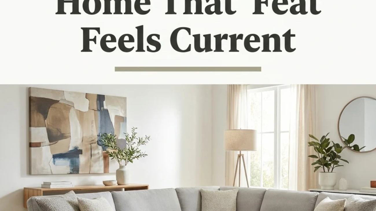
Contemporary decor is the style of right now, a constantly shifting, present-tense design language that borrows freely from minimalism, mid-century modern, and global craft traditions rather than locking itself to one fixed historical rulebook. This article gives you 15 genuinely usable contemporary decor ideas, covering color, material, lighting, furniture, and layout, built for a home that feels current today and can evolve gracefully as trends do.
Most “contemporary” advice online means one of two extremes: a sterile all-white box with a single monstera plant, or a chaotic mash-up of every trending object from the last five Pinterest scrolls with nothing tying them together. The rooms in this list sit in the more interesting middle: curved silhouettes softening sharp architecture, mixed metals used with real intention instead of accident, texture layered the way a considered wardrobe is layered, rather than thrown together. Here are 15 ideas worth saving and stealing.
Why Contemporary Decor Works So Well
Contemporary decor is defined less by a fixed set of rules and more by its relationship to time it describes whatever design language is currently in circulation, updating roughly every decade, which is exactly why it differs from modern design (a specific, historically closed movement rooted in the 1920s–30s Bauhaus). What we call contemporary today pulls from postmodernism’s willingness to mix references, mid-century modern’s clean furniture profiles, and a growing global-craft influence, resulting in a style that borrows rather than belongs to any single lineage.
Its material vocabulary favors warmth and texture over hard minimalism: white oak left with a low-sheen finish, honed travertine and Carrara-veined marble, boucle and heavy linen weaves, organic lime-wash or Venetian plaster walls, and mixed metal finishes most often warm brass paired deliberately with matte black rather than one metal used throughout. Color leans into warm neutrals (Farrow & Ball’s Skimming Stone or Portola Paints’ Clay-based hues are frequent professional references), with muted olive, terracotta, and warm black introduced as considered accents rather than an all-over statement.
Contemporary decor’s current dominance owes a great deal to how design trends now travel Pinterest and Instagram, compressing what used to be decade-long style cycles into a few viral seasons, and a growing sustainability-minded audience is pairing that speed with a preference for vintage-sourced or artisan-made pieces over identical mass-produced sets, which is why “contemporary” today so often means a genuinely mixed room rather than a matched one.
Small spaces adapt to this style unusually well, because curved furniture profiles and multi-purpose pieces, both contemporary staples, take up less visual room than the boxy, heavy silhouettes older design eras favored. The honest limit is restraint: contemporary’s borrow-from-everywhere nature can tip into visual noise fast in a small footprint, so prioritize one or two texture-rich anchor pieces rather than chasing every trend at once.
Style at a Glance
| Element | Minimalist Roots | Current Trend Overlay |
| Philosophy | Clean, uncluttered forms | Curved lines, mixed materials, personal curation |
| Materials | White oak, honed stone, glass | Boucle, organic plaster, mixed metals |
| Color Palette | Warm white, greige | Olive, terracotta, warm black |
═══════════════════════════════════
15 Contemporary Decor Ideas
1. Color-Drenching One Room in a Single Warm Hue
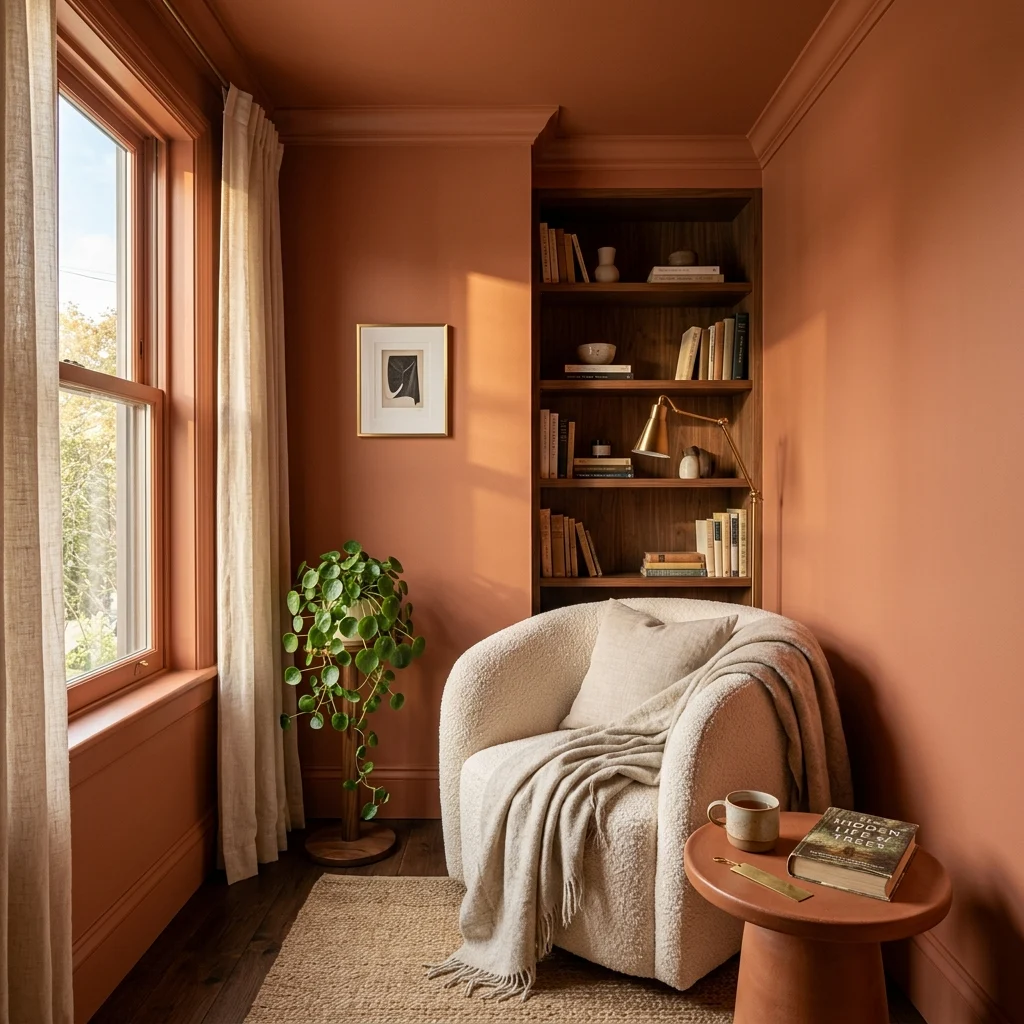
Vibe: The room feels enveloping, like being wrapped in a single warm note.
Why it works: Color-drenching painting walls, trim, and ceiling in one continuous hue removes the visual break that white trim or a white ceiling normally creates, so the room reads as one cohesive volume instead of several disconnected planes. This technique, popularized by contemporary designers like Kelly Wearstler and widely adopted by paint brands including Farrow & Ball and Portola, works best in smaller rooms without much architectural detail to lose, since the continuous color gives even a plain box a sense of intention it wouldn’t otherwise have.
How to get it: Choose a single warm, mid-saturation color, terracotta, olive, or a warm clay tone in a flat or matte finish for walls and ceiling, and a slightly higher sheen (eggshell) for the trim so the surfaces read as unified in color but still distinguishable by texture up close.
💡 Quick Win: Test color-drenching in a small powder room or reading nook first; the technique’s impact is immediate, even at a scale of under 50 square feet.
Shop the Look
| Product |
| Warm terracotta matte interior paint |
| Cream boucle upholstered armchair |
| Small ceramic side table |
| Brass table lamp, linen shade |
| Artificial trailing pothos plant |
2. Organic Plaster Walls for Tactile, Light-Catching Texture
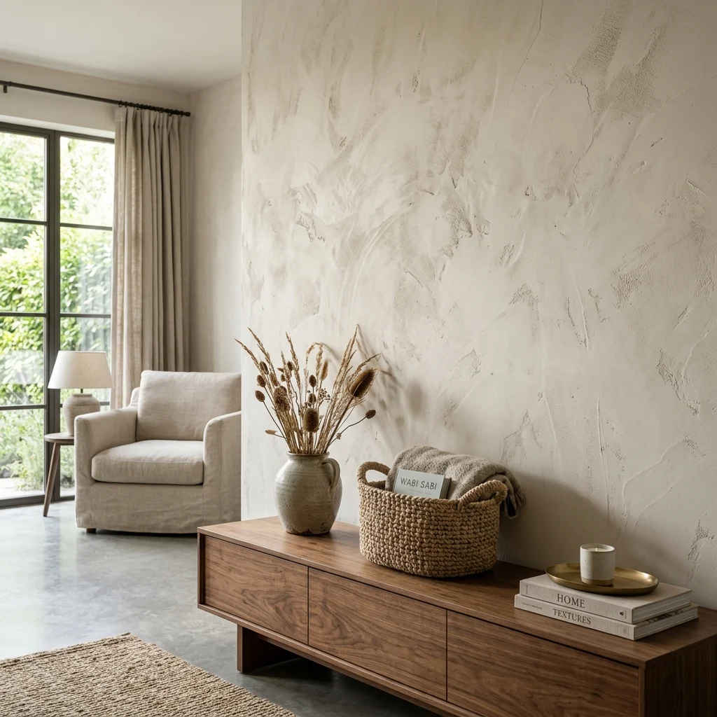
Vibe: The wall feels tactile, like something you want to run your hand across.
Why it works: Flat painted drywall reflects light uniformly, while hand-applied lime or Venetian plaster has microscopic surface variation that catches and scatters light differently across its own surface, the reason plaster walls appear to shift in tone throughout the day in a way paint never does. This technique has deep roots in Mediterranean and Moroccan tadelakt plastering traditions, and its resurgence in contemporary interiors reflects the broader shift toward materials that show the hand of the maker rather than a perfectly uniform factory finish.
How to get it: Limit organic plaster to one feature wall rather than a whole room when trying it for the first time. Most plaster application kits (including DIY-friendly options from brands like Portola Paints) cover roughly 200–300 square feet per kit and require two coats with a trowel or wide putty knife for the signature texture.
Shop the Look
| Product |
| DIY Venetian plaster wall finish kit |
| Low walnut console table |
| Large ceramic decorative vessel |
| Woven seagrass storage basket |
| Brushed brass wall sconce |
3. Sculptural Lighting as Functional Art
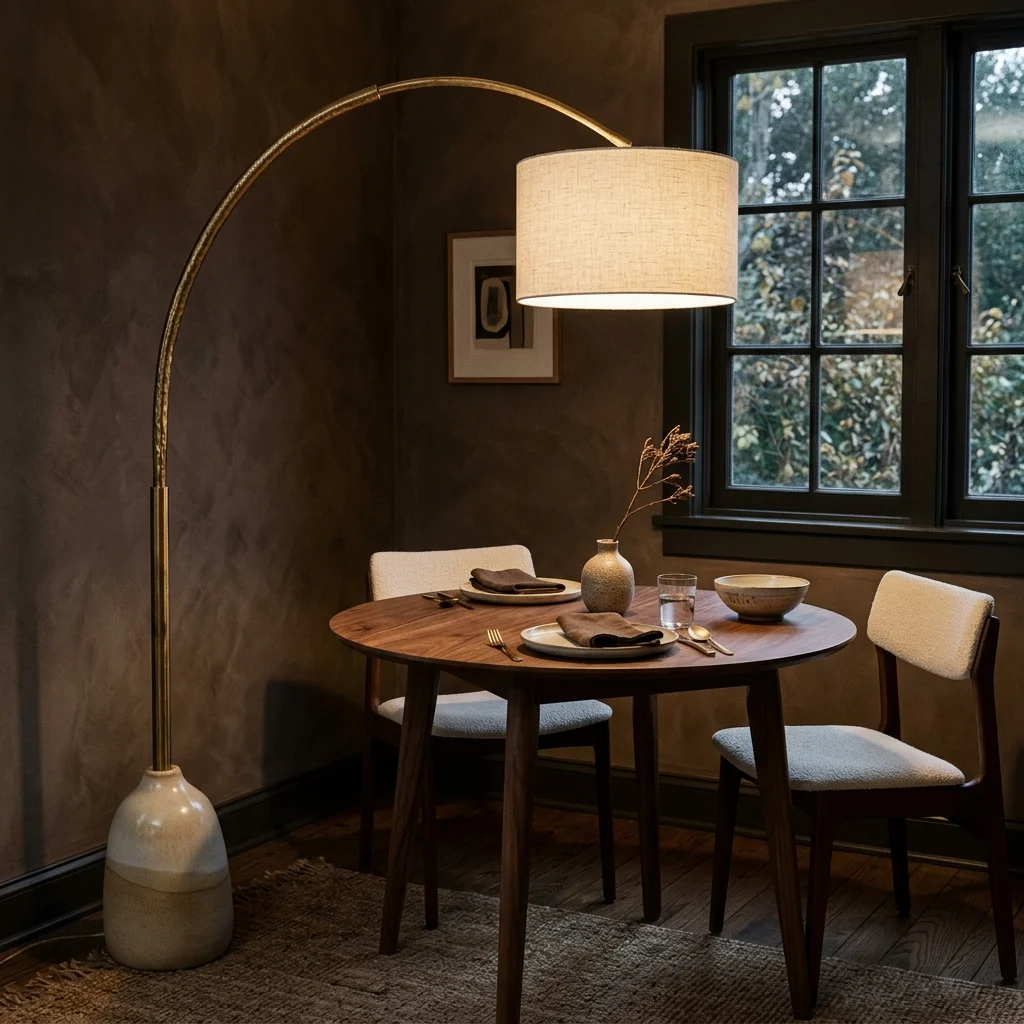
Vibe: The corner feels artful, like the light itself is the centerpiece.
Why it works: Contemporary lighting increasingly treats fixtures as sculpture first and illumination second, a shift driven by designers like Lindsey Adelman and brands such as Schoolhouse and Jonathan Adler, who build lamps meant to be looked at even when switched off. Choosing one sculptural piece over a standard overhead fixture also solves a functional problem: a well-placed floor or table lamp with a curved arm can direct light exactly where it’s needed without the flat, shadowless wash a central ceiling fixture produces.
How to get it: Choose one sculptural lamp with a distinct silhouette, a curved arm, an organic ceramic base, an asymmetric shade, and let it stand alone as a room’s lighting statement rather than pairing it with a competing overhead fixture in the same sightline.
💡 Quick Win: A single curved-arm brass floor lamp placed beside a reading chair does the job of both task lighting and sculpture at once.
Shop the Look
| Product |
| Curved-arm brass floor lamp |
| Ceramic dinnerware set, matte glaze |
| Linen napkin set |
| Glass bud vase, single stem |
| Warm white 2700K dimmable bulb |
4. Curved, Sculptural Furniture Silhouettes
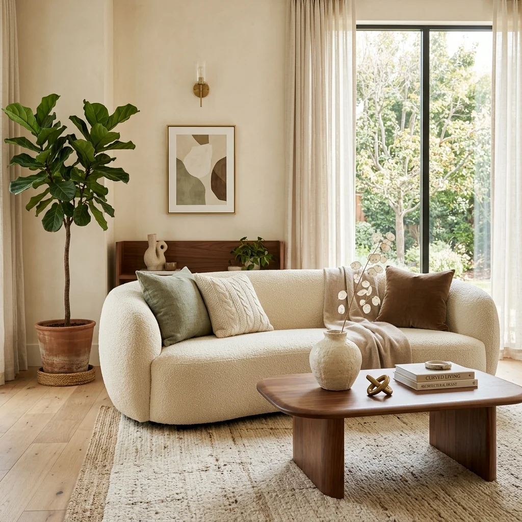
Vibe: The room feels soft, like every hard edge has been intentionally rounded off.
Why it works: Curved furniture profiles an unmistakable signature of current contemporary design soften a room’s overall geometry and making it feel more approachable than the sharp-cornered, rectilinear furniture that dominated the 2010s. This isn’t purely aesthetic: curved forms also improve traffic flow in smaller or oddly shaped rooms, since a rounded sofa arm or coffee table edge doesn’t create the same hard stopping point a squared corner does when navigating a space.
How to get it: Choose one curved anchor piece, a rounded sofa, an oval coffee table, and an arched mirror, and let straight-lined furniture around it provide contrast, since an entire room of curves can feel as monotonous as an entire room of right angles.
Shop the Look
| Product |
| Curved boucle sofa, rounded arms |
| Oval walnut coffee table |
| Sage bouclé throw pillow covers |
| Ceramic sculptural decor object |
| Artificial olive tree floor plant |
5. Mixed Metal Finishes Done With Intention
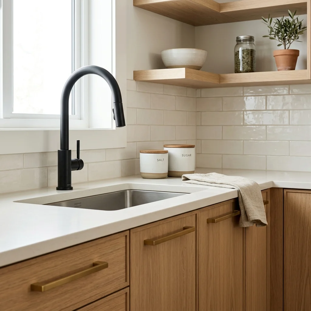
Vibe: The kitchen feels refined, like every metal choice was made on purpose.
Why it works: Mixing metals used to be a design mistake to avoid; in contemporary interiors, it’s now a deliberate technique, provided one metal clearly leads and the second is used sparingly for contrast, typically an 80/20 split. Brushed brass and matte black are the most common contemporary pairing because their warm-cool relationship mirrors the same temperature-balancing principle designers use with wood and metal elsewhere, giving a kitchen or bath visual depth instead of the flatness a single matched metal finish produces.
How to get it: Pick one dominant metal for the majority of hardware (cabinet pulls, faucet, light fixtures) and introduce a second metal only at one or two focal points, a single pendant, a faucet, or a mirror frame, so the mix reads as curated rather than mismatched.
💡 Quick Win: Swapping just the faucet to a contrasting matte black against existing brass hardware is often enough to introduce this look without a full renovation.
Shop the Look
| Product |
| Brushed brass cabinet pull set |
| Matte black kitchen faucet |
| White oak cabinet fronts sample |
| Ceramic kitchen canister set |
| Linen kitchen tea towel set |
6. Muted Terracotta and Olive as a Contemporary Color Duo
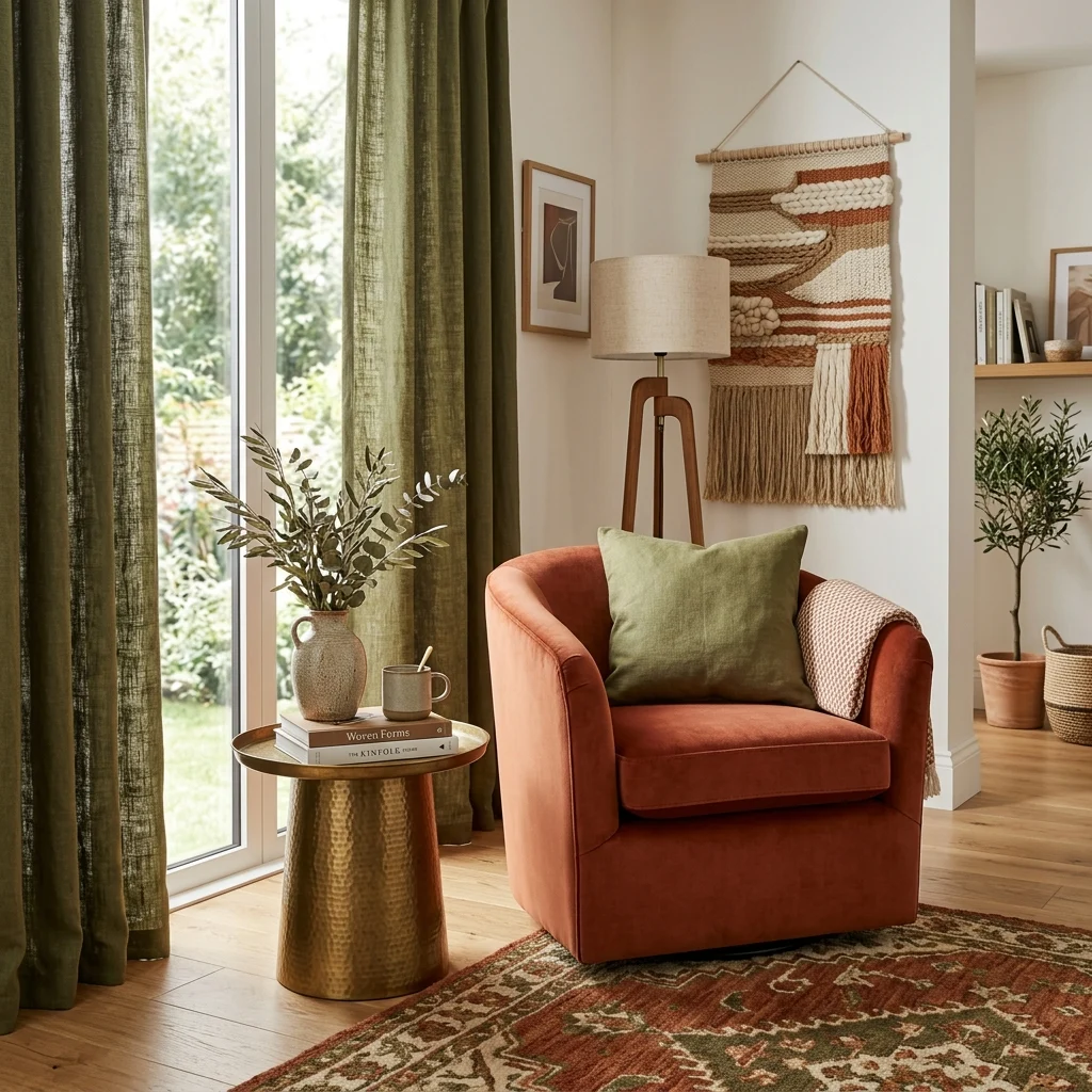
Vibe: The room feels layered, like autumn brought indoors without going literal.
Why it works: Terracotta and olive sit near each other on the color wheel’s warm-earth spectrum, which is why the pairing reads as harmonious rather than competing. Both colors share enough yellow undertone to feel like they belong to the same family, even at different values. This combination has become a defining contemporary palette because it delivers color without the visual loudness of primary or jewel tones, striking the same “considered, not cautious” balance that the whole style aims for.
How to get it: Introduce terracotta through one substantial upholstered piece and olive through textiles, cushions, a throw, or drapery rather than painting a wall in either color, keeping the pairing flexible enough to adjust as trends shift.
Shop the Look
| Product |
| Terracotta velvet accent chair |
| Olive green linen cushion covers |
| Olive linen drapery panel pair |
| Ceramic decorative vase, warm glaze |
| Brushed brass side table |
7. Boucle and Textured Weaves Layered Together
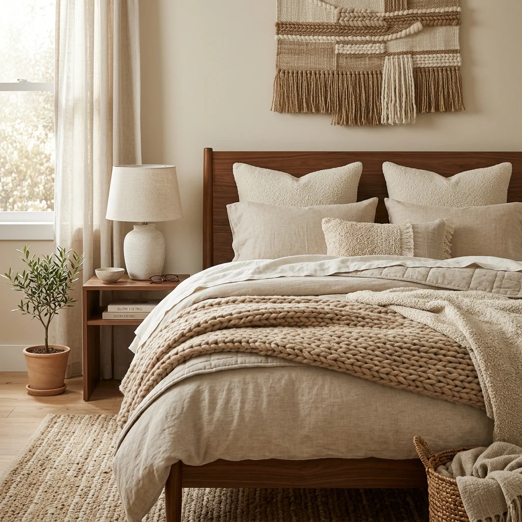
Vibe: The bed feels cozy, like several different quiet textures agreeing with each other.
Why it works: Texture layering is the technique contemporary decor relies on most heavily to create visual interest without introducing extra color. Boucle’s looped pile, a chunky knit throw’s raised stitch, and linen’s slubbed weave all catch light differently, even within the same tonal family, which is what keeps an all-neutral bed from reading as flat or boring. This is a deliberate substitute for pattern: where a maximalist room might use print to create movement, a contemporary one uses texture contrast within a narrow color range instead.
How to get it: Stay within two to three closely related neutral tones: cream, oatmeal, sand, but vary the textile texture in every layer: a smooth linen duvet, a boucle lumbar cushion, a chunky knit throw, so the eye reads variation through touch rather than color.
💡 Quick Win: Adding just one chunky knit throw to an existing all-linen bed introduces this layered effect without replacing anything.
Shop the Look
| Product |
| Oatmeal linen duvet cover set |
| Boucle lumbar cushion cover |
| Chunky knit throw blanket |
| Ceramic bedside table lamp |
| Woven textured wall hanging |
8. Furniture Grouped for Conversation, Not Just Symmetry
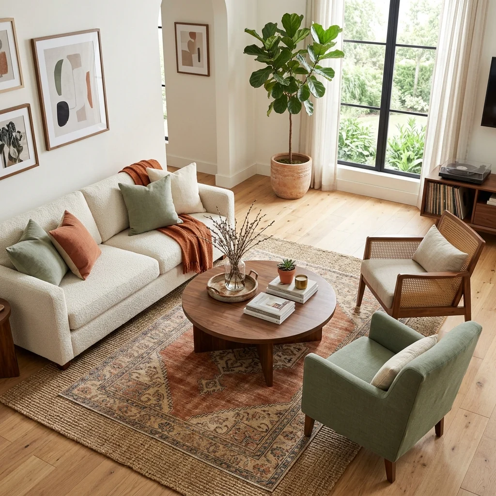
Vibe: The room feels inviting, like it was arranged for a real conversation, not a photograph.
Why it works: Perfectly symmetrical, wall-hugging furniture arrangements are a legacy of formal traditional decorating; contemporary layout instead prioritizes conversational proximity seating angled toward a shared center point, even if that means two different chair styles facing each other rather than a matched pair. This asymmetric grouping principle borrows from hospitality design, where lounge seating is arranged for how people actually gather rather than how a room photographs from the doorway.
How to get it: Angle at least one seating piece, a chair or a loveseat, slightly inward toward the room’s center rather than squaring every piece against a wall, and keep the coffee table close enough that every seat can comfortably reach it, generally within 18 inches.
Shop the Look
| Product |
| Boucle accent chair, curved arm |
| Rattan accent chair, low profile |
| Layered jute and wool rug set |
| Ceramic decorative coffee table tray |
| Artificial fig floor plant |
9. Curved Furniture to Soften Tight Corners in Small Rooms
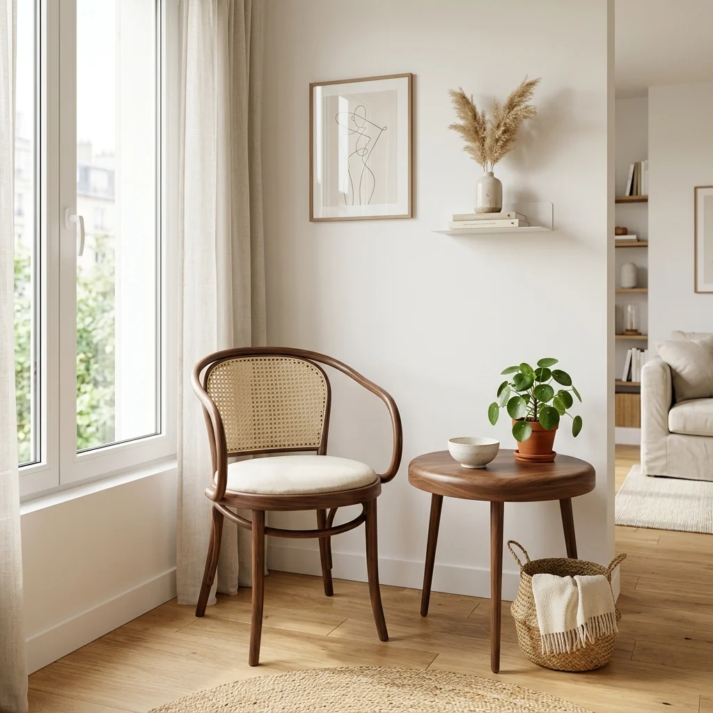
Vibe: The corner feels efficient, like every inch was considered.
Why it works: Sharp-cornered furniture in a small room creates hard stopping points that make already-tight traffic paths feel tighter; rounded furniture edges let you walk closer to a piece without the visual (and literal) collision sharp corners invite. This is why curved furniture, already a defining contemporary trait, does double duty in compact spaces. It’s both on-trend and functionally smarter for rooms where every square foot of clearance matters.
How to get it: In a small room, prioritize rounded or curved silhouettes, specifically at corners and high-traffic pinch points, a round side table instead of a square one, a curved-back chair instead of a boxy one, even if the rest of the room keeps straighter lines.
💡 Quick Win: Swapping just one square coffee table for a round one in a small living room often opens up several inches of usable walking space.
Shop the Look
| Product |
| Round walnut side table, slim legs |
| Curved-back bistro accent chair |
| Small woven storage basket |
| Ceramic decorative bowl |
| Compact artificial potted plant |
10. Vintage-Meets-New Furniture Pairing
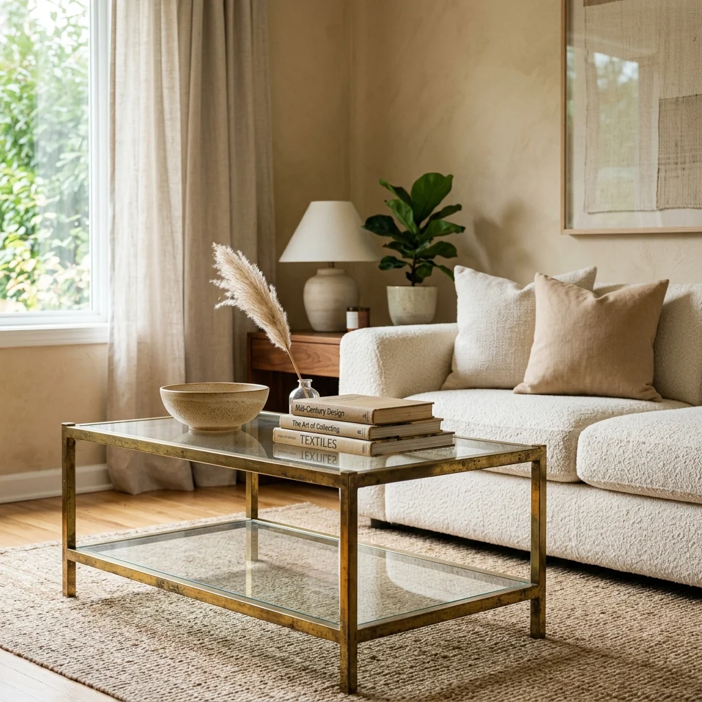
Vibe: The room feels collected, as it grew over time instead of arriving in one delivery.
Why it works: Pairing one genuinely vintage or secondhand piece with otherwise new furniture is one of contemporary decor’s clearest signals, as it prevents a room from reading as a single matched showroom set, which is precisely the look the style actively avoids. A vintage brass and glass coffee table, sourced from an estate sale or resale marketplace, carries an aged patina that no new reproduction quite replicates, and that visible history gives the surrounding new furniture more personality by association.
How to get it: Choose one vintage piece with real material presence, a coffee table, a mirror, a chest as your room’s collected element, and keep everything else new and relatively simple in form, so the vintage piece stands out rather than competing with other statement objects.
Shop the Look
| Product |
| Vintage-style brass and glass coffee table |
| Cream boucle sofa |
| Ceramic decorative bowl |
| Vintage-bound book stack, neutral |
| Dried floral stem in a bud vase |
11. Dimmable Layered Light for Day-to-Night Flexibility
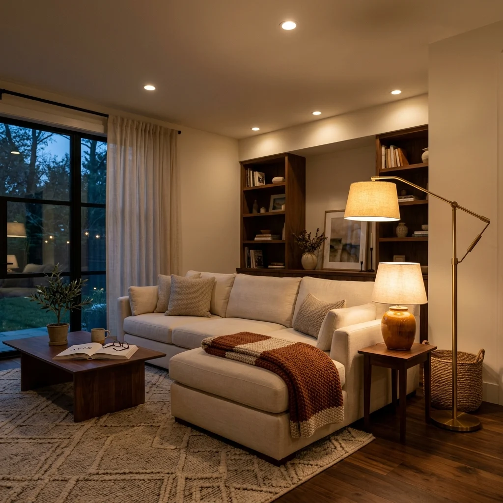
Vibe: The room feels adaptive, shifting easily from bright morning to low evening glow.
Why it works: Contemporary homes are increasingly designed around flexible use, the same room functioning as a workspace by day and a relaxed lounge by night, which lighting has to support directly. Independently dimmable ambient, task, and accent sources let the same physical space feel functionally bright for a video call at 10 am and warmly dim for reading at 9 pm, without changing a single piece of furniture.
How to get it: Put your main ceiling fixture, one table lamp, and one floor lamp on separate dimmer switches or smart plugs, and set distinct presets for “work” (brighter, cooler-leaning) and “evening” (dimmer, warmer) so the shift takes one tap rather than manual adjustment.
💡 Quick Win: A single smart plug on an existing floor lamp gets you 80% of this flexibility without rewiring anything.
Shop the Look
| Product |
| Smart dimmable plug adapter |
| Brushed brass floor lamp |
| Ceramic table lamp, linen shade |
| Warm white 2700K smart bulb |
| Recessed light dimmer switch kit |
12. Honed Stone and Travertine Surfaces
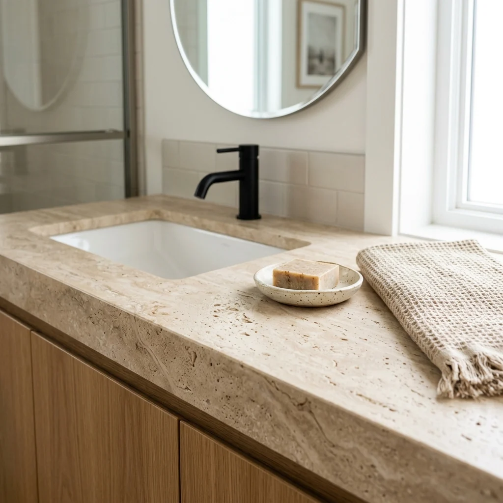
Vibe: The vanity feels refined, like natural stone doing exactly what natural stone should.
Why it works: Honed (matte) stone finishes have overtaken polished stone in contemporary interiors because a matte surface diffuses light rather than throwing sharp reflections, giving the material a softer, more tactile presence that photographs and lives better in everyday use. Travertine specifically carries visible natural pitting and veining that reads as organic rather than manufactured, which is why suppliers like Clé Tile and Artistic Tile have built entire contemporary collections around it. The imperfection is the selling point, not a flaw to hide.
How to get it: If a full travertine countertop isn’t in budget, introduce the material through a smaller application, such as a honed travertine tray, a side table, or a single accent tile inset paired with white oak or matte black so the stone’s warmth has a clear counterpoint.
Shop the Look
| Product |
| Honed travertine bathroom tray |
| White oak vanity shelf |
| Matte black faucet fixture |
| Ceramic soap dish, minimal |
| Linen hand towel set |
13. Artisan Ceramics as Everyday Sculpture
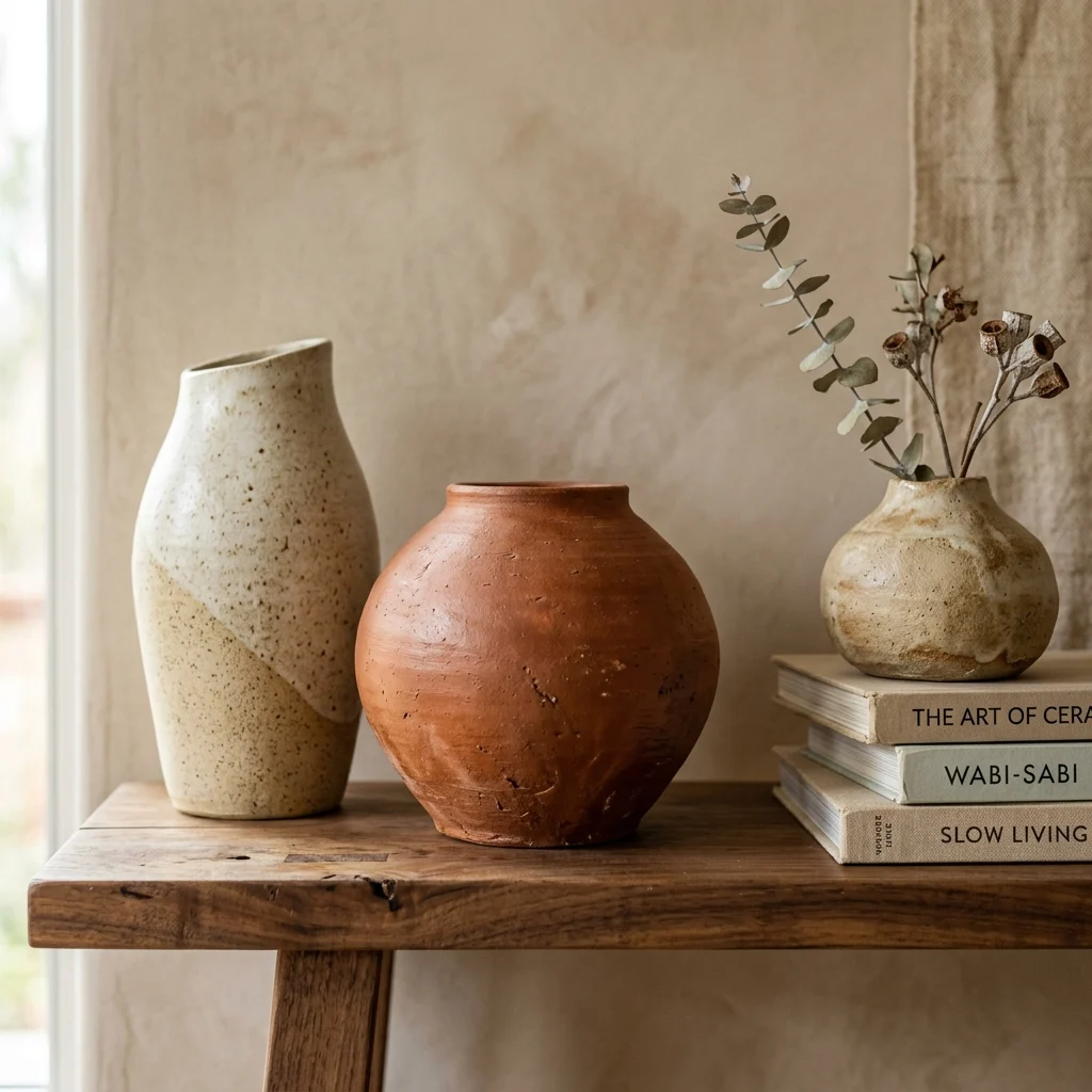
Vibe: The shelf feels curated, like each object has its own small story.
Why it works: Handmade ceramics carry visible evidence of the maker’s hand, slight asymmetries, thumbprint texture, glaze pooling unevenly at the base, which is precisely what separates them from mass-produced decor and why they’ve become a contemporary shorthand for authenticity. Studios in the Heath Ceramics tradition popularized this aesthetic at scale, and grouping a few pieces with genuinely different forms, rather than a matched set, reinforces the handmade quality the style is trying to signal.
How to get it: Choose ceramics from at least two different makers or collections rather than a single matched set, so the grouping reads as gathered over time rather than purchased as one unit, and keep glazes within a shared warm-neutral family so the variety still feels cohesive.
💡 Quick Win: One genuinely handmade ceramic piece placed among otherwise mass-produced decor elevates the whole shelf’s perceived quality.
Shop the Look
| Product |
| Handmade ceramic vessel, organic form |
| Artisan ceramic bud vase |
| Dried botanical stem |
| Neutral linen-bound book stack |
| Small woven shelf basket |
14. Black as a Contemporary Neutral
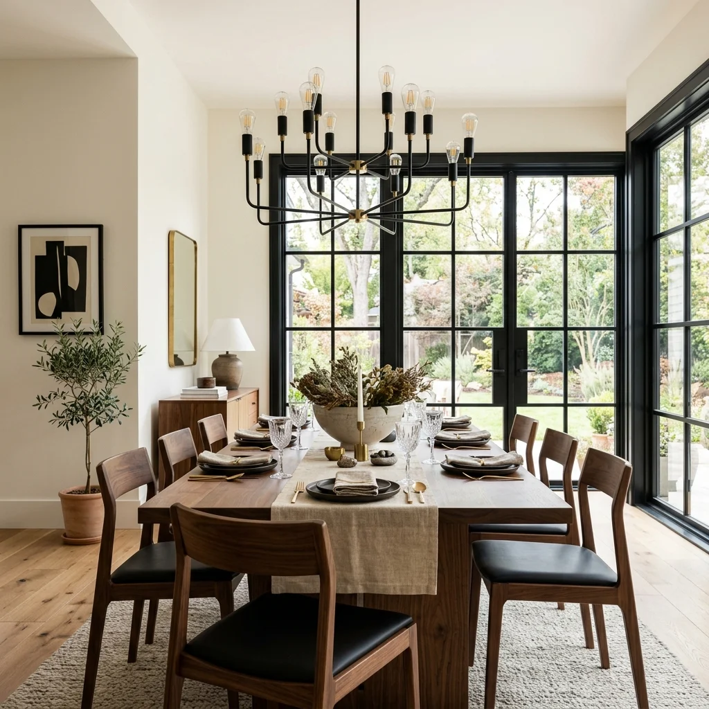
Vibe: The room feels grounded, like black is doing quiet structural work rather than shouting for attention.
Why it works: Contemporary decor increasingly treats black the way earlier eras treated white oak or beige as a foundational neutral rather than a bold statement color, used on window frames, light fixtures, and furniture legs to add definition without adding hue. This works because black at a small, distributed scale (trim, hardware, a fixture frame) reads as structural detail, the same way a charcoal accent functions in a minimalist room, rather than as the dominant color choice a full black wall would represent.
How to get it: Apply black in thin, structural doses to window frames, a chandelier, furniture legs, rather than as a wall color, keeping the surrounding palette warm and light so the black reads as definition, not weight.
Shop the Look
| Product |
| Matte black window frame paint |
| Matte black metal chandelier |
| Linen table runner, neutral |
| Ceramic centerpiece bowl |
| Black metal dining chair set |
15. Open Shelving to Display Curated Objects
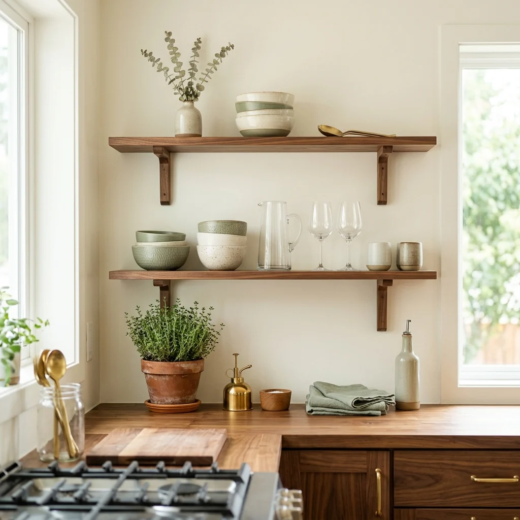
Vibe: The shelf feels personal, like a small display of what the room’s occupant actually values.
Why it works: Open shelving removes the visual bulk of upper cabinetry and replaces it with a curated, editable display a shift that reflects the same personal-collection instinct driving vintage furniture pairing and artisan ceramics elsewhere in contemporary design. The technique only works with deliberate restraint, though: shelving styled at roughly 60% capacity, with clear negative space left between objects, reads as curated, while a fully packed shelf reads as storage overflow rather than display.
How to get it: Install open shelving in walnut or white oak at standard 10–12 inch depth, and style each shelf with no more than four to five objects grouped with visible breathing room between them, rotating what’s displayed seasonally to keep the arrangement feeling current.
Shop the Look
| Product |
| Floating walnut open shelf set |
| Handmade ceramic bowl set |
| Glassware set, clear and amber mix |
| Small terracotta herb planter |
| Brass shelf bracket hardware |
═══════════════════════════════════
How to Start Your Contemporary Decor Transformation
Your single first move should be choosing one warm neutral wall color, a true warm white, or a soft clay tone like Farrow & Ball’s Skimming Stone, because contemporary decor’s mixed materials and metals all get judged against that base, and a cool, stark white will fight the warm woods and brass finishes the style depends on.
The most common mistake is trend-stacking: adding every popular element at once, curved furniture, color-drenched walls, mixed metals, boucle everything, without letting any single choice breathe. This reads as chaotic rather than current, because contemporary decor’s power comes from restraint within variety, not variety for its own sake. Fix it by choosing two or three techniques from this list to start, not all fifteen.
Three specific items under $50 that create immediate impact: a handmade ceramic bud vase in a warm sand glaze, a chunky knit throw in oatmeal draped over an existing sofa arm, and a set of brushed brass cabinet pulls swapped onto furniture you already own.
A weekend-scale update, a color-drenched accent room, new hardware, and one sculptural lamp typically run $200–$500. A full room transformation with new curved furniture and layered lighting generally falls between $2,500 and $7,000 and takes six to ten weeks, since vintage-sourced pieces in particular can take longer to find than ordering new.
═══════════════════════════════════
Frequently Asked Questions About Contemporary Decor
What is the difference between contemporary and modern decor?
Contemporary describes whatever design language is currently popular, shifting roughly every decade, while modern refers to a specific, historically closed movement rooted in the 1920s–30s Bauhaus and International Style. A modern room from the 1960s still looks correct today by modern standards; a contemporary room from the 1990s would look distinctly dated now. Contemporary decor also mixes more freely across styles, curved forms, mixed metals, and global craft influences, where modern keeps to a stricter, more geometric visual language.
What colors are trending in contemporary decor right now?
Warm neutrals lead soft clay, warm white, and greige as base tones layered with muted terracotta, olive, and warm black used as accents rather than dominant colors. Farrow & Ball’s Skimming Stone and Portola Paints’ clay-based hues are common professional references for the neutral base. Saturated jewel tones and cool grays, both common a decade ago, have largely fallen out of favor in favor of these warmer, earthier combinations.
How much does a contemporary decor refresh cost?
A budget weekend update using paint, hardware, and one statement lamp typically runs $200–$500. A moderate refresh, adding one or two curved furniture pieces and updated lighting, generally costs $1,000–$3,000, while a full room transformation with new furniture, layered lighting, and a mix of new and vintage-sourced pieces usually falls between $2,500 and $7,000, depending on how much vintage sourcing versus new furniture is involved.
Does contemporary decor work well in an older, traditional home?
Yes, the contrast between contemporary curved, mixed-material furniture and a traditional home’s original architectural detail, like crown molding or paneled doors, tends to look more considered than contemporary furniture in a purely modern shell. The key is keeping wall colors warm and neutral so the architecture and the newer furniture each stay visually distinct rather than competing, and introducing curves gradually through furniture and lighting rather than trying to soften the architecture itself.
What lighting style fits best with contemporary decor?
Sculptural, layered lighting is the defining choice, with at least one statement fixture treated as art (a curved-arm floor lamp, a sculptural pendant) alongside ambient and task sources on independent dimmers. Warm white bulbs around 2700K keep the space feeling current rather than clinical, since contemporary decor generally avoids the cooler, brighter lighting associated with earlier all-white minimalist trends. A mixed-metal fixture, brass paired with black, is currently one of the most searched lighting choices within the style.
═══════════════════════════════════
Ready to Create Your Dream Contemporary Home?
These 15 contemporary decor ideas move across color, texture, lighting, and layout from a single color-drenched reading room to curved furniture softening a tight corner, to one genuinely vintage piece giving an otherwise new room some real history, so there’s a clear entry point here, no matter which part of your space feels most in need of attention. You don’t need every technique at once, and choosing just two or three to start with is exactly how a considered contemporary room comes together, not a shortcut around doing it properly. Today’s specific action: pick one idea from this list, whether that’s swapping in mixed metal hardware or adding a single handmade ceramic piece to an existing shelf, and do just that this week. Once the room settles into its layered textures and warm, adaptable palette, it stops feeling like a trend you’re chasing and starts feeling like a space that’s genuinely yours, ready to shift as your taste does. Save the ideas that matched your own light and layout today, the curved sofa, the color-drenched wall, so they’re ready when you’re ready for the next step.
You Might Also Like
- Eco Friendly Bamboo Home Decor: 9 Stunning Ways to Style Every Room
- 10 Stylish Shelf Decor Ideas for Every Room
- Modern Home Decor: 15 Ideas Worth Saving and Stealing
- 13 Minimalist Home Decor Ideas for a Calm, Clutter-Free Space
- 12 Small Space Decor Ideas for a Modern Minimalist Home
- 15 Scandinavian Decor Ideas for Simple, Hygge-Inspired Living