
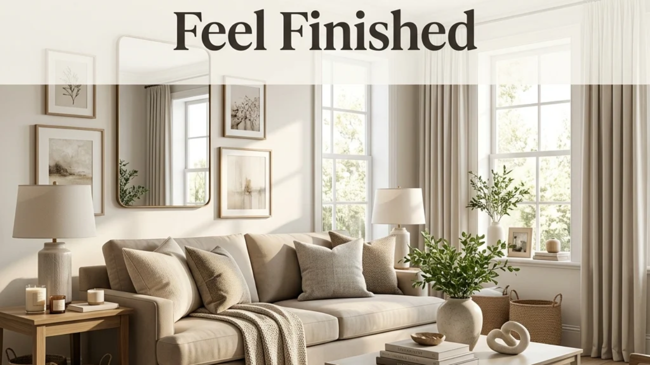
Home styling is the practice of arranging, layering, and editing the furniture and objects you already own so a room reads as intentional rather than simply furnished. It’s the final layer that turns a room full of good pieces into one that actually looks pulled together. This article gives you 20 real home styling ideas covering color, texture, lighting, furniture, and layout, all built on the same techniques professional stylists and stagers use, adapted for everyday living rather than a single photoshoot.
The feel is unmistakable: a shelf where every object earns its spot, a room where the eye moves easily instead of tripping over clutter, surfaces that feel curated rather than accumulated. Styling isn’t about buying more; it’s about arranging what’s already there with the same intention a photographer brings to a set. Here are 20 ideas worth saving and stealing.
Why Home Styling Works So Well
Home styling as a distinct skill grew out of two separate traditions: shelter magazine editorial styling, which shaped how rooms have been photographed for publications like House Beautiful and Architectural Digest since the mid-20th century, and retail visual merchandising, where store window and shelf arrangement techniques are engineered specifically to draw the eye and hold attention. What makes styling distinct from decorating is that decorating chooses what you own, while styling determines how it’s arranged. The same furniture and objects can look cluttered or considered purely based on styling technique.
The techniques that define good styling are less about specific materials and more about repeatable rules: the rule of odd numbers (groupings of three or five read as more visually dynamic than pairs), triangulation (arranging objects at three different heights within a vignette), and negative space (leaving roughly a third of any surface intentionally empty). Materials matter mainly in contrast pairing a matte ceramic vase with a glossy glass candle holder, or a rough jute rug beneath a smoother wool one, since texture variation is what keeps a neutral palette from reading as flat.
Home styling has grown into its own searched category specifically because of two converging trends: the real estate home-staging industry has made “styling for photos” a mainstream skill rather than a niche one, and Pinterest and Instagram’s flat-lay and “shelfie” content has turned styling techniques that once lived only in stylists’ portfolios into widely shared, learnable tutorials.
Style at a Glance
| Element | Editorial & Photo Styling | Everyday Livable Styling |
| Philosophy | Arranged for the camera, precise and sparse | Arranged for daily use, slightly looser |
| Materials | Matched, curated object groupings | Mixed, collected-feeling accessories |
| Color Palette | Tightly controlled, 2–3 tones per vignette | Warm neutrals with one repeated accent |
20 Home Styling Ideas
1. The Rule of Three Repeating One Color Three Times
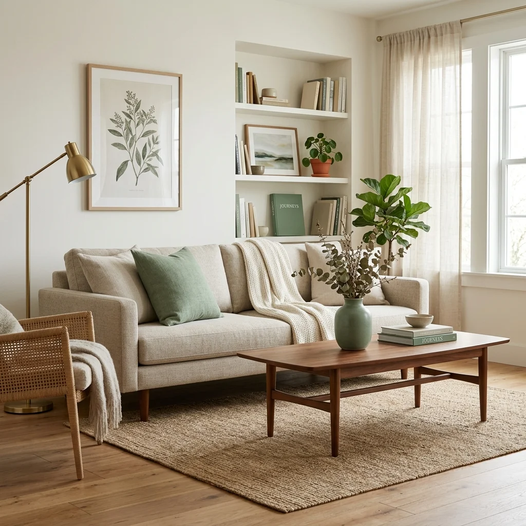
Vibe: The room feels cohesive, one color quietly tying three separate objects together.
Why it works: Repeating a single accent color at least three times across a room, rather than confining it to one item, gives the eye a pattern to follow as it moves through the space, a principle called color echo that professional stylists rely on more than any single “statement” piece. Three touches is the minimum the eye reliably registers as intentional repetition rather than coincidence, which is why two instances often still read as random.
How to get it: Pick one accent color already present somewhere in your room, then find two more objects, a pillow, a book, a small vase, in that same tone before buying anything new, since most rooms already contain the third and fourth repetition waiting to be surfaced.
💡 Quick Win: A single sage green ceramic vase moved from a bedroom to a living room shelf can complete an accent color repetition that already exists elsewhere in the space.
Shop the Look
| Product |
| Sage green ceramic vase |
| Sage linen throw pillow cover |
| Walnut coffee table |
| Neutral linen sofa slipcover |
| Sage-spined decorative book set |
2. Mixing Matte and Glossy Textures on One Shelf
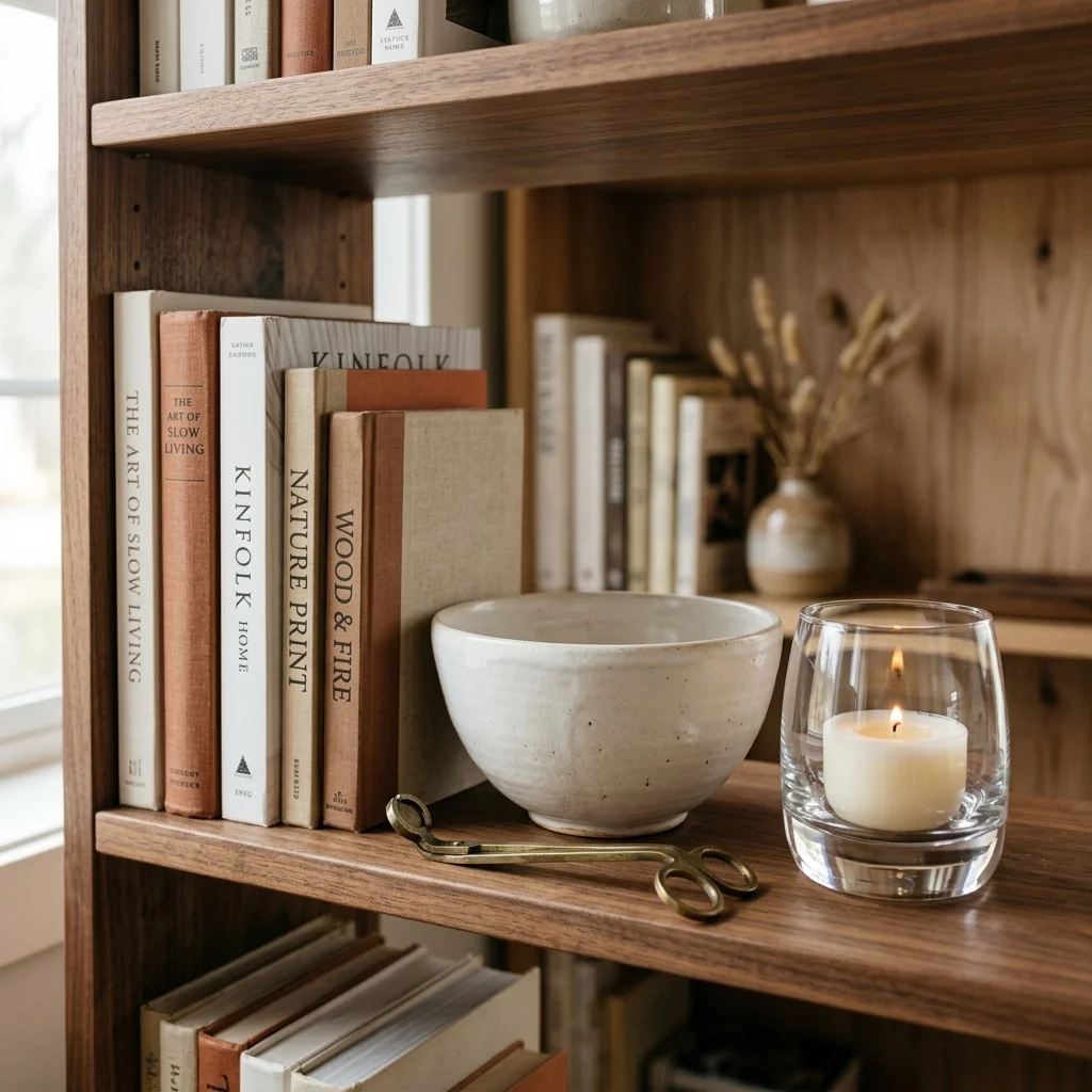
Vibe: The shelf feels layered, light behaving differently across each surface.
Why it works: A shelf of entirely matte objects, or entirely glossy ones, reads as visually flat because every surface reflects light the same way. Pairing at least one matte finish with one glossy or reflective finish creates the texture contrast the eye reads as depth, the same principle behind pairing a matte ceramic vase with a polished brass candlestick. This is a finish-based technique rather than a color-based one, which is why it works even within an entirely neutral palette.
How to get it: Audit one shelf and count how many objects share the same finish family. If four out of five pieces are matte, swap one for a glossy or metallic finish in the same color family rather than a different color entirely.
Shop the Look
| Product |
| Matte ceramic decorative bowl |
| Glass candle holder, clear |
| Brass bookend pair |
| Neutral hardcover book stack |
| Small brass decorative object |
3. Styling a Room to Photograph Well in Natural Light
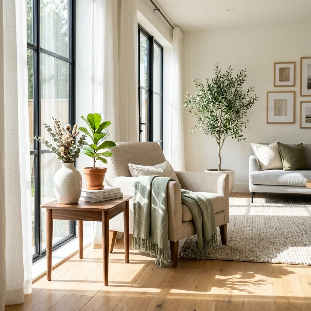
Vibe: The room feels luminous, styled objects catching light at exactly the right angle.
Why it works: Professional stylists position a room’s key vignette, the coffee table arrangement, the mantel display directly within a window’s natural light path, specifically because side and top light reveal texture and dimension in a way flat overhead lighting flattens out entirely, which is why the same arrangement can look completely different depending on where in the room it sits. This isn’t only useful for photos; the same light-catching placement makes a vignette read as more considered in everyday daylight, too.
How to get it: Move your most carefully styled object grouping to whichever surface sits closest to your largest window, and check the arrangement at a few different times of day, since morning and afternoon light hit textured surfaces differently.
💡 Quick Win: Simply moving an existing vase from a dim corner to a windowsill often improves how “styled” it reads without changing the arrangement itself at all.
Shop the Look
| Product |
| Textured ceramic vase, warm glaze |
| Linen throw blanket, neutral |
| Small potted plant |
| Woven placemat or tray |
| Sheer linen curtain panel |
4. Leaving Negative Space Around Your Furniture
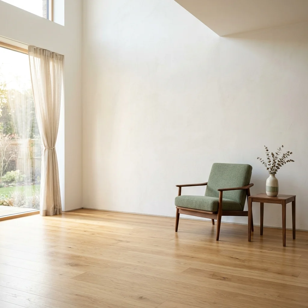
Vibe: The corner feels still, space doing quiet compositional work.
Why it works: Negative space in styling functions the same way it does in graphic design and photography; it gives the eye a place to rest between styled elements, which is why a room with every surface filled tends to feel visually exhausting even when each item is attractive. Leaving roughly a third of any given surface or wall genuinely empty is the specific ratio most professional stylists work toward, since less than that starts to feel crowded again.
How to get it: Pick your most crowded surface or wall and remove roughly a third of what’s currently displayed there, then live with the emptier version for a week before deciding whether anything actually needs to go back.
Shop the Look
| Product |
| Sculptural accent chair |
| Small round side table |
| Single ceramic vase |
| Slim floor lamp |
| Minimal wall mirror |
5. The Rule of Odd Numbers in Object Grouping
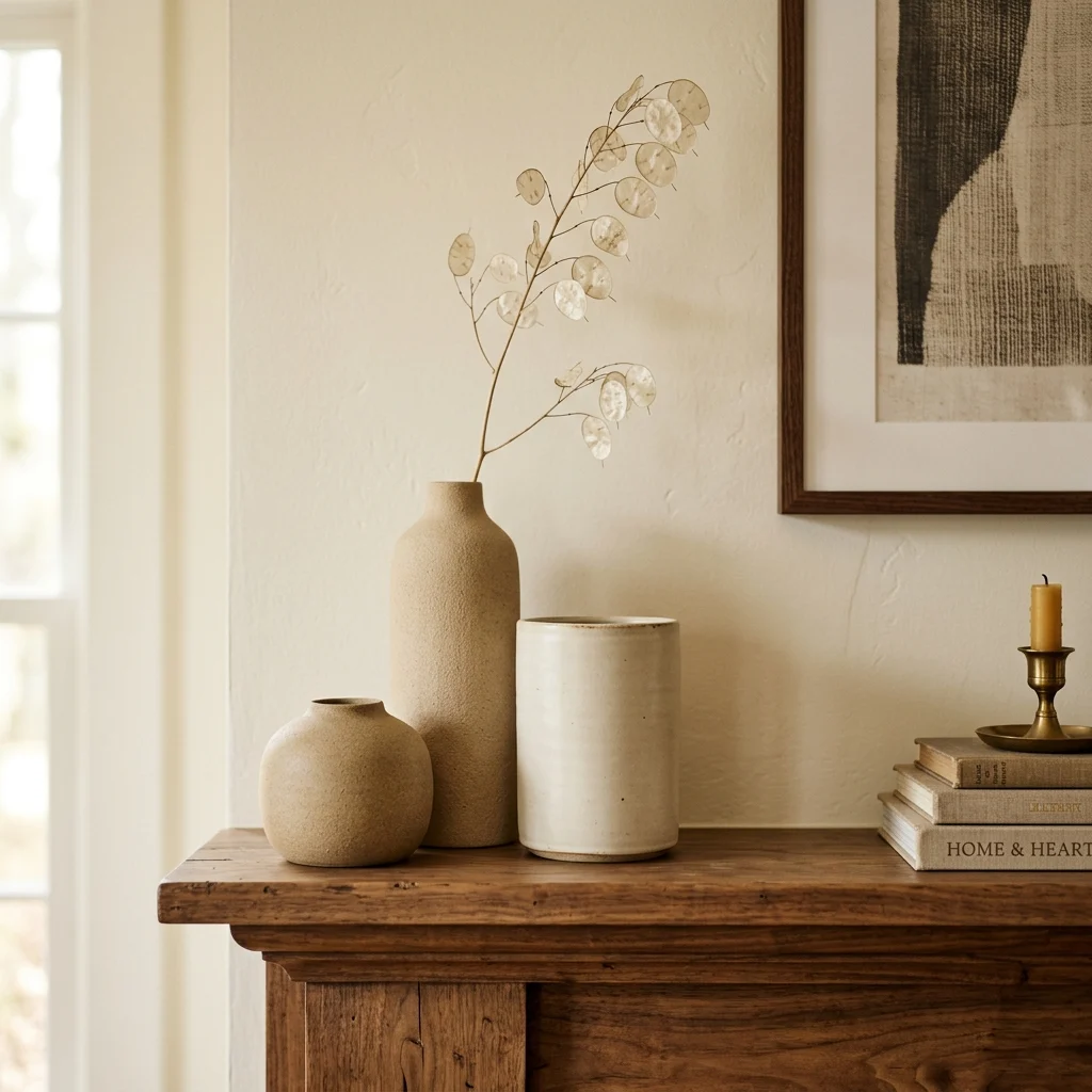
Vibe: The mantel feels dynamic, three objects settling into an arrangement that looks unplanned but isn’t.
Why it works: Groups of two tend to read as a static, matched pair, while groups of three or five create asymmetric visual weight that the eye finds more naturally engaging, a principle borrowed directly from classical composition theory and used constantly in retail visual merchandising. The key detail beyond the odd count is height variation: three identical-height objects still read as flat, while three objects stepping down in height by a few inches each create the sense of movement the rule is meant to produce.
How to get it: Choose three objects of different heights, tall, medium, and short, and arrange them in a loose triangle rather than a straight line, since a straight row of three still reads as static despite the odd count.
💡 Quick Win: If you only own two similar objects, add one plain candle or a small book stack as the third element rather than buying a matching third vase.
Shop the Look
| Product |
| Matte ceramic vase set of three |
| Dried floral stem, single |
| Small taper candle holder |
| Neutral book stack |
| Ceramic decorative tray |
6. A Monochromatic Vignette on One Surface
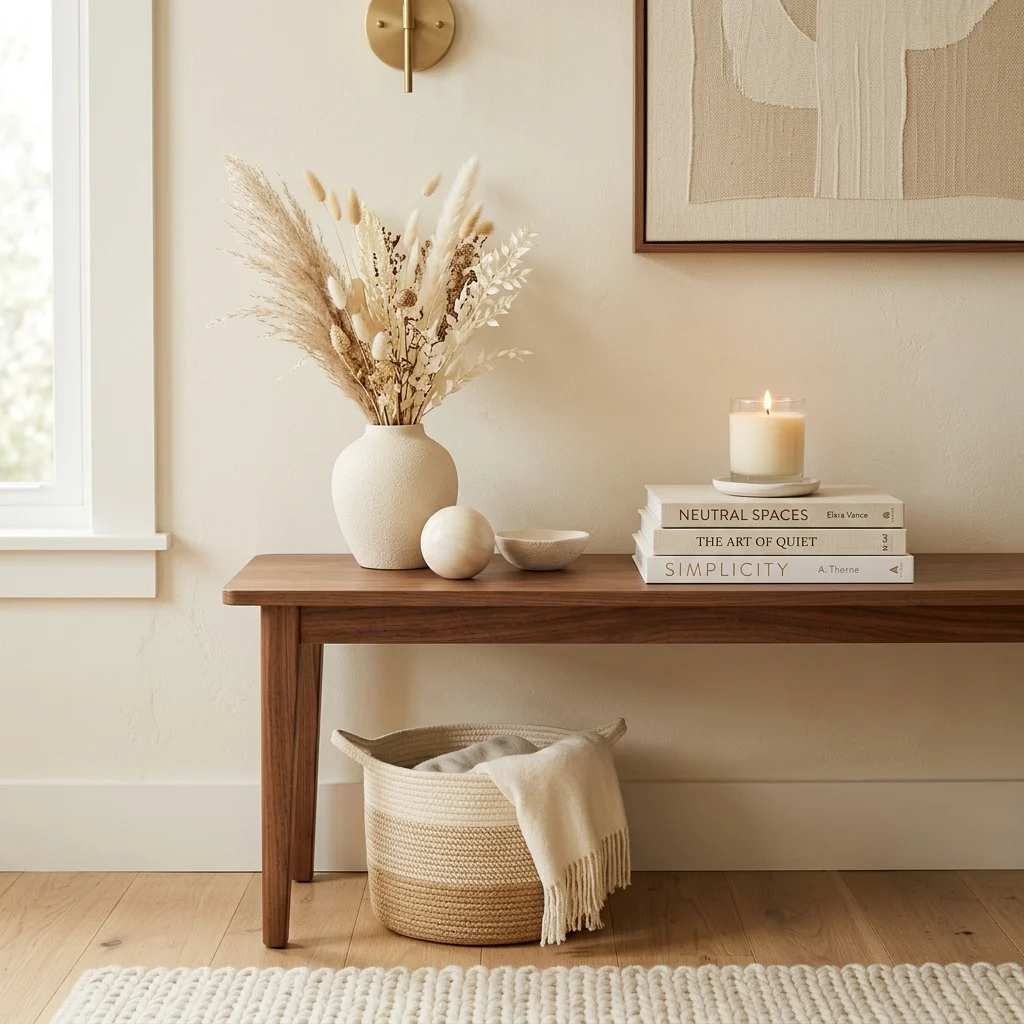
Vibe: The console feels quiet, one narrow color range doing all the talking.
Why it works: A monochromatic vignette, every object within one color family but varied in exact shade, material, and finish, reads as sophisticated because the color consistency removes any competition for attention, letting texture and shape carry the visual interest instead. This is a deliberately restrained technique, the opposite of the color-echo method used elsewhere in styling, and it works best on a single, defined surface rather than an entire room.
How to get it: Choose one narrow color family, cream, sand, warm white, and select objects that vary in exact shade within that family rather than matching perfectly, since slight tonal variation is what keeps a monochromatic grouping from reading as a purchased matching set.
Shop the Look
| Product |
| Cream ceramic vase |
| Ivory taper candle set |
| Cream-bound decorative book stack |
| Walnut console table |
| Small cream ceramic tray |
7. Layering a Vintage Rug Over a Jute Base
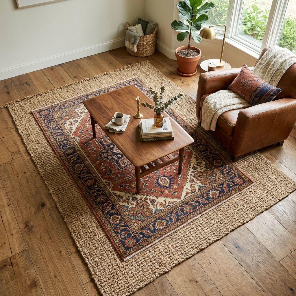
Vibe: The floor feels textured, two materials doing more visual work than either could alone.
Why it works: Layering a smaller, more pattern-dense rug over a larger neutral jute or sisal base adds texture depth at the floor level without requiring an expensive single large rug, since the technique lets a smaller, higher-quality rug cover the visual focal point while the cheaper base rug fills the remaining floor area. The jute’s natural rope texture also grounds a busier patterned rug, keeping the combination from feeling visually loud.
How to get it: Size the top rug to roughly two-thirds the width of the base rug, and offset it slightly off-center rather than perfectly centered, which reads as more intentionally layered than a precisely centered placement.
Shop the Look
| Product |
| Jute base area rug, large |
| Patterned vintage-style area rug |
| Rug pad, non-slip |
| Walnut coffee table |
| Leather accent armchair |
8. The Triangulation Principle for Tabletop Styling
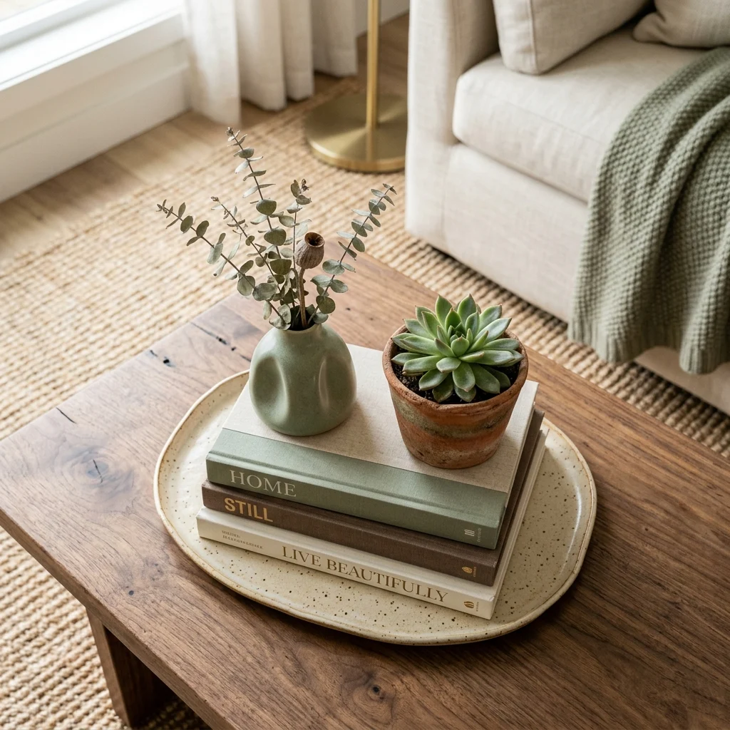
Vibe: The table feels balanced, with three points anchoring the whole surface.
Why it works: Triangulation places three objects of differing height at three different points on a surface, rather than lining them up or clustering them tightly together, which distributes visual weight across the entire tabletop instead of concentrating it in one spot. This principle governs most professional coffee table and console styling because it works reliably regardless of the specific objects involved; the geometry, not the items themselves, is doing the organizing.
How to get it: Place your tallest object (often a stack of books or a vase) at one point, a medium-height object like a tray at a second point, and a low, flat object like a small dish at the third, keeping enough space between each that the triangle shape stays legible.
💡 Quick Win: A tray, a candle, and a small stack of two books is the fastest way to apply triangulation on a coffee table with zero new purchases.
Shop the Look
| Product |
| Ceramic decorative tray |
| Neutral hardcover book set |
| Small potted succulent |
| Taper candle and holder |
| Small ceramic dish |
9. Vertical Styling for Narrow Shelves
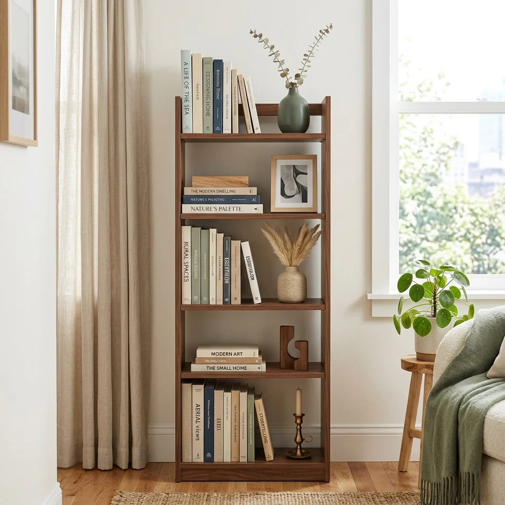
Vibe: The shelf feels efficient, height doing what floor space in a small room can’t.
Why it works: In a small space, styling a narrow shelf with only one or two objects per level rather than filling every shelf edge-to-edge keeps the piece from visually shrinking the room further. This is the small-space version of the negative-space principle, applied at a more constrained scale where even one extra object can tip a shelf from curated to cluttered. A single tall object per shelf also draws the eye upward, which makes ceilings feel higher in compact rooms.
How to get it: Limit each shelf to a maximum of two to three objects, mixing vertical books with one horizontal stack rather than filling the shelf uniformly, and lean at least one framed print against the back rather than hanging it, which reads as more intentionally curated in tight quarters.
Shop the Look
| Product |
| Narrow wall bookshelf unit |
| Small ceramic bud vase |
| Framed art print, small |
| Neutral hardcover book set |
| Small bookend pair |
10. Angling Seating for Visual Flow
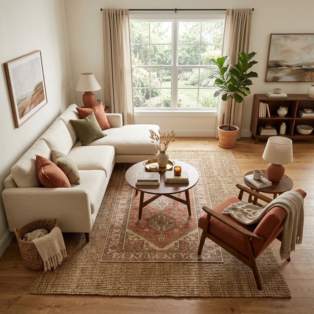
Vibe: The room feels dynamic, with one angled chair changing how the whole space reads.
Why it works: Furniture squared perfectly against every wall creates a static, boxy visual rhythm, while angling even one piece, typically a chair, breaks that rigidity and guides the eye through the room rather than letting it stop at each flat wall-aligned edge. This is a styling adjustment rather than a furniture purchase, since it requires only repositioning what’s already there.
How to get it: Angle one chair roughly 15–20 degrees away from being perfectly parallel to its nearest wall, checking that it still faces a natural conversational point like the sofa or coffee table rather than an awkward corner.
Shop the Look
| Product |
| Accent chair, curved back |
| Layered area rug set |
| Small round side table |
| Neutral throw pillow cover |
| Floor lamp, slim profile |
11. Grouping Candles at Varied Heights
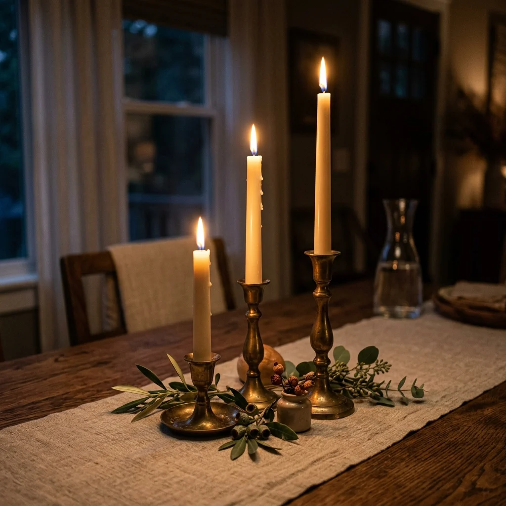
Vibe: The table feels intimate, small flames staggered like a miniature skyline.
Why it works: Candles at uniform height in matching holders read as a set rather than a styled arrangement, while staggering heights using different holder sizes or simply lighting candles that have burned down at different rates applies the same height-variation principle used in vase and book styling to something as simple as a taper candle grouping. This works specifically well at dining tables and mantels, where the flickering light itself amplifies the height variation once lit.
How to get it: Use candle holders in at least two different heights within the same finish family, and group them in odd numbers along a runner or tray rather than spacing them evenly across the full table width.
💡 Quick Win: Letting existing taper candles burn down unevenly before regrouping them creates natural height variation without buying anything new.
Shop the Look
| Product |
| Brass taper candle holder, varied heights |
| Unscented taper candle set |
| Linen table runner, neutral |
| Small greenery sprig |
| Long-reach candle lighter |
12. Grounding a Shelf With One Natural Material
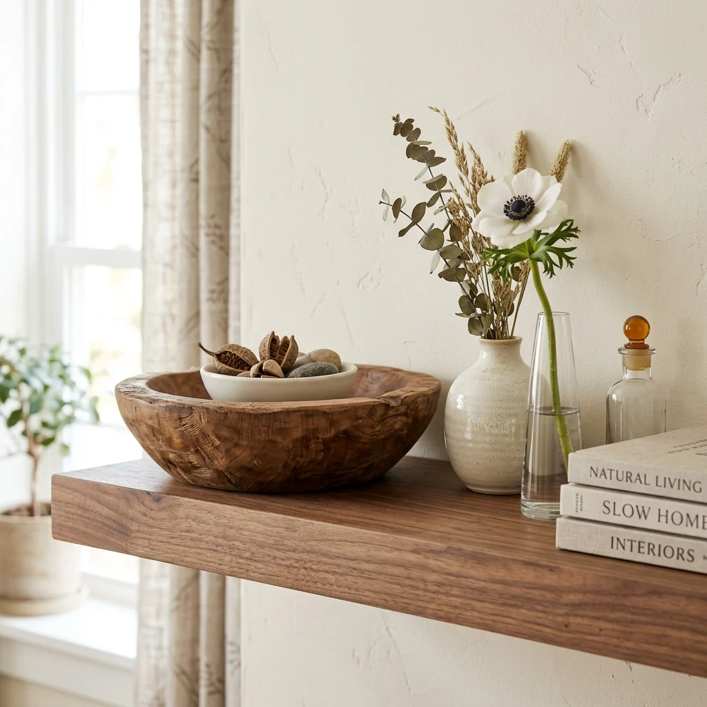
Vibe: The shelf feels grounded, one heavy material anchoring several lighter ones.
Why it works: A shelf styled entirely with small, delicate objects, glassware, and thin ceramics can read as visually unstable or fussy, while adding one substantial natural-material object, like a chunky wood bowl or a piece of raw stone, gives the arrangement visual weight to balance against. This is a material-based version of the same visual-weight principle that governs furniture placement, scaled down to a single shelf.
How to get it: Choose one solid wood or stone object per shelf as a base-level anchor, positioning it toward one side rather than centered, and build lighter glass or ceramic objects around it at varying heights.
Shop the Look
| Product |
| Chunky wood decorative bowl |
| Small glass bud vase |
| Matte ceramic accent vase |
| Floating wood shelf |
| Small stone paperweight object |
13. Stacking Books as a Styling Tool, Not Just Storage
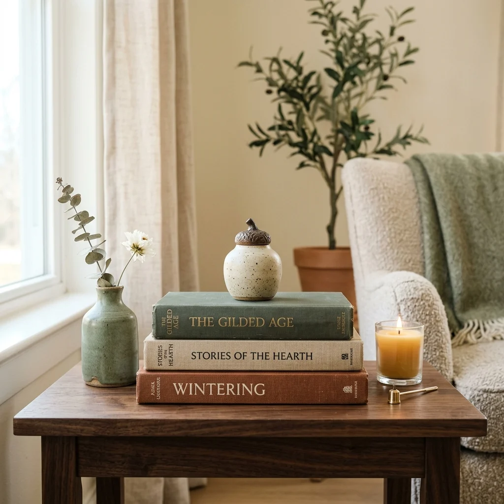
Vibe: The table feels intentional, books doing double duty as both reading material and height tool.
Why it works: Books stacked horizontally rather than shelved vertically create an instant, adjustable height riser that lets a small object on top sit at a more interesting level than the flat tabletop alone would allow. This is the specific technique stylists use to add a “third height” to any surface without buying a riser or stand. Choosing books with similar-toned spines, or wrapping mismatched spines in plain paper, keeps the stack from becoming its own competing visual element.
How to get it: Stack three books of decreasing size, largest at the bottom, and place one small object, a candle, a bud vase, on top rather than beside the stack, which uses the books as a functional pedestal rather than pure decoration.
Shop the Look
| Product |
| Neutral hardcover book set |
| Small ceramic bud vase |
| Taper candle and holder |
| Book spine wrapping paper, plain |
| Walnut side table |
14. Echoing an Accent Color Through Small Objects
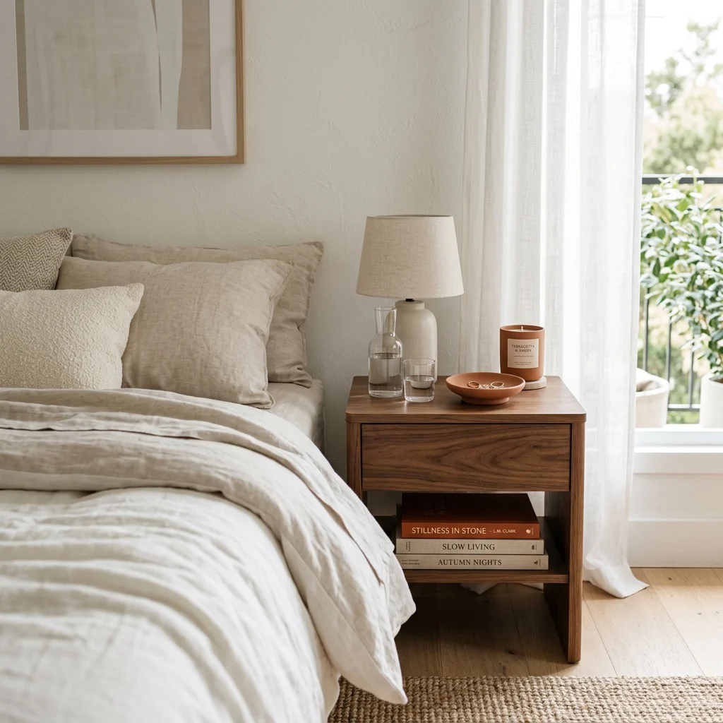
Vibe: The bedroom feels connected, one small color thread running quietly through it.
Why it works: Introducing an accent color exclusively through small, low-cost objects, a candle, a dish, a book spine, rather than a single large piece like a chair or rug, lets that color repeat across a room several times without the financial commitment of one expensive item, which is exactly the color-echo principle from earlier in this list applied at the smallest possible object scale. Small object repetition is also easier to adjust or remove entirely if the color choice doesn’t hold up over time.
How to get it: Choose three or more small objects under $20 each in your accent color rather than one larger piece, distributing them across different surfaces in the same room so the color reads as a running thread rather than a single isolated spot.
💡 Quick Win: A terracotta candle, already a common, affordable item, can be one of the three required color-echo touches with zero additional shopping.
Shop the Look
| Product |
| Terracotta ceramic dish |
| Terracotta candle, unscented |
| Terracotta-spine decorative book |
| Walnut nightstand |
| Neutral linen bedding set |
15. Anchoring a Zone With a Rug Underfoot
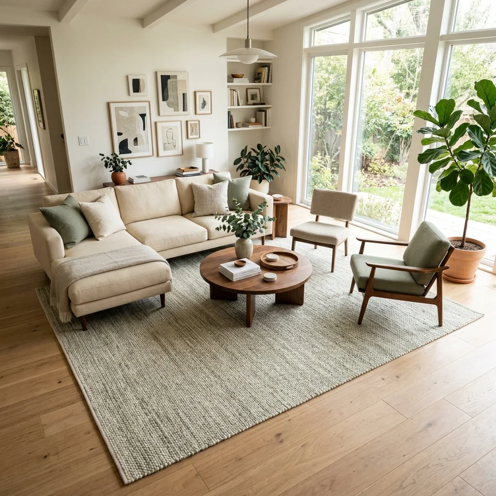
Vibe: The seating area feels grounded, one rug defining exactly where the zone begins and ends.
Why it works: An undersized rug where only the front legs of furniture touch it is one of the most common styling errors, because it makes the furniture look like it’s floating rather than anchored to a defined zone. A properly sized rug with every piece of furniture’s legs resting on it reads as a single cohesive area instead of scattered pieces. This single sizing correction is frequently the difference between a room that feels finished and one that feels slightly off without an obvious reason why.
How to get it: Measure your seating arrangement’s outer edges before buying a rug, and size up rather than down if you’re between sizes, since an oversized rug reads as intentional while an undersized one reads as a mistake.
Shop the Look
| Product |
| Large area rug, full seating coverage |
| Rug pad, non-slip |
| Walnut coffee table |
| Artificial floor plant |
| Neutral throw pillow set |
16. Balancing Hard and Soft Textures on a Console
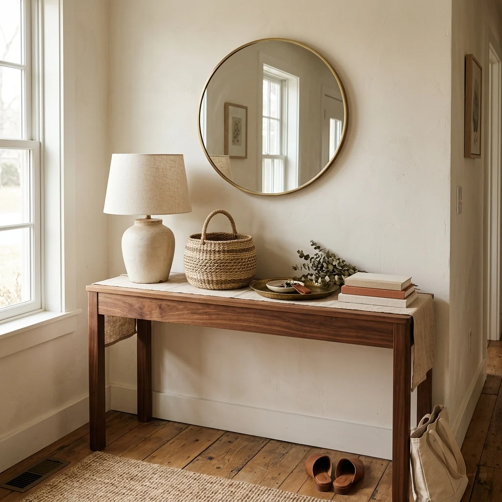
Vibe: The entryway feels balanced, with hard and soft materials trading visual weight evenly.
Why it works: A console styled entirely with hard materials, ceramic, glass, and metal reads as cold, while one styled entirely with soft materials reads as visually mushy and undefined; pairing both on the same surface, a ceramic lamp base next to a woven basket, gives the eye contrast points to move between. This is the same texture-layering principle used on shelves, applied at the entry-point scale where first impressions matter most.
How to get it: Include at least one soft, textile-based object, a woven basket, a folded runner alongside your console’s harder decorative pieces, positioning the soft element toward one end rather than centered to keep the balance asymmetric.
Shop the Look
| Product |
| Ceramic table lamp, matte finish |
| Woven storage basket |
| Linen table runner |
| Brass catch-all tray |
| Small round wall mirror |
17. A Seasonal Color Swap for Styling Refresh
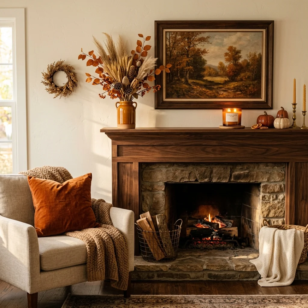
Vibe: The mantel feels seasonal, warmth arriving through a handful of swapped accents.
Why it works: Rather than redecorating a room entirely each season, professional stylists swap only the small, low-cost accent layer pillow covers, candles, and a seasonal floral stem while keeping the furniture and wall color constant, which refreshes a room’s feel at a fraction of the cost and effort of a full restyle. This works because the base neutral palette established elsewhere in this list is specifically designed to stay flexible enough to host rotating seasonal accents without ever needing to change itself.
How to get it: Keep a small rotating box of seasonal accent pieces, two or three pillow covers, one seasonal candle scent, and a dried floral stem separate from your everyday decor, swapping only these pieces every few months rather than restyling the whole room.
Shop the Look
| Product |
| Rust linen pillow cover |
| Amber-toned candle, seasonal scent |
| Dried wheat stem bundle |
| Warm walnut mantel decor tray |
| Neutral base pillow cover, year-round |
18. Creating a Reading Vignette With One Chair
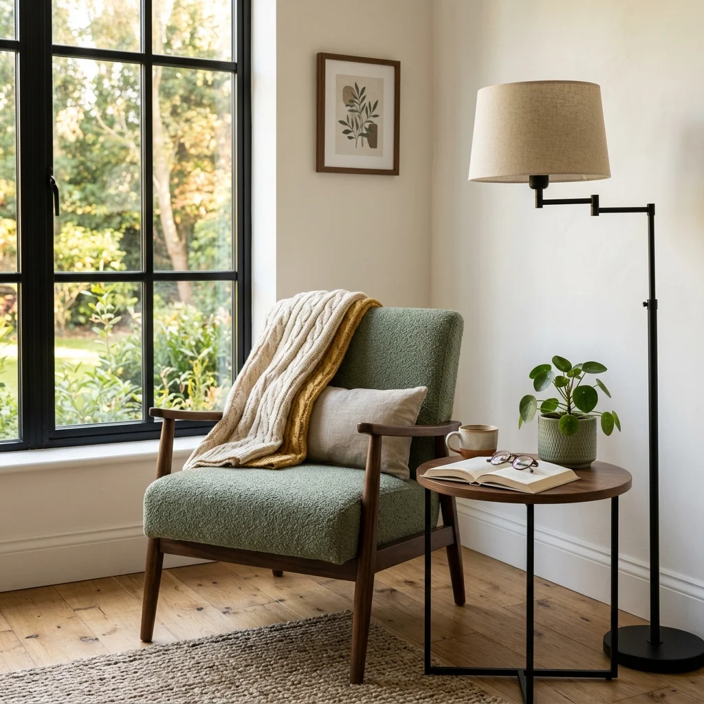
Vibe: The corner feels hushed, styled as its own small destination within the room.
Why it works: Styling a single chair as a defined vignette with its own side table, light source, and one or two supporting objects gives a room a secondary focal point beyond the main seating group, which is a technique borrowed from how model homes are staged to suggest lived-in use rather than just furniture placement. This works because it styles for a specific activity (reading) rather than a generic display, which makes the corner feel functional rather than purely decorative.
How to get it: Give your reading chair its own small ecosystem, a side table within arm’s reach, and a light source positioned over the shoulder rather than overhead so the vignette reads as a complete, usable setup rather than a chair placed in leftover space.
Shop the Look
| Product |
| Accent reading chair |
| Small round side table |
| Floor lamp, adjustable arm |
| Folded knit throw blanket |
| Small potted plant |
19. Layering Task and Ambient Light on a Desk
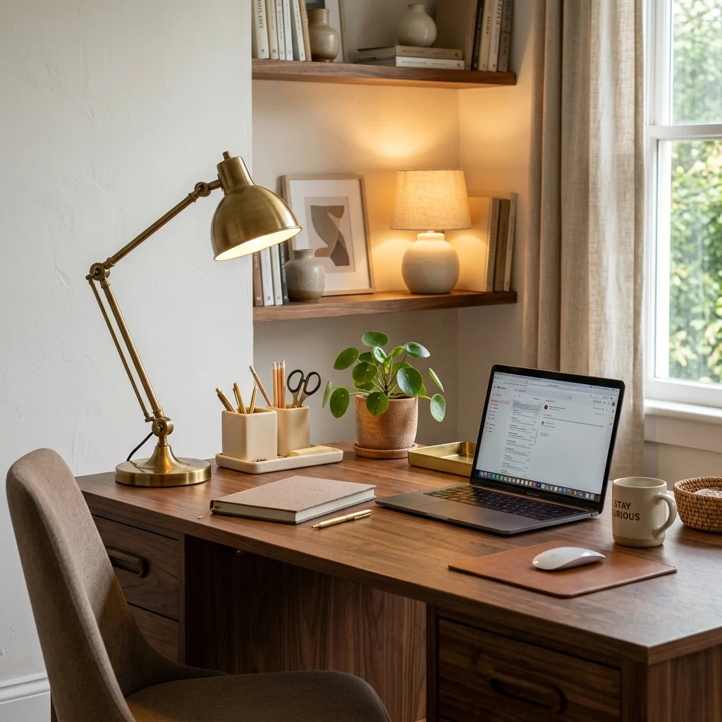
Vibe: The desk feels functional, with two light sources doing different jobs at once.
Why it works: A single desk lamp handles task lighting but leaves the surrounding area comparatively dark once the sun sets, which is why stylists add a second, smaller ambient light, a small table lamp, or accent light behind the primary work area so the desk doesn’t become an isolated bright spot in an otherwise dim room. This mirrors the same layered-lighting principle used across full rooms, scaled down to a single work surface.
How to get it: Position your main task lamp directly over your working hand’s side to reduce shadow, and add one smaller warm-toned accent light behind or beside the desk so the immediate surrounding area isn’t left in contrast-heavy darkness.
Shop the Look
| Product |
| Brass adjustable task lamp |
| Small ceramic accent lamp |
| Desk organizer tray |
| Warm white LED bulb set |
| Small potted plant |
20. Styling a Tray as a Contained Vignette
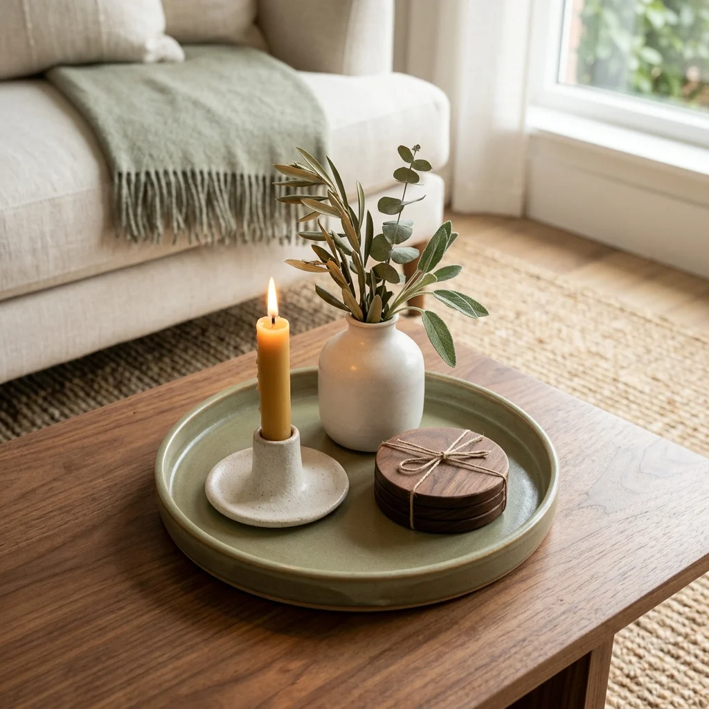
Vibe: The table feels tidy, a tray drawing a clean boundary around its own small scene.
Why it works: A tray functions as a visual container that groups several small objects into one cohesive unit rather than letting them scatter loosely across a larger surface, which is why professional stylists use trays constantly on coffee tables, ottomans, and console tops the tray’s physical edge does the same organizing work the rule of three does compositionally, just with a literal boundary instead of an implied one. It also makes daily tidying faster, since the whole vignette lifts and resets as one unit.
How to get it: Choose a tray large enough to hold three to four small objects with breathing room between them, and treat everything within the tray’s edge as one grouping, meaning objects outside the tray on the same table should form a separate, distinct vignette rather than blending into it.
💡 Quick Win: Moving three existing small objects onto any spare tray you already own is a five-minute styling upgrade with zero shopping required.
Shop the Look
| Product |
| Ceramic decorative tray |
| Taper candle and holder |
| Small ceramic bud vase |
| Neutral coaster set |
| Small ceramic catch-all dish |
How to Start Your Home Styling Transformation
Your first single move should be editing one surface before styling anything new. Pick your most cluttered shelf or coffee table, and remove roughly a third of what’s currently on it, because styling almost always starts with subtraction, not addition, and every technique on this list works better with fewer objects competing for attention.
The most common mistake is buying new decor before applying any styling technique to what’s already owned, which usually just adds another item to an already unedited surface rather than solving the underlying arrangement problem. Fix it by fully restyling one surface using only existing objects, applying the rule of three, triangulation, or negative space before deciding whether anything genuinely needs to be purchased.
Three specific items under $50 that create immediate impact: a ceramic decorative tray to contain a coffee table vignette, a set of taper candles in staggered holder heights, and a stack of three neutral hardcover books to use as a styling riser.
A single surface can realistically be restyled in under 30 minutes using only what you already own. A full-room styling pass, editing and rearranging every surface, typically takes a focused weekend, while a full-home refresh across several rooms usually spans two to three weekends and $50–$200 in small supporting purchases like trays and candle holders.
Frequently Asked Questions About Home Styling
What is the difference between decorating and home styling?
Decorating refers to choosing and acquiring the furniture, colors, and materials that go into a room, while home styling refers specifically to how those existing pieces are arranged, layered, and edited once they’re already in place. A fully decorated room with expensive furniture can still look unstyled if objects are scattered without height variation or negative space, while a modestly decorated room can look genuinely finished through careful styling alone, which is why styling is often the more cost-effective lever to pull first.
What colors work best for home styling vignettes?
Warm neutrals, warm white, sand, walnut brown, form the most flexible styling base because they let accent colors rotate seasonally without requiring the whole vignette to change. A single repeated accent, often sage green or terracotta, applied through the color-echo technique across three or more small objects, is the most common professional approach rather than committing an entire vignette to one bold hue.
How much does it cost to professionally style a room?
Home stylists and stagers typically charge $300–$800 per room for a single styling session using the client’s existing furniture largely, while a full-home staging service for a real estate listing can run $2,000–$5,000 depending on square footage. DIY-ing the same techniques using this list costs closer to $50–$150 per room in small supporting purchases like trays, candles, and a few accent objects, since the core techniques themselves require no purchase at all.
Does home styling work in a small apartment or rental?
Yes, and arguably more effectively than in larger homes, since small-space styling relies heavily on editing and negative space rather than adding furniture, which suits rental restrictions well. Techniques like vertical shelf styling, tray-contained vignettes, and rug-based zone anchoring require no permanent changes or wall damage, making them fully compatible with typical rental lease restrictions.
What is the single most useful home styling rule for beginners?
The rule of three grouping objects in odd numbers at varied heights is generally considered the most broadly useful starting technique, since it applies to nearly any surface in the home, from a coffee table to a bookshelf to a bathroom vanity, and requires no new purchases to try immediately with existing objects. Most other styling principles on this list, including triangulation and negative space, build directly on this same foundational height-and-grouping logic.
Ready to Create Your Dream Styled Home?
These 20 home styling ideas span color, texture, lighting, furniture, and layout, from the rule of three on a single shelf to anchoring an entire seating zone with a properly sized rug, so there’s a genuinely useful technique here for whichever room currently feels unfinished. You don’t need to restyle your whole home in one weekend, and working through one surface at a time is not a slower path to a finished-feeling home; it’s the actual method professional stylists use, room by room, shelf by shelf. Today’s specific action: pick your most cluttered surface right now, remove a third of what’s on it, and regroup what remains into one odd-numbered, height-varied cluster before you do anything else. Once a few surfaces carry this same intentional arrangement, the whole home stops feeling like a collection of furniture and starts feeling like a space someone actually considered. Save the techniques that fit your own rooms today, that tray vignette, that layered rug, because in home styling, the arrangement is often the entire difference between furnished and finished.