
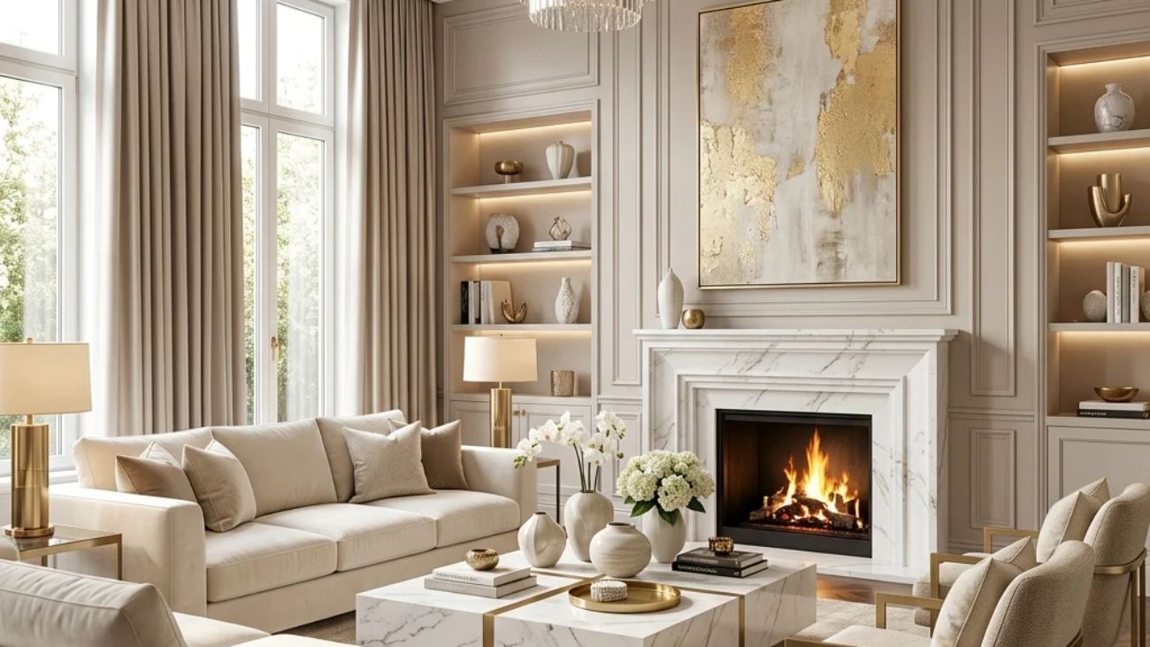
Luxury interior design is the discipline of using material quality, spatial restraint, and layered light to make a room read as considered rather than simply expensive to furnish. This article gives you 18 luxury interior design ideas, from curtain height to hardware to lighting circuits, built to work across an entire home.
The feeling is unmistakable: a room that looks composed at any hour, light falling in warm, layered pools instead of one flat wash, surfaces edited down to exactly what belongs. Luxury interior design doesn’t announce itself through price tags; it shows up in proportion, restraint, and the quality of a handful of deliberate decisions. Here are 18 ideas worth saving and stealing.
Why Luxury Interior Design Ideas Work So Well
What is it? Luxury interior design isn’t tied to a single era or culture the way farmhouse, or Japandi are; it’s a design philosophy that traces through Gilded Age and Belle Époque interiors, where craftsmanship and correct proportion signaled wealth more than sheer object count, refined later by mid-century hotel designers like Dorothy Draper into the layered, theatrical luxury still referenced today. What separates genuine luxury design from an expensive-looking imitation is that its core principles, material coherence, spatial discipline, and layered lighting, are achievable at any budget, since they’re decisions rather than purchases.
What are its core materials and colors? The palette runs warm charcoal, complex greige, and warm cream, with one deep jewel tone reserved as a controlled accent. Materials stay tactile and considered: honed natural stone or quality stone-effect porcelain, solid brass, performance velvet, book-matched marble, and reeded wood paneling. Nothing is chosen for its price tag alone; every material earns its place through texture or proportion.
Why is it trending now? The “quiet luxury” movement gained cultural momentum as a reaction against visible-logo maximalism, and a decade of design literacy driven by Pinterest and Instagram has created homeowners who understand luxury’s underlying principles without needing an unlimited budget to apply them. This “accessible luxury” shift has made strategic spending, not simply more spending, the defining trait of a well-designed room.
Can small spaces achieve this style? Yes, and arguably more completely than large ones, luxury design’s core principles require fewer materials and light sources to execute fully, which a small room naturally provides. Prioritize one exceptional material choice and a full-height mirror trick to extend perceived depth first.
| Element | Philosophy | Key Materials |
| Core value | Deliberate decisions over object quantity | Honed stone, brass, velvet |
| Approach | Material coherence, spatial discipline | Complex greige, book-matched marble |
18 Luxury Interior Design Ideas
1. Honed Natural Stone or Porcelain Slab Surfaces for Tactile Richness
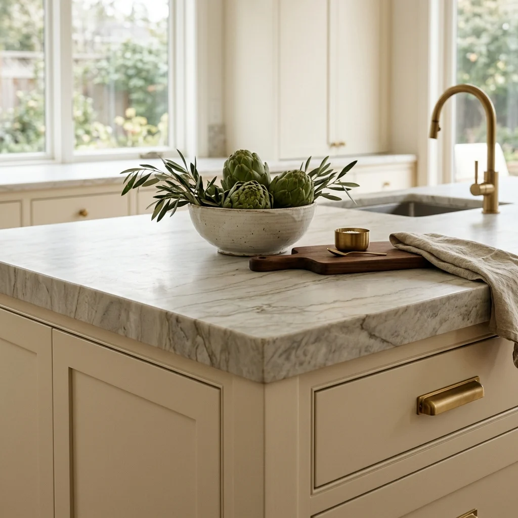
Vibe: The counter feels grounded, matte stone absorbing light instead of throwing it back.
Why it works: A honed rather than polished finish diffuses light across the surface, which is the specific quality that reads as considered rather than showroom-glossy polished stone reflects a room’s imperfections at the viewer, while honed stone reads as a deliberate material choice regardless of the room around it. Large-format porcelain slabs are now visually near-indistinguishable from natural stone at normal viewing distance, making this material coherence achievable at a fraction of natural stone’s cost.
How to get it: Specify a honed finish (not polished) on any natural stone or stone-effect porcelain slab surface, and continue the same material onto the backsplash where possible so the surface reads as one continuous material decision rather than two separate purchases.
💡 Quick Win: A honed quartz composite with subtle veining achieves 90% of the visual effect of natural stone at roughly half the material cost.
Shop the Look
| Product |
| Honed stone-effect quartz countertop sample |
| Brushed brass kitchen faucet |
| Ceramic serving bowl, warm white |
| Honed stone coaster set |
| Brass cabinet pull set |
2. Deep Complex Wall Color with Warm-Cool Undertone Shift
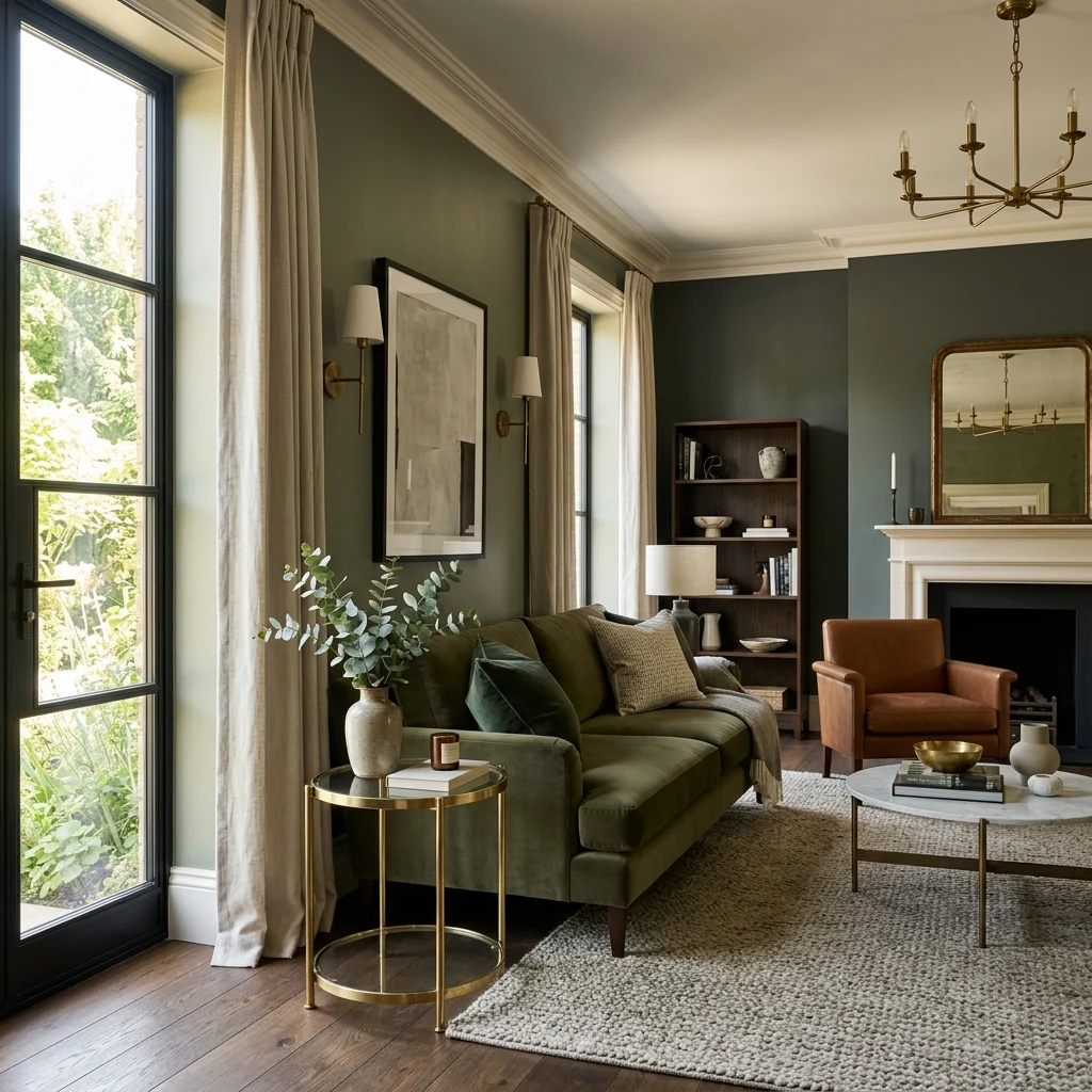
Vibe: The room feels sophisticated, with one wall color reading differently depending on the hour.
Why it works: A wall color that shifts between warm and cool depending on light direction, rather than reading as one flat tone all day, is the specific quality that signals a deliberate design decision instead of a default paint chip choice, since this complexity comes from a named undertone (a grey or brown base beneath the visible hue) rather than a single-note pigment. Eggshell finish adds the slight sheen that flat paint lacks, which is what separates a “considered” wall from a merely painted one.
How to get it: Choose a deep, complex color such as Farrow & Ball’s Studio Green No. 93 or Benjamin Moore’s Kendall Charcoal HC-166 in an eggshell finish, applying it to all four walls rather than one accent wall so the room reads as fully committed to the color.
Shop the Look
| Product |
| Deep complex wall paint eggshell |
| Quality roller and tray set |
| White trim paint, satin finish |
| Brass side table round |
| Velvet cushion cover, deep tone |
3. Layered Circuits with Dimmers on Every Light Source
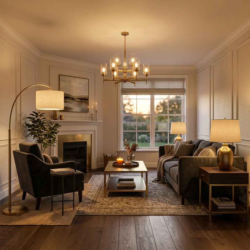
Vibe: The room feels layered, several controllable sources doing what one bright overhead fixture never could.
Why it works: A room lit only by a single bright overhead fixture on a standard switch is one of the most consistent visual signals of an undesigned space, since it flattens texture and eliminates the shadow variation that makes materials read as rich. Installing trailing-edge LED dimmers on every circuit, not leading-edge, which causes LED flicker, converts a functional light system into a controllable atmosphere tool.
How to get it: Install a dimmer on the primary overhead circuit plus at least one table lamp and one floor lamp per main room, all fitted with warm 2700K bulbs, so no single source is doing all the room’s lighting work alone.
💡 Quick Win: A smart warm-white bulb with app-based dimming in an existing lamp delivers the same atmospheric control without any electrical work, ideal for rentals.
Shop the Look
| Product |
| Trailing-edge LED dimmer switch |
| Brass table lamp with warm shade |
| Floor lamp brushed brass |
| Warm 2700K smart LED bulb |
| Velvet armchair, deep tone |
4. A Curated Trio of Objects Per Surface, Never More
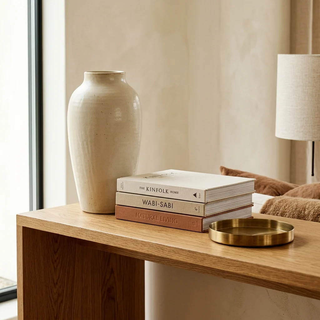
Vibe: The console feels curated, restrained, doing more than a full surface of objects ever could.
Why it works: Limiting every surface in the home to three or fewer objects is a compositional editing discipline, not minimalism for its own sake. A surface with six or eight items reads as cluttered, regardless of individual object quality, while the same surface edited to three well-chosen pieces reads as styled. Graduating the three objects across tall, medium, and low heights creates the three-dimensional depth that makes the grouping read as composed rather than randomly placed.
How to get it: Apply the three-object rule to every console, nightstand, and shelf simultaneously, using a small tray to consolidate smaller items into one grouped element when a surface needs to hold more than three functional pieces.
Shop the Look
| Product |
| Tall ceramic vessel matte glaze |
| Hardcover book set neutral covers |
| Small brass decorative tray |
| Console table, honey oak |
| Brass bookend set |
5. One Exceptional Upholstered Piece in Performance Velvet
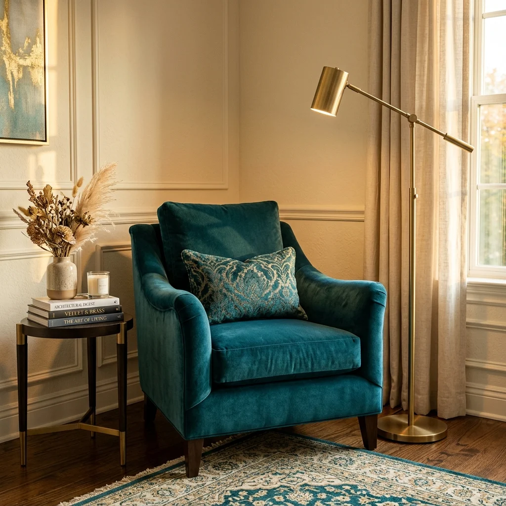
Vibe: The corner feels rich, one chair’s material doing more visual work than the rest of the room combined.
Why it works: Velvet’s pile catches and changes color as light shifts across it, a visual quality that reads as material richness at nearly any price point, which is why one exceptional velvet chair consistently outperforms furniture that costs several times more in a duller fabric. Performance velvet (Crypton-treated or similar) keeps this visual quality intact under regular use, where standard velvet would crush and mark within a year.
How to get it: Choose a velvet in a color that contrasts against your room’s dominant neutral, deep teal in a warm cream room, dusty rose in a grey-toned room, so the chair functions as the room’s clear focal point rather than blending in.
💡 Quick Win: A velvet cushion cover on an existing sofa introduces the same material richness in miniature before committing to a full chair purchase.
Shop the Look
| Product |
| Performance velvet accent chair, deep teal |
| Brushed brass floor lamp |
| Small round side table |
| Velvet cushion cover matching the tone |
| Warm linen throw blanket |
6. Monochromatic Tonal Palette Room to Room
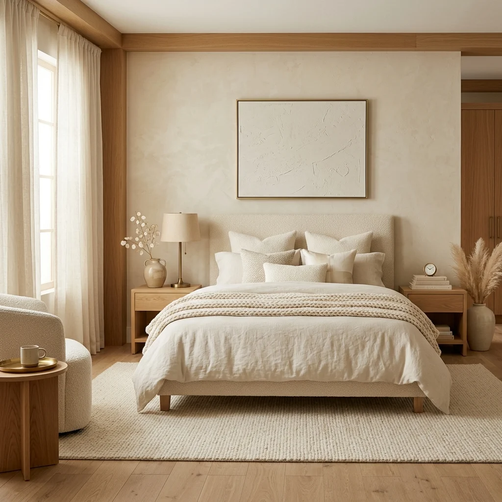
Vibe: The room feels serene, restrained, reading as its own form of sophistication.
Why it works: A monochromatic palette signals that every object in a room was chosen deliberately in relation to every other object, which is the visual signature of professional curation rather than accumulated purchases. The discipline requires only one filter for every new item: does it belong to the room’s chosen warm or cool tonal family, with texture, not color, providing the variation.
How to get it: Define your home’s primary tonal family before buying anything new, and allow exactly one accent color per monochromatic room, a terracotta pot or a brass lamp, so the palette stays enriched rather than diluted.
Shop the Look
| Product |
| Warm cream bedding set linen |
| Boucle accent pillow cover |
| Brass table lamp with warm shade |
| Ceramic vessel warm glaze |
| Honey oak bed frame, low profile |
7. Solid Brass Hardware Upgrade Across Every Storage Piece
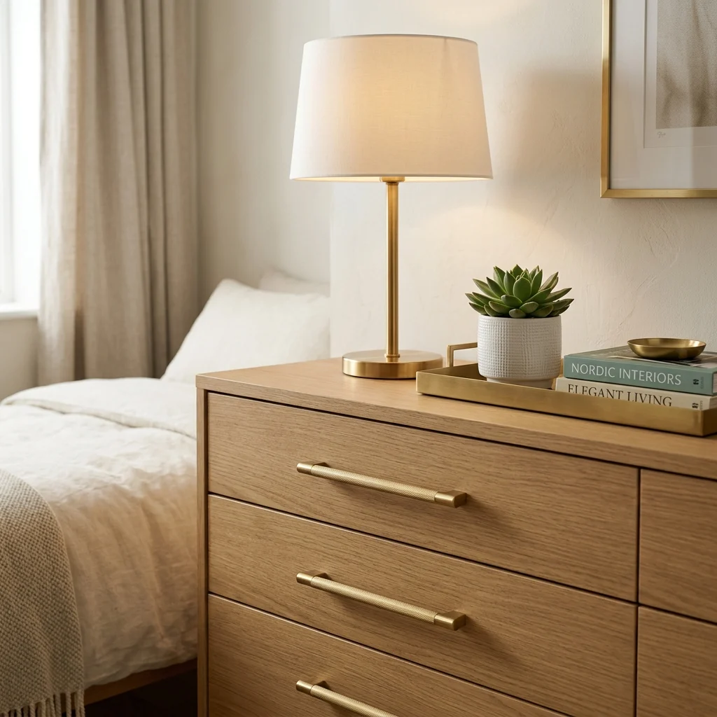
Vibe: The dresser feels upgraded, hardware alone shifting how the whole piece reads.
Why it works: Furniture hardware is a detail the eye unconsciously uses to judge a piece’s quality. Standard chrome or plain metal pulls signal a manufacturer’s budget decision, while matching brushed brass across every storage piece in a room signals a deliberate design decision, creating material coherence that ties otherwise unrelated furniture together.
How to get it: Measure existing hardware hole spacing (commonly 3, 3¾, 5, or 6¼ inches between screw holes) before ordering replacements, and apply brushed or unlacquered brass consistently across every drawer, cabinet, and door pull in the room simultaneously.
💡 Quick Win: Swapping hardware on just one dresser for under $40 is a same-afternoon project that noticeably elevates the piece without touching anything else in the room.
Shop the Look
| Product |
| Brushed brass drawer pull set |
| Brass table lamp with warm shade |
| Brass decorative tray |
| Honey oak dresser |
| Small potted plant ceramic pot |
8. Furniture Grouped Tightly Around a Correctly Sized Rug
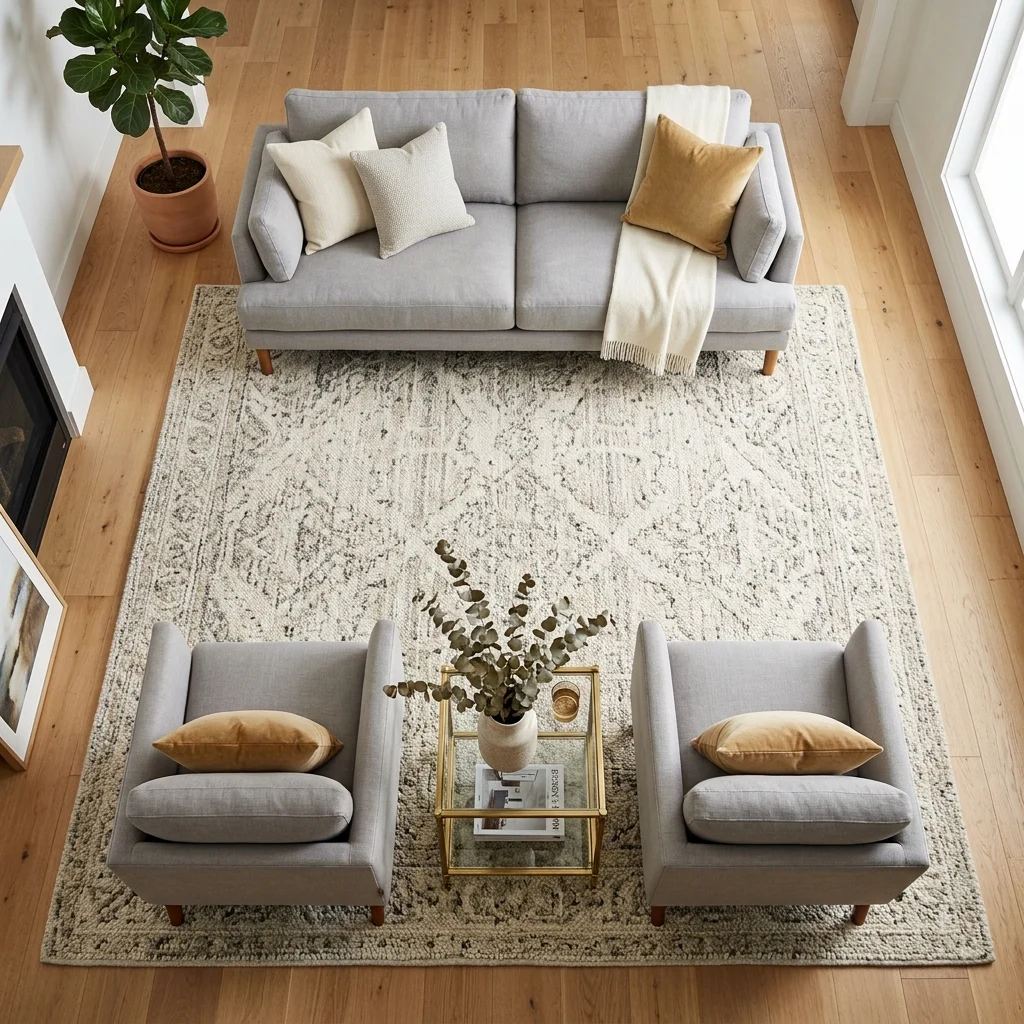
Vibe: The room feels resolved, furniture reading as one designed grouping rather than separate pieces.
Why it works: An undersized rug, one where only the front legs of seating rest on it is among the most common visual signals of an undesigned room, because it fails to define the seating area as a composed spatial unit. A correctly sized rug, large enough for every leg of every seating piece, creates a defined room-within-a-room that organizes the furniture as a single intentional composition.
How to get it: Measure the full seating group, including the coffee table, then add roughly 12–18 inches on each side to find the minimum rug dimension. A standard three-seat sofa with two armchairs typically needs a rug no smaller than 8 by 10 feet.
Shop the Look
| Product |
| Large wool area rug natural |
| Rug pad non-slip |
| Sofa performance fabric neutral |
| Matching armchair pair |
| Round coffee table, honey oak |
9. Full-Height Ceiling-Mounted Linen Curtains
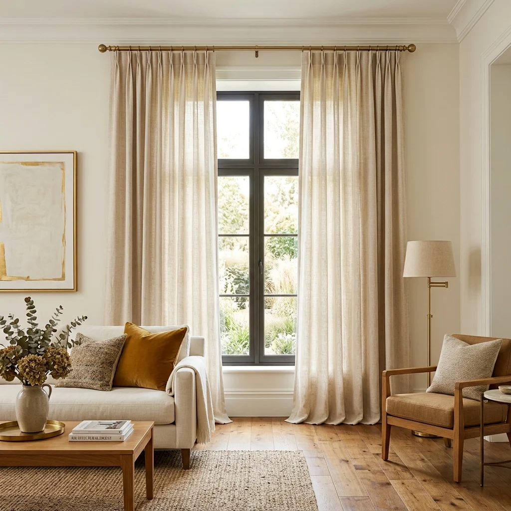
Vibe: The window feels taller, curtains suggesting the ceiling is the real boundary rather than the window frame.
Why it works: Curtains hung close to the actual window frame announce the window’s real size regardless of fabric quality, while curtains mounted at the ceiling and allowed to pool 1–2 inches on the floor suggest the ceiling itself is the architectural boundary, making the whole wall read as taller. Natural linen achieves this at any budget level because its visual quality comes from fiber texture, not manufacturing cost.
How to get it: Mount the curtain track within 2 inches of the ceiling, regardless of where the window sits on the wall below, using panels 2.5 to 3 times the window’s width for a properly gathered look when closed.
💡 Quick Win: Rehanging existing curtains at ceiling height, even with a visible rod, instantly changes the room’s perceived proportions at zero material cost.
Shop the Look
| Product |
| Natural linen curtain panel ivory |
| Ceiling mount curtain track |
| Brass curtain rod finials |
| Curtain ring clip set |
| Velvet cushion cover |
10. Warm Metallic Accents Layered Against Cool Stone
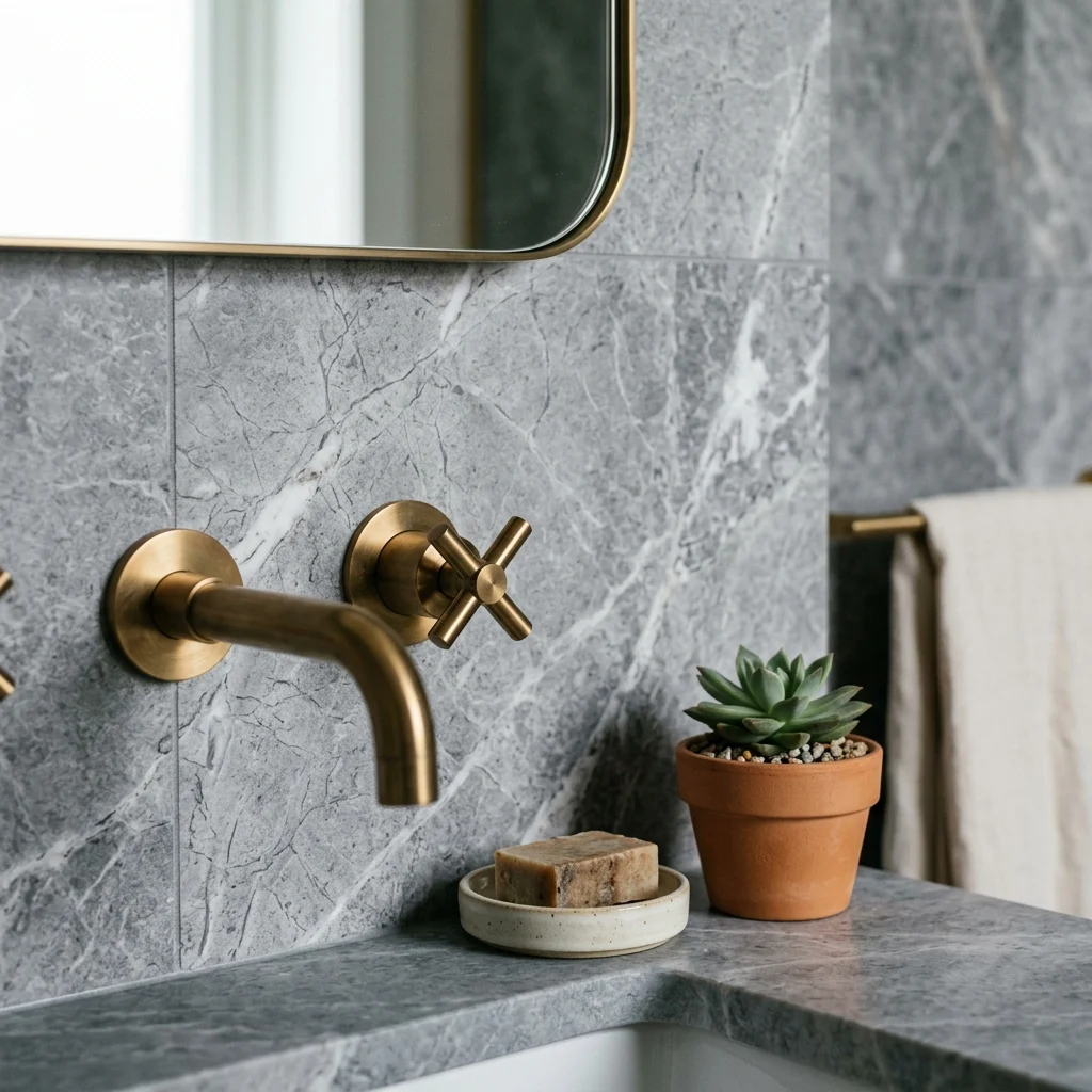
Vibe: The room feels balanced, warm metal keeping cool stone from reading as clinical.
Why it works: Pairing a cool-toned stone with warm brass fixtures uses temperature contrast rather than color contrast, which is the specific technique that keeps a stone-heavy room from feeling sterile. The brass provides just enough warmth to balance the stone’s coolness without introducing a competing hue.
How to get it: Choose brushed or unlacquered brass fixtures specifically when working with a cool grey or blue-grey stone, and keep every other metal finish in the room consistent with that brass rather than mixing in chrome or nickel.
Shop the Look
| Product |
| Brushed brass bathroom faucet |
| Cool grey stone-effect tile |
| Ceramic soap dish matte |
| Brass towel bar |
| Small potted plant ceramic pot |
11. A Single Sculptural Statement Fixture Per Room
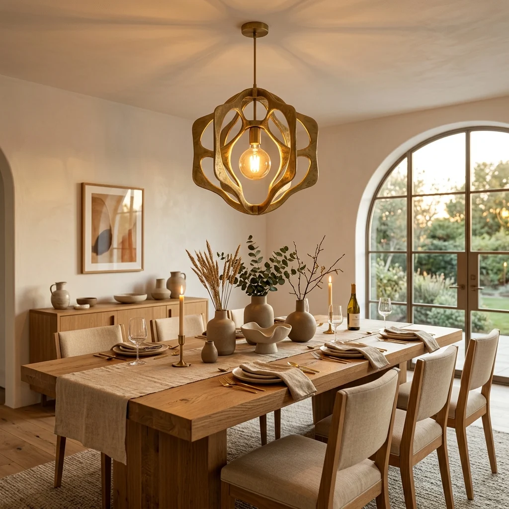
Vibe: The table feels anchored, one fixture doing what several smaller lights never could.
Why it works: A genuinely exceptional pendant performs three functions no other single object can: it provides primary ambient light, creates a focal point that organizes the room’s spatial composition, and introduces a material quality that adds tactile richness. Rooms without a statement fixture instead rely on several undistinguished light sources that add up to adequate lighting but no single point of visual interest.
How to get it: Hang the pendant so its base sits roughly 28–30 inches above the table surface, creating an intimate light pool without interrupting sightlines across the table, and install it on a dimmer.
💡 Quick Win: Swapping only the bulb in an existing fixture to a warm filament style is a five-minute change that shifts the mood before any hardware purchase.
Shop the Look
| Product |
| Sculptural pendant light fixture |
| Warm filament bulb set |
| LED dimmer switch |
| Ceramic centerpiece bowl |
| Linen table runner natural |
12. Matched Bedside or Side Table Pair for Symmetry
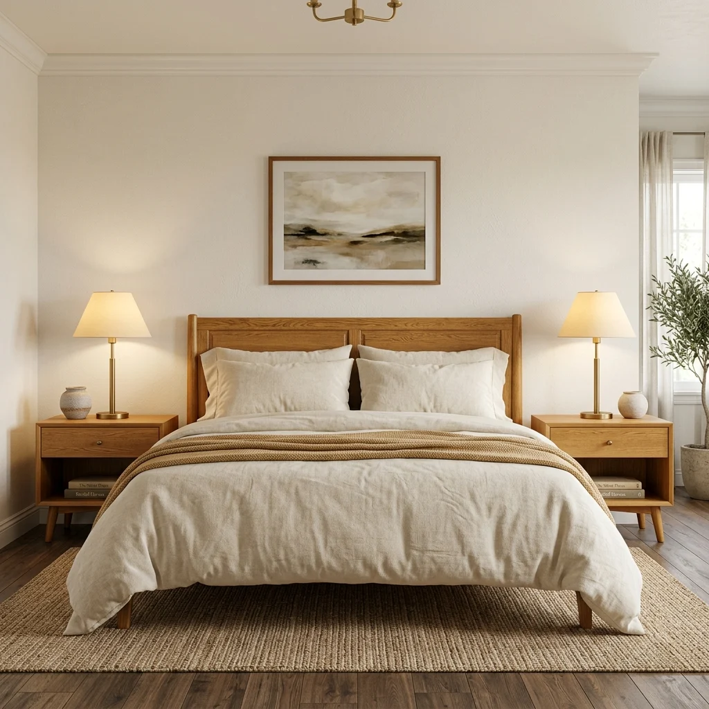
Vibe: The bed feels balanced, matched symmetry reading as calm and resolved.
Why it works: A matched pair of nightstands and lamps applies a classical symmetry principle that reads as deliberate composition, in direct contrast to mismatched or single-nightstand arrangements that read as improvised. This is one of the few places in a luxury interior where exact matching, rather than curated variety, is the correct compositional choice.
How to get it: Choose identical nightstands and lamps for both sides of the bed, keeping each surface styled with the same three-object maximum so the symmetry extends to the styling, not just the furniture.
Shop the Look
| Product |
| Honey oak nightstand pair |
| Brass table lamp pair matching |
| Ceramic vessel, small pair |
| Hardcover book pair neutral |
| Warm cream bedding set |
13. Book-Matched Marble or Marble-Effect Backsplash
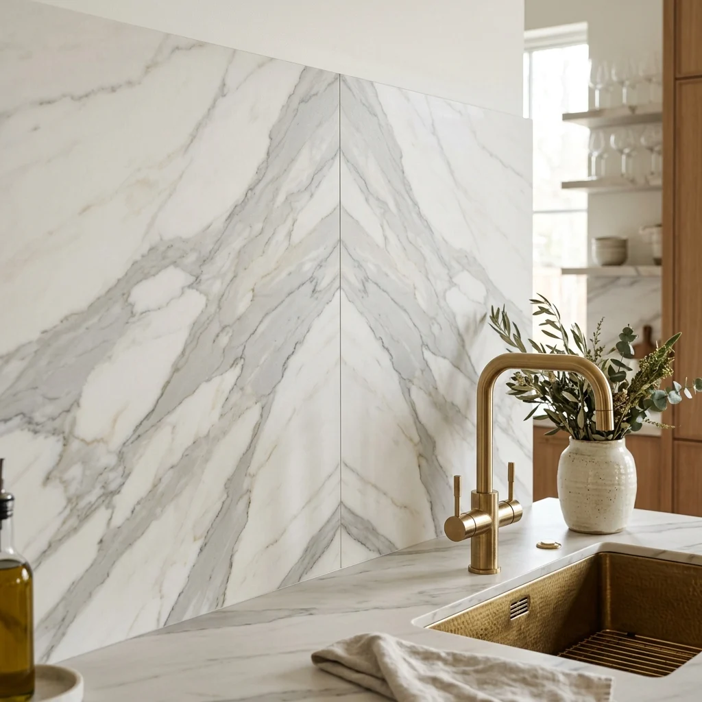
Vibe: The wall feels deliberate, veining meeting itself like an intentional pattern rather than a coincidence.
Why it works: Book-matching installing two adjacent slabs cut from the same block so their veining mirrors across the seam is a technique historically reserved for high-end stone installations, and it reads as a genuine design investment because the symmetry can only be achieved by ordering sequential slabs rather than whatever’s in stock.
How to get it: Request book-matched slabs specifically when ordering marble or marble-effect porcelain for a backsplash, and center the seam on the room’s main sightline (typically behind the range or sink) so the mirrored veining is the first thing visible on entry.
Shop the Look
| Product |
| Book-matched marble-effect porcelain slab |
| Brushed brass kitchen faucet |
| Ceramic vessel countertop |
| Stone sealer wet-rated |
| Brass cabinet pull set |
14. Large-Format Single Artwork Sized to the Furniture Below
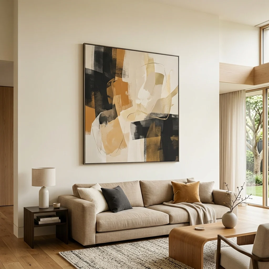
Vibe: The wall feels curated, one large piece reading as chosen rather than accumulated.
Why it works: A single large-format artwork with generous breathing space applies the same principle: museums use one significant piece per wall with room to be seen, which makes the piece appear more considered than the same art crowded among smaller frames. Scale matters more than subject here: an undersized piece above a large sofa reads as an afterthought regardless of quality.
How to get it: Choose artwork at a minimum 60% of the sofa’s width, hung with its center at 57–60 inches from the floor, in a slim neutral frame that keeps attention on the piece rather than the framing.
💡 Quick Win: A large-format print from a quality print service costs a fraction of an original painting and reads with equal visual authority from across the room.
Shop the Look
| Product |
| Large format abstract art print |
| Slim natural oak picture frame |
| Picture hanging kit with level |
| Neutral sofa performance fabric |
| Single ceramic decorative object |
15. Complex Greige as the Home’s Connective Neutral
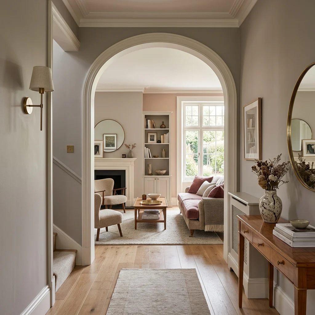
Vibe: The home feels continuous, one sophisticated neutral carrying through connected rooms.
Why it works: A “complex” greige one with a perceptible undertone of both pink and grey, rather than a flat single-note beige, reads as significantly more sophisticated because that undertone shift is what registers as a deliberate color decision rather than a default choice. Carrying it through connected spaces removes the color-transition breaks that would otherwise chop a home into visually separate segments.
How to get it: Choose a named complex greige such as Farrow & Ball’s Elephant’s Breath No. 229, and apply it through every connected hallway and living space rather than treating each room as a separate paint decision.
Shop the Look
| Product |
| Complex greige interior wall paint |
| Warm white trim paint |
| Brass wall sconce |
| Velvet cushion cover |
| Brass picture rail hook set |
16. Reeded or Fluted Wood Paneling on a Feature Wall
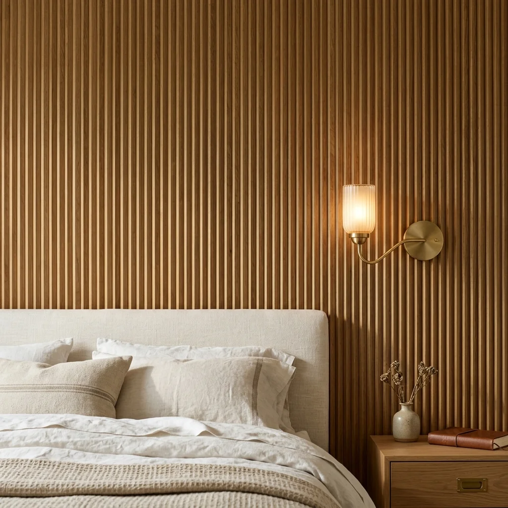
Vibe: The wall feels architectural, with vertical grooves that catch light the way genuine millwork would.
Why it works: Reeded or fluted paneling creates a shadow-relief pattern that reads as architectural detail rather than applied decoration, provided the panel and the surrounding wall are painted the same color. A two-tone treatment breaks the illusion and reads as decoration instead of built-in millwork.
How to get it: Apply reeded MDF or timber paneling to one feature wall, painting the entire wall panel and background in one matte or eggshell color so raking light from a nearby window creates genuine shadow relief.
💡 Quick Win: Reeded panel strips applied only behind a headboard, rather than the full wall, achieve the effect at a fraction of the material cost.
Shop the Look
| Product |
| Reeded wood panel strips |
| Construction adhesive |
| Eggshell paint matching wall color |
| Brass wall sconce pair |
| Linen bedding set warm white |
17. Picture Lights to Frame Art Without Overhead Glare
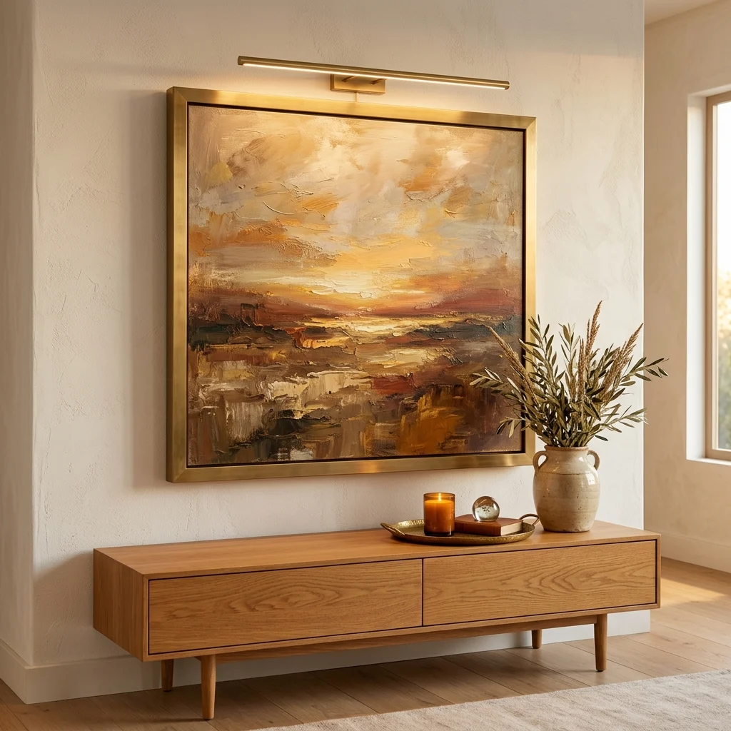
Vibe: The artwork feels gallery-lit, light doing exactly what the piece needs and nothing more.
Why it works: Overhead room lighting alone often casts uneven glare or shadow across artwork, while a dedicated picture light washes the piece evenly from a fixed angle, the same lighting-behavior solution galleries use, applied at residential scale. This small addition signals that the artwork was considered as a lit object, not simply hung and left to whatever ambient light happens to reach it.
How to get it: Mount a slim brass picture light 6–8 inches above the frame’s top edge, angled to wash the full artwork surface evenly, wired to its own switch so it can operate independently of the room’s main lighting.
Shop the Look
| Product |
| Brass picture light hardwired |
| Large format artwork print |
| Console table honey oak |
| Ceramic vessel warm glaze |
| Brass decorative tray |
18. Full-Height Mirror Panel to Double Perceived Depth
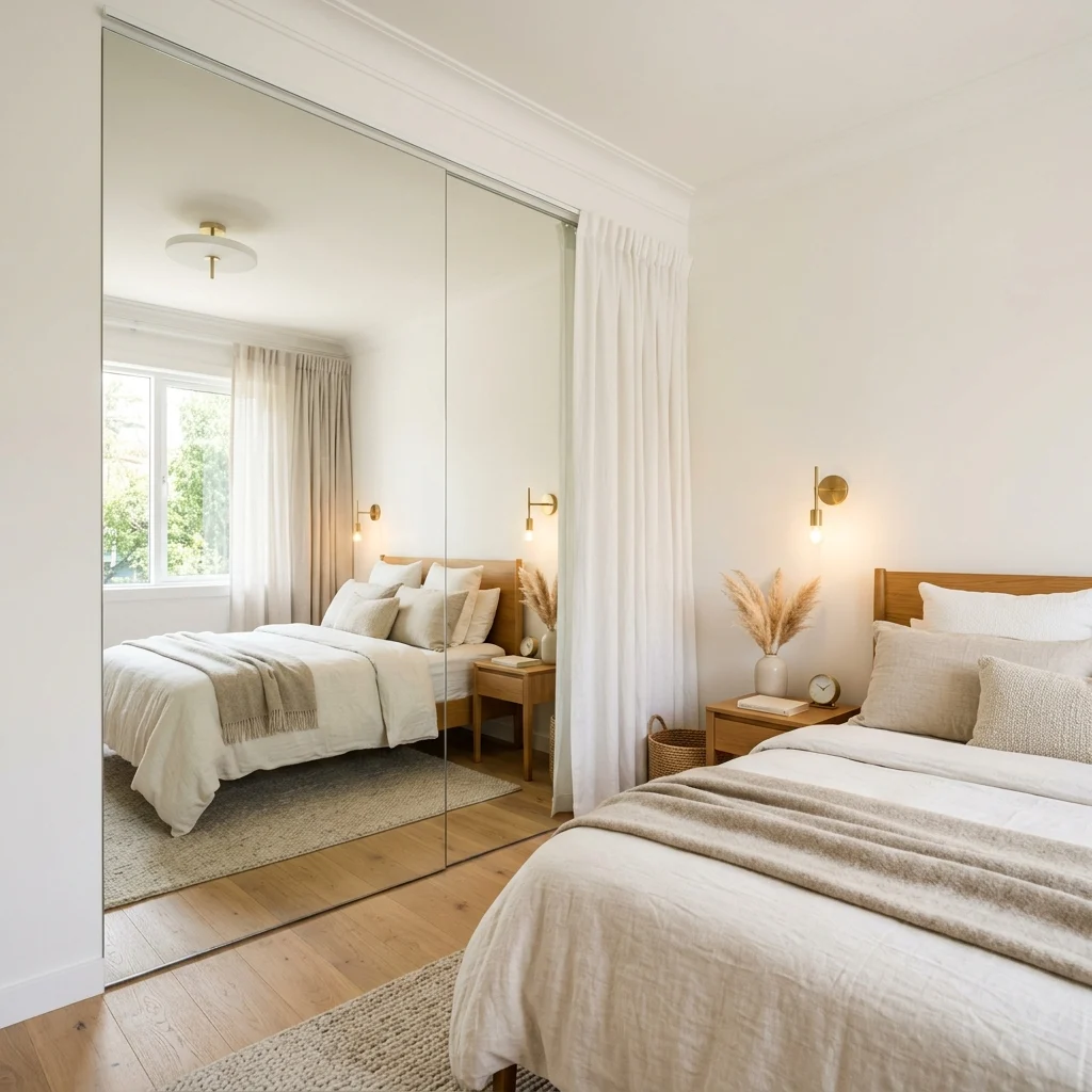
Vibe: The small room feels doubled, depth extending well past its actual walls.
Why it works: A full-height mirror covering an entire wall, rather than a smaller framed mirror, reflects the whole room rather than a fragment of it, which is the specific detail that makes the trick read as genuine spatial expansion instead of an obvious decorating gimmick. Positioning it opposite a window also doubles the natural light bouncing through the room.
How to get it: Install a frameless or minimally framed mirror panel floor-to-ceiling on the wall directly opposite your main window, sized to the full wall width rather than a partial panel that would break the reflected continuity.
Shop the Look
| Product |
| Full-height frameless mirror panel |
| Mirror mounting hardware kit |
| Brass wall sconce |
| Linen bedding set warm white |
| Honey oak bed frame low profile |
How to Start Your Luxury Interior Transformation
Start by auditing your lighting before buying any furniture. Stand in your main room at 7pm with only the existing lights on and ask honestly whether it looks warm and layered or flat and utilitarian. No amount of beautiful furniture will overcome a lighting deficit, since it will look exactly as ordinary under poor light as it did before the purchase.
The most common mistake is buying individually beautiful pieces that don’t share a tonal family: a velvet sofa in one palette, curtains in another, a rug in a third. This produces a room that reads as assembled rather than designed; fix it by defining your home’s warm or cool tonal family first, then filtering every purchase through that single question before buying anything.
Three items under $50 that create immediate impact: a set of two brushed brass drawer pulls, a small honed stone tray to consolidate a cluttered surface, and a warm 2700K smart bulb for app-based dimming in an existing lamp.
A full luxury interior transformation across a home realistically takes 3–6 months and costs $15,000–$40,000. A focused single-room refresh hitting curtains, lighting, wall color, and a rug costs $600–$1,800 and produces a space that reads as considerably more designed than its actual investment.
Frequently Asked Questions About Luxury Interior Design
What’s the difference between luxury interior design and expensive decor?
Luxury interior design is defined by material coherence, spatial discipline, and layered lighting decisions achievable at any budget while expensive decor simply means costly individual items that may or may not work together. A room furnished entirely with high-end pieces that don’t share a tonal family will read as less luxurious than a room built from modest pieces filtered through one deliberate palette and lighting plan.
What color palette works best for luxury interior design?
Complex greige, warm charcoal, and warm cream form the base palette, with one deep jewel tone as a controlled accent. Farrow & Ball’s Elephant’s Breath No. 229 and Studio Green No. 93 are common reference points. A color’s complexity whether it shifts between warm and cool under different light matters more than its specific hue for reading as luxurious.
How much does a luxury interior design transformation cost?
A focused refresh hitting curtains, lighting, and a rug typically runs $600–$1,800 per room. A mid-range whole-room transformation with new furniture and hardware costs $4,000–$10,000. A full multi-room renovation including stone surfaces, custom paneling, and layered lighting throughout can reach $30,000–$60,000 depending on square footage and material sourcing.
Does luxury interior design work with a modern or traditional home?
Yes the underlying principles (material coherence, spatial discipline, layered light) apply regardless of the base architectural style, whether the home is a modern loft or a traditional colonial. The specific materials shift by context: a modern home might lean on honed concrete and brass, while a traditional home might lean on book-matched marble and reeded millwork, but both apply the same three principles.
What’s the single most important element in luxury interior design?
Lighting quality is the most important element more than any single material or color choice, whether a room has warm, layered, dimmable light determines whether it reads as designed or merely furnished. A room with expensive furniture under one harsh overhead bulb will still read as flat, while a modestly furnished room with three layered, dimmable light sources will read as considered.
Ready to Create Your Dream Luxury Interior?
These 18 ideas move through material coherence, controlled color, layered light, and spatial discipline, showing that luxury interior design comes together through deliberate decisions rather than unlimited spending. Starting with a single dimmer switch or one correctly sized rug is not a lesser version of the transformation; it’s exactly the kind of high-return move this approach rewards. Today, stand in your main living space at dusk and count how many separate light sources you can control independently if the answer is one, that’s where your transformation begins. Done well, the home will start to feel considered at every hour, warmth and restraint working together instead of one substituting for the other. Save the ideas that matched your own rooms and your own light, that book-matched marble seam, that full-height linen curtain because luxury interior design rewards the home built through precise decisions, one deliberate material at a time.