
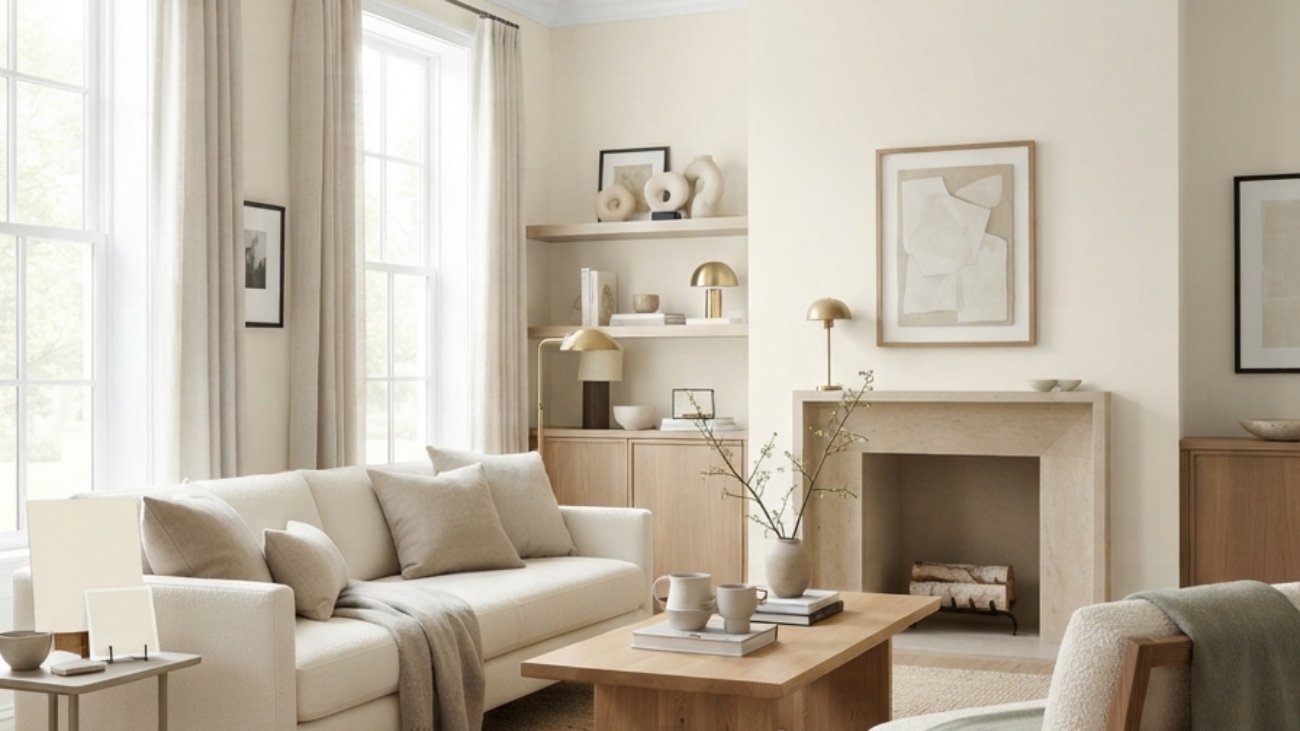
Sherwin-Williams Alabaster SW 7008 is a soft, warm white with a creamy quality that sits between a crisp white and a deeper off-white, making it versatile for walls, trim, cabinetry, and whole-home palettes. This 15 Sherwin-Williams Alabaster Color Review breaks down its undertones, LRV, lighting behavior, room applications, coordinating colors, wood compatibility, trim choices, and the situations where Alabaster may not be the right white.
Alabaster has a quiet warmth that changes with the room around it. In strong southern sunlight, it can feel creamy and sunlit, while cooler northern light can pull back some of its warmth and make the color feel more balanced. Against natural oak, linen, stone, and aged brass, it creates a soft backdrop rather than demanding attention. The result is a white that feels lived-in instead of stark, but its warmth is exactly why sampling matters. Here are 15 ideas worth saving and stealing.
Why Sherwin-Williams Alabaster Color Review Matters So Much
Alabaster is not a historical decorating style; it is a specific Sherwin-Williams paint color, SW 7008, within the white family. Its appeal comes from the long-standing interior-design preference for warmer whites that soften architectural surfaces rather than creating the sharp contrast associated with brilliant cool whites. Sherwin-Williams lists Alabaster at an LRV of 82.215, while its own color guidance places it among warm whites.
Its material partners are equally specific: unfinished white oak, natural maple, walnut, limestone, travertine, warm marble, natural linen, oatmeal wool, rattan, aged brass, and matte black. Alabaster has a creamy yellow warmth, so it generally feels more harmonious beside warm natural materials than beside icy whites. Independent color analysis also notes that neighboring bright whites can make Alabaster appear warmer or more yellow by comparison.
The color remains relevant because warm whites have become an important alternative to both stark white and cool grey. Sherwin-Williams currently describes Alabaster as a balanced neutral white and has featured it in real-home applications including kitchens, living rooms, and porches. Its official designer material also shows Alabaster used with warmer greys, browns, and beiges.
Style at a Glance
| Element | Core Trait 1 | Core Trait 2 |
| Philosophy | Soft warmth | Balanced brightness |
| Materials | Oak, linen, stone | Brass, ceramic, rattan |
| Color palette | Alabaster, ivory, oatmeal | Greige, sage, warm taupe |
1. Use Alabaster as a Whole-Home Warm White

Category: Color
Vibe: Cohesive; the color visually connects separate rooms into one continuous home.
Why it works: Using one white across connected rooms reduces abrupt color changes and allows flooring, furniture, and artwork to provide the variation. Alabaster’s LRV of 82.215 gives it substantial light reflectance while its warm character prevents the continuous palette from feeling as sharp as a brilliant white.
How to get it: Use Alabaster on the main walls first, then decide whether the same color should continue onto trim and doors based on your desired contrast. Sample it in the hallway as well as the brightest room because the same paint can shift significantly with changing light.
💡 Quick Win: Paint one connecting hallway in Alabaster before repainting multiple rooms; it gives you a low-risk test of how the color behaves throughout the home.
Shop The Look
| Product | Purpose |
| Sherwin-Williams Alabaster SW 7008 sample | Tests the exact color |
| Natural oak console table | Adds warm wood contrast |
| Oatmeal linen runner | Extends the warm palette |
| Aged brass table lamp | Introduces controlled warmth |
| Ivory ceramic vase | Keeps accessories tonal |
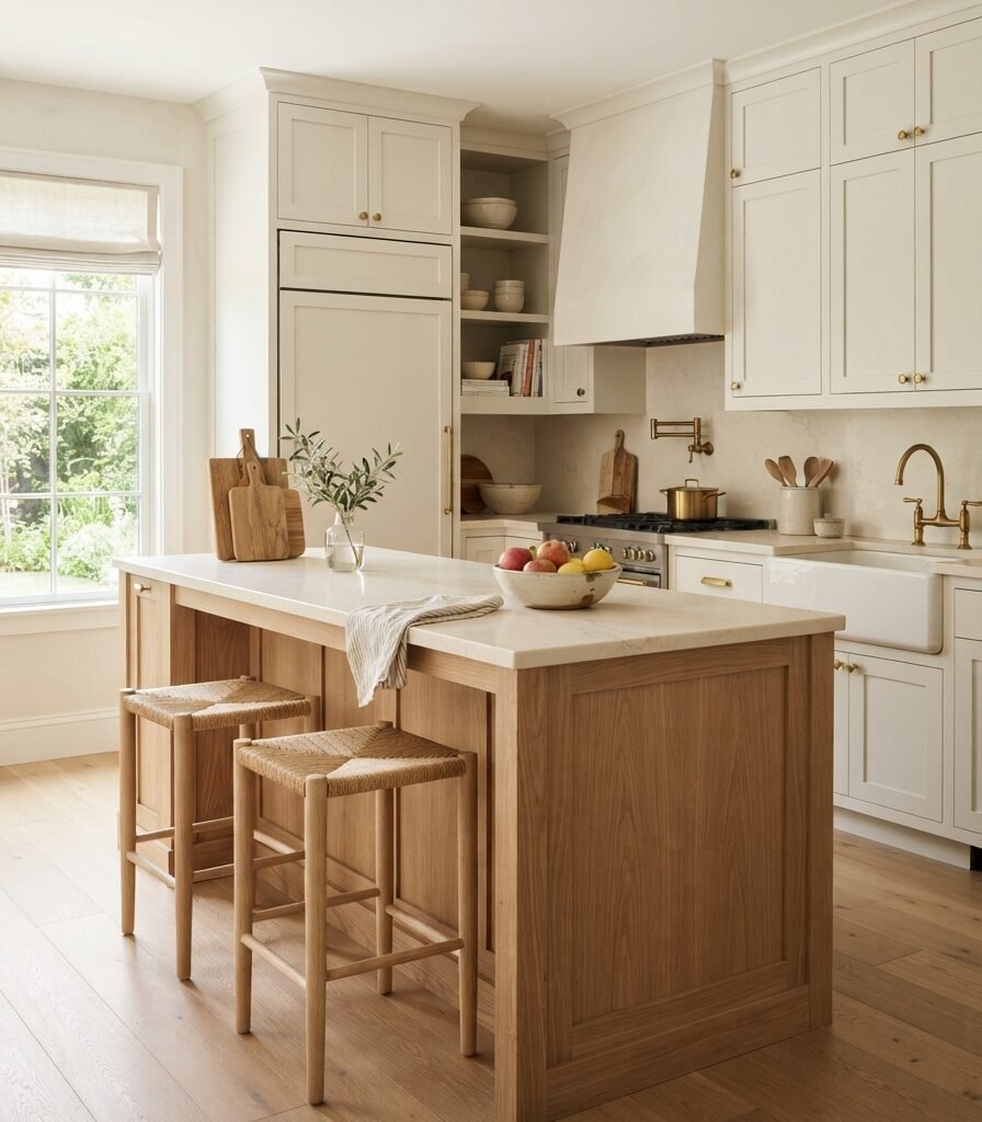
2. Pair Alabaster with Natural White Oak
Category: Material
Vibe: Grounded; the wood grain prevents the warm white from becoming visually flat.
Why it works: Alabaster and pale oak share a warm visual temperature, so the contrast comes from material rather than opposing color. The smooth painted cabinetry against open oak grain creates texture layering while maintaining a restrained palette.
How to get it: Choose unfinished or lightly white-oiled oak rather than strongly orange-stained wood. If your existing oak is golden, place a large Alabaster sample beside it before painting because the warmth of the wood can intensify the creaminess of the paint.
Shop The Look
| Product | Purpose |
| Natural white oak cabinet sample | Tests the wood pairing |
| Pale oak counter stools | Repeats the wood tone |
| Cream quartz-look tray | Bridges white and oak |
| Natural wood cutting board set | Adds practical texture |
| White oak floating shelf | Extends the material palette |
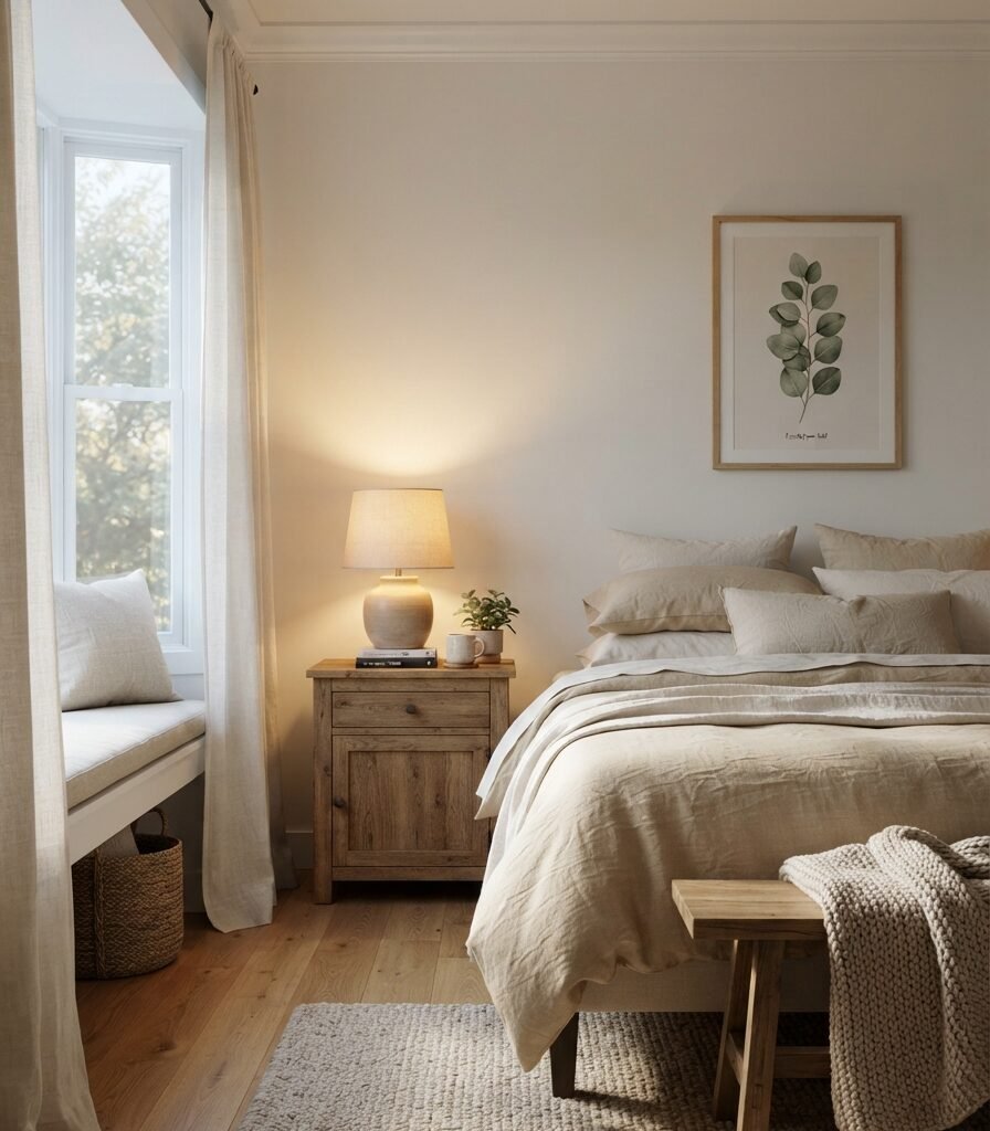
3. Let Alabaster Change with Natural Light
Category: Lighting
Vibe: Luminous; the white subtly shifts as the light source changes.
Why it works: Paint does not have one fixed appearance because light changes its perceived temperature and depth. Sherwin-Williams specifically notes that natural and artificial light affect how whites appear, while Alabaster’s warm character becomes more apparent under warm illumination.
How to get it: Paint a large sample board and move it between the window wall, opposite wall, and artificial-light zone. Observe it in the morning, afternoon, and evening rather than approving the color after viewing it only under store lighting.
💡 Quick Win: Test Alabaster beside your existing flooring after sunset with your normal lamps switched on; this often reveals undertones that daylight alone does not show.
Shop The Look
| Product | Purpose |
| Large Alabaster peel-and-stick sample | Tests light behavior |
| 2700K dimmable LED bulbs | Creates warm evening light |
| Linen drum-shade table lamp | Softens artificial illumination |
| Ivory blackout curtain panel | Controls strong daylight |
| Pale oak bedside table | Provides warm contrast |
4. Use Alabaster on Kitchen Cabinets

Category: Furniture
Vibe: Settled; the cabinetry feels substantial without looking visually heavy.
Why it works: Alabaster has enough warmth to soften large expanses of cabinetry while retaining the brightness expected from a white kitchen. It works especially well when darker wood or warm stone is introduced as a grounding counterpoint.
How to get it: Use a durable cabinet-grade finish and test Alabaster beside the countertop and backsplash before committing. Be particularly careful with very bright white quartz or cool white subway tile because those surfaces can make the creamy warmth of Alabaster more noticeable.
Shop The Look
| Product | Purpose |
| Alabaster cabinet paint sample | Tests cabinet color |
| Brushed brass cabinet pull set | Adds warm hardware |
| Walnut kitchen island stools | Grounds the white cabinetry |
| Cream quartz-look countertop sample | Tests surface compatibility |
| Natural oak cutting board trio | Adds organic warmth |
5. Balance Alabaster with Aged Brass and Ceramic

Category: Accessories
Vibe: Collected; the accessories give the white background a tactile identity.
Why it works: A warm white wall benefits from materials with visible surface variation. Aged brass adds a darker warm-metal note, while handmade ceramic introduces irregularity without forcing a strong accent color.
How to get it: Use one metallic finish consistently across the entryway rather than mixing polished chrome, bright brass, and black. Keep ceramic accessories within ivory, cream, and stone tones so Alabaster remains the dominant background.
Shop The Look
| Product | Purpose |
| Aged brass round wall mirror | Creates warm reflection |
| Handmade ivory ceramic vase | Adds tactile variation |
| Travertine-look catchall bowl | Introduces stone texture |
| Taupe linen console runner | Softens the surface |
| Brass taper candle holder set | Adds vertical accessory rhythm |
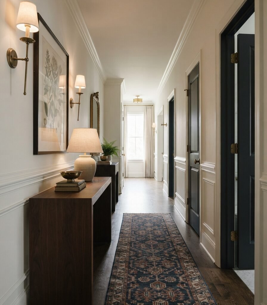
6. Create Contrast with Alabaster Walls and Dark Trim
Category: Layout
Vibe: Framed; the darker elements give the soft white architectural definition.
Why it works: Contrast is strongest when it follows architectural hierarchy. Alabaster provides the broad background while darker doors, trim, or built-ins establish visual boundaries rather than competing with every surface.
How to get it: Choose one architectural element to darken instead of scattering dark accents randomly. A charcoal interior door or walnut console against Alabaster can create a stronger composition than painting multiple unrelated features dark.
Shop The Look
| Product | Purpose |
| Charcoal interior door paint sample | Creates architectural contrast |
| Walnut narrow console table | Adds dark visual weight |
| Antique brass wall sconces | Bridges warm and dark tones |
| Vintage-style neutral runner | Extends the hallway composition |
| Black-framed botanical prints | Repeats the dark accent |
7. Make a Small Room Feel Brighter with Alabaster
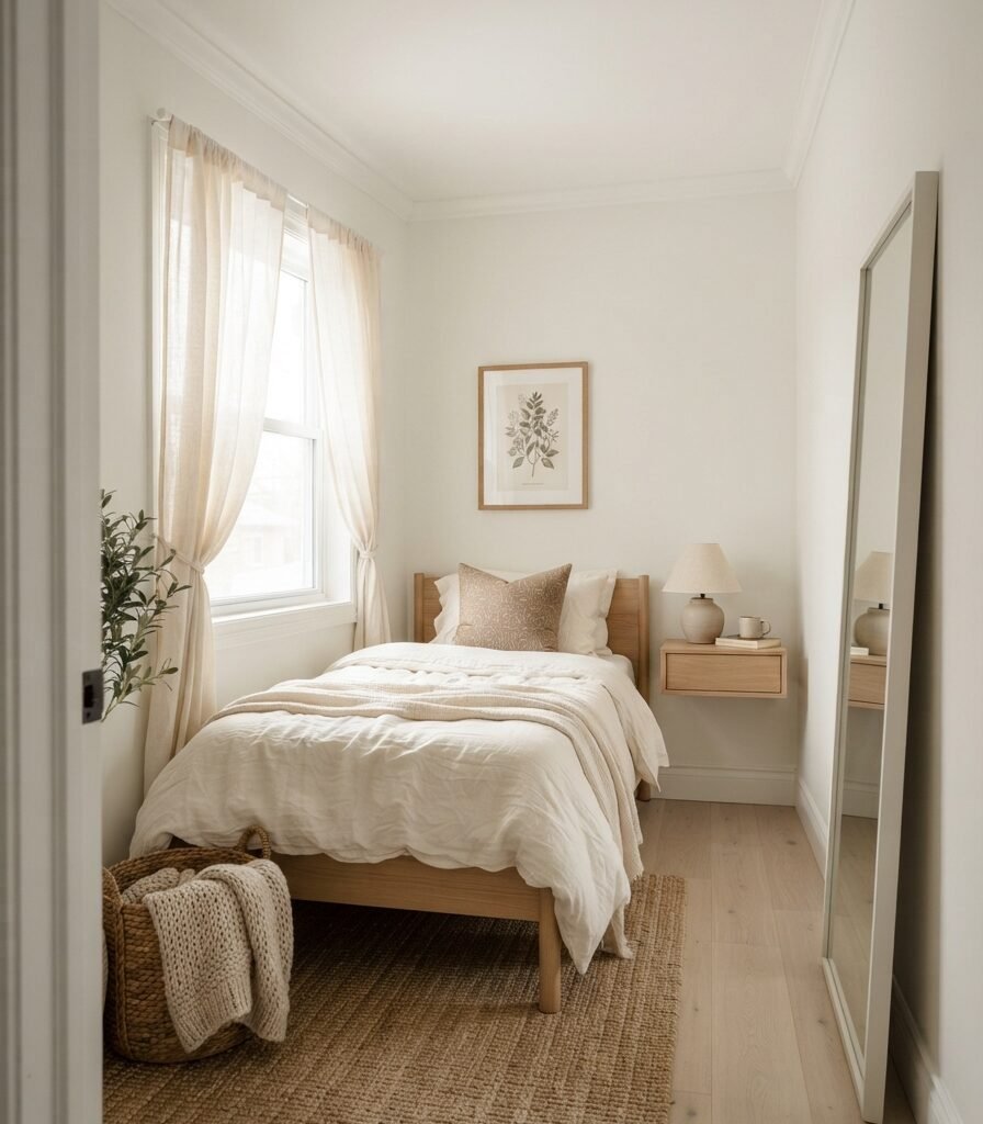
Category: Small Space
Vibe: Airy. The continuous pale surfaces make the compact room feel visually less fragmented.
Why it works: In a small room, the benefit comes less from the word “white” and more from reducing contrast boundaries. Painting walls and trim in closely matched Alabaster tones creates continuity, while its LRV of 82.215 helps reflect available light.
How to get it: Use Alabaster on the walls and trim, then keep the largest furniture pieces within pale oak, ivory, and warm beige. Add one large mirror rather than several small reflective objects so the room does not become visually busy.
Shop The Look
| Product | Purpose |
| Alabaster paint sample card | Confirms small-room appearance |
| Slim pale oak floating nightstand | Preserves floor space |
| Full-length arched mirror | Reflects available light |
| Ivory linen duvet cover | Maintains tonal continuity |
| Compact ceramic bedside lamp | Adds warm task lighting |
8. Pair Alabaster with Muted Sage
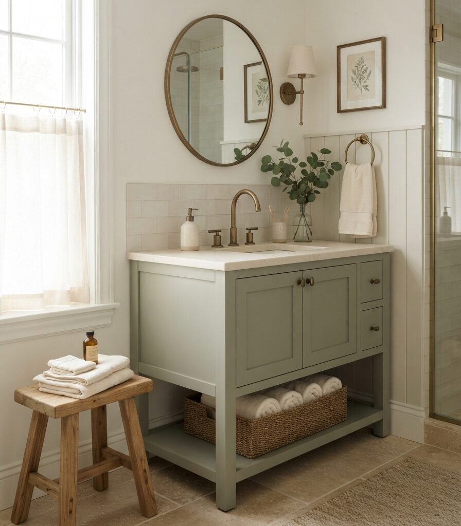
Category: Color
Vibe: Restful. The green adds life while the warm white keeps the room quiet.
Why it works: Muted sage has enough grey and softness to sit comfortably beside a creamy white without creating the high contrast of a saturated green. The combination also creates a natural-material story when paired with oak, limestone, linen, and aged brass.
How to get it: Keep Alabaster as the dominant surface and limit sage to approximately 10–20% of the visible palette through cabinetry, textiles, or one accent wall. Avoid highly saturated emerald or yellow-green finishes if you want the pairing to remain subdued.
💡 Quick Win: Test the combination with a sage hand towel and ceramic accessory before repainting cabinetry; it lets you judge whether your room’s natural light suits the pairing.
Shop The Look
| Product | Purpose |
| Muted sage vanity paint sample | Tests the accent color |
| Sage cotton bath towel set | Introduces low-saturation green |
| Aged brass bathroom hardware set | Adds warm metal |
| Oak bath stool | Connects the natural palette |
| Ivory ceramic soap dispenser | Keeps the countertop tonal |
9. Use Alabaster with Warm Marble and Travertine
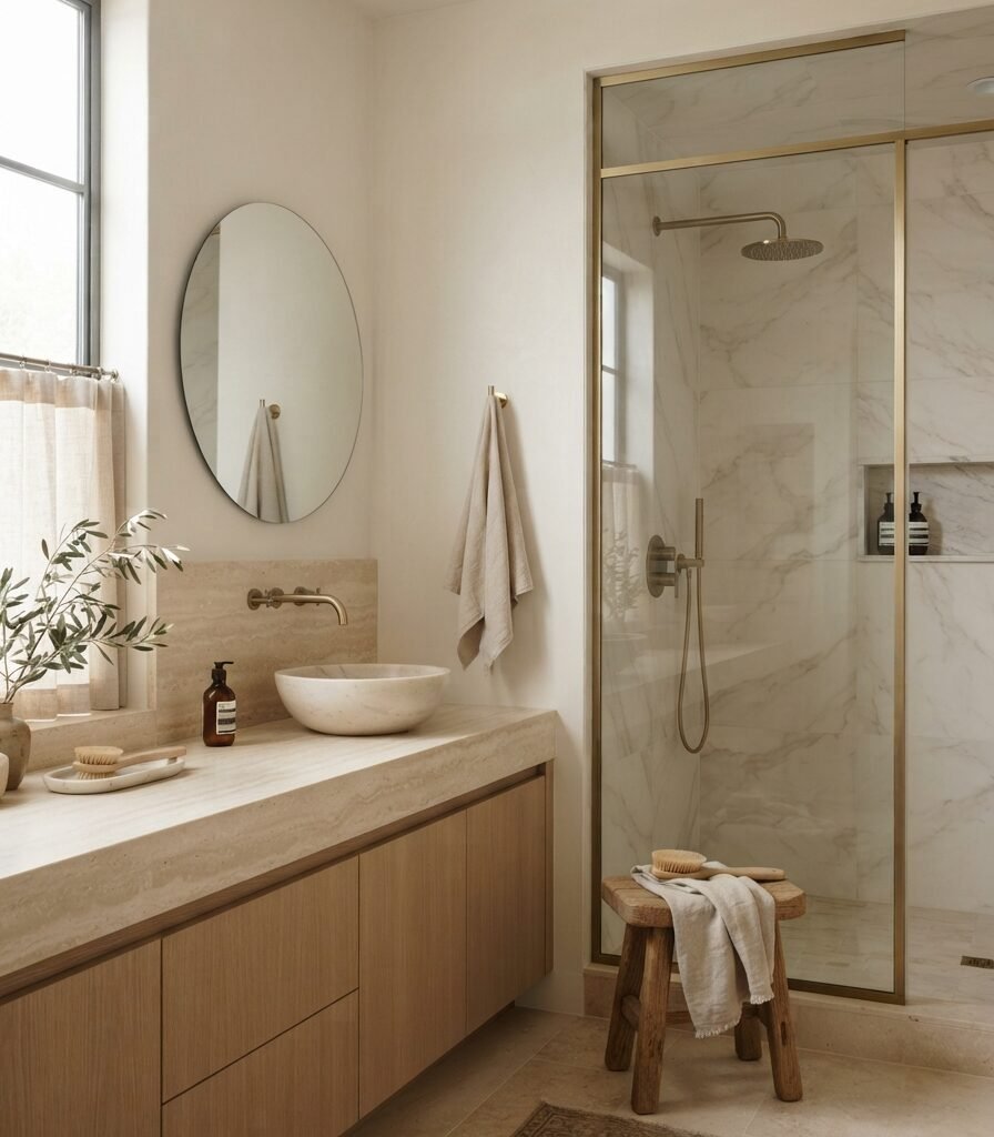
Category: Material
Vibe: Mineral. The room feels soft but substantial because the surfaces have natural variation.
Why it works: Alabaster is particularly useful beside warm stone because both surfaces avoid the blue cast associated with many cool whites. Travertine and warm marble introduce veining and mineral variation, giving the low-contrast palette enough visual depth.
How to get it: Compare your stone sample directly against an Alabaster paint swatch under the bathroom’s actual lighting. If the stone has strong yellow, pink, or green veining, check the combination carefully rather than assuming all warm stone will coordinate.
Shop The Look
| Product | Purpose |
| Travertine-look vanity tray | Introduces mineral texture |
| Warm marble-look peel-and-stick sample | Tests stone compatibility |
| Brushed brass bathroom faucet | Reinforces warm undertones |
| Natural stone soap dish | Adds tactile layering |
| Cream waffle linen bath towel | Softens hard surfaces |
10. Choose 2700K Lighting for Evening Alabaster

Category: Lighting
Vibe: Hushed; the warm light makes the walls feel softer after sunset.
Why it works: Artificial color temperature can amplify the warm component of Alabaster. Rather than relying on one overhead fixture, layered 2700K lighting creates multiple pools of illumination so the wall color shifts gently instead of being flattened by one intense source.
How to get it: Use 2700K bulbs for table and floor lamps, then place the sources at different heights. A lamp beside seating, a lower floor lamp, and dimmed overhead light will produce more depth than increasing the brightness of one ceiling fixture.
Shop The Look
| Product | Purpose |
| 2700K dimmable LED bulb set | Warms evening illumination |
| Aged brass arc floor lamp | Creates tall ambient light |
| Ceramic table lamp with linen shade | Adds soft side lighting |
| Plug-in picture light warm brass | Highlights artwork |
| Smart dimmer switch compatible bulb | Controls evening brightness |
11. Compare Alabaster with Pure White for Trim

Category: Furniture
Vibe: Defined the trim creates a quiet edge without introducing a strong color.
Why it works: Sherwin-Williams identifies Pure White SW 7005 as a cleaner white than Alabaster, so using the two can create subtle tonal separation. However, the brighter trim can make Alabaster appear warmer by comparison, a behavior independent color analysis specifically warns about when combining different whites.
How to get it: Use Alabaster for the larger wall field and a sample of Pure White for trim before committing. If the contrast makes the walls look noticeably creamier than you want, using Alabaster on both surfaces will create a quieter transition.
Shop The Look
| Product | Purpose |
| Pure White SW 7005 sample | Tests trim contrast |
| Alabaster SW 7008 sample | Tests wall comparison |
| Walnut picture frame | Adds warm dark contrast |
| Cream linen accent chair | Bridges the whites |
| Brass picture light | Highlights architectural detail |
12. Style Alabaster with Natural Linen and Oatmeal
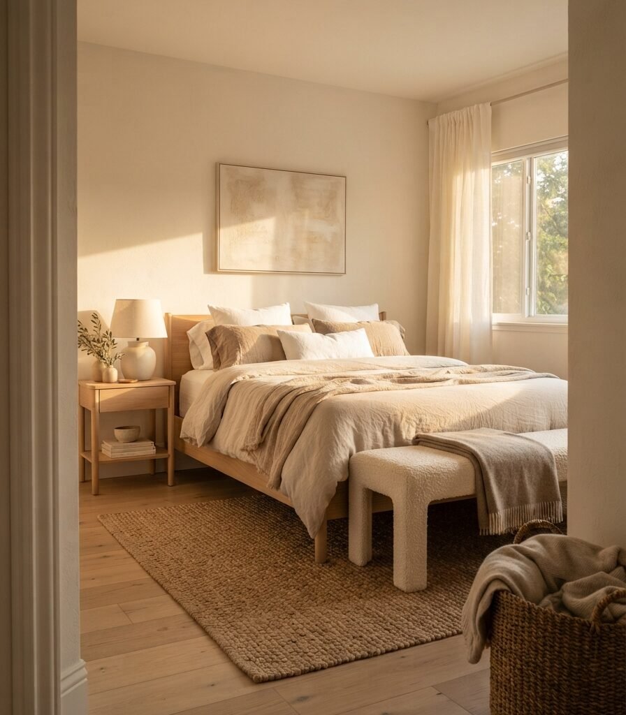
Category: Accessories
Vibe: Tactile; the room relies on texture rather than strong color contrast.
Why it works: A monochromatic warm-white palette needs surface variation to avoid appearing flat. Linen, wool, oak, and ceramic each reflect light differently, so Alabaster can remain the visual foundation while the room still feels layered.
How to get it: Build the textile palette in three close tones: Alabaster or ivory, oatmeal, and flax. Change texture rather than hue; combine washed linen, boucle, wool, and cotton instead of introducing several unrelated accent colors.
💡 Quick Win: Add one oatmeal linen throw and one textured ivory cushion to an existing Alabaster room before buying new furniture.
Shop The Look
| Product | Purpose |
| Oatmeal linen duvet cover | Adds tonal warmth |
| Flax linen euro pillow covers | Builds textile layering |
| Ivory boucle lumbar pillow | Introduces tactile contrast |
| Natural wool-look throw | Adds heavier texture |
| Pale oak storage bench | Connects textiles to furniture |
13. Use Alabaster in a Tiny Bathroom
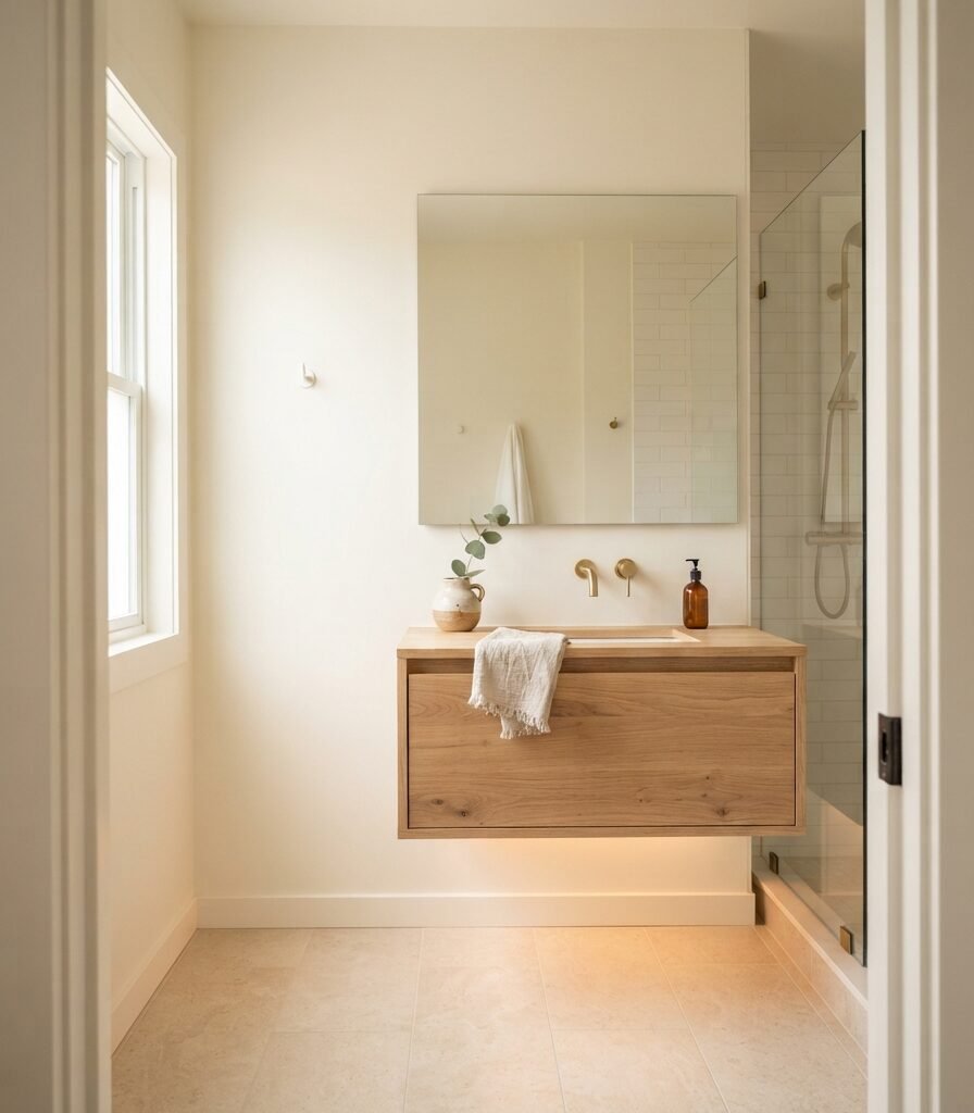
Category: Small Space
Vibe: Weightless; the small room has fewer visual boundaries.
Why it works: Small bathrooms benefit from continuity because every high-contrast boundary can make the room appear more segmented. Alabaster walls combined with warm white tile and a pale vanity create a closely related field while the mirror supplies actual reflection.
How to get it: Keep the wall, trim, and ceiling close in value, then introduce contrast through hardware and one natural material such as oak. Avoid pairing Alabaster with a bright optic-white tile unless you deliberately want the walls to read creamier.
Shop The Look
| Product | Purpose |
| Frameless rectangular bathroom mirror | Maximizes visual reflection |
| Floating pale oak vanity | Keeps floor visible |
| Brushed brass faucet | Adds warm contrast |
| Warm white subway tile sample | Tests tile compatibility |
| Ivory linen hand towel | Maintains tonal continuity |
14. Use Alabaster with Deep Green for a Dramatic Accent
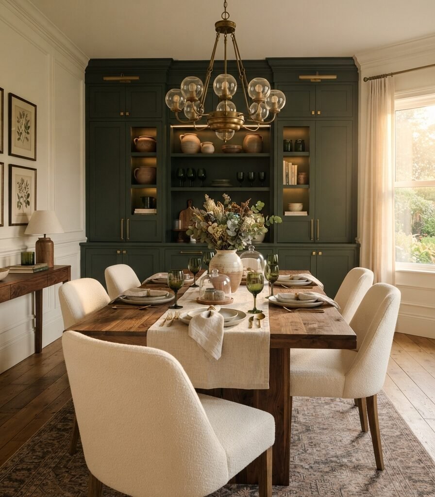
Category: Color
Vibe: Rich; the warm white becomes more luminous beside a deeper saturated tone.
Why it works: Alabaster can serve as a visual reset when paired with a deep green because its warm lightness provides contrast without the icy effect of a brilliant cool white. The combination works particularly well with walnut, aged brass, and natural linen.
How to get it: Keep Alabaster on the larger wall surface and concentrate the green on one architectural feature such as cabinetry, a built-in, or a single accent wall. This creates hierarchy instead of dividing the room into equal color blocks.
Shop The Look
| Product | Purpose |
| Deep forest green cabinet paint sample | Creates saturated contrast |
| Walnut dining table | Grounds the palette |
| Aged brass linear pendant | Bridges green and Alabaster |
| Cream upholstered dining chairs | Softens the contrast |
| Dark green glass vase | Repeats the accent color |
15. Choose Alabaster for a Soft Exterior
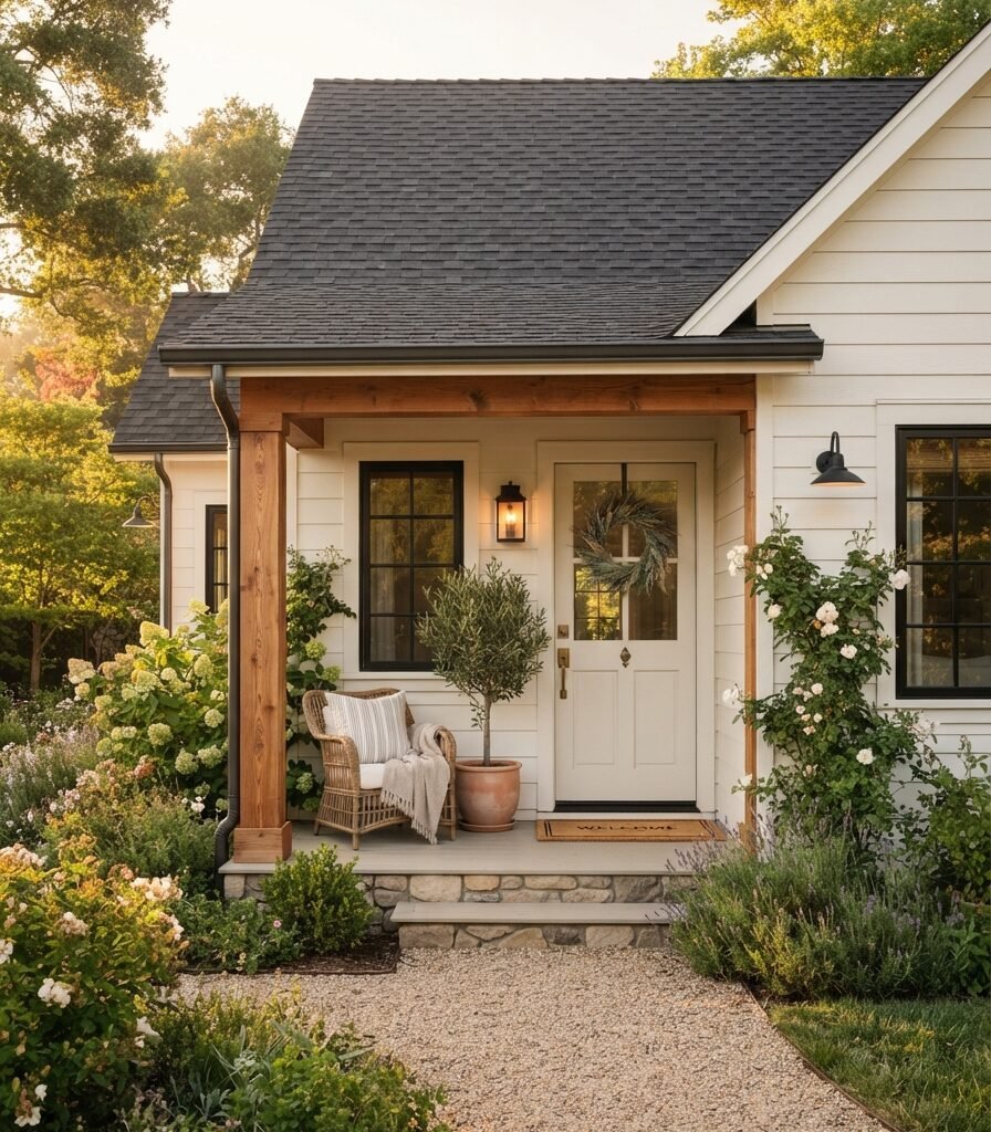
Category: Material
Vibe: Welcoming; the exterior feels softened rather than stark against natural materials.
Why it works: Alabaster’s warm white character can work particularly well where bright sunlight would make an ultra-clean white feel harsh. Sherwin-Williams lists SW 7008 for interior and exterior use, while its official color pages show Alabaster in exterior applications.
How to get it: Test the exterior sample on the actual siding and view it in both direct sun and shade before painting the entire facade. Pair it with one dark architectural accent, such as charcoal or black window frames, rather than adding several competing exterior colors.
Shop The Look
| Product | Purpose |
| Alabaster exterior paint sample | Tests facade appearance |
| Matte black exterior door hardware | Creates crisp contrast |
| Natural cedar porch planter | Adds organic warmth |
| Charcoal outdoor doormat | Grounds the entry |
| Aged brass exterior lantern | Adds warm architectural detail |
How to Start Your Sherwin-Williams Alabaster Transformation
The one first move is to buy or create a large Alabaster SW 7008 sample and place it on the wall that receives your most representative natural light. Sherwin-Williams lists its LRV at 82.215, but LRV alone cannot tell you how the creamy warmth will interact with your flooring, tile, cabinetry, or artificial lighting.
The most common mistake is treating Alabaster as a neutral white that can automatically sit beside every other white. Bright optic-white appliances, cool subway tile, or very crisp trim can make its warmth look more pronounced; independent color analysis specifically flags this comparison issue.
Three useful entry purchases under $50 are an Alabaster sample, a large white poster board for movable testing, and a 2700K LED bulb pack. Together, they let you evaluate both daylight and evening appearance before committing to gallons of paint.
A single-room test can be completed over a weekend, including sampling, prep, painting, and drying time. A starter refresh may cost roughly 50–250 beyond tools you already own, while a full room with new trim, cabinetry, lighting, hardware, and furniture can reach 1,000–4,000 or more. Whole-home repainting is better approached room by room so you can confirm the color before multiplying the commitment.
Frequently Asked Questions About Sherwin-Williams Alabaster Color Review
What color is Sherwin-Williams Alabaster and is it a true white?
Sherwin-Williams Alabaster is SW 7008, a warm, soft white with a creamy quality rather than a stark, brilliant white appearance. Sherwin-Williams records its LRV at 82.215 and places it within its white color family. It is best understood as a warm white rather than a pure optical white.
What undertones does Sherwin-Williams Alabaster have?
Alabaster has noticeable creamy warmth, commonly described as a soft yellow undertone moderated by its neutral base. Independent color analysis notes that the warmth becomes more obvious beside very bright whites. Test it beside your permanent finishes because flooring, tile, countertops, and artificial lighting can change how that undertone reads.
How much does Sherwin-Williams Alabaster cost?
The paint itself varies in price according to product line, finish, container size, and retailer, so there is no single universal cost. A sample or small tester is a much cheaper first step than purchasing several gallons before confirming the color. For a typical bedroom or living room, your total painting budget will also need to account for primer where necessary, brushes, rollers, tape, and surface preparation.
Can Sherwin-Williams Alabaster be used with cool white trim?
Yes, but the contrast needs to be intentional. A brighter white such as Pure White SW 7005 can make Alabaster appear warmer because the two whites have different visual temperatures. If you want a quieter, more seamless result, using Alabaster across both wall and trim surfaces is often easier to control.
Which rooms look best with Sherwin-Williams Alabaster?
Alabaster is particularly versatile in living rooms, bedrooms, kitchens, bathrooms, hallways, and open-concept spaces because its warm white character works across several material palettes. Sherwin-Williams showcases it in kitchens, living rooms, and exterior applications, while independent analysis also identifies walls, cabinets, trim, doors, and bathroom vanities as potential uses. Its success depends less on the room name than on how its warmth interacts with the room’s natural light and permanent finishes.
Ready to Create Your Dream Home with 15 Sherwin-Williams Alabaster Color Review Ideas?
These 15 Sherwin-Williams Alabaster Color Review ideas cover undertones, LRV, natural light, cabinetry, trim, wood, stone, accessories, small spaces, exterior applications, and contrasting accent colors rather than treating Alabaster as simply “another white.” A paint transformation is incremental, and starting with one wall or one sample board is the safest way to understand a color before committing to an entire room. Today, paint a large sample of SW 7008 and move it around your room from morning through evening. When the color is right, Alabaster can make a home feel soft, warm, cohesive, and quietly illuminated without removing the character of the materials around it. Save or pin your favorite Alabaster combinations, especially the oak, sage, brass, travertine, and deep-green pairings, before choosing your next paint finish.
You Might Also Like
- 20 Budget Home Decor Ideas That Actually Look Expensive
- 13 Minimalist Home Decor Ideas for a Calm, Clutter-Free Space
- 10 Stylish Shelf Decor Ideas for Every Room
- 20 DIY Home Decor Ideas You Can Actually Make Yourself
- 15 Home Makeover Ideas for a Real Before-and-After Transformation
- 12 Small Space Decor Ideas for a Modern Minimalist Home