
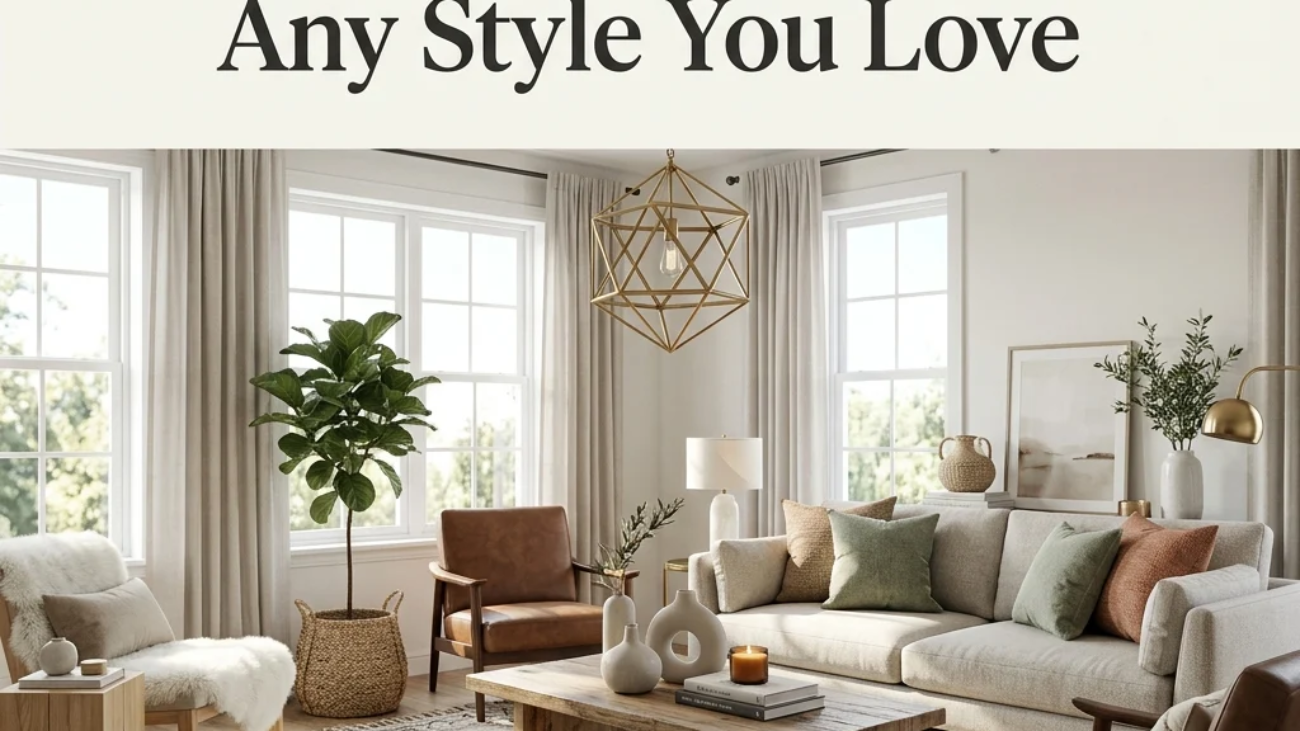
Interior design inspiration is a collection of foundational design principles and techniques, balance, proportion, color theory, and texture layering that work underneath every decorating style, from farmhouse to modern, rather than tying you to one aesthetic before you’re ready to choose. This article gives you 20 real interior design inspiration ideas covering color, material, lighting, furniture, and layout, each one a principle you can apply no matter which look you eventually land on.
The feel is unmistakable: a room where nothing looks accidental, where scale and light and color all quietly agree with each other regardless of the specific style on top. These are the rules that hold whether the room ends up moody and traditional or bright and minimal, the underlying grammar every well-designed space actually speaks. Here are 20 ideas worth saving and stealing.
Why Interior Design Inspiration Works So Well
Interior design inspiration in this sense refers to the formal elements and principles taught in design education: balance, rhythm, emphasis, proportion, scale, and contrast, a framework that traces back to the Bauhaus foundational design course of the 1920s, where instructors like Johannes Itten first formalized color and composition theory as teachable, repeatable rules rather than pure instinct. This is what separates broad design inspiration from a specific style guide: a style tells you what to choose, while these principles tell you why any given choice will or won’t work.
The materials and colors involved vary by style, but the underlying logic doesn’t: color theory’s 60-30-10 rule (60% dominant color, 30% secondary, 10% accent) applies whether that dominant color is warm white or deep charcoal, and texture layering combining at least three distinct materials like linen, wood, and metal in any single room reads as intentional across farmhouse, modern, or traditional interiors alike.
Broad design inspiration searches have grown specifically because more people are building Pinterest mood boards before committing to a single style, using platforms to gather principles and instincts across many aesthetics before narrowing down a shift design educators have noted as search behavior moves from “show me farmhouse decor” toward “show me what actually works” earlier in the planning process.
Style at a Glance
| Element | Universal Structural Principles | Personal Aesthetic Layer |
| Philosophy | Balance, proportion, rhythm, contrast | Whatever style you choose on top |
| Materials | At least three textures per room | Style-specific: wood, stone, textile choices |
| Color Palette | 60-30-10 ratio across any palette | Your chosen dominant, secondary, and accent hues |
20 Interior Design Inspiration Ideas
1. The 60-30-10 Rule for a Foolproof Color Palette
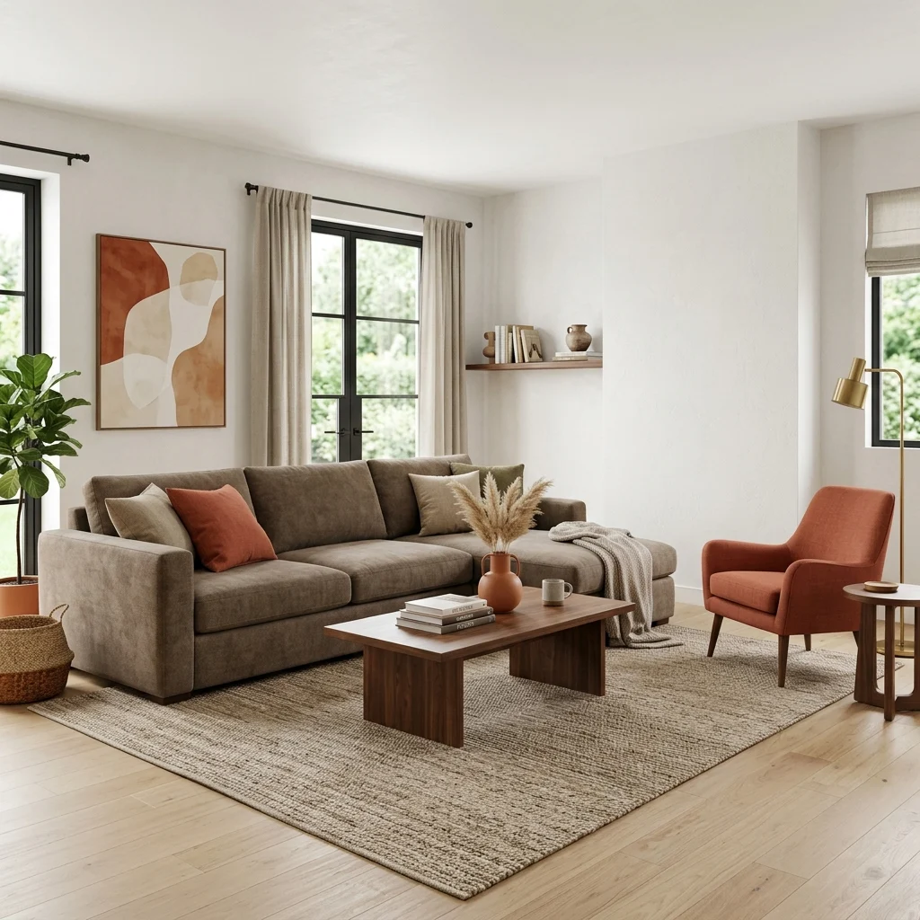
Vibe: The room feels balanced, three colors settling into their proper proportions.
Why it works: The 60-30-10 rule assigns 60% of a room to a dominant color (typically walls and largest furniture), 30% to a secondary color (upholstery, rugs), and 10% to an accent (pillows, art, small objects), which prevents the two most common color mistakes a room with too many competing colors and a room so monochromatic it reads as flat. This ratio comes from design education rather than any single style, which is why it works equally well whether the dominant color is warm white or deep forest green.
How to get it: Choose your wall color first, as the 60%, select furniture upholstery in a complementary but distinct tone for the 30%, and reserve your boldest color choice entirely for accessories at the 10% level, resisting the urge to introduce it anywhere larger.
💡 Quick Win: If your room already has strong wall and furniture colors, check whether your existing accent objects add up to roughly 10% of the visual field. Often, the fix is simply removing a few competing accent colors rather than adding anything.
Shop the Look
| Product |
| Warm white interior paint sample |
| Taupe linen sofa slipcover |
| Terracotta accent chair |
| Terracotta throw pillow cover |
| Walnut coffee table |
2. Layering at Least Three Textures in Every Room
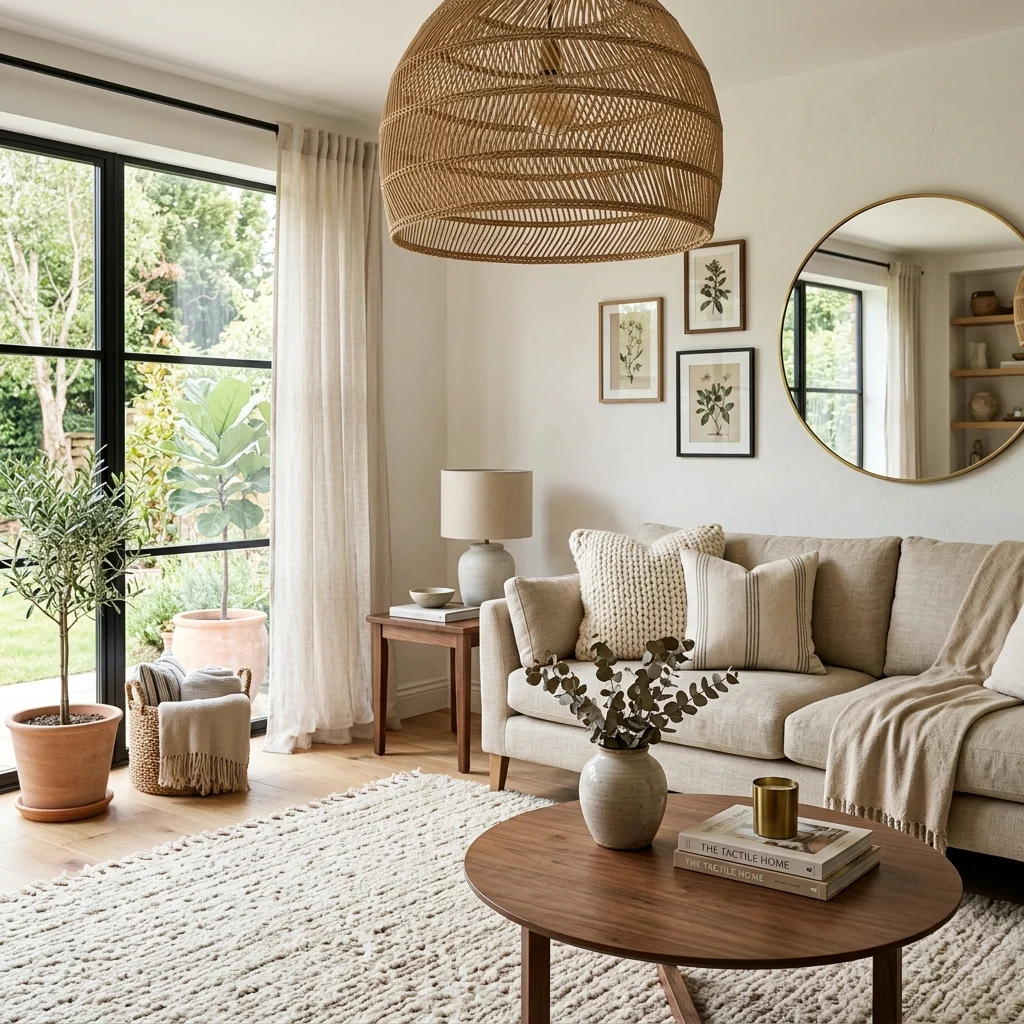
Vibe: The room feels tactile, three distinct materials working as one composition.
Why it works: A room built from a single material family, all smooth fabrics, or all hard surfaces, reads as visually flat regardless of how attractive that one material is, because texture contrast is what gives the eye something to register as depth. Combining at least three distinct textures per room, such as woven rattan, smooth linen, and a rough wool rug, is a principle that holds across every style, since even the most minimal modern room still needs this contrast to avoid feeling sterile.
How to get it: Audit your room by texture rather than color. Count how many surfaces are smooth versus woven versus hard, and if two categories are missing entirely, introduce one small object from each before adding anything else.
Shop the Look
| Product |
| Linen upholstered accent chair |
| Wool blend area rug |
| Rattan pendant light fixture |
| Ceramic decorative vase |
| Walnut side table |
3. Creating a Focal Point With Layered Lighting
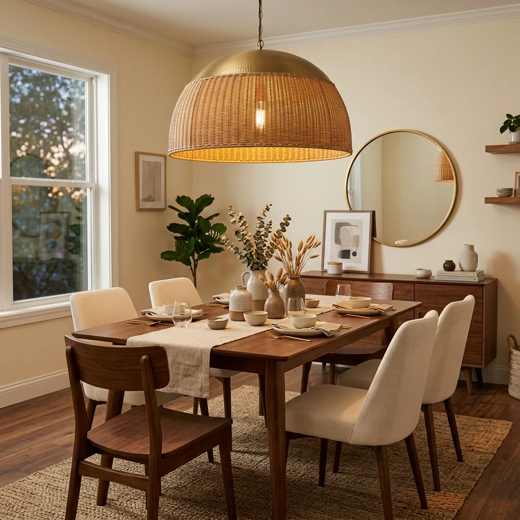
Vibe: The room feels anchored, one bright point telling the eye exactly where to land first.
Why it works: Emphasis, one of the core principles of design, requires a single element that draws the eye before anything else; without it, a room reads as visually flat because attention has nowhere specific to go first. Lighting is one of the most reliable ways to create this focal point, since a brighter, more sculptural fixture naturally pulls the eye ahead of furniture or wall color, and dimming secondary ambient light reinforces the hierarchy.
How to get it: Choose one fixture per room to serve as the clear brightest and most visually interesting light source, then keep every other light source in that room dimmer or simpler, so there’s no competition for the eye’s first stop.
Shop the Look
| Product |
| Statement dome pendant light |
| Linen table runner, neutral |
| Ceramic centerpiece bowl |
| Dimmer switch for ambient lighting |
| Warm white dimmable bulb set |
4. The Furniture Scale Rule for Proportional Rooms
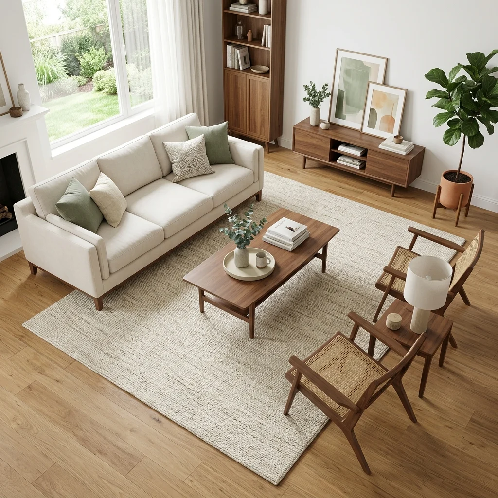
Vibe: The room feels spacious, every piece sized to agree with its neighbors.
Why it works: Proportioning the relationship in size between different elements is one of the most common places where rooms go wrong, typically through a coffee table too small for its sofa or a rug too small for its furniture grouping. The standard professional rule sizes a coffee table to roughly two-thirds the length of the sofa it sits in front of, and sizes a rug so every piece of seating furniture rests with at least its front legs on it, ideally all four.
How to get it: Measure your sofa’s length before choosing a coffee table, aiming for that two-thirds ratio, and measure your full seating arrangement’s outer edges before choosing a rug size rather than guessing based on the room’s overall square footage.
💡 Quick Win: If your current rug is too small, sizing up even one size from a 5×7 to an 8×10, for instance, often fixes a room’s proportion problem more than any furniture change would.
Shop the Look
| Product |
| Walnut coffee table, mid-size |
| Large area rug, full room coverage |
| Rug pad, non-slip |
| Ceramic decorative tray |
| Artificial floor plant |
5. Building a Gallery Wall With the Rule of Thirds
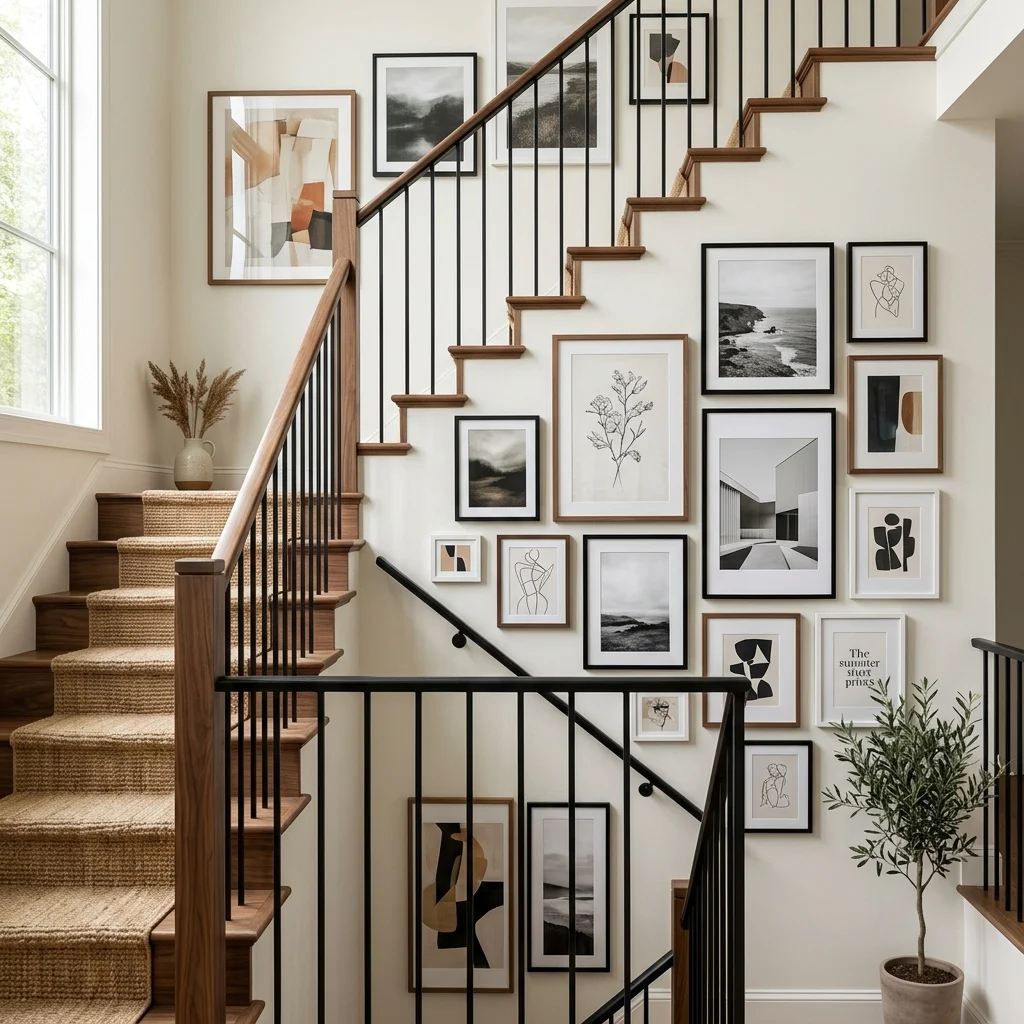
Vibe: The wall feels dynamic, deliberately placed slightly off from dead center.
Why it works: The rule of thirds, borrowed directly from photography and classical painting composition, divides a wall into an imaginary three-by-three grid and places the visual weight of an arrangement along those gridlines rather than dead center, which reads as more dynamic and considered than perfect symmetry. This is why gallery walls centered precisely over a sofa often feel slightly static compared to ones intentionally shifted toward one-third of the available wall space.
How to get it: Before hanging anything, tape the overall gallery wall outline to the wall and check whether its visual center falls on one of the imaginary third-lines rather than the wall’s exact center, adjusting the whole grouping’s position rather than individual frames.
Shop the Look
| Product |
| Mixed black frame set, varied sizes |
| Neutral abstract art print set |
| Painter’s tape for layout planning |
| Command picture hanging strips |
| Small picture ledge shelf |
6. Creating Depth With Tonal Layering in One Hue
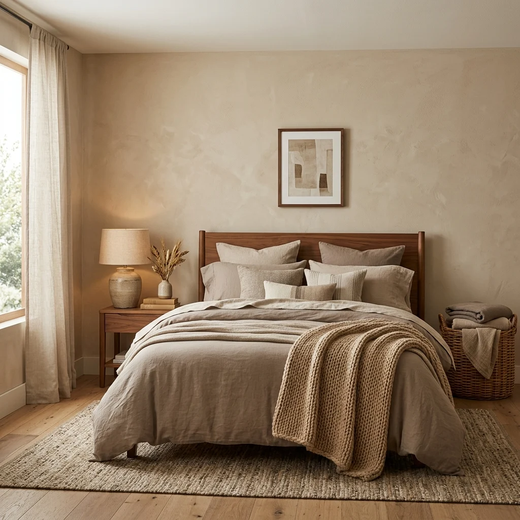
Vibe: The bedroom feels soft, one color family doing quiet, layered work.
Why it works: Tonal layering using several distinct shades within the same color family rather than a single flat tone creates depth without introducing pattern or contrasting hues, which is why designers rely on it in rooms meant to feel calm above all else. This works because the eye still registers variation between the lighter and darker tones even though nothing technically “contrasts,” avoiding the visual flatness a single uniform shade produces.
How to get it: Choose one color family and select at least three distinct shades within it a light wall tone, a medium bedding tone, and a darker furniture tone, rather than matching everything to one exact shade.
Shop the Look
| Product |
| Sand-toned bedding set |
| Taupe linen curtain panels |
| Ceramic table lamp, warm glaze |
| Woven storage basket |
| Walnut nightstand |
7. Pairing Raw and Refined Materials for Contrast
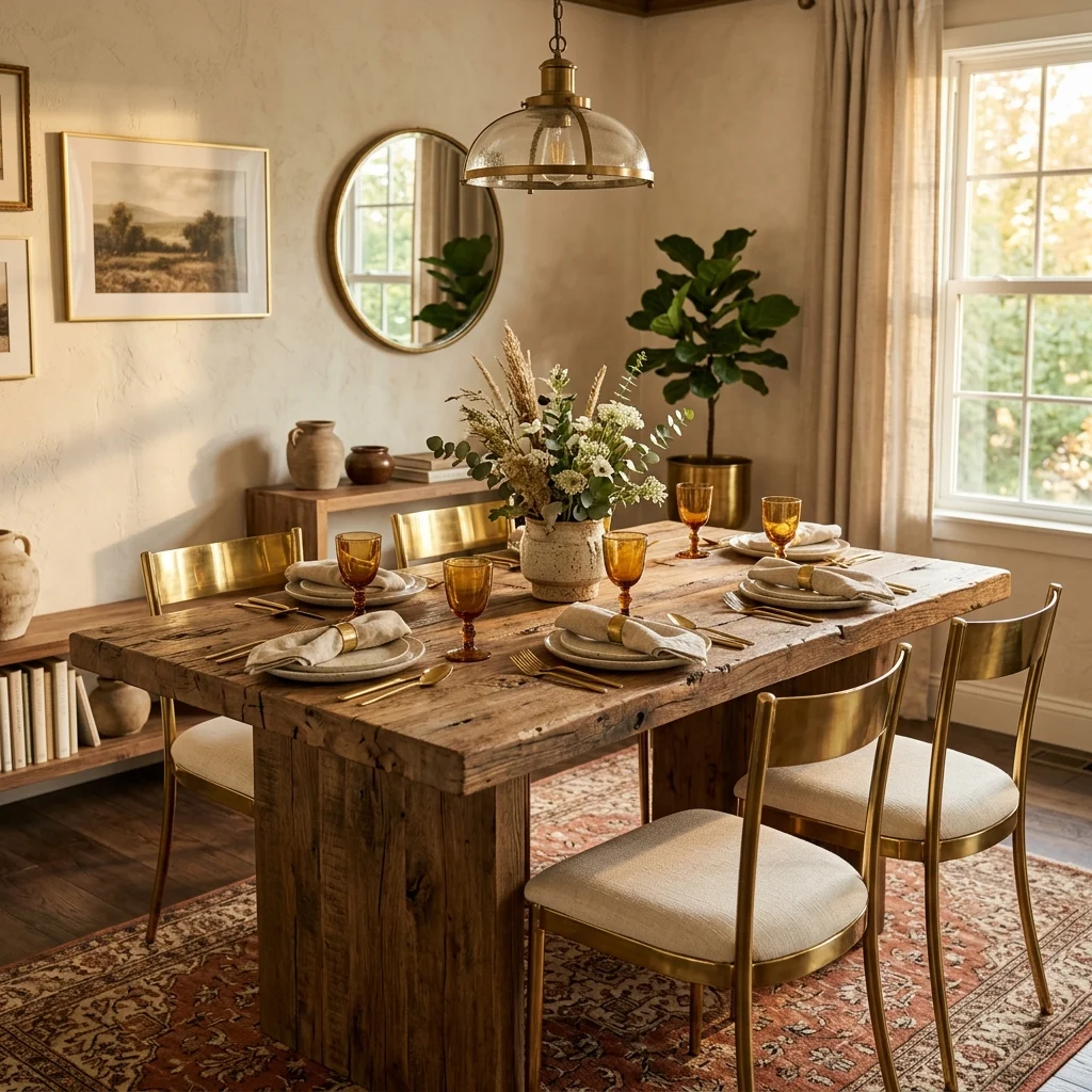
Vibe: The table feels contrasted, rough, and refined, trading visual weight.
Why it works: Pairing a raw, unfinished material against a polished, refined one, reclaimed wood beside brushed brass, rough stone beside smooth glass, creates the kind of contrast principle designers rely on more than color contrast alone, since material finish reads as a distinct visual signal even within a fully neutral palette. This pairing also prevents a room from feeling either too rustic or too formal on its own, landing in the more interesting middle ground.
How to get it: Choose one dominant raw material and one dominant refined material per room, and let them meet directly at a single furniture piece, a table combining both, rather than keeping them in separate zones where the contrast goes unnoticed.
Shop the Look
| Product |
| Reclaimed wood dining table |
| Brushed brass dining chair set |
| Ceramic centerpiece bowl |
| Linen napkin set |
| Brass candlestick pair |
8. Designing Clear Sightlines Through Connected Rooms
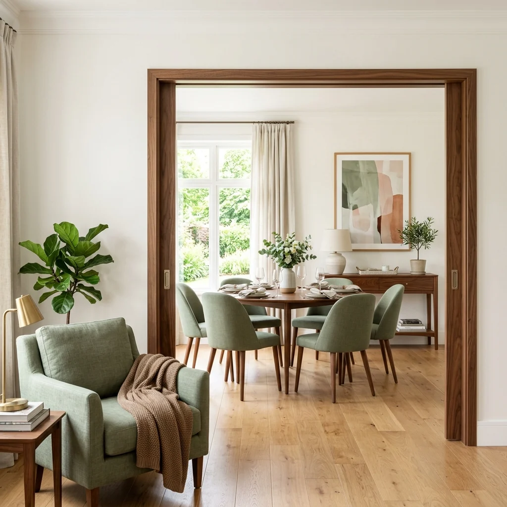
Vibe: The rooms feel flowing, one space leading naturally into the next.
Why it works: A clear sightline and an unobstructed visual path from one room into the next make connected spaces feel larger and more cohesive than they physically are, because the eye reads open visual distance as spaciousness even when the actual square footage hasn’t changed. Placing a single interesting object, like a piece of art or a console table, directly within that sightline gives the eye a destination, which reads as intentional rather than merely open.
How to get it: Stand in your main living space and identify what’s directly visible through any open doorway, then make sure that visible spot holds something worth looking at rather than a blank wall or clutter.
Shop the Look
| Product |
| Console table for doorway sightline |
| Framed art print, statement piece |
| Table lamp, warm glow |
| Ceramic decorative object |
| Small runner rug for the hallway |
9. Scaling Furniture Down Without Losing Comfort
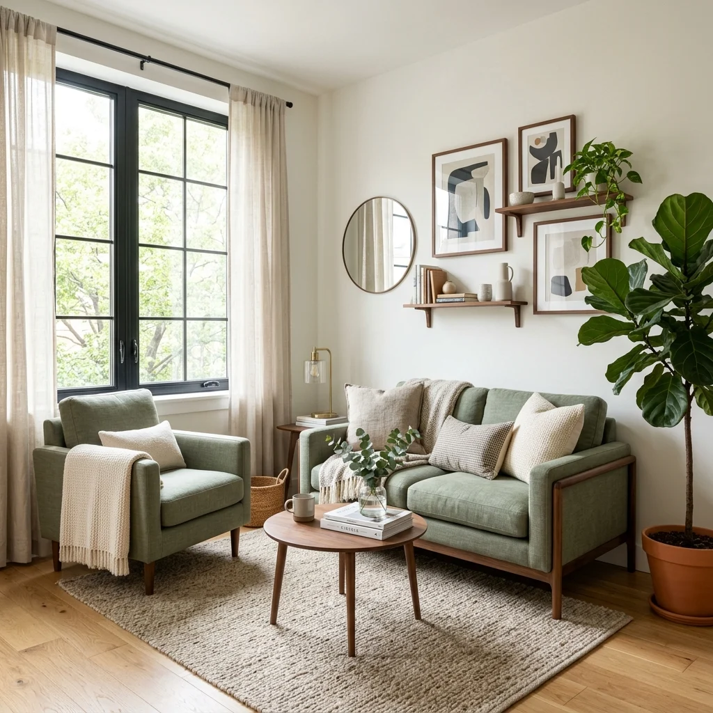
Vibe: The room feels comfortable, with smaller furniture losing nothing in actual use.
Why it works: Small-space furniture scaling often goes wrong in the wrong direction. People buy furniture so small it becomes visually and physically inadequate, when the real fix is choosing furniture with a smaller footprint but correctly proportioned seat depth and arm width, not simply “smaller” in every dimension. A loveseat with proper 20–22 inch seat depth remains genuinely comfortable, while a miniature sofa scaled down uniformly often isn’t.
How to get it: Prioritize seat depth and cushion height over overall furniture width when shopping for a small space, since those two measurements determine comfort, while overall footprint determines fit; the two don’t have to be sacrificed together.
💡 Quick Win: Measuring your existing favorite chair’s seat depth before shopping gives you a comfort benchmark to check any smaller-scale replacement against.
Shop the Look
| Product |
| Compact-scale sofa, proper seat depth |
| Slim-arm accent chair |
| Small round coffee table |
| Artificial floor plant, narrow profile |
| Nesting side table set |
10. Balancing a Room Symmetrically vs Asymmetrically
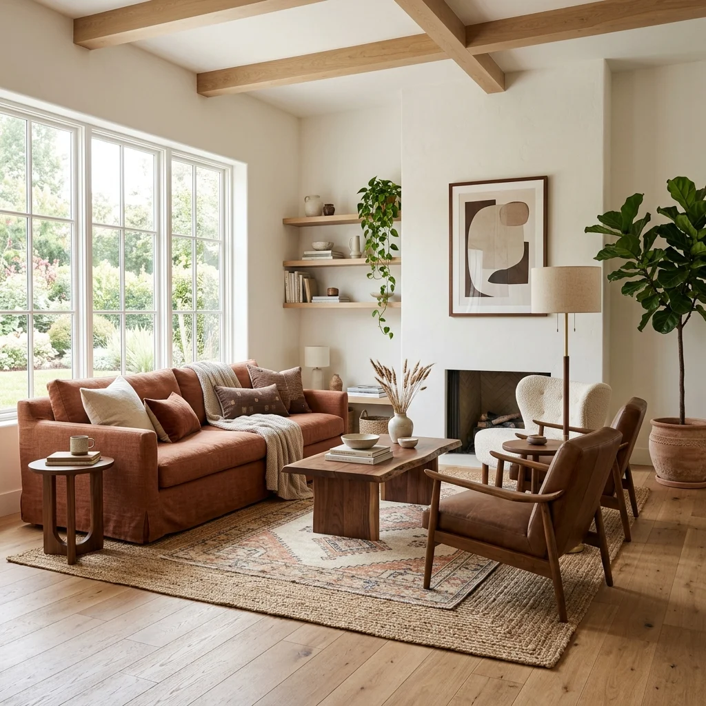
Vibe: The room feels considered, uneven furniture somehow still settling into balance.
Why it works: Symmetrical balance, matching furniture mirrored on either side of a center point, reads as formal and calm, while asymmetrical balance uses different objects of roughly equal visual weight (one large sofa balanced by two smaller chairs and a floor lamp) to create a more relaxed, dynamic feel without matching anything exactly. Both are legitimate design principles; the choice depends on whether a room’s purpose calls for formality or ease.
How to get it: For asymmetrical balance, estimate visual weight rather than object count. A single large dark sofa can balance against two smaller lighter pieces on the opposite side, since weight is about visual mass, not the number of items.
Shop the Look
| Product |
| Large sectional sofa |
| Accent chair pair, smaller scale |
| Floor lamp, slim profile |
| Layered area rug set |
| Artificial floor plant |
11. Using Mirrors to Multiply Natural Light
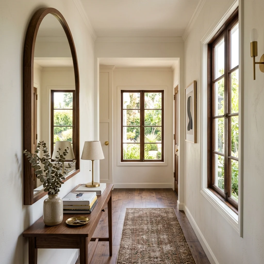
Vibe: The hallway feels expanded, borrowed light doing work daylight alone couldn’t.
Why it works: A mirror positioned directly across from or adjacent to a window reflects natural light deeper into a room than the window’s direct throw alone would reach, effectively doubling the usable daylight in dim corners or hallways without any electrical cost. This is a light-behavior principle specific to mirrors rather than any decorative object, since only a reflective surface actually bounces and redirects light rather than simply existing near it.
How to get it: Position your mirror perpendicular or directly opposite your brightest window rather than on an adjacent wall, and choose a larger mirror over several small ones, since surface area directly determines how much light gets redirected.
Shop the Look
| Product |
| Large wall mirror, brass frame |
| Small console table |
| Table lamp, warm glow |
| Ceramic decorative object |
| Runner rug, narrow hallway size |
12. Choosing One Statement Material to Repeat Throughout
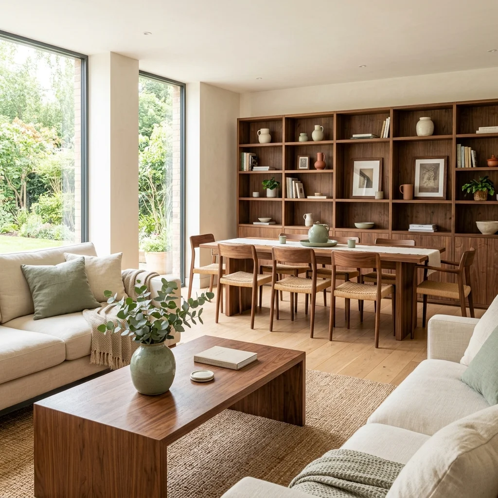
Vibe: The space feels cohesive, one material quietly threading every piece together.
Why it works: Repeating one dominant material, a specific wood species, a particular metal finish across several furniture pieces in an open or connected space creates rhythm, one of the core design principles, which is what keeps an open floor plan from reading as several unrelated furnished areas stitched together. This works especially well in open-concept homes where the living, dining, and kitchen areas need a unifying thread despite serving different functions.
How to get it: Pick one wood tone or metal finish before furnishing an open space, and check every major piece against that reference before purchasing, even if the furniture styles themselves vary slightly.
Shop the Look
| Product |
| Walnut coffee table |
| Walnut dining table |
| Walnut open shelving unit |
| Ceramic decorative vase |
| Linen textile set, neutral |
13. Displaying a Personal Collection as Wall Art
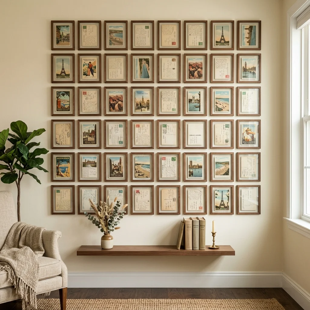
Vibe: The wall feels personal, a private collection turned into a deliberate composition.
Why it works: Any genuinely personal collection of postcards, ticket stubs, small ceramics, pressed botanicals becomes wall-worthy art once it’s framed and arranged with consistent spacing and frame style, since repetition and alignment (rhythm again) is what elevates a collection from clutter to composition. This principle matters because it means original, non-repeatable wall art doesn’t require an art budget at all, just consistent presentation.
How to get it: Choose one uniform frame style and size for the entire collection, and arrange pieces in a strict grid with equal spacing rather than a loose salon-style scatter, since grid alignment is what signals “curated collection” rather than “random objects.”
💡 Quick Win: A grid of just four or six matching frames, even with modest contents, reads as more intentional than a larger but inconsistent arrangement.
Shop the Look
| Product |
| Thin black frame set, uniform size |
| Grid layout hanging template |
| Small floating shelf |
| Command picture hanging strips |
| Acid-free mounting backing |
14. Using an Unexpected Color on the Ceiling
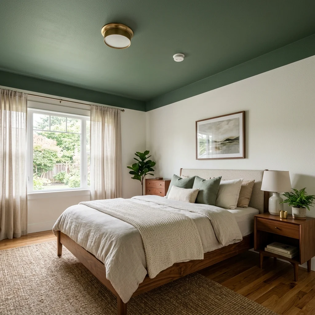
Vibe: The bedroom feels enveloping, color arriving from a direction most rooms ignore.
Why it works: Ceilings are the largest single surface in most rooms, yet are almost universally painted plain white, which means a colored ceiling, sometimes called the “fifth wall” in design education, delivers outsized visual impact precisely because it’s an underused surface rather than a competitive one. A deeper color overhead also lowers a room’s perceived ceiling height, which can make a tall room feel more intimate and grounded.
How to get it: Choose a ceiling color a shade or two deeper than your wall color within the same family, rather than a completely unrelated hue, so the effect reads as an intentional gradient rather than a mismatched surface.
Shop the Look
| Product |
| Sage green ceiling paint, matte |
| Warm white wall paint |
| Walnut bed frame |
| Neutral linen bedding set |
| Painter’s tape for ceiling line |
15. Creating a Transition Moment Between Rooms
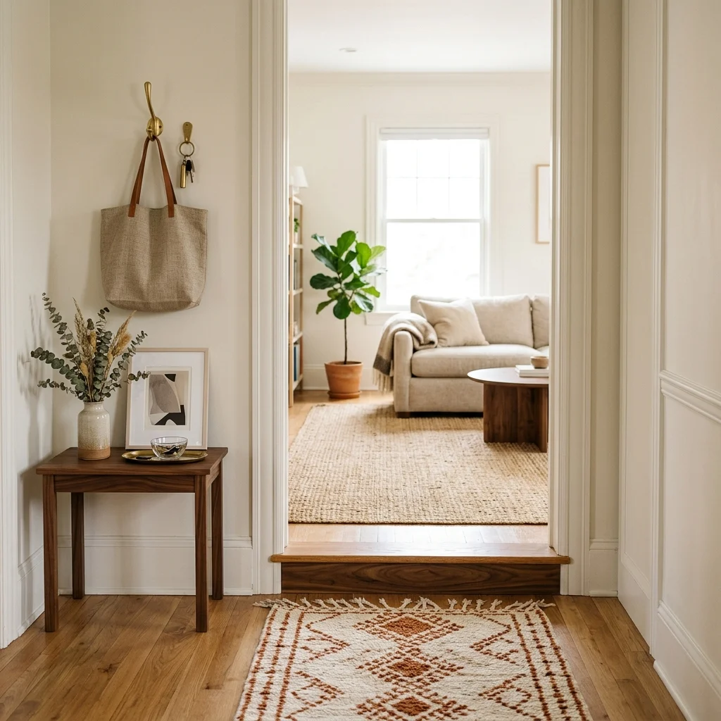
Vibe: The threshold feels intentional, a small pause marking one space ending and another beginning.
Why it works: A transition moment, a rug change, a slight color shift, a single styled object at the threshold between two rooms gives the eye and body a clear signal that one function is ending and another beginning, which matters most in open floor plans where architecture alone doesn’t provide that cue. Without any transition marker, connected spaces can start to feel like one undefined room rather than a sequence of considered spaces.
How to get it: Choose one small styling element specifically for the threshold itself a narrow runner rug, a single wall hook, a slim console, rather than letting the two rooms’ furniture simply meet with no marker in between.
Shop the Look
| Product |
| Narrow runner rug, threshold size |
| Small wall hook set, brass |
| Slim console table |
| Small ceramic catch-all dish |
| Wall mirror, entryway size |
16. Mixing Old and New Materials for Depth
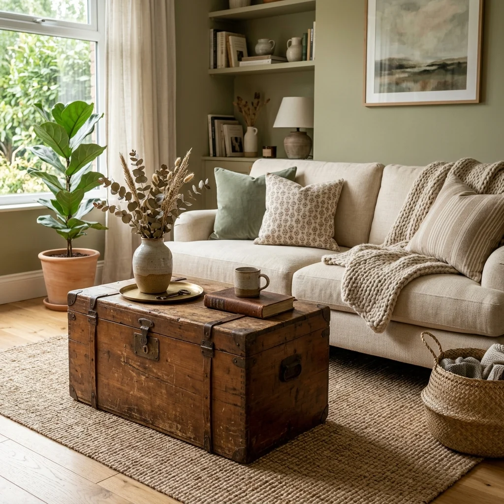
Vibe: The room feels collected, old, and new, sitting together without either looking out of place.
Why it works: A room furnished entirely with new pieces, however well-chosen, can read as showroom-staged rather than genuinely lived-in, while mixing in even one older or vintage-sourced piece introduces the kind of material and history contrast that signals a room built over time rather than purchased all at once. This principle underlies nearly every professionally designed interior regardless of style, since even the most contemporary rooms typically include at least one aged or antique object.
How to get it: Choose one genuinely older piece sourced secondhand or inherited as a mixed-material anchor, and let its visible age and patina contrast intentionally against otherwise new furniture rather than trying to match its finish to everything else.
Shop the Look
| Product |
| Vintage-style wood trunk coffee table |
| Linen upholstered sofa, new |
| Ceramic decorative vase |
| Woven storage basket |
| Vintage-finish brass accent lamp |
17. Balancing Warm and Cool Tones in the Same Room
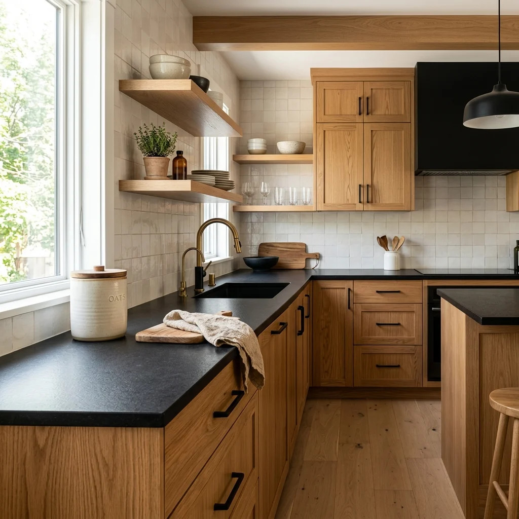
Vibe: The kitchen feels refined, warm, and cool tones trade the room evenly.
Why it works: A room built entirely from warm tones can start to feel heavy or dated, while one built entirely from cool tones can feel sterile. Balancing both within the same space, warm oak cabinetry against cool matte black hardware, gives the eye the same kind of temperature contrast that governs successful color palettes generally. This principle explains why so many currently popular kitchen and living room palettes deliberately combine a warm wood tone with a cooler black or gray accent rather than committing fully to either temperature.
How to get it: Identify whether your room currently leans entirely warm or entirely cool, then introduce one dominant element of the opposite temperature, a cool metal finish in a warm wood room, or a warm wood accent in a cool-toned room, rather than trying to balance every single object individually.
Shop the Look
| Product |
| Warm oak open shelving |
| Matte black cabinet hardware set |
| Matte black kitchen faucet |
| Ceramic kitchen canister set |
| Linen kitchen towel, neutral |
18. Creating Conversation-Friendly Furniture Distances
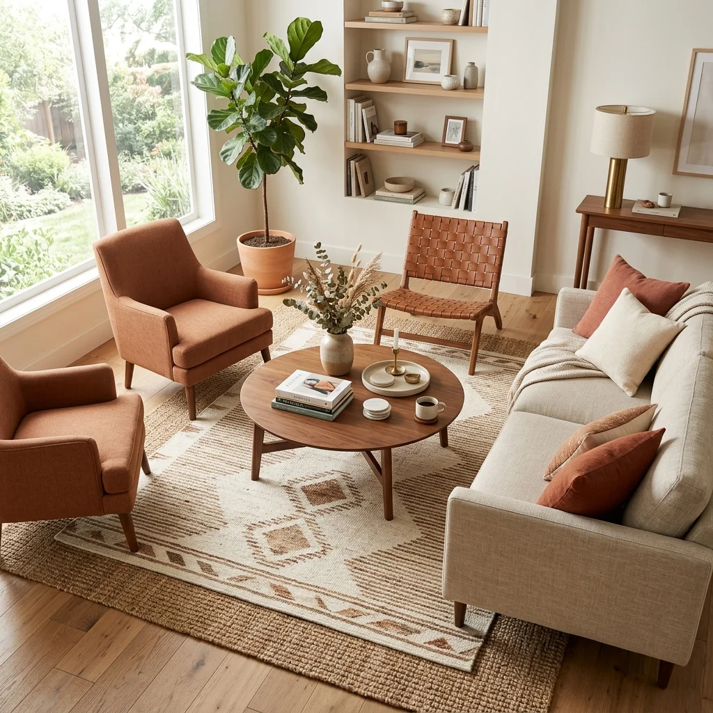
Vibe: The room feels inviting, seating close enough for an actual conversation.
Why it works: Furniture placed too far apart for comfortable conversation is one of the most common layout mistakes, since people naturally lower their voices and lean in at distances beyond about eight feet, which makes a large but poorly spaced living room feel oddly disconnected despite ample seating. Professional layouts generally keep primary seating within four to eight feet of each other, close enough for easy conversation without feeling cramped.
How to get it: Measure the distance between your main seating pieces and adjust if it exceeds eight feet, pulling chairs or a sofa closer to the coffee table and to each other rather than spreading furniture out to fill available floor space.
Shop the Look
| Product |
| Sofa, standard conversational scale |
| Accent chair pair |
| Coffee table, centered placement |
| Layered area rug |
| Artificial floor plant |
19. Dimmer Switches as an Underrated Design Tool
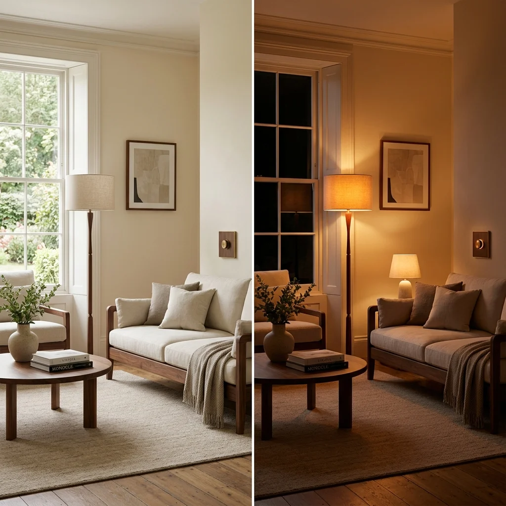
Vibe: The room feels adaptable, one small switch changing its entire mood.
Why it works: Lighting intensity affects a room’s perceived warmth and formality as much as color or material choice does, yet dimmer switches remain one of the most overlooked design tools available, since a single fixed brightness level forces every room to feel the same regardless of time of day or activity. A dimmed, warm-toned room reads as intimate and relaxed, while the same fixture at full brightness reads as functional and alert, genuinely two different design outcomes from one hardware swap.
How to get it: Install a plug-in or wall dimmer on your room’s primary light source first, since this single change affects the room’s mood more directly than almost any decor purchase, and pair it with warm-white 2700K bulbs for the most flattering dimmed effect.
Shop the Look
| Product |
| Wall dimmer switch kit |
| Plug-in lamp dimmer adapter |
| Warm white 2700K dimmable bulb set |
| Floor lamp, adjustable |
| Table lamp, warm glow |
20. Choosing One Statement Art Piece Over Many Small Ones
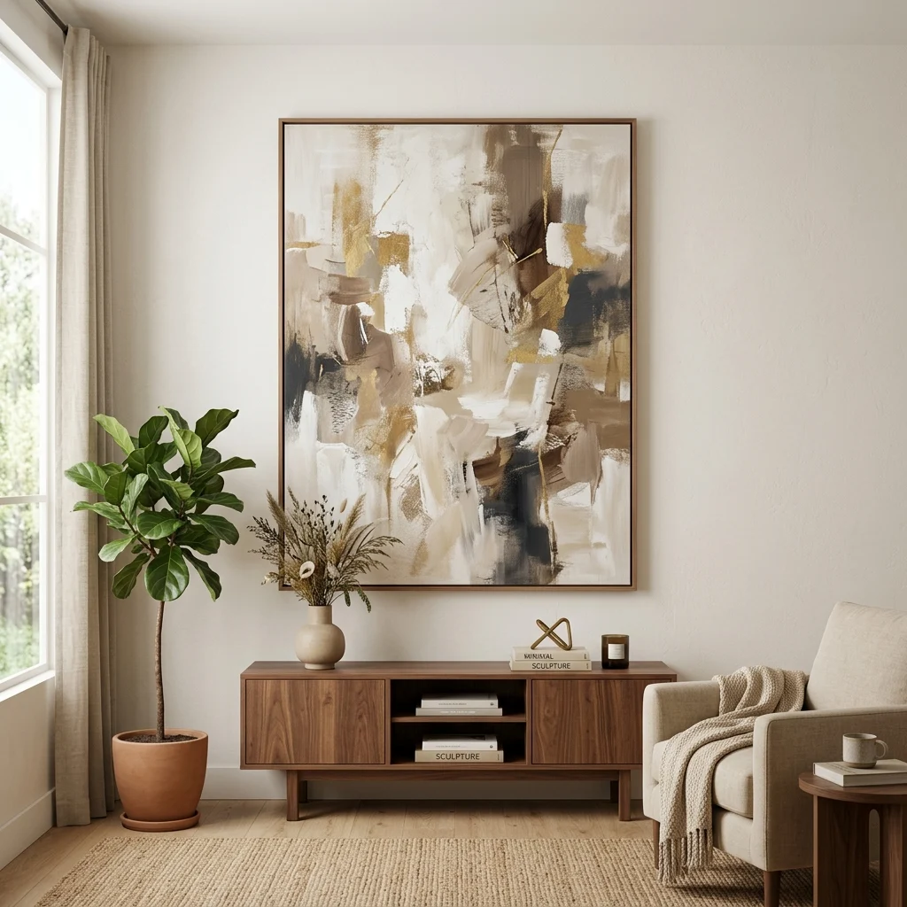
Vibe: The wall feels confident, one piece doing more than a dozen smaller ones could.
Why it works: Emphasis, the same principle behind focal-point lighting, applies to art just as directly. One large, well-chosen piece creates a clear visual anchor, while several small, unrelated pieces scattered across a wall can dilute attention rather than concentrating it. This isn’t a universal rule against gallery walls, which work when executed with the rule of thirds and consistent framing discussed earlier, but rather a reminder that a single statement piece is often the simpler, more reliable choice for beginners.
How to get it: Size a single art piece to roughly two-thirds the width of the furniture beneath it, and leave generous negative space around the frame rather than surrounding it with smaller supporting pieces that compete for the same wall.
Shop the Look
| Product |
| Large abstract canvas art |
| Low wood console table |
| Ceramic decorative object |
| Thin black frame, if unframed canvas |
| Picture hanging hardware, heavy-duty |
How to Start Your Interior Design Inspiration Journey
Your first single move should be applying the 60-30-10 color rule to just one room, because color proportion is the principle that affects every other decision after it, and getting this one ratio right first prevents the scattered, uncertain feeling that comes from choosing furniture and accessories before settling on a color structure.
The most common mistake is skipping proportion and scale in favor of jumping straight to color and accessories, which is exactly backwards. A room with a perfectly chosen palette but an undersized rug or oversized sofa will still feel off in a way color can’t fix. Address furniture scale and rug sizing before any cosmetic decision, since these structural choices are the hardest and most expensive ones to correct later.
Three specific items under $50 that create immediate impact: a set of dimmer switch hardware for your main living room lamp, a large single wall mirror positioned to catch window light, and a set of three matte ceramic vases at varied heights for practicing the rule of odd numbers on any shelf.
Applying just one or two principles from this list to a single room can happen in a weekend. Reworking a full room around proportion, color ratio, and lighting layering typically takes four to six weeks of gradual furniture and accessory changes, with a realistic starter budget of $200–$500 and a full room transformation running $1,500–$4,000, depending on how much furniture needs replacing versus simply rearranging.
Frequently Asked Questions About Interior Design Inspiration
What is the difference between interior design inspiration and following a specific style?
Interior design inspiration refers to universal principles, such as balance, proportion, color ratio, and texture layering that apply across every style, while a specific style, like farmhouse or Japandi, tells you which materials and colors to choose within that framework. A room can follow every principle correctly and still look like any style at all, which is why designers typically teach principles first and let personal style choices come second, rather than the reverse.
What colors work best when I don’t know my style yet?
Warm white and greige remain the safest starting point for a dominant 60% color regardless of eventual style, since both work as a neutral base under nearly any secondary and accent color combination you might choose later. Testing a paint sample under your room’s actual light before committing is more important than the specific shade chosen, since undertones shift significantly between north-facing and south-facing rooms.
How much does it cost to apply real interior design principles to a room?
Applying principles like the 60-30-10 rule, proper rug sizing, and layered lighting, without buying new furniture, just rearranging and adjusting proportions can often be done for under $100 in supporting purchases like a properly sized rug or a dimmer switch. A fuller transformation correcting furniture scale and introducing new material layers typically runs $1,500–$4,000, depending heavily on whether existing furniture can be resized through rearrangement or needs outright replacement.
Do these design principles work in a rental apartment?
Yes, nearly all 20 principles in this list, including color ratio, texture layering, mirror placement, and furniture scale, require no permanent changes and work entirely within existing walls and fixtures. The one exception is ceiling paint, which requires landlord approval in most rental agreements, though a bold rug or a large piece of art can achieve a similar focal-point effect without any wall or ceiling alteration.
What is the single most important design principle to learn first?
Proportion and scale are generally considered the foundational principles beneath all others, since a room with correctly sized furniture and rugs will feel functional and comfortable even before color or lighting choices are refined, while a room with beautiful color and lighting but poorly scaled furniture will still feel subtly wrong. Most design education programs teach proportion before color theory for exactly this reason; it’s the harder mistake to notice consciously, but the easier one to feel.
Ready to Bring Your Interior Design Inspiration to Life?
These 20 interior design inspiration ideas span color, texture, lighting, furniture, and layout from the 60-30-10 color rule to conversation-friendly furniture distances and a single statement piece of art, so there’s a genuinely useful starting point here, no matter which style you eventually land on. You don’t need to apply every principle across your whole home at once, and working through them room by room, one proportion fix or one lighting layer at a time, is exactly how professionally designed spaces actually come together over time.
Today’s specific action: measure the distance between your main seating pieces and adjust it if it’s pulling your conversation area apart, before touching color or accessories at all. Once these underlying principles are in place, whatever style you eventually choose on top will feel effortless rather than forced, because the structure holding it up was already sound. Save the principles that speak to your own rooms today, that layered lighting, that mirror trick, because in interior design, the inspiration that lasts is the kind built on rules that never go out of style.