

Winter light paint colors are pale, softly reflective shades that help a home feel brighter and more comfortable when daylight is shorter, cooler, and often less intense. These 15 light paint colors for winter cover warm whites, crisp whites, pale greiges, soft grays, and subtle blue-gray tones, with practical ways to use each one without making your rooms feel cold or washed out.
The right winter shade can make morning light feel cleaner, afternoon shadows gentler, and evening lamps warmer against the walls. Some colors create a snowy, crisp atmosphere; others bring in the visual equivalent of wool, cashmere, oatmeal, or candlelight. The key is not simply choosing the palest color on a paint card, but matching its undertone to the room’s natural light. Winter daylight can appear cooler and sharper, particularly in north-facing rooms, so a slightly warm neutral can prevent an interior from feeling stark.
Here are 15 ideas worth saving and stealing.
Why 15 Light Paint Colors for Winter Work So Well
Winter paint palettes are less a historical design style than a seasonal approach to color: they use pale surfaces to capture available daylight while adding enough warmth or softness to keep interiors comfortable. The palette can range from crisp whites that echo snow and winter skies to muted neutrals that feel more like wool, limestone, or dried grasses.
The core colors include warm white, soft ivory, pale greige, cool white, blue-gray, silver gray, and muted beige. Materials such as unfinished oak, walnut, linen, wool, boucle, travertine, brushed brass, matte ceramic, and natural stone help keep pale walls from feeling flat. Benjamin Moore’s current winter palette, for example, includes White Diamond, Winter Lake, Midnight, and other seasonal shades ranging from crisp white to charcoal and blue-gray.
Light paint colors remain useful because homes now need to work across more hours of the day: bright mornings, dim winter afternoons, work-from-home hours, and cozy evenings. A pale wall can amplify available light, while warmer whites and greiges can counter the cooler cast of winter daylight. Sherwin-Williams similarly describes warm whites as inviting and suitable for natural materials such as linen, wood, and travertine.
Style at a Glance
| Element | Winter Light-Paint Direction |
| Philosophy | Maximize brightness + soften seasonal coolness |
| Materials | Linen, oak, wool, stone, ceramic, brass |
| Color palette | Warm white, ivory, pale greige, soft gray, blue-gray |
1. Sherwin-Williams Alabaster SW 7008 for a Warm Winter White
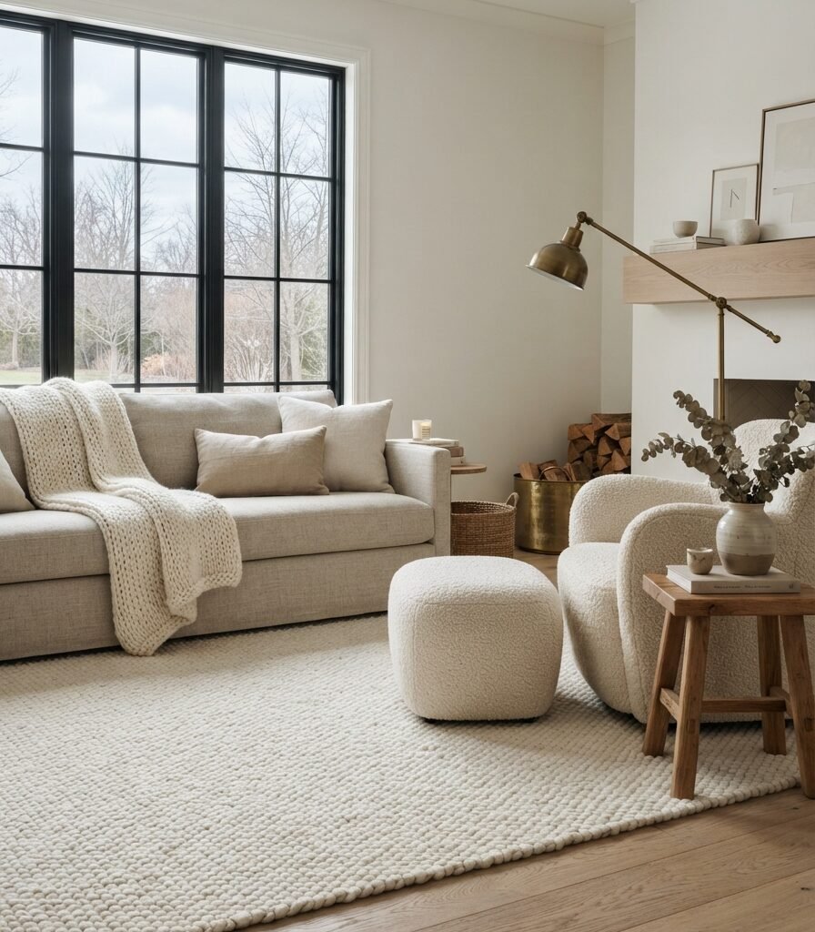
Category: COLOR
Vibe: Hushed.
Why it works: Alabaster is a warm, balanced white with an official LRV of 82.215, giving it plenty of light reflectance without reading like an icy, high-contrast white. Its warmth works particularly well with oak, linen, travertine, and other natural materials that can feel especially welcoming during winter.
How to get it: Paint the walls in SW 7008 Alabaster and repeat the same family through ivory curtains and oatmeal upholstery. Keep trim either Alabaster or a carefully tested compatible white so a stark trim does not exaggerate the wall’s warmth.
💡 Quick Win: Paint one large 30-by-30-inch sample board in Alabaster and move it beside the window during morning and evening before painting the room.
Shop The Look
| Product | Search phrase |
| Paint sample | Sherwin-Williams Alabaster SW 7008 sample |
| Rug | Ivory wool low pile area rug 5×7 |
| Throw | Oatmeal chunky knit throw blanket |
| Lamp | Aged brass arc floor lamp linen shade |
| Vase | Matte ivory ceramic organic vase |
2. Benjamin Moore White Diamond OC-61 for a Crisp Snowy Feel
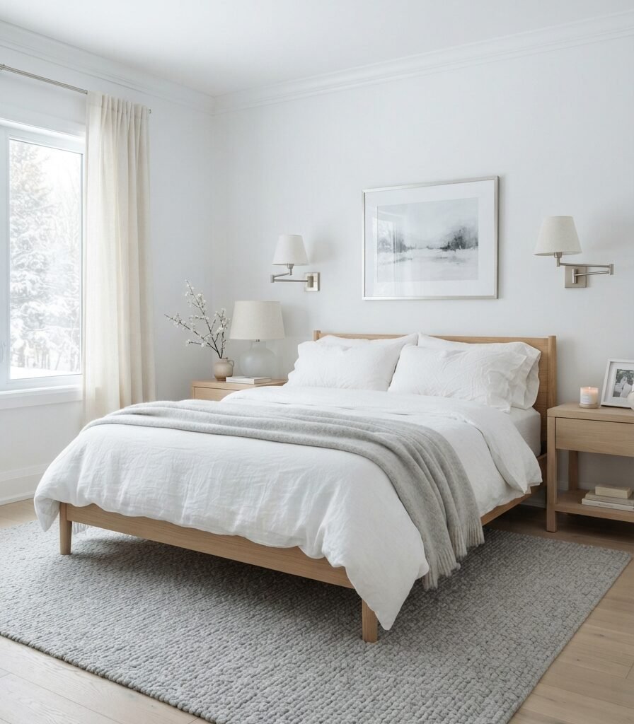
Category: LIGHTING
Vibe: Luminous.
Why it works: White Diamond is a crisp white that can reinforce the clean visual quality of winter daylight without requiring a dark accent wall. Benjamin Moore specifically includes it in its winter palette and describes it as suitable for walls as well as trim, moldings, and doors.
How to get it: Use White Diamond where the room already has reasonable daylight, then introduce warmth through oak and linen rather than making the wall color do all the work. In a dim north-facing room, compare it against a warmer white before buying gallons.
Shop The Look
| Product | Search phrase |
| Bedding | White linen duvet cover king |
| Curtains | Sheer ivory linen curtain panels |
| Sconces | Brushed nickel glass wall sconces pair |
| Rug | Light gray wool bedroom rug 5×7 |
| Lamp | Frosted glass bedside table lamp |
3. Sherwin-Williams Pure White for Clean Winter Contrast

Category: MATERIAL
Vibe: Fresh.
Why it works: A clean white backdrop works especially well when the room already contains tactile materials such as unfinished oak, linen, woven baskets, and stone. The contrast between smooth paint and natural grain prevents the palette from becoming visually sterile.
How to get it: Use Sherwin-Williams Pure White on cabinetry or walls, then choose one dominant warm material, preferably natural oak, to keep the composition grounded. Avoid adding several competing beige undertones beside the white.
Shop The Look
| Product | Search phrase |
| Hardware | Brushed brass kitchen cabinet pulls 5 inch |
| Runner | Cream washable kitchen runner neutral |
| Board | Natural unfinished oak cutting board |
| Crock | Large matte white ceramic utensil crock |
| Pendant | Opal glass brass kitchen pendant light |
4. Benjamin Moore White Dove OC-17 for a Soft Whole-Home Base

Category: FURNITURE
Vibe: Comforting.
Why it works: White Dove sits naturally between a stark white and a more obviously creamy wall, making it useful when furniture needs a quiet backdrop. Benjamin Moore currently lists it among its popular white and cabinet colors, which also makes it easy to coordinate across different applications.
How to get it: Pair White Dove with furniture that has visible natural grain, especially walnut or light oak. Use upholstery in oatmeal or warm gray instead of matching every surface to the wall.
Shop The Look
| Product | Search phrase |
| Sofa | Warm ivory linen blend sofa 84 inch |
| Coffee table | Light oak round coffee table |
| Chair | Beige boucle accent chair wood legs |
| Console | Walnut wood entry console table |
| Lamp | Aged brass ceramic table lamp linen shade |
5. Pale Oak OC-20 with Oatmeal and Natural Wood

Category: ACCESSORIES
Vibe: Cocooned.
Why it works: Pale Oak works as a gentle greige foundation when pure white feels too sharp. The low-contrast palette lets texture do the visual work: boucle, linen, oak, and woven fibers create depth without requiring saturated winter colors.
How to get it: Keep the accessory palette within three neighboring neutrals: oatmeal, ivory, and natural oak. This prevents the greige wall from looking disconnected from the furnishings.
💡 Quick Win: Add an oatmeal boucle lumbar pillow and a natural woven basket to an existing chair for an instant winter-softened corner.
Shop The Look
| Product | Search phrase |
| Pillow | Oatmeal boucle lumbar pillow cover |
| Basket | Natural seagrass woven storage basket |
| Throw | Ivory boucle throw blanket |
| Mug | Matte cream ceramic coffee mug |
| Stems | Dried natural winter eucalyptus stems |
6. Classic Gray OC-23 for a Quiet Winter Bedroom

Category: LAYOUT
Vibe: Still.
Why it works: Classic Gray creates a quiet backdrop that supports symmetry and negative space. Instead of filling the bedroom with winter decoration, the layout allows the pale wall color, centered bed, and restrained textiles to establish calm.
How to get it: Center the bed on the strongest architectural axis, then leave the wall around it largely open. Use matching nightstands and lamps to reinforce balance rather than adding more decorative objects.
Shop The Look
| Product | Search phrase |
| Headboard | Light beige upholstered platform bed |
| Nightstands | Pale oak bedroom nightstand pair |
| Curtains | Soft gray linen blackout curtains |
| Lamps | Matching ceramic bedside lamps pair |
| Blanket | Light gray wool throw blanket |
7. Benjamin Moore Simply White OC-117 for a Small Winter Room
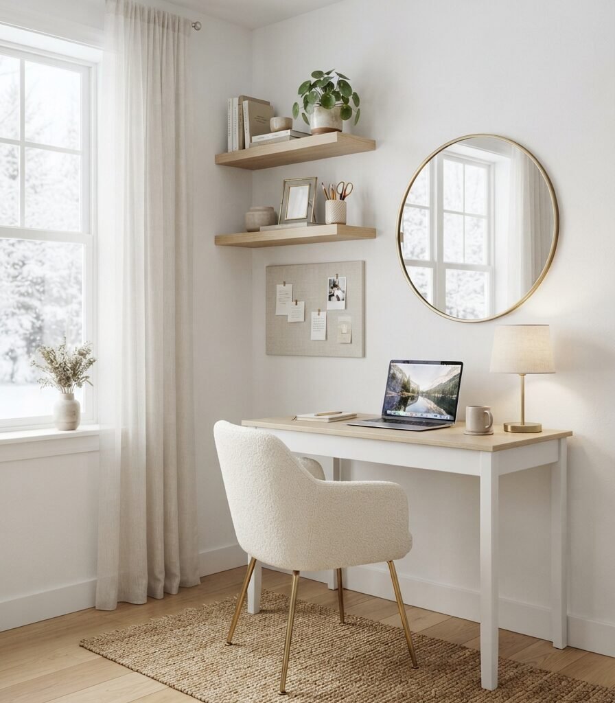
Category: SMALL SPACE
Vibe: Airy.
Why it works: A light wall color can help a compact room feel visually continuous, particularly when furniture remains shallow, and the window area stays unobstructed. Simply White is included among Benjamin Moore’s popular modern and kitchen whites.
How to get it: Paint the walls and ceiling in the same Simply White family, then use one large mirror opposite the window. Keep the desk no deeper than necessary so the floor remains visually open.
💡 Quick Win: Replace bulky shelving with two 8–10-inch-deep floating shelves painted to match the wall.
Shop The Look
| Product | Search phrase |
| Desk | Slim white writing desk 36 inch |
| Shelves | White oak floating shelves 24 inch |
| Mirror | Round brass wall mirror 24 inch |
| Chair | Ivory upholstered compact desk chair |
| Lamp | Small brass adjustable task lamp |
8. Light Paint Colors for Winter: Cloud White OC-130

Category: COLOR
Vibe: Gentle.
Why it works: Cloud White provides a warmer alternative to very crisp whites, allowing winter rooms to retain brightness while carrying a little more visual softness. It is also listed among Benjamin Moore’s established white palettes.
How to get it: Pair Cloud White with one slightly darker neutral such as warm taupe for the rug or dining chairs. Avoid using several near-identical whites because subtle undertone differences become more visible when everything is pale.
Shop The Look
| Product | Search phrase |
| Chairs | Cream linen upholstered dining chairs |
| Chandelier | Aged brass six light dining chandelier |
| Rug | Taupe neutral washable dining room rug |
| Candlesticks | Brushed brass taper candle holders |
| Dinnerware | Ivory stoneware dinnerware set |
9. Silver Satin OC-26 for Cool Winter Sophistication
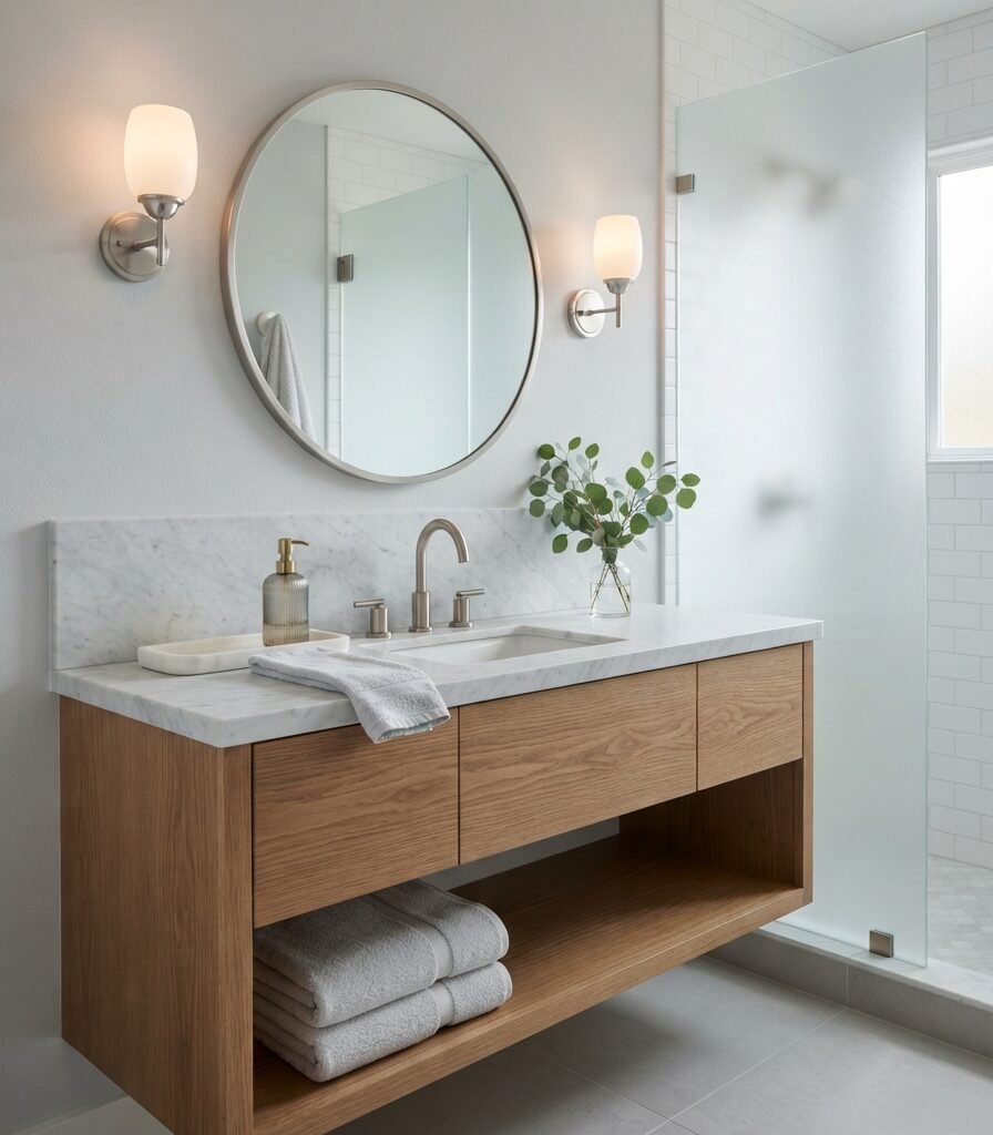
Category: LIGHTING
Vibe: Frosted.
Why it works: Silver Satin introduces a delicate gray veil rather than the visual blankness of a pure white room. It works particularly well where winter light is naturally cool and where marble, glass, and pale wood already provide varied surface reflection.
How to get it: Balance the cooler wall with 2700K–3000K vanity lighting and warm oak rather than adding blue-toned accessories. This keeps the gray from becoming visually icy after sunset.
Shop The Look
| Product | Search phrase |
| Towels | Soft white waffle bath towel set |
| Sconces | Brushed nickel frosted glass bathroom sconces |
| Dispenser | Ribbed glass bathroom soap dispenser |
| Tray | White marble bathroom vanity tray |
| Stool | Light oak bathroom stool small |
10. Balboa Mist OC-27 for a Pale Greige Winter Living Room
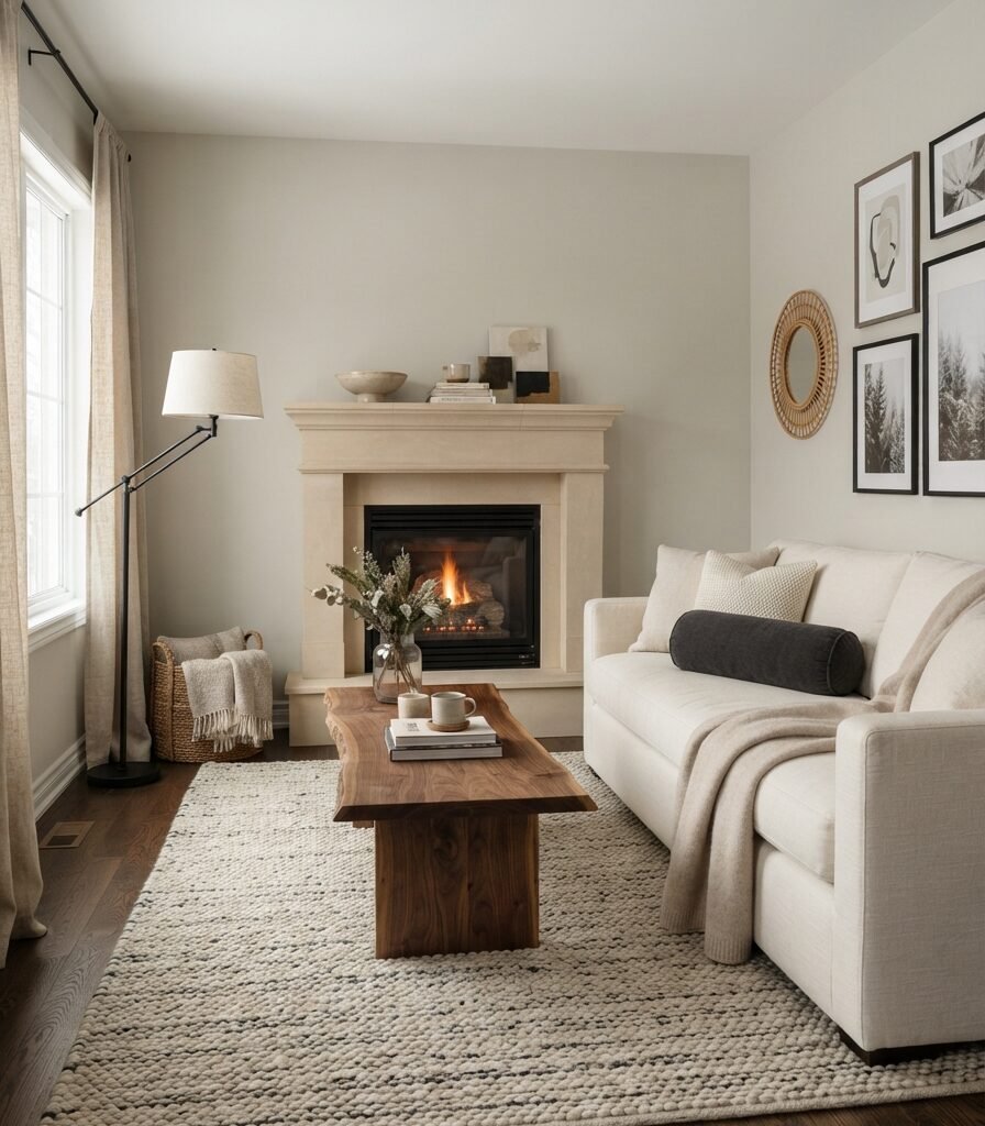
Category: MATERIAL
Vibe: Grounded.
Why it works: Balboa Mist creates more tonal depth than a white while remaining light enough for a winter palette. Benjamin Moore includes it in its light neutral collections alongside Pale Oak, Classic Gray, and other adaptable pale shades.
How to get it: Pair the walls with one substantial natural material such as limestone, travertine, or walnut. Avoid filling the room with small decorative objects; let the larger material surfaces establish depth.
Shop The Look
| Product | Search phrase |
| Sofa | Cream performance linen sofa 84 inch |
| Coffee table | Walnut rectangular coffee table rounded edge |
| Curtains | Natural linen pinch pleat curtain panels |
| Rug | Ivory wool and jute blend area rug |
| Lamp | Matte black reading floor lamp adjustable |
11. White Heron OC-57 for a Fresh Winter Kitchen
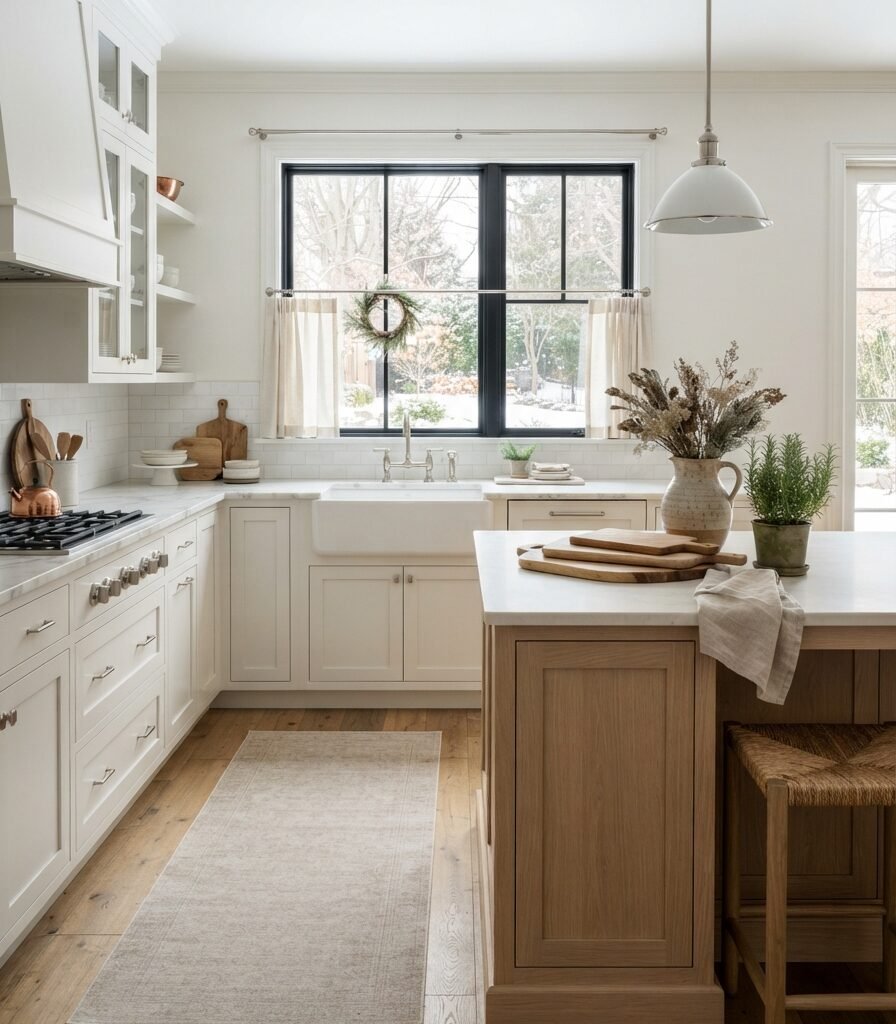
Category: FURNITURE
Vibe: Crisp.
Why it works: White Heron is a clean, light option when the goal is to make cabinetry and walls feel unified. Benjamin Moore lists White Heron OC-57 among its white cabinet and interior color options.
How to get it: Use White Heron across cabinetry and walls, then create warmth through the island and flooring. Choose a single hardware finish- brushed nickel or aged brass- rather than mixing several metals.
Shop The Look
| Product | Search phrase |
| Hardware | Brushed nickel cabinet pulls 3 inch |
| Curtains | White linen cafe kitchen curtains |
| Pitcher | Large white ceramic kitchen pitcher |
| Canisters | Matte white ceramic kitchen canister set |
| Board | Pale oak rectangular serving board |
12. Light Paint Colors for Winter: Paper White OC-55

Category: ACCESSORIES
Vibe: Quiet.
Why it works: Paper White can create a subtle gray-white envelope that gives artwork and wood furniture more definition than a warmer cream. Benjamin Moore lists Paper White OC-55 within its current light and cabinet color collections.
How to get it: Use darker frames and one charcoal accessory to create a controlled edge against the pale wall. Keep the remaining accessories ivory or natural wood so the hallway does not become visually fragmented.
Shop The Look
| Product | Search phrase |
| Console | Narrow pale oak entryway console |
| Art | Minimalist winter landscape framed print |
| Runner | Ivory gray wool hallway runner |
| Bowl | Matte white ceramic catchall bowl |
| Hooks | Brushed brass wall coat hooks set |
13. White Heron and Warm Oak in a Compact Bathroom
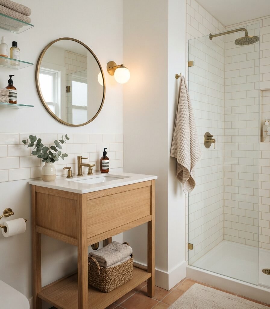
Category: SMALL SPACE
Vibe: Cleansed.
Why it works: A pale wall color works particularly well in a compact bathroom when reflective surfaces and uninterrupted color continuity extend the visual envelope. The oak vanity provides enough warmth to stop the white surfaces from feeling clinical.
How to get it: Paint the walls and ceiling in the same light family and use a mirror that reaches close to the vanity width. Keep tile, paint, and grout within a narrow tonal range for fewer visual breaks.
💡 Quick Win: Swap a small builder-grade mirror for a 24-inch round brass-framed mirror before changing the vanity.
Shop The Look
| Product | Search phrase |
| Mirror | 24-inch round brass bathroom mirror |
| Towels | Oatmeal waffle hand towel set |
| Basket | Small natural seagrass bathroom basket |
| Bottle | Amber glass bathroom soap dispenser |
| Sconce | Small brass opal globe bathroom sconce |
14. White Diamond with Soft Blue-Gray Winter Accents
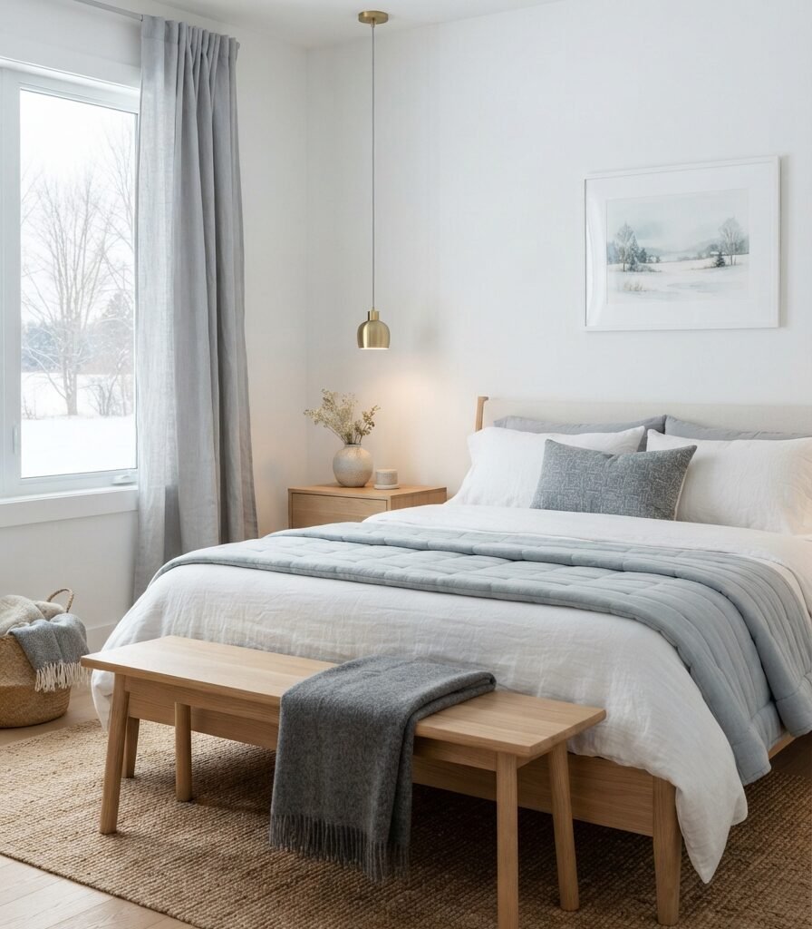
Category: COLOR
Vibe: Icy.
Why it works: White Diamond can act as the bright base while muted blue-gray supplies the seasonal color story. Benjamin Moore’s winter palette similarly pairs crisp whites with blue-gray and charcoal hues, showing how winter schemes can move beyond all-white rooms.
How to get it: Keep the blue-gray below roughly one-third of the visible room; bedding, one curtain layer, or artwork is enough. The white wall remains the dominant reflective surface.
Shop The Look
| Product | Search phrase |
| Quilt | Pale blue gray cotton quilt king |
| Curtains | Silver gray linen blackout curtains |
| Bench | Light oak bedroom bench upholstered seat |
| Artwork | Blue gray winter landscape print |
| Throw | Ivory wool herringbone throw blanket |
15. Classic Gray and Natural Stone for a Soft Winter Retreat
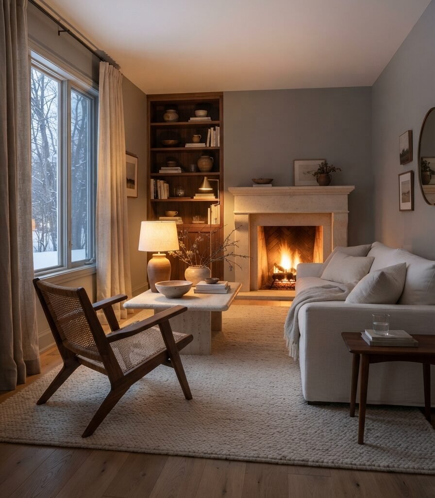
Category: LAYOUT
Vibe: Grounded.
Why it works: Classic Gray becomes more dimensional when the room is organized around larger material zones rather than many small decorations. A limestone fireplace, wool rug, and walnut chair create distinct visual weights while the pale walls keep the composition light.
How to get it: Establish one clear seating axis facing the fireplace or main window, then keep the central walkway open. Use a large rug to connect the sofa and chair rather than scattering several small rugs across the room.
Shop The Look
| Product | Search phrase |
| Rug | Ivory wool living room rug 8×10 |
| Coffee table | Natural limestone round coffee table |
| Chair | Walnut frame ivory linen accent chair |
| Curtains | Natural linen full-length curtain panels |
| Lamp | Antique brass ceramic table lamp |
How to Start Your Winter Light-Paint Transformation
Make one large sample board of your chosen paint color your first move. A board around 30 by 30 inches is large enough to reveal undertones more honestly than a tiny swatch, and you can move it beside windows, furniture, and flooring before committing to the whole room. Paint appearance changes with natural and artificial light, so testing throughout the day is more reliable than choosing from a screen.
The most common mistake is choosing an extremely cool white simply because winter means “snow.” In a north-facing room, already-cool daylight can make a blue-leaning white feel stark and flat; a warm white or soft greige may balance the room better.
For an inexpensive entry point, start with one large peel-and-stick paint sample, a pair of 2700K warm-white LED bulbs, and one oatmeal linen-blend cushion cover. Keeping each purchase under roughly $50 lets you test the palette without turning a color experiment into a renovation.
A weekend is enough to sample colors, repaint one small room, change lighting, and add winter textiles. A starter refresh can realistically stay around 100–500, while a full-room update with several gallons of paint, lighting, rugs, curtains, and furniture can reach 1,000–3,500+. Built-ins, cabinetry, flooring, and electrical changes are the elements that push a project into a multi-week or multi-month timeline.
Frequently Asked Questions About 15 Light Paint Colors for Winter
What are the best light paint colors for winter?
The strongest choices depend on the room’s natural light rather than the season alone. Warm options such as Sherwin-Williams Alabaster SW 7008 can soften cool winter daylight, while crisp shades such as Benjamin Moore White Diamond OC-61 can create a cleaner snowy effect. Pale greiges such as Pale Oak OC-20 and Balboa Mist OC-27 provide more tonal depth without becoming dark. Always test samples in the actual room.
Which light paint color is best for a dark winter room?
A warm or balanced white is usually a sensible starting point when a room receives limited daylight. Sherwin-Williams Alabaster has an official LRV of 82.215, so it reflects substantial light while retaining a warmer character than an icy white. For a particularly dark room, compare Alabaster with a crisp white and observe both under the room’s actual bulbs before deciding.
How much does it cost to repaint a room with a light winter color?
For a DIY refresh, paint and basic supplies can often fit within roughly 100–500, depending on room size, number of coats, and paint quality. Adding curtains, a rug, lamps, and new accessories can bring a fuller room update closer to $1,000 or more. Professional labor, extensive wall repairs, and high ceilings can increase the total substantially.
Can warm white paint work in a north-facing room during winter?
Yes, and it can be especially useful because north-facing rooms tend to receive cooler, muted natural light. Benjamin Moore notes that winter light in north-facing spaces can be cooler and sharper, making warm or balanced whites useful for countering that cast. The key is to test the exact shade because too much yellow can still become noticeable under certain lighting.
Which light paint color is best for kitchen cabinets in winter?
White Dove OC-17, Simply White OC-117, White Heron OC-57, and other light cabinet colors can work depending on the countertop and room lighting. Benjamin Moore currently lists White Dove, Simply White, and White Heron among its white cabinet options. For winter kitchens, compare the paint against the countertop, backsplash, and flooring together; a white that looks neutral alone can reveal a strong undertone beside stone or tile.
Ready to Create Your Dream Winter Light-Paint Palette?
These 15 light paint colors for winter move from warm whites and crisp whites to pale greiges and soft blue-grays, while showing how materials, lighting, furniture, accessories, and layout change the way each shade reads. A whole-home transformation does not need to happen at once; starting with one sample wall or one small room is often the smartest way to understand the color before expanding it. Today, paint a 30-by-30-inch sample board of your favorite shade and check it beside the window in morning, afternoon, and evening light. Once the right pale color is paired with warm wood, soft textiles, and appropriately balanced lighting, winter rooms can feel brighter, calmer, and more settled. Save or pin your favorite combination of warm white, pale oak, wool, linen, and soft winter neutrals so you have a clear palette ready for your next paint project.